The goal of the experience design proposed for the Volkswagen website (South Africa) was to create an overarching customer journey that would span the full lifecycle and relationship with the product or service, creating “… a preconceived and persuasive journey across all available media.” [1] The experience design aimed to cover all available channels by creating a grand customer journey to bind all interactions and experiences over time with customers. It became clear that the website was the one touchpoint that could speak directly to customers’ needs at any time over the full duration of the customer lifecycle. Establishing an information architecture and structure for the website that had this journey at its core would mean creating a consistent thread in the customer experience.
Central to this approach are the beliefs that:
- Answering customers needs can form a foundation for the creation of the journey
- Designing a customer experience around needs creates trust
- If customers believe that their needs will be answered through the web, it will increase the use of the website and the channel itself will become top of mind
Volkswagen it is!
The phase 1 launch of the Volkswagen website occurred in September 2005. This first release aimed to put in place a user experience and architecture upon which an integrated media approach could hang; a platform for customers, Volkswagen, and dealerships to grow upon.
The act of visualizing the integrated strategy, the full-fat customer journey, made it clear that the website, alone of all the channels, could affordably speak to customers throughout the full duration of the relationship cycle. Based on this insight it was vital that the website embody the full customer experience.
The customer experience design process
The process begins and ends with the customer—from creating a “landscape” of customer needs that change over time, to measuring success as the usability of (and level of satisfaction with) the experience for customers.
Broadly speaking, the steps in the process ran as follows:
- Identify and describe customer needs across the full lifecycle
- Identify all current activity across the lifecycle
- Identify gaps (where needs aren’t met)
- Where needs are addressed assess how successfully are they functioning
- Map business needs to the same landscape (and repeat steps 3 and 4)
- Between lifecycle stages assess how well transitions are being handled and identify gaps
- Create briefs to fill all gaps (for either customer or business needs)
- Use all available channels to address needs
- Build in the ability to campaign across this “landscape” over time
- Measure effectiveness against the movement (and drop off) through the lifecycle
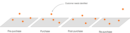
Fig. 1. Customers’ needs were identified and mapped to the lifecycle in a linear progression.
The strategy
We used the customer ownership model to form the basis of an “ideal” journey through all lifecycle phases. Matching business and customer needs was key to the experience design because the momentum in the journey relies on business needs and customer needs sitting back-to-back at the end of any journey. For example:
Business need: Acquisition
Customer need: Narrow my choices: help me to find and choose a car that’s rights for my needs and budget (I need more than just a catalog).
The needs analysis involved the strategist and me working through the phases in the lifecycle and mapping largely known customer needs. It was a very rudimentary mapping process and, had we the opportunity, customer interviews certainly would have aided the process.
For each stage in the lifecycle we:
- Identified overarching business objectives
- Identified our customer needs
- Identified business needs
- Located gaps in current activities and information to answer the above
- Identified the barriers to answering the needs
- Found solutions to fill the gaps
- And pinpointed dependencies for the successful roll out of the solutions
Identifying changing needs over time allowed us to create hooks to pull customers from one lifecycle stage to another, from one experience to another, and from one environment to another. We then constructed the full-fat, cross-media journey across all channels and touchpoints over time, including activities, content, hooks, and data requirements. Then we visualized the journey.
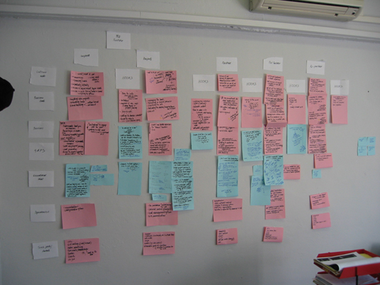
Fig. 2. The needs analysis and mapping process.
Some key points about the strategy and strategic approach:
- The framework allows for delivering on the brand ambition
- Customer needs are central to the design making it meaningfully customer centric
- It allows for all stakeholders needs to be tactically addressed through the lifecycle
- Being media neutral, it allows for true marketing integration across channels
- It is a platform for ongoing interactions, flexible enough to include tactical initiatives
User journeys
Early in 2005, jh-01 put together the information architecture design for the website, including analysis and content and functionality audit of the current website; development of the conceptual model; and persona creation and user journeys, wireframes, and sitemap.
Implementing a user journey usually takes place within a pre-established hierarchical structure where the journey is carved in, ad hoc, like a highway tunnel through a mountain. It is usually at the page level through newly designed calls to action and with the introduction of individual web pages that user journeys are cobbled together through a hierarchy. But because the notions of the lifecycle and journey were integral to the experience design and strategy in this project, the information architecture could truly apply the practice of user journeys: meaning that the structure itself was that of the “grand” journey from purchase to re-purchase spanning over three years.
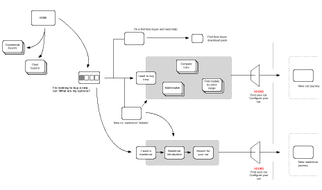
Fig. 3. An example of User Journey diagram.
Moving through the structure, dropping into the structure, is one and the same as moving through and dropping in and out of the overarching customer experience. On a structural level, the architecture itself, is representative of the changing relationship over time and the broad marketing endeavours of Volkswagen. Not to mention the changing needs and subsequent content and functionality of and for the user.
And all the other good stuff?
The process really began by identifying personas with each stage and sub-stage within the overarching journey. Cutting across these personas were different user types (first-time versus repeat website users, first-time versus repeat car buyers, fleet versus commercial versus passenger buyers, etc.).
As mentioned earlier, we used the Ogilvy One customer ownership model as the basis for the grand journey and for each persona at each stage in the journey we fleshed out:
- The primary need for each stage
- Need states within
- The users mode(s)
The personas then enabled the re-organization of content and identification of new content and functionality required for answering the customer needs across the lifecycle. It resulted in having content “buckets” for each lifecycle stage. The content within these buckets was then organized in a linear way, mapping content and functionality to need states as they changed over time from the start of the lifecycle stage to the end. Content was created to address changing need states within lifecycle phases. We created hooks within the content to move users from state to another.
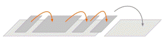
Fig. 4. Content was created to address changing need states within lifecycle phases. We created hooks within the content to move users from state to another.
In the early stages of consideration, for instance, we knew some people were “wallet conscious” and others “under the bonnet” type buyers. We also knew many people sit on the fence between buying a new car or simply going pre-owned, and we also needed to speak to first time buyers. So we created a section called “Help me choose” that sits apart from in the list of navigation options for this section.
For this section we created four content items addressing each need: a budget helper; a specs comparison tool; up-front pros and cons around new versus pre-owned cars, and a guide for first time buyers. All of these content items contained hooks or “next steps” to move people into looking more carefully at the models that were more likely to be right for them. Once this was done, the wireframes concret-ized the rules for navigation and layout and the content and functionality on each and every page to ensure that the detail required for the successful translation of concept into design and build had its blueprint in the wireframes.
The interaction design
After the architecture was signed off, Ogilvy Interactive developed an original system of interaction design concepts and rules based around the thinking of the journeys that moved the wireframes into a more sophisticated web-based experience.
Link types: top level, journey, recursive and detour
Page types: informational, simple direction, immersive destination
Interpretation of journeys into link types to assist with interface design.
Lastly, a sitemap was used to explain the structure of the journeys with a page code system that mapped back to the wireframes, so that the overall system could be understood by programmers and project managers for the build process.
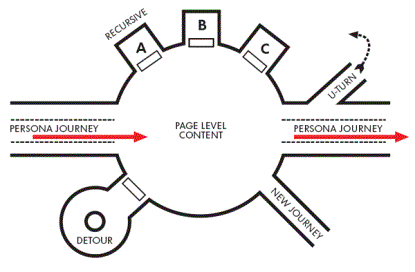
Fig. 5. Interpretation of journeys into link types to assist with interface design.
Moving forward
The phase 1-website release puts an architecture in place that will allow a modular approach to the inclusion of future content and functionality on the site. Where we know needs are still not being met or where new needs come to light there is a strategy and “logic” for the inclusion of new elements.
The website, being the one constant in the integrated strategy, can start to support the activities of other channels and can pick up from where others leave off; as a direct response and customer relationship management interface but also to successfully manifest the overarching customer journey across channels. The tip of the iceberg being campaign and marketing integration, the website will also integrate the back-end between customers, Volkswagen, and third-party partners (dealerships, financing, etc.).
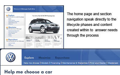
Fig. 6. Volkswagen South Africa.
Rolling out the experience design revealed that the web, unlike any of our other channels, offers a touchpoint for meeting customers (and their needs) at all times across the duration of the relationship. And it can do this affordably.
Customer journeys do work as a user experience model for online interactions with customers over time and as a customer-centric and needs-based approach promise to create a space where trust can exist. This project attempted to extend that thinking and approach into a customer experience design that occurs across multiple channels. In addition, the experience design is intended to offer a meaningful approach to integrating media and marketing initiatives.
Given the low bandwidth and often compromised user experience of the internet in South Africa, increasing the use of digital channels requires a robust customer-centric approach that speaks directly to people’s needs to create trust in a particular website, as much in an entire channel. For developing contexts like South Africa, this approach provides a strong argument for investing in the correct use of the online channel and to strategically drive traffic online.
[1] This case study covers the re-launch of the Volkswagen (SA) website in September 2005 as the online arm of a customer experience design conceived by jh-01 and rolled out with Ogilvy One and Ogilvy Interactive in Cape Town. This experience was created with Ogilvy One in Cape Town late in 2004.
what a lovely and interesting case study. Thank so much for sharing your conceptual diagrams… I can’t get enough of them!
Thanks…a note on the conceptual diagrams: I’ve always felt that because our ‘product’ as information architects is so abstract or conceptual that it is vital to visualise our solutions. Before going solo I used to ask designers to help me prepare my hand drawn sketches and conceptual diagrams to make them look amazing. Clients, and even internally at the company, people started to appreciate the IA so much more and started to feel like the process was almost an end in itself. It has helped me so much in the growth of my own ideas and being taken seriously by those I work with.