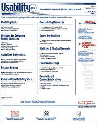
When Detroit’s automotive engineers design a new car, they often bring in real drivers who sit in the seats, mash the gas pedals, and pump the brake. This is the engineers’ approach to involving users in the process of designing new cars that people want to drive—and can drive. Their approach is similar to the thinking that led the National Cancer Institute’s (NCI) Communication Technologies Branch to formally encourage the designers of government information websites to involve users in the design process. We created Usability.gov, a place to share our knowledge about user-centered web design and why it works with our colleagues.
| We are gratified to see clear results from Usability.gov. Government web designers are using more user-centered design practices, and web designers in general appear to be more cognizant of the user’s mindset. |
Today, Usability.gov has earned a following among technology professionals. For the uninitiated, Usability.gov is a one-stop source for government web designers to learn how to make websites more usable, useful, and accessible. Our site addresses a broad range of factors that go into web design and development: how to plan and design usable sites by collecting data on what users need; how to develop prototypes; how to conduct usability testing; and how to measure trends and demographics. We have packaged our core knowledge into a specific set of evidence-based guidelines for user-centered web design. In addition, the site offers case study information in a section called Lessons Learned.
 |
What many do not know is the story behind Usability.gov, and knowing that story puts our work in context. It’s a story that underscores the critical role that Usability.gov plays in the electronic communication of complex cancer information to very diverse audiences. One minute, a researcher seeking grant information is pulling up an NCI website for details on what grants are available and where to apply. The next minute, an ordinary citizen is frantically searching NCI websites for any informationæany cluesæabout a type of cancer for which the doctor is testing them. Every day, NCI disseminates life and death information. Usability.gov ensures that users and their web behaviors are kept in mind when designing sites.
The seeds for Usability.gov were sown in early 1999 when the popular CancerNet web site came up for a redesign. As usual, we began by seeking input for the new design from technical professionals: web designers, content writers, engineers. Our “kitchen cabinet” also included users. But the opinions from this broad group of professionals and laymen were as diverse as their backgrounds. Whose ideas were right?
Our director, Janice Nall, decided that we needed a methodology to show that what we were doing would produce an end result that was better than what we started with. In fact, we had to be able to quantifiably measure that CancerNet’s new face was better than the old face, to offer proof beyond a lot of people saying it looked better.
To accomplish this objective, we decided to collect quantitative data about CancerNet’s users and their needs as part of the design process. An online questionnaire and in-person interviews turned up some revealing information. We learned that one-third to one-half of CancerNet users were first-time visitors who were often totally unfamiliar with the site. This fact raised obvious questions: With so many new users, was the site easy enough to use? Could users find the information they needed on the site quickly and easily? These were critical questions in light of the kind of information that CancerNet provided to the public.
Given these questions, we began testing the site, an experience that furthered the need to develop a formal way to collect and share our knowledge for future reference. We conducted user tests with doctors, medical librarians, cancer patients, researchers, and others who we expected would be regular visitors. What we learned from testing was as surprising as what we learned from our questionnaire and interviews: some icons were not clearly clickable, many links were confusing, our terminology did not match our users’, and core information appeared to be buried or lost within the site. These were not mere glitches, but conceptual and foundational challenges that needed to be addressed.
To be thorough, our testing was iterative; we built on prototypes and brought in new sets of users to test each new version. We continually collected information to see if new problems cropped up, seizing on every comment, even something as simple as, “What is that there for?” We were like those automotive engineers in Detroit, watching test participants’ every move and examining their every facial expression.

|
|
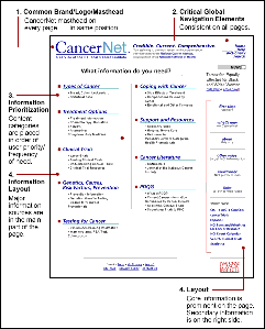
| User-centered design tips on CancerNet from Usability.gov’s Lessons Learned section. Click to enlarge. |
Today, when you visit Usability.gov, you get a sense of how these tools help government and other web designers to avoid our early mistakes. Whether you read our case study about the redesign of CancerNet in our Lessons Learned section, or read our guidelines about testing issues such as scenario writing, user recruiting, goal establishment, or data compilation, you will see our picture of user-centered web design in action.
We are pleased with CancerNet’s redesign. In the past year or so, the site has won four content and design awards, and CancerNet recently merged with several existing sites, including Cancer.gov, into one portal site. But just as importantly, we are gratified to see clear results from Usability.gov. Government web designers are using more user-centered design practices, and web designers in general appear to be more cognizant of the user’s mindset. What Usability.gov demonstrates is that web design is not about flash and splash. It’s about transmitting useful information that users want—and need—in a way that helps them find what they are looking for.
| Sanjay Koyani works for the Communication Technologies Branch of the National Cancer Insitute. He can be reached at . |
![]()

Fascinating article. It reminded me that usability can make a huge difference in people’s lives. It also reminded me of some charity work I did for a children’s cancer charity in the past. I posted a bit about that experience on my site:
Croc o’ Lyle: Usability can save lives
http://crocolyle.blogspot.com/2002_03_31_crocolyle_archive.html#11405055
Dear Sanjay,
Good article.
I would appreciate it if you could discuss the organizational structure of the team who did the redesign, with a short discussion of each member’s responsibilities and skills. I’m always interested in how other teams structure themselves.
Thanks.
Sanjay,
When I interviewed you last Fall for a Web Shui column in Builder.com, the question came up about how a designer/developer was to know what the relative impact of a particular standard/guideline/approach would be if they followed it. Once of the criticisms I had gleaned from people I talked to about your site was that it gave a designer little guidance on how to juggle priorities, such as usability vs timelines vs resources. I thought you said that you folks were going to tackle that next. Has that happened, yet?