Bold claims have been made about applying “big data” to solve the world’s problems, from health (Fitbit) to saving energy (Nest). Data is all around us, appearing in slick devices and colorful dashboards, yet focusing on the technology can cause us to miss the people who have to use it.
Our job as designers is to communicate information. A clean design with big numbers and charts looks good, but how can we make sure people actually understand the data?
|
|

|
|

Designing with data for real people
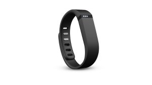
The most visible way people are now bringing data into their lives is with fitness trackers such as Fitbit, Vivofit, Jawbone Up, and many more. Over the last year, I’ve been talking to people about how they use data in their lives. This article is not about the merits of any one device but a compilation of interviews about how real people use data, merged into personas, with some ideas for design.
“Ironically, devices that initially helped foster engagement in fitness sometimes became too naïve to support increasingly sophisticated fitness priorities.”
Simplicity can be limiting
Ken is a middle-aged guy who needed to get in shape. He heard about the Fitbit, and being a gadget guy thought it “was a good excuse to play around,” but he is starting to feel the limits. For good health, you need to get your heart rate up occasionally; not all steps count the same. “This might be a tool more for getting started. I’m training for a 10k and ‘steps’ isn’t a useful way of looking at it. I’m checking out GPS running watches now, but don’t tell my Fitbit.”
Ken’s is a common story; a study noted that “ironically, devices that initially helped foster engagement in fitness sometimes became too naïve to support increasingly sophisticated fitness priorities.”
It is important to realize that the tools themselves are not going to get people to exercise, but they can inspire people to try. For new users, extreme simplicity is a requirement, but this very simplicity becomes limiting as the user expectations increase. At each stage, the tool needs to give back more value than it asks, to address more complex questions as users’ experience and competency increases. For example, colorful charts can show progress and sustain interest for a while, but inevitably we all plateau. The experience needs to develop to address day 100 as well as day 1.
|
|

Curiosity, not hard-core analytics
Susan came at quantifying herself from a different angle–sleeping. One of the promised benefits of the devices is to track and understand your sleeping patterns and ideally wake you up at the most auspicious time.
In the end, her Jawbone Up didn’t have a big impact on her life. “I didn’t really use the data–I still drink coffee too late in the evening and read the web in bed, but there is a nice feeling from seeing the chart. It has certainly made me think about getting more sleep.”
That’s probably the best benefit she could get. A blog post in Nature cites research that shows “the stage of sleep we’ve been woken from … does not actually have an impact on cognitive performance,” but “sleep is arguably one of the most (if not the most) important health factor that can be altered.”
|
|

One insight from Susan’s story is that many users are not looking for deep statistical analysis. Susan was just curious.
If there is no goal, it can be very hard to offer more than tracking and generic advice. Like the Cheshire Cat said “[If you don’t care where you end up], it doesn’t matter which direction you go.” Sleep cycle info isn’t something Susan can use to control her sleep.
In contrast, designing to a specific issue is much easier. If you read enough health stories, the climax is usually an insight like “My heart attack was a wake up call.” One person who suffered from Crohn’s disease wrote: “I know/knew that alcohol can be bad for anything in the bowels, but it was when I compared pain/flare-days to lite alcohol consumption … I saw a pattern… having the data made it plain as day.”
Achieving that insight is still a human process. Each one of us has to recognize there is a problem before trying to fix it.
A good design should communicate the resolution of information, that measurements are imperfect and the person should focus on the high level changes.
Telling the whole truth
Dan is a former fitness tracker user, but has fallen off. “The biggest issue for me was that the numbers didn’t add up.” “When I saw I was getting credit for steps when lifting my fork, I had to laugh.” He is not alone. The study Phases of Accuracy Diagnosis (PDF) noted most users “learned to regard the data provided by the Fitbit as highly suspect.”
Bad or inconsistent data is a de-motivator. This is important because, as the Phases article concludes, “users are inclined to abandon their use of the Fitbit because: they don’t trust its accuracy; they have trouble understanding what state it is in; and they are unable to make the Fitbit more accurate as they become expert users.”
|
|

Data uncertainty raises an ethical question for designers. We have a responsibility to tell the whole truth. Bold claims about improving health made in marketing need to be honestly built into an app.
Good design with a simple number may hide the messy fact that the number may not mean much at all.
In all the user research I’ve observed, people are always asking for simplicity. Our challenge as designers is that a simple answer is almost always incomplete. The calories burned each mile varies tremendously from person to person, from flat ground to hills, from running to walking. It feels good to design a screen around a single, simple number, but it just isn’t, you know, true. A good design should communicate the resolution of information, that measurements are imperfect and the person should focus on the high level changes.
As Wired Magazine noted, because many of the algorithms are hidden and proprietary, it is hard to know how accurate they are. Comparing them against each other suggests that measuring calories burned via an app is not an exact science.
The Withings scale Health Mate app is designed to coach people to achieve their weight loss goals. Withings has the data. Does the product work, or not? Only they know.
Grice’s Maxim of Quality recommends you don’t say what you believe to be false (don’t lie) but also don’t say things you lack adequate evidence for (be completely truthful). Hiding complexity under bold graphics makes for a beautifully designed chart, but it would be more honest to share the uncertainty behind these numbers.
Once you start to ask questions about health data, you learn that it is often tentative and is revised with new research. This is hard for people to make use of, especially when communicated through fear–and we have to design for this.
At your next family gathering, listen to people talk about their health. Cholesterol levels, blood pressure, diabetes, HDL, LDL? Which one is good now? Can we eat eggs again? Oh, those doctors, why don’t they make up their minds?! Understanding health is a design problem, just as a GUI is easier to use than a command line interface.
More data ≠ better answers
At the heart of many of these devices is a promise that design can make the complex understandable. An article on wearable medical devices noted the biggest challenge: They need to actually work before they can be used for medicine.
|
|

Life recently reminded me that more data does not always give better answers. I do quite a bit of running and wanted to quantify it by using a heart rate monitor. During my runs, I noticed my heart rate was above normal. Way, way above normal. My doctor had me wear a high end EKG system for a few days. After a few weeks of fear, the answer came back: “Yeah, some people’s hearts just beat faster.”
After all this digital measurement, it was a shock to be reminded that all those numbers are just rough guidelines. I learned that doctors care more at how quickly it descends after exercise.
In fact, my heart showed “J point notching of the ST elevation symptomatic of athletic people.” No average person is going to understand this, nor should they be making their own medical diagnosis. Even EKGs routinely get mis-read by professionals; here’s a cheat sheet to distinguish people at risk of a heart attack from the athletic.
Designers have a responsibility to consider whether regular people can plausibly use a tool, and when the subject matter is best for professionals. Just putting an EKG on a watch does not answer the question “Am I healthy?”
|
|

One method is to look at the context of use. Specialists know how to use or to ignore a particular number, but the average person rarely has the training to know if a particular reading is good or bad for them personally. If the information is meant to be understood relatively, over time, perhaps avoid specific numbers; use unlabeled charts or icons. For example, the Fitbit Flex uses 5 LEDs to show progress. A color LCD implies greater precision, whether or not the data is any more precise.
|
|

In contrast, using interesting design and high resolution of information risks both overwhelming the user and losing the marathon by focusing on the steps.
|
|

Alternatively, capturing and reporting info may not be enough for good design. Knowing that tracking alone does not motivate most people, consider whether the experience could be built around a plan to get from A to B. This lets people select the challenge they are looking for and sorts them into groups that can get better advice.
As an example, the new Apple iPhone Health app has a staggering number of inputs to choose from. What it lacks is a meaningful way for the person to get value from it. The inputs are dutifully displayed on the “dashboard”, sans context, guidance, or help. The dashboard chart even clips the Y axis to make it look prettier, at the cost of making a one pound drop look like a big deal (“… not that there’s anything wrong with that!”)
|
|

A design that only works for a new user is not a very good design.
Plateaus are harder to climb than mountains
Mark is an older guy who wanted to be more active. He was a passionate step counter for the first few months but has fallen off. He echoed a comment in a recent study:
“I liked it a lot in the beginning and I think now I’ve sort of fallen out of love with it. You know it’s like you’ve been married for a long time and… it’s all right but the excitement has gone.”
There are a lot of people like Mark out there–the drop off rate of these products is said to be as high as 1/3 in the first 6 months. The biggest problem is simply novelty fatigue. People love new experiences but become bored or distracted. Gyms know this–they would never have enough space if all the members actually used their memberships.
Mark noted that he was excited to hit his steps but began to feel judged when he didn’t hit them, especially on rainy days. Taking long walks on vacations set high bars that he could never reach on a work day. Tracking also has a perverse emotional effect. “If I forget my Fitbit, I wonder ‘why bother walking if I don’t get the credit,'” Mark said.
|
|

Roger S. Gil says “monitoring progress can elicit more anxiety since it makes the inevitable ‘plateau’ periods … much more noticeable.”
After the initial honeymoon period where someone plays with a device, it needs to quickly become a tool to achieve a personal goal, or it gets put in the closet. No device is going to make someone exercise, but a design that only works for a new user is not a very good design.
A good example of going beyond tracking is RunKeeper’s Goal Coach feature. It lets you set a challenge to yourself, offers a plan, and shows how you measure up. This is not for the faint of heart. A challenge for the Marks of the world is that most people lack a specific quantifiable fitness goal in their lives. ‘Being healthy’ is a lifestyle, not a 10 week goal.
|
|

Designing for this situation requires the tool to avoid judgments, celebrating progress at each turn.
No one tool is going to solve everyone’s problem. Different stages, from novice to professional, require radically different interfaces with the appropriate amount of challenge and responses. Taking a comprehensive lifestyle approach can help–for example asking people to plan when they want to exercise–to make it a part of their weekly schedule. For some, sharing with friends helps stay focused, but many feel more anxious about being judged.
Simple measurements have a lurking danger known as Goodhart’s law: “When a measure becomes a target, it ceases to be a good measure.” That is, focusing around a single number causes people to work to improve it, even if the larger picture doesn’t change. For example, measuring “steps” may have the side effect of justifying eating more.
In all of these cases, design is clearly an essential tool for addressing the problem of our age: personalized data. It’s up to us to make it work FOR the people whose lives are being quantified.
How do you value — like in the context of Susan — curiosity as a step in engagement that leads to the ah-hah moments? Maybe it’s not so much a plateau and instead a steady winding path with moments of clarity? This is the question I ask myself daily as a designer.
i’m not sure i agree with the derived sentiment that “In all the user research I’ve observed, people are always asking for simplicity.”
and in QS, considering users that know their process and accommodate recording that (maintenance) as well as users who need help developing a process (discovery) all in the same application set would be valuable. it’s all tough stuff though, so i look forward to the incremental innovation in the space
Thanks Marina,
This is one of the hardest questions in design. Our society valorizes quick action and instant insight, yet we live our lives one day at a time. Small slow steps is almost always how change happens.
I’m not sure information design itself can solve this problem; the experience itself needs to be designed to live and change. In the sports world, the best example I’ve seen was what got me running in the first place. In 2006(?) the New York Times Well section had a tool that combined coaching strategies from famous coached, a run tracker, but most importantly, a blog by another runner starting out at the same time. That impersonal human connection was great. (It didn’t hurt that Tara Parker-Pope is a fantastic writer with a curious mind.) it’s still live at http://health.nytimes.com/run-well/
Thanks for reading!
I guess what I’m questioning is whether ‘instant’ insight actually exists; wondering out loud if it’s all part of a relatively slow process with the insight being more like a bubble that we only see because it is the thing that breaks the surface. Ultimately semantics. The hope: new metaphors sometimes lead to new perspective which sometimes lead to a new idea (for me anyway). 🙂
I will read the times article …
‘Beyond the question about whether this information is accurate, this is an example of reporting the raw data without providing the value of interpretation, such as “how can I get a better night of sleep?”’
Thanks for posting. This part makes me think about setting the context of the entire experience of the data as the value, goal, or… wait for it… the point of looking at it in the first place.
Effectively relaying the value of interpreting the data does sound like a good handoff to effectively relaying the data itself. In other words, it sounds like the experience of the service would be more effective if we designed it for to be persuasive and motivating, not just on the whole, but specifically before and while displaying the data.
For example, if we were talking about a sleep habits app that did nothing but report data on your sleep habits, and for some reason there wasn’t space within the app to talk about why you would use it, it would be more effective to call the app “Better Sleep”, rather than “Sleep Habits”.
Have a very solid list of questions from this article. Very exciting. Thanks!
Great article Steve, thank you for sharing your wisdom and insights with us. It really does drive home the underlying fact that we humans are incredibly complex beings. While all this data is being collected, is it the many layers of interpretation that are really what contribute to one’s gratification of the data? I think for the great majority, the data is only useful if the person who owns it can derive a tangible benefit from it and herein lies one of the challenges.
Very good article, I tried to write something along these lines a month ago (http://heberg.se/2014/12/opportunity-in-self-tracking/) but you really formulated it more succinctly and just plain better. Thank you.
good read!!