Session Summaries and Reviews
Saturday, March 5
Opening Plenary
BJ Fogg
 Fogg’s primary area of interest is in the overlapping areas of technology and persuasion, which he calls captology. He points out that captology can be both good and bad: allowing people freedom of choice or limiting it. He says the techniques used for persuasions in one-time interactions are different than required for ongoing relationships, and Fogg points out that we may see too many one-time persuasions.
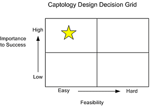
In order to prioritize how we expend our captology energy (designing for impact/persuasion), Fogg suggests we brainstorm a bunch of sticky notes about target outcomes (user behavior), then place the notes on a decision grid that ranks for importance and feasibility. For the best punch, select target outcomes in the high-easy area (important and feasible).
Fogg pointed out that video games are excellent at affecting user behavior since they provide quick feedback on your increasing competency. This type of feedback is especially important for certain groups, such as teen boys. While this is scary in some ways, such as the amount of time players are rehearsing violent behavior, the powerfully persuasive use of technology can be harnessed for other purposes. It’s a good example of Fogg’s observation that you increase your credibility by knowing what your audience responds to most favorably.
In conclusion, Fogg offered up some guiding words to help designers who want to have a positive impact via persuasive technology:
- Specialize: Find your niche. The more specialized, the broader the impact you have.
- Take risks.
- Appreciate (a healthy emotion).
- Rebound: We all fail; now get back up and keep going.
- Find your “true north. ”
For me, an opening plenary needs be inspiring, entertaining, somewhat practical and credible. BJ Fogg’s plenary was all of those, and is easily one of the best plenaries I have heard for a long time.
As we expected, the presentation covered many aspects of persuasion. BJ discussed how the tools we use change us; examined some of the common persuasive (and nagging) techniques that are currently being used, and elaborated on persuasive strategies that have the most powerful impact.
BJ reminded us that we are creating things that are used by people, and that we are in the position where so few of us can change so many others. We need to ensure that the way we affect those people is planned, not unplanned. This, along with the ethics of persuasion and design, are key issues for us to consider further.
— Donna Maurer
Sorting Out Social Classification
Peter Merholz, Peter Morville, Thomas Vander Wal, Gene Smith
Conference Description
This was a very well-structured and interesting panel. Gene Smith started the discussion with a good overview of folksonomy/social classification, explaining that a folksonomy/social classification schema is one where the participants in the content creation are also the ones creating the classification.
Gene also showed examples from key sites such as del.icio.us and flickr (these demonstrations need to be shown in real time before people ‘get it,’ but this wasn’t practical in this instance) and walked through the very short history with a series of provocative quotes.
Taking a conservative approach, Peter Morville reminded us that context is important, and that folksonomy doesn’t suit all (or many) contexts. He also noted that, as interesting as the concept of folksonomy is, hierarchies are not going away.
Thomas Vander Wal compared metadata and tagging, highlighting the problems that we have all had with managing metadata. He suggested that, in some circumstances, tagging is easier and can be generated as a by-product of tasks that users are already doing.
Peter Merholz discussed three key problems with current tagging implementations: a lack of synonyms, multiple meanings for a tag and incorrect tagging. He also briefly discussed the idea of discoverability, not findability.
All together, this was a good panel – it introduced the folksonomy concept, explained the current opinions and provided ideas for the future. It will be interesting to see what happens over the coming year.
— Donna Maurer
Thinking Navigation (or Navigation on Vanguard.com Pt.2)
David Fiorito
Conference Description
At last year’s IA Summit, one of the most popular presentations was “Creating a Consistent Enterprise Web Navigation Solution,” where David Fiorito and Richard Dalton of Vanguard discussed the process for creating consistent navigational patterns across enterprise websites. At the time of the presentation, the new navigation system had not yet been implemented, so this year’s follow-up presentation reviewed the system and discussed the process of applying it to the various websites.
One of the major lessons learned was how to present the design before the rollout. Senior executives and managers benefited from a high-level overview with fewer details, while those implementing the design needed more details and background, both to aid in buy-in as well as to ensure the proper execution.
They created a detailed, web-based documentation site, and conducted several rounds of usability testing on the site to ensure those implementing the navigation system would be able to find the relevant details. There is nothing on the site that explains the system to end users, but the goal was to make the navigation clear to users, and usability testing has shown that the new navigation is effective.
— Jeff Lash
The Confidence Game: The Influence of IA on Users’ Confidence
Jared Spool
Conference description
 This was the first “Spool” lecture I’ve ever attended, and it was pretty good. Spool himself is quite a character, with an animated–albeit clownish–persona that kept the audience engaged and the talk moving rapidly. Looking at the issue of “influencing” user behaviors, Spool discussed how content presented at different levels of the information architecture of a website can have an impact on a user’s decision-making process. He discussed the purchase of hi-tech items–such as digital cameras–using sites like Amazon, WalMart.com, and Target.com as a reference. It was an interesting study, and it raised intriguing issues about the value of brand and the need to understand users’ goals or “outcomes of use”. (Hmm, calling Alan Cooper?) While not as intellectually rigorous as a CHI or UPA case study, Spool’s presentation raised worthwhile issues for the IA community to debate.
— Uday Gajendar
Spool presented findings from a recent UIE study of people who purchased laptop computers and other electronics online. He found that sites should give the purchase confidence, because confidence results in purchasing enthusiasm. (Of course, you must find the threshold point of confidence, and I’m not sure that Spool clearly addressed that point.)
Test subjects were given a stipend, and Spool found that they spent 250% of it at Crutchfield, vs. only 42% of at J&R. Wow! People were confident at Crutchfield–enough so to spend a good deal of their own money in addition to their stipend. Shoppers at J&R, on the other hand, didn’t even spend their entire stipend.
Spool identified three stages in the ecommerce decision-making process:
- Winnow
- Department page: presents collections of likely product candidates.
- Group items usefully and describe them carefully.
- Do not present featured products at this stage; it is too early in the process.
- Are you using facets? Be sure they are the right ones, and that they match the user’s mental model (i.e., “shoots 8×10 photos,” not “4 Megapixel”).
- Good example: Lands End’s swimsuit page.
- Select
- Gallery page: shows selected details about each product in the department.
- Display a small logical group: understand the threshold of “too many” (though Spool did not specify what this threshold is).
- Validate
- Product page: deliver the right information so the purchaser can feel confident that it is the right product.
- Example: Crutchfield employs good descriptions written in the purchaser’s terms.
A related tidbit that Spool shared: “Worried about cluttered pages? Remember that the page is only cluttered if the information is not relevant to you. If it’s relevant, than it’s useful, not cluttered.”
— Weston Thompson
What makes users decide to purchase? And conversely, what makes them return empty handed? Jared Spool spoke to a packed room about the benefits of giving users confidence in your site to allow them to make important decisions.
In a recent study, users were given $1,000 dollars to spend on electronics at various shopping sites. The resulting spends as a proportion of the original stipend varied enormously: on crutchfield.com, users spent 237% of the stipend, on amazon.com just over 90%, and in others as little as 50%. Spool examined why test subjects did not have the confidence to spend their stipend on some sites, even though the purchases were free to them. He proposed that a good IA supports the three stages of shopping: winnowing (seeing a large selection of products and picking the correct range), selecting (picking the product to buy), and validating (checking that the selected choice is correct). Department pages (e.g. cameras), gallery pages (e.g. cameras under $150), and content pages (e.g. Kodak EasyShare Model 123) support these respective stages, and Spool gave specific recommendations for designing these pages.
The big surprise is that users don’t use content pages to make decisions: they are made at the selection stage, on gallery pages. Content pages are then used to validate these choices. As a result, the most successful shopping sites are designed to support funneling: users are given enough information at the gallery / selecting stage to have confidence that they are looking at the correct item by the time they view its content page. Less successful sites, on the other hand, are designed for ‘pogosticking’: users go back and forth between content pages and gallery pages. At the end of the presentation, Spool thanked an enthused audience for encouraging his behavior.
— Helen Leech
Evangelism 101
Dan Willis
Conference Description
Dan’s presentation was energetic and interesting. He outlined the key aspects of an evangelist, what they do and how to identify one. He presented his “8 random rules of evangelism,” which included “be shameless,” “be fuzzy,” “be tactile,” and “incite the riot.” He continued with a good explanation of ways that different people evangelize and how to work with evangelists.
Doesn’t sound much like IA? Dan connected evangelism and IA neatly-many of us are involved in selling what we do and what IA is about, and any help doing this is always appreciated.
— Donna Maurer
Yet another dynamic, lively, engaging speaker, Dan Willis described the perils and joys of IA evangelism within a company, offering advice and tips. The key takeaway for me was that different kinds of evangelists-pirates and poets-each have certain personality traits and thus need to be nurtured differently in an organization. Timing, patience, and persistence seemed to be the top criteria for any evangelist pursuing positive change.
— Uday Gajendar
Content Genres – The Hidden Workhorse of Information Architecture
Peter Merholz
Conference Description
 Peter Merholz presented an extended look at a rather simple idea: document genres. He started with the notion that IAs usually look at metadata in terms of author, title, and other descriptive aspects. But he countered that people approaching a task or goal seek custom tools; they need to know the genre of the document. Is it a guidebook, a map, or a weekly independent newspaper? Merholz emphasized that knowing the genre helps set expectations. Genres are often known by visual cues and affordances, but they are harder to convey online.
Merholz pointed out that we can find ways to use the notion of genre to help organize unwieldy content inventories, such as large intranets. Genres serve as trigger words for users, which help them move through these large document sets. Merholz acknowledged that this is similar to the notion of content type, but that content type often connotes format. Additionally, content type is jargon in the header of most markup schemes.
Merholz pointed out an example use of genre on the Trend Micro web site that helps it stand out from its competitor Symantec. Trend uses genre effectively on product pages to tie in Features, System Requirements, and White Papers. These links help users self-select without forcing them to segment out at the start of the information-seeking process. Merholz also showed mockups of how Clusty and Google could use genre to help people understand and filter their result sets. In his mock-up, his search for “information architecture ” on Clusty resulted in a set of genre types such as tutorials, weblogs, books, and essays, instead of what Clusty gives you now: a mixed-up list of related topics, sub-topics, keywords, and proper nouns.
Tying this into the popular world of content management systems, Merholz noted that genre relies on presentation/layout, so the CMS goal of separating those can be counterproductive. As a quick example, he showed a menu: well, we know it’s a menu because it looks like one, even though the actual content is pure gibberish. Likewise, he showed actual menu content set up like an essay, thereby obscuring its actual nature. Merholz stresses that presentation sets expectations of what the content is and what purpose it serves, how to use it. But Merholz found a way to bring the two together: He looked at the content delivery method (i.e., PC vs. PDA) as a genre. Then he analyzed sub-tasks to find which content delivery methods were best suited to the sub-task.
Merholz’s final thoughts were that genre will help us with information architecture, especially in large spaces, and that genre reminds us that IA is really about the content the fact that people are using it.
— Weston Thompson
I profess to having an interest in this subject, and attended the session to primarily see what Peter Merholz was up to with thinking about genres and how we can leverage them in our designs.
Peter explained the basics of content genres– that we frequently know which ‘type’ of document or resource to use based on our previous experience with information. For example, when determining where to eat we might use a local free newspaper to find out about restaurants, then a map to get there. The physical content genres we use are not always used in the online world, and there are additional genres there that we do use.
Genres are not the same as templates. Peter discussed situations where a genre will use a particular template to reinforce the genre (and to provide recognizable shape); noting that in other cases many genres will use the same template.
Overall, this was a good summary. I’d be interested in seeing what happens when put to practical use, and whether genre identification really helps people to find and understand information. An IA research project perhaps…
— Donna Maurer
The 2005 Information Architecture Slam: The Second Annual “Workshop with a Winner”
Lynn Boyden, Chris Chandler, Matthew Fetchko, Eric Reiss
Conference Description
 The IA Slam involves teams of eight people working for 45 minutes to design a solution to an IA problem, with each team having 10 minutes to present the design. This year’s problem was ‘The Merger from Hell’ in which the teams had to design a new floor plan for the recently merged Bal-Mart and Fordstrom while maintaining the individual brand identities.
Not an IA problem? Of course it was. In coming up with this solution, we used many of the same skills we use when working on a website–managing team politics, identifying the problem, thinking about the customer experience, brainstorming and designing solutions, communicating our designs.
The winning team was announced at lunch next day, after a long and tiring evening of judging!
This was easily the highlight of the Summit for me. Thanks to team green for being the ‘most congenial’, and thanks to the organizers (who played their parts amazingly well) for once again running it.
— Donna Maurer
Design Patterns in Enterprise UI Architectures
Karl Mochel
Conference description
This was a well-delivered (and much-needed) talk regarding the evolution of enterprise software UI architectures. While I don’t think Mochel spoke of design patterns in the true (Christopher Alexander) sense, he did a nice job distinguishing enterprise systems with specific qualifiers (transactional, frequent data entry, cross-functional dependencies, etc.), thereby presenting to the audience of IAs a different problem space than the one usually seen in CMS or intranets.
The presentation touched on a variety of ways to organize web-based enterprise functionality (persistent tab, tabless, and contextual tab)–each with its own benefits–derived from an understanding of the user’s questions and goals. Mochel also carefully pointed out the advantages of re-organizing functionality to correspond to the user’s goals, even while keeping the same pages in different locations. This concept was nicely demonstrated with a multi-step animation that showed a Marketing application morphing from one type of architecture to another, resulting in a slimmer structure overall. I think the audience found this animation most helpful in grokking the abstract concept of “enterprise architecture.”
Finally, Mochel described his interest in interactive visualizations and their connection to enterprise architectures, thereby enabling ways of “viewing into” complex datasets. As a next step, it would be great to see screenshots or an actual demo of an enterprise UI featuring examples of decision-making scenarios enabled by such interfaces and architectures. The foundation for exploration in this area has certainly been set with this talk.
— Uday Gajendar
IA For the Personal Information Cloud
Thomas Vander Wal
Conference Description
The core idea that Thomas presented here is that, just like the Internet itself is a publishing cloud that we enter to find information, there is a personal cloud that is wholly within our purview, or within our perceived purview. What makes the personal information cloud so important to us as designers and architects of information spaces is that we need to be considering (beyond our current target zone) findability and initial-use. Once information is found and consumed, it will invariably need to be re-used, controlled, shared, and otherwise manipulated. What this means is that information will be structured and re-presented outside our control. No one is really thinking about this issue when they create their information spaces today. Issues of intellectual property, privacy, and brand all become huge concerns moving forward for people thinking about such spaces.
The portable nature of information brings up both concerns and challenges about the personal information cloud. Having information be contextualized to location, task, relationships, etc. means that we need to have a much better handle on how our information can be used way beyond how it will be found.
— David Heller
Interface Design for Database-Intensive Web Applications
Jessica Jackson & Rick Omanson
Conference description
This presentation examined the fundamentals of interface design when applied to large, database-driven sites such as catalogs and libraries. Scalability and transactionality were offered as the driving influences that can impact the interface design in these sites, and Jackson cited various examples, including CDW and the Library of Congress, with its millions of items. Some key issues included the familiar problems of orientation, navigation, and operations within a large-scale site. The typical questions of “how to organize the content” and “how to help the user find an item” were also examined, along with a summation of some options, including multilevel navigation and breadcrumbs. Predictably, a lively discussion ensued over the value of breadcrumbs: should they show history or architecture, their location and usage, etc.
I think what emerged from this talk was a set of basic heuristics and issues–not completely novel or profound–for designers of large inventory sites to consider. It would have been more compelling to examine the challenges of emerging technologies (Flash, wikis/blogs) and the increasing need for search/find/remember functionality within large sites: What are their interactions and how should the architectures respond to them, given the live database connection? There may also have been a missed opportunity to deeply explore what “live-ness” means to interfaces and the supporting IA, and how it can make them very dynamic and configurable.
— Uday Gajendar
![]()
Overview & Pre-sessions | Saturday Sessions | Sunday & Monday Sessions