How many times have you been asked, “So, is the new website going to be black and white too?” after presenting your wireframes to a client or a usability test subject?
This question is almost a traditional part of being an information architect. Wireframes do not clearly define what they mean to convey, leading to confusion. This is most apparent in wireframe usability tests with users who don’t know anything about the project or process. Fortunately, there are a few simple steps that will make wireframes be understood by anyone. They don’t even have to be much more work. It’s simply a matter of choosing to “get real” from the start.
Real people don’t understand wireframes
Usability tests are done to get early feedback on content and functionality decisions from people outside the project team. These participants, unfortunately, are not sure how to respond to a wireframe. It is not intuitively clear what they should be doing, which site they are looking at (public site, intranet, client site)—it may not even be clear that they are looking at a web page. This lack of information and context adds a bit of cognitive friction to each step in the process. This level of confusion results in less confident answers and fewer opinions.
Wireframe tests usually take place with well-meaning, but unsophisticated users. They generously accede to poking and prodding and answer questions as best they can, despite not exactly understanding what is wanted. This realism gap is due to the lack of definition of what should and should not be looked at. “Look at the field names but not body copy.” “You can look at the forms but not images.” “Comment on the page layout but not design, and, yes, the font size but not font.” It’s no wonder that the layperson is confused.
Visual affordances, such as color and underlining links are key to using a site, and these cues make a significant difference in a usability test. Users cannot confidently predict how they would use a page if they don’t recognize links or can’t read what the page expects them to. Information architects, however, tend to shy away from these cues because they don’t want to step on designers’ toes. Wireframes, after all, are not designs.
Or are they?
Avoiding “design” elements removes visual cues that users rely on:
* Color, which identifies hyperlinks and focuses the user’s attention on an element of the page
* Branding, which confirms that the user knows where they are
* Recognizable web page elements, such as forms and search fields
* “Content,” such as account numbers or product names, which allows experienced users to focus on how they would really use the page, instead of interpreting “lorem ipsum”
The boundaries of the role of the information architect shouldn’t be more important than clarity.
Originally the term “wireframe” referred to a quickly rendered 3D model showing the model’s structure used while the model maker was working. They were much faster to work with than the full rendering. Interestingly, they are not currently used as modern tools and techniques are fast enough.
Why wireframes?
Information architects construct wireframes instead of designing final pages, in part, because:
# Wireframes are faster.
# Information architecture and design phases can happen in parallel.
# Wireframes force viewers to focus on the content, not the visual design.
Notice anything? All these goals are internally focused on the project-team. Wireframes aren’t created for external audiences.
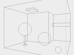
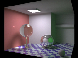
Figures 1,2: Originally the term “wireframe” referred to a quickly rendered 3D model showing the model’s structure used while the model maker was working. They were much faster to work with than the full rendering. Interestingly, they are not currently used as modern tools and techniques are fast enough.
Wireframes are conceptual models of a page that web design teams have become to interpreting. Each wireframe is surrounded by experience in reading them, knowledge about the project scope, knowledge about how the designer will use the document. Liz Danzico writes about this wireframes becoming project memory in the article “The Devil’s in the Wireframes.”
Just because project teams understand the purpose of wireframes, that doesn’t mean everyone will. Similar to listening to someone sing out loud to his iPod: we only hear the singing, while the person hears the whole orchestra. Likewise, the test subject knows only that “the page isn’t going to look like what they see,” but what they see is all they have to react to.
Wireframe makeover
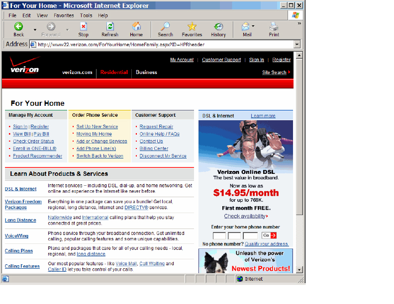
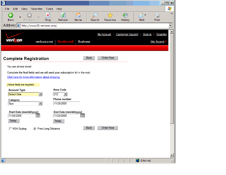
Here is an example of the simple steps to transform a standard wireframe into a realistic wireframe. In this example, let’s say we are designing a registration process for Verizon.com (no special criticism is intended for the site below).
The site we are designing for Verizon.com:
Here is a standard wireframe:
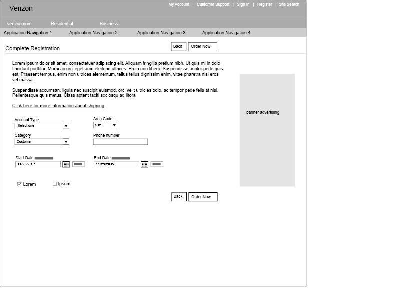
And here is the same wireframe, made more real. (An additional 10 minutes was required to use the standard header and a library of realistic form elements in Visio or InDesign.)
And here is a version re-using Verizon’s standard buttons and clip art. (Additional time: two minutes.)
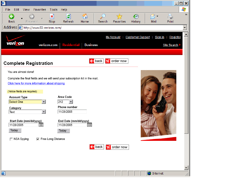
Which do you think would be easier for test subjects to understand?
Tips to get real
These tips are best for intranets or sites with defined styleguides, and less useful for graphical or marketing pages where the design is the content of the page.
# Make a header bar with the company branding. It should look like the site they are used to, showing the company logo.
# Use color. Hyperlink color is a basic requirement.
# Put a web browser frame around the image (or at least the first page).
# Use real form elements, not drawn replicas of them.
# Create a template or library of real form elements (feel free to share yours in the comments below).
# Avoid lorem ipsum. Instead, use: “Descriptive text that will explain this product.” to avoid confusion about greeked text.
# Use accurately sized fonts (this also keeps you honest about what can fit on the page).
# Use real detail such as products names and data. Especially on transactional tools with expert users, users care about what they are reading and recognize and use data like account numbers. It may not be important to us, but they have expectations that need to be met.
Compare the wireframe to the current site, note any changes in functionality that may trip them up.
The page doesn’t have to be perfect, just enough to give the test subject their bearings. A semi-designed page is easier to understand than a non-designed page. This is not wasted work; these decisions need to be figured out at some point. Consider bringing designers into the process earlier, cooperating on file formats and processes. It might even make their jobs easier.
Are traditional roles limiting projects?
Wireframes are in fact the first design iteration, and this overlap with visual design can be uncomfortable for teams. However, denial is not the way to fix this issue. Good collaborative relationships should make this overlap an opportunity to reduce work, not fight over ownership. Concern that wireframe might be mistaken for a visual design, or worse, be criticized for lacking design, may be holding the entire project back. It is much easier to communicate within the project team than the outside audience.
Consider these and other ways to make the transition as smooth as possible, for example, by having the wireframe be designed to import into the designer tool without retyping all the text.
Interesting article.
My initial reaction is to ask why bother with wireframes at all?
With access to the right skills, it may well be easier to go straight to a HTML prototype. This, I believe, could be better at overcoming the problems external people often have with wireframes.
Going straight to a prototype would be especially applicable if the project is to improve an existing page or site (is in the example), as the current pages provide a ‘template’ which can form the basis for the prototype.
The one reason to use wireframes that isn’t merely for the benefit of the designer is that of communicating purpose to the client without distractions. It’s an interesting idea to use colour and make a pseudo-wireframe for usability testing, wireframes still have a very important role in an earlier stage of design, when proposed solutions are still being mooted.
This is especially important if the new proposed designs are very different from an existing design, as differences in colour and typography may be sufficiently apparent to the client that they end up becoming a focus, when really they have less significance than the layout of the page and UI elements. Going straight to a prototype means that early decisions about colour, branding and typography have to be made at a stage when really they shouldn’t be allowed to cloud the subject matter.
That all said, I think there is some value in having these chrome parts visible once you get to the user testing stages. Perhaps it would be an acceptable alternative to just use a generic stylesheet at this point?
I agree that wireframes are a technical document and that visual prototypes (containing real or sample content) are far more suitable for usability testing and client feedback. My own design team create wireframes in the first instance to establish the UI framework. Once we are happy with the framework the wireframes are then split in to two complementary models. The early wireframes evolve into ‘wireframe templates’ – these descibe the content elements/tags/metadata for each template (then used by the developers who are building a content management system or other software). The complementary model is a ‘visual prototype’ – this shows a contextural view of the wireframe, and contains actual content, labels and sample images – like the examples in your article. This system works really well for us. However, in our case we sometimes have to handover the Information Architecture to a branding or marketing agency who create the final visual designs (since we have perfectly capable visual designers in-house this constantly proves a challenge). As far as I’m concerned the Information Architecture is influenced by the visuals (colours, fonts, text sizes), so it can be quite tricky working with other design agencies who are primarily focused on the branding…
Fidelity for prototypes can be roughly measured by 3 attributes: visual detail, functional depth, and technical reuse. The obvious trade-offs are the more realistic any of these attributes becomes, the most cost there is involved. The effort for including visual detail on each page I think is discounted above when you consider the cost of maintaining that consistent style over multiple pages, unless you increase the technical reuse attribute as well (CSS) which in turn provides more cost.
I don’t think there’s a single silver bullet / best practice for how to prototype for every single project. One should consider who the prototype is for (investors? the client’s business analyst? end users in usability testing? your developers?) Each group will have different needs in each of the 3 attributes. Design your prototype to meet the needs of these interim users and you’ll find the right balance of cost/value for visual detail, functional depth, and technical reuse.
Stephen… I whole-heartedly agree with the points you make. Excellent article.
In my experience, increased use of rapid prototyping techniques makes having an intelligible prototype all the more important. I’ve used Axure for about a year, and of course I get the “it needs more colors” comment, but the most significant thing that I’ve noticed is that prototype test participants are unsure of whether they have completed a task if you use genericized page types. When I take the time to put in fake data that matches the tasks in the test, users have a lot more confidence about whether they’ve found what they’re looking for. It helps prototype tests more definitively answer the question, “is this usable?” This leads me to believe that a new rapid prototyping best practice would be to complete the prototype tasks *first* and then begin working on the prototype. This could increase rapidity even further.
Until now, I wasn’t aware that putting wireframes in front of users for the purposes of usability testing was in any way common practice. It seems a very odd thing to do. No wonder the author sees it as a problem, and no wonder most of the comments here are coming back saying “That’s why we use prototypes!”
Wireframes can be used for usability tests in instances where visual comps have not yet been made or if visual comps are out of scope of the project. Usually clients will want to test wireframes as a first step to seeing how effective the information architecture is presented to the users, without being distracted from visual representation. I found this to be effective in the beginning stages to get a grasp on what significant final decisions need to be made before comps are started.
Usually the wireframes that I’ve developed are minimal in color with an exception for links and icons. I try as much as I can to avoid lorem ipsum, not just for the client but also as a benefit for our copywriters to have something to start off of. Using real information is key in any wireframes, especially when testing the structural layout of the site.
An understanding of what wireframes are should be made during the discussion of the statement of work. Knowing that visual is separate from ID/IA work is key to the client’s understanding before any work has begun and should be reminded in instances when they do go off track.
I do find it however that wireframes and visual comps clash in a way – knowing that most clients will give “LATE” feedback on ID/IA work that has been signed off. Yes – Clients suck. Well most of them at least. =)
It’s true. The quality of the prototype affects the feedback you receive, but testing early on with lesser fidelity prototypes can be really valuable. Most teams should have a set of wireframe templates that leverage existing identity, visual styles, and common assets (like custom buttons, etc.). This is only really possible if you’re extending existing products. Working from these templates, the time to make your wireframes more “real” dissappears.
However, if the problem is users don’t understand the conceptual nature of the wireframe, this is as much to do with education and culture as it does wth the wireframe’s fidelity.
At the World Bank, user testing is fairly strongly embedded in the culture, and the usability guru does an excellent job of educating users as to what an HTML wireframe is, what it isn’t, and the purpose of the specific test. Users test both bare bones HTML wireframes as well as higher-fidelity, grayscale wireframes. The higher-fidelity wireframes had to be grayscaled because users believed color versions were work that had already been completed, and there’s a bias against critiquing already completed work.
A common reason for using lower-fidelity wireframes is that users may hesitate to provide the same feedback they would if they were presented “ideas” for the site.
At the other end of the spectrum, at Comcast Interactive, I’ve heard stories where hi-fidelity prototypes were interpreted as finished products by management who liked what they saw and mandated a launch.
The same education and culture issues come into play, but getting real is certainly not without its problems.
Ideally, your wireframe should be crafted with its use in mind. Documenting decisions for history or for feedback should create a different wireframe than one used for testing or another used for communicating design with the rest of the team.
Wireframes are a tool. A screwdriver is a tool. And just as it is not very efficient to knock in a nail with a screwdriver, there’s not much point using a Robertson screwdriver on a Phillips screw.
I work for a software consulting company and am faced with a wide variety of application and user types. It might occasionally be useful to have higher or lower fidelity wireframes than a typical Visio mock-up, but I find this to be the exception. It really depends on the complexity of the application, the phase of the project, the extent of the differences between this and what the users are used to, and so on.
There are several types of information that we want to get from user reviews. For some applications, the appearance is a high priority, and for these we produce a visual prototype. I find standard wireframes valuable for evaluating the data semantics of the panels: the field labels, priorities, groupings of data, and so on. And I find that if we introduce too many variables, the focus of a review can be diminished.
I’ve never heard the comment “is the application also going to be in black and white?” But I have heard over and over again something like, “I don’t think this blue goes with that orange.” If users are given the proper perspective up-front, they can typically not only relate to the wireframes, but appreciate them as providing a visual focus around which to wrap a text-oriented business requirements document.
Having said this, we’re on the cusp of changing technology and are increasingly moving from paged to rich internet applications, in which static Visio wireframes are not so useful. But that’s another topic.
Good stuff.
I’ve used what I call “frankensteins,” part wireframe, part real page elements for a while. Similar to what Steven points out,
assuming we are designing new areas for an existing site, we can use real headers, real images and even real visuals of form elements/text. I also agree with real explaination text, as lorem ipsum doesn’t transmit enough information to business users.
Zef Fugaz’s above comments are good too, these can be another step in different documentation that delivers to different needs. I’ve had to deliver upwards of 4 different “site/content maps” to a client, all valid “site/content maps” but all showing different perspectives of the data at hand. We sent different docs to different stakeholders that had different priorities.
I believe it is up to the facilitator to manage participant expectations when testing with wireframes. I recently tested wireframe content pages with a fully designed home page layout with great success.
I’ve tested with prototypes as basic as sketches on flipchart paper and created flyout menus with sticky notes and still received rich, valuable and useful feedback.
Baldly telling them not to focus on the design usually fails, but telling them that they are looking at the equivalent of a blueprint generally helps. I want them to find the bathroom for me, not comment on the lack of curtains.
Putting in dummy images tends to generate comments about the image and whether the participant likes it or not. Putting in a box with a comment inside that says ‘Image’ lets the participant assume that they will see a picture there, without them needing to process it.
As mentioned, you want to avoid lorum ipsum and use real text and I always visually distinguish links and buttons so they look clickable. Yes, there has been the odd participant who’s commented that they don’t like the ‘grey’, but that just indicates to me that I need to stop the test, manage the participant’s expectations again and then carry on, not that testing with simple wireframes is a bad idea.
In addition to Ben’s comments above, the problem with electronic prototypes is that the participant expects the entire prototype to work. They are constantly clicking buttons that don’t work and get a negative perception because the ‘site’ appears to be ‘broken’ all the time. Testing on wireframes manages their expectations. They know it isn’t finished and have lower expectations of what they can click on.
Testing with wireframes is an excellent way to obtain feedback on navigation, labelling, workflow and ease of use. Make sure they can find the bathroom first, then start decorating.
yeah!! its definately a good suggestion by Stephen Turbek spending 10-15 mnts more on wireFrames and comming up with actual content and visual design.
It’s true. The quality of the prototype affects the feedback you receive, but testing early on with lesser fidelity prototypes can be really valuable
I have had a contrary experience to the author. Often a wireframe can be *easier* to use than the finished site, especially if the visual design is not so great.
I find that navigation and form elements tend to be the only colored items on wireframes, and that makes them easier to find. Often, they are much less obvious in their final state. I have asked visual designers to squint at their comps and make sure that the “colored stuff” in the wires is still popping.
I agree with the author that if you are trying to get early feedback on paper, it’s generally a good idea to add fidelity and visual cues. I also like the idea of testing HTML prototypes, but it’s often much faster to get it out on and tested on paper. If you’re using templating in Visio, it will be very easy to drop in navigation, logos, pictures, etc. to make the wireframe more useful.
Absolutely you should be collaborating with your visual designers and copywriters before letting anything go out to usability testing. Interaction design is only one piece of the puzzle and not having those in will skew your results.
I am not convinced you need color as part of your wireframes for your internal audience unless the interaction designer is also responsible for the visual design. Or, if the visual designer is going to add their design to the wireframe to create a common deliverable. I think this depends on the project, organization and team as to how appropriate this is.
Your concerns are right on, but I don’t think I agree with the solution. Like a couple people here commented, it’s all about managing expectations, both for usability testing and for internal presentations.
What I’d be interested to see is effective ways of doing this: how to make people understand what they are looking at? F.i. for internal presentations, show a complete visual page, then peel off half to reveal a wireframe underneath, explain, continue in wireframes from there.
Another thing I wonder about is your statement that people feel less free to comment on wireframes. Because people are more inclined to comment on paper prototypes than on hi-fi visual prototypes. Would the wireframe, being lo-fi but more structured than a hand-drawn screen, be an exception?
Good article. This is a problem I hit in every project.
I would agree with Zephyr – if I do an official looking wireframe most clients feel they are under pressure to understand/improve what they see (while thinking I am the “expert” who spent lots of time and experience to create the wireframe). But if I stand infront of a white board and start drawing boxes to achieve the same result the client is with me all the way (making good suggestions etc).
Maybe its because if you do it together you are explicit about what your considering when you draw boxes, what are the trade-offs etc whereas if you just hand them a final wireframe the don’t have access to the though process that went into making it.
A couple of points on why wireframes should remain as is:
1) Conceptual: I would be worried about adding any imagery or colours etc as its important that visual design is seperate. For me its an important message that they have “information design” as a seperate step and flag that the visual design sits “on top” of this. Like the famous Garrett diagram on “Elements of User Experience”.
2) Practical: I work for a technical company, often our clients have long term relationships with a seperate design agency and they want that 3rd party to do the visuals. Having wireframes which the client has understood (and signed off) means the design agency can get on with doing visuals while we start doing the back end. Wireframes are great for communicating between tech and design people (even in seperate companies). Also, if a company is going through a rebranding then you don’t know what the final visual assets are going to be (and sometimes you can’t sit around and wait).
I agree with Janine that wireframes should remain as ‘wireframes’.
Essentially whatever documentation you produce should be focused on a task and an audience at various stages of the project.
If the task is to map or test out a site structure then a ‘traditional wireframe’ should be used.
If the task is to mock-up a visual design incorporating a site structure than a more visual approach should be used. These should be flat images so variations can be done easily and designs viewed without the need or a computer.
Then an interactive mock-up (bult in HTML/FLASh etc) can be incorporated to test out UIs and structures (agreed on through the wireframe and visual mock-up) in a ‘live’ environment etc .
In my experience most web/intranet project approaches use all 3 approaches at different stages of the project for different purposes and different audiences. At any stage you can go back and revised previous diagrams/visuals.
Obviously if you are trying to sell a site to management using a wireframe you probably aren’t going to get a lot of imapact and thus a visual mock-up is needed but that doesn’t mean a traditional ‘wireframe’ doesn’t have value and meet it’s initial purpose of planning out the navigation and general site layout.
I studied with Paul Rand ten years ago and remember a couple points he made regarding design that are relevant to this discussion:
1) Early designs should look rough. Use paper such as newsprint so that the lines show that this is a rough design.
2) Use cheap materials for design exploration. If you use expensive paper, for example, you may be less inclined to crank out drawings or make mistakes.
Paper prototyping is the equivalent to the designer’s thumbnail sketch and should be a part of the IA’s skill set. Some have mentioned using tools such as whiteboards, easel pads or sticky notes to effectively create initial designs.
The “rough” and “cheap” qualities also apply to wireframes typically created using Visio or PowerPoint. By limiting wireframes to black and white and not using images, we are creating designs that look rough. True, they do not look realistic, but project teams and users can get past that with a little explanation. And unlike a high-fidelity mockup, a wireframe is easier to see as a prototype, a work in progress and thus open to change.
Visio is also a lightweight tool that makes it easy to try alternatives out. I find it’s much easier to try different approaches out in Visio than it is in Photoshop or Flash for example.
There is no substitute for interacting with a prototype however. For example, I have found that working out effective flyout navigation had to be done using an HTML wireframe with functional menus. The Visio wireframe showing all the menu combination did not convey to the designer or the user whether the menus were intuitive or easy to use. As the Web becomes more interactive and richer, the need for interactive wireframes and simulation will increase.
I think wireframes are the best bet for early testing. I also believe in testing additional users again with higher fidelity designs and comparing the results.
I’ve been running to this problem forever. Wireframes are a quick way to get a visual. I found the best use of wireframes in it’s crudest for is standing by a whiteboard doing sketches. However, I found that the best use of time on the computer is to do HTML.
I’ll say that with one condition… I’ve experimented with lots of uses of PowerPoint, PhotoShop, Visio etc. In the end, a hybrid CSS/JS does the best trick. If you can keep the HTML at is simplest form but be able to show a near production quality version and flip it to black and white it helps in doing both testing it in usability and talking to business partners without having to discuss colors/look and feel.
The trick is the CSS/XHTML. Removing table layouts etc.
That’s my two cents…
Thank you for this article. In recent conversations with other IAs/Desginers I have been puzzling over the best way to create and use wireframes. I think one of the problems with wireframes is the many roles they play in the IA/design/development process. It is nearly impossible to have a single type of wireframe that will be best for all those audiences and uses.
In my IA experience, I’ve seen the following 5 uses/misues of wireframes (in no particular order).
1. Content strategy/placement
2. Usability testing
3. Developer instructions
4. Designer instruction
5. Business owner (client or internal) approval
For each type of use, one could argue that a different kind of wireframe (or sketch, or prototype) could be developed. I don’t know that I personally would argue that point, but I can see how the different audiences for wireframes within an organization would drive the way wireframes look.
I have had success in user testing both with high-fidelity wireframes that feel more “designed,” and with very low-fidelity black-and-whites. I agree that a good usability moderator can explain the conceptual framework of wireframes and account for user misunderstandings about lack of color and other design deficits.
Stephen,
this is probably one of the best articles I have come across (and I read a lot of IA related articles)- in terms of addressing a meaningful and real issue (and inadequacy in the IA community).
Thanks for writing the article I was going to write!
great stuff
frank
http://www.usabilitydiary.com
I think keeping your wireframes simple, as they are meant to be, is key. In my experience a client will get too focused on the design of the wireframe if you include media and styles. They will be distracted by elements such as fonts, colours, logo and placements. All of which are very much not your focus at this stage.
I think to keep focus you need to keep your wireframes as they should be simple and only a mould of the product to come. This is so that you can get the appropriate feedback. You can argue that it only takes 10 extra minutes to add the extra. The result of adding the extra elements, in terms of time lost, will be far greater than 10 min. The reason being you will spend extra time convincing the client that his site won’t look like this but will only be structured like it will be a waste. In my experience clients understand wireframes; they understand you are showing them the mould and not the product.
Mitchell Geere
http://www.mitchellgeere.com
As UXA’s we preach consistency and adheranec to standards. Black and white wireframes – in the strictest sense of the word – are as far from “familiar” as can be for most users. If wireframes are going in front of the client and/or end users, taking the extra few minutes to show the design in context of what is familiar to them can be far more effective. I’ve been designing wireframes this way for some time and am a huge propenent for it.
Sure, there may be some stray comments from the users about colors and images, but asking them to stifle comments about one or two specific elements is far easier than asking them to imagine what they would be seeing in a real implementation when all you’ve presented them with are minimalistic wireframes.
There are those who note that we, as IA’s, UX’s, etc. should do whatever is necessary to adequately communicate ideas and concepts to our clients. One could hardly argue that a classic wireframe does that.
In my experience good wireframes are an excellent way to define the scope of a build. The alternative of writing code to specify the scope can be problamatic.
Invariably the design process means change – quick iterations which normally if you are using the code approach results in hacked code. By the time this code gets to the point where the visual result gets signoff it is normally not optimal. However invariably this code is pushed into use for the final development by management who are reluctant to pay for it to be rewritten to be optimal.
As such by taking the wireframe approach and remaining non code you can work faster and in the end get a better code result because it gets written just once after the design has been completed in the optimal manner based on (what is hoped) a buildable design.
I completely agree. I have used this approach in my projects and it does have a great influence in the response.
I always had something that bugged me about wireframes and is this:
As I understand, wireframes are only good to test simple aspects of the use of a site or application like “if we put this back button here or there…”. But I think all those design patterns are more than established and feels a little like reinventing the wheel to try and change them. I mean, all the web sites that have great usability put the same stuff in the same way on the same spot. Because it makes sense, through consistency you make sure the user won’t get lost.
In the other hand the thing that really can make a difference is the design itself, because if you dont nail it right, it will bury some things you want people to notice. So it makes more sense in my mind to test a design itself not only a rough wireframe, because the greatest thing you can do for usability is put the stuff where the user expects to find it, and that is already more than established.
I don’t know if I made myself clear because English is not my main language, but I certanly hope to have contributed something to the discussion.
Wireframes? Who does wireframes anymore? And I’m allowed to ban myself? Fascinating.
As a IA and a UI Designer, I find wireframing the keystone to any functionality. Being that I work next of kin to programmers all day from initial strategy to maintenance, it is essential that the wireframes are in order. I then create it in html for the full effect of the final implementation. I do agree, however, that wireframing is really for the internal clients, not external.
Bottom Line: Make sure your wifreframes are colourful and your images are real, or else you will a create chaotic team
I’ve had success using b/w wireframes within the team rather than as an external deliverable. I would agree most with the approaches endorsed here by Joel and Bo. It’s very important to set the stage for a client, regardless of output. Otherwise, a feedback session can quickly deteriorate into a game of “you’ll understand when you see it.”
It really depends on the project. If the site is going to be created using a dynamic CMS, then its more difficult to make HTML mockups. The site’s pages were dependant on user types and specific content elements based on roles. The developers needed to understand the presentation, but the templates were done in HTML.
Unfortunatly what’s good for a developer isnt apparently good enough for fellow IAs. I still get wierd looks when I show my documents drawn in Visio. Sadly some dont get the real reason why we need to create documentation. Its based on the project needs– not some pie-in-the-sky ideal document.
I found this article really interesting, especially now that I am designing some wireframes for a project and I noticed that all the tips for good wireframes apply in my wireframes too in order to be more functional and easily accepted from the client. It is really important the client to believe that the wireframes are being designed particularly for his company and is not part of a series of templates that the agency works with.
I can understand also those who commented that there is no purpose on working with wireframes these days as there are other approaches as HTML or Ajax to create more interactive prototypes but I personally believe that wireframes are very usefull for the initial meetings with the client. Firstly, because they save you a lot of time at the first steps of the design process and secondly because you do not need to consider for issues as positioning of brand and other call to action buttons as these are issues that should concern you in later steps in the design process.
I dunno – I agree with the author that the fact that a client will “grok” familiar, designed elements faster; however, I’m my experience, it just provides the client an opportunity to rathole into issues such as “that’s not the right button” or “we’re changing that logo next week” or “that grey bar is so ugly.” When you introduce color and style into the content, be prepared for color & style content issues getting in the way of the usability and informational stuff you want to solve.
An equivalent might be forcing a civil engineer to replace his b/w blueprints with color versions, in which the grass is green, the the hay bales that rim the swales a bright yellow (of course with an fluorescent orange line representing the plastic construction fencing) the gravel in bluish gray and the asphalt in brownish black.
I believe that wireframes or schematics have their own place within the web design process. Adding designed visual elements to the page such as colour and images distracts from the main purpose of a wireframe which is to make sure the right information is on the page and placed in the right priority and hierarchy.
Clients will get distracted and caught up in commenting on the design, when that phase will come later. Perhaps the Information architect should focus more setting the expectation and communicating to the client exactly what the purpose of a wireframe is rather than adding visual elements. It doesn’t mean to say schematics can’t look ‘designed’ to a certain extent but they should know their limit. Then visual designers can start a-fresh working from the schematics/wireframes.
@Laura
I could not disagree more.
Managing client expectations about misinterpreting wireframe “design” is one of the easiest things in the world. I have navigated a zillion client relationships in these murky waters and have NEVER had a hard time doing it. The people who have a hard time doing it, are account reps and designers and dot com era, old-school IA’s. These are the wrong people to be interfacing with the client in the first place.
There are MANY things that need to be communicated with any prototypical documents. Jumping the hurdles of the client (and the design team for that matter) to understand all of these things is FAR more daunting than managing the clients misperception about design elements. The client needs input on aspects of communications design that should be worked out prior to aesthetic application. Content and communication should precede design. The fact that most agencies do this backwards, is not the fault of those of us who put things in the right order. Content and interaction goals should precede design always, but often in reality they don’t.
Today’ advanced UXP/IA/IxD-types (often) have to communicate interaction design best practices (the right design pattern for the given problem), information design elements, communication design, orientation, etc.
There are many cases where today’s progressing UXP-types will be the only person on a given team who has any training in interaction design best practices, advanced user centered design methodologies and so on. You can’t realy on a designer working with a blank slate, with no training — and possible no interest in ever getting the training — to design the right solution.
Let’s face it, for a long time most designers are still print designers working on interactive projects; they are not real interaction designers. Design schools are as a whole still way behind the pedagogical curve. So designers are still copying styles from interfaces, not understanding the underlying principles about what patterns are appropriate for solving complex interaction design problems. If you have a designer who is educated in the way I am talking about; double their salary now.
The days of designers whining about having their toes stepped on is (almost) over. The shelters for this archaic phenomena are still large agencies that allow for one-trick ponies and waterfall production. I am convinced that the hybrid UXP people will not stay in large agencies for long because they can’t generally pay them their market value. If you are a hot-shot UXP person you should start your own company now because the demand is endless and you will be the miracle worker who every client will love and you will peel business away from larger agencies who are holding their UXP experts back, killing the value of their deliverables, because they are either knuckling under to under-skilled emotional designers, or because their organization lacks the process and project management to integrate their designers ind IA’s into a more productive collaborative model so that everyone has the voice they should have, and not more voice than they should have.
My question is: without ‘design elements’ how realistic a ‘test’ is it to use a basic wireframe? Does the missing design elements create such a ‘fake’ environment that this negates the results of a test, after-all the scenarios tested need to be as realistc as possible don’t they?