“If the devil is in the details, it was very clear that angels live there also.”
For a while we at B&A have been feeling unsatisfied with our software and website. It was perfect when we were young turks, but now that we have a larger body of articles, increasingly richer material, and a growing audience, we realized we need something different, something that will tell the world we are a magazine on the rise. We could have redesigned ourselves, but we felt our community is one of our biggest assets, so we turned to them to help us envision our next generation of the website.
We got many entrants, often fascinating, sometimes surprising, sometimes strange, all intriguing. Some folks ignored our request to not design in the blog mode. We can only assume that this design is so prevalent that it has embedded itself in people’s minds. Others think of us as a blog, because we are on Movable Type’s excellent software. But we are not a blog: we embrace multiple points of view from multiple authors, we are edited, and topical. All we share with blogs, other than software, is chronological organization. And that has led us to the desire to really stand tall with other magazines who put the same editorial love into their bodies of content as we do. And by re-designing we wanted to strongly message “we are a magazine.”
One thing we were deeply surprised by, was how often a design might be overall excellent (or sometimes mediocre), and then would have a tiny corner of extraordinariness. Sometimes it was something as small as the treatment of the swag, or an approach to a navigation scheme, or the text resizing tools. If the devil is in the details, it was very clear that angels live there also. Often we found ourselves wishing we could Chinese menu across multiple designers, because there were so many different lovely moments.
Our judges lent a fascinating insight into the designs as well—an expert on usability would opine on the IA, or an IA remark on beauty. We may specialize, but the gestalt of a design is what we all respond to. We also asked our staff to add their two cents, because the folks who use their precious spare time to make this magazine great, could not be ignored.
So what’s next, now that we’ve got our winners?
Well, none of the designs are perfect in the first shot for our needs. This can’t be surprising to anyone; a great design always comes from conversations between the client and the designer. So we’ll move forward, and ask our winner to work with us to get to the right instantiation of the design, as we continue to evaluate our content management system and publishing engine.
Don’t expect this slow caterpillar to be a butterfly overnight, but do expect a new look in 2005…
So here they are, our winners!
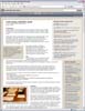
The winner! And champion of battle Boxes and Arrows! The judges said “This is a clean, light design that works well. Color and type are used to reinforce visual hierarchy in a meaningful way. Screen real estate is allocated in a way to support hierarchy as well.” “This one uses the structure of the grid and palette to its advantage. It is not very efficient with its use of space. I like the effort at leaving some breathing room on the page” The first prize winner will receive a set of professional books from the fine publishers at PeachPit Press and software from Adobe! We’ll be contacting the winner to begin work on refining the design to give you a new and exciting Boxes and Arrows! The silver goes to Sarah Doody Judges say “The colors are nice and unique. It’s very differentiable and, at the same time, feels very professional without feeling too academic.” And finally, the bronze goes to the design team at Behavior Design This winner was not in the original final running, because of its blog-based design. However, it was so lovely and well executed, it caught the judges eye and pulled ahead to grab the bronze medal! And special mentions go to Brandon Satanek A final honorary “best alternative to lorem ipsum” which had us giggling everytime we reviewed the comps, goes to William Lamson. We give this design a special mention because of the clever titles and lead-ins used in the layouts. We felt the judges would enjoy them as much as we did. Most of all we want to thank all the folks who took the time to design a new look for Boxes and Arrows, and who waited patiently while we made our decisions. This was an extremely difficult task. I think we were all surprised at how hard it would be to make a final call. All were wonderful—check the full set of entries out for yourself! We especially want to give a special thanks to our judges, who took time out of their busy schedules to help us choose our winner. Thanks all!![]()
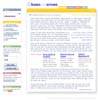
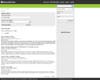
The Winning Entry
by Alex Chang and Matt Titchener from April3rd.com. |
|  |
| 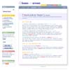


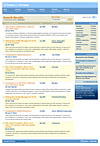
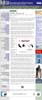
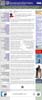
Runners Up
 |
|  |
| 
 |
|  |
| 
Not only did he submit two entries, but they both were in our top 5 favorites. |
|  |
| 
 |
|  |
| 
 |
|  |
|  |
| 
Overall Thanks
As a newcomer to the site, I’d love to be able to view all the entries. Unfortunately the link to http://www.boxesandarrows.com/contest/anon-album/ is broken, and the images of the winning designs further up the page are too small to see…
Is there a webmaster who can reinstate this content?
As of Valentine’s Day, the link to http://www.boxesandarrows.com/contest/anon-album/ is still broken. Where is the love? 🙁
it will be redirecting to this link now
http://www.eleganthack.com/boxes/contest/archive/anon-album/
Sorry but we’ve changed to a new system, and still figuring out the bugs!
Just a quick update: We are adjusting the software to accept a templating language (Liquid) and We hope to have the new design up before the end of the fall, if not that the end of the year.
A refresher: http://www.boxesandarrows.com/suggestion/view/2499
Now that the design has been selected (excellent work by all the finalists), how about opening up the CMS selection/implementation to the same community process?
Submissions could be segmented according to category (Open Source, “home grown”, low cost commercial and high cost commercial).
No offense to the winning entry or the judges but the winning design is far from fresh or groundbreaking. In contrast to one of the judge’s quotes of: “Color and type are used to reinforce visual hierarchy in a meaningful way.” I have to say that the colors of the tabs do not correlate at all to the left hand navigational sections in any meaningful way whatsoever.
For a text-heavy site like B&A the use of space is not well suited to the long-term needs of the site. It does not allow for a “liquid” design and text is going to be too confined to the overall wrapper.
RE: the drop shadow, let me just say that it adds nothing to the usefulness or beauty of the overall design but will add an unnecessary headache to the front-end coder’s job.
Although I’m offering my opinion, it is just that, *my* opinion. I’m sure there are many people out there that like the design I just think I prefer the current design to the winning entry.
Thanks.
Congratulations to the winners :-). Beatiful work.
There are some nice and very interesting entries…
Just like the blogalike design has “embedded itself in people’s minds”, i think one can say that Amazon and Google are very present as well.
I’d be interested to hear more about what B&A feels makes a design “blog oriented” or not. Maybe they’re right and I’m so inundated with blog input that I can’t differentiate well anymore. I can understand how they would cringe at being refered to as a blog. But I don’t know how to draw a line that has “blog” design on one side and “web site” design on the other.
There were some great visual designs put forward, but I am not sure the most usable design won. B&A has been one of the content heavy sites that got it right with navigation on the right. The chosen design is cute, but practical for maintaining may be a problem and for those of use that consume the site on a mobile device it will be a lost effort if not make it harder consume. Much like Joe I do not see the correlation with color.
The most best visual design that *seems* most functional is the Behavior Design entry. There are many things that appear to be truly functional and not just cute and that would work across devices very well as well as across medium.
It is sad in this day when design does not work across device or medium easily, but it is the norm unfortunately. Often we fall into this hole as we are only thinking in one dimention (in the U.S. the one dimension of choice is the desktop browser).
Yes, contratulations to all the winners!!
Like others on this post, I am extremely disappointed with the winner’s designs. Yes, I did enter .. but only for fun (honestly). If I had won, i would have declined any work on the site and would have passed it on to someone else. So this post is not bitterly composed whatsoever 🙂 ……..
To be honest, my jaw dropped when I examined the winning entries. But I’ll TRY and refrain from going into a whole bunch of negative criticism.
But seriously, my only reason for commenting is not to berate the winner’s designs …. I don’t want to visit B&A someday and be looking at a conundrum of badly integrated text and graphics.
But I do understand that this contest inherently attracted entries from mainly non-professionals (no offense to anyone by this statement) since there would be no money involved, so if you think about it, the ‘winners’ were expected.
Am I dreaming, or did someone actually use ‘boxes’ and ‘arrows’ in the body of their design? woweee.
Ok, Tino …. enough. lol.
A post by “Tino” at Nov. 23 basically asked, “Why would anybody want to do this (redesign B&A) for free?” Then he brilliantly and unoffensively concludes that such competitions would only attract “mainly non-professionals”. In a final stroke of genius, Tino makes clear his disappointment by asserting that the “‘winners’ were expected” because they’re not professionals.
Tino also humbly admits that he entered the competition, “but only for fun (honestly)”. Thanks for the reassurance. He continues to say that “If I had won, i would have declined any work on the site and would have passed it on to someone else.”
If Tino had won, I’m not sure why he would have declined to work on the site. Perhaps he’s a professional among the unranked, and of course, professionals don’t do free work even if he happens to be brilliant.
Regrettably, despite his “just for fun” entry, Tino did not win nor was he even among the winners, which wouldn’t have mattered because even if he had won or perhaps came close to it, he wouldn’t have worked on it anyway.
In closing, I would like to ask, “If the mainly non-professionals produced the a winning design, and Tino’s entry didn’t show up anywhere (even among the mainly non-professionals), then where does that put Tino?”
Congratulations to the winners.
Though I am sorry because I have to agree with Joe.
…. the winning design is far from fresh or groundbreaking, …
I am a bit wondering, maybe there wasn’t enough time to redesign the site, that can happen of course.
In my previous post I mentioned that I have to agree with Joe that the winning design is far from fresh or groundbreaking. Though I want to note that a redesign must not necessarily be fresh or groundbreaking, but beside usability I would have expected a more timeless design, respectively “Gestaltung”. I am simply not very pleased with the sites aesthetic (layout, colors, contrast).
So I think it’s about time we heard from one of the designers of the “winning” design i.e. me:
Firstly, excuse me if I am overly wordy with this comment, I simply want to make clear where we (that is, april3rd.com) stand regarding the matter of “design”.
Ignoring our design, my initial impression of the other entries was good – especially silver and bronze. From a purely aesthetic point-of-view, I’m actually quite convinced that these are more appealing; given that our entry took three days of work this doesn’t really suprise me. I can’t comment on how the judges see things, and I can only guess at the motives for picking us as the winner. This however doesn’t change much; this is quite understandably one of those unsettleable debates concerning asethetics and useability that could run on for miles with no conclusion. All I will offer those who feel disappointed is this: I feel disappointed too, that there is now something held up in the spotlight [our “winning” design for boxes and arrows] that doesn’t represent half of what april3rd.com as a design team are capable of, and if anything it lets us down.
It’s one of the those “truths” about someone (or something) that can only been see to be believed. To look at our holding page or the design here for boxes and arrows doesn’t do us justice concerning the quality and breath of design we are capable of, but as we’re only a startup company we don’t really have much else to point you to, to prove our point. It’s just something that is, and will have to be, until our footprint in the market becomes that much larger.
Now concerning some minor points about implementation in the comments already made:
– To say that the colours don’t match down the left hand navigation and the tabs is simply an untrue statement. “Search…” the “Archives”; “Most popular articles” of “this month”; “Newsletter” “About” boxes and arrows; “Authors” to “Write for us”; “Syndicate” “About” boxes and arrows. Is this really too hard a stretch of the sematic-colour paradigm? I think not.
– Every aspect of this site can be authored in valid xhtml and css, including the drop-shadow. Now to say that it’s easy, is probably incorrect, but to say that it’s a “headache” is probably going too far. If you’re not prepared to put up with some “headaches” concering implementation of a site, then why bother with designing it at all? I’m trying to not get pulled into a argument about each and every single aspect of the design – it’s not something I have to defend – but on this particular point I felt quite strongly.
Some things that I’ve noted as being true:
– The design isn’t timeless.
– The design isn’t so good for viewing on other devices (though consider, are any of the others entered either?).
– Certain aspects of the design I would personally change – typographic decisions and the like (no fundamental changes), but because I didn’t oversee the finishing stages (crossing i’s and dotting t’s) I didn’t have a say in that – which to be honest was by choice.
So all in all, I must admit I was shocked too – but also, in defence, I can honestly say that with some tweaking from myself, and some further thoughts about how to direct the design to something that will gain the popular vote, we (that’s april3rd) can come to a clean, elegant, useful and most of all likeable design.
Sorry you’re so disappointed, but to ease the situation, I understand why.
Thanks for your time, Matt Titchener
You raise an interesting question: what makes a design “bloggy.” In my opinion, it’s made up of a series of “article” or entries all equally weighted, a lack of images as headers, navigation ruining down the side: portrait, not landscape. It’s a certain hyper-minimalism with a lack of a designers choices about what is most important; instead of publishing in bunches publishing happens steadily, so the “lead” article is always the latest.
As for how April 3rd won, we weighted the judges votes for 1st, 2nd, 3rd, which allowed a design that was considered strong by all, but nobody’s favorite to win. Many designs had fans & foes. Perhaps choosing a design that worked across tastes was a mistake but I don’t think so. We at B&A are trying to reach across design and usability to marry varying points of view to create a better way to design. We hope April 3rd will work with us to help us find our way.
It sounds to me like “bloggy” is being described as an aesthetic quality, having to do with how design elements are proportioned on the page, not with what the site actually *has* or *does*. For example, as far as I can see the only substantive “blogginess” difference between the winner and almost all of the other entrants appears to be (a) it only has two or three articles on the front page, forcing articles more than a month old into the “archives”, and (b) it has a stripped-down feature set, removing many of the other methods readers use to access B&A’s rich content (such as browsing by categories, browsing by authors, etc). In particular, it dramatically downplays the community/discussion areas that contain (in many B&A readers’ opinions) B&A’s most interesting insights and information.
If you took any of the other contest entrants, stripped out most of the articles from their home page leaving only two or three, and then also removed all references to most of the other cool features web sites do better than print magazines, then does that make the other entrants “non-bloggy”?
I thought a blog was merely a web site consisting entirely of short, spontaneous content, published extremely frequently, ephemeral rather than archival, where one author or a very small group of regular authors post personal journal-like entries, often with reader commentary. That’s what a “blog” is *substantively* to me. Many of the qualities Christina describes as “bloggy” sound to me more like cosmetic “blog-like” qualities, or even just good old-fashioned “webbyness”.
I do, however, totally and completely agree with B&A’s (now) apparent intention to make the “current issue” content more prominent on the home page, and to have more editorial control over the design and presentation of the main features. I think NONE of the entrants do this well, including my team’s entry and including the winner. I don’t know if “not a blog” is the right way to describe that objective, however, insofar as even a blog site can have editorial control over the top-level home page presentation of content without sacrificing all of the other great stuff blog sites do. It may have thrown many of us off that most of Erin’s examples of “sites we like” ( http://www.boxesandarrows.com/archives/boxes_and_arrows_redesign.php?page=discuss ) were either 100% pure blogs or at best very blog-like (the most “magazine like” of them was The Morning News ( http://www.themorningnews.org/ ), an awesome web magazine that still looks pretty bloglike).
Ironically, as B&A strives to look like a magazine and not like a blog, the trend among many web-saavy print magazines (and indeed among many mainstream journalists) is to become more blog-like, for example the meticulous cross-referencing and faceting of the new Harpers ( http://www.harpers.org ) or the way Washington Monthly ( http://www.washingtonmonthly.com ) made their blog their actual home page.
-Cf
I think the language used here about the term “blog” is disdainful. The word “blog” has become synonymous with “amateur” in the media, and it is understandable that you would want to distance yourself from it. It doesn’t change the fact that it is the one of the best ways to manage content, offer fresh information, and to keep an audience on the web.
That said, I think I understand that you want something that is more contained and “issue-based”. Is your publication schedule going to match that structure, or are you going to publish articles as they are completed? If yor publication is going to be issue-based, I would reference television program sites like Nova that are episode based. Each of your “issues” should have its own mini site. Otherwise, if your publishing schedule is going to be more blog-like, I would consider using the medium to your advantage sans blog prejudice.
Our publishing schedule has always been “issue based” although we have slowed down a bit over the years. We always have had a “welcome” that leads for the month and has top presence for the month. We publish 2 other articles with the welcome and 2 more on the 1/2 month making it a total of 5 articles a month. This summer saw a bit of a slowdown due to the schedules of the authors and the editors, we were down to 2 a month with plus welcome still sitting in the prominent position.
We have been hoping that the redesign will bring a bit more prominence to the new articles – splashier, bigger type, larger image – whatever – to separate it from the older articles.
I think, however, that we will get there. And we will be working with the winners to iterate to a final solution.
I really like and appreciate Matt’s comments as they answered some of the concerns I had. The CSS and XHTML is the only valid approach to doing things these days as it allows the user to use the info across devices and to reskin the content to better suit themselves. Some of the tasty details under the visuals really are important and should be brought forth when announcing the winners as this is of interest to many of the B&A readers (I believe).
An improved mobile interface would be of great interest for myself and atleast a few others. A better print CSS is also needed that will tie in better to the screen version, so a quick look at the printed page will quickly connect with branding and visual design (a smaller font would be lovely also).
I don’t think the blog nature is a bad thing. I did have some concerns when B&A was being initially designed and built, but the tools have not really limited the presentation as badly as I had thought (a cup-half-full please) and actually B&A did a wonderful job breaking ground in some of how it pulled off the design. I have talked to many folks putting together newsletters that have pointed to the B&A design as a positive example of possibilities.
There are somethings the blog interfaces have tought many of us. One is people will scroll up and down and can perfer this method over many clicks.
Another is right navigation works very well for content/text heavy sites. I pay a lot of attention to how people consume web pages as a fun hobby. I see a lot of people in cafe’s, conferences, or at work will narrow their browsers to just the content on right nav pages. When I ask (given the right circumstances to ask) the reason’s given are the narrowing allows the user to focus on just the text, the user can follow IM windows or other things running in the background, and it helps the user read more quickly by keeping their eyes focussed. This is for people who normally read in Western left-to-right mode. Oddly, I have had some of the exact same people in usabiliity testing on left and right nav placement tasks and they do not narrow their browser windows in testing.
This right navigation I think makes a lot of sense for B&A and it was one of the things I truly like about the site as it exists. There are many things that I think need improvement and have also been expressed by others, which I saw the Behavior Design approach actually answering, such as a clearer global browsing structure at the top of the page, very clear meta content at the top of the article (date first published, author, and category), which is fantastic information design in my opinion as these are very common first questions many readers ask (although far too few sites actually get this right on the web).
The Behavior Design approach to pull quotes is brilliant and gives a magazine feel, but it is done in a way that would be difficult to pull off effectively in print (and keep in budget). The incorporation of images in the articles is excellent also. The abiltity to skim a page like this is wonderful. The column width in this design is quite comfortable for easy reading also, which for me has been a problem with the current B&A design. The only nit with the BD entry was font choice as the LCD screens that are on many desktops and laptops these days make reading serif-based fonts more difficult to read. I had never heard of Behavior Design before this entry, but what ever they do I will pay attention to.
hahaha. OK. Nice response to my post.
I’m not going to argue with ignorance though …. 🙂
end of story
Tino
As one of the runner-ups, I would also like to congratulate the medalists. Those and many other designs are impressive and most worthy of consideration. My hope was to contribute *something* back to the community that I learn so much from.
My other goal was to walk a mile in some other shoes. I consider myself a usability engineer and certainly not a highly skilled graphic artist (obviously!). Experiences like this (and I wish there were more) are a great way to learn how to better communicate with my visual design coworkers.
I would dare say there is probably an interesting B&A article lurking in all of these comments and ideas. How often are there 30 designs, of such diversity, for one web site publicly available? An analysis of the aesthetic and usability elements, the different page styles (magazine vs. blog vs. ?) and their appropriateness, and those “different lovely moments” would all be fascinating.
I can see that there are many comments here, and many personal reflections. Mine is in that category as well:
I do think the winner could benefit from following another colour scheme. Unless of course Boxes & Arrows are in the business of rebranding themselves. The only one of the suggestions that actually gave me a feeling of “Boxes & Arrows” was indeed number three (design team at Behaviour Design.).
The best design when you look away from the branding perspective would be number two (Sarah Doody).
Good job to the runners up, you had deserved to win in my eyes:-)
It’s unbecoming for a contestant who took the bronze to complain, but I think I want to break decorum here and do a little complainin’. But first — congratulations to April3 (is there a connection to Marchfirst?) and Boxes and Arrows. I’m absolutely positive that, when it’s launched, the redesign is going to be completely successful. There are too many smart minds at work here to see any other outcome!
My partner at Behavior and the co-designer of our entry, Chris Fahey, wrote a more eloquent reply (above) than I can hope to bang out here, but I want to emphasize that the preparatory material provided by B&A at the outset of the contest now seems, in retrospect, a bit misleading. That’s not to say that I disagree with the emphasis on a magazine-like approach over a “bloggy” approach, because I don’t. It’s a perfectly good strategy; it’s just not the one that was outlined in the beginning.
That’s all sour grapes though. I want to talk about something else that has bothered me about this since the beginning, when I was initially very hesitant to participate in the contest. It’s something which seems even more troublesome now that Christina has revealed that, thanks to the weighted voting method, the winning entry was nobody’s favorite, that it was merely the one that received the most valuable votes.
So my problem is this: Is making a significant change to the information architecture of this magazine a decision that’s truly appropriate for a panel of judges (even celebrity judges)?
We’ve all experienced “design by committee,” when clients put design questions before a varied group of parties for decision-making, primarily in order to appease many different interests. That nobody’s favorite design came out on top in this contest suggests that, inadvertently, this was a case of that type of thinking.
Shouldn’t B&A be a paragon of smart information architecture and design practices, and shouldn’t a major redesign have been decided on by just a small group of two or three stake-holders? I think so, even if it would have meant that a more controversial (and hopefully groundbreaking) design would have won.
Okay, before I sound even more petty than I already have, I’d like to air another complaint that’s perhaps a little more egalitarian: how come, in the display of the entries, B&A’s editors haven’t included links to the designers’ Web sites? Lots of this work is gorgeous and I want to find out more about who’s responsible for it! It would be a nice way for the editors to reward all of this free work they got.
And finally, one more thing. If anybody out there is looking for a new design for their information architecture-focused online magazine, drop me an email. I’ve got one handy.
A note about linking to all the entrants websites. Not everyone submitted their submissions and emails with urls for associated websites. The logistics of producing these pages, making sure that all the entries are matched up with the right names (we had removed all names for the judging) and then doing all the production is a monumentous task. For simplicity’s sake we kept the annotation down to the designer’s names.
I have no problem adding a comment here with every entrants name and their associated website, if folks want to send them to me.
Please, don’t change the site!
It works, don’t fix it.
One hesitates to weigh in negatively on a process that was undertaken in good faith by those I respect, and which doubtlessly consumed many hours that might more pleasantly have been spent in other ways. But I guess I have to register my disappointment at the outcome – not merely its existence, but its strength.
I can’t imagine reading the site the winners imagine.
My concerns are many, but they come to bear on the fact that the page is visually jumpy – actually, physically hard for me to focus on the copy. I’ll grant that part of it may be due to the resolution of the jpg. But mostly, it’s a result of a washed-out, low-contrast palette in combination with an indistinct visual hierarchy. Both the Doody and Behavioral entries are superior in this regard.
I would respectfully urge that, should other aspects of this design be implemented, serious thought be given to a more readable, more appealing palette.
I think everyone should read the article Fear of Design (http://www.boxesandarrows.com/archives/fear_of_design.php). This was the first article I read by Boxes and Arrows in 2002 – and I’ve been reading ever since.
Design should not exist other than to use your talent to help communicate a message. Along with that creation comes responsibility. If you don’t plan to be responsible for that message then why do you create in the first place?
I have noticed comments about doing this competition just for fun and others admitting that they were not pleased with the designs which they submitted. If you are being entrusted with the opportunity to design – then why would you offer anything less than your best?
So my question would be this – why do you create?
“If you are being entrusted with the opportunity to design – then why would you offer anything less than your best?”
I like this point. This is a point close to my heart. These are the reasons that I would could see that someone (not necessarily me, or anyone connected to April3rd) would have for not offering their best.
– Time
– Team efforts and compromise
– Bordom
– A lack of vision
I’d like to point out that I can safely say I have come across all these points through my design career – to say that every design you offer is your best, although most likely your aim initially, is a little naive.
It’s really sad that people get so f#$%ng critical of those who do volunteer work. Easy to criticize after the fact. I think all the entrants were great, and I think that the fact that B&A cares enough to try to improve its already amazingly wonderful magazine is laudable.
Never give up, B&A, never give up.
ah .. but being critical is the driving force for improvement. I think it’s a necessity to be constructively critical.
🙂
Since the contest result was announced and after reading the discussions, I’ve debated much over whether to post a comment for a few reasons:
1. It’s not so easy to talk about our own design without sounding self-vindicating or justifying.
2. I have always thought that if you have to explain your design, then there is probably room for improvement, because a good design should be straight-forward and self-explanatory to end-users.
3. I believe most of the time, comments and the critiques can be insightful and helpful for one to continue to improve, but I didn’t want to see the comment section become just a place for heated debates.
But after some further consideration, I thought it would be good to pen a few words here to clarify some of the things that one of our designers Matt Titchener commented on previously and also to perhaps disagree with certain points he had..ha ha… No, we are not having a family feud here. Matt is one of the best designers I’ve ever worked with. But on certain points, we’ve agreed to disagree–a way to keep each other in check. So I am sure he wouldn’t mind here… :0)
First of all, I am very grateful for the opportunity and look forward to working with the Boxes and Arrows to complete the re-design effort. All of us at April3rd.com were very excited to learn that we won the contest. We hope to contribute in whatever way we can to help the staff at Boxes and Arrows produce a top-notch site.
Secondly, I would like to say that I appreciate the comments both by Sarah Doody and by the Behavior Design team. Also their own contest entries are indeed excellent in my book. I agree with Sarah’s comment about putting forth the best effort in every design you create (actually…that should be the case in everything we do, right? :0) ). Personally, I can honestly say that I put in my best effort for the entry that we submitted. We began working on a re-design proposal back around mid-July. We spent quite some time studying the current site architecture and tried to identify areas both in aesthetics and usability that could be improved. We then spent the next couple of weeks putting together a design draft. Then about a week or so before the contest deadline, after evaluating our initial work and reviewing the contest guidelines once more, I felt pretty strongly to leave behind our first design proposal, and take a entirely different approach. Needless to say, this gave us very little time to work with (our day-jobs also happened to be going through a very busy time). This is what Matthew was referring to earlier about the time factor preventing us from putting forth the effort we would have liked to if we had had a little more time. However, I have to say, for the little window of the time that we had, I did give my best effort (had to stay up a couple of sleepless nights too). There wasn’t any lack of vision or a feeling of being bored there. The late decision to have a different design approach was probably what limited us the most.
After we submitted our design proposal, we realized that our design was by no means perfect. We found areas both in the appearance and functionality of our design that we would have liked to enhance and improve if given the time. We now hope to work with the Erin and Christina and the staff to put together something that’s the best fit for Boxes and Arrows. I believe that, together, we can produce a redesign of the site that’s of high standard and quality.
I am sure that most of the contestants, if not all, who entered this contest are true professionals. Besides the reward of competing and being recognized, the incentive for doing this “for free” is simply to be able to give back to the community that we all have benefited from and help Boxes and Arrows to continue to grow. I believe this is what we all want and I am open to hear your suggestions and constructive comments.
Thank you,
Alex
I hate to be Positive amidst so much criticism (and nit-picky sour grapes in some cases), but I really liked almost all the design entries.
Most of them are better than half of what’s out on the internet now, and some are Great.
Jursa, Lewandowski and Behaviour are my favorites. Great for Benjamin Young and others for putting in Photos of the shirts, etc. -DOH! I like that Brandon Satanek and Hattingh included diagramming elements in their designs.
—
I have to say the contest format was weird –I really missed the back and forth that Client/Designer usu. have, like “Is this too wild/minimalist, etc.? Do you like the typeface(s)?”… I kind of didn’t know where to go And didn’t have enough time for 2 or 3 different ones. I wish I had more time to polish my final, too. Oh, well.
Anyway, Congrats to All of you! Good Work!!! :thumbsup:
-WL
P.S.BnA is so great and I get so much benefit out of your site, it was my Pleasure to work for free. 😛
Congrats to all entrants and winners, particularly to the Behaviour Design team for their most excellent entry.
Christina, can you explain what you mean by blog design being ‘portrait, not landscape’? Are you talking about the visual page layout or IA? Even though it’s probably unrelated to your comment, I’ve always found the wide text column extremely hard to read. So much so, that I keep a page resizing bookmarklet on hand specifically for sites such as boxesandarrows!
Best of luck with the redesign, I look forward to seeing what you guys come up with.
Kudos to all the entrants in the B&A redesign competition, especially to the Runners Up and, of course, the Winning Entry by Alex and Matthew. Likewise to B&A for opening the competition to the community that you love and serve. This was a great opportunity for those who enjoy and benefit from B&A to illustrate their talents acquired from all the useful articles and discussions in B&A and wherever else they may have cultivated their skills.
In redesigning B&A, it seems logical to not only change and hopefully improve the appearance of the site, but all the more, if possible, change (if necessary) and improve the usability of B&A, which would unquestionably involve re-evaluating its information architecture (IA) since this is the very heart of what B&A is.
Therefore, it is not a surprise that the panel of expert judges chose April3rd.com to be the Winning Entry. Aside from attempting to improve the appearance, they had the insight and audacity to rethink and redesign the IA as to how better meet the need of this community. Perhaps B&A said it best; April3rd.com is striving “to provoke thinking among our peers, to push the limits of the accepted boundaries of these practices and to challenge the status quo by teaching new or better techniques that translate into results for our companies, our clients and our comrades.”
Surely all the entrants made such an attempt or had the view to; however, in the end April3rd.com came out on top. Congratulations to all, and especially to Alex & Matthew.
Hm, some personal notes — as someone who’s relied on B&A for information — but truly, truly found the design unusable, virtually illegible — I have to say that any redesign is quite welcome and long overdue.
To add to the chorus, I think that Behaviour’s design is flat-out the objectively best one — and that it’s so cruel that they apparently lost on a technicality. Boo hiss.
What draws me to their design is the use of colour to highlight information priority, and also that they obviously understand print design concepts of proper font sizes, linespacing and line lengths. These concepts, which are essential to legibility and ‘approachability,’ don’t change from print to web. I pray some of these considerations make it into the final version.
I also hope that whatever new incarnation this magazine finds itself in, that a top priority is more photography and illustration…if you’re trying to be more magazine-like, we need more of the *show* part of the show-and-tell. This *is* a magazine about design, not philosophy or creative writing, right?
My gripes aside, congratulations to all the winners and contributors!
I was a judge.
Unfortunately, there wasn’t much of a discussion over the designs. Without naming names, some judges didn’t write anything at all. They merely “voted” on designs without offering any reasons or keen insight. I was sad and disappointed about this. To be blunt, I was shocked at the apathy. B&A has given us so much yet we didn’t give back enough. Shame on us!
Contests are funny little animals. In retrospect, and given what I know about how we failed our mission, I think I would have told Christina to ask for submissions and then select her favorite. Forget using judges. Forget creating a committee. We simply didn’t do enough work. It doesn’t matter that we donated our time. We didn’t hold up our end of the bargain.
Summary: We, the judges, should be kicked like dogs.
Congrats to everyone. I remember being at the first meetings for B&A and wondering how long this would last…and I’m just really proud of everyone who has contributed their thoughts, ideas, efforts to make this such a great resource for the IA community.
Congratulations to the winners! This discussion has been interesting. Having went over most of the designs – winners, honorable mentions and others – I am really impressed by all of the work people put into this. There are some really amazing designs, even among the unmentioned ones.
My definition of blog must be narrower than what the B&A team defined it as. I didn’t realize that moving away from the current IA and layout were so crucial to how the entries were to be judged. I have to admit, most of my contributions were cosmetic because I didn’t fully understand what was meant by “blog” vs. “magazine” in the minds of the Boxes and Arrows staff.
I think the Behavior Design entry is very well-done and probably comes closest to what I imagine the B&A definition is after reading the comments. However, the winning entry is also very good and has been over-criticized in my opinion.
It really heartens me to see that anyone entered the contest, and seeing the outcomes of all of the talented individuals and teams makes me very happy. It is a testament to how much Boxes and Arrows has helped us in our own careers.
wow – do you guys at b&a realize how long your lines are?! It’s impossible to read, caus the eye can’t catch the new line. Make shorter collumns, larger lineheight or use an serif type.
Now i have to copy/paste to Word before i can read anything on your site…
Hey, what’t the status on this project? It’s been nearly 3 months – when is this going to launch?
As I said before, don’t expect us to move fast. right now we are working with the designers to refine the vision, as well as putting together a number of new features in the hopper. I really don’t expect to see a new design launched until late 2005. We’re all volunteers, and we all have more than 100% full time jobs. But slow and steady has always been our motto (except when it’s guess we’ll publish next month…).