Bolt | Peters recently collaborated with a team at Stanford University on designing the Google Sites template for local governments to use as a backup to deliver information on the H1N1 outbreak, and also disasters and emergencies in general. The goal was to create a template that was well laid-out, easy for non-techie local governments to edit and update with content, and conveyed the most important information to different audiences.

How It Started: The Quick Fix
With the recent outbreak of H1N1, Santa Clara County’s official public flu information site was taken down by the surge in web traffic. To help relieve the demand, the Stanford SIE Program, a Stanford University group that develops technology for social change, stepped in literally within hours of the interruption to create an ad hoc backup site using Google sites, so people could still access the critical info.
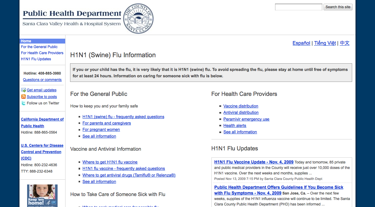
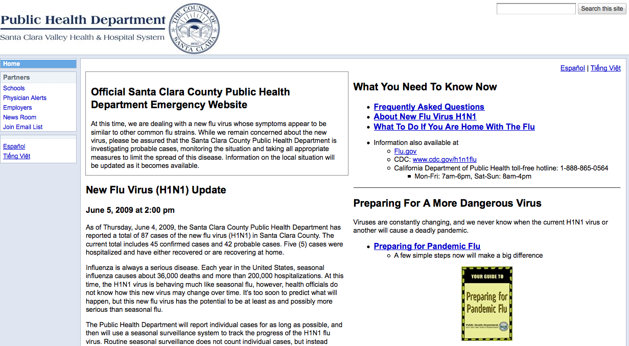
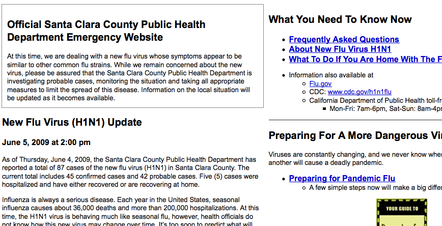
This is the version of the site they originally posted, using Google Sites’ standard WYSIWYG editing tools:

Stanford’s original stopgap design
After the site went live, Stanford trained the Santa Clara County maintain it and add their own information. Santa Clara County needed to have site that could handle the traffic and get the information out as quickly as possible—which is to say that there wasn’t a whole lot of time to think about design.
This experience made it clear that it would be valuable to create a well-designed, easy-to-edit template for local governments to distribute information in case of emergencies—not just H1N1, but any public hazard, including floods, earthquakes, wildfires, and so on.
The team contacted us in late October with the original draft of the website. Since it was important to make the site available as soon as possible to deal with the ongoing H1N1 outbreak, so the timeline we had for design recommendations was really brief—just a few days. With that in mind, we got to work.
Spotting the Problems
Because of the layout restrictions, our design evaluation focused primarily on information design. We had two main issues with the early design, along with a handful of usability tweaks here and there.

1. Lack of visual hierarchy.
With two columns of equal width and mostly indistinguishable boxes filled with text, it was hard to tell at a glance what information was urgent, time-sensitive, or recently added.
2. Big chunks of info, no organization
The info wasn’t grouped into meaningful categories—there wasn’t much visual or spatial distinction between contact info, prevention info, calls to action, and so on, making it difficult to zero in on information even if you know what you were looking for. Also, the info came in big blocks of unscannable prose, and deep reading is the last thing you want to do when you’re trying to learn about the tsunami headed your way.
3. It didn’t anticipate the distinct needs of the most critical user
segments.
There was plenty of good info on the site, but it was never clear who a given piece of info was for—you couldn’t scan the page headers and think, “Yeah, there’s what I’m looking for”. Instead it had a “general audience” feel to it; the info didn’t take into account that different groups might have different needs and different levels of urgency.
4. Buried info.
Vital info on vaccines, symptoms, and SMS / Twitter updates was absent from the front page entirely, lurking deep in the navigation.
Our Recommendations
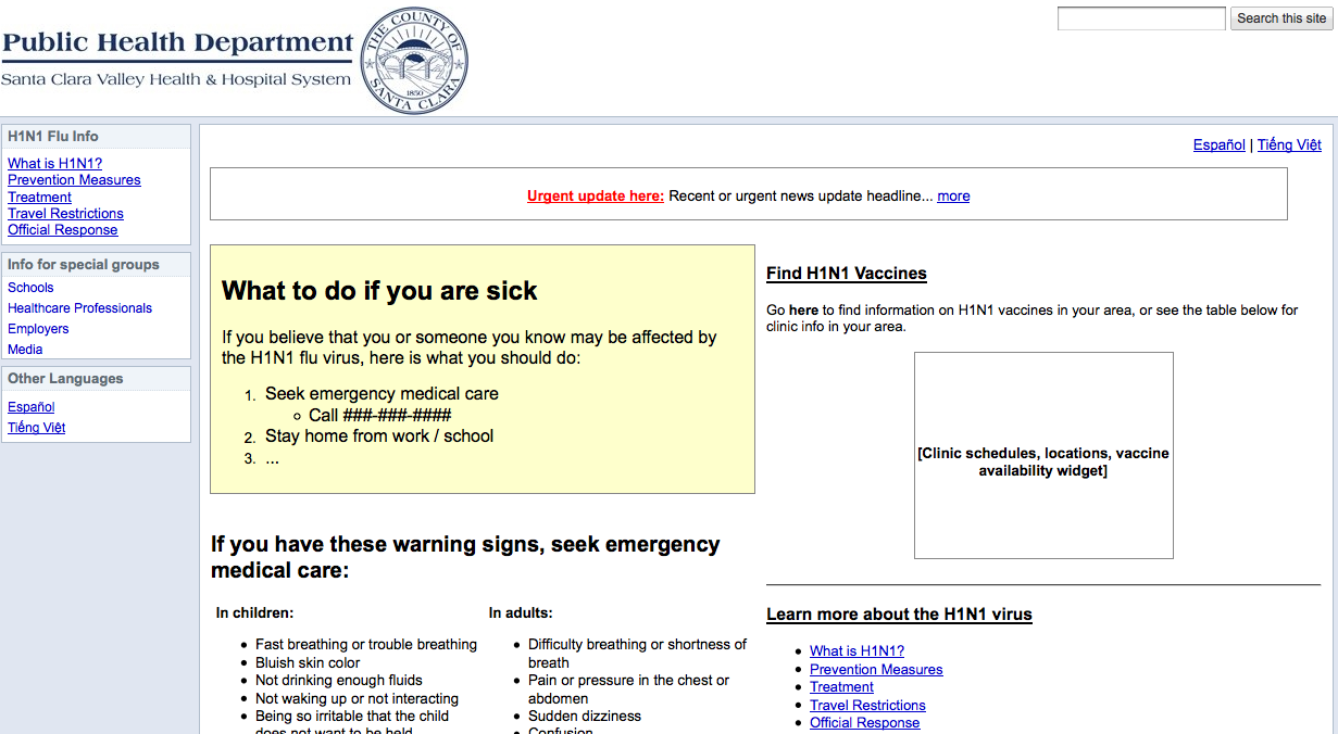
To keep editing simple for the local government end-users who would be using the template, we had to stick to using the WYSIWYG Google Sites editor, which meant no custom CSS and very little control over layout. We also had literally a single day to make our recommendations and synthesize them into a first-draft mockup—the result wasn’t pretty, but got our main info design recommendations across loud and clear.

Our first stab at redesigning the H1N1 template
Redesign Goal #1: Prioritize information according to the urgency
of visitor need.
Our design takes into account that there are different “general public” user segments with different goals, and that there are tiers of urgency and priority. From most-to-least urgent, we identified these segments:
* People infected with the flu: Immediate help / contact info
* People worried that they might have the flu: Self-diagnosis
* People concerned about catching and/or spreading the flu: Preventative measures and vaccine info)
* People just curious, staying informed: Information about travel restrictions, public response, news updates, deep flu info
The structure of the site was altered to serve each of these segments:
# We added a page-width alert box that would be displayed to convey urgent, time-sensitive info—this is a common feature on many of Google’s sites, as well as CNN.com.
# A yellow-shaded box to give the highest priority group, currently affected individuals, clear instructions on what to do.
# The left-column contains info on self-diagnostic and preventative measures for at-risk or concerned individuals.
# The top-right contains info on vaccines; below is links to deep info, research, and update notifications. Though the Google Sites template didn’t allow us to resize the right column, we noted that it should be made smaller than the left column.
# The left sidebar navigation was reserved for redundant quick links to most important info, as well as links to pages for specially affected individuals and organizations.
Redesign Goal #2: Reduce block text down to easy-to-scan lists
and chunks.
Cut the bureaucratic BS.
We broke down the block text to keep from overwhelming users with too much difficult-to-scan information upfront. Lists were kept to under 8 items long, unless they broken down into categorized sub-lists; text was kept under five lines. All information that couldn’t be condensed in this way was moved to lower-level pages, and linked from
higher-level pages.
Users don’t need to know what the mission statement and goals of the organization are; they just want to know if and how they are personally affected, and what they can do in case they are affected.
Redesign Goal #3: Use informative headers that directly address
user goals, and which give all users clear next steps.
All types of visitor (e.g. directly affected, at risk, concerned, just curious, administrative, medical, etc.) should be able to tell by the header if that information is “for them”. We tweaked the headers to make it clear what kind of info you could find in each section. We also made it clear what, if anything, each user segment needed to do:
* Immediately affected individuals are given step-by-step instructions on how to deal with their
emergency situation(s).
* At-risk individuals are given step-by-step information on preventative, precautionary, and self-
diagnostic measures.
* Individuals seeking non-urgent information can be given supplementary external information
resources (by phone, online, and downloadable / printable) and means to stay updated (by email,
text, RSS, Twitter).
* Urgent contact info is immediately visible in the right sidebar.
The First Revision
After we sent over our recommendations and mockup, a member of the team sent us a nice note a day or two later:
You’ve convinced us that we have to completely rethink and redesign the site from scratch, so
your style guidelines come at a very good time. I can’t thank you enough for opening our eyes to
how we can do this in a much better way. I think we can create a site that works much better than
the original site.
…and then a few days after that, Stanford sent a revised version over to Google, who worked with the design firm OTT Enterprises to create two new designs with some added visual design flourishes.
Unfortunately we don’t have permission to show you this revision yet (working on it), but it wasn’t bad—certainly cleaner and better organized, easier to scan, less dense. There was, however, a large distracting green gradient background, some empty space in the sidebar columns, a few stock photos, and a muddled color palette (green, blue, yellow, and gray).
Our second batch of suggestions focused mostly on visual design and layout. Just a few of them:
Visual Design
* Get rid of the gradient background; it’s distracting and confuses the emphasis on different parts of the site, since it runs behind multiple different elements.
* Get rid of the green coloring, which is tertiary to the blue and yellow. Instead, use several shades of blue as the primary color and a little light beige or light grey as a secondary trim. Blue signifies authority, calmness, trustworthiness, etc., which are of course appropriate here. Notice how almost every major government agency’s website (including the CDC) uses dark blue and gray as the main colors.
* Remove the stock images, including the CDC and Flu.gov widget images, which look like ads. The phone and email icons are fine, however.
* Rather than images, make the content headers stand out with size and strong typography—”make the content the focus” is an old web design adage, and the content, in this case, is the flu information. Here are a bunch of sites that use typography, font size, whitespace, and bold layout to create emphasis, using few images [list of a bunch of websites].
Layout
* Header and upper-page content takes up way too much space—note that the important info (”If you or your child…”) doesn’t begin until more than halfway down the screen. Compress.
* I like how Design #2 places the alert and contact info in the sidebar; in Design #1 the sidebar is wasted space. This frees up space to move important info (Vaccine and How to Care for Someone With The Flu) up to the right side.
* This design consists mostly of links to deeper pages, but there’s definitely room to put more specific, useful info right on the homepage: symptoms, preventative measures, vaccine info (see our original design)
* Get rid of the Contents box.
The Results
Stanford started over once again, aided by our style guide and input from OTT Enterprises. After further iterations in Google Sites, they handed it over to the Google visual designers, and here’s the before-and-after:

Google Sites template, super rush draft

Google Sites Public Health Template 1.0
Can you do better?
As with all things on the web, the template is a design-in-progress, and will be improved as time goes on. Stanford SIE is looking for feedback on the design, so here’s where you can send feedback for the Public Health template and the All Hazards template. Since these Google Sites templates are available to everyone, you can even make your own design edits and mock up improvements.
Or if you just think it’s great and you just want to use it yourself, here’s the complete list of links:
Google Sites Templates blog post
Public health sites:
Template
Example site
User guide
All hazard sites:
Template
Example
User guide
Stanford SIE site (we’re credited here!)
Note: Nate and Tony’s book on remote testing, “Remote Research”:http://www.rosenfeldmedia.com/books/remote-research/, will be published by Rosenfeld Media in 2010.

Thanks for presenting a practical approach to public health/crisis information display, which is an area of growing interest among web designers, disaster planners, governments at all levels, and the media.
We confronted a related challenge with FluPortal http://www.fluportal.org , a Corporation for Public Broadcasting-funded project to provide H1N1 pandemic information to public radio and public television stations. Our target audience was not the public, rather stations’ editorial and technical staffs. We needed to present a large volume of specialized information and tools for reporters and web managers to access and deploy quickly and easily.
While design and layout were secondary to substance, they remained very important. The recurring comment from our public media users was that the site had a lot of great information, but it was too dense to sift through, especially when on deadline. While we never fully cracked the problem during the project’s short timeframe, we did make great progress in the technical tools section: http://www.fluportal.org/for-station-sites/ Here, we identified three kinds of station web managers: 1) limited technical skills and resources, 2) intermediate, and 3) advanced. We then created Quick, Easy, and Go Big guides based on each user type. Those guides were very well received.
Templates are a great idea, and there’s a similar need among public media stations who want to communicate important crisis information to their local audiences. Many of them don’t have the resources to build something from scratch each time, and templates can reduce the redundancy in effort across the public media system.
Best,
Rekha Murthy
Public Radio Exchange
Thanks for the information I just like to say love this place, regalo
http://www.nexopia.com/users/giocr/blog/1-sembrando-en-el-hogar