When working with government and large private organizations on complex information systems, project managers and business representatives often demand early-stage validation that the proposed classification system provides the user-friendly solution they are charged with delivering. They also require this validation in a format that will be engaging for senior business stakeholders.
I developed the following enhancement to Donna Maurer’s “card-based classification evaluation technique” as a direct response to a client that wanted to engage with the process of restructuring their content-heavy intranet. My client knew the current classification structure was ineffective at enabling users to find the information they required, but they felt the process of developing an alternate structure would be complicated and contentious due to differences of opinion between senior stakeholders. My client requested quantitative data to validate that the proposed classification system was an improvement on the existing structure. They also had tight timescales and budgetary constraints.
Having previously used card-based classification evaluation to obtain qualitative insights into labeling and the general effectiveness of a classification system, I felt there was an opportunity to enhance the technique and deliver just the kind of information my client demandedwithout breaking their budgetary constraints.
Key differences between this and standard card-based classification evaluation
The two key differences between this and standard card-based classification evaluation are the way in which the captured data is analyzed, and that the technique should be conducted in a number of rapid iterations throughout the development of the classification system so that any improvements can be identified.
How to conduct card-based classification evaluation
Card-based classification evaluation should be conducted in exactly the same way as described in Donna Maurer’s article. For those unfamiliar with the technique, what follows is a précis of how the technique is conducted. For more detailed instructions see “Donna’s article”:maurer.
- Transfer the top 3 or 4 levels of the classification system you wish to evaluate onto index cards. On the first card, put all of the top level categories. On each subsequent card place the next level of classification labels.
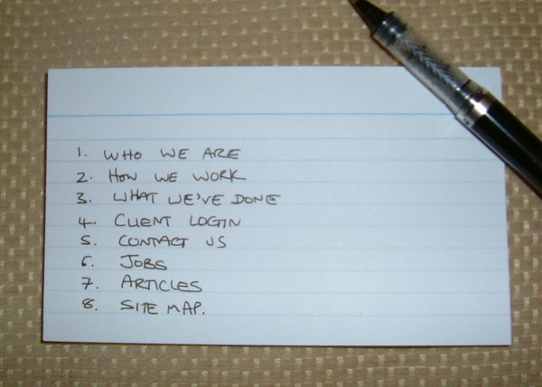
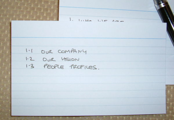
- On another set of index cards, write and number around 15 common information-seeking tasks. One task per index card.

- Arrange ten-fifteen 30-minute one-on-one sessions with representative users of the system. I find that this number enables you to conduct the sessions over a single day, thus enabling rapid progress.
- To conduct each session you should:
- a. Introduce the activity (ensuring you inform the participant that you are not testing them but the proposed system).
- Show the participant the top level card and ask them where they would go to complete each scenario (never let them know whether their response is correct or not).
- Make a note of the last selection each participant makes for each task. For example, Task A – 1.12.4.
- Capture any general comments the participant makes about the classification labels.
- Thank the participant for their involvement.
Analyzing the results
To analyze the results it is easiest to use a spreadsheet application. On a spreadsheet, create a separate column for each of the following:
- The tasks
- The correct location(s) of the information (or where you think it should be)
- A column to record each users’ results, i.e. one column per user
- Columns for analyzing the results (these are explained in detail later)
A screenshot of an analysis spreadsheet is included below.

For each task define where in the classification system the correct result would be found. This is easy when evaluating an existing classification system, but for new structures this forces you to make a decision. If the correct answer could be found in multiple places, capture all the possible locations.
For each task record the location in which each participant believed they would find the information they required. If the user made two attempts, enter both numbers separated by a comma.
Once the results have been input, use a color-coding system to make the results easy to scan. I highlight first-time correct responses in bright blue, second-time correct responses in green and incorrect responses in yellow.
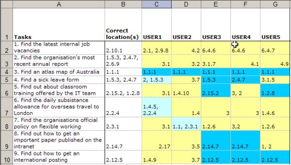
Having entered the raw data, this can be analyzed to generate results that can indicate whether or not the proposed classification system is working. The following are key pieces of analysis that can be extracted from the data:
* Percent correct on first attempt: The total number of first time correct answers divided by the total number of attempts * Percent correct on first or second attempt: The total number of first or second time correct answers divided by the total number of participants
Other data, such as percent of participants making the correct first choice from the top-level navigation, can also be interesting as it can indicate where in the classification system problems lie.
I then use a traffic light system to give an immediate visual indication of the results of this analysis. I color the cells in the following way:
- red for 0-40% correct
- amber for 40-60% correct
- dark green for 60-80% correct
- light green for over 80%.
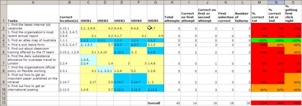
What the results mean
The results are intended as a guide to support what may otherwise be a subjective analysis. Don’t focus on the specific percentages; instead look at the color bands.
- Lots of red in the ‘getting first click right’ cells suggests that there is a problem with the top-level categories. Poor top level labeling alone can affect the success rates for the entire classification system. Consider whether the entire information architecture needs to be restructured, or whether the problem can be resolved by creating more meaningful top-level navigation labels.
- Green in the ‘getting first click right’ column, but red ‘overall success rate’ suggests that the top-level categories are good, but that there is poor distinction between the second level categories, or that the labeling requires attention.
- Green ‘correct first time’ suggests that it is time to start thinking about the next phase of the project.
- Streaks of green and red suggests that the classification system is working very well for some tasks, but very poorly for others. More work is required.
Iterative evaluations
By conducting this technique at intervals during the development of the classification system you can assess the progress being made.
The following screenshot shows a summary of the results of 4 rounds of this technique conducted iteratively during the rapid development of a classification system for an intranet. As you can see from the dates, three iterations were conducted in a seven day period and the percent of people being able to get to the right location on a first or second attempt improved from 39% to 81%.
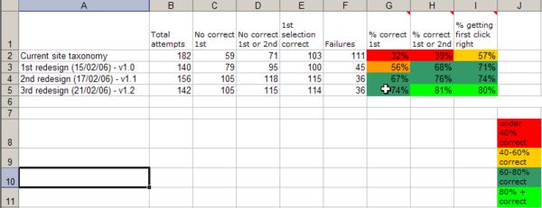
On the spreadsheet, the first round of evaluations was conducted on the existing site. This served as a benchmark against which the new classification system was measured. Subsequent iterations were on different versions of the redeveloped classification system.
The spreadsheet highlights the following:
- the poor initial quality of the classification system
- the improvements that were made with each iteration
- the relatively limited improvements that are made after a number of iterations, indicating the diminishing returns of continuing to make refinements after a point
Last thoughts
The data produced by this technique should be used as a guide to support qualitative assessments made during the development of a new classification system. If conducted iteratively during the development of a classification system, the technique can provide a sense of the progress being made.
Please note: I am careful to say “a sense of the progress being made.” I am not a statistician and am thus cautious when presenting numeric information. I believe it may be possible to use the technique to produce statistically valid data, but I have only used it to produce indicative data to support and help communicate my qualitative assessment of the success of a classification system.
Obviously there are many other methods of enabling people to find the specific content they require (searching, A-Z indexes, etc.), so I recommend against zealously repeating this technique until you obtain 100% success. Instead use the technique to support your instincts and the other card sorting activities conducted during the development of a classification system.
I have found that the results from this technique are very useful for communicating progress to stakeholders and other parties that wouldn’t usually engage with the process of restructuring a classification system.
I am very interested to hear your opinions and the experiences of those that try to use this technique.

A good enhancement & neat visualisation of outcomes!
This is great…I like that you also keep testing results visually represented with only three colors. Any more than that would require too much thinking and analysis (think of the American homeland defense color scheme). I hope practitioners try your method and report back in this comment string.
thank you so much for outlining this. the final spreadsheet really helps show clients the value of the different iterations. I will apply my own flavor to it and report the results!
at first glance this looks like a great way of improving your ia iteratively. but do the results get better because you adapt to the test users or the other way around?
Nifty. One additional success metric to apply would be the levels of the hierarchy traversed to get to each item. I.e., average “clicks” to finish each scenario in each redesign. The success rate and “click” count together would really be compatible with each other. I’ll have to give this a go in the future.
Chad,
So far I’ve always tried to avoid making the user focus too much on their success/failure – I’ve just given them two attempts, but it sounds like what you are suggesting could work. Let me know how it goes.
Hey Ian – did you accidentally repeat the first photo of the index card after this text:
2. On another set of index cards, write and number around 15 common information-seeking tasks. One task per index card.
Thanks Dawn – hopefully that will be corrected very soon.
Iain, Very nice article. I work in the Process Improvement arena, specifically with CMMI, and capturing measures and managing to them is integral to achieving high level certifications. Measuring the improvement of websites, and proving it, can be tricky. Your spreadsheets provide a simple and understandable way of showing this.
How many people do you interview (ie. is there a magic number), and is it important that the same people be interviewed throughout the process?
Mike,
Thanks for your comment. So far I’ve only used the technique to provide data to support what would otherwise be an entirely subjective assessment of the success/failure of the classification system.
The limited budgets/timescales I typically work within have only enabled me to run one or two days of sessions within each iteration. This means I’ve spoken to between 15 to 30 people, each attempting 10 to 15 tasks. I am not a statistician, but I am guessing that these numbers won’t produce statistically valid data (I am always careful to point this out when using this technique to communicate to clients). Sadly I can’t advise as to what kind of numbers you would need to involve to provide statistically valid data – maybe someone else can help there?
As for repeatedly using the same people, I have always had the luxury of a large pool of potential users, and have always used new users for each iteration. Obviously this could cause some to question the comparison between iterations, but I’ve never had this problem with the clients I’ve worked with. Even if a client wants to include some repeat participants, I would always argue for some new participants with each iteration.
My preference for using new participants is primarily so they don’t take ownership of any solutions/recommendations they may give during the sessions. Also I find that from a political perspective, it is often better to be able to say that 100 people participated in the creation of the classification system, rather than just 15.
I am sure that a statistician may well be wincing at my response – if one is out there reading and wants to recommend how a more rigourous approach could be applied I’d like to hear from them.
Iain,
From a statistical stand-point you’d be looking to use binomial point estimators and confidence intervals to estimate the ‘real’ (i.e. population) values for 1st-time completion, overall success etc. 15-30 people will give you a confidence interval that is relatively broad. I’ve worked some of these out previously for reference:
Task with measured ‘success’ rate of 2/3 (66.67%): 47.7% – 81.9% with an expected success ratio of 64.8% (30 users)
Task with measured ‘success’ rate of 4/5 (80%): 61.44% – 91.75% with an expected success ratio of 76.6% (30 users)
Task with measured ‘success’ rate of 3/4 (75%): 56.82% – 87.82% with an expected success ratio of 72.32% (32 users)
What that means is that, if you’re tests gave you an 80% measure of ‘success’ (whatever that was), then you would expect the user population as a whole to perform the same task with a success rate of 76.6%, with a 99% confidence interval (i.e. 1/100 chance that it really lies outside the range) of 61.44% at the low end, and 87.82% at the high end. To put that another way – there’s a half of a percentage point chance that users will actually fare worse than 61.44% if you measured 80% during the test.
I would also reinforce your point about not using the same users again for future iterations – you’d basically invalidate the results – statistically speaking – in that event.
Nicely written article, btw.
Iain,
I must say that this is a wonderfully clear representation of data. I am sure Tufte would be proud of you.
To save us all the pain of reinventing the wheel, is there any chance you could provide this spreadsheet for download? Please excuse me if I missed the link if it already exists.
One suggestion I would add is the use of ‘conditional formatting’ in Excel to colour code the cells, both in terms of whether the responses were ‘correct’ and in terms of the percentage of correct responses. This saves a LOT of time and reduces the risk of error.
I’ve also used a variation on Donna’s original technique which allowed me to highlight the areas where users experienced difficulty in classifying ‘correctly’ and what their alternative classifications were. This assisted greatly in improving the results in subsequent evaluations.
– Miles.
Another variation I have also tried is using a wireframe of the home page combined with index cards for lower levels of the hierarchy. The wireframe included navigation for users to ‘jump’ a level deeper, so a rigid top down test would not reflect the way in which users navigated on the site. This approach allowed us to explore the combination of taxonomy and navigation in a single test (kind of a mix between paper prototyping and Donna’s card-based classification evaluation).
– Miles.
@Miles – I played around with using conditional formatting, but with my limited Excel powers (!) I was unable to make this work is the correct answer could in multiple locations, i.e. the correction location cell has multiple right answers seperated by commas. I suppose there are some clunky workarounds for this (using multiple cells), but if you know of a more clever way please do share!
@Simon – Thanks for your comments. I’ll try to tidy up a version of the spreadsheet and make it available in due course.
@Iain – the trick is to use a better separator than a single comma, and make sure your list has starting and ending separators too, like “,1.1.1,4.2.3,”. They you just check to see if the cell contains the users answer (prefixed and suffixed with commas – to avoid 1.1.1 being matched against 11.1.1). I find it’s a lot easier if you record the data on one sheet and analyse (using formulae) on another.
You can also get a little more sophisticated and do ‘closeness’ matching to assess whether the user was in a nearby section, so if the user selected ‘1.1.3’ but the correct answer was ‘1.1.2’, you can look for ‘,1.1,’ (right section, wrong level) or ‘,1.1.’ (right level, wrong section) and consider it a ‘closer’ classification than ‘2.8’, say. I’ve found that if users are close ‘enough’, the presentation of the classification on the site can minimise issues with discovery.