This interference can be especially frustrating for IAs. We spend time architecting a page that will meet user needs in the best way possible. We’ve done user research. We’ve understood business models. We’ve brainstormed. We may even know that a page has to support ads, but if you’re like me, you try to place them somewhere out of the way, like the bottom of the page. And then the dreaded moment occurs, probably at the final schematic review, when the marketing director or some other important stakeholder looks at the page, searches in vain (ignoring all your fine work), and finally points to the top of the page and says, “We need an ad right there.”
What’s an IA to do?
The bad old days
In the bad old days (the not so distant past, actually), the design team swallowed their pride and agreed to do what our imagined marketing director asked of them. We grumbled, but in the end, whoever was responsible for the profitability of the project soothed our wounded egos and directed us to place the ad in the exact spot we had so astutely avoided placing it.
Whether it was a banner ad, skyscraper, pop-up, roll-over, or some other new-fangled advertorial innovation, we accepted our fate and placed the ad. Months later, when the site was launched, we could only cry as we navigated to our beautifully designed, and cruelly despoiled, pages.
I wish we could say that things have changed dramatically since then, but they have not. Advertisers still think up wonderful new ways to draw attention away from a site’s content to their content. And business models are still created which rely on advertising revenue for a site to be “successful.” The truth of the matter is that ads may never go away. If anything, the prevalence of online advertising is growing.
Just consider these facts.
- The second quarter of 2004 saw record revenue growth for online advertising at $2.37 billion.1
- Online advertising now accounts for 5.4 percent (or $8.7 billion) of ad spending in America, and 3.6 percent globally.2
- Twenty-five percent of Ford’s Lincoln Mercury ad spending is going online.3
Add to that the perception among advertisers that online advertising is one of the best ways to reach adults,4 and one is inclined to conclude that online advertising is here to stay. What must be developed then is not a way to make ads go away, but rather a better way to incorporate ads and ad content into our sites.
Strategies for presenting ads
Fortunately we are not alone in our understanding of users’ feelings about ads. Advertisers, while not having our background, do understand that many web users are not all that happy about having ads on the internet, and that too many ads can ruin a page and dilute their own advertisement. Success is often measured by click-through rate, and advertisers now seem to understand that improving the user experience of ads can improve their own success. The success of contextual, text only ads should be noted (40 percent of online ad revenue is generated by search related advertising5).
What follows is a list of some strategies and guidelines for presenting ads on a page. These approaches will undoubtedly become more sophisticated as the possibilities, and variability, of online advertising grows. The Interactive Advertising Bureau (IAB) has put together a list of standards and guidelines for presenting advertising on the web, and is dedicated to educating people on how to advertise online. Instead of addressing these standards in this article, we would like to address their information architecture—how they fit into a larger page-level and site-level system.
Accordingly, the terms “success” and “failure” when used below refer not to the financial success or failure of an ad presentation strategy, but the user experience success or failure of an ad presentation strategy. As to which definition of success or failure is more important, I’ll let others debate.
1. Wrap the ad
Wrapping, or identifying your ad, is really a call-out indicating that what is in the box is an ad. A wrapped ad is really just a nice way of saying to the user, “Look! This content? It’s not our content. It’s someone else’s, and they paid money to have it here. Go ahead, look at it if you want, but know what it is you’re looking at—an ad.”
The visual design of the wrap should be consistent across the site. The design of the wrap generally never competes with the ad or with the design of the site. The text may be grayed, for example, but it is enough to be a consistent indication to the user.
Ad wrapping is appropriate for most types of ads, but most commonly seen with rectangles, buttons, and, skyscrapers.

2. Cluster the ads
An alternative to wrapping your ad is clustering several ads together. With this approach you indicate to the user that this area has been set aside for ads. In this example, the right hand side of the page has become an “ad zone,” and the user can see it for what it is, and then concentrate on the content in the center of the page.
In order for this strategy to be “successful” all, or almost all, pages on the site must have the same area set aside for ads. In general, the types of ads clustered together tend to be either skyscrapers or buttons.
A distinct drawback with this approach (and perhaps why one doesn’t see it too much) is the possibility that a line of ads can become like a row of Las Vegas slot machines – lots of blinking and distraction. One way to deal with this is an ad styleguide, addressed later, but advertisers do not always follow the guidelines set out for them.
Another “drawback” to this strategy is that you’ve lost the right-hand column as a space to put content.

3. Use leaderboards
“Leaderboard” is an IAB term, and refers to an ad that is placed at the very top of the page. It is larger than a banner (728 x 90 vs. 468 x 60 for a “full banner”), and its use appears to be more and more popular these days. The advantage of the leaderboard is that it gives the advertiser prime space, but also moves the ad out of content’s way.
Of course, the problem with the leaderboard ad is that it pushes the page down, moving more content below the fold.
An additional leaderboard may also be placed at the bottom of the page, but most advertisers may consider this space to be undesirable.

4. Use multiple layouts
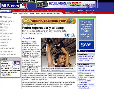
Varying the layouts on different pages will help allow for the best accommodation of ads for the type of content that is being presented. The homepage, for example, will demand one layout, while a content page may demand another.

Homepage
Content Page
This can help avoid a certain sameness across a site while giving advertisers the options they crave. However, whatever ad layouts you choose, they should be standardized into a system that advertisers can understand and rely on.
The same template can also have variations that allow for different ad sizes. This allows for the content creator to select a layout that works best for the content, and then ad placement and sizes will conform to that layout. Advertisers also find this option appealing since they can track which ad layouts are the most successful.
5. Place the ad beyond 800 x 600
Another strategy that may be less popular with advertisers but can help the page retain its cohesiveness is placing the ad outside of the 800 x 600 area. This allows the page to retain its cohesiveness, and the content to take center stage, especially for those users who have limited desktop space to begin with.
In my experience advertisers tend not to like this option since the ad may not be seen by all users. However, other IAs have related that they are beginning to see this type of ad more often. It may be that as a greater percentage of users move beyond an 800×600 screen resolution it is becoming less of a worry for advertisers.

6. Hold firm on pop-up ads
The pop-up ad is still a no-no, especially if it pops up behind the browser window (a “pop-under”). These types of ads are the most distracting and disrespectful to users and should be avoided at all costs. They also happen to be among the most annoying ads, perhaps because they are not actually near any content that a user might want to read, and are instead off by their lonesome, desperately trying to get your attention.
Although I have no statistics to bear this out other than my own observations, it does appear that pop-up ads are beginning to become a thing of the past. Pop-up blockers are certainly part of the reason for this, but we like to think that advertisers are beginning to realize that extremely annoying is less effective than mildly irritating.
However, if you are forced to use a pop-up, or pop-under, then at the very least follow the guidelines set out by the IAB.
7. Create guidelines: the ad styleguide
An ad styleguide is similar to a styleguide that one might create for a site, except the audience is not content creators, but ad creators. The desire for an ad styleguide stems from the fact that advertisers often have their own interests in mind before that of the content. The result is an ad that competes with your content for the attention of the user, and advertisers do this by making the ad animated, or flashing, or by begging the user to click on it for some special service.
An ad can also ruin the effect of a well-designed page. Pages are normally designed to emphasize the most important content elements, but a “well-designed” ad can ruin even the best page designs. Placing limits on what advertisers can create to insert in your site will make for much happier content producers and much happier users.
However, as mentioned above, advertisers will push the boundaries of what is acceptable, and following this strategy means that the ad sales team must enforce the styleguide, otherwise the situation will quickly degenerate.
8. Check the business model
While advertising is certainly a revenue generator, it might please you to know that much of the world, including content producers, would probably be happier with fewer ads, or generating revenue in other ways than selling ad space next to their content. The ad sales department might object, since their year-end bonuses often depend on how many ads they place, but businesses sometimes do consider other ways of generating revenue from content.
As the IA, it is important, and even refreshing, to be a part of this conversation. From a business point of view, ads often have a limited upside. After all, page real estate, while theoretically limitless (a page could scroll forever), is in reality finite, and often advertisers will want a limit to the number of ads on a page so that their ad is not competing for “eyeballs.” This means that the smaller your site is, the less money you can possibly make, and the more likely you are to be motivated to monetize your content in new ways.
While a new business model probably will incorporate ads to some degree, removing ads as the sole source of revenue for a site will make it that much harder for the ad sales team to argue for “top billing ” on your templates.
Strategies involving contextual ads
In the spirit of “if you can’t beat ’em, join ’em,” contextual ads use external inputs to try to blend in better with the content and, it is hoped, with the interests of the user.
9. Take advantage of text-only ads (ala Overture and Google)
Most users should be familiar with the text-only ad. This was popularized by Google AdWords and allowed advertisers a way to capture some of the huge amount of traffic that comes to Google every day, and also allowed Google to monetize their search engine.
Text-only ads, as their name implies, have only text within the ad space, and tend to be generated by a keyword either entered by the user, in the case of search, or a keyword provided by the content, such as a metatag keyword. The resulting links presumably fall in line with not only what you’re interested in, but also the content on the page. The user then, the theory goes, will be less annoyed because the links have a legitimate reason to be on the page.
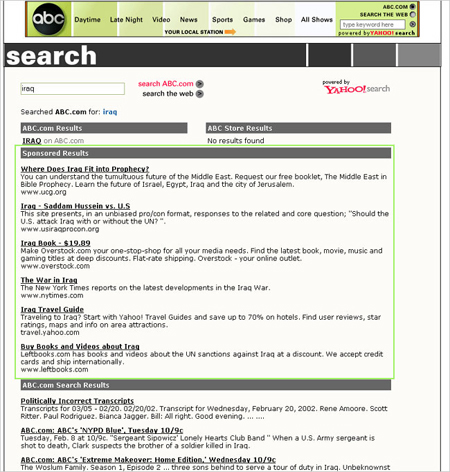
They are most commonly spotted on search results pages and they are far more effective than your typical banner ad.1 The danger with these ads is that they may be used in place of real content. In this example from abc.com, the abc.com search results don’t appear until far down the page-certainly below the 600 pixel mark-under the sponsored results section.
This suddenly makes search far less useful.
10. Personalize the ad
Similar to text-only ads, responding to a search or metatag keyword, the traditional ad can now be coded to respond to the type of content the user is viewing, and to the type of user who is doing the viewing. If there is profile information available – say the user is registered on the site and demographic or psychographic information has been gathered on them – this information can be used so that the ad presented is in line with certain known information about the user. For example, if the user is from New York City, an ad might be selected promoting a Broadway show.
While these ads may still visually clash with the design and layout of your site, they do have the benefit of having a better reason for being on that page than an ad that contains random content. They also tend to be more popular with advertisers and marketers, and make the ad space more valuable.
How I learned to love the bomb
While ads, by their very nature, will always live in tension with the content they support, new strategies are being developed that can help satisfy the needs of users and advertisers. By thinking of ads not as those annoying flashing animations that distract the user, but rather as another content type with its own peculiar features that must be incorporated into the page, you can change your distaste of ads into an architecture challenge. This may not change how you feel about ads (and if you feel about ads as I feel about ads, you can always purchase Norton Internet Security which has an ad blocking feature), but it can change how you feel about the work you produce.
Successfully incorporating ads into a site is perhaps one of the most difficult challenges, not least because of the nature of the content itself. Ads are revenue generators, and the ad sales department will often make blanket demands about what ads sizes they want and where they should live on the site. Balancing these demands with user needs can be difficult, but using some of the above-mentioned strategies can increase your chance of success.
![]()
1 IAB Internet Advertising Report Revenue Report
http://www.iab.net/resources/ad_revenue.asp
2 The Economist December 29, 2004 “Back on the up.”
http://www.economist.com/displaystory.cfm?story_id=3523042
3 IAB Internet Advertising Report Revenue Report
http://www.iab.net/resources/ad_revenue.asp
4 “For advertisers who want to reach employed adults during the day, the Internet offers an unprecedented opportunity, with 50 million people regularly online at work,” says eMarketer CEO Geoff Ramsey. “There’s a virtual elephant in the room — one that astute marketers can no longer choose to ignore.”
http://www.emarketer.com/Report.aspx?atwork_feb03
5 IAB Internet Advertising Report Revenue Report
http://www.iab.net/resources/ad_revenue.asp
6 “Roughly 15 percent of ads displayed adjacent to Google searches (at the company’s own Web site and on Google-powered sites like Yahoo! and AOL) result in clickthroughs – more than 10 times the click rate of the average banner ad.”It’s an Ad, Ad, Ad, Ad World,” Josh McHugh.
http://www.wired.com/wired/archive/12.03/google.html?pg=8
2005 Online Media Outlook
http://www.avenuea-razorfish.com/OnlineMediaOutlook.pdf
Special thanks to Liz Danzico for finding some of these examples of ad displays.

this is an incredible peice, and very sufficly authored. From my point of view, ad users, the people who clik the ads come first as far as the ddesifning is concered, and then he design team, nd thirdly the sales team. But it is always the sales tema that gets the first apple. It is the case in each publishing venture. Anyway thank you for your points. Singh http://www.searchbox.mobi
Pop-up blocking has now been generally accepted as a legitimate thing, and advertisers are wising up to not using them (What’s the point? apparently 50-60% of web users now use ad blocking). Ad blocking though, seems to be enjoying a quiet rise. There are lots of very easy to use fire and forget ad blockers / hiders. E.g. Mozilla (& Firefox) offer adblock and bannerblind extentions; Zone alarm and norton security offer similar features, and even without installing any software users can block ads by configuring their hosts file or by downloading and using a custom CSS.
http://www.ux-design.net/degoogling.php
In an article Ive just written on ad hiding using custom CSS (sorry shameless plug above), Ive shown how easy it is to get carried away and start seriously changing your web experience. Like hiding googles logo as well as its advertising. Or hiding all the excess cruft that you dont ever use on your favourite sites (like register here boxes or whatever).
In a way, pop-up blocking became acceptable because it was different to other kinds of adverts and required a different technique to block. Microsoft could safely integrate it into IE without worrying that it will be mis-used by the world and ruin internet advertising revenues for everyone. But ad blocking in the body of a page lumps the ok stuff (like targeted google adwords in subtle hues) together with the bad stuff (animated gifs and flash banners etc). This sends advertisers a difficult message. You can envisage a continued battle between advertisers and end users where the advertisers continually change hosts and ad sizes to get around the blocking rules.
In an ideal world, it would be great if everyone could rally together and focus on blocking the worst of the culprits (e.g. animated gifs and flash animated banners), giving advertisers a strong message while allowing them to carry on doing well targeted, visually subtle adverts. After all we dont want to put our favourite sites out of business, we just want them to play nice.
Whoops – due to a couple of typos that first paragraph didn’t make much sense. It should have read:
“Pop-up blocking has now been generally accepted as a legitimate thing, and advertisers are wising up to not using them (Whats the point? apparently 50-60% of web users now use pop-up blocking). Ad blocking in the page body, though, seems to be enjoying a quiet rise…”
Your insightful article makes one major assumption that may or may not be true.
The premise you are working with is that publishers deliver advertising to readers.
I would argue that the business model of publishers is the other way round: their commodity, what they sell, really, is a readership. The purchaser is the advertiser. The advertiser, after all, is who generally provides the bulk of a publication’s revenue. (This of course assumes that we are not talking about, say, a magazine like the Economist which charges very high subscription premiums). In that sense, then, could one say that the core user group, the core constituent, is the advertiser, and not the reader?
Very true. Often times one designs first for the user, then for the ad sales team, which can often be very vocal about their needs, especially since they often have bonuses and such tied to how much they sell, and the more they can offer their clients, the more they sell, the more money they make.
Advertising and the way it is manage within a page is seems to be a bit of a hassle, ( i personally havent had to place many adverts in sites i have made but from an obsovational view i see that intergrated ad work better, for instance iinet.com.au
places there own ads under the header/menu:
these ads are designed for the page and help to compliment the overall design. Yet sites like flashkit.com, have sold out to advertisers and the site has been basically destroyed in a way, yet i think that advertisers and webdesigners should get together and figgure out a bette way to intergrate advertising into a page with out making it so overlly confronting . sorry if this makes no sense and the spelling is a little out im a little pissy at the moment, yet id like to put my point across lol!!!