I started writing this article with an emphasis on the financial domain. I then realized that I would like to broaden the focus because my findings are also applicable to a general domain like email account registrations, for example. In this article, I would like to take a simple example of how users register for an email account online. For a first timer, is the transition from a real world of letter writing to the online medium easy? And for a frequent user, is he or she motivated enough to create an email account with another service provider?
Yes, this is for all of you out there—my fellow usability practitioners, information architects, designers, managers, project leads, editors, and people who are looking to develop their UX practice.
In the modern family, where often both parents are working full-time and the children are involved in many after-school activities, people may only have a few minutes to spare on an important task during the day. And it’s the Internet that supposedly helps people achieve this. But do we, as designers and usability practitioners, always help them do it? I say, “No.”
Just the other day, a friend of mine begins to complain of the spam mails that she receives everyday. “I have two separate email ID’s to keep myself away from such mails—one for official purposes and the other for my junk emails. But even my official ID seems to be flooded with these emails. So I found myself moving to another email service provider. Again, I found myself grappling with the registration process.”
There are three people who determine success of a web-based form: the usability practitioner, the designer, and the user (Image 1). Taking a simple everyday example like an email service, I aim to discuss the various aspects that lead to a great forms structure.
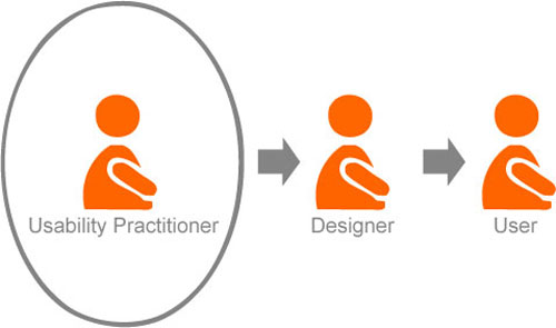
Image 1: Success of a web-based form requires involvement of a usability practitioner, designer, and user.
There are a million websites out there. There are a million email service providers out there. How do you ensure that you gain the right audience to join your service? What are those factors that will help users move ahead and become your loyal customer? Part of the answer has to do with the first step: REGISTRATION!
In the first part of this series, I will focus on the basic issues that a usability practitioner must address to create a usable web-based form:
- Affordance
- Orientation
- Chunking
1. Affordance: The Lure
We all know how grueling and tedious a registration process can be. Therefore, we need to ensure that our sites adequately “lure” users into the process. To do this successfully is not just a matter of providing the right cues, but how and where we provide them.
Coming from the real world
Every online form was created keeping the real world in mind. We all once began filling in forms in real life before we began moving to the online medium of getting things done quicker.
Email service providers must allow for a smooth transition from a real world scenario to the internet, for those who are petrified of it. Users should know the advantages of the service provided as compared to the real world scenario of letter writing. Why would users move to your service when they can just write a letter? What are the advantages of sending an email? Is it quick? It is easy? These issues should be addressed upfront to ensure that they are lured forward.
None of the websites that I reviewed follow this practice effectively.
Entry points
An entry point to an application must be clear and appropriate to the specific needs of the user. For example, let’s say a user visits a website to send out an email to a distant relative. He or she has never used a web-based email service before. Not knowing that he/she needs to register, they would look for a direct cue to send out an email. Where do you think this user would look for a cue? This is where you need to perform a quick goal-task analysis. Let’s consider a scenario:
A first timer enters the website to send out an email. This user is hauled because he/she is unsure of their next step.
Let’s have a look at Gmail, our most used email provider. Most websites that I reviewed allow you to register. But users are not lured into it. As a first time user of a website, they need to know the benefits of registering clearly, up front. Gmail does a good job of this (Image 2).
Users often hate to register. Therefore, as usability practitioners, we need to tell them of the benefits of registration when they enter a website for the first time.
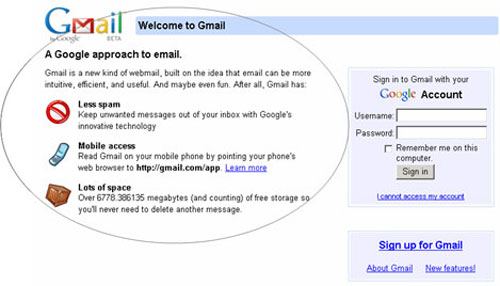
Image 2: A good example of enticing users to register online by clearly listing the benefits up front.
Service/Product comparison
Remember, your users are watching your competitors as well. So if you aren’t that big in the market, how exactly would you think big? Compare your features with that of your competitors to formulate your strengths over the others in the market. Let’s see how Bluebottle effectively does this (Image 3).
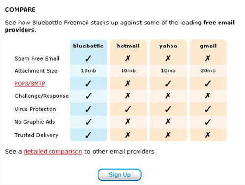
Image 3: Bluebottle’s website allows users to take a peek at service comparisons. Users also have the freedom to view a detailed comparison.
Online benefits
It is important to inform the user up front of what they will gain after registering. It’s a competitive world out there and users must and should know what the website is selling them. This affirms the brand’s identity and responsibility to gain customers online. A basic cue reassuring users about the benefits helps build trust which encourages them to use your services. As shown in image 2, Gmail clearly provides the online benefits.
Another clever way to entice them is to provide a view of what the service looks like once they have registered or applied. In this case, it would be ideal to show users on the homepage a view of what their personal landing page (the inbox) would look like once they have registered.
None of the websites that I reviewed follow this practice rightly.
Security
It is essential that users know that the information they are entering will be secure. A basic “Lock” or “Key” icon would do the trick. Also, providing them with security information and its benefits improves customer loyalty and trust. With the case of Yahoo, the website uniquely utilizes this feature to grab users towards their secure service (Image 4).
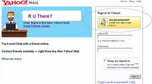
Image 4: Providing a security message increases loyalty which moves users towards registering.
Taking a tour
Before users move ahead to encounter a form, it is necessary to tell them why they need to do it and most importantly how they need to do it. Again, taking the same examples forward, if you look at the example below, you will see how AIM Mail allows users to take a tour (Image 5). This also gives an edge to its competitors as they are showing them of what’s inside even before registering.
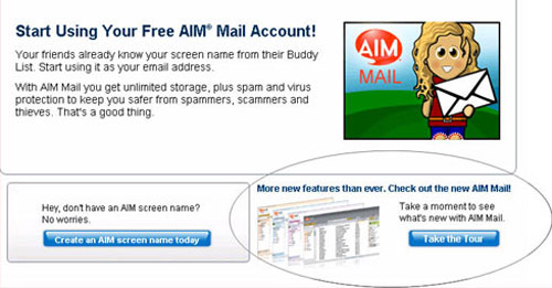
Image 5: The website allows users to take a tour before registering.
User’s path forward
This doesn’t just end with the benefits. Users have to be told where to go after they have been guided. All websites do provide a way to move ahead. But I specifically want to use an example that can show improvement in terms of placement of this cue, which is most important while users are making a decision.
We love Gmail. But we sometimes wish it were always right.
Provide users with a clear path forward AFTER you are done enticing them with the meat.
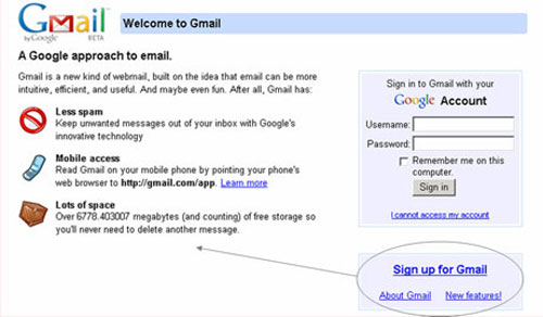
Image 6: The website must provide a clear path forward after enticing users with the benefits.
Consistent design
As users transition from the homepage to the form, it is important that the design of the pages remain consistent. Any small change in the design or layout could affect their performance and decrease the overall experience.
Most websites get this right. But we can still look for improvement. Let’s have a look at the example below (Image 7). Here, as users move from the landing page to the form, we see significant changes in the layout and the visual design.
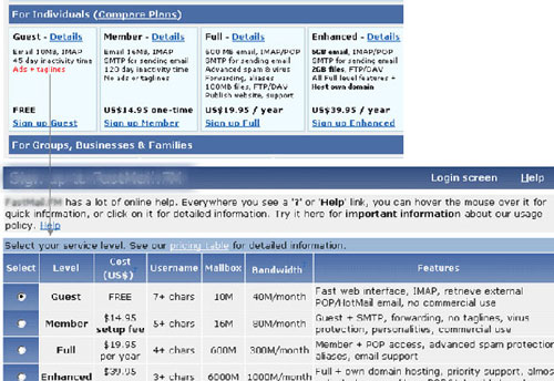
Image 7: The design of the page is inconsistent with the previous page.
An overview of what’s to come
As users enter the application, they need to know what to expect, however short it maybe. Therefore, throwing users directly into a form is not the best way to help them achieve their goals. Instead, the website must first provide users with an overview of what’s to come, including the application requirements and the next steps. This can be just a few lines telling them of the benefits, the things that are expected and an instant access to their emails soon after they are done.
Let’s have a look at Yahoo as an example (Image 8). It doesn’t do a perfect job. But it’s nearly there. All the information that the user is expected to provide during the registration process is described up front.
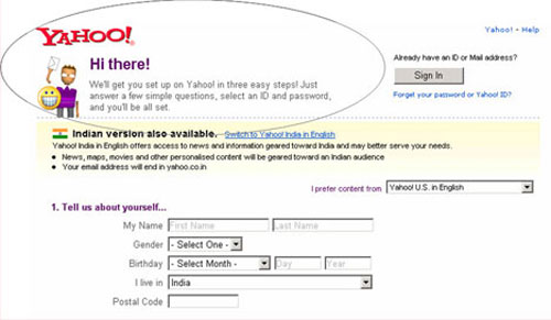
Image 8: The website informs users of what is expected of them while registering.
Lending a helping hand
We all know that people fumble along the way. Heck, sometimes I come across forms that I don’t understand. Therefore, it is essential to provide users with online help whenever needed.
For applications that drive business, a toll free number is essential as this brings in the revenue. But with the case of an email service provider, online help would suffice.
The visibility and location of the help link is equally important. By providing this, you can ensure that users not only find it quickly but also feel safe just by seeing it. This is also useful for first time users who are just transitioning from the real world of letter writing to the web world of emails.
None of the websites that I reviewed follow this practice successfully.
Language aid
There are websites that allow users to view their services in the language they choose. This should also be the case with web forms. Choosing the language of their choice gives them freedom and control. It also helps them move forward and register as they can be assured that the website caters to their needs as well.
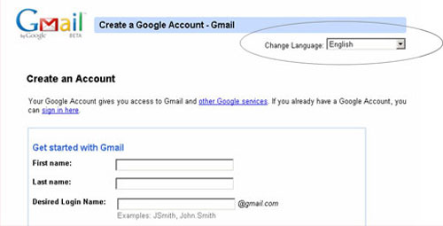
Image 9: The website provides a way for users to set their language preferences.
Save and continue
Let’s say that the basic goal is to register online, so why not just save users’ information automatically as they proceed? A basic “Save and Continue” button would not only tell users that their information is automatically saved but it would also allow them to access the information if they need to resume the application later.
Now if your form is just a page long, you would obviously need a button that reads “submit” or “done”.
Most websites only follow the later.
2. Orientation
Form title
Ensuring that the page header follows a clear task flow from the preceding cue helps applicants orient themselves to the page. Most websites do this successfully. Let’s take a look at the example below (Image 10). Gmail follows a clear flow from one page to another, telling the users where they are at each specific point in time.
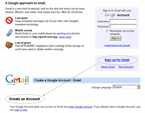
Image 10: The website provides a clear orientation feedback to the users as they move from one page to another.
Progress indicator
How ever short or long your application form maybe, users need to know their path ahead. A well-positioned progress indicator outlining the entire application process helps users see what lies ahead of them. There’s no use of providing the progress indicator on the left or the right of the form. Users need it up front as they do not tend to look to the left or the right of the form when they are entering information into an application. The best way to grab the user’s attention is to display the progress indicator on the top of every page of the application.
Let’s have a look at an example below (Image 11). This website has got the concept right. Yet, it can further deliver what’s best for users at this point. If you are providing users with a form, make sure that you tell them what each step entails. For example, Step 1: Enter your personal details. The example below does provide a progress indicator by telling users of the number of steps ahead. Yet, it fails to mention the step details.
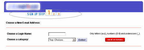
Image 11: An example of a progress indicator. Though, the website needs to take a further step to provide the step details.
Progress feedback
More than 60% of web-based forms that I’ve encountered add in extra steps along the way, ones not included in the progress indicator. As applicants do not see all the steps up front, they are baffled when additional steps start appearing. When you tell users that the form entails 3 steps, don’t cheat them. Keep it to 3 however tempted you might be. With the example above (Image 11), users are probed into a number of pages, viewing the same orientation feedback for pages to come. Make sure that each step is provided on the same page. Moving them through pages and providing them with the same orientation feedback is only going to cause confusion.
3. Chunking
People perceive information more easily when related parts are grouped. This increases users’ efficiency and reduces reading effort. Chunking information into related parts helps users better understand information to navigate more effectively.
Headers
Ensure that you break the form into logical content groups and provide relevant headers for each information chunk. I have seen more than 90% of web forms that just provide the main header and then continue with about 20 questions on the same page. This can overwhelm a user. A quick way to organize information into groups would be to do a card sort with potential users of the application or even your co-workers. An example of effective chunking is found at Yahoo and My Way (Image 12 and 13).
A clever trick is to number the chunks to allow users to perceive how much is left and also to perceive that they are moving forward. It provides clear direction of a way forward.
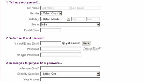
Image 12: The form is well-chunked, with clear headers describing the grouped content.
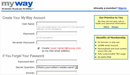
Image 13: The form is well-chunked, with clear headers describing the grouped content.
Labels
Labels on individual pages within the application process must be related to the main header as well as its elements. For example, forms should display a clear and simple header along with related sub-headers. In the example above (Image 12 and 13), the sub-headers (labels) are clearly grouped with their header. You have personal information and password information separated with clear headers that define the structure. This provides clarity and direction.
Summary
As usability practitioners, we need to first and foremost understand the user’s intentions and expectations, in order to provide an online experience that accommodates them. The image below (Image 14) shows the mapping between the user’s intentions and expectations and the ways in which the usability practitioner can help accommodate them in order to ensure the ultimate success of online application forms.
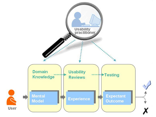
Image 14: The usability practitioner ensures that the form’s structure accommodates the user’s mental model, experience, and expectations.
The journey of creating a successful online application form requires three people working in parallel: the usability practitioner, the designer, and the user. The usability practitioner needs to keep in mind the big picture. The designer needs to have a clear understanding of all the details that will go into the form’s structure. The user helps shape the overall approach to the application form and ensures its ultimate success.
You might agree, partially agree, or even disagree with my thoughts. You might even have something to add to this. Let’s hear your point of view. We are innovating, remember?
Coming up…
The next part of this article will focus on the designer’s role in the process of creating the form’s structure, layout, segmentation, widgets, color schemes, formatting, alignment, and consistency.
References
- “GUI Design for Dummies” by Laura Arlov, 1997
- “GUI Bloopers: Don’ts and Do’s for Software Developers and Web Designers” by Jeff Johnson, 2000

Absolutely fantastic article. This can actually be a checklist with few more addition which i would probably add to this for any webarchitect who is incharge of creating a website for his client. an idea or a schema – whatever may be the case and findings. the fact remains the same that the usability remains high priority. some more points that i would like to bring to attention so that its been discussed when the designer role is being discussed
1. how the site structure has to be laid on for the execution of these forms, the forms and the pages has to be integral part of hte entire site structure when it comest to the usability manuovering of site
2. centralisation/decentralization of forms for effective communication thro the forms for what the user is upto or what he is planning or thinking on the same. eg. varied services will be offered thro one form with just a LOV and there will be a distinctive variation from one service to the other but still be part in the same form. whats the approach that we should take in that case in the stand point of usability and clarity of perception
3. one more thing which i want to add to the list of points is the indication of result in every action of the forms designed. i always seen in addition to information on use and advantages of using any service as listed above, if action is also mentioned then the client has clear set expectation on to decide to apply a click or not. Lack of this actually increases the bounce rate on the form when the stat is analyzed as the clients expect a different action thro the click but result is varying..
Sathish, thanks for sharing your thoughts.
With respect to point one, I truly believe that the best form will have users driven into it rather than them having to find it. So yes, like you mentioned, it is important to blend the form into the structure of a website.
With respect to point number two, I cannot begin to explain the number of times our users wished that their path forward through the course of a form was clear enough for them to understand. I believe that the essence here is communication. You hit the nail on the head, Sathish. 🙂
Your point three spoke about immediate action feedback, if I got that right. Yup, yup, yup! I wouldn’t agree with you more. I will be talking more about feedback in the next part of this article. I will take what you said into account as well.
Talking of luring a user esp. in context of email: Not too long ago the default choice for free email was primarily Yahoo and Hotmail/MSN + a local variant (e.g. Indiatimes in India). When Google entered the game, they had an uphill task to differentiate themselves so that people move away from their one/two primary email Hotmail/Yahoo addresses and opt into Google. Afterall, it’s not easy to change people’s habit (like your Shampoo/Toothpaste).
Google changed the game by
1. using the different (not unique and neither original) interaction model,
2. allowing labels instead of folders etc.
3. Email Search with a Pedigree
4. Fantastic Anti-Spam (I rarely receive Spam in my Inbox and rarely a genuine email in my Spam Folder)
5. to top it all a huge space.
It changed the rules of the game since – forcing Yahoo to change interaction, UI, space etc. Users were enticed by the 1GB limit and the fact that it was exclusive ‘invitation only’ email (in the start). Once people started using, they were hooked – these are classic selling techniques which you will notice aplenty in the real world.
I didn’t aim to focus this article on email applications alone. I wanted to provide these examples as a support. But since our readers are taking this article literally in context, I would want to emphasize again that these pointers can be used in any domain, while creating a forms structure.
I would agree that a good example with respect to luring users would be Google. I love what they do with most of their stuff. When they come out with something (even if it’s a beta version), it has to be with a bang.
I remember Rediff trying to beat Gmail at this. Their advertisements primarily focused on unlimited space provided to their users. They even integrated Instant Messaging (Rediff Bol) into their service following Gmail which lead to a 40% increase in their revenues.
Anshuman, I think we forgot a really huge aspect. In my observation, one of the good techniques that Gmail has adopted is by attracting potential customers with their social networking buzz which is their Orkut. This again is a luring factor.
Leading our way back to a forms structure, I would think that the enticing ingredient plays a huge role in getting users to move ahead. Whether it’s creating a differentiating factor from your competitors or even building an external lure (like a social network which is now buzzing around), it’s this “pull” that gets them to make that switch and become loyal.
Shneiderman’s “Eight golden rules of Interface design” comes to my mind when I read this article.
Great Article.
I agree that this content can be used as a “web-based form” guideline. Nevertheless, I believe that there are four people who determine the success of a web-based form. Developer is the fourth one. The implementation of designers’ clear understanding of all the details is an important step before the user helps shape the overall approach to the application form. Sometimes many innovative ideas never get into practice. Usability practitioner’s responsibility is also to work close with developers to ensure that implementations of the designs do not drift from the validated design intent.
Look forward for part II 🙂
Kinjal, I don’t know where you found an association but if you did– so be it. I guess it was that both have a checklist flow. 🙂
Marianna, obviously a developer plays a vital role here. I took that for granted. Without him/her, nothing would be functional. Thanks for your inputs. I will try and add a bit about the developer in the next part of this article when I concentrate on the actual design and structure of a form. I would hate to bring the code in though. I hope you don’t hate me for this. 🙂
Afshan,
Excellent article. I am forever working on web forms harping on these points to developers and BA’s. The one nut that I have a tough time cracking is the customer especially when it comes to designing forms that can and should be modified from the paper version to use technologies of the web to make the form more user friendly. In many cases I end up for multiple reasons developing forms that mimic the paper form and not optimaly designed for web technologies.
For this reason I think that customer influence should be touched on lightly in this series but customer persuation left to an entirely different article.
I look forward to the next article focusing on the designer and how they use buttons versus links as well as graphics and css to help users through the form. At least I think that is what you are writing about. If not I am still excited to read it.
Thanks again for an excellent article
Trevor, thanks for bringing up customer influence here. I believe that they definitely play a big role but I aimed to make these pointers aware to all practitioners before we take that next step.
I will incorporate your points into the next part of my article.
Change Language link is in English in Gmail and this approach does not really work most of the times. If the user could read that instruction, then he does not really need to change the language in the first place. Two better approaches are either to display country flags (visually) or write the language name using the respective script. Some sites use world image map also but the downside is that some countries speak more than one language.
Praveen, I remember doing a research study on understanding cultures and languages which included your idea of mapping the country’s flag with the language.
Thanks for pointing this out. It didn’t strike me. I should have mentioned this. 🙂
This is an excellent article.
Few inputs which you might like to add in your article.
There is another focused way of presenting the “registration” form to the users unlike GMAIL. On the main page of the site user is welcome with a first focused option to “register”. Have a look at http://www.linkedin.com . It takes the first 3 required fields on the very first page and asks for only “required fields” data entry for the registration to complete.
The emphasis here is usable and simple IA that makes sense to any novice site user for the registration process. Use of less (or only required fields) for the registration gives the breathing space to the page and excites the user that only 7 fields are required to be filled in for getting registered with the site. The less number of fields on the page enables designers to make the text fields appear big/bold/clear that gives lot of comfort to visually week users.
Even if the user is performing the registration process which is not taken with too excitement by web users (usually
because of lengthy forms and all) this simple IA helps in providing exciting user experience for the users.
Another thing which I personally have experienced in our user experience studies and I would suggest that you make should make it as a part of your research is the point of “validation Interaction”. As per my learning in the user experience studies the use of AJAX (asynchronous calls) for validating form fields have further helped in improving the user experience of forms. e.g When a user enters the intended username in the form field and he moves to the password field, the system interacts with the user by showing the message of “status” of the availability of the desired user name as entered by the user. This is an enhanced user – computer interaction where the current context of communication is not breaking as the system has responded to the user that the intended user name is not available and he/she must use another name in order to proceed with the registration process. Otherwise in the old sites (some people who still like to validate the form after the complete data entry by the users) the fields are validated when the data is submitted by the users and then the system tells them that (after entering whole lot of data) there is a problem with the very first field i.e. user name is not available or something, and that frustrates any user (novice or expert).
Meaningful interaction between user and application also enables us to design a rich user experience of form pages.
Hi Afshan
Enjoyed your article and I’m looking forward to the next instalment.
Many of the points you have made relate to what I call the ‘relationship’ of the form: the way that the form has to exist within the relationship between the user and the web site, balancing the user’s reasons for filling in the form and the organisation’s reasons for asking for the data.
As you mention, sites often just assume that the user will want to engage with the form – wrongly. I love your way of putting it: luring users into wanting to engage.
I’ll be linking back to this article from my forms advice wiki: http://formsthatwork.editme.com
Best
Caroline Jarrett
Caroline, thank you for the reference.
Your paper, “Designing usable forms: the three-layer model of the form” caught my eye where you talk about perceptual (layout), conversational (questions and answers) and relationship (the structure of the task).
I am going to link your papers here.
1. Designing usable forms: the three-layer model of the form: http://www.formsthatwork.com/ftp/DesigningUsableForms.pdf
2. Making a better web form:
http://formsthatwork.editme.com/files/Articles/BetterForm.pdf
3. Should I use a drop-down? Four steps for choosing form elements on the Web: http://www.formsthatwork.com/ftp/dropdown.pdf
While I was going through the third paper, I came across six questions that practitioners need to run through:
1. Is it more natural for the user to type the answer rather than select it?
2. Are the answers easily mis-typed?
3. Does the user need to review the options to understand the question?
4. How many options are there?
5. Is the user allowed to select more than one option?
6. Are the options visually distinctive?
If we are looking at these questions from a higher level before entering a form, we could also add a few that aim at finding the business objective and the user goal.
1. Why do people come to your website/application?
2. How important is it for them to register?
3. How do you make them register without having to just provide a link?
This relationship that you mention is an important one. It is the relationship between the host (the information providers), the guests (the users who are interacting), and the medium (the interface).
Hi Afshan, pity I didn’t read this article last year! I’ve just come out of a project redesigning the webmail service of an ISP here in South Africa. Our challenge was not so much on enticement to sign up but getting users of the previous service to buy into the new and “improved” version that we believed added much benefit. Our experience is that users are resistant to change, skeptical of anything “new and improved” and were vigorously apposed to some changes that we, in our testing, found simple and pragmatic. This is what I love about designing user experiences – learning more about users and entertaining their goals and viewpoints.
I’m looking forward to your next installation.
Good to hear your point of view Kelly.
I think there are many more things that we can consider in good form design which can greatly add to a user’s ability ton understand what is asked of them and to complete the request actions. Here are a couple of quick ones off the top of my head.
1. Inline Validation – Don’t wait for the user to hit “submit” before telling them they have made a mistake. Often user’s will fail three or four times to submit a form and this can lead to a lot of frustration.
2. Tool Tips – Either ever-present or present on focus, tooltips explaining what exactly is required of them for each field and giving an example of a correct input.
3. Clear annotation of required fields. – the standard for this is Name (required). The “required bit can also be written as * which will still satisfy screen readers.
4. Proper use of fieldsets and legends – Group related fields into fieldsets and annotate the with legends. e.g. A fieldset including fields for personal details may have a legend tag of “Personal Details” and include such fields as “First Name”, “Second Name”, “Phone Number”, “Email Address”, etc.
5. Field Length – Set the width or size of fields to properly represent the ammount of information that you might want a user to enter. E.g. “Area Code” field might be shorter then the “Telephone Number” field.
there are more but I need to get home for dinner. I hope that was helpful.
OH dear. Another tip. Don’t allow HTML in your comments. The user might break something. Eeeeek!!
What I was trying to say is that you can use the abbr tag to shorten “(required)” to “*”
Thanks for your information 🙂
Trying to get more done in the same amount of time. Your article is helping many Web Designers and is even used in the course on Usability at Full Sail university.
Would like to collaborate with my site SEO Zionsville
Hello there, I found your site by the use of Google while searching for a comparable matter, your website got here up, it seems to be great. I’ve bookmarked to favourites|added to my bookmarks.