Playing games is a human impulse. People get a kick out of competing, collecting things, and finishing tasks. You can apply game design elements to anything, which is called gamification.
Mobile app onboarding is a useful place for a touch of competition or goal-setting. Whether as small as a progress bar or as major as a tutorial for a mobile game, these elements help users finish onboarding and come back to the app again.
As a content developer at Clutch, I got the chance to delve into a research survey on the mobile onboarding process. The results support gamification as a resource UX designers can and should turn to. According to the survey, 44% of app users download an app “for fun,” which is more than any other reason. Designers should play to that desire and make onboarding itself fun.
In addition, 72% of respondents said that completing onboarding in less than a minute is important in their decision to keep using the app. Users aren’t willing to spend much time on onboarding, so designers should add elements that convince these users to stay.
This article explores the origin and definition of gamification and provides three specific UX elements you might include as you’re designing a mobile onboarding experience.
Gamification and mobile app development
The word ‘gamification‘ first appeared in 2002 and was popularized in 2010. Since then, it’s become a buzzword as industry after industry has hopped on the gamification train.
A common misconception holds that gamification is only applicable to games and game design. It’s the opposite.
According to Merriam-Webster, gamification is “the process of adding games or gamelike elements to something (such as a task) so as to encourage participation.” This means anything can be gamified, and once you understand gamification, you’ll start to see it everywhere.
Those little green stars the Starbucks app gives you for buying a latte? Gamification.
A Snapchat streak with a close friend that you’re loath to break? Gamification.
The concept is useless, however, if designers don’t identify why users want to participate in the first place. Designers need to consider the ‘mission,’ or the task-and-reward setup, as the focal point of their gamification scheme. What is the ultimate reward users garner—not just from the gamified bit, but from the entire app? For Starbucks, the mission is about getting convenient, discounted coffee. Although animated green stars look cute, they’re just steps along the endless coffee journey.
Video game design already shares elements with software and app design, so gamification is a natural fit for mobile apps.
Progress bars: Easy and informative
The beauty of progress bars is that they imply a defined end goal towards which users will move as they fill out forms/get acclimated to an app. Yet progress bars are so simple that they hardly feel like gamification.
People don’t like to leave tasks unfinished once they’ve begun, which is why progress bars appear on designs of all kinds.
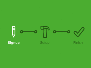
Think about the information that progress bars convey to users. If the first step on your progress bar fills up right away, your users already have a stake in completing onboarding…even if they haven’t actually done much.
Good UX shows users how long a task will take, and progress bars give users a visual representation they can consult at any time.
Because this element is so ubiquitous, you can take creative liberties with the representation of both ‘progress’ and ‘bar.’ The TurboTax mobile app, for example, uses a sheaf of pages to indicate form blanks. As I used the app, I knew how many pages I had to fill out.
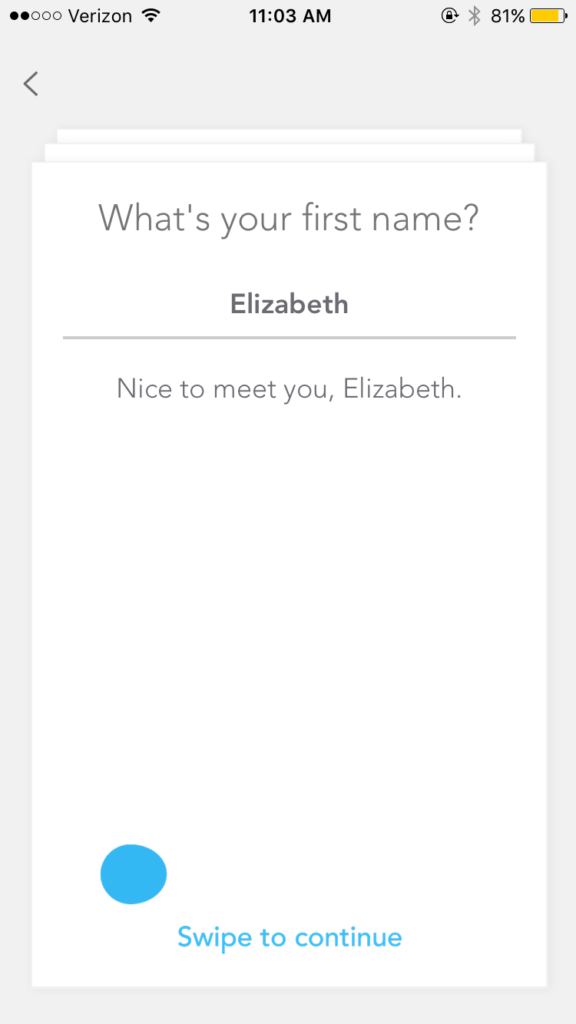
Each time I completed a page, the sheaf got thinner.
This light touch of gamification kept me motivated, but it didn’t make me feel like I was playing a game. It’s appropriate for a tax app.
Badges and stickers: Dopamine rush
Whenever I discover that an app or website gives out badges, trophies, or stickers, I get excited. I yearn for Snapchat trophies. I strive to earn TripAdvisor badges. None of the rewards mean anything—I don’t get a ‘better’ Snapchat or TripAdvisor experience for these achievements—but they change my behavior regardless.
Achievements, such as Uber’s driver badges, are psychological tricks meant to get users invested in an app. What’s astounding about trophies and stickers is that most people, including me, don’t care whether they mean anything. We’re primed to nab those trophies anyway. That’s because achievements can cause the brain to release dopamine.
“Dopamine is your brain’s version of a carrot,” writes Thorin Klosowski for Lifehacker. “The more goals you achieve, the more dopamine it releases, and the easier it is to stay motivated.” That’s why being “the best,” even if it’s “the best at spending money on Target’s Cartwheel app,” brings us pleasure.
If these rewards are introduced during onboarding, they can be a powerful incentive to make users come back to the app, especially if a user starts down the path to a reward during the first interaction.
The navigation app Waze, for example, hands out achievements and has different user “levels.” Waze makes these features available during onboarding so that users know from the start what goodies they’re able to nab.
For example, when I created an account, I noticed right away that my user icon was a baby with a pacifier.
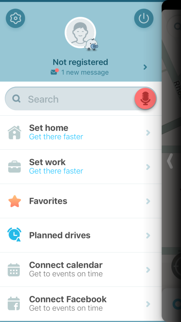
When I tapped on the introductory new message in my inbox to try to figure out how to customize my profile picture and avatar, the app took me to a scoreboard.
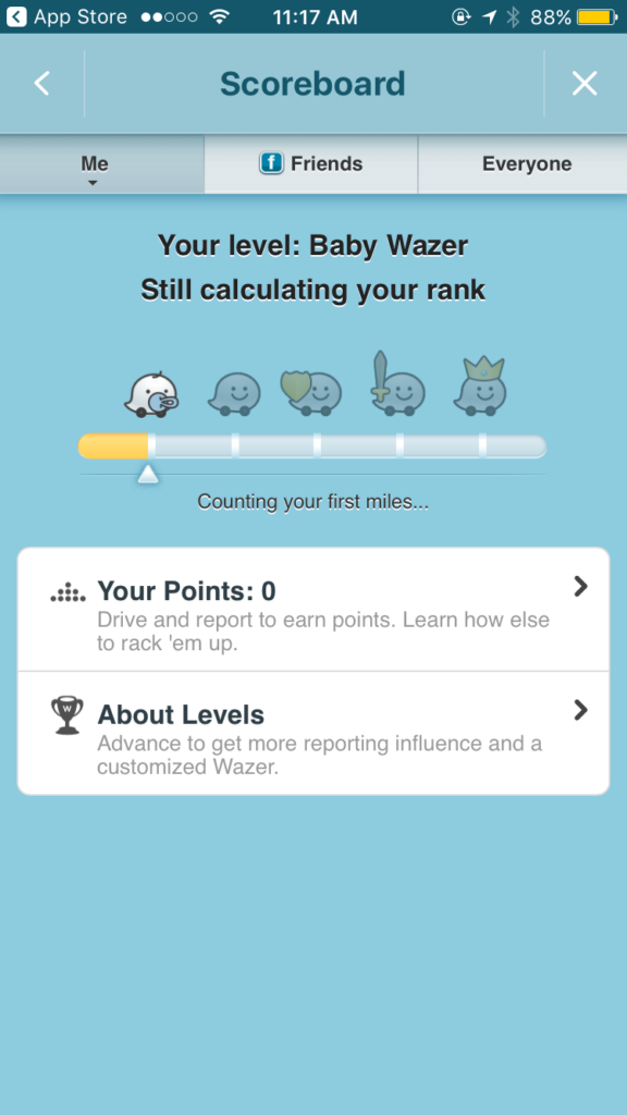
IMAGE 1
Aha! So I started as a Baby Wazer, but through driving and reporting, I could level up and achieve those sweet, sweet rewards.
Since I still didn’t know much about the app or how to earn points, I tapped on “Your Points.”
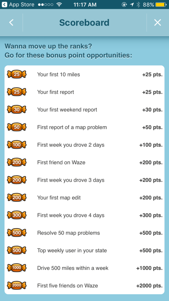
And there, listed in increasing point order to make me dream big, were all the opportunities I could try for. All the candy graphics with numbers inside them made me want to get driving–which is exactly what Waze wanted.
Other than various avatars, achievements and levels land users…nothing. They don’t make traffic easier to navigate or driving safer. But they land Waze a larger active user base.
Interactivity: User input counts
Interactivity causes onboarding to seem more like a collaboration than a boring tutorial, and if done right, it can make users feel as if their input really counts.
In fact, interactivity is why the ‘carousel of copy’ onboarding approach (in which users can swipe through images full of explainer text) doesn’t meet with much favor any longer. You can’t do anything to a carousel of copy.
Think about it: Would you rather take a quiz upon first opening an app, or be fed pages of text you can’t skip?
Hilary Clinton’s 2016 campaign app was a great example of interactivity that began during onboarding and was extended throughout a user’s journey. It gave users a customizable campaign HQ, which Samuel Hulick of User Onboard referred to as a “campaign Tamagotchi.”
The onboarding introduced a star system and provided daily opportunities for users to earn stars by completing activities that helped the Clinton campaign.
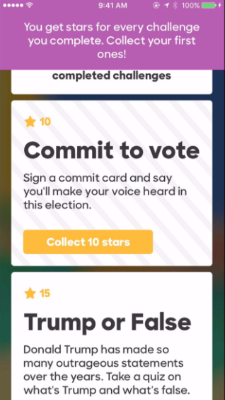
Image: Hillary 2016 from UserOnboard
As users racked up stars, they could buy items to place inside their HQ.
As Wired describeed further, according to Stephanie Cheng, a senior product manager with the Clinton campaign, app developers took inspiration from Duolingo, Swarm, Farmville, and Candy Crush, among others. Although the strategy wasn’t enough to win Clinton the presidency, her campaign’s app seemed to have been more successful than her competitor’s: In September of last year, it had double the downloads (100,000 vs. 50,000) of the Trump campaign app.
The app’s interactivity and emphasis on personalized user experience was a large part of that success.
The dangers of gamification overkill
It’s easy to include too much gamification, or to use gamification like a hammer when a scalpel is needed.
Game design is inherently a balancing act, after all: A well-designed game inspires its users to spend time and energy playing, but if that same game turns simple transactions into competition, users will become disillusioned.
Sergio Nouvel breaks this down on The Next Web:
“Product designers started to attach virtual currencies to anything, under the silly premise that if you offer people something to collect, they will try to collect it no matter what. But virtual economies add cognitive noise, introducing unwanted distortions both when they are worth too much and when they are worth nothing.”
In other words, users aren’t stupid. If you’re too obvious about your gamification attempts, users might think you’re trying to play them (literally).
Consider Tom Haverford and H2Flow from Parks and Rec.
Leslie Knope and Tom have to convince the city of Pawnee that fluoride in the water supply is healthy, not dangerous…so Tom, the savvy devil, rebrands fluoridated water as H2Flow. “The more Flow you take in, the more Sparkle Points you get,” Tom tells the citizens of Pawnee. If they get enough Sparkle Points, they can eventually earn a spot in the H2Flow Platinum Club.

Image: Parks and Recreation
Which is, of course, bogus. Water doesn’t need to be gamified so blatantly.
Use gamification only if you need it, not just because you can, and don’t be so obvious about it that your users roll their eyes. H2Flow-style design only works in the wacky world of Pawnee.
Conclusion: Game-inspired design can work
Game design can help apps attract and retain users. The human brain’s urge to compete, collect, and complete tasks is strong, and UX designers can use that urge to their advantage.
Progress bars, introduction of rewards, and interactive elements are three examples of gamification that work well in mobile app onboarding. However, be careful of over-using these aspects, or using them clumsily. Gamification is meant to motivate users, not disillusion them.
Keep in mind that the elements in this article are just a framework. There’s no hard-and-fast rule when it comes to gamified aspects.
Ultimately, gamification helps attract more (and more dedicated) users. Introducing gamification during onboarding is an easy way to set your app’s tone and get users involved from the get-go.
Give gamification a spin, and see what it can do for your app.

thanks for the great post Elizabeth I like to share the post