“Interactive design [is] a seamless blend of graphic arts, technology, and psychology.”—Brad Wieners Wired, 2002
So, why the debate? Perhaps the dividing line sits in our minds: left brain (logical) vs. right brain (intuitive). Or, if we take a less deterministic view: few engineers have taken the time to study art and few artists have spent time programming or conducting usability tests. But times are changing. Visual designers working on the web need an understanding of the medium in which they work, so many have taken to code. Many have entered the usability lab.
But what about the other side? Are developers and human factors professionals immersed in literature on gestalt and color theory? They certainly have the tools for it—programming environments make it very easy to throw around images, colors, and fonts (of all shapes and sizes). But with power comes responsibility. And in this case, the need to understand how visual information communicates with your audience.
“We find that people quickly evaluate a site by visual design alone.” —Stanford Guidelines for Web Credibility, 2002
Visual communication can be thought of as two intertwined parts: personality, or look and feel, and visual organization. The personality of a presentation is what provides the emotional impact —your instinctual response to what you see. Creating an appropriate personality requires the use of colors, type treatments, images, shapes, patterns, and more, to “say” the right thing to your audience. This article, however, focuses on the other side of the visual communication coin: visual organization.
How we see: visual relationships
Whenever we attempt to make sense of information visually, we first observe similarities and differences in what we are seeing. These relationships allow us to not only distinguish objects but to give them meaning. For example, a difference in color implies two distinct objects (or different parts of the same object), a difference in scale suggests one object is further from us than the other, a difference in texture (one is more blurry) enforces this idea, and so on. Once we have an understanding of the relationships between elements, we can piece together the whole story and understand what we are seeing.
This process is accelerated by our ability to group information visually. When we observe one blade of grass, nearby objects that share a similar color, shape, size, and position are grouped together and given meaning: a lawn. We don’t have to compare each blade to the others.
The principles of perception give us valuable insight into how we visually group information. For example, objects near each other are grouped (proximity), as are objects that share many visual characteristics (similarity).

Fig 1: Principles of perception: proximity, similarity, continuance, and closure.
But understanding the psychological manner in which we group visual information is not enough if we want to be able to communicate a specific message. In order to do that, we need to know how to use visual relationships to our advantage—we need to know what makes things different.
Though lots of variations are possible, we can group distinct visual characteristics into five general categories: color, texture, shape, direction, and size. Introducing variations in one or all of these categories creates visual contrast. The more contrast between two objects, the more likely they will be perceived as distinct and unrelated.

Fig 2: Visual differences between objects.
Telling a story: visual hierarchy
“Designers can create normalcy out of chaos; they can clearly communicate ideas through the organizing and manipulating of words and pictures.”—Jeffery Veen, The Art and Science of Web Design
Now that we understand the basic ways to visually distinguish objects, we can look at the big picture: using visual relationships to tell a coherent story. Elements within a “visual narrative” are arranged in an easily understood order of importance. A center of attention attracts the viewer’s attention, and each subsequent focal point adds to the story. This logical ordering is known as a visual hierarchy.
To build effective visual hierarchies, we use visual relationships to add more or less visual weight to page elements and thereby establish a pattern of movement through the layout. Visual weight can be measured by the degree to which a page element demands our attention or keeps our interest. Large red type, for example, contrasts with a white background much more than a light gray dot. As a result, the visual weight of the red type grabs our attention first, though it might not keep our attention as long as a detailed image.

Fig 3: Three objects with differing visual weights created by variations in color, shape, and texture.
Visually dominant elements (those with the heaviest visual weight) get noticed the most. They are the center of interest in a layout and they determine where the story begins. The hierarchy of subsequent elements guides our eyes through the rest of the composition, giving us pieces of the story as we go. The relative position of each element in the hierarchy provides valuable information about its importance to the big picture.
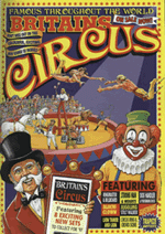
 Fig 4: The heaviest (most visually dominant) elements in this circus poster are the images of the performers and the title. They communicate the big picture: the circus is in town. The lightest (least visually dominant) elements in the hierarchy are the ticket prices and features. If the hierarchy were reversed, few people would know the circus was in town. Instead they would be confused as they passed posters seemingly promoting “$5.50.”
A balanced hierarchy provides not only a clear path for recognizing and understanding information, it also helps unify the disparate elements within a page layout into a cohesive whole. This creates a sense of order and balance. Without visual hierarchy, page elements compete for attention, and as a result, none of them win. In all hierarchies, only certain elements should be on top; the rest need to follow suit. The appropriate position of each element in the hierarchy depends on the message you are trying to communicate.

Fig 5: In a layout with an effective visual hierarchy, the distinct visual weight of each element guides viewers through the page in an informative and appropriate manner.
Putting it to use
Any given web page is composed of many distinct elements. Navigation menus (possibly several layers deep), contact information, search boxes, site identifiers, and shopping carts are just a few. The visual organization of a web page can communicate valuable information about the similarities and differences between elements and their relative importance. Once your audience understands the significance of your page elements, they can apply that knowledge to the rest of the site.

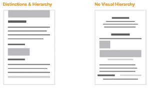
Fig 6: If all the elements in a page layout are given equal visual weight, making sense of the page is difficult. Meaning is created through the differences and similarities among elements and their place in the page’s visual hierarchy.
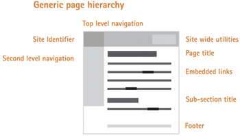
Generally, the hierarchy of a web page is based on distinctions between the content, navigation, and supporting information on a page. Within each of these sections further distinctions can also be made. A general web page hierarchy (from highest to lowest importance) may look like the following:
Content
- Page title
- Subsection title
- Embedded links
- Supplementary information (captions, etc.)
Navigation
- Location indicator
- Top-level navigation options
- Sub-navigation options
- Trace route (breadcrumbs)
Supporting elements
- Site identifier
- Site-wide utilities (shopping cart, site map, etc.)
- Footer information (privacy policy, contact info, etc.)

Fig 7: The visual hierarchy of a generic web page.
Of course, there are many situations where deviating from this formula is advised (on navigation pages, home pages, etc.). The content, audience, and goals of each page should determine its exact hierarchy. Nonetheless, the visual representation of each element on a web page should always be:
- Appropriate for and indicative of the element’s function
- Applied consistently throughout the site
- Positioned properly in the page’s visual hierarchy (in a manner reflective of its relative importance)
Visual hierarchy, however, does more than simply explain page elements. It guides users through the site’s content and interactions. Armed with an understanding of each element’s place in a hierarchy, we can emphasize important elements (such as content or interaction points), and subdue other elements (supporting information).

Fig 8: In this online form, visual hierarchy guides the user through the necessary steps to place an order. It also emphasizes (with color, positioning, and scale) the first step (“Ordering from…”) and the last step (the “Sign-In” button). Simultaneously, the supporting information is subdued (it has little visual weight) and does not interfere with the main interaction sequence.
Similarly, visual hierarchy can provide users with a sense of where they are within a website, to direct their attention (to special offers, for example), to suggest distinct choices, to explain new elements, and more. However, effective visual communication does not “speak” loudly. It quietly educates and guides the audience through the interface.
Given the massive number of web pages and applications, users often rely on visual cues (especially initially) to assess web interfaces. Therefore, a well thought-out visual organization can greatly enhance usability by grouping information into meaningful page elements and sequences. Such a system relies on an understanding of how people use visual relationships to distinguish objects and what those relationships reveal to viewers (through visual weight and hierarchy). But visual organization is only half of visual communication. The rest, personality (or look and feel), is another story…
![]()
- Web design: art versus engineering, The Jungle
- Aesthetics and Apparent Usability, Noam Tractinsky, CHI97 Electronic Publications: Papers
- Usability experts are from Mars, graphic designers are from Venus by Curt Cloninger, A List Apart
- Stanford Guidelines for Web Credibility, 2002
- The Art and Science of Web Design Jeffery Veen, New Riders Publishing, 2000

Nice. A lot of IAs still don’t know this kind of stuff. A really great explanation of basic visual principles is in Scott McCloud’s first book “Understanding Comics.”
Really nicely presented article. It condenses much of Mullet+Sano’s book Designing Visual Interfaces into a couple of pages.
Very handy for classwork or for handing out to other team members who don’t know too much about the ideas behind visual design.
Visual contrast can also include varying degrees of image opacity / transparency. For example, I bet you’ll find Oprah before you will find Britney on this map… http://www.1-900-870-6235.com/SearchMap.htm
Fabulous seminal piece! You don’t know how many hours I looked for stuff like this in the early ’90s. Short, concice and very full of core principles.
Another great article at boxes and arrows. I am a graphics person that has recently been involved in IA and can both learn and share information and knowledge with my team learned from relevant articles. The article is digestible and to the point.
Great article. I would love to see something similar dealing with motion graphics and/or animated interfaces. Seems like this only gets tricker as the design elements start moving around in response to the user interactions in a more immediate and responsive way.
I think this is a good article, however, you have completely left out Typography – I see no mention of it.
In your discussion concerning “principles of perception” or “visual hierarchy” you are discussing age-old techniques in typography. Why am I mentioning this? Too often, the design/code processes are separated and a common language between them is never found. Your article is a bridge, but typography is very important as well.
Many designers have taken up “code” as they possess this intuition whereas many code professionals sometimes do not even speak or know of typography. Unfortunately (and I know this from experience), they think that a term like “typography” means “design” – but it generally emobies the same principals your article explains.
The web is awash with so many with visually indecipherable websites because the most basic concepts which graphic/web designers employ (grid, typography) have been left out of the discussion far too often.
They are not merely tools for designs’ sake, they are important factors in common sense visual communiations – I think that this audience should recognize that designers and code people can speak similar languages.
Have no fear of design or typography or grids – they are coders friends as well…
I recommend Val Casey’s [http://www.valcasey.com] site for some solid information and examples of good web design.
Type (in the context of visual organization) is simply another visual element. All the type within a layout needs to be considered part of the overall visual hierarchy. Type also has it’s own “internal” visual hierarchy within groups of text and even within individual letters and words. (this is why some faces are easier to read than others: contrast, white space, etc.) However, if by typography you mean selecting appropriate typefaces that communicate the proper message to your audience, you might be interested in what I call the “second part” of visual communication: look and feel (or personality). A brief discussion of personality can be found at: http://www.lukew.com/bio/design_philosophy/personality.html
I’m using the term “typographic grid” and the principles that come with it much like you use the term “visual hierarchy” and “layout”. You even used typographic-grid-like images in your explanation. This could be a misappropriation of my terminology I will admit.
However, I don’t feel that typography is merely “look and feel” in general – rather, it is inherently structural. And I do think it is worthy of at least getting a mention in this discussion.
But we are talking about the differences in terminologies and I have found (from experience), it helps tremendously to sort through these differences. And I think this is where the article starts out – as you’ve cited “Usability experts are from Mars, graphic designers are from Venus.” But this would be an altogether different article…
This article sparked a related question for me. What is more important for a task oriented web page design (not a marketing site) & how do you choose:
1) The layout of the text & graphics shows the information hierarchy but putting the subordinate concepts below & perhaps indented indented under superordinate concepts (like in an outline or tree view).
2) The display be visually balanced (not to much optical weight on one side or the other)? For example, if you have a web page with a vertical nav area down the left and align all text and buttons to the left inside the content area, the page looks unbalances because there’s too much on the left.
Has anyone seen any research on support either idea or any research comparing these design goals?
This is a terribly simplistic description of both visual communication and — more distressingly — visual narrative. But at least you’ve put these terms forward, and in a constructive manner. Hopefully this will spur others to delve deeper.
Nice introduction to principles of visual organization. But the example of the Amazon login form must me a joke! The Amazon form shown is one of the poorest examples of good visual organization I’ve seen on the web (except perhaps Jakob Nielsen’s website). I suspect the author’s web browser didn’t render the form correctly since there are some very obvious bugs…
-e
Thanks for a fabulous article… I guess I have to reconsider color styles on my homepage… 😉
Thanks!