Let’s say you’re a pirate, and you’ve scored a really excellent treasure. We won’t
You are not a freelance pirate. Oh no, not in this economy. You work for one of the big worldwide piracy conglomerates, perhaps PiraSeas™ or Global Pillage®. One of your duties as Sr. Pirate Captain (Level 2) is to create a map pinpointing your stash. These days, with Corporate demanding accuracy on penalty of the plank, you need to make your map clear, precise, and understandable for anyone, even those hook-handed crooks at the head office.
When maps can rock your world
Maps are one of the most basic (and informative) infographics. The simple map. A rectangle with a few lines, some labels, and an X can impart what it would take hundreds of words to describe. Maps are an abstraction of our world, a representation of space. At their most basic, they tell us where. If tweaked and tuned properly, they can tell us where, how, and even why.
Maps tell us how places relate to each other as well as where things have gone, are going or will go. But mostly, maps tell us how to get places. And that is what your treasure map is all about.
Creating successful maps requires an ability to plan, attention to detail, design skills, typography skills, and a considerable amount of time. You might be asking yourself why you should go to such trouble when you can quickly sketch a print map or simply link to an online map. Here’s why:
- Readability and impact. Store-bought maps must serve all conceivable readers with all conceivable goals. They include information – and clutter – you may not need. By depicting only the features necessary to your story, you can make your map much clearer and stronger than any map you can buy.
- Look and feel. Your map should reflect the look and feel of your publication, site, or killing spree. A pirate map should look like it came from a pirate – not MapQuest.
- Accuracy. If you know your topic (and you should) and you care (yes?), you can guarantee accuracy. Highly localized or proprietary information doesn’t show up in commercial maps. Also, map companies are known to place “bunnies” in their work to catch copyright infringement. You don’t want to send Corporate across a bridge that doesn’t exist, do you?
- Artistry. It’s well known that accomplished pillagers tend to be frustrated artists. Believe it or not, rendering a tasty little map is a wonderful exercise in design precision and artistic restraint.
Rendering a map for the first (or even the fifteenth) time can be an exercise in fumbling and bumbling. These guidelines and steps will help you create effective maps quickly and with utmost pleasure.
Thou shalt …
Treasure accuracy. Labeling streets correctly and showing bridges only where they actually exist is just the beginning. The craft demands pathological attention to detail. If you faithfully render every undulation in every road, river and topo line, the cumulative effect is elegantly intricate and something to be proud of.
Draw to scale. As Mr. T would say, “Never fail, draw to scale!” And show the scale. Maps that are not drawn to scale are not maps. They’re doodles best confined to toilet tissue.
Keep north at the top. Don’t deviate from that unless you have a great reason. One exception is a diagram where internal landmarks are more important than compass points.
Show enough to make sense. X marks the spot, but who gives a galleon if they have no idea where the spot is?
Never show too much. The more details you show, the more subtle each detail must be. The more subtle, the less clear. The less clear, the more annoying.
Be consistent. Consistency can be the hobgoblin of little minds, but it kicks ass when it comes to maps. Use consistent styles within and among your maps.
Layer. If you are creating a map with various elements, you must employ some degree of Edward Tufte’s “least effective difference” layering. To make topographical lines, park boundaries, trails, streets and city boundaries all readable and useful, you must treat them with subtlety. Group like elements into graphical families. All city elements might be grays or solid lines while all park elements might be greens or dotted lines.
Focus the reader. This is the key difference between the kind of map you have in your glove compartment and the kind of map that tells a specific audience a single story. Look here! You are here! The treasure is here! Readers should immediately know the main point of your map. Secondary information should receive secondary emphasis, and so on down the line.
Know what you’re gonna show
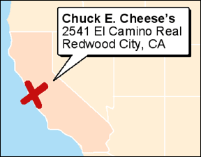
Let’s say that because of its proximity to the San Francisco and San Jose airports – and its preponderance of singing animals – you hid your stash at the Chuck E. Cheese Pizza Time Theater in Redwood City, CA.
The more completely you plan your map before you start rendering it, the more easily it will come together and the less likely you’ll have to go back and add elements (which invites errors of scale). When you imagine (or sketch) your map, consider these three points:
Details. Provide enough detail surrounding the X so that people can find the treasure. Streets, landmarks, bodies of water, Taco Bells. Putting an X next to a road is insufficient when a patch of quicksand lies between the two. Show just enough detail to guide, educate, or entertain your reader. Any more than that and you’re making a mess.

This lacks local detail and is utterly useless.
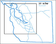
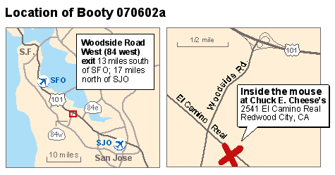
Views. Consider the size of your finished map. Can it accommodate the essential details AND scope? If not, you need multiple views. For your treasure map, you need one view showing Corporate how to reach Woodside Road from San Francisco or San Jose international airports, and another view to show them the way to Chuck E. Cheese.
7 steps to greatness
If you aren’t practiced in the fine art of map rendering, it’s easy to get lost in forgotten elements and incessant fiddling. If you follow these steps in a vector drawing program such as Illustrator or FreeHand, your maps should come together quickly and slickly.
- Scan or import your source materials, then lock them on a layer below your drawing layer.
- Trace the essential lines using the bezier tool. As in life, the fewer anchors, the better. Make sure you include the scale. Mark all points of interest. Double check to ensure you’ve included everything you need; it’s easier to delete elements than to add them later. Bonus tip: Trace with a color that stands out from your scan. C100 M0 Y0 K0 will make you feel happy.
 Select the whole mess, duplicate it then group it.
- Draw the bounding shape of your finished map. Position your group on top of it and scale the group (including the scale marker!) until the essential elements fit as perfectly as your peg leg.
- Style the lines and the shapes.

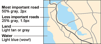
The shoreline and all major freeways provide context. All but the focal freeway are given secondary treatment.” Apply common sense and Tuftean rigor. Think layering and least effective difference.
- Set the graphics and text. Cities and area labels should be level, within the areas they describe. Street names should be set along the streets themselves, as long as they are readable. Find a nice place for the scale.
- Paste the map inside your shape. Do some fine-tuning, integrate your multiple views, and you’re ready to rock!

![]()
Takeaways
Maps are simple, versatile, and useful. While they do a wonderful job of telling us how to get places, maps (informed by the critical thinking and design skills used to create them) can tell much more complex and compelling stories.
For example, this CNN special report includes interactive maps of occupied lands in the Mideast. This article by Monica Moses of the Poynter Visual Journalism Faculty includes links to infographics covering terrorism.
Whether you’re explaining the history of the occupied lands or directing people to your stash, you must give people the information they need to understand your story, and you must present the information in the clearest possible manner.
This is sound design, pure and simple and all the more important when an unclear information display has the potential to send you off the plank.
| Lee McCormack created maps and other infographics on daily newspaper deadline for almost six years. Now that he works on search site AltaVista, his maps portray interaction instead of location. |

nice job
I love the definition of a mpa I learned in the Army: “A map is a two-dimensional representation of the earth’s surface, as seen from above.”
While I know there are raised-relief maps, and while some may have examples that diverge, I find that, for me, this definition pretty much covers the map. 🙂
Your quotation “Consistency can be the hobgoblin of little minds” isn’t quite accurate. Ralph Waldo Emerson wrote, “Foolish consistency is the hobgoblin of small minds”–and that one word really changes the meaning. It’s the foolish, extraneous, insignificant devotion to consistency that becomes the burden on getting work done. Yet appropriate consistency isn’t a hobgoblin.
Good point, adding the “foolish.” I really enjoyed this article, but I’m curious about when to deviate. Seems to me that Harry Beck’s choice to give up detail and accuracy in the London Underground Map makes it the useful document it is. it’s the same with site maps… including all the information makes them unreadable. The challenge is know what to include.
Let me be the first to take issue with the 2nd Commandment, “Draw to scale”. Mr. McCormack says, “Maps that are not drawn to scale are not maps. They’re doodles best confined to toilet tissue. ”
They’re not maps, true — they’re *diagrams* that can be every bit as useful as maps. Witness the London Underground “map” (its creator always referred to it as a “diagram”). It works because, for its users, geographic context is simply not important information. “Omit unnecessary information” is a Tuftean maxim, and sometimes that can include scale.
http://www.thetube.com/content/tubemap/
the tube map is a popular exception i see.. but perhaps it is more a conceptual model than a map?
Well it points to an important issue among maps — the importance of literal respresentations of space vs. simplifying for clarity and comprehendability.
The genius of the tube map is that it stripped away irrelevant detail for its typical usage.
For example, the last time I went to London, I caught the train from Heathrow to Paddington and then took the the tube to Bayswater, since that was the closest stop to my hotel.
The actual geography of London was irrelevant at that point, the important thing getting to the right stations. (Although obviously knowing the actual geography was useful for figuring out what station was closest to my destination. But even that wasn’t truly necessary, since the hotel had specified which station to go to, so even if I didn’t know London I could have found my way there.)
Once I got off at Bayswater, then literal geography became crucial to the final navigation to the hotel — which is why most subways have a geographically accurate map of the local area at the station while their route maps are simplified to the essentials.
So it’s not necessarily a case of non-literal maps being “wrong” as much as their being intended to satisfy different needs.
We do the same thing all the time when drawing maps in real life. If I draw a map of how to drive from my house in LA to Christina’s in Silicon Valley, it’s going be wildly “inaccurate” — the 400 miles between metropolitan regions will probably take up as much space as the details at end up about what to do once you get off the freeway. But I bet most people could follow it.
Who says maps must have anything to do with geography in the first place?
Are the following not “site maps” in the truest sense (?);
http://www.1-900-870-6235.com/HawkingMap.htm
http://www.1-900-870-6235.com/BurkeMap.htm
http://www.1-900-870-6235.com/Navigation/GATESmap.htm
These seem much more akin to Concept maps than Site Maps per se, in my opinion. I think that showing the visual relationships between bits and parts of content can help a user make the mental relationships and create a spatial model of the site, but it may be difficult to then relate it back to the website.
I think one of the points of the article is that clarity and appropriate level of detail is one of the keys to a successful map – geographical or otherwise.
Where is a good place to go learn about map design? I have a computer science background, but my current position involves a lot of cartography. Unfortunately, I don’t know anyone else who does this kind of stuff. Are there other websites or books I should read for principles of map design? Thank you.
Joel,
I’ve been out of the cartography world for a while now, but here are some of the books I have learned a lot from. These are about principles of cartography — for example, how maps are imbued with meaning (semiotics, visual design, perception and interpretation) and how to design appropriate symbologies — not the technical and programming aspects of GIS and other cartographic systems.
How Maps Work, Alan MacEachren
The Power of Maps, Denis Wood
Mapping it out, Mark Monmonier
How to Lie with Maps, Mark Monmonier
The text used in my cartography courses at Rutgers U.:
Elements of Cartography, Arthur Robinson, et. al.
They’re all available at Amazon.com.
I hope this helps,
Ruth
I’ld just like to add that it’s not always advisable to “take away” all extraneous detail since you’re not always sure what’s going to be extraneous to everybody. A good example is if you strip every street off of a map except the ones you expect people to travel along. This ensures that if someone makes a wrong turn, encounters a detour, or passes the correct street, they are not “off the map” and have no way to get back on it (without backtracking, if they know for sure they’ve passed the street).
This is a good example of the difference between simplicity and clarity. Map designers have to strive for clarity–especially for commercial or consumer maps–since the maps have to serve so many purposes. This isa good thing. Simplicity often leads to oversimplification where not enough data is present and, therefore, not enough context. Clarity is making all of the data clear enough to be easily read and followed while allowing it to provide (sometimes many) levels of context). BTW, clarity and subtlety are not opposed. Subtelty and focus probably are.
Some of the bet maps I’ve ever seen were created by my co-workers at TheUnderstandingBusiness for the Rand McNally USATLAS in 1990 and 1991. They’re not for sale anymore but you may be able to find a copy at a used book store.