Designing a website’s structure around customer needs creates trust—trust in the web as a valuable space to interact with a brand, product, or service. Such a website provides your customers with a valuable first point of contact.
User journeys are a method for conceptualising and structuring a website’s content and functionality. These journeys allow us to shift away from thinking about structure in terms of hierarchies or a technical build.
Pioneering web designer and artist Auriea Harvey (zentropy8) describes web design as “thought patterns, processes, paths.” User journeys tap directly into this model, reflecting the thoughts, considerations, and experiences that people go through in their daily lives, beyond the web.
Creating a user journey places a strong emphasis on personas and also merges the creation of scenarios and user flows. However, unlike user flows, hierarchies, or functional specs (which explain the interaction between a user and a system’s logic and processes), user journeys explore a user’s mental and lived “patterns, processes, and paths” and translate these into web-based experiences.
Primary needs and need states
Answering customer needs is the end point of our journeys through the structure and the starting point of our thinking about the journey itself.
Successful commercial websites satisfy both business and customer needs. Each journey a user takes through a site should fulfil a need. If, at the end of a journey, you have a business need and a customer need sitting back to back, then the site endeavour will succeed.
For example:
Primary user need: I want to take a vacation abroad
Business need: Increasing our flight ticket sales
Marketing/business phase: acquisition
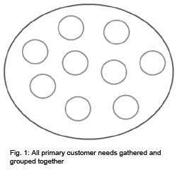
The first step is to identify your customers’ needs. These are broad, top-level needs. Let’s call them primary needs. Primary needs usually fit into classic marketing cycles (acquiring, servicing, retaining customers) and can be identified by using common sense, consulting your client, or conducting research.
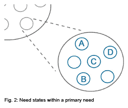
Need states are like micro-needs within the primary needs you identify. They are close to the idea of interaction modes: searching, exploring, browsing, etc. And like interaction modes, need states change during the course of a website experience, as users move through the journey during one session or over multiple visits.
Start conceptualising the usual way—with personas. The need states will cut across these personas.
| Persona | Need State |
| John: I’ve never flown or booked my own ticket before.
Julie: I am very experienced with this kind of thing. Pete: I’m used to this process but not this airline. |
A: “I have bought my ticket and am looking for hotels, insurance, car hire etc.”
B: “What’s the best way to get there?” C: “I’m planning my trip and need ideas and ball park costs.” D: “I know where I want to go and am shopping around for the best deal.” |
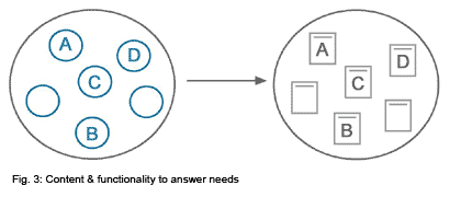
Even at this early design stage, ideas start to emerge for the kind of content and functionality to meet these customer needs. Already we see a website forming that has the user and the user’s life experience at its core.
Answering needs
This is the fun part. Sit down and brainstorm content and functionality that will most effectively answer the customer’s needs. This can be anything from wizards to checklists, games, forums, or peer reviews.
In the case of a redesign, you want to assess how well the current content and functionality is answering and addressing the primary needs and need states.
Clients will usually have some existing content that can be evaluated on the grounds of relevance to and impact on the customer needs. Try to get your hands on an existing site map or draw one up by hand, and group that content under the various customer needs you have identified. The gaps will become clear. You can also rate the content in terms of how well it has been executed.
This exercise will reveal all the classic examples of brochure-ware present on the site and information that is actually superfluous to the customer. This can help in culling content.
With powerful and relevant content in place, you have the foundation to build effective journeys for your customers.
Creating a journey
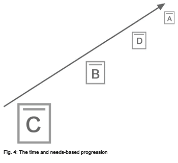
Think about the user’s needs and the associated content in some form of time-based progression. You need a beginning, middle, and end. It is all rather logical; the trick is simply to role-play. Put yourself in the mindset of your user and imagine how the need states shift as you move through the overall process.
| Original need states we identified | Need states in a time based progression |
| A: “I have bought my ticket and am looking for hotels, insurance, car hire etc”
B: “What’s the best way to get there?” C: “I’m planning my trip and need ideas and ball park costs” D: “I know where I want to go and am shopping around for the best deal” |
C: “I’m planning my trip and need ideas and ball park costs”
B: “What’s the best way to get there?” D: “I know where I want to go and am shopping around for the best deal” A: “I have bought my ticket and am looking for hotels, insurance, car hire etc” |
When presenting this to your client or team members you want to show the order of the content. Show how the content becomes a kind of landscape the user traverses when moving towards the end goal, matching the business and customer needs.
A new kind of magic should start to happen now. In grappling with the complexity of options in creating a journey or story, you’ll realise that the visual design, layout, and navigation provide the solution to take your user experience to the next level.
The trick is balancing freedom of movement through navigation while presenting an “ideal” path that hints at the overall journey.
The journey in the interface
In the interface you need to create a sense of where the user sits in the journey: what came before and what is coming next.
You can almost think of it as a pre-emptive breadcrumb trail. Or perhaps you can think of it in the terms the architect Rem Koolhaas uses: “design [is about] entrances and exits.” This is an interesting view since websites are often passive, self-service environments where the user tends to instigate interactions. In terms of journeys or movement through information, the user chooses when and where they will enter and they drop off when it is appropriate.
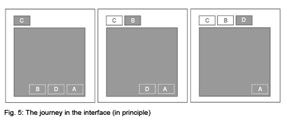
When inviting users to enter the journey, you appeal to the broad primary need: “Thinking of travelling?” and, associated with this option, you reveal the landscape of that journey:
| Need states in a time based progression | Calls to action |
| C: “I’m planning my trip and need ideas and ball park costs” | 1. “Planning your trip? Read our destination reviews” |
| B: “What’s the best way to get there?” | 2. “Configuring your trip? Use the journey planner” |
| D: “I know where I want to go and am shopping around for the best deal” | 3. “Get the best rates — find fares” |
| A: “I have bought my ticket and am looking for hotels, insurance, car hire etc.” | 4. “Complement your trip with these great deals on car hire, hotels and insurance” |
The user will self-select where they want to go. This choice inevitably drops them into the journey at the point relevant to them. But since we have mapped our content and functionality along a time- and need-based trajectory, the user is oriented based on the relevance of content and functionality at a point in time.
So at this moment, the stuff “behind” them holds less relevance, the things ahead of them provide a sense of direction, and the content and functionality directly in front of them has maximum relevance and is answering their current need state.
All this adds up to:
- People easily navigate where they need to go to get the kind of content or functionality they require at that time.
- People who leave the site can return and pick up where they left off as their need state changes.
- Because of the beginning, middle, and end structure, the user is continually getting closer to answering their primary needs.
- You can “hold people by the hand” through the experience.
Having a journey in place also means that we can create dramatic and compelling hooks to pull people from one moment (or stage) to another.
Creating hooks
The structure tells a story so you can create hooks throughout the journey. Because the journey maps needs along a time-based progression, the calls to action (hooks) will have relevance because we’re anticipating the user’s next need.
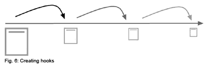
Here are a few examples of the kinds of hooks that can be used:
- Use actionable content (content with functional elements) where the response moves the user into the next need state.
- Create visualizations of the content and functionality that accompany the calls to action, hinting at what comes next.
- Present all upcoming options. For example, if the user is in moment 2 of 5 then offer the hooks for 3, 4 and 5.
- Capture user data where a drop-off is expected so that returning users feel that previous visits have been valuable.
- Highlight the end goal, the primary need—never let the user lose sight of it. Use offers or rewards to keep the user engaged and progressing all the way through the journey.
- Address barriers throughout the journey. If we know what concerns people, address these items and use them as a reason to stay in the journey.
Measuring and iteration
Since there is logic to the structure, click-through statistics can fairly easily be mapped back to assess the relative success and accuracy of each user’s journey. By analyzing the stats, one can easily identify the pages and links where drop-off is occurring.
Drop-off may be a natural part of the overall user experience but can also help point to problems in the design and structure. Then you can research, make changes, test, and roll out the new design. User journeys are a natural part of any iterative design process.
The big picture
Let’s zoom out from an individual journey to view an entire website as an even larger journey. There are multiple primary needs spread out in a time-based progression. People can drop into the online experience at any point and find answers and solutions to their needs. They may enter or exit this experience whenever it suits them and, at any point, this space, this website, is a reliable point of contact. This is the promise of user journeys: creating trust that allows this medium to take its place as a valuable channel for customers to experience a product, service, and brand.
![]()
Auriea Harvey. “Cutting Edge Web Design: The Next Generation,” Daniel Donnelly, ed.,
1998, p. 50
Hobbs reinforces some of the same user-centered design principles of the likes of A. Cooper, J. Nielsen, JJ Garrett, L. Rosenfeld and others. His diagrams help convey and reinforce his concepts, and the need-satisfaction dialogues are similarly instructive. This material isn’t new or different; it is well-presented and informative.
Great article. Thanks. I lead a non profit that is trying to apply this thinking to creating a guide that people all over the world might use to become involved in helping kids in poverty move to jobs and careers. While I understand your concepts, I don’t have the tech skills, time or talent to apply them into building and constantly updating this blueprint. Thus, my goal is to recruit people from the design community to volunteer time, talent and leadership to this effort. Visit the Tutor/Mentor Institute section of http://msg.uc.iupui.edu/TMC/html/index.php to see how I integrate GIS maps and interactive databases into this project, and to see how I’ve applied your concepts thus far.
If anyone would like to get involved, or learn more, please post an introduction on the site. Thanks.
I introduced myself about a year ago and would like to update the web site I mentioned. You can now visit http://www.tutormentorconnection.org and find examples of how maps can be used to show where poverty is concentrated and where service organizations are located. In the links section of the site is a sub section on process improvement, creativity, collaboration and knowledge management. These links point to many organizations using visual tools to help express ideas that might unite the social sector, business sector and public sector in building better systems to help end poverty, improve diversity in the workplace, etc. I think designers have a special talent for communicating ideas and hope to connect with some of you professionally, or via the universities where you learn your skills.
Jason,
I enjoyed your article and I have a follow up question. What happens if a journey is non linear? How do you design, conceptualize and map non-linear types of interactions? This is a particular concern with web 2.0 applications where the concept of a page has changed with the ability to present options in context and in real time.
A great article! Thanks Jason.