I have developed and practiced a card-based system that allows me to evaluate a classification outside of its implementation. It is simple, requiring little input from individual users (10 minutes from 20 users is not a significant amount of time for them, but provides me with a significant amount of feedback). Using this technique means that I can focus my in-depth usability testing on interface issues, rather than the classification.
A bit of history
It started while I was working for the Australian Bureau of Statistics. I poked my nose into someone else’s project. I’d heard about a new hierachy being designed for our external website and decided to have a look.
After much discussion with the creators, making some changes, and addressing some remaining concerns, I said the fateful words, “We should test this.” They agreed wholeheartedly—as long as I did all of the work.
I was already in contact with a lot of customers, and knew I would be able to get people to participate. That was the easy part. The difficult part was figuring out how to test it. In this case, I faced the following problems:
- The development work hadn’t started, and the timetable was already tight. I couldn’t wait until the system was developed to test it on screen (and if I waited, there was little chance of getting any changes implemented).
- The classification was for an external site and, due to the technical infrastructure, we couldn’t get a prototype on a live site to test.
- I didn’t want to bring customers into the office to test, as I would only need a short time from them. Yet I didn’t really want to lug around a laptop to customers’ offices either.
- I knew there were usability issues with the current site and didn’t want the existing problems to impact the test of the classification system.
Given these constraints, and after practicing a few times, I developed what I call “Card-Based Classification Evaluation.” This testing method can be organized and run quickly without a lot of overhead, yet can be very effective in ensuring that your classification will help your users find what they need.
Preparation
OK. Computer off, pens out.
Here’s what you need to run your own card-based classification evaluation:
- A proposed classification system or proposed changes to an existing system. Some uncertainty, mess, and duplication are OK.
- A large set of scenarios that will cover information-seeking tasks using the classification.
- A pile of index cards and a marker.
- Someone to scribe for you.
Go through your classification and number it as shown in the example below, as far into the hierarchy as you need:
1. Heading
1.1. Sub-heading
1.1.1 Topic
Here’s an example of the hierarchy I tested for the Australian Bureau of Statistics:
1. Economy
1.1. Balance of Payments
1.1.1 Current Account/Capital Account
1.1.2 Exchange Rates
1.1.3 Financial Accounts
1.2 Business Expectations
1.3 Business Performance
1.4 Economic Growth
2. Environment and Energy
3. Industry
4. Population/People
Next, transcribe your classification system onto the index cards. On the first index card, write the Level 1 headings and numbers. If you need to use more than one index card, do so. Write large enough that the card can be read at a distance by someone sitting at a desk.
Repeat for Level 2 onward, with just one level on each card or set of cards. Bundle all the cards with elastic bands.
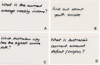
On a separate set of index cards, write your scenarios. For the ABS example, a scenario might be “What is the current weekly income?” or “Which Australian city has the highest crime rate?” On one corner of each card, write a letter (A, B, C, etc.) to represent the scenario.
Write a short description of each scenario you wish to test on an index card.
Running the evaluation
Arrange 10-15 minute sessions with each participant. How you make arrangements will vary depending on your audience, so I’ll leave it to you to figure out the best way. In an office situation, I sometimes let people know that I’ll be around at a particular time, and that I’ll come to talk with them. This saves people the worry of meeting me at an exact time.
The introduction
For each evaluation, take a minute or two to introduce the exercise, and let the participant know why you are doing it. Remind them that it will only take a short time, and give them any other background information they need. These few minutes give them a chance to settle, and can provide you with some initial feedback.
My usual intro goes:
“Hi, I’m Donna Maurer, and this is [my colleague], and we work for [my department]. I’m working on a project that involves making improvements to our website. I’ve done some research and have come up with a different way of grouping information. But before it is put onto the computer, I want to make sure that it makes sense for real people. I need about 15 minutes of your time to do an exercise. You don’t need any background information or special skills.”
(They usually laugh at the “real people” part and nod hesitantly at the end.)
“I’m going to ask you to tell me where you would look for some information. On these cards is a set of things that I know people currently look for on the website. I’ll ask you to read an activity; then I’ll show you a list. I want you to tell me where in the list you would look first to find the information.
“I’ll then show you some more cards that follow the one that you choose, and get you to tell me where you would look next. If it doesn’t look right, choose another, but we won’t do more than two choices. This isn’t a treasure hunt; it is me checking that I’ve put things in places that are sensible for you. Don’t worry if this sounds strange – once we have done one, you’ll see what I mean. And if there are tasks on those cards that you wouldn’t do or don’t make sense, just skip them.
“[My colleague] is going to take some notes as we go.”
They usually still look hesitant at this point. But don’t worry—they figure it out after the first card.
Presenting the scenarios
Put the top-level card on the table, and check that the participant is reading the first scenario. Ask, “Out of these choices, where would you look for that information?”
The participant points or tells you his choice. For that item, put the second-level card on the table. Ask, “Where would you look now?”
For each item the participant chooses, put the corresponding card on the table until you get to the lowest level of your classification.
Have your colleague write down the scenario ID and classification number. Then change the scenario card, pick up all the cards except the top level, and start again.
During a scenario, if a participant looks hesitant, ask him if he’d like to choose again. I only offer two choices at any level because I want to see where the person would look first, not get him to hunt through the classification endlessly. Record all the participant’s choices.
Do this for about 10 minutes, or until the participant seems tired. I usually get through 10-15 scenarios. Wrap up briefly: If you noticed something unusual or think the participant may have something more to add, talk about it. Don’t just stop and say goodbye—let the participant wind down. Thank the person, and then move on to the next participant. Start the scenarios where you left off in the previous session. If you start from the beginning every time, you may never get through all your scenarios.
You’ll probably want to practice this procedure a bit before you do your first real test. It takes a few tries to get the hang of presenting the cards and re-bundling them, particularly with a big classification.
Analysis
Record your results in a spreadsheet. In the first column of the spreadsheet, list the classification (by number or number and name). Across the top row, list the scenario IDs.
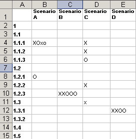 |
| Record the results of your sessions in a spreadsheet. Mark each response from the participants at the intersection of the scenario and the classification item. |
Mark the intersection of each scenario and the classification item selected by the participant. I usually use capital letters for first choices and lowercase letters for second choices. If I’m testing more than one group of participants, I use different letters for each group. (In the example below, I have used X and O to represent two different groups of participants.)
For scenarios or parts of the classification that work well, you will see clusters of responses. For instance, in Scenario B in the table above, the Xs and Os are in a cluster on item 1.2.3, indicating that all the participants chose that item. Assuming the choice is the one you wanted them to make, a cluster means that your classification works well in that scenario. In scenarios where the appropriate choice is less clear, people may look in a range of places (scenario C in the table), and the responses will be more spread out.
There will be some labels that participants consistently and confidently select, some that every participant ponders over, and some that no participant selects. Keep the first, consider the second, and ask questions about the third. Think about why some things worked well: Was it because of good labelling? Straightforward concepts? Similarity to an existing system? Think about why other things didn’t work: Was the scenario able to be interpreted in more than one way? Was there no obvious category to choose? Were there labels that people skipped entirely?
Don’t be afraid to revise and iterate your classification until you are happy with the results (actually, until the participants are happy with the results). Change labels and groupings, reword ambiguous scenarios, and ask further questions in the wrap-up. A bit of shuffling at this point is much easier than changing a navigator after implementation.
At the end of the evaluation, I usually write up a short report for the project team, which I also send out to the participants. This is a good chance to show them that you are doing something with their input, and maybe an opportunity to get some extra feedback.
Notes
A few other things to keep in mind:
One of the major benefits of this technique is its speed. Because it is fast and done on paper, you can:
- Get people to participate easily—even busy people can spare a few minutes.
- Get a lot of participants (which is necessary to show the clustering of responses).
- Cover many scenarios and much of the classification.
- Change the classification as you go or test alternatives on the fly. This is a good reason to write out the cards rather than type them—it makes them much easier to change. (You can see that I did this in the example above. The numbering system is not sequential.)
- Rerun the evaluation whenever you make changes.
With this method, not only do you see whether your classification will be successful, you gather valuable information about how people think. Some participants will race through the exercise, hardly giving you time to get the cards out. Some will ponder and consider all of the options. Some take the new classification at face value, while others think about where things may be in an existing scheme. Some learn the classification quickly and remember where they saw things previously. Take notes of participants’ comments—they are always useful.
One trick with this process is to get people comfortable quickly so they will perform well for the short time they participate. Pay attention to the non-verbal signals they give you, and adjust your introduction and pace for each participant. (For instance, this evaluation can work with vision-impaired participants, by reading the options to them.)
The wrap-up at the end is especially useful for getting additional feedback from participants. If I am having trouble with a label, I often ask what it means to them. If there is a section of the classification that they didn’t choose (which may be because it is a new concept), I explain what might be there and see how they respond.
Make sure your classification goes down to a fairly detailed level, not just broad categories. Even though you may tell participants that this isn’t an information-seeking exercise, people are pleased when they “find it.” For this reason, it is also worth starting with an “easy” scenario.
I have used this method mostly with internal audiences, where it is easy to get people to give you a few minutes. My experience with external audiences has only been with existing customers, but there are many ways to get other external participants. For example, you could run this evaluation as part of a focus group or product demonstration.
To date, the only criticism of this technique I’ve heard is that it just tests known-item searching (where users know what they are looking for), and that it doesn’t test unknown-item searches (where the user is looking for something less well-defined). But if you have figured out how to test unknown-item searching, please let me know!
So far, I’m pleased with the results of this technique. Getting a lot of feedback from many participants has proven to be amazingly useful, both for developing the best classification system for users, and getting the important people involved and interested.
![]()
In her spare time Donna tutors Human Computer Interaction at the University of Canberra, studies for a Masters in Internet Communication, and maintains a weblog, imaginatively called DonnaM, about IA, usability, and interaction design.
Hi, I just noticed that the first image, the one with the caption , is not pointing to the correct location, it should be http://www.boxesandarrows.com/files/banda/card_based_classification_evaluation/classification.jpg instead of http://www.boxesandarrows.com/archives/images/040703_card-based/classification.jpg
How could it be managed without scenario ? Advice please
Lateral – a historical note:
In 1975 I needed to index a large collection of resources. Different types (moves, photos, books, magazines, brochures, clippings) and a large number of topics. I devised a “card based” system and the project introduced me to taxonomy.
Does anyone remember COBOL card sorters? The system I used was almost as antique, yet captured the algorithmic essence of the matter: cards with holes punched along their edges, sorted by passing knitting needles through them. Rather elegant, it was … not fun to produce, not easy to maintain, but simple and something like fun for the user!
This is an excellent technique to uncover any possible issues with labelling or grouping. When it comes to intranets with large amounts of content it can be extremely challenging to get labels right (considering an organisations’ culture, politics etc). So it is always good to also test in the context of a visual interface as this can give additional clues as to what is in each section, aiding a users understanding.
Considering your question evaluating unknown-item searching, I guess that a way to evaluate this is to measure user satisfaction through formal usability testing. So, if in a design there are contextual links and references to also see… then, are users pleasantly surprised at stumbling upon something? Do they leave feeling that it is a really useful site and they learnt more than they expected?
Just a thought, although, not completely scientific or new.
Thanks for the great practical article. One thing that threw me a bit was this section “During a scenario, if a participant looks hesitant, ask him if he’d like to choose again. I only offer two choices at any level because I want to see where the person would look first, not get him to hunt through the classification endlessly.”
The first time I read it, I thought you meant you offered only two choices in the hierarchy, even if there were something like six. Now I’m thinking you mean, you only asked twice before moving on.
I’m wondering one other thing: what about one person running this card-based test? I know with usability testing, that is not ideal even for a discount style test, since so much is going on, but does it make more sense for this technique?
Yes, I mean that I only ask twice before moving on. Sorry for the confusion…
I think I could manage to do this with one person, but I have always been lucky and had someone to give me a hand. The tricky bit with doing it alone would be recording the scenario & choice and re-bundling the cards for the next scenario – this may break the flow of the discussion a bit (but probably not much). It would be tricky to note comments at the same time.
Donna,
Thanks for sharing this great technique! The examples were very helpful. The method seems to be a bit of a twist on a closed card sort — kind of a closed card sort mixed with a cognitive walkthrough.
It seems it would be very useful, especially with large taxonomies. A closed sort requires the participant to deal with lots of content examples, finding what category they’d put each into. Your technique is scenario based which is more natural – usually, most end users will use a hierarchy to find information rather than categorize content using it.
For more on cognitive walkthroughs, see:
Usability Evaluation with the Cognitive Walkthrough
http://www.acm.org/sigchi/chi95/proceedings/tutors/jr_bdy.htm
or
http://jthom.best.vwh.net/usability/cognitiv.htm
Very good read. Thank you.
Just yesterday I was in a meeting where we were talking about how to structure our usability testing so as to clarify the categorization issues from the UI issues–so your article is a bit of manna. We’re going to try this technique on a tricky section of our site that we’re re-organizing. I particularly like that you include your insights on ANALYZING the data, something that you don’t always see in card-sorting related articles.
This is a very innovative idea! I like how this method is similiar to user testing because you get to watch a user perform a task and listen to their feedback (I assume you encourage the user to think out loud).
I think this may be better than card-sorting. Lyle makes an excellent point that this exercise is natural to a user. It seems more realistic than telling a user to sort a pile of cards (something they normally don’t do online or offline).
It also seems like this method is much more applicable than card-sorting. I’ve found that card-sorting really requires a larger-scale site with lots of content. I assume this method could be used on small or large sites as long as they’re are at least two levels “deep”, right?
I hope to implement this new method soon. Again, very innovative method and a good article.
Thanks for all of the nice comments.
Kyle – you are correct – the method could be used on anything at least 2 levels deep, and I do get people to think out loud.
Actually I sometimes do something similar informally for just top-level stuff as well – when someone asks me where I would put something, I give them a related scenario and ask where they would look. Answers their own question usually.
hi donna
this was an extremely useful article indeed! i work as an analyst programmer, who also gets to do some usability/IA type work if i push hard enough *grin*
we are currently in the process of providing a category browsing interface for our company’s knowledge base, and after having done an open card-sort exercise to assist with initial grouping ideas, we are now testing our proposed taxonomy/hierarchy using your method.
it seems to be working very well (and users certainly enjoy participating), though i do have one question..
the ‘by eye’ method of analysis as outlined in your example seems to work well with smaller numbers of scenarios, but the set we’re currently using has 50-odd cards to be sorted. i’ve tried to keep the number to a minimum, but we have a very wide range of categories and subjects to be validated.
is there any automated analysis method / software that you or anyone else might be able to recommend? for the open card-sort testing we used ezsort, which worked well, but it’s not applicable to ‘known item’ exercises such as this.
or is it the case that we’re just using too many scenarios for this method?
any feedback gratefully received, we’re still relatively new at this and eager to learn more ;o)
cheers,
chris
I have done ‘by eye’ analysis on a hierarchy with 300 items and 100 scenarios (gosh that was interesting).
I still used the spreadsheet as described in the article, printed it out, stuck it together and looked at it on a big desk (or on the floor!). It would be worth probably shading alternate rows so you can follow a row or column across.
I’m very visual, so this works well for me. Let me know if it doesn’t work for you, and I’ll see if I can think of another way to do it
cheers for the prompt reply, donna!
thanks for the reassurance – i’d started putting together our first 3 or 4 results in exactly the way you describe, and if it’s good enough for the ‘inventor’, hey, it’s good enough for me *grin*
having thought back over this since posting yesterday, i think it’s probably the best way to go anyway, since having to do it ‘by eye’ forces you to think properly about the implications of the results, rather than relying upon some bit o’ software to spew out answers.
as an aside, one of our database guys (who also dabbles in usability stuff) is going to have a look and see if he can come up with something that could either
1. give us some assistance
or
2. give us some numbers (however meaningless) that we can throw at ROI-obsessed managers!
if we do get anything useful, i’ll post back up here. i guess i wasn’t 100% clear when i posted (at least, not when i read it back) – it’s not so much “magic analysis” i was looking for as just some kind of correlation analysis to give us a concrete figure for ‘confidence’.
hmmm – when i read that paragraph back, i’m not sure that’s clear either – curse the limitations of the written medium!
having just run through the first few users, this method still seems to work great – we’re getting several in next friday for an all day session of testing and usability work, and will be including this evaluation.
it’s pretty exciting stuff to be doing at last – our company (and especially our development dept) is pretty backwards when it comes to user testing, so it’s nice to be able to get some done after months of bitchin’ and moaning at managers!
cheers,
chris