Information Architecture “Making Connections”
March 21-23, 2003 Portland, OR
Introduction: Friday, March 21
|
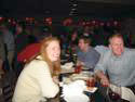
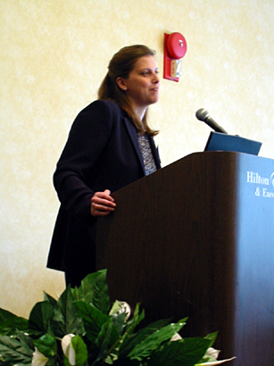
| IAs attend the AIFIA hosted cocktail on Friday evening. Top image: Brenda Janish and Dave Robins. Bottom image: Rashmi Sinha. Photos: Erin Malone |
Spring is in the air and 400 +/- IAs are gathered together for networking, knowledge sharing, drinking, schmoozing, eating and drinking. It must be the annual ASIST IA Summit. Held in Portland, Oregon this year, the summit was well attended and seemed to be just what the doctor ordered. Despite the beginning of a war and major roads shut down by war protesters, folks managed to gather from across the country and the world to rub elbows with their own kind—just the thing for a conference with the theme “Making Connections.” As Richard Hill commented, “I came here to escape from the war—this is my reality,” a sentiment seemingly held by many attendees.
As usual, the summit began with a host of pre-conference workshops and seminars. Despite a few that were cancelled, the overall attendance seemed to mirror past years. Many attendees arrived early just to be able to shop at the well-known Portland mecca, Powells. In fact, this author ran into more IAs at Powells than any other downtown place during the conference. (We IAs do seem to love our books.)
The traditional cocktail hour on Friday evening was abuzz with stories about war protests and excitement over the next two days of events. Old friends greeting each other and as usual a lot of new faces to match the friendships already formed online through the lists and blogs. The evening was capped off with many smaller groups peeling off around the city for group dinners and the AIFIA (Asilomar Institute of Information Architecture) hosting a members gathering in the hotel bar.
Saturday, March 22
Keynote: Stewart Brand
or five years,
whichever comes first.”
—Jeff Rothenberg
Brand spoke to us of the similarities between architecture—structure—and information spaces. He shared several illustrations from How Buildings Learn, to make the point that well-crafted structures adapt and evolve over time and that structures designed as “art” fail in the long run because of their inability to evolve. This point then led into the concepts of layers of change and pace layers.
“Learning (fast) plus continuity (slow) equals robustness and adaptivity.”
Brand closed his presentation with a discussion of the Rosetta Project and its associated website.
All in all, Brand was entertaining and very thought provoking. The topics he discussed apply to Information Architecture or are metaphors for the way we need to design and think about the information systems we are working with every day. He was open to a variety of questions and often responded to a question with another question for the audience to ponder.
Sites discussed:
http://www.longnow.org
http://www.longbets.org
http://www.rosettaproject.org/
—Erin Malone
Information Architecture, and People
Fu-Tien Chiou
Fu-Tien Chou, as the first session of the conference, began at the foundation: with an overview of traditional architecture, site planning, and information. He set out with a critical analysis of the comparisons between traditional practices and information architecture.
In traditional architecture, standards such as construction and occupancy types dictate much of how an architect can construct a building. They must also be designed for flexibility. Buildings have regulations one must follow to ensure life safety, although they may or may not advocate design. Despite the regulations, there are structures that make statements (e.g., museums) and that tell a story (e.g., monuments).
What, then, might this tell us about information architecture online? It, too, has construction types (e.g., site must be static or dynamic), has purpose (e.g., personal, non-profit, education), and can be designed for flexibility (e.g., transactional, content-oriented, expressive).
With a building, one can distinguish recognizable physical elements. We can name parts such as a wall, window, and door. However, buildings can also be designed so that these elements cannot be distinguished from one another. This kind of design also has a purpose, even though it may not fall into our categorization system.
 |
| Fu-Tien Chiou. Photo by Mike Lee. |
What implication does this have for the web? We also have recognizable elements. Chiou compared a site’s:
- Page to a Room
- Link to a Door
- Label to a Sign
All of these elements make sense in context. But what if we look at the elements from a different point of view? Chiou showed us the Taj Mahal as an example. By viewing its silhouette, the audience was able to identify the structure (overall view). A closer looked revealed the entrance (full view). Zooming into the door, we saw the door in context (human scale).
More complex sites that must be scalable and customizable are forcing us into more of a planning role. “We no longer design sites, we plan sites.” Chiou emphasized that the traditional architects are not the builders. IAs can learn from this coordinator role; many of our tasks in the process might be the same. Traditional architects assume the following roles:
- Know the user/client contact
- Have multiple checkpoints and receive sign off on a design
- Design before building
- Document
- Test before putting together
Chiou challenged us to think about “how one makes a space, a place.” He defined place as “a space with character.” Our task then, as IAs, is to create meaningful spaces. Overall, he urged us not to get information from just one source—it is all connected.
—Liz Danzico
Wayfinding and Navigation in Digital Spaces: Panel
Moderated by Rashmi Sinha, with a panel of Mark Bernstein, Susan Campbell and Andrew Dillion
Susan’s position was almost in direct opposition, that structure is the experience, and that architectural metaphor should be used to guide design. She discussed different design methods (rule-based, patterns, and building blocks) and how these methods relate to different IA examples. Her message: Structure communicates meaning.
Andrew, on the other hand, was uncomfortable with metaphors, and questioned most IA’s complete obsession with navigation (which leads to the similarity of so many sites.) The missing link: semantics. His argument: information is about so much more than space, it’s about meaning, value, and imagery. It has a shape.
The audience responded to these provocative comments with many discussion points: We have inadequate tools to describe complicated experiences. Why is semantics being ignored (and is it)? We still struggle with dimensions. We talk about navigating when we mean understanding. Of course, time ran out while the panel was responding to these points.
Notes from the panel: http://www.rashmisinha.com/talks/navpanel/
—Dorelle Rabinowitz
Model of Attraction: Providing a Central Framework to Think About Information
Thomas Vander Wal
In this session, Thomas Vander Wal presented a framework he developed that describes the relationship of information to users, which he has named the “Model of Attraction” (MoA). He believes the framework provides an accessible way for people to understand the relationship between users and information, as well as going beyond just understanding the process of finding information (which IAs tend to focus on) to what users do with the information once they find it, and how they get the information to follow them.
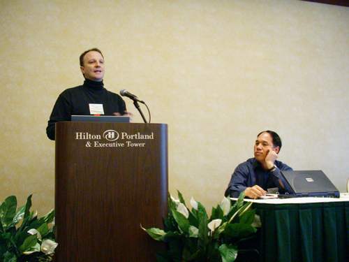 |
| Thomas Vander Wal at the podium. Fu-Tien Chiou looks on. Photo by Mike Lee |
He then discussed other metaphors used to describe users and information, namely “navigation is broken” and “information foraging,” both of which he believes have shortcomings when it comes to users retaining and storing information, and users getting information to follow them. He went into detail about the four phases of attraction: seeking information; recognizing information; retaining/storing information; and following (the user’s access to the information after they have found it), as well as attraction receptors: intellectual/cognitive, perceptual/sensory, mechanical/digital, and physical (how are people using this information in the physical world?).
Thomas pointed out that understanding attraction also requires understanding repulsion—essentially, repulsion of unwanted information also helps users find what they seek. The remainder of his talk covered more detailed aspects of the MoA, too detailed to cover here, and I highly recommend learning more at his site: http://www.vanderwal.net/essays/moa/030322/.
—Brenda Janish
The Sociobiology of Information Architecture
Alex Wright
In this entertaining and interesting talk, Alex Wright went all the way back to the beginning of life—to Eukaryotes— to begin to draw parallels and lessons for information architects. The talk was not so much about IA, per se, as it was a look at the evolution of nature and the way information has been shared between organisms and beings over the course of the world’s history. Alex drew parallels for IA from the hive minds of ants and bees as well as the social communities of schools of fish.
 |
| Alex Wright explains how sociobiology is relevant to IA. Photo by Erin Malone. |
He spent time looking back at early humans and how we have shared and disseminated knowledge via hierarchies and social networks. His survey across these various systems was an interesting overview of how these systems can work and how each one is built on the lessons of what came previously. He made a few predictions for the future based on the past—distributed syntax and the creation of personal information architectures.
The full set of slides can be reviewed at his site: http://www.agwright.com/presentations/asis/wright_asis_032203_files/frame.htm.
—Erin Malone
The Psychology of Information Architecture
Jason Withrow
Jason Withrow followed the Sociobiology of IA with a look at what IAs can learn from psychology. Understanding simple concepts from the field of psychology and the way people think can help an IA create a more powerful site. In addition, Jason specifically offered examples of where psychology research has been misapplied in the field of web design, such as the 7 +/- 2 rule that often is cited as a rule for limiting the number of items in navigation. He pointed out that this research originally applied to the amount of numbers that humans can hold in their short term memory when asked to recall. This clearly is not the same as a page with a series of navigation links. There is no need for short term memory here—the navigation is persistent.
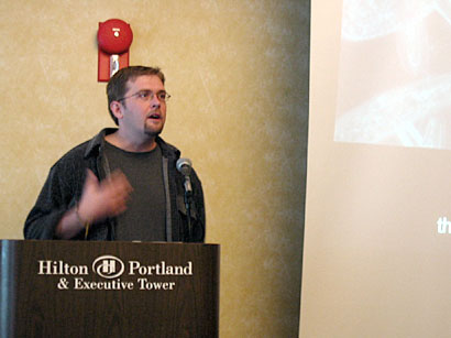
 |
| Jason Withrow discusses the specific psychology concepts that IAs should understand. Photo by Erin Malone. |
Jason discussed the following concepts in more detail:
- Memory: He pointed out the misapplication of the navigation model rule and then talked about cases where memory does matter, such as deep within sites where the navigation is local to an area. In this case, other cues are helpful: breadcrumbs, color coding, top level heading, and page titles were just some examples given.
- Mental Categories: The ways people group items. Specifically, Jason discussed:
- Template matching: Some sort of perfect representation of an item which is then compare to everything else to see if it matches
- Prototype matching: When a person has an idealized representation, it doesn’t match perfectly but is close enough
- Transference: How learned behavior in one situation is transferred and applied to other, similar situations
Understanding these concepts and deciding when and how to apply them, or not, can help make a site more learnable and, in turn, more usable to more people.
—Erin Malone
Designing a Usable Intranet for Wachovia Bank
Kathleen Meter
The Wachovia intranet redesign was a huge challenge for Kathleen Meter. Wachovia, a financial services company with 20,000 employees, had merged with First Union, adding 60,000 employees. There was a huge need for improved communication across the entire new organization. Kathleen faced many trials, from 85,000 employees with different (and often competing) priorities, to major time constraints. The first part of the two-phased project combined both firms’ legacy intranets into one interim site, and then into the final design. Phase two (currently in progress) involves migrating over 400 intranets onto the new platform. To design this intranet, she used heuristic evaluations and content inventories, which led to brainstorming sessions, after which schematics were prepared, surveys were done, and usability testing was performed.
 |
| Kathleen Meter. Photo by Mike Lee |
Kathleen is currently in the middle of phase two, migrating existing intranets to the new look and feel, which presents a whole bunch of fresh challenges: Who goes first, who’s ready to go first, and what content should be migrated. Her approach was to create a process to engage participants and make them partners. Using templates and a style guide, the migrating sites are allowed flexibility of content, while standardizing the look and feel. Kathleen’s overall challenges are time, resources, and support, and they are still evolving.
—Dorelle Rabinowitz
![]()
Wachovia.com Redesign Project
Samantha Bailey
 |
| Samantha Bailey. Photo by Erin Malone |
Redesigning the Wachovia internet site fell to Samantha Bailey. Her task, to merge two robust branded websites while maintaining channel parity and minimizing customer impact. Her team took 3 months to decide how to proceed; and even though the merger was completed on paper, in reality it took far longer internally. Changes to the status quo were almost guaranteed to make someone unhappy. Samantha discussed her planning options, her solution, and told an engaging story about the battle for the homepage, which was eagerly discussed in the audience as well.
Her team benefited from Wachovia’s leadership support, which helped drive their user-centered design process, but Samantha was honest, declaring that IA is the art of compromise, and she wonders whether the redesigned site is truly user-centered. Lessons learned: Top down buy-in is of critical importance.
—Dorelle Rabinowitz
Using Personas and Scenarios to Guide the Ford.com Site Redesign
Dai Pham
More often than we’d like to admit, personas are used only at the start of a project. But how often are they actively used throughout the site development process? Dai Pham of SBI/Razorfish showed us not only how to inform the planning and information architecture phases, but how to carry the personas through the content strategy, design, and testing phases as well.
The Ford team created three personas in all: A primary and two secondary. The primary represented the audience segment that was most difficult to design for. This primary persona drives the design, since, by designing for the most difficult, the team could meet the needs of the secondary personas as well.
While the user research and information architecture teams created what IAs know as personas, the team began involving the content and design teams. The designer created a kind of persona “mood board:” a visual representation that embodied the characteristics of the personas. Meanwhile, the writer got involved by developing content directions that corresponded to each persona. Further, the designer mapped color palettes to each persona to show how color could mirror the characteristics of one over another, and how they could be combined. Since the team had worked with Forrester at the start of the progress, they mapped the final personas against the client’s key metrics to show how the personas were supporting the metrics. Finally, the team used the personas to screen participants for usability testing. During testing, they could gear questions to the individual characteristics to ensure that the final product met the needs of the audiences they intended to reach.
This rich overview left the group with practical tools for integrating personas into the entire site development process.
—Liz Danzico
Ontology Development and Relationship Modeling for Enterprises and Enterprise Websites
Brett Lider
Brett Lider “gets jazzed about waking up ontologies and vocabularies.” To demonstrate how a well modeled and tagged content in a CMS sytem could pump custom content tailored to specific audiences, he walked us through some scenarios with fictitious car company GoMobile.
Diagrams were used to display how different car models and available options could be associated by geography. That’s to say that a specific European model might only have the option for a modest stereo and small wheels, while the North American version could also come with sporty wheels and the boom boom system. The pages served up would reflect available options while suppressing those that weren’t.
But, he cautions that these industrial strength systems are best suited for organizations with deep pockets for deployment and maintenance costs. But, knowing the underlying concepts is still valuable because they can be applied to smaller systems.
—Seth Gordon
Content Analysis and Modeling for BBCi
Margaret Hanley
 |
| Margaret Hanley. Photo by Erin Malone |
Margaret Hanley’s presentation provided a great foundation in describing the process and deliverables for content modeling. The context of her content modeling was the BBC’s regional websites. Her group was tasked to expand access to content easily and to streamline sharing inside and outside of the
BBC. The problem was that many of the content creators were fixated on playing with the html tables and not really on developing content. They were looking into establishing a workflow process and even finding ways to leverage assets that BBC already owned such as video, images and audio.
In order to get a handle on the type and amount of content they had, they established a process that included a site audit, content inventory, content audit, content modeling, and classification scheme analysis. The deliverables from these processes gave them some insights on the context, structures, metadata, and understanding of existing controlled vocabularies. From there they were able to conduct some content modeling and establish a metadata framework that would cover all their content assets. The content then was converted into data models which became the framework for their content management system.
The outcome is that they have a system that includes content objects which are put together to create collections, and templates display the collections with appropriate logic behind them when published. The project provided them the flexibility to reuse content across the network, freed up time of writers to develop more content, and also gave them a mechanism for managing the context of materials they have in a fast and orderly manner.
—Lisa Chan
Content Modeling and Analysis for EastEnders
Celia Romaniuk
There were several factors in the motivation to do content modeling. These factors included a redesign of the visuals, brand, and navigation, the need to transition to a content management system, a system of controlled vocabularies and relationship modeling. Using the “friend of a friend” (FOAF) model, she began to study the relationships among the characters by using RDF (resource description framework). By having a series of “classes” that utilized relationships, content creation and maintenance would be easier. The current workflow process was based on an episode date database, the personal memory of writers, and various volunteers who were available to answer questions. For example for one radio series they used index cards to track the plot lines of the series.
The goal was to change the information in the character profiles automatically and to answer audience questions using RDF. The RDF would give them the ability to manage timelines and events and provide content creators the opportunities to develop content features based on the RDF. By identifying relationships using a grammar of noun, verb, object, a content creator could formulate a complex matrix of relationships, plots, and events in the lives of those in the soap opera.
Celia’s method included content indexing, search log analysis, ontology research, and collaboration. She examined the components of the storyline to get an idea of storyline structures to aid in the RDF development. She explained that her next steps were to actually develop the framework for sharing and to see if her model could be repurposed for other soaps.
—Lisa Chan
Jared Spool
Jared Spool’s discussion began with his statement that there are seven types of navigation pages, and that we would only discuss 5. He then demonstrated how difficult it can be to find specific information on the web, and what a negative experience it can be. But, he says, there is hope! There are different types of successful pages and predictive user behaviors that we can design for.
Jared went on to describe content pages, galleries, trigger words and how the back button is “the button of doom.” He also explained how successful pages use descriptive links and details to guide users in their selection or path. He gave amusing positive and negative examples, and explained his interview-based design methods: first he interviews testers and finds out what interests them. Then, a test is designed around those interests. This method is in direct contrast to typical user testing, which he referred to as Leo DeCaprio tasks, or asking someone who knows absolutely nothing about a subject to describe the first new thing they learned.
Jared’s research proves that we can learn more from involved users, and he gave a list of links for anyone that was interested further.
—Dorelle Rabinowitz
Tools for IA: Panel
Moderated by Nick Finck with panel discussion by Madonnalisa Chan, Bob Boiko and Andrew Hinton
You might expect that a panel discussion about IA be focused on differing opinions about improved Visio features. The panel at the Summit, however, surprised everyone by presenting us with a different view of IA Tools.
With Nick Finck moderating, the three panelists set out to present tools from different areas of expertise:
- Madonnalisa Chan: Search
- Bob Boiko: Database Design
- Andrew Hinton: Presentation of IA
Each panelist discussed tools that they use not only to create the information architecture deliverables, but also to inform the decision to start a new project. Query analysis tools, for example, could be used by an information architect to identify symptoms of a larger issue – either with the search engine or the presentation of results. Another tool, perhaps a wireframing tool, could be used to present the solution to the client or business owner.
—Liz Danzico
The Accidental Thesaurus: Enhancing Search Precision through Manual-Selected “Best Bets”
Richard Wiggins
Many users use search engines to find starting points on a site. But the general results a search engine returns are often not what a user needs or wants. Part of this is due to the fact that search engines can’t tell the difference between new content and archived or leaf pages and starting points. This is complicated by the fact that users enter the query terms they think of, not the labels on the site, expect official sites to be at the top of results lists, have complete coverage of a site, and expect disambiguation. To help, Richard Wiggins of Michigan State University suggests a registered keywords approach he calls the “accidental thesaurus.”
To create an accidental thesaurus, first review your search logs to find the most popular search phrases. Plot your queries and you will get a Zipf distribution, showing that a small number of unique searches accounts for a large number of all searches performed. Enter the most popular searches into a database and match each phrase to “the best” URL. A database with only 1000 entries can assist users with 50% of their searches. At MSU they manage this database via a web interface. When the user searches, first the keyword database is queried, then the search engine. The results are presented together on the same page, with the hand picked results at the top. This improves both end-user and content provider satisfaction. Any non-trivial site can benefit from this technique.
—Chiara Fox
Designing the Right Search Interface for your Users
Whitney Quesenbery
Through usability testing with health information sites, Whitney Quesenbery discovered that some search usability problems have nothing to do with the search engine itself. Users often have trouble formulating their query. They know what they want but cannot find the words to express it. The location of the search box in the site design can impact if users can even find search. Users may have exact locations where they expect to find the search box. The search results page also greatly influences a searcher’s success. Placing the search again box above results may “hide” the results and users may not realize they are there. The results must include enough information (such as headlines or titles and abstracts) so users can decide which results will meet their need. Options to refine search are often ignored.
There are three key search personas. There is the InfoSeeker, who needs help getting started. They are primarily a browser, but will search if frustrated. They need good links to get them to what they need. The Gatherer wants new details, not the same old information. They need good launch points and a search that narrows from there. The Hunter is an “advanced” searcher, and knows specifically what they are looking for. They need a good search with professional results. Depending upon the type of user, the search should look and behave differently. The search also has to match the type of site. On a site focused on a single, narrow topic, with a single primary audience, the search helps to locate specific, detailed topics. A deep site with a single, broader topic may have several audiences. The search here aids in navigation by exposing all of the site content on a specific topic, cutting across the site hierarchy. A broad site, with multiple topics or sub-sites, will often have many audiences. Search narrows the collection to a section of the site. Search makes the connections between sections or topics on the site.
—Chiara Fox
Tax Services’ Public Website in the Netherlands
Sanne Peek
Sanne Peek of Informaat, a Dutch Internet consulting firm, presented a case study for a search interface on the Dutch Tax Service Web site. Peek explained that in the design, they used three different techniques to address the needs of two different audiences. The audiences – individuals and business – approach the site with a variety of tax-related questions, but the real difference between the two is timing: individuals tend to need tax information only twice a year while businesses need it throughout. This distinction became a key factor in their search design.
Informaat employed three approaches to support users in their search for tax information. In the search algorithm, the first approach, they prioritized different information depending on the time of year. With this technique, they were able to address the different needs of individuals and businesses. During certain times of the year, users asking questions about individual tax returns were far greater than those asking about business. The second approach called for integrating the call center and the content management system, to allow quick updates to FAQs. They also created a page of top ten FAQs, which was again driving by the time of year. Lastly, Informaat developed several “alternative” methods for finding tax information, which included “best bets” generated when search terms were not found, and an index of frequently used keywords.
Peek then entertained questions from the audience. When asked why the site didn’t ask users to self-identify on the opening pages as either individual or business, she explained that in many cases, people do not know whether they should be filing as an individual or as a business.
—Dan Brown
Representing Many Voices: Challenges in Government Site Design
Anne Galloway
Anne Galloway presented a case study of a site she worked on for the Canadian government. Galloway presented her experience as an anthropologist and ethnographer in working with a diverse group of users. She was asked to design a community site for the Social Sciences and Humanities Research Council of Canada. Galloway had to build a site to support the collaboration and interaction between program officers, stakeholders from the public and researchers. From an ethnographer’s point of view, the greatest challenge is the vast cultural gaps between these distinct user groups. Given that arranging cross-functional meetings was inconvenient, Galloway instead represented absent voices at her sessions. At any given meeting, she had to balance the needs of the participants with stakeholders who were not there. The site is currently in the prototype stage and is due to launch later this year.
Paper that the presentation came from: Representing Many Voices: Challenges in Government Site Design
Powerpoint slides
—Dan Brown
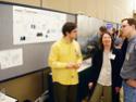
Posters
Saturday night’s poster session was varied and deep with the types of posters presented.
 |
 |
 |
 |
 |
| Posters from the top: James Spahr with Brett Lider, Dan Brown, ChiFoo magnetic poetry, viewing the posters, Kim Prater. All photos by Mike Lee. |
Jenny Fry and Chang Su presented “Methodological challenges in Information Architecture: Adventures in re-indexing federal statistical websites” (http://ils.unc.edu/govstat/papers.html). A journey through top down and bottom up approaches which ultimately led them to use an integrated approach.
Pren Lee showcased her work to rework the information architecture of the University of Texas Law School’s student portal. (http://utdirect.utexas.edu/law/students.WBX). The changes are subtle but significant and Pren presented her work with a stack of research to back it up.
Heidi Adkisson gathered statistics on the locations of various e-commerce page elements from 75 sites and produced a series of visuals to showing their most common locations. (http://www.hpadkisson.com/papers/asis_poster_small.pdf). One particularly beautiful area of her poster was the scatter plots that showed where functions like ‘search’ and ‘view cart’ are most commonly located.
Grete Pasch presented: Fast, Cheap and in control: Managing metadata for streaming media. She spoke about how the Universidad Francisco Marroquin is managing streaming media of classes and guest lecturers.
Aaron Louie‘s poster was a dense and through review of facilated classification as it relates to Information Architecture. (http://students.washington.edu/ajlouie/IASummit-Poster-Louie.pdf). Thankfully Aaron has made a PDF of this text heavy poster available online.
James Spahr was insane enough to try to map every single peice of traffic that occured within a site over a 2 year span. (http://www.designweenie.com/images/Spahr-IA_Summit_ApacheMaps.pdf). The poster is a hypnotic, cryptic and dizzying visual.
Washington DC area IA’s (Dan Brown, Stacy Surla, Meg Cole, and Marcy Katz) poster: ‘Making Connections’ is a wonderful diagram that mapped the various levels of activity in their local IA community.
Kim Prater‘s poster was on wayfinding on the web. Specifically on how users construct mental models of sites and how search processes effect these mental models.
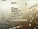
Member’s of the Computer-Human Interaction Forum of Oregon (http://www.acm.org/chapters/chifoo/) made magnetic poetry out of a statistical analysis of the SIGIA-L list. Hilarious. If you missed the poster session, you missed out on the poster that came closest to being a brilliant piece of art. (Although James Spahr had many people ask him for framed copies of his map, he thinks the magnet poetry was a much cooler poster.)
—James Spahr
Information Overload: A Love Story
Thom Haller
Thom Haller ushered in a first for the IA Summits. He delivered a prototype performance piece, a comedic monologue with slides and props that focused on the pressure of finding appropriate labels for oneself in a world overflowing with information and demanding standardization.
 |
| Thom Haller. Photo by Mike Lee. |
Thom set the stage by drawing on the code instilled in him by his early days as a Boy Scout. He then took us through his transformation as a gay youth and his search asa student whose opportunities followed the corridor of interstate 75 from West Virginia to places north. He reviewed the highlights of his career seeking labels for what he did and desperately trying to avoid life in a mauve cubicle.
Family photos projected on a hugescreen brought the past into a cinematic present. Throughout the performance he reenacted his torment by manhandling a Play Dough brain he molded and then sliced into warring halves. He “danced” through a sense of places using Hoola Hoops and then wore them as oversized label jewelry dominating his presence.
Thom closed by sharing his current label as an information designer, playing out that role in our nation’s capital– a place far way from I-75. We laughed, we cried, we enjoyed. An audience of about 50 people immersed themselves in the information space that Thom created. We came away caring about how labels affected one of our own, and we were reminded by his performance that Information Architecture is a compositional art with a domain much larger than the Web.
—Brian Arbogast de Hubert-Miller
Part 2: Sunday
- Mike Lee’s photos from the Summit
- Views of Portland: Erin Malone
- Friday evening cocktails: Erin Malone
- Saturday Sessions: Erin Malone
- Sunday Sessions: Erin Malone
- Victor Lombardi’s Photos
- Thomas Vander Wal Photos 1 and Photos 2
- Christina Wodtke’s photos
- Lisa Chan’s photos
Other Summit Summaries & Thoughts:
- Summit Blog setup by Adam Greenfield and Joshua Ellis
- Lou Rosenfeld
- Victor Lombardi
- Thomas Vander Wal
- James Spahr
- Anne Galloway
- Mark Bernstein
- Lieke van der Meer
- Amy Lee
- Mike Lee
- Adam Greenfield
- Tanya Rabourn’s notes
Summit Notes/Presos/Posters:
- Collected Summit presentations at ASIST
- Long Now Foundation
- Long Bets
- Rosetta Project
- Wayfinding and Navigation in digital spaces
- Model of Attraction
- Sociobiology of Information Architecture
- James Spahr’s poster (PDF)
- Representing Many Voices: Challenges in Government Site Design
Powerpoint slides - http://www.icdlbooks.org/adults/adult_info.html
Brian Arbogast de Hubert-Miller is the Information Architect for the School of Information Studies at The Florida State University. He is also a full-time member of the faculty and specializes in information architecture theory, experiential learning, and professional practice.
Dan Brown has been practicing information architecture and user experience design since 1994. Through his work, he has improved enterprise communications for Fortune 500 clients, including US Airways, Fannie Mae, First USA, British Telecom, Special Olympics, AOL, and the World Bank.
Madonnalisa Gonzales-Chan aka. Lisa Chan wrangles the volunteers for Boxes & Arrows. During the day she is Metadata Services Manager at Stanford Graduate School of Business.
Liz Danzico is a Product Manager of Search and Browse at BN.com and teaches Interface Design at the Fashion Institute of Technology. Liz has a B.A. in English from Penn State and an M.A. in Professional Writing from Carnegie Mellon. She is a copy editor at Boxes and Arrows.
Chiara Fox is the Senior Information Architect in PeopleSoft’s web department. Before joining PeopleSoft, Chiara was an Information Architect at the pioneering consultancy Argus Associates.
Seth Gordon uses his understanding of user research and IA to improve user experiences and solve business problems. He has recently completed consulting projects for the Nielsen Norman Group and Razorfish. Visit him at www.gordy.com, where there isn’t a drop of content about user experience.
Brenda Janish an editor for Boxes and Arrows, is an information architect at iLeo in Chicago where she has helped design consumer-facing sites for clients including Kellogg’s, Procter & Gamble, McDonald’s, and the U.S. Army.
Jeff Lash is a Usability Specialist and Information Architect at MasterCard International and writes the IAnything Goes column for Digital Web Magazine. His personal web site jefflash.com proudly has no IA-related information.
Erin Malone is currently a Product Design Director at AOL (America Online). She has been a practicing interaction, interface and information designer since 1993. She is editor in chief of Boxes and Arrows.
Dorelle Rabinowitz has over 15 years experience working as an information architect, designer, producer, and a storyteller in new and old media. She’s been at SBI and Company (formerly Scient) for three years as a lead information architect.
James A. Spahr works as a designer and programmer for Designframe Incorporated. His design work has been showcased in Graphis Books and in ID Magazine. He teaches undergraduate Information Architecture and Graphic Design at Pratt Institute.
Peter Van Dijck is a Belgian information architect who specializes in metadata and international information architecture. He is the author of a book called “Information Architecture for visual designers” that will be published in September 2003. His site is http://petervandijck.net.