Have you ever wished your early design mockups could come to life, so you could try out the navigation, test an interaction, or see if a button label just feels right when you click on it?
Sure, you could invest in a dedicated prototyping tool, but you can create surprisingly quick and effective prototypes with a software program that’s probably sitting on your hard drive right now. It’s PowerPoint—and no, I am not kidding.
I’ve met many designers who use PowerPoint for blocking out screens without ever discovering the interactive features for creating hyperlinks, buttons, and dynamic mouseover effects. Yes, PowerPoint can do all that. When I show people an interactive PowerPoint prototype, someone inevitably asks what I created it in. The reaction is always the same: “PowerPoint can do that?”
Overview
To see what PowerPoint can do, here’s a sample interactive prototype created in Microsoft Office PowerPoint 2003 for Windows. (Important: View the document in slideshow mode to see the interactivity. Links and orange buttons are clickable.)
Though there are other prototyping tools out there, here are the main reasons I lean toward PowerPoint:
-
It’s fast. You can try something, hate it, and try something else—all in a matter of minutes.
-
It’s low-fidelity. A PowerPoint mockup doesn’t try to look exactly like the final product, so it’s easy to work on high-level design issues and not get bogged down in details like colors or exact text. I also like being able to jot down notes in the margins of an early design, which I’ve never found a good way of doing in HTML or Flash.
-
Everyone has it. One of the great things about PowerPoint is that the people on your team usually have it. You can easily email a PowerPoint prototype to people for review and feedback.
Basic Interactivity
To begin, create a simple PowerPoint mockup, each slide depicting a separate screen in your site or application. You can use shapes, text, and clipart to populate the screens. I like to leave a little space in the margins for notes and half-baked ideas.
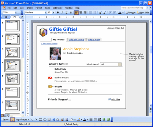
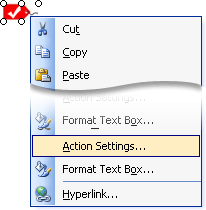
Once your basic mockup is in place, you can add hyperlinks to text, shapes, or images. The links won’t be active in regular working mode; in slide show view, clicking on a linked object will go to a specific target screen.
Ready to give it a try? Let’s take a look at how to do it.
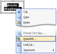
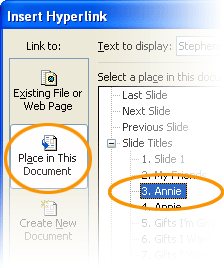
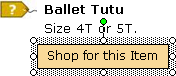
Hyperlinking Text
|
 |
|
 |
|
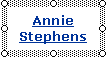 |
Hint: PowerPoint automatically applies a style to text links, but only if you apply the hyperlink to the text itself, not the box around the text. You’ll probably want to change the default sea-foam green color. Here’s how:
- Open the “Slide Design” panel from the Format menu
- Click on “Color Schemes”
- Click on the “Edit Color Schemes” option, which appears at the bottom of the screen.
Two settings control the color of links: The “Accent and hyperlink” color (for active links) and the “Accented and followed hyperlink” color (for visited links).
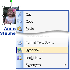
Creating Buttons and Hyperlinked Images
Follow the same basic process to create buttons and images that link to other screens.
|
 |
|
 |
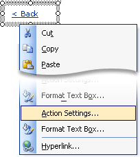
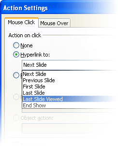
Simulating the Back Button
PowerPoint has a “back” control, but it steps back to the previous slide in the presentation. With hyperlinks, this may not be the slide the user just viewed.
If you want a back button that lets the user get back to the screen he came from, you’ll need to build it yourself. Here’s how:
|
 |
|
 |
|
 |
Hint: Even without a back button, you can go back in slideshow mode by right-clicking anywhere on a slide and selecting “Last Viewed.” However, keep in mind that other people who click through your prototype might not know this.
Advanced Interactivity
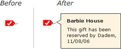
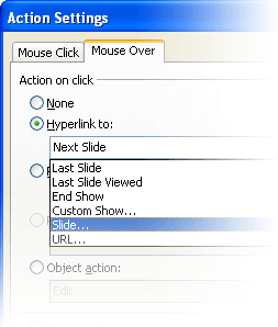
PowerPoint can go beyond basic hyperlinks and simulate dynamic behavior, such as mouseover effects for a Rich Internet Application.
Creating Mouseover Effects
|
 |
|
 |
|
 |
|
 |
Now, in slide show view, mousing over the item you selected will switch to the target slide: the one that shows the “after” mouseover effect.
Hint: There’s no “mouse out” effect in PowerPoint. The best way I’ve found to simulate it is a bit clunky, but it gets the job done:
- On the “After” slide, draw some boxes around the item you want to apply the mouse-out effect to.
- Apply a mouseover action to the boxes around the object. (For example, if you want to return to the previous slide when you mouse off an item, give the boxes around the item a mouseover effect that returns to the previous slide.)
- Make the surrounding boxes transparent.
Mouseover behaviors can get out of control quickly in PowerPoint. This is partly because creating the mouse-out behavior is awkward, and partly because you need to create “after” screens for each individual mouseover effect. PowerPoint can help you try out a mouseover behavior (e.g., wire up a single example), but for prototypes with lots of dynamic effects—or many instances of the same effect—you’re probably better off with another tool.
Other Tips & Tricks
Use slide masters for persistent navigation
If your mockup uses a persistent navigation framework (tabs, left navigation items, etc.), create the navigation elements in a slide master, and apply hyperlinks that lead from the master to individual screens. This way, each slide you create will already have the navigation built in. If you need to make changes, edit the master and the changes will automatically apply throughout the prototype.
Disable standard slideshow controls
Even with interactive elements in place, PowerPoint continues to work like a slideshow: clicking a slide advances to the next one. This can be disorienting for people using your prototype. When they click on something you didn’t make interactive (which—trust me—they will), the slideshow will advance to something that doesn’t make sense.
To avoid this confusion, I suggest turning off the slideshow behavior. Your hyperlinks will still work, but clicking outside them won’t advance the slideshow.
|
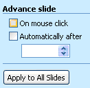 |
Note: In PowerPoint 2007 for Windows Vista, this feature is under the “Action” item on the Insert ribbon.
Conclusion
It’s possible to take the interactivity a step further with the Control Toolbox and ActiveX controls in PowerPoint, but I find that the techniques outlined here are all I need for early-stage prototypes. They help me test-drive an interactive design, get feedback, and make improvements early in the process.
Of course, PowerPoint isn’t right for every project. Here are some trade-offs to keep in mind if you’re deciding whether PowerPoint is a good fit for what you’re doing:
- Sample interactions vs. all interactions. PowerPoint works well for creating a skeleton of a site or application and for testing individual interactions. But since it’s not especially object-oriented, it can be awkward to apply the same basic interaction to multiple things. For example, imagine a list where each item leads to a separate details screen. You can do this in PowerPoint, but each individual page and each individual link need to be created manually. It’s a lot of work, you wind up with a huge file, and God help you if you need to modify anything. Keep PowerPoint in mind for sample interactions, but if you’re looking to build a complete prototype where everything is truly functional, keep looking.
- Low-fidelity vs. high-fidelity. PowerPoint is great for testing interactivity, but it won’t give you a realistic sense of what any one screen will really look like. You’re not going to get a sense of exact layout from PowerPoint. Also, remember that PowerPoint screens don’t scroll, so if you’re designing for the Web, your mockups won’t necessarily get a full-size picture of any one screen.
Overall, PowerPoint can be a blessing for interaction designers who want to create interactive prototypes quickly and easily. Interactive PowerPoint mockups can give a flavor for how a site or application will feel when you move through it—which is what interaction design is all about.
Very good, practical advice. In particular, I’ve been trying to figure out how to change the default formatting for link text in PowerPoint for years without success. Drove me crazy. I usually resorted to creating a rectangular autoshape with no fill and no border, add the blue-underlined text, then make the box the hyperlink (as you say in the article). A pain in the, um, neck.
I also like using PowerPoint for prototyping. Another good technique is using a combination of PowerPoint and Visio. You can embed a Visio object into a PP chart (Insert -> Object -> Microsoft Visio Drawing), then choose a drawing type of Software -> Windows XP User Interface, which allows you to quickly create a mockup. Then for interactivity, I use “invisible” hyperlinks sitting on top of the Visio object. By invisible I mean a no-line, no-fill rectangle with a hyperlink to the appropriate slide. The downside is that if you update your mockup you have to remember to move the invisible hyperlink, but sometimes the advantage of being able to use the Visio drawing makes up for the hyperlink maintenance. And people don’t need Visio to view your PP charts.
Anyway, nice article. I use PP a lot and still learned some new tips. Thanks.
Fantastic article! (and a bit of the slap in the forehead, I admit) I have used PowerPoint for web mock-ups and, separately, have used the hyperlink feature in presentations to link to sites I want to show, but I had no idea I could link to pages within PowerPoint itself. I will definitely put this tip to use. Thank you so much!
I found this excellent too – thank you. I’m not sure if you mentioned the fact that you can save the deck as a Powerpoint Show or .pps. This allows people who don’t have Powerpoint to view it. I tried with your example and the links all appeared to work.
This had never even crossed my mind! I’ve just spent the past few days drawing screens on bits of paper which is all very well until I have to change something or demonstrate some kind interactivity. I passed them on to the designer who did a good job but inevitably got some bits wrong. A powerpoint prototype would have been just the ticket and I’ll definitely be giving it a go soon. Thanks!
Incidentally this all works in OpenOffice Impress too.
Great article …I’ve used PowerPoint for mocking-up GUI’s and learned lots of good tricks I thought only available via VB …similar to VISIO stencils, I try to keep a a set of contols available for re-use in a separate slide e.g.checkboxes, radio buttons, tabs, tables etc…when I need higher fidelity I steal contro;s from the VISIO XP stencil….
Both this article and the article on PDF are excellent for those of us who need to create simple prototypes that are easily distributable, and don’t always have a development resource to assist. The roll-over is a good tip, but a horrible solution! Thanks also to Tamlyn for the heads-up on OpenOffice…
I love this. There should be more articles on how to use commonly available software for design purposes, especially if it speeds up the process. How many of us know Flash to whip up something that doesn’t require its complexity to express our ideas? What other programs have people used for design purposes? Logo design in MS Paint? HTML coding in WordPad?
I use PowerPoint prototypes often. Maureen and some commenters have described the main techniques. Here are a few tips I have found useful in my circumstances.
* Len mentions having a slide with all the controls and widgets, like a stencil or library. This saves a lot of time. I have a starter PowerPoint file with this slide in it, as well as the transition settings that Maureen mentions.
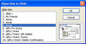
* Avoid the temptation of linking to Next and Previous slides, and go to named slides (as in Maureen’s examples). You’ll be grateful later when you insert additional slides to flesh out an interaction or show alternatives.
* I go to some lengths to avoid giving the prototype a polished visual design, because we have a graphic designer who gets paid to do that and is better at it than I am, and because I want the clients or users to see the prototype as a rough draft. Also, my prototypes are for exploring site architecture and task flow, which means font and color would just be distracting. (“Can we change this blue to something lighter?”) So, I work in grayscale, use a handwriting font, and highlight navigation tabs with crudely drawn semitransparent ovals. (Despite these efforts to make sure the prototype is seen as an early rough sketch, I still get comments like “I really like the way you highlight the tabs. Can we do that?”)
* I usually end up creating multiple slide masters. In a tabbed interface, one master per tab is typical. An interaction that takes place on a single page may require 4 or 5 slides to portray, and I find that having the common elements of those slides on their own master makes later adjustments easier.
* For remote usability testing, I sometimes put a brief description of the task on all of the relevant slides for easy reference. I like to use a callout box coming down from the upper right of the slide.
* I display the slide title and slide number at the bottom of each slide, in a very light gray. During remote usability testing or walkthroughs, this helps keep everyone on the same page.
I was pleasantly surprised to come across this article in Boxes and Arrows!
Joseph’s recommendations above are useful. And thanks to Maureen for publishing this article. I never thought that this was such an underutilized feature. I first discovered the interactive power point show back in grad school while tinkering with it for a class project- as I wanted something quick and dirty to demonstrate a tool in my CHI class. And incidentally now I am using it as a tool to do some quick usability tests at work.
I think it is a very useful tool to run quick and easy tests with users at any time in the design process. And it doesn’t take too much work to set it up either. Thanks for sharing it with everyone Maureen!
I have been watching Boxes and Arrows for long time and this is another great article!
I feel there is much more to “Low-fidelity vs. high-fidelity”, though. There is allways a good chance exact prototype in color looking “like the real thing” will create more problems than it will solve.
For articles and discussions on the same topic, you can check Henrik Olsen’s great site http://www.guuui.com
I’m author of a specialized tool for prototyping (www.MockupScreens.com) so I’m probably biased on this, but I have compiled a list of specialized tools at:
http://c2.com/cgi/wiki?GuiPrototypingTools
Excellent article! I was wondering why you chose to draw several boxes for mouseout behavior instead of just one. Normally, we draw a single large rectangle under the area in question, give it a fill color temporarily, and move it down the layers until the button elements we need to see are visible. We then make the square transparent.
If you make this single transparent layer large enough, you can quickly make duplicate slides and swap out the individual mouseover elements as needed. Naturally, you need to change the target slide for the mouseover behavior of the transparent layer to reflect different actions. But this is much easier than drawing multiple boxes each time you need to create a mouseout routine.
Great question, Eric. The reason I draw several boxes for the mouseout behavior is, uh… well, it just never dawned on me to draw one. You’re right — it’s a much better technique! I’m having a bit of a forehead-slapping moment myself. Thanks!
I messed with PowerPoint for a couple of years. I believe that if you do different unrelated projects then powerpoint can be a great tool as described in this article. However, if you are tasked in a project that has a great degree of transactional/interactive design, like a customer service portal, then PowerPoint becomes extremely tedious.
I have found it much easier to invest the time in creating html templates in Dreamweaver and create prototypes on the fly. Having said that, it does take a certain level of skillset. Many IAs are not as comfortable operating in HTML and javascript to create rapid prototypes or have readily available resources to help them do so.
Oh yeah, another comment….
Maureen, I think your use of screenshots and step by step instructions is very thorough and makes the article a great resource for people wanting to explore more with PP.
Great job.
Good stuff and as Bo indicates, really well thought out and put together.
Powerpoint is indeed a good prototype platform (though fiddly at times). It’s also an neat tool to help content producers quickly see their copy and content in context. A flat site template that allows for inclusion of proposed content can quickly show where readability or too much text can be an issue. Asking content owners to add the content/copy themselves helps them understand the constraints of available space and the context that it will appear within.
Finally, one note of caution about use of Powerpoint prototyping (particularly relating to highly polished designs). The The ubiquity of Powerpoint is a big plus but can lead to distribution beyond your intended audience. It’s crucial therefore to indicate that the design is ‘a prototype’ and state it’s specific purpose or you may find your Powerpoint can quite quickly become a full business specification or subject of extended debate.
Thanks.
Thank you for a terrific article! I just found this site today, and I’ve already learned something that I’m going to use…well, right now.
We have been using Powerpoint for “Mockups” in web application design for a couple of years now and found it very useful. For all of our application elements like buttons, input boxes and even tables we have created pictures or other grouped elements which will allow also to enter text. So if we start designing a screen we just drag the elements on one slide that resembles a browser window. Changing a UI design until the user experience is sufficient is easy, even in direct cooperation with members of the functional project team.
We found that PowerPoint provides some advantages: the functional project teams can work on the design without help from IT and the stakeholders will understand that this is “only” Powerpoint (while a HTML mockup can create the impression that the application is already working). PowerPoint mockups can easily be shared while not every functional user might have a Visio licence. We even have expanded to concept to mockup toolkits for mobile devices and Notes applications.
Really enjoyed learning about these “hidden” features of PowerPoint. I have been using PPT to show scenarios and prototypes for a couple of years now, using a combination of Photoshop comps, visio buttons and charts, and screenshots of actual HTML elements. Now I can link to different pages within the document to help explain various click paths and scenarios. Thanks again!
Nice article/tutorial. I didn’t know that it was possible to link to a slide in the same document. Coooool!
Alex
Been doing it this way for years, although never did anything terribly robust until the fall of 2005 I needed buy-in from a decidedly difficult set of stakeholders.
I did up a full-on site imitation requiring 60-plus slides … no call-outs or anything like on the slides — just the mock-ups so that, in presentation mode, it really gave the stakeholders a feel for the vision. Different user paths were broken up into sections within the file so that everything could be kept organized; a unobtrusive slide number in the corner to help references to particular screens (that, visually, might be almost identical).
Great post! I’ve been searching for a simple yet easy-to-distribute way to create interactive mock-ups myself when I fortunately stumbled about this blog post. It was a great inspiration for me. I adapted it a little for my use: I am using OpenOffice instead, and I am creating Desktop applications instead of websites. So here’s what I came up with:
http://my.opera.com/manooh/blog/interactive-mockups-with-openoffice
I would love to have some more good examples.. thanx
Efrat
Every time I created low-fidelity mock ups with power point, I often used to wonder if it is the right tool for quick prototype. Your post has clarified all my doubts and encouraged me to use it more frequently.
Thanks for sharing Maureen!
Hi,
This is very useful indeed. I have one question, how can I make tree view navigation in PowerPoint, like the image shown here http://en.wikipedia.org/wiki/File:Tree_vew_example.PNG
So when I click on the (+) sign the contents of it are shown.
Thanks very much
Hi,
Very useful article indeed.
I have built an interactive wireframe in PowerPoint, where it has many hyperlinks. I have saved this wireframe as a web page, and here is the problem, it doesn’t look like the slideshow at all, images do not appear..etc. My aim is to view this interactive wireframe on different browsers, as a proper HTML page. I have people who would like to view it on a Mac and/or a PC. I really do not have the time to rebuild the whole thing again.
Also, if I have some animation on the slideshow do you think it will be Ok on different browsers?
Can you advice me here please.
Thanks for your time.
One of the most useful and interesting articles I´ve ever seen.
Could anyone point to (or share) a starter slide with all the controls and buttons, as mentioned?
Thanks in advance.
Nice trick with Powerpoint, which many are not aware of! But there is a better tool for this!
In case you want to add interactivity to your static designs, ClickThru can be the ideal tool. Since ClickThru focusses on adding interactivity layer to existing designs, you can use your favorite design tools and hence you can decide the visual fidelity of your prototypes. Visit http://www.sleekbitz.com for demo and free trial version.
Thanks for sharing, Maureen. I’ve been using PPT to create interactive prototypes too, but find myself at a loss when I’m dealing with long scrolling pages–for example, think of a link below the scroll. What I do to work around this is use motion paths in custom animation to enable page scroll. But I don’t like that too much because it seems “artificial”. Do you have a way of working around this?