If I asked you what is one of the biggest problems on websites today, I’m willing to bet you wouldn’t say it has anything to do with words.
But what if I told you it does?
Let’s talk about user-centric language.
One research group describes the usability problems that result from something as simple as using the wrong words on websites:
“Writers often use the language they are most familiar with when describing offerings on websites, without realizing that those terms are unknown to their readers. Unfortunately, site visitors often don’t understand those company- or industry-specific words and phrases.”
In fact, a repeated challenge on websites is that words (“terminology”) and even how the content is organized (“content structure”) reflects the organization’s internal understanding of their own products and services, rather than an external user’s understanding of that company’s products and services.
This problem happens frequently, rearing its ugly head when:
- companies use feature-laden language to describe their products and services instead of talking about how these products and features benefit customers;
- websites use nomenclature on navigation menus that’s recognized by internal audiences but not external ones; and
- navigation menus use an audience-based navigation scheme—confusing, because not all users on your website know or realize what audience they fall into—rather than a task-based one.
When there’s limited time to do UX research, examining the language on your website can be a last priority. But no website—or digital product—can meet its goals without considering whether the language in its interface is user-centric.
What is UX writing?
UX writing recognizes language as an intrinsic part of a user’s experience with a product.
UX writers think intentionally about how words alone can facilitate—or get in the way of—users’ goals. As a discipline, UX writing lets you manipulate language. It helps you prod your users one step closer toward desired actions.
Indeed, validating the effectiveness of language—on websites, apps, and other digital products—is just as important as other areas of UX research.
Let’s take a look at how UX writing and user-centric language can aid your business goals by looking at some examples from my work.
Terminology in our find-something-tool
In this article, I’ll refer to our end users as “users” or “patients” and to our stakeholders as “clients.”
I work in health care. Shortly after we launched our new health care website, one of the most common questions we got from our business clients is why we refer to our health care providers as “doctors” in our interface rather than specialists, providers, or clinicians.
Our clients were quick to point out that not all of the staff who care for our patients are doctors; there are important differences between a doctor (MD), a physician assistant (PA/PA-C), and a nurse practitioner (NP).
And we agree. MDs and PA-Cs receive very different training and designations. This training quite literally saves lives.
At the same time, we knew most patients didn’t understand the differences between these academic credentials. Suddenly, we were forced to answer a very different question when it came to how to represent these differences on our website.
We now had to communicate these distinctions clearly and efficiently, in a way that didn’t distract and/or confuse our users (patients) away from their primary task on our site.
Think of it this way: Imagine you’re looking at your neighborhood clinic’s website. You have a cold and you need to make an appointment. You see a button that says:
“Our PA-Cs”
Would you click on this button?
Or would you glide past it, becoming frustrated that you couldn’t find a doctor you could make an appointment with to talk about your cold?
Here’s another way to think about it: When was the last time you were in the doctor’s office and demanded to see a PA-C rather than an MD?
Whenever we need to make a decision about what words to use on our site, we ask ourselves: Is this terminology something our users will understand?
Danny Halarewich of Smashing Magazine puts it another way:
“Commonly-known labels [text on buttons and links] facilitate the user’s browsing experience, while uncommon ones make the user pause to wonder what the button does.”
In other words, relying on user-centric language increases the likelihood that users will explore more of your site.
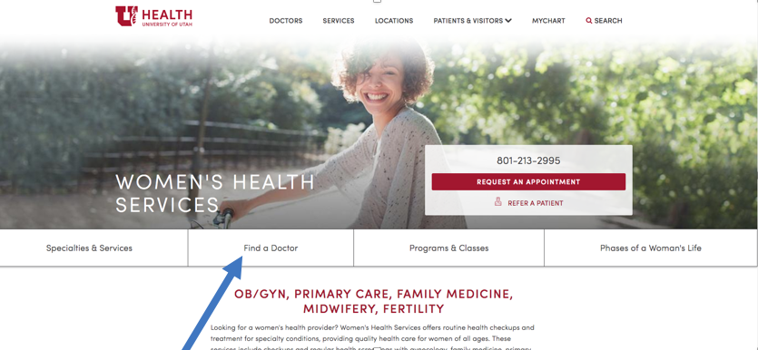
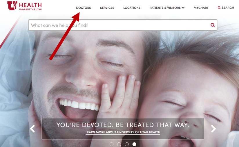
All these reasons are why we ultimately settled on using the terminology “Find a Doctor” in the universal navigation on our health care site instead of “Find a Specialist” or “Find a Provider.”
Search volume data: A tool to figure out which words are “user-centric”
Sometimes my team is unfamiliar with one of our audiences. We’re not sure what words are most familiar to our target users. When this happens, one of the tools we rely on is search volume data.
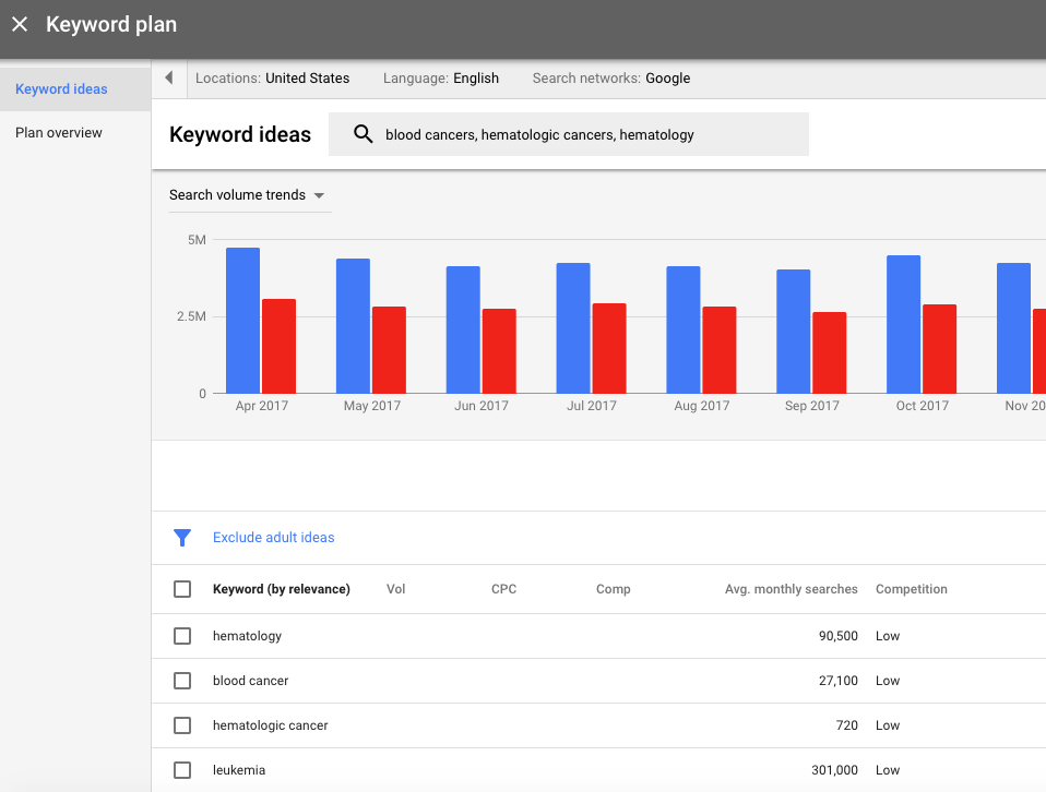
Search volume data estimates how many people search for specific words and phrases in search engines like Google each month. Google’s own tool for this is called the Keyword Planner. My team uses it regularly.
When we needed to decide whether to label a page and navigation element with “blood cancer” or “hematologic cancer,” we turned to the keyword planner. After comparing search volumes both nationally and regionally, we saw that far more people search for “blood cancer” each month than “hematologic cancer.” So we felt confident in labeling the page and navigation with “blood cancer.”
Search volume data has limitations, of course. The most obvious is that we don’t know who’s searching for certain terms (are these searchers representative of our target audience, or not?). Another limitation is that we can’t know the intent behind searches. Some customers also use different terms when they’re in different stages of the customer journey.
So, search volume data shouldn’t be used as the be-all, end-all of terminology decisions, but it can be a powerful research tool.
Terminology for our Virtual Visits product
Another example involves word choice for one of our partner team’s Virtual Visits product. Virtual Visits is a digital product that lets you make an appointment with your doctor online from a computer, tablet, or smartphone.
We had a complicated challenge with this product. For a patient to start their Virtual Visit, they were first required to answer several filtering questions, including:
- whether they had a special kind of electronic medical record account;
- whether the appointment was for themselves or their child;
- whether they had permission to access their child’s health records in said electronic medical record account;
- and what device they were using.
Because we needed to collect so much information up front, it became increasingly clear that we needed to reduce the cognitive load placed on our users. (Cognitive load is just the “total amount of mental effort that is required to complete a task” on a website).
For one word choice in particular, we had to choose between two words: “dependent” and “child.”
There were pros and cons to both choices.
On the one hand, “dependent” is more descriptive than “child.” As a general rule, specificity is usually better when it comes to web content.
On the other hand, there was a cost to using the word “dependent.”
Because the word “dependent” isn’t commonly used, we had a suspicion that it would disrupt our users’ experiences on our site, making them feel confused and uncertain:
What is a dependent again? I’m pretty sure my child is my dependent. Or are they asking if my kid is adopted? But why does that matter? Or maybe they’re asking if I care for an elderly parent, or an adult with mental disabilities? …
Google’s Product Director Luke Wroblewski puts it this way: “Rather than forcing people to divert their attention from their primary task, come to where they are.”
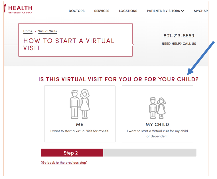
After reaching out to the product team, we were able to confidently make a decision. They confirmed that for 99% of the product’s users, “dependents” are their minor children—even though for about 1% of users, “dependents” are elderly parents or an adult with disabilities.
So we settled on using the word “child” in the main question we asked users. We did end up including the word “dependent” in smaller print on the button below the main question, but we put it in context with the word “child” by clarifying: “ I want to start a Virtual Visit for my child or dependent.”
This way, we also satisfy the outliers—the 1% of users who need to start a Virtual Visit for someone who’s not their minor child.
We also intentionally avoided mentioning the name of a second app that would let a patient start their Virtual Visit. That’s because introducing new names also increases the cognitive load placed on users.
UX writing: Can the right words impact your business goals?
Words matter. On websites, they matter maybe even more than you think they do.
Using the wrong words can create measurable problems on websites. But there are also strong benefits to incorporating user-centric language.
Nielsen Norman gives a full explanation of why the words you on use on websites are so important and so powerful:
“Well-written microcontent [words], when presented at the right time, can draw people in, emulate a courteous customer-service agent, and humanize the user experience. When the usability of your interface is not perfect, microcontent can step in and help save the day, leaving lasting positive impressions.”
When done right, words and messaging in an interface can also reduce friction, ease uncertainty, and guide action (like conversions or calls-to-action).
Good terminology eases and facilitates users’ ability to complete tasks. It makes the entire user experience feel seamless as users move across your site.
Marcia Riefer Johnston of Content Marketing Institute adds that “… one of the most effective ways to [ensure your users take actions you want them to] is to test and tweak your words.”
Whatever words you use, they shouldn’t distract users from whatever it is they’re trying to accomplish on your site. To do that, you’ll need to take the time to test your language as part of your overall UX research plan.
Next steps: Why you should test your website’s language
Test your own language. Because assumptions are so dangerous and the potential costs are so high, develop ways to test content ideas that produce actual data.
Here are some tools you can use to test language in your products:
- Create a survey to discover your users’ natural terminology;
- Cross-reference existing terminology on labels, links, and page names against search volume data (see above);
- Run a card sort or (even better) a tree test to ensure both the labeling and organization of your content matches your users’ mental models of your content; and
- Even run an A/B test to see which words convert better.
On my team we’ve used all these methods, and we’ll continue to do so as we add new content to our site.
I’m a UX Writer for Sun Life Financial and I can confidently say this is a solid breakdown of the writing process. I notice that there are rarely UX Writers hired at organizations, more frequently Researchers who are also content strategists. Do you feel it would be important to have a specific role dedicated to UX Writing in your organization?
That is such a great question. You may have found this in your own work, but I definitely feel it’s beneficial for UX writers to have an understanding of UX research methods, especially in the areas where content and UX merge (like information architecture). UX research definitely does (and should) inform UX writing. Likewise, it’s important for UX researchers to be able to identify where UX writing is needed and where it can strengthen a product …
In the end, I think official titles are less important than having a mix of skillsets on a team. Many content strategists do UX writing (and vice versa). But if there’s a need for UX writing that’s not being met by a product’s content strategist, then yes—the org should definitely hire a dedicated UX writer! It all comes down to what the people on your team can do …
Great article Alana, thank you very much for sharing it.
Thank you, Franco! I’m glad you liked it.
Thanks , I’ve just been looking for information about this
sbject for a while and yours is the best I hazve found out till now.
But, what concerning the conclusion? Are you sure in regards to the
supply?
An impressive share! I’ve just forwarrded this onto a friend who had been conducting a little homework on this.
And he in fact bought me breakfast because I found it for him…
lol. So let me reword this…. Thhanks for the meal!!
Butt yeah, thanx for spending some time to discuss
this matter here on your internet site.
Haha, thanks, Ryan! I’m glad I could assist in getting you a free meal 🙂
Great information. Since last week, I am gathering details about the UI DESIGN experience. There are some amazing details on your blog which I didn’t know. Thanks.