[Article edited on May 31, 2018, to clarify that PlayCaptcha and Funcaptcha are separate solutions, unrelated to each other.]
The other night I listened to my friend swear his way through the online purchasing process for concert tickets. He knew who he wanted to see, how many tickets he wanted, and his budget. All was going well until he got to a point in the journey that kept tripping him up, and the longer it went on the more frustrated he became.
As UX practitioners, these are the types of experiences we try to avoid; we would never knowingly place an obstacle in a user journey that would cause such frustration. In the end, he managed to purchase the tickets but not without some undue stress caused by not being able to read the distorted text in a plain old captcha.
For those unfamiliar with captchas, they typically appear as distorted words that require you to type those same words into a box on the page. Retail sites or email registration pages are common locations for captchas. Deliberately difficult to read, they tend to break the flow of the journey, frustrating the user in the process.

The term captcha was coined back in 2000, but there are examples of its use as far back as 1997 by now-defunct search engine AltaVista. Captcha stands for ‘Completely Automated Public Turing test to tell Computers and Humans Apart,’ which is a bit of a mouthful. It is clear that the captcha was developed with computers, and not users, in mind.
The captcha’s raison d’être is to prevent bots from creating accounts, which can then be used to spam, or, in the case of ticketing websites, buy up large quantities of concert tickets to resell for a higher face value.
So, there is clearly a need to prevent bots from doing their thing, but it shouldn’t have such a negative impact on the experience for users. And, having been around for so long, you would expect that there would be a more elegant solution to the captcha.
And there is—more than one, in fact. This list is not exhaustive, but it will give you an idea of some of the solutions out there, and their pros and cons.
The first option is the visual captcha, typically a set of images where users select the one(s) that matches the word.
Visual captchas are simple and straightforward and can be completed in under a second. They are also mobile friendly. Substituting a visual captcha for a standard captcha would have made it easier for my friend, but the downside of visual and text captcha is the need for users to see the set of images, obviously a problem for non-sighted users where screen readers may struggle to convey the information. Visual captchas are often accompanied by an audio captcha, which gets around the problem, but it is not without issues.
Audio captchas play back a string to text to users using one or more actors’ voices, often with added background noise. They come in a variety of formats: some read out a couple of words, others a string of characters; voice distortion and background noise may add complexity and increase difficulty.
A visually-impaired policy advisor to the Australian Communications Consumer Action Network (ACCAN), said: “My experience with audio CAPTCHA has been almost as inaccessible as visual CAPTCHA — I must have listened to the Skype audio captcha 20 times before I gave up and asked my sighted friend to set up my account.”
Screen reader technology moves through pages reading form fields and content as users navigate; however, when the user lands on the audio captcha, the captchas often play at the same time the screen reader relays the form details, making it difficult to distinguish the captcha from the form details.
From an implementation point of view, the problem of language arises for global organizations, which might need to deploy different audio captchas. Furthermore, how do you make it accessible to culturally and linguistically diverse users who may not be fluent in the particular language? Research from Stanford University (pdf) found that non-native English speaking users were “slower in general and less accurate on English-centric captchas,” which added to the friction of using the site. So, if audio captchas are difficult to solve and provide poor experiences, what’s the solution? FunCaptchas may have an answer.

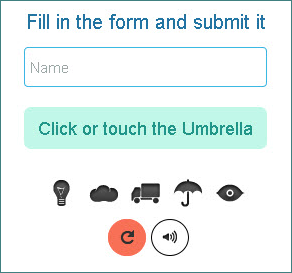
Gamified captchas use play to prove that the user is human. Heinz was one of the first big brands to use a gamified captcha called PlayCaptcha, which was developed by a third party. Here, users are asked to put some salad cream in a sandwich.
Gamified captchas, such as PlayCaptcha and Funcaptcha (a competitor), interrupt the flow of the user journey by asking users to complete a visual task, which may take a couple of seconds to complete. However, the creators claim their gamified captchas improve both user experience and brand recall.
In addition, FunCaptchas’ creators claim it has “scalable security” that will “outsmart machine learning” by randomizing the image noise, rotation, and angle, making it difficult for machines to process the images.
However, gamified captchas are yet another form of visual captcha. Non-sighted users can complete an audio captcha—which will, of course, suffer from the issues mentioned above—to access the site.
Slider captchas avoid some of the issues mentioned; they do this by substituting a slider for a captcha. Users are asked to slide a bar across the screen to prove they are human; slider captchas translate well to mobile, where sliding interactions are common. But, despite being quite effective at stopping bots, slider captchas don’t appear to have a keyboard shortcut, which may cause accessibility issues.
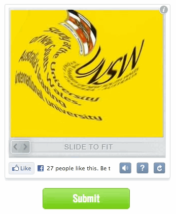
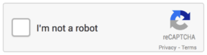
A couple of years back, Google introduced reCaptcha, the solution you are probably most familiar with. On the surface, it appears to use a tick box based captcha, asking the user to verify whether they are a robot or not. Simple, right? However, if Google suspects the user is a robot, it may display images (similar to a visual captcha) and ask the user to select the ones that match the word or phrase.
Google’s reasons for developing reCaptcha are not entirely altruistic—reCaptcha is helping to digitize books and categorize images for Google. Others have raised privacy concerns that Google tries to identify users by capturing more information than the user enters, such as screen size, IP address, a count of mouse and touch events, and whether you have a Google cookie. This is something that is likely to change with the General Data Protection Regulation (GDPR) coming into force this month in the EU, but it not clear what Google intends to do.
Accessibility of reCaptcha is an additional concern. I spoke to a senior accessibility analyst from the Digital Accessibility Centre in Wales, who said of reCaptcha that “the current audio alternative and image only options are not the way forward;” however, he mentioned accessible ‘workarounds,’ such as browser plug-ins Webvisum, Antcpt, and Rumola, which help users with disabilities solve reCaptchas.
So far no captcha option is accessible to all users, and many provide a poor user experience. But there is one type of captcha—the honey pot—that may have the solution. This least intrusive of options hides a field or tick box in the site’s CSS; the captcha is invisible to humans but readable by bots. If this field is completed, the site knows a bot is trying to access the site.
The honey pot is my favorite of the ones discussed because it does not interrupt the user journey at all, has no user experience of its own to be disappointing, and effectively suits the site’s needs for distinguishing between bot and human. In addition, if it is labelled correctly, it is completely accessible.
Conclusion
Unfortunately, interruptions to the flow of a user’s journey are often unavoidable and sometimes necessary. As practitioners, we need to seek solutions that mitigate the impact of interruptions and consider all users.
As in the honey pot example, how solutions are implemented play a part in shaping the journey, and knowing the pitfalls in the experience can help us design solutions that get around them quickly or avoid them altogether. This is what we should be aiming for, and in doing so we will create much better experiences and happier users.
One comment
Comments are closed.