When developing user interfaces, designers increasingly use custom graphical elements. As the web browser becomes basic technology for software interfaces, more and more elements derived from graphic and web design replace the traditional desktop approaches to the concrete design of human-computer interfaces.
In the near future, this development will become even more relevant. The barrier between web pages and desktop software is beginning to disappear, and modern rich client user interface technologies such as Silverlight/WPF, Air, or Java FX enables designers to take the control over the whole user experience of a software product. Style guides for operating systems like MacOS or Windows become less important because software products are available on multiple platforms, incorporating the same custom design independently from OS-specific style guides. Software companies and other parties involved begin to use the power of a distinct visual design to express both their brand identity and custom interactive design solutions to the users.
While this implies a new freedom for designers working in the field of interactive software products, it strengthens the importance of visual design for the design of user interfaces. Designers working on concrete graphic solutions for a specific interface are breaking away from established standards defined by a software vendor. It is now the responsibility of those user interface designers to choose graphical elements wisely to make a product’s interaction principles visible and usable.
Elements of interactive visual design
Following the roots of visual design in print and online communication, the design of a visually compelling and functional application must take into account different requirements, even though it takes the same methods to realize its goals: A dynamic visualization of the interactive product in form of text, images, and colors. In contrast to pure one-way communication design striving to create identity and media, the main goal of such a design process for interactive products is much closer to product or industrial design — namely the creation of a product that serves the user in a optimal way. It requires a strong collaboration with the disciplines of interaction design, software development, and product management.
The role of photography in software user interfaces
Photography has both challenges and opportunities as graphical element in user interface design. I chose photography as an example for a classic communication design instrument, but the ideas are also applicable to typography, illustration, motion design, graphics, and the like. One important aspect of these thoughts is the required collaboration between the different design disciplines involved in the creation of a user experience, and how to optimize team performance for most valuable ideas and outcomes.
Case 1: Photography as content
In software applications, photography in most cases is used as content element, since photos express situations of human life very well and thus are well suited to capture and represent a certain message. The images have a semantic meaning, communicating information to the viewer and user of the respective web or software application.
Examples for this type of application can be found not only in private photo collection software such as iPhoto but also in enterprise content management solutions for web sites and product catalogues, or the web shop itself. To the user, the photo is not an element of decoration or design, but it is the actual content or a part of it.
On the visual design side, the challenge is to present this content in a way that makes it visible and reveals context and meaning. Photographic content tends to come to the fore due to its strong graphical impact, so other elements should be designed to support that effect and not to compete with it for the viewer’s attention.
The challenge of well-representing imagery content elements in a user interface is often to provide adequate metadata-driven tools to allow enhancing images with meaning; take tagging people at Facebook as an example, which turns photos into something findable. Finding a a meaningful visual representation of photographic content and this data is a common challenge to visual design and information architecture.
Case 2: Photography as design element
While the use of photography as a design element in user interfaces is rather new, there is a long tradition of using photography as a design element in advertising-related online media. This treatment as design element follows the rules of brand communication and takes photography as integral element of the web site design.
But contrary to its usage as a content element, the image is used in web design as a medium to communicate a message to the user in order to create a certain context for the real content. Some sites, such as financial institutions or software suppliers, are working with stock-like photography showing photos of people or buildings, while other businesses can combine site content and corporate communication in one image, like on fashion sites.
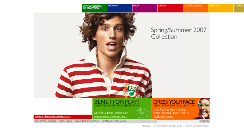
Benetton uses the photo on their home page to convey both a product and a brand message to the visitors. The photo is in the focus, but is receipt more like a visual expression of emotion than as actual site content. The web design uses the photo like an advertisement would do: It is part of the site’s visual design and has been chosen by the designers. The product, derived from the site’s content, is turned into the medium to make an impression to the visitor.
Photography in interactive media is often a trigger for engagement and interaction. Interaction designers working on the product’s interaction flows can thus provide visual designers with key information to select and apply visual elements, in order to start the conversation, and keep it alive.
3. Photography in software UI Design
Unlike other digital products, the visible part of software usually makes no significant use of photography by means of communication design. Today’s desktop software interfaces consist of text, rectangle areas, and icons, along with with a lot of transparency or 3D effects. If not a necessary content element, photos are only used in splash screens of desktop applications.
In web interfaces, static images in header bars are quite common, resulting from the “hybrid” characteristics of those applications between a software product and a web site. In most cases, the photo serves as decorative element with no semantic meaning and is thus reduced to a very small amount of space of the screen; it is not important for the product’s original purpose. This is done in order to provide as much space as possible for the informational content that is useful to the user.
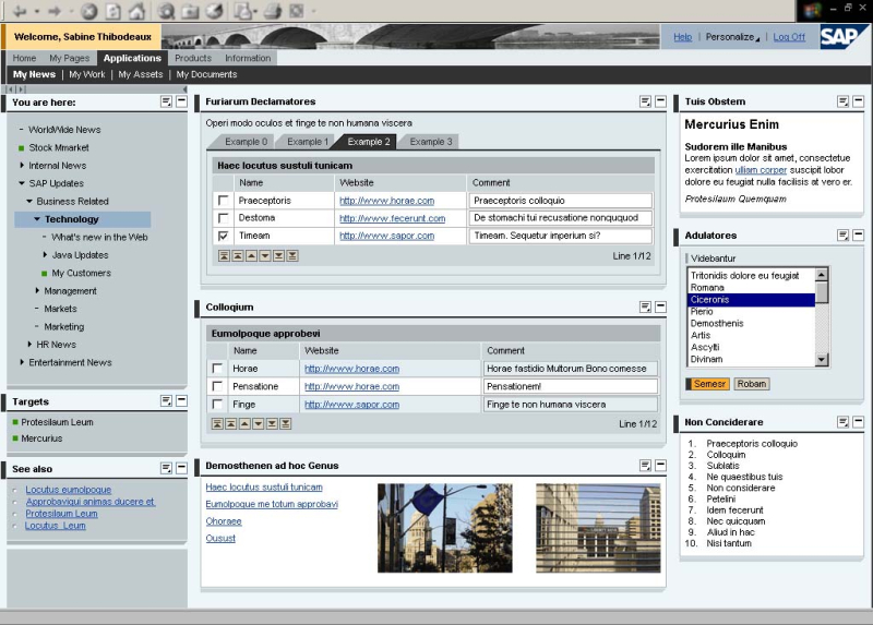
The image above shows SAP’s enterprise portal product in a standard visual design. The small photo showing a bridge in the header bar is part of the UI design, while the images at the bottom are content elements related to the text messages.
Like in web design, the image is used here as an element of design but loses all its visual power due to its jammed position in a design that puts all emphasis on the representation of information. The “mise en scène” of the interface suffers from the poor integration of the photographic element, totally separated from all information. Its meaning in the application context is reduced to a vague bridge metaphor referring to the function of a portal.
The best of both worlds: towards a new quality
With every release, software providers make a step towards a custom graphical representation and improve the visual design quality of their products. To take a real advantage of photography as a medium, there is a need to treat it differently than it is done today in the software industry.
At same time, a lot of effort is being made to make applications more “shiny and glossy”, to better imitate real world structures on the screen. Sometimes, like in current reporting tools for business intelligence, this additional glitter reduces the visual perception of information instead of enhancing it.
The following examples and recommendations are not always easy to follow, because a meaningful integration of this medium in a UI design that centers around representation of information and providing a tool for efficient usage is a difficult task. Nonetheless, visual elements such as photography have the power to reveal a message instantly and powerfully to the user to complete and to establish a visual identity. Designers should use these possibilities to trigger the user’s attention to support a holistic interaction design and not to distract her by decorative elements and visual clutter.
Examples for photography in interactive applications
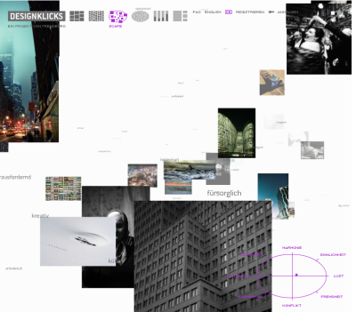
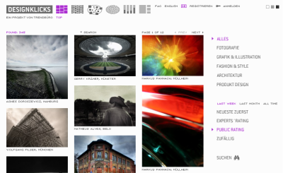
This example screenshot shows Designklicks (now seen.by), a German website that collects and tags user-generated imagery. Just like Flickr and other photo-centric web sites, the images are in the focus of the design and are visually strictly separated from other design elements like icons, logos, buttons, and links. For a visual representation of the complex information architecture, it allows the user to sort and present the content in different ways, from a simple grid to a navigable 3D space.
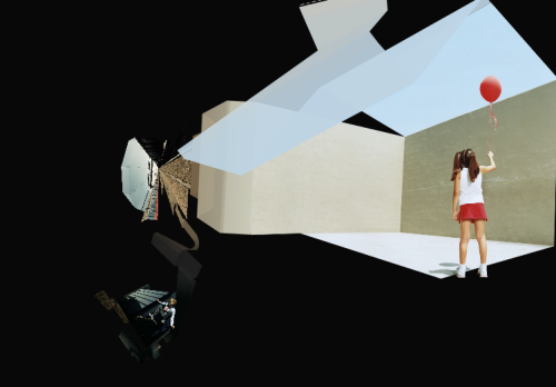
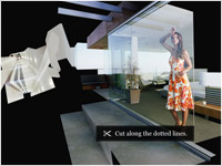
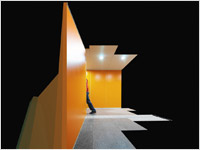
These screens are taken from an art project for gettyImages, done by the barbarian group. It uses widescreen photos to build a three-dimensional flow of cascaded rooms, connected to each other by graphical signage elements appearing in the images.
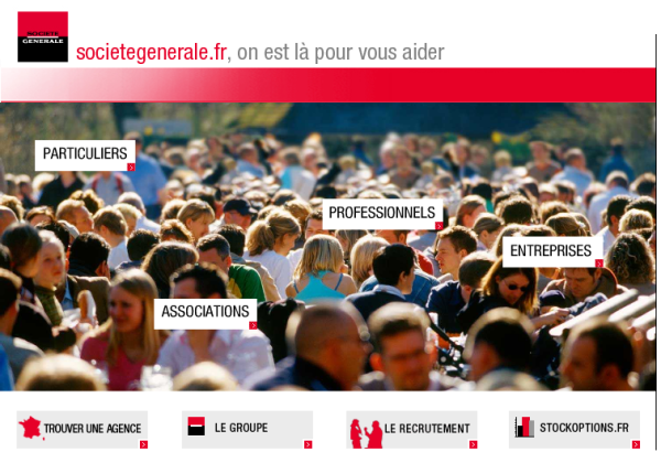
The bank Société Générale used a photo as main art on their web site, emphasizing the fact that they address everyone with their services. The main navigation appearing on the start page is embedded into the photo, but at the same time arranged in a clearly separated layer above the image.
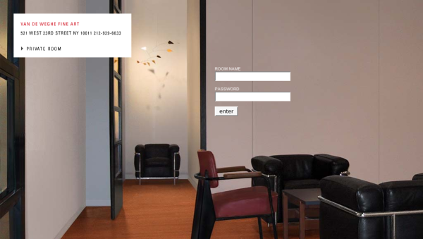
Photography is the main design element of Van De Weghe Fine Art, an art gallery in New York. All graphic design elements remain very reduced while the full screen photo is used to create a virtual room for information and interaction.
Take the blinkers off, and think about experiences as a whole
People in the roles of information architects or interaction designers tend to concentrate on their part of the job and leave subsequent visual decisions to the graphic or visual designers, which is of course always a good way to start. Nevertheless, all designers (including the two disciplines mentioned before) should be able to actively think about and contribute to the concrete, sensual appearance of the final product, since this is what design is all about.
So why posting this on a site dedicated to the “design behind the design”? Because interaction designers and information architects have become strong conceptual thinkers, driving an experience in terms of concept as well as it’s soul. Visual design should enhance and implement this vision, which is in fact in most cases the contratry of “making things pretty.”
Recommendations for photography in next-generation interfaces
- Integrate the images into the interaction design. This can be achieved by making areas responsive to user behaviour, enhancing its function from a visual element to an instrument of interaction. Due to its realistic and nonverbal nature, photography can be equally or more powerful than icons, buttons or other classic interface elements.
- Work with screen space. Place images in a way that they have a real impact on the overall appearance instead of putting them into small banner-like screen areas.
- Photography invokes an emotional reaction and has the capability to create a certain ambiance more easily than other media. Use pictures that make the user feel comfortable and adequate to the application context.
- Clarity, structure, movement, separation, union – photos can convey messages instantly to the viewer, by means of blur, motion, composition, and of course motive. Work with these as design elements.
- If used as content element, think about alternatives to simply placing photography on a grid. There are a lot of possibilities to make images “tangible” to the user. Think of multiple layers, movable objects, or 3D approaches.
- Keep the subject of the application and the nature of the content in mind while designing. Choose photos that convey a real meaning and make sense in the application context. Avoid standard (stock) images or those with only decorative function. Prefer custom-made images tailored to your intentions and requirements.
- Combine and integrate all elements to create a holistic interface design where all visual elements work together and make the interface.
See also:
Interactive Identity: Bridging Corporate Identity and Enterprise IT
Visible Narratives: Understanding Visual Organization by Luke Wroblewski
10 ways by gettyImages
seen.by
Coming soon:
Part II – Typography in User Interface Design

I wouldn’t call myself a visual designer, but I am a photographer and interaction designer, so I very much appreciate thoughts such as these. How nice it will be to one day be free of artificial constraints of corners and straight lines and interact with textures and images we recognize and feel. The types of designers need to group together (as mentioned here http://www.boxesandarrows.com/view/bringing-holistic on B&A) to prevent mis-application of the use of photos.
Hey what’s with the headings on this page??? the vertical space (in flock & FF) above the headings is less than the space underneath. So the connection that the user would have with the previous paragraph is stronger than the subsequent paragraph, I’d suggest reversing the spacing to give a greater connection with the subsequent paragraph.
Really interesting article.
Thanks Milan.
@Julian Taverner Thanks for the suggestion. We’ve updated the spacing.
Okay, so my disclaimer is that I am an art director/visual designer who also happens to have interaction design experience. The phrase in this article that furrowed my brow is “design behind the design.” I don’t believe visual design can be separated from interaction design; they are fluid and overlap (or should). The only real solution to this is collaboration. An information architect and visual designer should be working hand in hand from a strategic perspective.
Milan,
Your article stimulated a lot of ideas for me- thanks for an insightful piece. This quote in particular:
“People in the roles of information architects or interaction designers tend to concentrate on their part of the job and leave subsequent visual decisions to the graphic or visual designers, which is of course always a good way to start. Nevertheless, all designers (including the two disciplines mentioned before) should be able to actively think about and contribute to the concrete, sensual appearance of the final product, since this is what design is all about.”
When I look at the screenshot of the login form for the Van De Weghe Fine Art gallery, it’s clear that, functionally, the page is a simple two-field form, but the substance of it is significantly altered by the photograph illustrating the “room” metaphor. Cases like this one reinforce the point that seemingly aesthetic choices will affect how a tool is used and should not be considered separate from the UX or IA process.
Chris
I created a dashboard from the visual elements of a report.
This will be used to measure current state with objectives, a classic KPI.
My next project will be to create a web site from all of the elements.
My site: http://www.neuropersona.com
Original report: http://neuropersona.wordpress.com/web-persona-analytics/uniqlo_2009/
Visual Dashboard: http://brandwarfare.wordpress.com/2009/03/29/visual-brand-dashboard/
In one sense I do something similar with a persona construct which I call NEUROPERSONA
http://www3.sympatico.ca/nick.trendov/Persona%20and%20Story%20Lens%20S2.html
I would say that photography creates the impression of being immersed.
Many companies are working hard at immersion, Second Life and other on-line communities are examples.
However, I am a storyteller and I believe simple stories with complementary photographs can do better.
Video of course is sexier as it contains voice and/or music but for me the stories and photos are far more flexible.
Great article.
Cheers,
Nick
Chris, thanks very much for your comment. There are a lot of discussions going on on the scope of disciplines like IA and IxD, and if UX is the sum of the two or the two plus Visual plus Usability plus … whatever. I think every *designer* should care about how the product he works on is perceived, so a good Graphic Designer will also care about the representation of information, and a good IA or IxD may use something visual like photography to “render” the concept.
Nick, immersion is an important point, and photography is imho a great medium to strive for it, to start a “visual dialogue” with the user. This may also be used for persuasion or for creating something like a social space in applications. In dashboards and other information media, the use of photos as decoration is very poor in most cases. If there is no consequent, holistic design wherein the photography plays an important role for either information or interaction, a design without photos is always better than one with a poor integration of the medium. Have a look at this book review for a short intro on visual dashboard design: http://eric.jain.name/2006/01/02/information-dashboard-design/