This story is the third in a series of articles sharing a design framework for dashboards and portals.
Part 1 of this series, “The Challenge of Dashboards and Portals,” discussed the difficulties of creating effective information architectures for portals, dashboards, and tile-based information environments using only flat portlets, and introduced the idea of a system of standardized building blocks that can effectively support growth in content, functionality, and users over time. In enterprise and other large scale social settings, using such standardized components allows for the creation of a library of tiles that can be shared across communities of users.
Part 2 of the series, “Connectors for Dashboards and Portals”
Part 3 now describes the Container components of the Building Block system in detail.
Overview of the Container Blocks
The building block system includes seven types of Containers, beginning with the Tile, and increasing size and complexity to include a collection of interconnected Dashboards or Portals, called a Dashboard or Portal Suite. From smallest to largest, the Container blocks are:
- Tile
- Tile Group
- View
- Page
- Section
- Dashboard or Portal
- Dashboard or Portal Suite
The different kinds of Container blocks in the system play different roles, based on their relative size, in the overall effort to construct dashboards or portals. The smaller blocks–Tiles, Tile Groups, and Views–-enable the display of content, and support users’ interactions with content. Sections, Dashboards or Portals, and Dashboard or Portal Suites–-the larger blocks–enable the navigation, organization, and management of collections of content. Pages straddle the middle of the size continuum; they are the largest block whose role is primarily to provide a framework for display of dashboard or portal content, and the smallest building block which plays an important navigational / organization role in the system. The different kinds of blocks work in concert to enable the creation of a scalable, navigable, and maintainable information architectures that support high-quality user experiences.
The Connectors (described in part four of the series, the next installment) ‘hold things together’; thereby creating navigation paths amongst destinations, establishing a tangible architecture or structure, providing referential cues for orientation with the environment, and allowing movement into and out of the environment. The different kinds of Containers work in concert with Connectors to enable the creation of scalable, navigable, and easily maintainable information architectures that support high-quality user experiences.
Container definitions
Each Container block definition includes:
- Mandatory components
- Optional components
- Stacking size
- Detailed description
- Example rendering (for illustrative purposes only)
- Rendering description
Tile definition
Mandatory components: Tile Header, Tile Body
Optional components: Tile Footer
Stacking size: 1
Tile description:
Tiles are the fundamental building block of the dashboard or portal framework. Tiles locate content and functionality within the coherent information and navigation hierarchy of the larger dashboard or portal environment, while clearly identifying the sources and broader contexts of the information or tools they contain, and offering consistent access to convenience functionality such as printing and e-mailing the Tile contents for use outside the dashboard.
Tiles consist of two required components–-a Tile Header and Tile Body–-and one optional component–the Tile Footer. Tiles may include multiple Control Bars (note: adding multiple Control Bars can quickly increase development complexity and lower usability levels). The Tile Header contains a mandatory Title, optional Subtitle, mandatory source indicator identifying the origins of the content, and may include buttons or links for Convenience Functionality (described in detail in a subsequent part of this series).
The mandatory Tile Body can contain nearly any form of content. Tiles commonly contain text, charts, tables, interactive maps, scrolling news feeds, RSS consoles, video, slideshows, syndicated XML structured documents, links to documents and resources, and complex transactional functionality. Of course, this is only a small subset of the tremendous diversity of Tile-delivered content available in the rapidly growing libraries of widgets published for Apple’s OSX desktop, Yahoo’s widget platform, Google Gadgets, web desktops such as NetVibes, and the many social networking platforms including FaceBook and MySpace. In the end, the range of content that can appear within a Tile is limited only by imagination and ingenuity.
The optional Tile Footer is a structurally consistent location for contextual links, pointers to related destinations and content. The Tile Footer commonly offers links to additional resources or source data in another format (tab delimited, .pdf, etc.), links to other Tiles, Pages or areas of the Dashboard that provide related content or functionality, links to other applications and environments offering comprehensive functionality or information out of scope for the Tile, etc.
The sizes and internal layouts of individual Tiles will vary depending upon several factors including, but not limited to their content, priority vs. neighboring Tiles or blocks, and expectations for reuse.
It is good practice to define a grid for screen layouts that prescribes standard sizes for Tiles and all screen elements, and match the sizes and internal layouts of Tiles to this reference grid.
Here are a few guidelines on information design and interaction design standards within Tiles:
- Each chart, table, or text block within a Tile needs an accurate title or label
- Charts may have a footer area that offers additional data values, a key or legend for the items shown in the chart, links to additional resources, or source data in another format
- Tiles that contain long lists, large tables, or other large objects may scroll, depending on the interaction and design standards and capabilities of the dashboard or portal platform
- Tables in Tiles often allow users to change sorting order or open and hide columns
- Charts summarizing large amounts data can offer interactions or drill-down behaviors allowing users to navigate deep data sets
Many of these interaction behaviors and design best practices are now offered as standard functionality–making them ‘free’ or ‘low-cost’ in design and development terms–by leading business intelligence and portal platform vendors. Additionally, these capabilities are also becoming standard in many general purpose presentation frameworks, including RUBY and AJAX libraries, and the various for-purchase (Adobe AIR, etc.) and open-source development toolkits.
Stacking note: Tiles stacked inside larger building blocks retain their individual Tile Header, Tile Body, and any optional components.
Figure 12 shows an example rendering of a Tile.
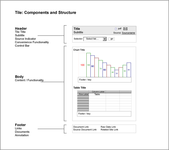
Figure 12: Tile components and structure
Rendering description:
This wireframe shows the structure of a Tile with an attached Control Bar. The Tile Header offers several types of convenience functionality (print, e-mail, and PDF export of the Tile). The Control Bar offers a single selector. The Tile Body contains a chart and table, each with a title and footer or key. The Tile Footer contains four links, to a mixed set of destinations.
Tile Group definition
Mandatory components: Tile Group Header, Tile Group Body
Optional components: Tile Group Footer
Stacking size: 2
Tile Group description:
Tile Groups consist of two required components – a Tile Group Header and Tile Group Body – and may include an optional Tile Group Footer. Tile Groups may include multiple Control Bars (note: adding multiple Control Bars can quickly increase development complexity and lower usability levels). The Tile Group Header contains a mandatory Title, optional Subtitle, mandatory source indicator, and may include buttons or links for Convenience functionality.
A Tile Group typically combines two or more Tiles together–likely from different sources or perspectives–into a larger unit of information or functionality that allows the combination of resources to answer more complicated questions, or achieve more complicated tasks. A Tile Group might answer the question, “How are my daily sales vs. my competitor’s daily sales?” by presenting a Daily Sales Tile and a Competitor Sales Tile next to one another, under the combined title “‘Daily Sales vs. Competitor Sales’.”
In this scenario, these two Tiles likely present information that comes from different data sources (perhaps one internal, and one licensed from a third party market metrics service), and different organizations that used the building blocks system to coordinate user experience design and development efforts that rely on a common enterprise portal or platform foundation. The consumers of the individual Tiles are likely affiliated with separate business units or operating groups, and may not need or be aware of the other Tiles, or the Tile Group. The consumers of the Tile Group could easily be part of a third element of the organization–or perhaps they are affiliated with the originating groups for the separate tiles, but share a common management perspective or performance incentive that requires a comparative presentation of the source information.
Stacking note: Tile Groups stacked inside larger building blocks retain their individual Tile Group Header, Tile Group Body, Tile Group Footer, and any optional components.
Design note: While Container definitions mandate some components to maintain the structural integrity of the building blocks system (always a Tile Header, etc.), they do not mandate constant visibility or display of all the structurally required components. Excess chrome is the enemy of a good user experience at all levels of structure, and should be avoided. Many existing interaction patterns, control mechanisms and design principles can help eliminate excess chrome, and minimize the presence of chrome in general to that which is necessary for a high quality user experience, without increasing the effort or cost of relying on the building blocks.
Figure 13 shows an example rendering of a Tile Group
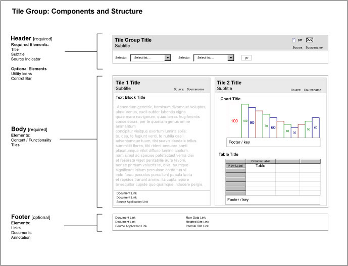
Figure 13: Tile Group components and structure
Rendering description:
This wireframe illustration shows the structure of a Tile Group with an attached Control Bar. The Tile Group Header offers several types of convenience functionality (print, e-mail, and PDF export of the Tile as rendered). The Control Bar offers two selectors. The Tile Group Body contains two stacked Tiles; one Tile offering text, the other offering the combination of a chart and table seen previously. Note that both stacked Tiles retain their individual Tile Headers and Tile Footers. In this rendering, neither stacked Tile offers convenience functionality, though it is possible for stacked Tiles to offer convenience functionality.
View definition
Mandatory components: View Header, View Body
Optional components: View Footer
Stacking size: 3
View description:
Views consist of two required components–-a View Header and View Body–-and may include an optional View Footer. Views may include multiple Control Bars (note: adding multiple Control Bars can quickly increase development complexity and lower usability levels). The View Header contains a mandatory Title, optional Subtitle, mandatory source indicator, and may include icons for accessing standard convenience functionality.
A View typically combines Tiles and Tile Groups together to present a comprehensive set of information resources that address a single perspective within an area of interest. In common use, Views allow Dashboard or Portal users to see the most logical subsets of all available Tiles related to one aspect of an area of interest. For example, many Tiles might provide information about a single product–too many to appear on one Page–but the Customer View of a product presents only those Tiles that show information about a single Product in relation to major Customers. Another defined View could offer marketing information for that same product, and a third might allow executives to check inventory levels for the product at various storage facilities.
Views stacked inside larger building blocks retain their individual View Header, View Body, View Footer, and any optional components.
Figure 14 shows an example of rendering of a View.
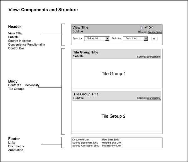
Figure 14: View components and structure
Rendering description:
This wireframe shows the structure of a View with an attached Control Bar. The View Header offers several types of convenience functionality (print, e-mail, and PDF export of the View as a single unit). The Control Bar offers two selectors. The View Body contains two stacked Tile Groups, one Tile offering text, the other offering the combination of a chart and table seen previously. The stacked Tile Groups retain their individual Tile Group Headers, but do not include Tile Group Footers. In this rendering, neither stacked Tile Group offers convenience functionality, though it is possible for stacked Tiles to offer convenience functionality. The View Footer contains links to a variety of documents, applications, and destination sites.
Page definition
Mandatory components: None
Optional components: None
Stacking size: 4
Page description:
It’s best to talk about Pages in two senses; first as building blocks or Containers, and second as browsable destinations for users navigating dashboard or portal environments. In the first sense, as part of the hierarchy of building blocks in the dashboard or portal system, Pages are simply a larger kind of Container without mandatory components. They are governed by the same principles of portability, openness, independence, etc. as the other blocks, which means individual Pages may not be visible to some types of users, depending on security restrictions, and could consist of a mix of smaller building blocks and elements of free-form content. I considered calling them ‘nodes,’ to emphasize the distinction between their building block system role and their browser navigational role, but that felt too abstract.
In the second sense, Pages take on their traditional role as presentation canvases for content and functionality, linked together by navigation mechanisms: they serve as the single-screen units of display and interaction familiar from the Web browsing paradigm. In this role, Pages become the delivery vehicle for combinations of Containers and Connectors that allow users to work with content, and move through the dashboard or portal environment. Pages typically combine collections of Tiles, Tile Groups, and Views with a set of accompanying Connectors (Section Connectors, Page Connectors, Crosswalk Connectors, Geography Selectors, and Utility Navigation) to create a navigable user experience. Pages–following the principle of Openness–may include free-form content or navigation mechanisms. Common examples of free-form content include search functionality, global navigation, links to intranets and extranets, feedback forms for requesting new features, and branding elements.
A Page can consist of a single Tile, or only free-form content, may or may not have a Page Header or Page Footer managed as building blocks assets, and might not be connected to or accessible from other areas of the Dashboard or Portal. For example, a Page dedicated to account administration functions might only be visible to members of the user group Account Administrators, who themselves cannot see other areas of the Dashboard or Portal, and thus would not require navigation connections to other Pages in the Dashboard or Portal.
Figure 15 shows an example rendering of a Page.
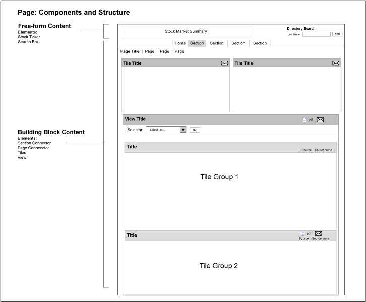
Figure 15: Page components and structure
Rendering description:
This wireframe shows the structure of a Page that mixes free-form content with building block content. The free-form elements appear in the form of a typical dashboard page header that contains a stock ticker and market summary, and a staff directory search box. Branding elements such as logos identifying the individual dashboard often appear as free-form content.
The building block content includes a navigation cluster made of a Section Connector and a Page Connector, two stacked Tiles, and a View that contains two stacked Tile Groups (Tiles not shown). On this Page, the two independent Tiles and the View are stacked at the same level within the containing Page. The layout of this Page places the Tiles above the View to ensure they remain visible without scrolling, but this layout is not necessary by the rules of the building block system. The individual Tiles on this Page do not include either Control Bars or Footers. The View includes a Control Bar with two selectors. None of the blocks offers Convenience Functionality, though of course this is possible across all levels of the stacking hierarchy, and is commonly available for the Page itself.
Section definition
Mandatory components: 1 Page
Optional components: None
Stacking size: 5
Section description:
The Section is primarily an organizational building block, but it does have a mandatory component of at least a single Page; this is to define an explicit context for navigation, user role. Sections typically consist of collections of Pages related to a core conceptual element of the information architecture or mental model for the Dashboard or Portal. It is not uncommon to see broadly defined Sections such as “Products,” “Customers,” “Supply Chain,” or “Sales.” Deep or complex Sections offering a considerable number of Pages or a large amount of content commonly include summary style Pages that condense or introduce the full contents of the Section in an overview. Shallow sections offering few Pages often do not require a summary style Page.
Figure 16 shows an example rendering of a Section.
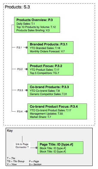
Figure 16: Example Section
Rendering description:
This site map style rendering shows a Section, titled Products, which contains five Pages that offer a variety of content related to the two types of Products produced and sold by a fictional company. The Section begins with a summary Page titled Products Overview. The four additional Pages are titled Branded Products, Product Focus, Co-Branded Products, and Co-brand Product Focus. The five pages contain a mixture of stacked Tiles, Tile Groups, and Views. The summary Page, titled Products Overview (P.3), offers the following: two stacked Tiles, Daily Sales (T.1) and Top 10 Products by Volume (T.12); and a stacked View, titled Products Sales Briefing (V.3).
By personal preference, only the blocks stacked at the level of the Page–level 3–are individually identified on this map-style rendering; the Views and Tile Groups would obviously include further Tiles stacked within. I use this rendering convention to cut down on visual clutter in maps of large dashboards or portals. For your own renderings, feel free to itemize every stacked block at every level on the Page, or even list the dashboard or portal contents in simple outline fashion without pictures. Each stacked block in the rendering is identified by its Title, and a unique ID code or label, to allow synchronization with a master list of building blocks available across all dashboards. The numbered lines indicate that each Page includes a standard Page Connector, offering navigation between all the numbered Pages in the Section.
Dashboard or Portal definition
Mandatory components: 1 Section
Optional components: None
Stacking size: 6
Dashboard or Portal description:
The Dashboard or Portal is the largest single unit of meaning possible to assemble from stacked building blocks. A Dashboard or Portal must consist of at least one Section (itself made of at least a single Page). Dashboards or Portals typically consist of several connected Sections, assembled from connected Pages that contain a variety of stacked building blocks, combined with a smaller number of stand-alone Pages dedicated to utility functionality or administration. Most Dashboards or Portals rely on a variety of Connectors to link assembled building blocks into a cohesive and navigable whole. A Dashboard or Portal’s information architecture often aligns with a single mental model, or a small set of closely overlapping mental models, though this obviously depends on the needs and goals of the expected users.
To most users of internal tools situated withing an enterprise, a Dashboard or Portal is the total set of Sections, Pages and other stacked building blocks their security and access privileges permit them to see and use when they visit a URL or some other user experience destination (note: for web-delivered Dashboards or Portals, it is common practice to create a URL and expose this address via an intranet or other internal gateway). Since each user has an individually determined and potentially different set of security and access rights to each possible Section, Tile, View, and Page, each user will likely see a different combination of Dashboard or Portal content that is tailored to his or her own needs.
In this way, individual Dashboards or Portals often draw from a pool of defined Tiles and blocks which:
- Serve a group of executives running a large organizational unit within an enterprise, such as Marketing, Manufacturing, or Information Technology.
- Provide a class of information resources giving insight across an enterprise, such as inventory monitoring, sales forecasting, financial reporting, and quality control assessment.
- Offer functionality in support of specific roles that entail responsibilities across the enterprise, such as regional directors, account managers, or human resources directors.
I recommend labeling or branding these kinds of internally focused Dashboards or Portals clearly, to help communicate their contents and purpose to users and administrators who will likely have to work with many different tools and environments, and may easily suffer disorientation as a result. A simple title such as “Corporate Finance and Accounting Dashboard” can help distinguish one Dashboard or Portal in a Suite from another for busy users. I also recommend creating a log-in or destination page that orients users and confirms they are accessing the correct Dashboard or Portal to meet their needs.
In more public and social settings, the patterns of architecture, usage, and design at this level of size and complexity naturally differ.
Design note: Depending on the depth and complexity of the assets offered within any one Dashboard or Portal, it may make sense to create a separate Home Page that introduces the structure and contents of the Dashboard, and offers unique content. Home Pages in this style commonly provide trend charts with roll-ups of more granular metrics, score-card style visualizations that communicate status for major areas of interest, alerts that require business attention, and high-level summarizations of the more extensive information available deeper inside.
Figure 17 shows an example rendering of a Dashboard.
(click on image for larger view)
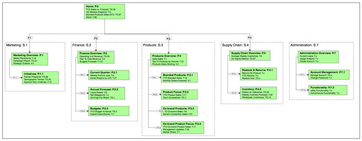
Figure 17: Example Dashboard or Portal
Rendering description:
This sitemap style rendering shows a medium-sized Dashboard or Portal designed to meet the information and business functionality needs of a large enterprise with multiple operating units and business lines. In this context, the Dashboard provides cross-unit summaries of many important metrics for senior managers, and could even provide them business functionality to alter business processes, change supply chain structures, or revise finance and resource allocations.
This Dashboard or Portal consists of a dedicated Home Page, and five major sections: Marketing, Finance, Products, Supply Chain, and Administration. The first four sections–S.1 through S.4–are linked via a Section Connector, offering direct navigation between these Sections. Each of these Sections includes a summary style Page. The Administration Section is not linked and navigable via the Section Connector: access to this Section would come via another path, generally direct URL entry or at the Dashboard or Portal log-in prompt (not shown). Within the major sections, all Pages are linked and navigable via Page Connectors.
Dashboard or Portal Suite definition
Mandatory components: Dashboards
Optional components: None
Stacking size: 7
Dashboard or Portal Suite description:
A Dashboard or Portal Suite consists of a group of stacked (though at this high level of structure, the construct is more akin to a collection of interlinks rather than hierarchically arranged) Dashboards or Portals sharing integrated content and common infrastructure. Stacking Dashboards or Portals as a Suite allows design and support teams to organize and manage distinct but related Dashboards or Portals as a single unit, and can help users by giving them quick and direct access to the collection of interconnected Dashboards or Portals. These Suites generally serve a diverse population of users who draw on a variety of business intelligence resources or other functionality to execute job functions at a variety of levels within the enterprise. The goals or purposes of the Dashboards or Portals in a Suite may vary dramatically; hence their individual content offerings will also vary dramatically. Users whose business needs or functions require them to work with single Dashboards or Portals in a Suite may not realize the commonalities underlying the various individual Dashboards or Portals they use. Users whose needs span multiple Dashboards or Portals in a Suite typically rely on a Dashboard or Portal Connector to move from one Dashboard or Portal to another within the Suite.
From an enterprise level architectural or IT administrative viewpoint, the Dashboard or Portal Suite can become the connection point to other enterprise level systems, such as metadata registries and repositories, ERP and SCM applications, enterprise data stores, security and authentication platforms, intranets, extranets, etc. The Dashboard or Portal Suite is also a useful unit for enterprise level perspectives including IT portfolio management, business process management, strategic information management, and knowledge management.
Figure 18 shows an example renderingof a Dashboard Suite.
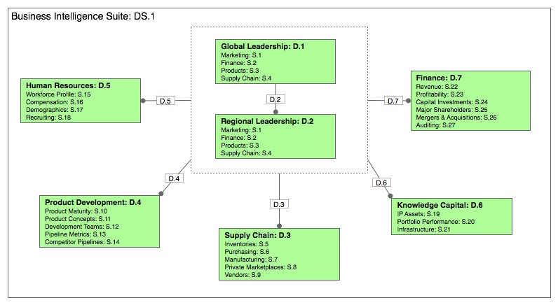
Figure 18: Example Dashboard Suite
Rendering description:
This sitemap style rendering shows an enterprise level Dashboard Suite made up of seven individual Dashboards that share assets. Five of the seven provide depth of content in major domains of a global enterprise: Supply Chain, Human Resources, Product Development, Knowledge Capital, and Finance. Each of these domain Dashboards has a distinct internal structure, with the individual Sections identified on this map.
The remaining two Dashboards–Global Leadership and Regional Leadership–aggregate assets for presentation to the different levels of executive leadership within the enterprise. Within this scheme, the information architecture of the two leadership Dashboards is closely parallel, but the scope of the assets shown in each would differ; users of the Regional Leadership Dashboard would have a view of Finance assets for their individual regions, and not globally, as in the Global Leadership Dashboard.
In this Suite, the five domain Dashboards are linked to the two Leadership Dashboards via a Dashboard Connector, meaning that each of these is navigable directly from the Leadership Dashboards. The Regional Leadership Dashboard is also linked to the Global Leadership Dashboard via another Dashboard Connector. Whether these Connectors allow two-way access is dependent on the individual access rights of the various Dashboard users. The Dashboard Connector here ensures that the members of the respective leadership teams can literally see what their colleagues see when discussing a course of action.
Coming soon: Building Block Definitions (Connectors)
The fourth installment of the series will define the Connector components in detail.

Thanks for a great addition to the series Joe.
I’m trying to convert your theoretical approach to a -for me- more tangible example. Would it be fair to translate your top level stacking orders like this (for most situations):
– Portal Suite = Website (as in top navigation like “consumer, business
– Portal = Main category
– Section = Subcategory
One other thing I was wondering was: Why 7 levels?
Some websites have more structural levels than the ‘portal’ and ‘section’ level. Also, the tile building blocks could be split up in even smaller tiles (like the header, body and footer section) and even those could be split up etc… Is your definition based on being “workable” or is there another reason?
Keep up the good work. Waiting for #4 🙂
yes, yes, I can use this 🙂
@Floris: You could translate the blocks to this sort of situation (if I understand correctly) – though I recommend keeping in mind the idea that the blocks are aimed at tile-based modular design and development situations, rather than categories in an information structure.
Very true that the blocks can be split into smaller elements; if introducing further granularity suits your purposes, I encourage doing so. The blocks are meant to be an open system that grows with adoption by the community, so I also encourage sharing any sorts of ‘extensions’ that come about.
Seven levels provides considerable potential for scaling with structure, while retaining flexibility.
@Patrick: I’m glad to hear it’s useful to you!
Joe, Thank you for develolping this series. I have found them very very useful. This takes all of the conceptual talk about containers and building blocks and applies it which is what allows for further thought. I am very happy to have found this series.
Thanks a lot
I wish that I could publish this to my LinkedIn account for my contacts and others that ask me questions to see.
Trevor Bollers