Organizations now recognize the value of spending time and money on user experience design. Many have spent considerable time and money to develop just the right user interface (UI). So when it comes to adding or changing functionality, they may not want or have the option to do a full re-design because of budget, time, or technological constraints. That leaves designers working under less than ideal conditions.
Specific practices and concepts can assist you when designing for an existing UI. The following projects demonstrate these approaches.
Project 1: Source code management application
The goal of this project was to adapt an existing enterprise content management web application (EMC Documentum’s Webtop) to allow for source code management. A fundamental constraint of the project was that the new application would use the existing technical architecture as well as the existing user interface.
Project 2: Intranet for hospital chain in South Florida
The aim of this project was to determine page types and content types from a fully designed prototype (no wireframes) created by another consulting firm. This was necessary so the client could use a content entry/web publishing solution to build and edit their site. The prototype was not designed, however, to account for page and content types that could be used in a modular way.
Approaches
General methods
The following are some methods that work well when designing for an existing UI. Just because a UI already exists doesn’t mean you should ignore any of these tools.
User research
Interviews were used to validate and add to our requirements.
Use cases
We created use cases of each feature we planned to include before we began work on the design.
Sketching
Quick sketches of all functionality were reviewed with the team to make sure the design was technically possible. This step prevented us from detailing designs that could not be implemented. The sketches also helped developers and designers estimate the scope of the project.
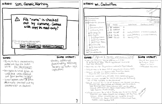
Figure 1: Sketches [Click for larger image]
Team reviews
We reviewed each set of functionality with the team (especially the developers) as we finished designing the clickable wireframes. While we designed, the developers created technical designs and documentation, which were very helpful. We read the documentation at the end of technical design, but it would have been useful to read them as they were created. Even though we may not fully understand these documents, we can still determine where they stray from the UI design and catch any variations before implementation begins.
User testing
We did user testing of our Project 1 design using clickable wireframes. We then created a set of recommended UI changes and reviewed them with the team and management to determine which changes would be made immediately and which would be saved for later.
Client meetings
Client meetings were instrumental in understanding what the clients expected from their intranet (Project 2). Without these meetings, it would have been impossible to determine the appropriate page and content types.
Methods for re-purposing an existing UI
Clickable wireframes
We choose to use a unique type of wireframe documentation: clickable wireframes using HTML, CSS, and JavaScript. This approach is very similar to a concept discussed in HTML Wireframes and Prototypes: All Gain and No Pain. We created and edited the clickable wireframes using Dreamweaver. This documentation was more helpful than static wireframes and resulted in several positive outcomes:
Benefits
* Interactivity allows you to validate designs and catch usability/user experience issues earlier
* Clearer explanation of form objects and their contents (i.e., dropdowns, text fields, lists)
* Better explanation of interaction between screens
* Shows technical team how the interface work
* Serves as marketing and testing tool (with the annotations turned off)
* With an existing UI, if it’s HTML, you may actually be able to use the current interface, including the visual design, to create the wireframes
* Helps generate buy-in from the decision makers throughout the project
Drawbacks
* Pages must be printed individually, which can be cumbersome for large projects
* Changes are more difficult to record
* Designer must know HTML, CSS, and some JavaScript
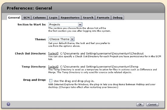
Figure 2: Clickable wireframe without annotations [Click for larger image]
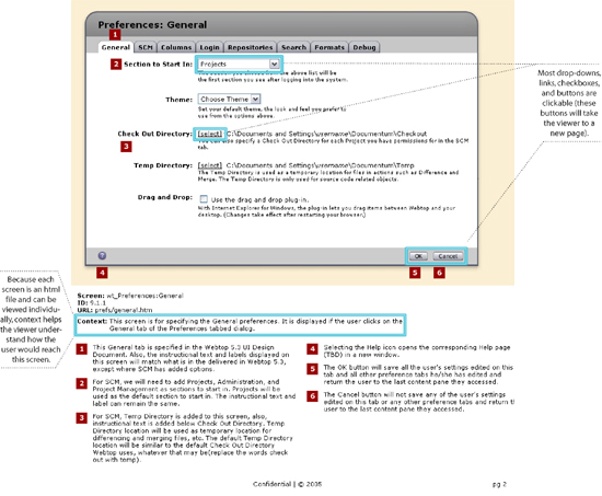
Figure 3: Clickable wireframe with annotations [Click for larger image]
When to stray, when to stay: how to handle consistency
Problem: How to choose between sticking to existing UI standards and changing them to add new functionality?
Solution: Look at how new features differ from existing UI.
Lesson learned: Do what is best for your users!
It sounds simple, but it’s not always easy to sell people on new ideas, especially developers because it means more work for them. Sometimes you must stray from the existing UI’s conventions to do what is most beneficial for your users. Using an existing UI does not mean making life harder for your users.
Benefits
* What works best for your users leads to happy users
* Your site/application will be more credible if you do things the right way
Drawbacks
* More complicated/time consuming technically
Example
* Import: Source code applications generally allow users to select folders and files for import and then select and unselect items as necessary. With the existing UI, this was not possible. We added functionality to support this behavior.
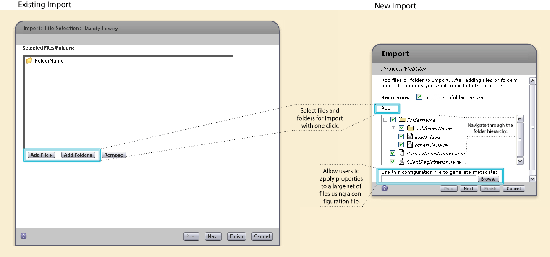
Figure 4: Import [Click for larger image]
* Error Handling: Other source code applications show errors and warnings for each file or folder and allow users to address them individually or as a group by using buttons like Yes, Yes to All, No, No to All and Apply, Apply to All. With source code tools, users often manipulate tens or hundreds of files at one time. The existing UI did not account for this behavior because users were often working with only one or two items at a time; the application was not able to perform actions on folders or folder hierarchies. With the additional functionality, a new way of error handling had to be supported.
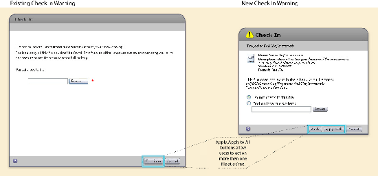
Figure 5: Check in [Click for larger image]
The little things count
Get the most out of what you can change in the UI. Some things may seem too insignificant to bother changing, but little changes add up in the end.
Benefits
* Improved readability
* Improved scalability by saving space
* Consistency
Drawbacks
* Little things can add up and cause scope to increase
Examples
* Properties: We bolded the labels in the file properties dialog.
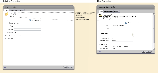
Figure 6: Properties [Click for larger image]
* Homepage: A more structured organization, listed vertically rather than horizontally, allows any number of additions of News or Events items. Aligned vertically for easier readability, each item has a title, text block, and an optional image placed to the left or right of the text.
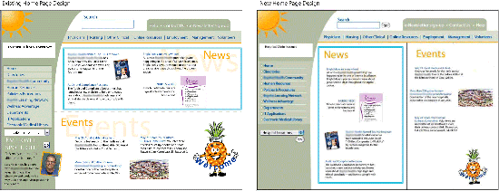
Figure 7: Homepage [Click for larger image]
* Course listing: More spacing and table row highlighting improve readability. Consistent information and layout are displayed for each course listing.
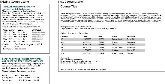
Figure 8: Course listing [Click for larger image]
Talk the techie talk
Do your best to understand the technical constraints. This helps you design the best possible solution for you, the developers, and the users. This strategy is particularly helpful when you are working within an existing UI that may have technical constraints. There may be a way to do things without so much work on the back end. Don’t force developers to take your design as is.
Benefits
* Design the best possible solution
* Connect with the developers (after all, you need them to build your designs)
Drawbacks
* Requires more effort on your part
* May be a waste of time because you already had the best solution
Change it up!
These techniques were gathered from a couple of projects, so it may not make sense to use them all on one project. Pick and choose those that make sense for you—the user.

Hey, I threw together some css/js/html to enable the annotation toggling on html wireframe mockups mentioned in the article – hope it is helpful to someone. Feel free to use it however you like.
preview image: http://www.linuxgrrl.com/hosted/annotation_toggle_preview.png
the files: http://www.linuxgrrl.com/hosted/annotation_toggle.zip
(btw, the annotation layer is also a macromedia fireworks compatible png which means you can use the shapes in it for your own annotations if you open it up in that program.)
Very nice article! It fits closely with a pitch that I lost–that is, a situation where the client said they’d already chosen a technology platform and presentation layer. I know that I can use some of your techniques later to help me. Grazie!