Sunday February 29, 2004
 |
| The panel discusses the use of narrative in design. (photo Erin Malone) |
The Use of Narrative in Interaction Design
Marisa Gallagher, Nancy Broden, Jonathan Woytek
Conference Description | Handout
This group of speakers explored the idea of various mental models as internal representations of the external world, comparing the typical narrative model with web design and a user’s experience of a website. They suggested the value of drawing parallels between theatre/film and web design, using the script as a strong conceptual model, and defining the impact of narrative on the deliverable and thought process around web design.
The panelists suggested that following the user’s narrative thread through the web design process creates a strong bond among team members, as well as between team members and project, as they explored the roles that narrative can play in creating enriching experiences on the web–not just for users, but also for design teams.
—Lara
Ferguson McNamara
 |
| Texas inspired carpeting at the Summit hotel. (photos Kiersten Lammerding) |
 |
Bottom-Up Information Architecture: Re-Designing an Enterprise-Class Web
Site
Sarah A. Rice
Conference Description | Handout
14 Things Users Want to Know
Jared Spool
Conference Description | Video presentation
I must admit that I only attended this session because I had never seen Jared Spool speak and thought to do it while in the USA. I expected that the ’14 things’ would be a list of guidelines to follow when designing sites.
I was pleasantly surprised to be wrong. Jared discussed their recent research (so recent that they have not yet finalised conclusions) aimed at identifying what users want to know, undertaken by analysing discussions in online forums. The team has been analysing questions and discussions about chronic illness, technical support and investing, and has identified 14 major types of problems and questions, consistent across the three domains. I didn’t note a full list of topics, so look out for an article on the UIE website soon with more details.
—Donna
Maurer
2003 Dublin Core Conference: Building Metadata-Based Navigation Using Semantic Web Standards
Bradley P. Allen, Joseph T. Tennis
Conference Description
In this presentation, Brad Allen and Joe Tennis led us through a case study of the website they helped build for the 2003 Dublin Core Conference, where they put semantic theories about web navigation to the test. Their consistent focus on RDF as the fundamental representation for metadata in the Semantic Web, combined with their subject-specific ontology development, produced an automatically generated faceted retrieval interface for the conference site.
Successful in many respects, this approach to a “bottom-up” organization of knowledge also held some challenges, including blurred boundaries between multiple levels of related terms and how to connect them for searching, and the issue of how to deal with a much larger set of data automatically. An intricate examination of this developing strategy in action, this presentation left no doubt in my mind that further research is critical to the future of information management.
—Lara
Ferguson McNamara
 |
| David Hoffer with a pretty cool information graphic. (photo Erin Malone) |
Information Design and Information Architecture – Together Again for the First Time
David Hoffer
Conference Description
It was good to see a number of presentations about information design at the IA summit (Dan Willis’ was the other that impressed me). I know that I spend a lot of time on the structure of the content, and less time on looking at how the content should be designed to meet user needs. David’s presentation had excellent examples of well-designed reports, plus stories outlining how the reports evolved.
David’s presentation has inspired me to think more about design at the detailed level. It was clear that the presentation inspired other listeners as well, when James Spahr jumped up excitedly to suggest some improvements to an excellent report and diagram.
The statements that summarised this presentation for me was “the same user research tools that you use to develop and IA can be used to do clearer information design” and “There is a direct correlation between Information Design and Information Architecture / Interaction Design, but they are also distinct disciplines that require different skills.”
—Donna
Maurer
An Ethnographic Study of How Stockbrokers Use a Web-Based Trading System
Laurie Gray
Conference Description | Handout
Laurie Gray, Senior Usability Specialist at HumanCentric Technologies, presented this case study of how site visits and observations contributed to a greater understanding of brokers’ work habits, the different types of users, and how the current electronic trading system could be redesigned and extended to meet the users’ needs better.
Laurie and a SME (subject matter expert) from the undisclosed client, a national financial services firm, observed and interviewed 16 brokers over a three week period. These contextual inquiries included unstructured questioning along with a short standard interview. The brokers were asked to show how they do their work, and their actions and comments were logged. The data was analyzed and different patterns started to emerge. Some brokers, for example, leaned more towards mutual funds, while others were stock-focused. The 16 brokers were plotted on a chart of 5 different axes, similar to a semantic differential analysis. The results showed that different types of users used the web-based trading system different, and that there were significant holes in the system where users needs were not being met.
This case study is an excellent example of how contextual inquiry can uncover the root problems users face and help to define requirements for a product. Though HumanCentric employed a more “lightweight” CI methodology, the approach was appropriate given the timeframe and it illustrates the “real-world” application of a proven methodology.
—Jeff
Lash
Using Machine Learning Techniques to Populate Dynamic Interfaces
Miles Efron
Conference Description | Handout
 |
| Karl Fast just before his presentation (photo Erin Malone) |
Information Visualization: Failed Experiment or Future Revolution?
Karl Fast
Conference Description | Handout
Wow, what a brilliant, exciting talk about a critical issue to IA/UX professionals. Admittedly, it was conceptual without immediate action items for practitioners back at the office, but the presentation offered much food for thought about the future of visualization and interaction. And that’s a wonderful concep: they are interrelated! Fast provided an overview of prior visualization experiments, referencing some major texts and inventors like Ben Shneiderman and Stuart Card. He offered a definition from “Readings in Information Visualization”: “Information visualization is the use of computer-supported, interactive, visual representations of abstract data to amplify cognition.”
This sounds like a general strategy of offloading the mental workload and maximizing fast perception of symbols, abstractions, signs, etc. towards enriched understanding of data. Fast offered some myths about information visualization that he debunked. For example, the death of text is greatly exaggerated. In fact, he applauded the use of textual representations in many cases. Also, there has been improper application of information visualization that may have contributed to a negative stigma among IA folks. One example is the classic dynamic slider application for videos, which raises all kinds of interaction issues (not to mention some common sense). Can you drag a slider across 50 megs worth of actor names? Nice question. Hard problem to solve. For Fast, information visualization is about problem solving and finding the proper representation that makes the interaction and information access transparent and meaningful.
The talk was rather fast-paced with lots of information, maybe even too much to absorb in 45 minutes. Unfortunately, he ran out of time for questions, but he did certainly spark some inspiration and discussion, based upon the buzz in the room. As a conference attendee told me, “This is one of the most important presentations at this conference”.
—Uday
N. Gajendar
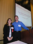 |
| Jessica Moore and Joseph Matthews (photo Mike Lee) |
The Blind Leading the Blind: Theorizing a Web for the Visually Impaired
Jessica Moore and Joseph Matthews
Conference Description
Section 508 guidelines give dos and don’ts for Web accessibility but fail to provide a cohesive approach for how to design sites for the visually impaired. In their talk, Jessica Moore and Joseph Matthews of AARP Services, Inc. presented strategies they developed in their redesign of AARP’s website. Moore began by noting that their site is far from perfect, since they’ve had to make compromises to support a broad base of browsers.
Moore argued good information design is the foundation of making an accessible page–organizing content into blocks, and then determining the appropriate order of the blocks to be read (which may or may not be the same as the order they are displayed on the page). The order should be documented as a content outline that can be referenced during visual design and coding. Moore suggested the following order to content:
- Header (including home link, search, etc.) – while one might think it’s repetitive, users can enter a site at any point and it’s useful in getting oriented
- Contextual information (page title, topic, “you are in,” etc.)
- Main navigation
- The main content of the page
- Sub-navigation
- Cross-promotional content
- Footer
One important consideration, Moore said, is not only paying attention to consistency within your site, but also paying attention to being consistent with other highly-used sites, since users become familiar with certain conventions. Moore said it’s important to actually test your site with screen reader programs, such as JAWS, to catch specific issues, such as truncated link descriptions. Likewise, she said, it’s important to test with actual visually-impaired users, whose behavior differs from what a sighted person might expect, such as tuning out repetitive document information generated by the screen reader, just as a sighted user might tune out repeated navigation. Another key issue to remember, is that designing for users with poor eyesight is not the same as designing for those without sight.
Matthews talked about how most Section 508 issues can be eliminated by using semantic mark-up–HTML as it was originally intended, for example, using the H1 tag for first-level headlines. Cascading Style Sheets should be then used to provide visual formatting. One advantage of using CSS for formatting its that it makes it easy to provide alternate stylesheets, for example for a “large print” version of the site.
—George
Olsen
![]()
 |
| The Design Methods panel discussing methods and process. |
 |
| Andrew Hinton asks the panel a question. (photos Erin Malone) |
Design Methods and IA Panel
Panelists Jesse James Garrett, Victor Lombardi, James Spahr. Moderated by John
Zapolski
It’s always good to start a panel discussion with a definition, and being a design panel, John started with a definition of design:
“Design is to design a design to produce a design”
Zapolski helped us further by explaining that the panel would be focusing on the second design.
But seriously, this was an interesting and constructive panel. The discussions centred around what is driving the acceptance of design methods, why methods are becoming more frequently used, and the disadvantages of methods in a design process. The panel also discussed ways to improve the use of methods by ensuring that practitioners understand the background of a given method and know how to apply the method properly.
As you can expect from a short panel discussion, there was no strong conclusion to the discussion. However a quote from an audience member summarised it for me:
“A design method does not a design make”
—Donna
Maurer
 |
| James Kalbach (photo Mike Lee) |
Information Search Experience: Emotions in Information Seeking
James Kalbach
Conference Description
James Kalbach did his homework. His talk on the role of emotions in information seeking was the most well-research presentation I attended at the summit.
James started by surveying research about how people look for information, including a detailed look at Carol Kuhlthau’s six-step information search process and the link between the perceived complexity of a search experience and feelings of uncertainty. Kuhlthau’s work shows the link between emotions and information seeking, and indicates that reducing feelings of uncertainty and complexity should be a key goal of design.
James then presented his information search experience (ISX) model. ISX has four dimensions:
- Needs (problems or gaps)
- Uses (solutions)
- External Factors (context for information seeking)
- Internal Factors (prior knowledge, experience)
ISX also has three planes, or levels at which users engage information:
- Physical/action
- Cognitive/thought
- Affective/motivation
The ISX dimensions and planes form a matrix that can help designers understand how users feel at each stage of the search process. The ISX model isn’t meant to be academic–James presented it as practical tool to help with feature development, user research and other tasks.
The two slides of references at the end of James’s deck make a great starting point for anyone interested in the role of emotions in design or search.
—Gene
Smith
Children as Design Partners for Educational Web Sites: Challenges and Lessons
from the NIDA for Teens Project
Nancy Kaplan, Jennifer Isenberg
Conference Description
Rapid User Mental Modelling at eBay: a Case Study
Larry Cornett, Dan Ido, Kirsten Swearingen
Conference Description | Handout
This presentation covered both the rapid user mental modelling process used in the Ebay IA redesign, as well as Ebay’s project approval process.
Ebay had experienced organic growth over the past few years, which led to a growing sense of complexity for new users. The IA redesign project was the first major effort to evaluate the structure of the entire site, and was guided by user mental models, business goals and existing features and content on the site.
Ebay may be one of a handful of organizations that must base its IA decisions on hard metrics. As Larry Cornett explained, Ebay knows the nominal value of bids, listings and registered users within its system, and can calculate the impact of design changes based on those values. Understanding the business impacts and ROI of IA changes was critical for this project’s success–it had to be justified in the same way, and on the same footing, as any other project within Ebay.
By demonstrating the business benefits, the Ebay user experience group was allowed some freedom with their methodology. One of the tools they used was rapid user mental modelling (RUMM). Kirsten Swearingen of Uzanto Consulting explained how their three-step RUMM process–explore, understand and verify–was used to guide Ebay’s redesign. For the Ebay project, RUMM involved:
- Exploring the domain through interviews and free-listing exercises with users and stakeholders. A list of 300 tasks was generated in this stage. Tasks were divided into three groups: core tasks, boundary tasks and horizon tasks.
- Understanding user mental models through an open card sorting exercise. Twenty-eight people participated in the card sorting, and one of the card sorts was done by a group of six people. This resulted in a premliniary IA with five top-level groupings.
- Verifying the proposed IA through a closed card-sorting exercise with 1000 participants. This card sort was done online, and the results confirmed the architecture developed in the previous phase. It also helped further expand the site map.
This mix of methods generated both qualitative and quantitative data. The quantitative date was important because the design research had to be both persuasive and defensible to Ebay management. The final deliverable from the RUMM process was a revised site map for Ebay which is currently being used to guide the IA redesign.
Though he wouldn’t give numbers, Larry emphasized that the IA redesign project “achieved significant positive ROI.” He offered four “key takeaways” for IAs undertaking similar projects:
- Talk to decision makers in their own language
- Don’t “special case” your project
- Gather persuasive quantitative data
- Track success & bank credibility for future projects
 |
| Jesse James Garrett talking about Brand (photo Erin Malone) |
Brand Driven Information Architecture
Jesse James Garrett
Conference Description
In an interesting look at the links between brand architecture and information architecture, Jesse James Garrett outlined some of the major elements that make up a brand and then linked them to what we already know about IA. As examples, he described how brand language can drive nomenclature, how brand priorities can help us to prioritise content and how brand semantics can drive the semantic structure of the IA.
—Donna
Maurer
J-Flow Interactive Design Tool: From Sitemap to Prototype
Peter Boersma, Jacco Nieuwland
Conference Description | Handout
Architecting Time: Designing Online Events and Other Magic Tricks
Katrina Friedman
Conference Description | Handout
 |
| Uday Gajendar discusses IA and Beauty (photo Mike Lee) |
The Aesthetic Imperative: Four Perspectives on Aesthetics to Impact the
User Experience
Uday Gajender
Conference Description | Handout
Donald Norman argues that attractive things work better. But how do user experience professionals talk about “beauty” in a way that’s useful in the design process. Uday Gajender, an interaction designer at Oracle Corp., sought to provide a framework that information architects could use to include aesthetics as part of the total design effort. Gajender discussed four models from different fields: philosophy, psychology, computer science and architecture. None is superior to the others, he said, rather they provide different viewpoints for approaching the issues:
- Optimal Flow – Based on the work by Milahy Cziksentmihalyi, this viewpoint emphasizes the sense of deep personal engagement commonly found in immersive games, puzzles and websites. A prototypical example was the computer game, “Myst.”
- Lifestyle Design – Described in John Dewey’s “Art as Experience,” this aspect is demonstrated in products by such as the Sony Walkman and Apple iPod that merge sensual beauty and functional power, creating both a pleasing artifact and experience.
- Machine Beauty – A viewpoint articulated by David Gelernter, in a book of the same title, that values on the union of power and simplicity in technology. While Gajender only alluded to Bauhaus, Bauhaus design is a good example of this approach’s focus on transparency of use and directness of results. Current examples include the OXO Good Grips potato peeler or Palm OS user interface.
- Spiritual/Cultural Appeals – A fourth viewpoint, articulated by architect Walter Gropius, takes a holistic look at how the relationship between a product and user add or detract from personal beliefs and cultural values. As a current example, Gajendar pointed to the proposed “Freedom Tower” at New York’s Ground Zero site, which seeks to communicate patriotic and human values of: perseverance over tragedy, hope and renewal of prosperity.
Gajendar said he hoped these viewpoints could be used to created products that are not only functional, but emotionally and physically satisfying and memorable.
—George
Olsen
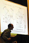 |
| Peter Merholz backlit by a really cool chart (photo Erin Malone) |
Then a Miracle Occurs
Peter Merholz
Conference Description
We all know the Miracle that Peter’s presentation was about–that step between research and design where a bunch of things fall together and a design comes out. It is difficult to explain how we move from user research to a design, and Peter’s presentation provided some insight. He discussed issues with analysing large volumes of text-based data and outlined an approach based on task analysis, mental models and thematic models where the model can be used as both an analysis and presentation tool. Peter also outlined examples of other fields that study human behaviour in the design process (which sidetracked the discussion into cow paths in university campuses).
 |
| Peter Morville kicks off the session with the AIfIA prize. |
 |
| Dan Willis gets a stack of UX books. |
  |
| Audience members waiting for the 5 minute madness to begin |
 |
| Margaret Hanley, this year’s conference chair kicks off the madness. |
 |
| Donna Maurer (photos Mike Lee) |
While Peter still did not manage to define the miracle (if that is even possible),
he provided some additional ideas to help us all to bridge the gap between research
and design.
—Donna
Maurer
5 Minute Madness
While there are two full days of listening preceding it, the “Five-Minute Madness” session is the information architect’s chance to be heard. Ending the Summit each year, this hour gives everyone attending the conference the opportunity to take the floor (for five minutes), speaking on reflections about the weekend.
To start the activities, Peter Morville presented Dan Willis with the AifIA-sponsored first prize: a hefty supply of experience design-related books and a bag. Dan promptly placed the bag over the books and continued back to his seat. When the audience suggested putting the books in the bag, Dan quickly pointed out “I’m a user and I’ll do it an way I damn well want to!”
With that as its start, the hour didn’t slow down. Here are some of the highlights:
- The information architect from RSA Securities talked about the value of the conference, this being her first time. Since she is the sole information architect at her company, she doesn’t get the opportunity to share ideas like this often. To express her feelings, she then broke out into song. Really.
- The IA Slam was a key theme. Because of it’s content (to design a ‘smart’ refrigerator, one information architect expressed real concern about what they had been asked to do. The role of an IA on a project, he expressed, should have been to advise the client against such a product. Lively and near-heated discussion ensued. Members of his team at the Slam, as well as other participants, fell into agreement and disagreement. In this mock scenario, some argued, it was about doing great work not pushing back. The IA Slam is sure to be back next year with more good debate to follow.
- Jesse James Garrett diplomatically expressed his dismay at what has become of the discussions on the SIG-IA list, and encouraged those in agreement to join the AIfIA list instead.
As always, there seemed to be more people than time. Gives us something to look forward to next year!
—Liz
Danzico
Christina Wodtke encouraged us to be confident in our IA abilities as we work with others. We have good ideas, so just speak up and go for it!
This is a great feature of our conference, and it works well with the creative and supportive networking environment we have when we get together as a group. What an awesome way to wrap up a fantastic weekend!
—Sarah Rice
And thus the summit drew to a close. Attendees scattered across the city and around the world. We can only hope that next year’s summit is as interesting, lively and well-attended.
For More Information:
- IA Summit official schedule
http://www.iasummit.org/conference.htmlSession presentations and handouts
linked here as well - Summit blog
http://www.iasummit.org/blog/ - IA
Slam
http://www.e-reiss.com/Seminars/IA%20Slam%20mini-site.aspx
Blog writeups and more reviews
- Brett Lider – Every
Breath Defying
http://everybreathdeathdefying.com/blog/archives/cat_conferences.html - Tanya Rabourn – Pixel
Charmer
http://www.pixelcharmer.com/fieldnotes/archives/cat_form_conference.html - Dan Saffer – Celtic
Knot
http://www.celticknot.net/blog/archives/000899.html - Kieth Instone – User
Experience.org
http://user-experience.org/uefiles/facetedbrowse/ - Donna Maurer – Maadmob
http://www.maadmob.net/donna/blog/ - Jesse Wilbur – jdwilbur
http://www.jdwilbur.org/weblog/index.php - James Spahr – Design
Weenie
http://www.designweenie.com/blog/archives/001309.php
Videos:
- Poster Sessions Videos
http://www.cmsreview.com/IA/Posters/ - Content Management for IAs Session Videos
http://www.cmsreview.com/IA/audiovideo.html - Jared Spool Video
http://media.skybuilders.com/IASummit/Summit/Spool.rm
