The age of cheap “like”-hunting needs to come to an end. It all started innocently enough with likes and tweets. Then in a few years, we suddenly ended up with governments scoring people and masses manipulated into meaningless activities to generate more ad revenue.
But it doesn’t have to be that way. Now the time has come for us—designers, working on digital products—to step up our game and act like real gatekeepers.
Instead of unethical practices and cheap tricks to lure people into more and more engagement, we need to do the hard work of designing meaningful products where people can connect, collaborate in a meaningful way, and help each other build a better world.
We have a huge responsibility here as designers. It’s up to us how we design these platforms and what social norms we set there. In this article, I will share a few good examples I’ve seen, and I will also share a few stories from my UX company, where we try hard to put more meaningful social features in both our client’s products and our own.
Turning harsh forums into helpful communities
Stackoverflow is one of my favorite examples of meaningful social interaction. If you were part of online programming forums in the 90s, you might recall that n00bs didn’t get much empathy or support. Stackoverflow arrived on the scene in 2008 and solved the hostile environment brilliantly by applying gamification methods to encourage constructive participation on their platform.
On Stackoverflow, all the 560,000 registered users have a public reputation score; they can also earn badges. Users’ reputations grow as they contribute to the community. Stackoverflow highlights the best answers and encourages people to give more comprehensive answers to each other.
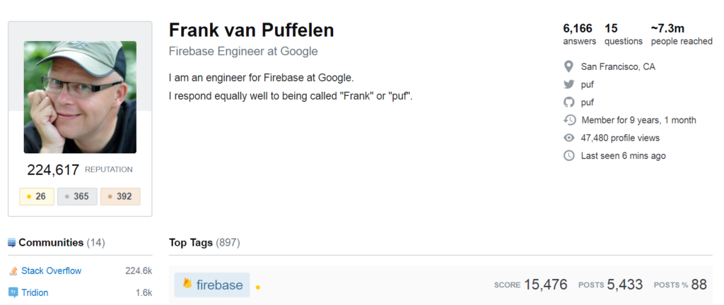
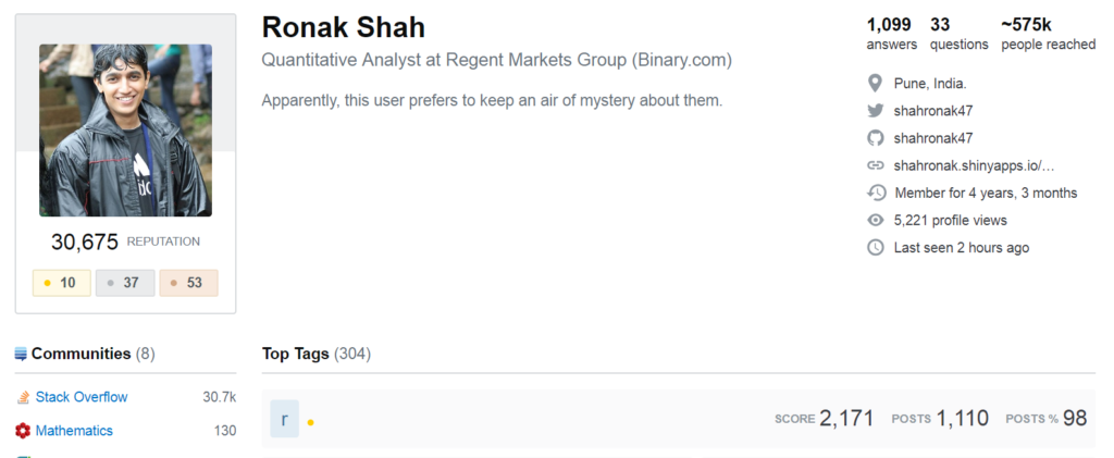
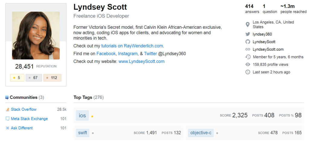
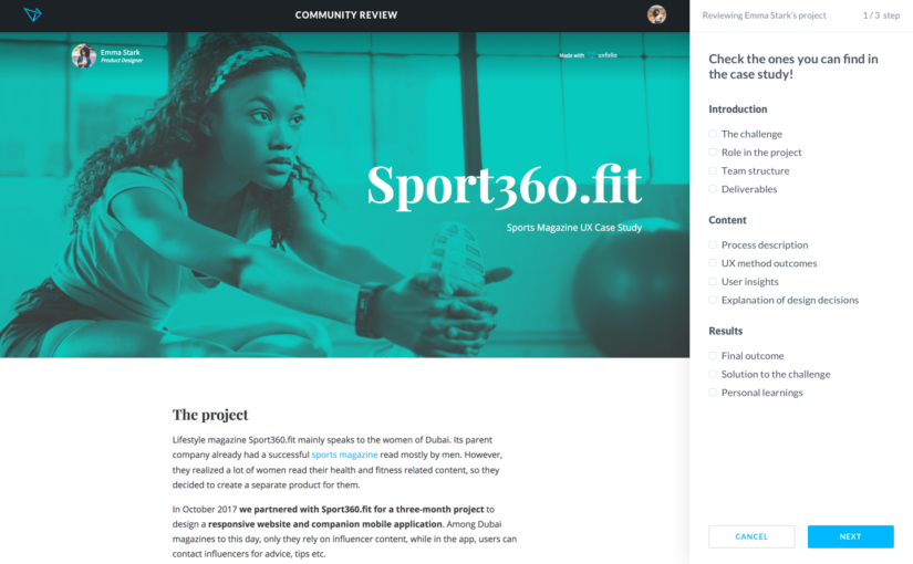
Stackoverflow’s approach was a huge inspiration for us when we designed UXfol.io, a web app where designers can build their online UX portfolios. When creating the tool, our team wanted to add social features. We looked around, but we weren’t really inspired by what we saw on popular platforms like Behance and Dribble. Most people there are just commenting on design projects as a way to ask others to like their work.
So, instead of adding those same basic social functions, we started experimenting to find out what our users need.
We wanted to help people create better portfolios, so we pored through the first portfolios our early adopters created; we sent them an email with feedback and tips on how to improve those portfolios.
Turns out, the early adopters really liked our emails, so after a while we added an “Ask for Review” button. The reviews still go out in email, but this button helped us validate the need for it. Incidentally, we wrote hundreds of reviews manually, so now we also know how to give helpful, constructive feedback.
Our next step is to let users to give reviews to each other. We will introduce karma points—people will have to contribute to the common good before they can enjoy its benefits. Instead of likes, stars, or comment fields, we will use what we learned by writing portfolio reviews ourselves and structure the feedback form in a way that teaches reviewers to give useful feedback.
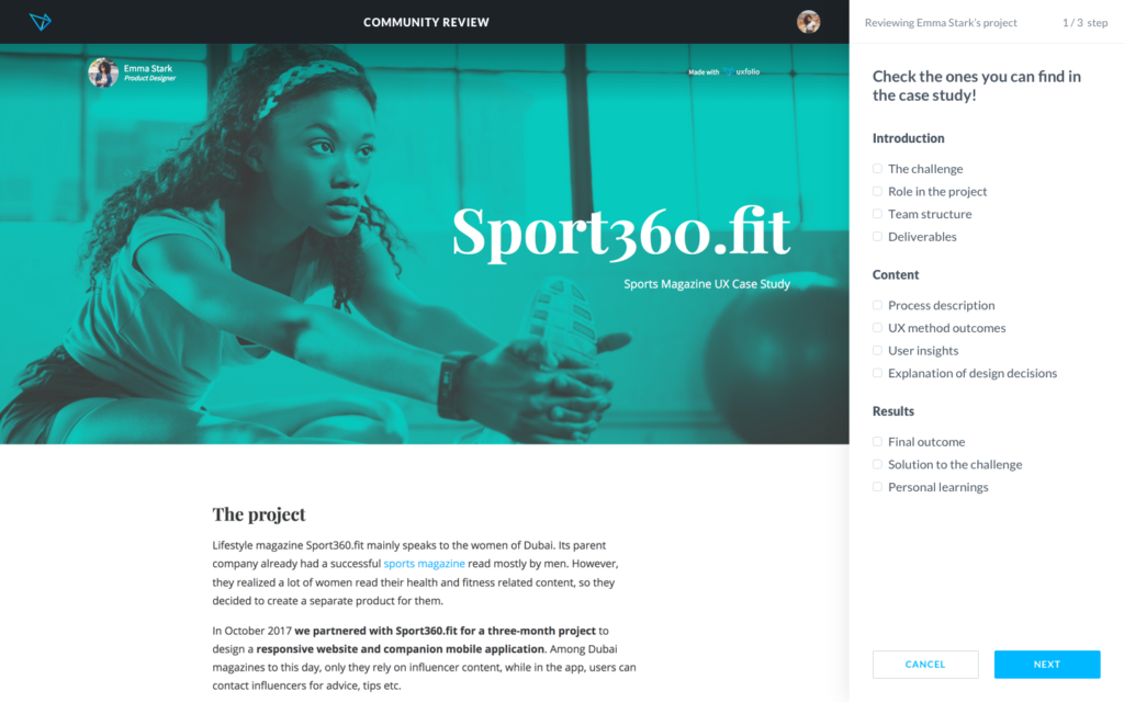
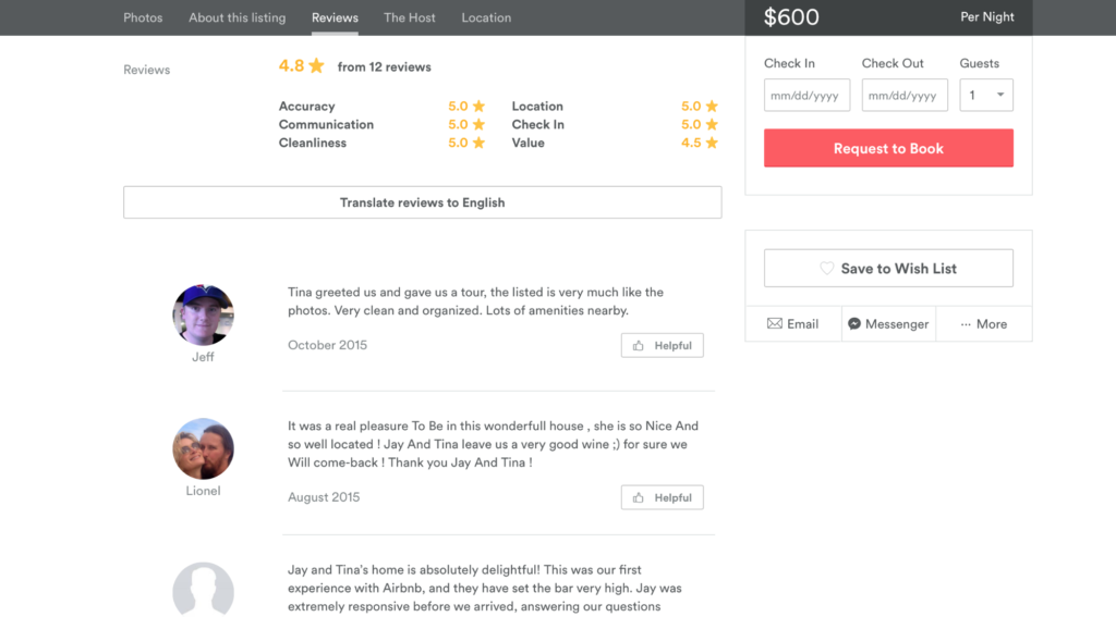
AirBNB served as a major inspiration for us, as well. Their review forms are a great example of how designers try to structure interactions, so people can create great content with the least amount of effort.
When you review your host on AirBNB, you can choose from a list of guests’ most common issues, like safety or cleanliness. If you indicate that your apartment was dirty, the form asks you more questions to specify the nature of the problem and which rooms were affected. Everything happens quickly and you don’t even have to type—just choose from options. AirBNB also encourages you to send a private message to the hosts before writing a public review, which gives the hosts a chance to solve issues before being shamed on a public platform.
Connect people in a meaningful way
When we worked on StyleLike, an influencer marketing platform for fashion brands, we started the job by interviewing potential users. We had terrific discussions with Instagram celebrities about how they manage their cooperation with brands.
Then a weird thing happened. Many of our interviewees asked us to connect them to the other influencers we talked with. Naturally, we replied with the question designers use the most: Okay, but why?
It turned out that most of the influencers are lonely in their professional life. They were early users of the Instagram platform who figured out how to make money out of it. Once they quit their “normal” jobs, though, these influencers didn’t have social communities in which to share their experience or learn from each other.
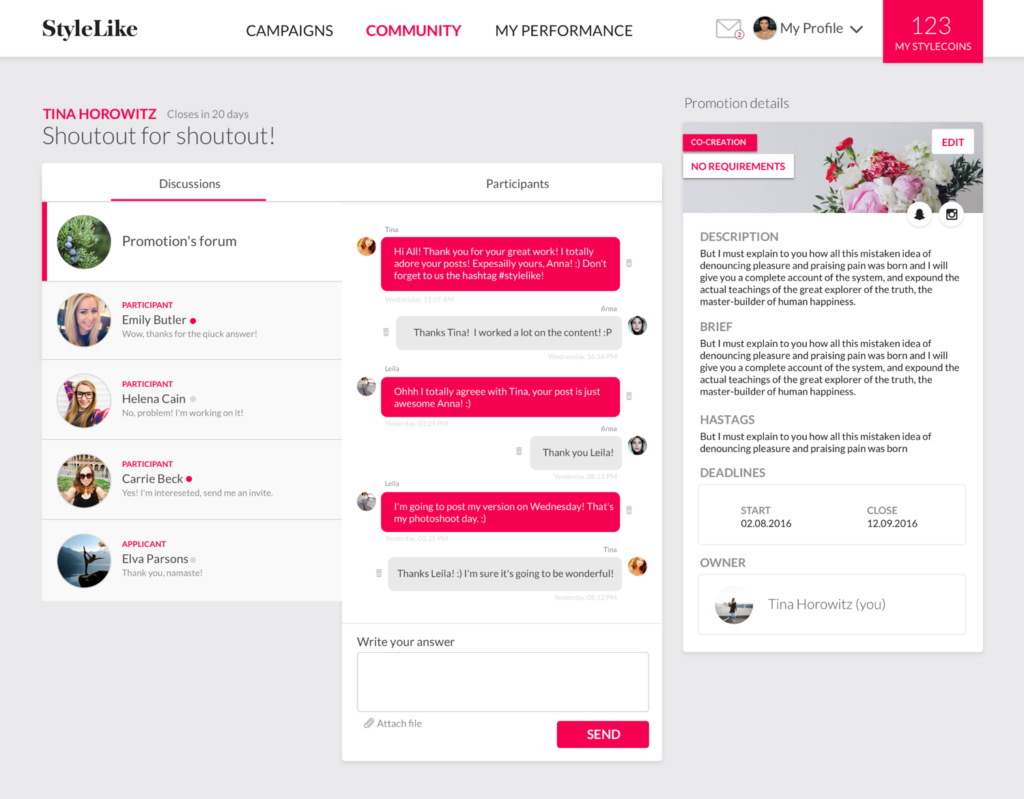
At this point, we knew our product was not solely an advertising platform any more but also a place for influencers to socialize and learn from each other.
Instead of using leaderboards and other competitive techniques, we gave influencers an interface where they can find each other and talk to each other. We made it easy for influencers to share tips under each campaign they join, and we also let them collaborate and start campaigns together. All these social features can lead to real, deep human connections. All we had to do is to listen to our users, find out what they need, and provide an option for meaningful interactions.
Solving society’s big questions with debate
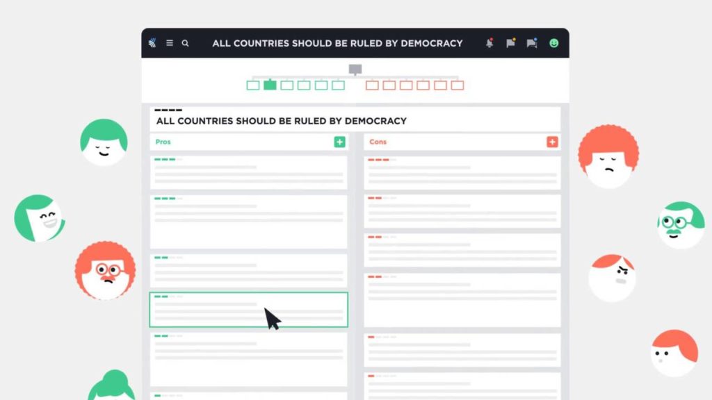
Kialo is a website, where people can discuss questions like climate change, universal basic income, or NFL protests. You can’t just comment freely: All thoughts are organized in a tree, where you can systematically move between arguments and counter arguments.
For most people this might look too sterile, because Kialo tries to solve very difficult questions with calm and conscious reasoning, without emotionally overheated, passionate discussions. On the other hand, it is a wonderful experiment to create a platform that encourages civilized and deep conversations by design.
How to build your own meaningful social features
I trust designers around the world to take responsibility and add more and more meaningful social features to the products they are working on. This new era of meaningful social is just about to born, so we have a lot to discover and experiment with. If you plan to join the ethical design movement, here are a few tips I can give you.
Imagine
In contemplating what makes for meaningful online interactions, consider real world ones.
As a designer, would you go to an event where random people approach you every five minutes with requests—or demands, or pleas—to consume and praise their work? What if this event had a different setup: a separate room where people could give feedback on each other’s work, but only to those who are interested?
When we imagine how our online interactions would function in the real world, we can then build virtual places that encourage certain types of interactions.
Scale
Now, imagine your social feature at large scale.
What if many thousands or millions of people are using it? How will
your product’s social interactions affect these people? You have to anticipate that a feature useful for one person (getting many likes for a post) could cause anxiety and stress in others (people don’t love me me much as they love someone else). Designers must think about these social effects before they release a feature.
A good tool that might help you to examine how your product affects its broader environment is Maheen Sohail’s Ethical Design Thinking (PDF) guide. This guide helps you systematically go through different actors and environments and think about the possible side-effects of your product.
Prototype
Finally, our good old standby—prototyping—can help as well.
In my experience, the most useful way of prototyping social features is by mocking them up using communication tools that already exist, for example email or chat. These tools let us interact with real users, try different social interactions, and gather feedback.
As I explained above, we used email messages to prototype a review tool for design portfolios. From these email conversations, we learned a lot about what people like and what kind of reviews they want to receive. Later, we turned these insights into software features to help users write great reviews.
Conclusion
All in all, building meaningful social features might be more difficult than adding a mere like button, but your thoughtfulness will help you to build a real community around your product, which is worth all the effort.
If you are working on a meaningful social feature, I would be happy to read about it in the comments section below.

Really good article! I’ve been thinking more about meaning in design. A good book is Overcrowded — where he talks about how we have so many choices. I think you started by talking about social manipulation being a design device people are using — causing ethical issues and addiction — people feel worse. Another point is that people feel better as a result of meaningful design. They feel “whole” or complete (more satisfied)