What if I suggested a new way of navigating an online information space? What if it was something we’ve all seen before but just never thought to use? I’m talking about subtracting away information the user doesn’t want.
Content filtering is a much more natural way of sorting through categories, especially when the majority of your content is under more than one subject. Think of a web page that has the game results from every sports game on earth; this may be a huge page, but it is somewhat conceivable. Some people might even call it helpful. As interaction professionals, we might start to think about ways to navigate or sort through the information on that page. At this point, some of you are likely thinking it needs to be organized and others are thinking it should just be put into a database.
If all those sports scores were organized into columns, maybe some users would be tempted to scroll down through the page. If those columns were fed into the page dynamically, they could be rearranged according to topics at the top of them. This technique has been seen before, there are many email programs that sort hundreds of emails by date, by sender or by subject. This is sometimes seen on the web as well, where some sites have columns of data that can be easily re-organized by clicking on one of the headings. But this technique is for short columns with small entries, it is not for pages of text with details, graphics, links and so on. But perhaps it could be.
Let’s go back to that page with the sports scores. Imagine the page now displays a subset of only the most popular games of the week, only the games that are the most popular, perhaps 20 entries. On this page, the navigation is based on the same sorting system as above but the headings are now displayed within pulldowns. Yes, pulldowns. OK, I know what you are thinking, this technique doesn’t require the pulldown pull down element, but it makes for an easy and quick example. Let’s get started.
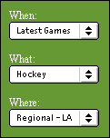
 The user starts to navigate by sorting the results according to “Latest Games,” this gives them what they want at the top, as expected. But now the actual content on the page has changed to be more relevant. How did this happen? The site filtered out the information from the first page that wasn’t relevant and added more of the information that was requested.
How is this different from a standard navigation and structure?
Well, imagine the user is still looking at the “latest games” page that was just selected. Now, they select another category, such as “hockey,” but this time from an additional dropdown.
Now they have the information sorted into a new topic, one that is a combination of the two dropdowns, showing the latest hockey games. The page has gotten rid of everything that wasn’t related to hockey and now shows an overview of the latest games combined with and overview of the hockey games. Two clicks and you’re there, at your very own topic. One more selection and the site will filter the information further into something like regional information on the latest games.
But the great part is the user can quickly switch any of the categories (the region, sport or the timeframe). And they can do it without switching the other two categories. This whole process is much simpler than backtracking up the site structure to go down another branch. Plus it makes the content delivery much more personal.
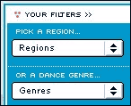
 Here’s another example: On BurnitBlue.com, a United Kingdom-based music portal, there is a dropdown dropdown menu system on the right hand side of the page. These dropdowns dropdowns are filled with titles that reflect the categories that visitors find important. We have all seen dropdown dropdown-based navigation before and it usually just doesn’t work very well, but in this case it works well enough to show the beginnings of content filtering. The site offers you the ability to use the dropdowns as filters for the main body content. You just pull down to your category, and the body area brings that category to the surface. While not a perfect example, in terms of consistency, and this site does a pretty good job at showing you how the initial concept works.
 The main key to this technique is in how you display the body content. The page has to be formatted with an even representation of content within the filtered area. The Burn it Blue BurnitBlue website uses the term “Headlines’ to represent this content area, but any summary of the site content would be applicable.
What is important is that the users are presented with a few examples of the content they are looking for before they navigate further. Providing this overview of the section content is essential to making content filtering work. Within the marketing departments, eyes will light up at the thought of an information architect who supports overview titles such as “Top Stories” or even “Hot Picks.” Finally, a legitimate excuse to put featured content on the main pages. In this case, advertising meets architecture with a firm handshake.
Content filtering and development
Here are a few serious applications where the content filtering techniques are applicable:
- Developing with metadata—As more and more information is tagged with relevant metadata it becomes increasingly important to be able to cross-reference materials. Looking at the above examples, you can see that this technique is specifically for data that is labelled under more than one category
- Devices with smaller screens—With limited screen sizes and mobile connectivity becoming a fast approaching reality, we are in desperate need of navigation techniques that will save space while not hindering the interaction process. Using navigation elements that save space is of prime importance, this use of new menu systems or condensed navigation might just do the trick.
- Representing the data architecture—This technique represents the data architecture much more closely than categorical navigation. Having the navigation system more reflective of the data structure allows for more rapid and iterative development.
Content filtering and horizontal navigation
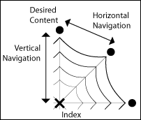
To further the strength of content filtering I would like to explain how it relates to other forms of navigation. Typically, navigation systems can either be seen as being either horizontal or vertical navigation, meaning they usually either delve into the content or move sideways across it. For example, horizontal navigation could be thought of as a link to related content or as a link to a relevant discussion group. In comparison, I refer to elements like breadcrumbs and site categories as vertical navigation. Content filtering can be seen as a way to navigate both horizontally and vertically but its strengths lie in how it increases horizontal navigation.
 As a visual example, think of an information space as being like a spider web. If you imagine each of the threads coming from the middle of the web as being different categories then you can think of the lines connecting them as links for traversing the site structure. With vertical forms of navigation, the user will “dive” down a content thread to find the desired content and perhaps use a horizontal thread to access related content. Using content filtering the user is given the opportunity to navigate along both types of threads as it the technique the user creates their own categories and can change those categories as they see fit.
Content filtering—conclusion
The reason why this content filtering works is because it gives the experience that the site is bringing the information to you rather than you having to search for the information somewhere in the site. It feels like you are getting rid of the stuff you don’t want, or even that you are creating your own pages.
Content filtering is a much more natural way of sorting through categories, especially when the majority of your content is under more than one subject. You might even say that this filtering technique is very similar to a Boolean query within a search engine, though it is a much more accessible user experience. It is this natural user experience that makes content filtering so accessible, the technique is reflective of our own intuitive process of elimination. Navigation techniques that mirror our natural sorting and selection processes will be more appreciated by those that work with them. Hopefully this new technique will influence your new navigation designs in becoming more reflective of our natural processes. Use it well!

Interesting. We actually tried out an approach like this for a client – no usability testing though so no idea if it worked well.
There are a few problems with this approach we encountered:
– empty nodes: you have to have your dropdowns dynamically avoid empty nodes.
– if they have to choose all three dropdowns before clicking submit, that can get complex cognitively. It may be better to reload upon choosing an element in a dropdown, but that invites some obvious interface problems.
This is not exactly new. We’ve used this technique for years, even using the choices to filter the choices. Works great. Customers complained a lot before we used it (who wants to wade through long, long lists of anything other than one’s personal stock holdings?) They don’t complain now – I guess that means it’s usable.
This seems very much like faceted browsing to me. Peter Moreville has written some stuff about it. The problems I’ve found with faceted browsing include a lack of instant gratification (search engines give you immediate results), and issues of context, especially feedback on what I’m doing.
Marti Hearst at UC Berkeley has some good examples at her Flamenco project (see flamenco.berkeley.edu). Marti’s got an extra improvement: she makes sure that every option shows the number of hits you’ll get if you choose it. This addresses the “empty nodes” problem as well as the “one item surprise”.
It does sound a lot like faceted searches. You should check out the stuff that Marti Hearst has done at Berkeley; I think she’s explored some of the concepts here pretty rigorously. Really I think the word that’s missing here is “winnowing”: a method of refining a large set of stuff into a small and precise set of stuff.
Also look at the examples at http://64.220.144.86:8080/facetmap/index.html where you can look at an example using wines or create your own facetmap to try it out. (when did that cool feature get added?)
For the “empy node” problem: we’re building a faceted search interface for a large product database right now and decided that any nodes with 0 results in them would simply not be shown as navigation options. (They of course appear in the CMS for content creators, and would appear with results if content is put in them).
I’m wondering about the real value of this for small screens, as you suggest. Part of the power of it is taking advantage of people’s ability to scan large bodies of information quickly and to decide how to process it. Without being able to actually *see* the large set of items being refined, winnowed, or filtered, I don’t really have any idea about what I’m getting.
Small addition to my comment above:
The URL for the FacetMap demo is better written as http://facetmap.com
Travis has done added some impressive things here, including the ability to try out different navigation interfaces for the facetmaps, including a drop-down menu system almost *exactly* like what Clifton is describing in his article.
An excellent example of this kind of filtering is on http://www.epinions.com/ – the site’s a great hybrid of exclusive category navigation and filtering (“I want cameras that cost less than $300 and are made by Canon”)
There’s the simple and then there’s the really complex. The example I always turn to is the Texas Instruments parametric search (powered by Endeca). The search begins once you’ve clicked on a product group (the visual design is not optimal): http://focus.ti.com/tihome/docs/paramsearches.tsp, the data is fully displayed at the bottom, if you scroll down and start selecting parameters you can see how the dynamic relation between the parameters affect the results.
What’s interesting about TI is that they don’t drive their main site search with Endeca, just the parts search — but TI has a great understanding of the need for designing a variety of specialized searches (http://focus.ti.com/tihome/docs/allsearches.tsp?DCMP=TIHomeTracking&HQS=Other+OT+home_s_allsearch, not that all of these have been ‘optimized’). A great piece on searching in general (http://www.intranetjournal.com/features/cadis-2.shtml) notes semiconductor catalogs as one high-profile use of parametric searches. The real issue is LOTS of data/attributes to sort through to get to what’s relevant to you. If the kind of content that Google returns had more parameters in the metadata then we’d see a lot more parametric searching going on. Otherwise it’s a must-have where there are lots of attributes and large data sets (Home Depot’s products are navigated via this approach, again using Endeca).
A few months have now passed and I’ve found a great example of this technique used online at Oddbins.
— This is an excellent Filtering example! —
http://www.oddbins.com/products/Wine.asp
I have also linked the demo that was mentioned above as well as an example from NBA.com that almost ‘gets it’… but not quite. 🙁
— This is the direct link to the FacetMap demo —
http://facetmap.com:8080/browse.jsp?s=220000&n=2&v=2
— This example is almost there… Such a shame —
http://store.nba.com/
Why is it that the only perfect examples of Filtering are about drinking? How strange is that?
I guess you have to be drunk to warrant this amount of ‘ease of use’…