Most of the today’s finding interfaces do not support integrated finding effectively, often creating disparate search and browse user interfaces that confound people with a jumble of controls competing for their attention.
In this article, I propose the Integrated Faceted Breadcrumb (IFB) design that integrates the power of faceted refinement with the intuitive query expansion afforded by browse. Although other breadcrumb-based finding interfaces currently exist, they fall short of expectations by ignoring design best practices. At best, the breadcrumb is stuck in a role of a side-kick, forced to eke out meager screen real estate along-side more powerful finding controls.
In contrast, breadcrumb is the superhero of the IFB design, dealing a decisive blow to many usability issues that plague today’s finding interfaces. To prove this point, I did what we do best – I tested my hypothesis. Twelve evaluators found IFB to be easy to use, intuitive and resourceful for solving complex finding tasks which would be difficult to accomplish using more conventional faceted search interfaces.
The Challenge of Integrated Finding
In his recent UIE webinar, Peter Morville lauded the advantages of integrated finding: “Browse and Search work best in tandem… the best finding interfaces achieve a balance, letting users move fluidly between browsing and searching.”1
Unfortunately, most sites today do not integrate faceted search and browse effectively. For example, Walmart.com approaches browse and search using two different interfaces creating a jumble of duplicate controls that overwhelm the customer, making the site more difficult to use, as shown in Figure 1.
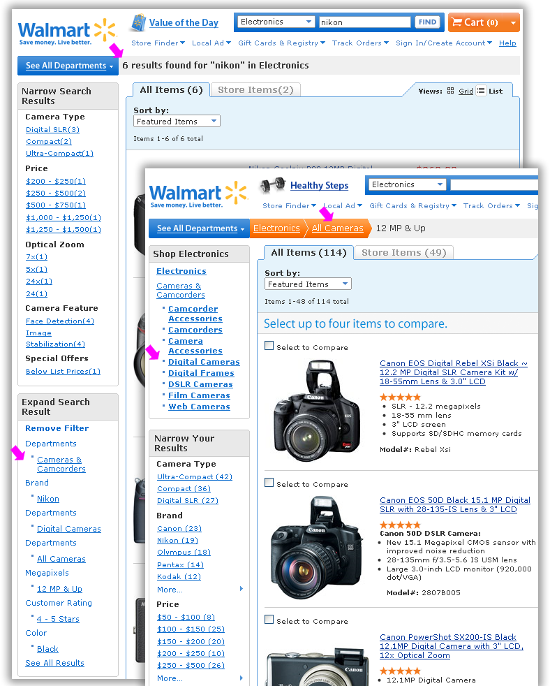
Figure 1. Disjointed finding mechanisms for faceted search and browse on Walmart.com
A veritable cornucopia of filters, links and options on Walmart.com make it unlikely that the customers will be able to duplicate the search successfully or efficiently discover related items and content. Duplicate finding methods also create a problem for natural search, because each finding page exists only within the context of the specific session.
Achieving “flexible navigation, seamless integration of browsing with directed (keyword) search, fluid alternation between refining and expanding, avoidance of empty results sets, and at all times allowing the user to retain a feeling of control and understanding” are “overarching design goals” of faceted finding, says Marti Hearst in Chapter 8 of her Search User Interfaces book.2
Integrated Faceted Breadcrumb (IFB) Design
To meet the search and browse integration challenges, I propose the Integrated Faceted Breadcrumb (IFB) design solution. A wireframe of the recommended Walmart.com UI redesign that uses the Integrated Faceted Breadcrumb is shown in Figure 2.
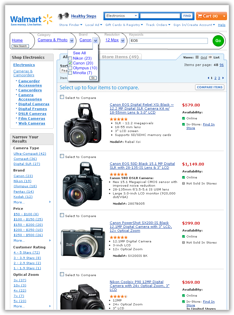
Figure 2. Wireframe of Walmart.com redesigned using Integrated Faceted Breadcrumb (IFB)
Breadcrumbs are simple, intuitive, flexible and resourceful. As Jacob Nielsen, states in his 2007 Alertbox, Breadcrumb Navigation Increasingly Useful: “Breadcrumbs show people their current location relative to higher-level concepts, helping them understand where they are in relation to the rest of the site. Breadcrumbs afford one-click access to higher site levels and thus rescue users who parachute into very specific but inappropriate destinations through search or deep links. Breadcrumbs never cause problems in user testing… people… never misinterpret breadcrumb trails or have trouble operating them.”3
Preliminary Usability Evaluation of the Integrated Faceted Breadcrumb
Findings from the early usability testing of the Integrated Faceted Breadcrumb design using a linked HTML prototype are very promising. Using a simple, 8-page HTML prototype, I tested several variations of this design with 12 current users of popular e-commerce interfaces, people of various genders, ages and backgrounds.
Evaluators were able to quickly grasp the range of possible interactions and use the interface effectively to solve complex finding tasks which would be difficult to accomplish with the existing faceted search interface. Most evaluators found IFB design intuitive because it makes liberal use of the existing mental models for breadcrumbs and faceted search.
The participants’ confidence and ability to accurately predict system behavior was also observed to be very high after just 1-2 simple tasks; this indicates a fairly short learning curve for IFB design. Although no formal studies comparing the performance of someone using IFB vs. existing faceted finding solutions have yet been conducted, IFB design was strongly preferred by the participants when compared with the existing Walmart.com faceted search design for certain kinds of finding tasks.
Early usability tests show that Integrated Faceted Breadcrumb (IFB) design provides many benefits over most conventional faceted search designs:
- Short learning curve: familiar links and drop-downs make this control fairly intuitive. People who previously used a breadcrumb can operate IFB effectively.
- Efficiency: combining breadcrumb and facets into one control makes very efficient use of limited screen real estate and greatly reduces clutter caused by duplication of controls.
- Unlimited Access: Combined search and browse allow unrestricted access to any page that pertains to the current query.
- Integration: fully integrates landing pages, brand catalogs and category pages into the faceted search hierarchy. There is one prominent place on the screen to see where you are and access all the navigation tools right where they are needed.
- Flexibility: customers can switch from search to browse and back again as best fits their needs at each stage of the finding process.
- Resourcefulness: provides opportunities to widen the search and access complimentary products and services related to the current query.
What makes Integrated Faceted Breadcrumb (IFB) different
In his 2009 UIE webinar, Faceted Search: Designing Your Content, Navigation, and User Interface 4, Daniel Tunkelang stated that most breadcrumb-based finding interfaces are not intuitive, nor easy to use. What makes Integrated Faceted Breadcrumb (IFB) design different? I believe Integrated Finding Breadcrumb design is more intuitive and resourceful than other faceted breadcrumb solutions due to the following key design recommendations made based on several years of designing and researching finding interfaces:
- Combine hierarchical Location & Attribute breadcrumbs
- Use Change instead of Set-Remove-Set
- Automatically retain relevant query information
- Label breadcrumb aspects
- Make it clear how to start a new search
- Allow direct keyword manipulation.
In the following sections, I discuss these design recommendations and explain how Integrated Faceted Breadcrumb compares with some existing faceted breadcrumb solutions. Whether or not the reader decides to adopt all or some part of IFB in their own finding interface designs, I hope the following sections will prove to be a good resource for discussion and further exploration of integrated finding UI designs.
1. Combine Hierarchical Location & Attribute breadcrumbs
In 2002, information architect Keith Instone cataloged the three types of breadcrumbs in his 3rd Annual IA Summit poster with a revealing title: Location, Path & Attribute breadcrumbs.5 In faceted search interfaces, Attribute breadcrumbs commonly convey applied facet values such as price, category, style and brand. Most commonly, Attribute breadcrumbs are Path breadcrumbs, displaying facet values in the order they were applied by the customer to reach the current set of search results. Attribute-Path breadcrumb UI on the Ariba Discovery Network is shown in Figure 3.
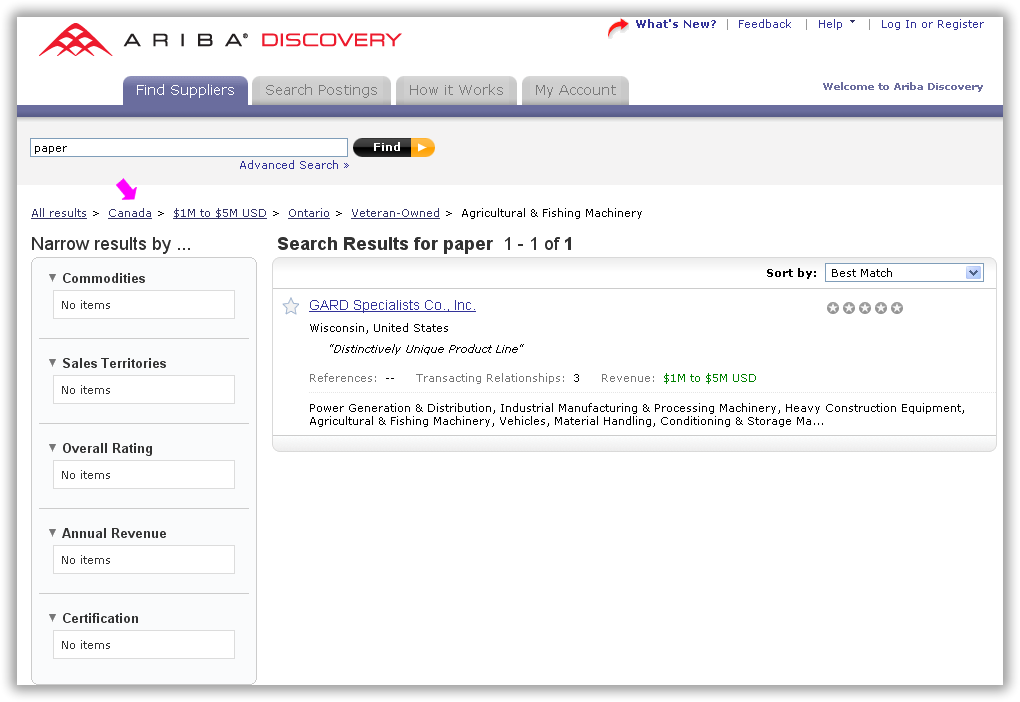
Figure 3. Attribute-Path breadcrumb in the Ariba Discovery Network UI
Unfortunately, Attribute-Path breadcrumb is not resourceful from the standpoint of integrating search and browse and helping people find related content:
- Temporal breadcrumb cannot be used to effectively link and anchor categories, landing pages, brand catalogs and other browse pages, precisely because it is carrying all of the attribute history instead.
- Temporal breadcrumb cannot be used to effectively show the customer where they can go because instead it is busy showing them where they’ve been.
- Pages with Temporal breadcrumbs cannot be effectively linked by natural search, because people creating different URLs each time the content is accessed.
- When the query changes, attributes appear to “randomly” jump around on the breadcrumb.
In contrast, Location breadcrumbs are hierarchical: they do not deal with where the person has been, only with where within the site’s organization they are right now. Hierarchies are very helpful in a wide range of finding and navigating tasks and provide an intuitive way to manage complexity and access resources.
How do we determine the hierarchy of Attributes? My research led me to believe that most people find it intuitive when the Attribute-Location breadcrumb simply replicates the order in which un-selected facets are presented (most typically in the left nav bar). Replicating the order in which un-selected facets appear also provides an effective way to integrate search and browse by treating the Category as just another Attribute in the breadcrumb. In vast majority of finding interfaces, Category appears first in the left nav bar, which places any applied “browse” Category Attributes in front of the applied faceted search values.
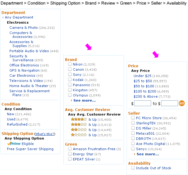
Figure 4. Un-selected facets in the left nav bar on Amazon.com
Most of the people found the Integrated Faceted Breadcrumb hierarchy straightforward and intuitive and were able to confidently and accurately predict the expected system behavior for complex filtering tasks that involved applying, removing and changing filter values, after spending only a few minutes working with the system.
2. Use Change instead of Set-Remove-Set
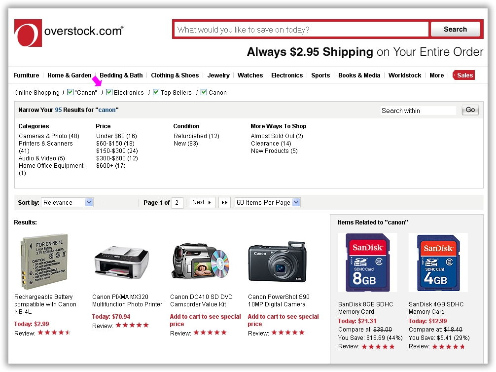
Figure 5. Overstock set-remove-set implemented via checkboxes
Applied aspects are removed from the breadcrumb by un-checking the checkbox next to the applied aspect in the breadcrumb. For most people, set-remove-set interaction conflicts with their mental model. As one of my evaluators stated: “This feels like having to turn off the radio every time I want to change the station.”
Instead of removing Canon in order to select Nikon, most people think in terms of simply changing Canon to Nikon, which can be accomplished most readily with a drop-down control. The drop-down is more intuitive than a typical remove mechanism, as it allows the user to discover all of the navigation options available from the parent facet or category. This idea was first introduced by Luke Wroblewski in his excellent book Site Seeing: a Visual Approach to Web Usability.6 One of the sites that implement drop down in the breadcrumb is Edmunds.com, shown in Figure 6.
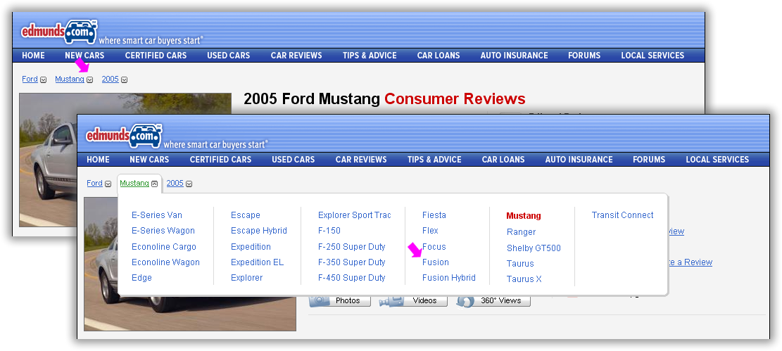
Figure 6. Edmunds breadcrumb with drop down options
In my testing, vast majority of people preferred this design to a more common set-remove-set paradigm and found it very intuitive and effective.
3. Automatically retain relevant query information
In my research, I found that people seldom want to start the query over completely from scratch, unless they specifically indicated this action. Instead, they wanted to retain as much of the query as possible with every change of the facet values, and expect the system to help them construct a query that “makes sense”, gracefully dropping facet selections that no longer apply to their new query.
Unfortunately, few sites today implement this function well. For example, changing the model from Mustang to Fusion does not retain the year selection of 2005, as most people would expect. Instead, as shown in Figure 7, Edmunds.com resets the model year to the current year, 2010, which simply disappears from the breadcrumb.
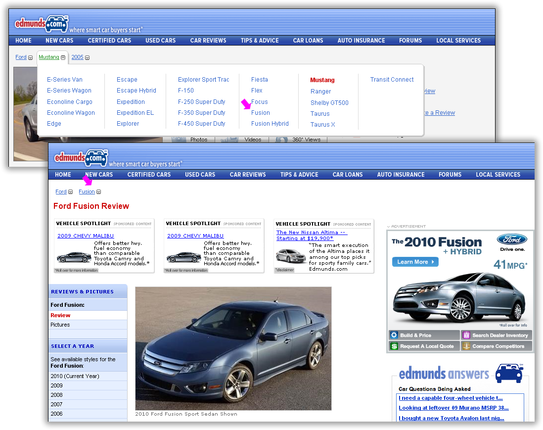
Figure 7. Changing aspect values drops useful query information on Edmunds.com
I found that a more resourceful system behavior is to retain any relevant attribute values that apply to the new query, preferably in way that always produces some search results.
Figure 8 shows how Integrated Faceted Breadcrumb design handles the change in the Product Type from Digital Cameras to Lenses, retaining the Brand and Keywords aspect, while dropping the Camera Resolution aspect (as it does not apply to Lenses).
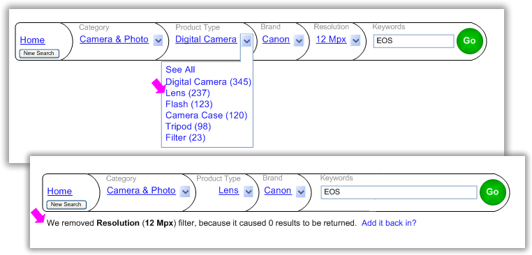
Figure 8. Integrated Faceted Breadcrumb retains relevant query information
Retaining aspects that apply to the updated query allows the customer to concentrate on their finding goals, while the system takes care of the details.
What if the person really wanted to browse just the Lenses Product Type? My testing showed that most people found it very intuitive to click the Lenses link in order to navigate to the Lenses Product Type landing page. The result of combining drop-down control functionality with the existing breadcrumb link interaction gives us a powerful, intuitive, flexible finding control.
What if instead of browsing, someone wanted to remove a single applied aspect from a breadcrumb, leaving the rest of the query intact? My research showed that most people found it easy and intuitive to navigate to the drop down and select “See All” option Integrated Faceted Breadcrumb design provides at the #1 position in the drop-down, as shown in Figure 9.

Figure 9. Integrated Faceted Breadcrumb makes aspect removal intuitive
4. Label Breadcrumb Aspects
In Design Cop-out #2: Breadcrumbs7, Jared Spool mentions that the biggest problem with breadcrumbs is “the lack of scent” and that “the wording of the individual trail elements becomes very important.”
While most applications simply display the applied aspects in the breadcrumb, my research shows that labeling each of the applied aspects with the aspects name adds a great deal of information scent. The resulting IFB “breadcrumb tiles” (shown in Figure 9) display relevant aspect labels which help customers make sense of their queries and orient themselves quickly if they find the page through natural search.
5. Make it clear how to start a new search
Ariba interface in Figure 3 has a single search box which retains the original keywords, in a manner similar to Google. Unfortunately, any keyword change drops all of the applied aspects and filters launching a new keyword-only search. This is obviously not very resourceful, as we are trying to retain as much of the query as possible for reasons explained above.
In contrast, Integrated Faceted Breadcrumb (IFB) provides a dedicated “New Search” button on the Home breadcrumb tile. As shown in Figure 10, clicking the “New Search” button removes all aspects and keywords, resetting the breadcrumb to the full-screen text box, reminding many evaluators of the simplicity of the Google search.

Figure 10. “New Search” in the Integrated Faceted Breadcrumb (IFB) interface
Resetting is accomplished via an HTML layer or similar device so that the rest of the content on the page does not change. This way, the search box can reset almost instantaneously, perhaps even with an elegant animated transition.
6. Allow Direct Keyword Manipulation
Many faceted search interfaces like Overstock.com pictured in Figure 11, have two search boxes: one to “search within” the existing query, and one to start over with a new keyword-only search. Having two search boxes takes up precious screen real estate and increases the potential for confusion. Worse yet, the customer can not directly modify their keyword query after the search is executed, because the system converts all the keywords into an aspect which cannot be modified, only removed in its entirety.

Figure 11. Overstock.com does not allow direct manipulation of the keyword query
In his seminal book, Designing the user interface: Strategies for effective human-computer interaction8, Ben Shneiderman describes direct manipulation is one of the key HCI design principles. Integrated Faceted Breadcrumb (IFB) provides direct keyword query manipulation with the dynamic editable Keywords Aspect shown in Figure 12.
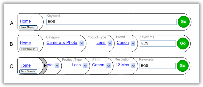
Figure 12. Direct query keyword manipulation in IFB
At the start of a finding session, the search box starts out fully expanded across the entire width of the page. When the customer types in some keywords, they are retained in the search box for easy editing or keyword addition, as shown in Figure 12-A. If the customer selects one or more facets, they are always added according to their respective hierarchy in front of the search box. As more aspects are added, the keyword box gets progressively smaller, until it reaches some reasonable minimum size as shown in Figure 12-B.
If sill more facets are applied at this point, a scroll arrow appears immediately after the Home facet, allowing customers to scroll only the applied aspects in the manner of a carousel control, without ever hiding the Home facet or the search box, as shown in Figure 12-C. IFB dynamic editable Keywords Aspect design proved to be very successful with our evaluators who found it intuitive, resourceful and easy to use.
Conclusion
Bruce Sterling, in his brilliant and entertaining book Shaping Things9, mentions Raymond Lowey and his very useful acronym MAYA. Faceted breadcrumb designs have only recently began to move out of being Most Advanced (the domain of academics and computer geeks) and toward becoming Acceptable to the general internet public.
Faceted breadcrumb holds in my opinion the promise to become the key component in the next generation of intuitive finding interfaces that fully integrate the best of faceted search and browse capabilities. I hope this article will assist anyone designing a faceted finding interface and helps move faceted breadcrumb designs, like the Integrated Faceted Breadcrumb, one step closer to the edge of MAYA, helping make resourceful integrated finding a commonplace reality. I look forward to continuing the discussion of IFB in the article comments thread and on Twitter “@DesignCaffeine”:http://twitter.com/designcaffeine.
References
1 “Search UI Patterns”:http://www.slideshare.net/UIEpreviews/search-discovery-patterns-a-uie-virtual-seminar
2 “Search User Interfaces”:http://searchuserinterfaces.com/book/sui_ch8_navigation_and_search.html book.
3“Alertbox, Breadcrumb Navigation Increasingly Useful”:http://www.useit.com/alertbox/breadcrumbs.html
4 2009 UIE webinar “Faceted Search: Designing Your Content, Navigation, and User Interface”:http://www.uie.com/events/virtual_seminars/facets/
5 “Location, Path & Attribute breadcrumbs”:http://instone.org/files/KEI-Breadcrumbs-IAS.pdf
6“Site Seeing: a Visual Approach to Web Usability”:http://www.lukew.com/resources/site_seeing.asp
7“Design Cop-out #2: Breadcrumbs”:http://www.uie.com/articles/breadcrumbs
8 “Designing the user interface: Strategies for effective human-computer interaction”:http://www.aw-bc.com/dtui/
9 “Shaping Things”:http://mitpress.mit.edu/catalog/item/default.asp?tid=10603&ttype=2

A thorough, careful, and well researched approach to the challenges surrounding browse and search. IFB seems dramatically more intuitive than traditional breadcrumb solutions I’ve encountered. Thank you.
Hi Draka —
No money, decorous or otherwise. I just wanted to give away my best design to date as a kind of social experiment. That said, there are many critical insights that simply would not fit in the article, so if you are thinking of implementing something like this, let me know: Greg@DesignCaffeine.com
Glad people are finding this article useful — thank you all for your comments!
Greg
I think this is awesome. There are a few content heavy sites I work on that would seriously benefit from this.
Hi, Greg,
This is absolutely insightful and valuable. Thanks for sharing this, complete with user research on it! One thing I particularly like about your interface design here is that the user can see both the facet and the facet value in the breadcrumb trail, as well as being able to select a different facet value.
As I read this, a couple of questions came up (maybe I’m slow!).
* In your discussion of Change instead of Set-Remove-Set, the Change example allows user just one choice, and making a different change updates the results I assume, but the Set-Remove-Set allows user to select any number of choices. In the big Walmart example of IFB, you show a dropdown of checkboxes and a Go button. That made me think that I don’t understand your intent in this discussion. What’s the differentiation you’re aiming for here?
* In your Figure 9, you showed multiple checkboxes as a user option; if you allowed a user to select both Nikon and Canon, would you display both facet values in the breadcrumb trail? Or…?
Thanks! Christine
Very interesting work! Especially since the concept of “change” seems so much more intuitive than “set-remove-set”. I;m intrigued and would like to start using some of these concepts, but have a couple of questions about how you would propose handling some of the stickier situations that can arise:
1. Does this model work with multi-select dimensions? That is, does this model still work in a situation where the user is allowed to select more than one value per facet?
2. How do you handle hierarchical facets like category? In the examples shown here, you only show a single level of category represented in the breadcrumbs. Do you only display the lowest level reached and provide access to select or change the higher levels behind the drop-down?
3. When a user decides to go back and change a previously selected facet selection as in your example for figure 9, do you provide the full list of available facet values for that facet for the entire data set or do you constrain the available options? In the example shown, selecting lenses would be outside the current set of results since you have already selected to constrain by 12Mpx, which implies that you are covering the entire scope of available options. This can lead to unintended consequences like zero results unless you drop other conflicting facets, but how do you decide which ones to drop and in which order to avoid the dead end?
Hi Christine and John — thank you both for your comments.
John: “…this can lead to unintended consequences like zero results unless you drop other conflicting facets…” I addressed this exact issue in: “3. Automatically retain relevant query information” — yes, I recommend you drop conflicting facets. As to what algorithm to use to select the facets to drop, it will depend entirely on your system: some combination of visitors, conversion, available inventory and category could all be considered. My background is in software engineering, and I can definitely help you build the best algorithm for your needs.
Christine: “if you allowed a user to select both Nikon and Canon, would you display both facet values in the breadcrumb trail?” How the OR is implemented, and whether you need it the OR function at all will depend solely on how the system is to be used. For example, it’s rarely useful to show two categories joined with OR, but atomic values like sizes and colors quite naturally fall into OR paradigm. I discuss some of the filtering challenges here: http://www.designcaffeine.com/2010/articles/321/ and these challenges certainly apply to IFB. Plus, there is a whole question of using a “Go” button vs. an Ajax call to support multiple-select… Again the answer depends on the business and customer goals you are trying to achieve.
Based on high interest of implementing IFB, I am doing a series of 1-2 day workshops at client’s locations designed to address the specifics of individual systems and ensure successful implementation. Please feel free to email me at Greg [at] DesignCaffeine.com to see how we can continue the conversation.
Thanks again for your comments!
– Greg
Greg,
This is brilliant. The mental energy you save the user can be devoted to finding what they are looking for,
not fighting the query engine.
Thanks for sharing this with us.
Lloyd Muccio
Great article! I’ve been building websites based on Endeca.com’s software for some years now. The latest project is based on Lucene, though. At the beginning I had to convince usability agencies that Guided Navigation may be a good idea. I’m glad the concept has evolved so nicely, even Google is using it by now 😉
I will speak on Faceted Search this Thursday at a Swiss University http://e-byz.ch/usability/guided-navigation-faceted-search-websites
Walter
Thanks! This information is exactly what I was looking for. I work on a lot of information sites that contain thousands of item that don’t necessarily fall into one neat spot.
Nice article.
Do you know of any site that has these ideas implemented?
It did not find it on any of the sites that you mentioned (no idea if you were in any way involved with them or not).