 |
| Click image to download “Classic IA Tools” (PDF, 592K) |
On March 21st, in a crowded conference room at the Portland Hilton, I was listening to Rashmi Sinha and thinking about comic books.
This isn’t to suggest that Ms. Sinha, a psychologist, researcher, and user experience consultant who presented at AifIA’s Leadership Seminar, wasn’t keeping me interested on that day in Portland. In fact, I was enjoying her discussion of free listing, card sorting, and other tools so much that my brain was running at double speed. While I was listening to Ms. Sinha, I was also thinking about how much easier my work would be if I could get some of the people I work with (and for) to attend similar presentations. But that would be impractical, and it’s also unlikely that the same people will ever read the work of Rosenfeld, Morville, or Krug.
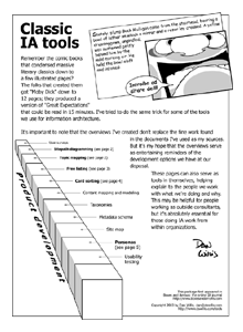
What I need are highly condensed overviews, I thought, like those comic books that convert great literary works into a few illustrated pages. They condense Moby Dick down to 12 pages and provide a version of Great Expectations that can be read in 15 minutes.
So I created these one-pagers (it took me two pages to cover personas). I did treatments for the tools that could be done well in this format and skipped the ones that couldn’t. My hope is that these pages help make the tools of our trade more accessible. They require little investment from the reader and they’re goofy as hell. (It’s been my experience that people open to whimsy also tend to be open to new ideas.)
These overviews don’t replace the fine work that I used as my sources, just as 20 panels of a comic book can’t replace James Joyce’s Ulysses. But they may be able to spark interest in — and support for — information architecture in a new, viral way.
![]()
http://www.dswillis.com (a shameless pitch of his consulting services) and http://www.dswillis.com/draw (another shameless pitch, this one a showcase for his illustrations and cartoons).

As a designer with a past full of comics too, this is very enjoyable! In the past (when appropriate) I often used comic techniques to make ideas stick where a “spec” wouldn’t.
It seems like the idea broke down a little bit towards the end though, with the persona part. The other pages give you an idea of what the technique is about at a glance. The persona one could have more going on graphically, perhaps a representation of the different parts of a persona, or where they come from?
A nice piece!
I love it when memes seem like they start cropping up all over–if you haven’t seen it yet, check out the poster from CHI that parallels the IA process and dating:
http://www.miyukishimbo.com/shell/dating.html
Wonderful stuff.
Years ago I experimented with
what I called “software engineering comix”
using a now-defunct Mac program called
Comic Strip Factory. I did seven of them, with
one idea per strip.. the opposite of Dan’s compressed
insight, but likewise aimed at folks who think visually.
This is a great concept. As an online instructor, I have used cartoons to illustrate complex technical concepts and have been fairly successful in conveying my thoughts. Very well done Don.
Fantastic! Great idea and just what I needed. Cheers!
Thanks for the a new challenge you have unveiled in your short article.I’ll make sure to bookmark it and return to read more of your useful info. I’ll definitely comeback….
sohbet kanalları
sohbet kanalı
canlı sohbet odaları
I’m glad that using humor/comics can help make concepts stick.
Brilliant! Absolutely required stuff. Thanks for making this complex stuff that much more clear.