Content today is increasingly delivered by audio both online and in the real world. We have radio shows and newscasts, and in recent years, podcasts, audio books and navigation/car assistance systems have been added to the field. Audio is more emotional, as sound effects and acoustic atmosphere enhance content to help deliver its messages. It also affords users the opportunity to interact with content while their hands and eyes are busy (i.e. when doing physical work, driving, walking, etc).
However, the inclusion of audio often results in usability issues that make it difficult for users to access and understand content. That is why we need new tools to organize linear content like audio. Luckily, a wide range of techniques employed in information architecture, journalism, usability engineering and interface design are available. All that’s required is the knowledge to combine them effectively. This article presents a practical framework for designing and implementing audio-based content, such as podcasts.
“There is no reason to over-estimate the importance of writing and thereby under-estimate other technologies of information processing.” Harald Haarmann in History of Writing.
The Problem with Audio
When using audio today, we face challenges similar to those of written text about a decade ago. During this time, information was being transferred from hand-held documents to the computer screen, without being optimized for the new online medium. Now the same mistakes are being repeated with audio. Existing text is read by a narrator, or worse, the text is speech-synthesized by a computer. Audio doesn’t function the same way as written text, so its execution is often poor. The main difference between printed text, be it on paper or on the computer screen, is that audio is linear. You can only consume it in a linear fashion and you have to listen to it at a given speed.

Figure 1: Part of the “Web Trend Map by Information Architects, Japan
For example, Figure 1 shows part of the famous “Web Trend Map by Information Architects Japan”:http://informationarchitects.jp/web-trend-map-2008-beta/. It’s an excellent example of how information can be displayed in a two-dimensional space. It’s not possible to use one-dimensional spoken text in the same way. When accessing audio, users have no idea how long the segment will last, unless this information is provided by the interface or the narrator states it at the beginning of the segment. Users only have a vague idea of where they are within the narration. If you don’t have any visual hints it’s difficult to determine how much time is left and what topics are going to be discussed. Finding specific content by rewinding or forwarding is difficult. In contrast, finding the next subsection within a text document is very simple. You can easily find a particular word on a page by scanning it or by using your browser’s find function.
Best Practices for Audio
When beginning an audio-related project, ask yourself whether audio is the right medium for your message. In some cases, text is a better choice and in other cases it’s video. Don’t use audio just because you can. If you are certain audio is the best choice, there are several fields to help inform how you implement it. The most important professions we can learn from include:
- Information Architecture
- Journalism
- Educational Psychology
- Usability Engineering
- Interface Design
Information Architecture for Audio
The principles of information architecture are exactly what you need to create usable audio. Your approach to creating audio should be similar to developing a large website. In both scenarios you don’t want the user to get lost or overwhelmed by content. For any informational audio that is longer than a few minutes, follow these guidelines:
- State the Length: Typically the user has no way to assess the length of the audio segment. Sometimes the length is provided by the interface, but not always accessible. For example, if you listen to a podcast with your MP3 player, it might be in your pocket so you don’t see the time and duration displayed on the device.
- Give an Overview of the Structure: Informing users how the audio is structured helps them find the content they’re looking for. It also gives them the option to directly locate the information they’re most interested in.
- Introduce the Topic: An introduction helps set the mood and prepares the listener for the content to come. In printed text, such an introduction might seem hackneyed, but with audio it’s good practice to describe a situation the listener knows from everyday life. It’s better not to jump right into the topic, but instead provide some information about it.
- Provide Orientation from Time to Time: If the audio is longer than a few minutes, help the user form a mental model of the content by repeating its structure from time to time. Tell the user where they are within the content and give an overview of up-coming topics. For longer audio pieces, consider giving users the option to skip sections/chapters via the interface or offer content in segments.
Journalism for Audio
Radio has been around for more than a century, and most of the best practices from radio journalism are ideal for creating usable audio. Here are some of the most important points.
- Keep it Short: Ideally, audio narration should be shorter than printed text covering the same subject. If you have three pages of printed text, don’t write three pages of text for the narrator. Since users are unable to easily scan audio content and must listen at the narrator’s speed, concentrate on the most important content. Moreover, the sentences and the individual words should be kept short. It is much more difficult to comprehend a long, complicated sentence read aloud than to read it in print.
- Repeat Often: Repetition is something you usually try to avoid with written text. With audio, however, it helps to get your point across if the most important facts are summarized and repeated. The key is a summary at the end of the audio. It’s also a good idea to repeat the main subjects or themes rather than referring to them by pronouns or synonyms. The text might seem strange when you read it, but as soon as you hear it, you will realize the audio is easier to follow.
- Use Mental Pictures: Good journalistic audio sparks the listener’s imagination. It not only makes the piece more entertaining, it also helps the user understand and remember it. Try to create pictures in the listener’s mind. Describe what they might see and feel if they were in your place. For example, let them hear the sounds of the location where your story is set.
- Take Advantage of the Possibilities: Different styles of speech, tone, speed and dialects can be used to create memorable audio. When the language is too formal, you lose credibility and narration is more difficult to understand.
- Don’t Overuse the Thesaurus: This is another piece of advice from radio journalism. When you use overuse synonyms, you decrease comprehension. The listener has to decipher the synonyms while the narrator continues talking, so he might not understand some of the text. For example, when referencing Japan, avoid using the terms “Nippon” or “Land of the Rising Sun.”
Here is an example of how to structure an audio sequence:
- Greeting
- Introduction (i.e. audio length, what subjects/topics will be covered and how the user can interact)
- First section of content
- Describe the structure (i.e. summaries, repetition, overview and acoustic bumpers)
- Repeat Steps 3 and 4 until all content is delivered
- Conclusion (i.e. summary or what action users can take next)
- Farewell
This structure is derived from the typical sequence of a radio show and has been successfully adopted by many podcasters.
Educational Psychology for Audio
Much research has been conducted on reader comprehension and written text, notably the work of Norbert Groeben from 1972 onward. Most of the results show that the techniques from information architecture and radio journalism cited above are also valuable for creating accessible content to be used in an academic setting.
- Keep Short-term Memory In Mind: It is important to write short sentences and to repeat words rather than using synonyms.
- Design Audio Content for Different Reading Speeds: Research shows that reading speed varies by individual, depending on age, familiarity with the subject, education and other factors, so it’s important to adapt the complexity and the reading speed of the narrator to your intended audience.
Usability Engineering for Audio
Because audio differs, some of the established techniques used in web development cannot be applied audio. Wireframes, card sorting exercises or eye tracking can be used to evaluate information architecture or interface design, but these techniques do not work for developing and testing audio content. Still, we can borrow from usability engineering when including audio:
- Design for the Target Audience: It’s still uncommon to apply the techniques of user-centered design to audio, but do convince your design team to produce content for the users, not its creators.
- Create Personas: Personas are the perfect method for representing your target audience, so use them.
- Create Scenarios: Usage scenarios are a technique you can successfully apply when creating audio content. It is crucial to understand the user’s:
- Environment (i.e. quiet or noisy)
- Access Possibilities (i.e. Do users need to rely on their eyesight or hands right now? When driving or working out eyes and hands are mostly occupied.)
- Mood (i.e. passive/reclined or active/leaning forward)
- Expectations (i.e. entertainment or information)
- Experience (with interface as well as with content)
- Test With Users: If possible, test early versions with selected users from the target audience. Usability testing in a research lab is best, but informal tests are a good start.
- Conduct Log File Analysis: Do your statistics. Look at which files are most frequently downloaded (and the least). Correlate the files with their content and then produce more of the successful content types.
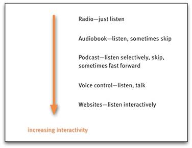
- Consider Users’ Goals & Tasks: Figure 2 shows that audio delivered over the web has a different level of interactivity than, say, just listening to the radio. Apart from listening on demand, users can forward or skip through audio. They may also be looking and interacting with other materials at the same time they are listening.

Figure 2: Depending on the context, the amount of interactivity varies.
What’s more, knowing user’s expectations is crucial to creating the appropriate content (Figure 2). With audio this is more important because it is difficult to skip irrelevant information.
Interface Design for Audio
Finally, give careful consideration to the interface that provides access to and control of audio content. Again, the well-known principles of interface design apply. In general, give the user as many hints as possible about what to expect from the audio—before he even starts listening.
- Provide a concise description of the content.
- When linking, make it clear that an audio file is linked.
- Explain how to locate content within the audio piece, if possible.
- Include metadata (i.e. ID3 tags in MP3 files that are shown within the playback software, as well as on portable devices).

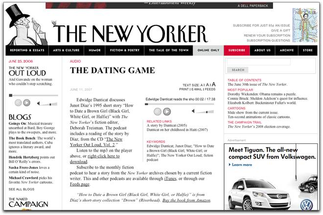
Figure 3: Podcast page of “The New Yorker website”:http://www.newyorker.com/online/2008/08/11/080811on_audio_grann?xrail
Figure 3 shows the podcast page of the The New Yorker magazine. Much of the information on how to subscribe to the podcast and how to download the audio file is in text. Some short links at the end of the paragraph might work better.

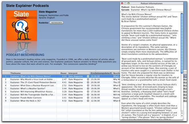
Figure 4: Metadata in iTunes
Above is a good example of metadata displayed via iTunes (Figure 4). Note the long description; it’s concise but not suitable for scanning.
Conclusion
Creating usable audio is not difficult when you follow a few simple rules. These mostly stem from the creation of usable content in the form of text. Information architecture, journalism, educational psychology, usability engineering and interface design provide plentiful tips for doing so. Most of the methods used in these fields can be applied to the creation of audio. To summarize, the main guidelines for usable audio are:
- Write with your audience in mind.
- Structure your content by providing an overview at the beginning and giving an introduction to longer audio pieces. Be sure to include a summary at the end.
- Follow the rules of radio journalism for creating easily understandable narratives.
- Rely on a familiar interface or put your design in front of users if you digress from a familiar practice.
If you follow these tips you will be able to create audio that is easily accessible, engaging and helps to communicate your message, not only intellectually but also emotionally. After all, emotional quality is one audio’s main advantages over text.

Thanks for the article—I liked being reminded that designing a user experience acknowledges ALL senses involved in that experience. And that we have many of the tools already at-hand regardless of the modality being used in the experience. Adaptability is itself a tool.
Many of the details you discussed are ones I personally think of in terms of easing the users’ cognitive load. Of course paying attention to the limits of short-term memory is a primary gesture in accommodating the limits of cognitive load, but other elements you discussed are, too. For example, giving an overview of the structure before narrating segments of info helps with establishing or building on a listener’s personal schema/mental model. (This may be particularly important if the audio is not in one’s native language or the content is new to that person.) Providing “orientation from time-to-time” helps ease cognitive load, too, as does providing mental pictures and adjusting reading speed to subject matter.
Is suppose the long-and-short of it is that because there are so many parallels across design disciplines (i.e., different names for the same concepts and artifacts, similar design processes), we should not be timid about using what we know as we move into new or different territory. Thanks again for your multifaceted article.
Great article — this is definitely something people need to think more about.
I would add: where possible, make audio available in multiple formats, e.g. both embedded Flash player (or something of the sort) and downloadable mp3.
Really enjoyable article. I still think that many people still haven’t got their heads around what they need to do to make audio accessible in the internet.
Thought you might be interested in what the guys at the BBC are doing with audio. There is a long running radio soap called ‘The Archers’ in the UK and they are experimenting with segmenting each scene and attaching metadata so it would be possible for a user to create their own programmes based on a certain location or character or event etc. I find this quite awesome as it allows the user to decide what content they want to consume and also how the content is structured. In effect users can construct their own programmes – is this the future for all programmes whether audio or vision?
http://www.bbc.co.uk/blogs/radiolabs/2008/08/archrs_an_everyday_story_of_we.shtml
Patrick,
thank you very much for the link to the Archers’ site. This sounds fascinating. Especially because one of the things I think a lot about is how the future of radio/web/… programmes will look like.
But as far as I understand the tool that is described in the blogpost of the BBC is just for internal use, right? This is a pitty, I’d love to play around with it! Do you have even more info on this subject? I’m eager to learn more about it!
Thanks in advance!
This is an intriguing topic, one that cries out for more discussion and analysis — as does the related issue of IA for video content.
Coming from the world of Instructional Design, I find the suggestions under the “Educational Psychology” section not only compelling but also empirically valid, based both on my experience and the research that I have done. Repetition and simplicity are essential, but must be accomplished without condescension (it can be done!).
User control over audio content is also key, but is often difficult to achieve without the jarring effect of “scrubbing” the audio progress bar: speech is suddenly interrupted, as is the users attention. I recently (only last night, in fact!) saw a subtle and elegant solution to the problem of audio interruption during navigation; it was in the CD-ROM that accompanied a Verizon wireless card. Audio sections were indicated by graphic buttons, and you were free to jump from one to another as desired. The “jarring” effect was minimized by the inclusion of a looped musical “pad” or beat underlying all audio: its playback remained unbroken, flowing and throbbing along nicely while one audio section changed to another. I don’t recall if the individual sections were set to fade out upon navigating away from them, but that was certainly the effect.
For those who are interested, this was on the “Welcome” CD for the Verizon Kyocera 650 Wireless PC card.
Great post!