The Building Block System
This story continues the Introduction to Building Blocks Series.
Part 1 of this series “The Challenge of Dashboards and Portals” discussed the difficulties of creating effective information architectures for portals, dashboards, and tile-based information environments using only flat portlets, and introduced the idea of a system of standardized building blocks that can effectively support growth in content, functionality, and users over time. In enterprise and other large scale social settings, using standardized components allows for the creation of a library of tiles that can be shared across communities of users.
Part two now outlines the design principles underlying the building block system, and the simple guidelines for combining blocks together to create any type of tile-based environment.
Overview
The building block system is a packaged toolkit that offers standardization across several layers of an information environment, including the information architecture, the user experience, the functionality, and the metadata. As a potential framework for standardization, it is most important to understand that the building blocks are inclusive rather than exclusive, and that they are neutral with regard to any specific software solution, vendor, package, programming language, system architecture, development platform, business rules, enterprise environment, or user experience design guidelines.
Consequently, adopting the building block system and approach – at the right level of formality for a particular set of business, technology, and information architecture needs – can help resolve some of the many problems inherent in flat portlet-only design approaches (the box of chocolates model) regardless of the context. Potential applications or contexts of use for the building blocks include:
- Any experience defined by stock portlets
- Any environment assembled from custom built or customized off the shelf [COTS] tiles
- Intranets and extranets
- Content aggregators
- Collaboration environments and solutions such as SharePoint, eRooms, etc.
- Personal publishing platforms and group authoring solutions
- Wikis and other collaboratively authored knowledge organization structures
- Web-based personal desktop services such as Google and Netvibes
- Mashups services and platforms such as Yahoo Pipes and Google Gears
- Social networking platforms such as Facebook, Myspace, etc.
- The rapidly expanding collections of public domain widgets
The building block system defines two types of information architecture components in detail – building blocks (or Containers), and navigation components (or Connectors) – as well as the supporting rules and guidelines that make it possible to assemble complex user experience architectures quickly and effectively. The block system is not a pre-packaged dashboard or portal design. Instead, it offers modular components you can rely on to work together and grow coherently as the pieces making up a finished dashboard or enterprise portal. Using the blocks will help focus design efforts on the important questions of what content to provide, how to present it to users, and how to manage it effectively.
The complete package includes:
- Basic principles and assumptions underlying the block system, and how it can complement other design approaches.
- Assembly guidelines and stacking hierarchy which shows how to combine blocks into larger units while ensuring a sound and consistent information architecture.
- Modular building blocks of all sizes (Containers)
- Modular navigation components (Connectors)
- Standardized Convenience Functionality for blocks, which recommends a baseline set of common capabilities such as export of building block content, printing Tiles, etc.
- Common Utility Functionality which captures common productivity enhancements and capabilities linking the block-based system to other enterprise systems such as calendars and document repositories.
- Suggested metadata attributes for blocks that support administration and management needs, as well as important classes of utility functionality including alerting, syndication, searching, collaboration, and system administration.
1. Basic Principles and Assumptions
A few basic principles inform the design of the building block system and establish its boundaries with regards to other design systems or paradigms. In sum, they outline an open, flexible, well-structured, and internally consistent system. While the building blocks are independent of many constraints for where and how they may be put into effect, they will be most effective when a limited set of assumptions about the underlying environment are true. Those assumptions include the availability of authentication functionality to verify user identities, a role-based security framework that allows security permissions to be set at the level of individual blocks, a reasonably robust network that doesn’t require design for asynchronous use, and standard service levels for source application and system hosting and maintenance to ensure the steady availability of aggregated content and functionality.
Principle:Openness
The building block system is open: using the building blocks does not mean that every piece of content must appear within a Tile (Tiles are the smallest building blocks, the de facto foundation level). In the same way that many sites supported by content management systems include considerable amounts of content that is not directly managed by the CMS, it is easy to mix block-based and free-form content in the same Dashboard or Portal, and even on the same Page. Mixing content may require you to give up some of the benefits of the building block system, depending on your platform and other infrastructure elements, but this is not sufficient reason to try and wedge everything into a poorly designed Tile.
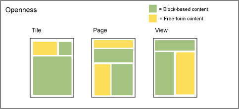
Figure 5: Openness
Principle: Portability / Syndication
The building blocks support portability and syndication by design, under the assumption that individual building blocks or groups of blocks can and will appear outside their original context or in more than one context (if not immediately, then at some point in the future). With the right IT infrastructure and environment in place, it is possible to share defined blocks of all sizes amongst a suite of integrated dashboards/portals or other environments tailored to different audiences, or with other applications and systems. The structure, presentation, and attributes of the building blocks look ahead to the creation of a large library of assets that diverse consumers throughout the enterprise or in the broader community can use and reuse.
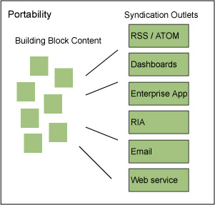
Figure 6: Portability / Syndication
Principle: Independence
Building blocks are wholly independent of one another, unless stacked together into a larger unit. This means that while one block may offer controls or functionality that manipulate its contents, neither those controls nor that functionality will affect neighboring blocks unless the blocks are stacked together.
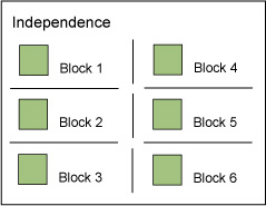
Figure 7: Independence
Principle: Inheritance
The blocks follow a simple inheritance pattern, wherein nested blocks inherit the properties and behaviors of blocks with a higher stacking size stacked above them. (Keep in mind that the literal ‘size’ of a block – what kinds and how much content it can contain – is not determined by its stacking size. The purpose of the stacking size is to assist designers in creating experiences with consistent behavior and structure.) If a block at a higher level offers the ability to change its contents with a Control Bar, these changes affect all blocks stacked inside, cascading down from the highest level of the stack. If a block contains other blocks nested at several levels of the stacking hierarchy, and those blocks offer controls that change their contents, then changes affect all of the blocks nested within (or stacked below).
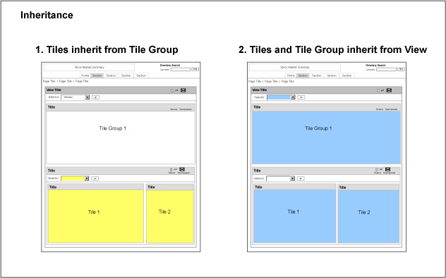
Figure 8: Inheritance
Principle: Layering
The building blocks work together as a coordinated system across multiple levels of the layer cake that comprises an information environment, from the user experience – visual design, information design, interaction design, information architecture – to functionality, metadata, business logic, and administration. It is possible to use the blocks to effect standardization at the level or layer of your choosing. For example, you could rely on just the presentation standards for identifying Container blocks to establish consistent screen layouts. Or you could put all the aspects of the block system into practice to drive the structure of a suite of integrated sites from top to bottom.
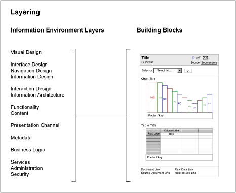
Figure 9: Layering
2. Assembly Guidelines and Stacking Hierarchy
The building block system relies on a small set of assembly guidelines and a size-based stacking hierarchy to ensure that it is easy to understand how to properly combine blocks together into larger units. The purpose of the guidelines and stacking hierarchy is to maintain the internal consistency of information architectures organized and managed via the building blocks. The hierarchy assigns each block a stacking size, ranging from one to seven, and specifies a few simple rules for stacking blocks of different sizes. To see if it is possible to stack blocks together, compare their stacking sizes in light of the rules below.
Note: The Container blocks will be defined in detail in Part 3 of the series.
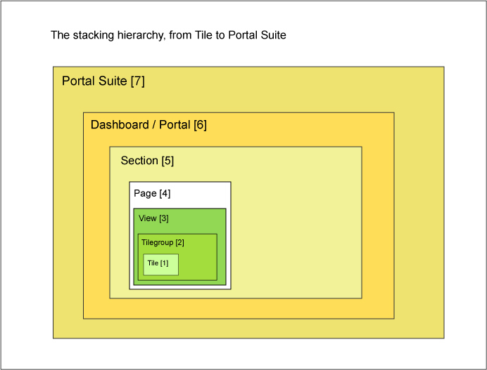
Figure 10: Stacking Hierarchy
This illustration shows the stacking hierarchy of the Container blocks, from the Tile – smallest, with a stacking size of 1 – to the Suite – largest, with a stacking size of 7.
Here are the assembly guidelines to determine proper block stacking:
- It is possible to stack blocks with a lower stacking size (“smaller” blocks) inside blocks with a higher stacking size (“larger” blocks).
- It is possible to stack several smaller blocks inside a larger block, for example placing three Tile Groups [size 2] inside a single View [size 3].
- It is not possible to stack a larger size block inside a smaller block. This means you can stack several Tiles [size 1] inside a single Tile Group [size 2], but you can’t stack a Tile Group [size 2] inside a Tile [size 1].
- It is possible to stack several sequential sizes of blocks together inside a single larger Container. This is the basic pattern for assembling a complex user experience.
- It is possible to skip a level of the stacking hierarchy when stacking several layers of blocks, for example by stacking Tiles [size 1] within a View [size 3], without placing them within a Tile Group [size 2].
- It is possible to stack different sizes of blocks together at the same level inside a larger Container.
As an example of the last three rules, a single Page [size 4] could include a View [size 3] and two Tiles [size 1] stacked at the same level. Inside the View are one Tile Group [size 2], with two Tiles [size 1] stacked inside the Tile Group, and two additional separate Tiles [size 1].
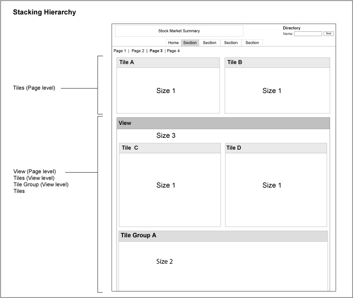
Figure 11: Stacking Example
Social Building Blocks Mechanisms and Network Effects
Thanks to these largely open system principles and flexible assembly guidelines, the building blocks can provide a lightweight skeleton that allows communities and groups of any size to create and use tile-based content and functionality within coordinated structures and processes, and then benefit from the network effects and social mechanisms that common structure and architecture makes possible.
With the support of basic environmental services such as tagging, rating, linking, search or findability, syndication, notification, and clear status signals, the building blocks can enhance well-known social processes or collective effects including:
- sharing
- comparison and interpretation
- synthesis
- remixing and mashup
- opportunistic discovery
- the emergence of collective consensus
- crowdsourcing
- exchanges with affiliate networks
- the formation of specialized sub-communities
- functional diversification
The building blocks can support all these social and network effects across the continuum of transparency and social involvement, from fully closed enterprises, to private and semi-public forums, to fully transparent or public contexts.
In the near future, Part 3 of the series will define the building blocks in detail.

Great article.
One quick question: What is a good recommendation for a book that goes through a lot of the underlying vocabulary used in this article (and most of the UX world)? I’m thinking about one that covers concepts like containers, connectors, etc.
Any recommendation of the best book out there would be great!
Most of the building blocks related vocabulary you’ll see throughout the series – like Container and Connector – is ‘original’. Either it’s describing something familiar used in a new way, or it’s a new concept. If one of these terms isn’t clear, let me know, and I’ll try to clarify.
As for the bigger UX vocabulary, the IA Wiki is a good place to check. The IAI website also offers some terminology definitions. Foundational reading like the Polar Bear books, Garrett’s Elements of User Experience, Shedroff’s Experience Design, etc. are good resources.
I am confused by this article. You say “the building block system is a packaged toolkit”. Ok, where can I go download it? I’m not sure what you’re specifically talking about here. is it a set of files, or a set of design principles? I don’t think that a set of design principles really is a “packaged toolkit.”
As far as design principles go, this is all very well-described, but I’m not clear how it’s really much more than “build using reusable parts, ideally square ones that can be arranged in various ways.” i don’t understand how this *particular* system “can effectively support growth in content, functionality, and users over time” more than other component-based design approaches.
If I’m misunderstanding something fundamental, I apologize.
@Andrew: Checking out the first article in the series should help set context, especially as some time has passed since the series started, in December ’06. What you’re reading in this article is indeed a set of principles and assembly rules. Defining the blocks themselves is the next piece in the series (working it’s way through editing now). Assuming a downloadable toolkit is on the way with the upcoming installments, what should the package include?
The Building Blocks are a component based design system; one that attempts to address the specific user experience problems common to tile-based environments. AFAIK, this is the first such component based system to be released to public domain. It is by no means perfect, but the fact that is component based and internally consistent make it an improvement on design approaches that are completely ad hoc and unstructured. See part one of the series for more on the problems, and also Usability Weaknesses Inherent In Portals and Forthcoming Boxes and Arrows Series on Portal Building Blocks.
You said “I’m not clear how it’s really much more than ““build using reusable parts, ideally square ones that can be arranged in various ways.”” This is the flat portlet approach in a nutshell, and exactly what the building blocks try to get beyond. The design principles described here were chosen based on experience with how dashboards and portals tend to evolve over the long-term, and also to support a specific vision for shareable assets discussed in part 1 of the series. With a different vision in mind, and a different context of use (say, content management) the design principles driving the system would be different, as would the resulting framework, and its components.
It is very possible that another component based design system for portals would do a better job of solving the same problems. If – or when – such a system exists, I encourage its release for the benefit of the community. Until then, perhaps the community can use the building blocks as a starting point, and refine and enhance them to be more effective as a framework for solving these problems.
Note: future illustrations will contain rectangles as well as squares…
I’ve just finished this second article in the series and I’ve learned a lot, thank you! I’m a software developer by trade, and in the process of designing a web-based application I’ve developed a necessary interest in IA/UX. Many of the new concepts you’ve tied together here have analogs in the object-oriented design world, particularly Inheritance. Some of them are implemented, to varying degrees, in products like PHPNuke and DotNetNuke.
@Dave: Thanks for mentioning OO design: you’ve identified the source of some of the most essential ideas that run throughout the Building Blocks – a discussion we had to set aside in order to focus on sharing the toolkit itself. As someone with experience as a software developer, thinking this way no doubt comes naturally to you. We’re privileged to be able to borrow it, and hopefully realize some common good in the process.
Are there any good primers on OO precepts that you’d recommend to those of us with backgrounds in user experience and IA / design?
Looking ahead, it’s something clearly we need more of here in IA/UX land. In fact, I’d wager our future depends on finding a way to incorporate this kind of thinking into our tools, methods, and frame of reference. But that’s also a discussion for another time and place.
Meanwhile, I hope you find something in your travels here in IA/UX land that is worth bringing home with you to the realm of software development!
It seems that the objects and the rules that you are describing here could be incorporated into a tool to make the process of designing/building web applications. Did you take a look at that Jumpchart link yet? (http://www.jumpchart.com/?code=D932A99) I would imagine if they integrated the toolkit you described many of us would be subscribers 🙂
Nice work, Joe. I think some people are desperate to see this as a literal toolkit, when in fact it goes far beyond that. What you’ve done here (and very well) establishes a way of thinking about information architecture that transcends all tools, but could integrate well with any tools. It’s a conceptual model, an extensible and flexible structural framework that would be useful in any programming environment.
In the end, our aim is always to create order out of chaos. This conceptual framework you suggest is very helpful for that.
Patrick (commenter),
Before Jumpchart gets your hopes up, I have to admit I’m a bit confused by the article as it seems are some of the other commenters, so I’ll only respond to how Jumpchart might fit in.
* Jumpchart is system agnostic
* Jumpchart does not currently allow for templates
* Jumpchart most likely approaches IA, and organization from a much more simplistic approach than it seems like the author is echoing.
Joe (Author)
I would really welcome your input on Jumpchart. It’s obvious that you approach the organization of websites from a different angle than I’m familiar with. We have a very simple concept of organization. I’ll admit that we think of organization as a very modular process, so maybe we’re not too far off…
If you have the time, please contact me @ joe at jumpchart.com, and I’ll get you an invite for beta access to Jumpchart. Maybe we can see how/if Jumpchart fits in with your ideas…
Excellent article.
At first it all seemed rather logical and not that new. However, after a while it really cleared my viewpoint on the matter.
I use Axure as a tool and noticed that the parts of the theory translates really well to the tool. I took the stacking hierarchy (figure 10) and translated the green bits directly into masters and the yellow bits into the site map structure.
(So I made Masters folders “_views” containing “_tile groups” containing “_Tiles” and split up/grouped some elements in order to correctly fit in the right folder. My sitemap actually fitted the other stacking levels already.)
Organizing and breaking down all my elements into these layers and thus becoming aware of their “true stacking identity” did not really change my design. However it did help me to get a grip on the vast amount of different elements in use. This will not only allow me to communicate more precisely with developers and designers, but also makes adjustments in Axure really easy. (For those that don’t know Axure: Masters link objects into other objects in your design. Change one and change them all. It is the ‘inheritance’ principle all the way)
I’m curious about part three and see if it will help easy my job like this article did 🙂
@Patrick: Jumpchart is definitely a good candidate for the building blocks. Check with Joe M on his plans for JC in the future.
@Joe: Thanks for the invite. And good luck with your product as it continues to evolve!
@Jeff: You’ve hit the nail on the head. This is “a conceptual model, an extensible and flexible structural framework”. And as some of the subsequent comments indicate, it is meant to be independent of vendors / tools.
Going forward, what should the packaged toolkit include?
@Floris: Great to hear that the blocks have made things clearer in your existing design, will help you communicate with other stakeholders, and that they’re working well with Axure (since it’s a major tool). I hope part 3 is even better for your needs!
Your tile-based thinking has many parallels in the component-driven software architecture world. I am a strong proponent of that and enjoyed reading your articles/thoughts. Also your terminology very close echoes those in content aggregators – Yahoo/IBM Pipes and connectors – and authoring IDEs – Container in Flex. Have you applied your model(s) to any real life examples yet?
Here are a couple of inks that do fair justice in explaining OOP for those not familiar with this software engineering approach: http://www.toa.com/pub/oobasics/oobasics.htm and http://homepages.north.londonmet.ac.uk/~chalkp/proj/ootutor/oopconcepts.html
Reminds me of the story of the blind men and the elephant; each man touches a part of the elephant and declares what the object must be. Here the elephant is Portal and the participants are UX professionals, IA, SA (software architects).
@Parth: Glad you enjoyed the articles, and thanks for the primers on OOP.
Can you talk a bit more about the terminology parallels?
The blocks were created and used to solve real life problems so have been used in many design efforts over the past few years. Because the majority of this work was for enterprise portals of one kind or another, most examples are not publicly accessible. However, with very few exceptions, all of the examples used in the articles themselves come from real life.
As you’ve noted, conflicts in framing are one of the long-standing challenges for portal efforts; the blind men and the elephant is a good parable. I’ve had good results addressing the confusion by talking about three distinct but overlapping views: technology, business, and user. (See this posting for more background: http://www.joelamantia.com/blog/archives/executive_dashboards/three_contexts.html.
Anyone curious about Jumpchart should drop me a line to get 3 free months of the service – it’s about to go from beta to subscription.