Web standards, browser support, and continued creativity are resulting in increasingly sophisticated web-based experiences. As information architects (IAs), it is important that we grow our capabilities to communicate more complex structures and interactions so that colleagues can comprehend, visualize, and ultimately build the experiences we envision.
As such, conversations about how to evolve our tried-and-true approach of wireframing are rampant. Some argue eloquently that we should move away from wireframing altogether and instead prototype a living, functionally evolving target experience (such as Garret Dimon’s “AJAX & DOM Scripting: Just Build It”). That’s also the direction espoused recently in “Getting Real” by 37signals. Others have demonstrated techniques to enrich wireframes by simulating in-page interactions via interactive storyboards (such as Bill Scott’s “Storyboarding Rich Internet Applications with Visio”).
However, IAs may be unable (lacking technical know-how) or unwilling (because of time, culture, or other constraints) to illustrate design solutions with such technically demanding methods. So, in keeping it old school, many will continue to focus on improving wireframing techniques. One improvement is to illustrate and document a design’s modular framework via efficient reuse of a similarly modular set of artifacts.
Reuse
Tired of cutting and pasting the same page module throughout a myriad of different wireframes? Even more frustrated when, late in the design cycle, it turns out that you need another tab or link in that header that you’ve already cut and paste into 22 wireframes? Ever wondered how you can improve your spec documents to generalize elements repeated across pages by using the same artwork that you’ve used in your wireframes? Do you reuse and centralize the storage of varied design artifacts throughout your process?
Front-end developers have long used “includes,” which are HTML markup snippets that are abstracted from a single page and reused across an entire site via a single code source. Similarly, site styles can be abstracted into linked cascading style sheet files shared by all pages in a site.
Our commonly used wireframing tools, such as Adobe Illustrator and Microsoft Visio, enable us to approach our challenges in illustrating and documenting our UI design within artifacts in a similar, scalable way.
Views and modules
Regardless of what stage of the design process you are in, at some point you’ll begin wireframing one or more views (commonly, web pages) to represent a structured display in a specific, static context.
In all but the most small-scale design processes, modules begin to emerge that are repeated across different views or variations of the same view. A module is an element or meaningful group of elements on a page that, while possibly static and unchanging, typically varies in presentation based on dynamically populated data, display conditions defined by business rules, and changes in state triggered by events and interactions.
Initially, perhaps it’s just a header that contains a tab set and text indicating “You are logged in as John Doe (Log Out).” But eventually, numerous views (or variations of the same view) reuse more and more modules, even if those modules vary only subtly in different scenarios. Common examples of modules include:
- A product item displayed in search results may be on sale, out-of-stock, also available via auction, or without a thumbnail image
- A hierarchical tree view or navigation list, such as a structure that includes expandable/collapsible items for Inbox, Sent Items, Trash, and more
- A context-sensitive bar for common actions like Add, Copy, and Delete
- An article list, such as a link set generated by an RSS feed
Modules can be far more page- and context-specific (and less like a reusable design pattern), particularly if a single context warrants illustrating a range of instances, such as:
- A configuration tool for a wireless rate plan that varies based on audience, active promotions, expanded and collapsed elements, and more
- Shipping method (e.g. overnight) and destination (address) that varies based on prefilled customer options, customized corporate-specific displays, types of items in the order, etc.
If a module is used in more than one illustration, then abstract and manage it in its own file. Once abstracted, you can reuse it in other deliverables such as views, flows, or specs as necessary. For example, if you have a header that’s used in two views, then cut and paste the header into a separate file and place that file in every view that contains a header.
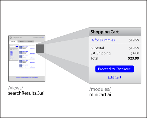
Cut each module from the view and paste it into a new, separate file
Placing artwork
Inserting a module from a separate file into an illustration can be accomplished via the following commands:
Adobe Illustrator CS2
- Click File > Place
- Browse and find the separate .ai file in which you’ve stored the artwork to place
- Check Link so that the artwork will be linked to the file and subsequent changes to that file will be reflected in this document
- In the subsequent Place PDF dialog, select Crop to Art and click the OK button.
Note that when you place Illustrator artwork in a separate file, artwork outside the file’s Artboard boundary will not be visible once placed.
Microsoft Visio 2003
- Click Insert > Object…
- Select Create From File to toggle the dialog to enable file selection
- Browse and find the separate .vsd file within which you’ve stored the artwork
- Check Link to File so that the artwork will be linked to the file and subsequent changes to that file will be reflected in this document
- Click the OK button
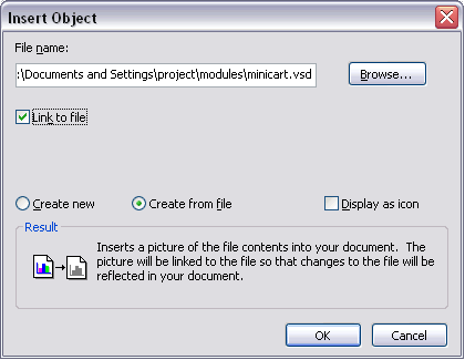
Microsoft Visio’s Insert Object dialog
By following these commands, you should now see the artwork from the included file as an object. You can move, resize, crop, and even edit the module from within the current document. However, since the artwork is linked, the module remains independent and can be reused across other documents. As you change and extend the module over time, updates will propagate automatically to every other document that links to it.
Embracing modularization
Numerous capabilities arise through a modular file approach:
- Change once and have updates propagate everywhere
- Nest relationships of modules within each view (and view variation), modules within modules within views, modules within views within flows, etc.
- Abstract design elements progressively as each module emerges, solidifies, and extends
- Reuse and share between designers and across projects
Additionally, nomenclature you establish during this process can permeate the team’s discussions and downstream development efforts. Take the advice of Christina Wodkte and Nate Koechley, who point out “If you’re making up a name, make it something we can all use.” Your modular concepts could align with CSS naming conventions, influence the markup, and even suggest core objects built during the development of client-side scripting.
But a module’s usefulness is not limited to reusing a single representation. Within the file, you can create multiple variations of a display, apart from the representation or scenario where the module initially emerged.
Good variations
Module variations are critical in comprehensively depicting behaviors, state, dynamic data, and conditional displays during wireframing.
For example, consider a mini-shopping cart displayed in many views of a shopping experience. Over time, teammates will need clarity on how the mini-cart appears in different states:
- Empty
- Contains 1 item
- Contains 2+ items
- Transitions when updated in real-time via an interaction to add an item to the cart from elsewhere in the view (without a refresh)
- Transitions when an item is interactively removed (without a refresh)
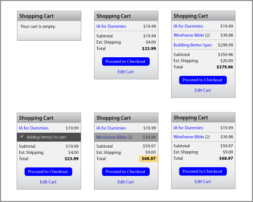
A grid of module variations based on display conditions and interactions
The module’s file is an ideal, consolidated location to store and evolve these variations. Within this file, you can quickly illustrate many variations in concert and manage those illustrations simultaneously.
This process frequently yields a grid of variations and enables visualization of patterns and differences across data, display rules, and state. With the consolidated display, teammates can more broadly understand how context influences the flexibility and scalability of the module’s elements. Additionally, if you need to update the module (whether to add a variation, update an element, or even modify copy), you have a single source.
Harvesting your crop
With module variations prepared, you can more quickly prepare many example views and flows. But, as you place a module file into each view, you now have an illustrated grid of instances instead of just one representation. Therefore, you must crop the placed artwork to show only the variation applicable to that view’s context.
Adobe Illustrator CS2
There are many techniques for cropping artwork in Illustrator, including:
1. Create a clipping mask
Regardless of how variations are arranged within a module’s file, you can use a clipping mask to hide all but the variation of interest:
- Create a path (such as a rectangle with a stroke color but no fill color) surrounding the variation of interest and above the placed artwork
- Select the path and placed artwork simultaneously
- Select Object > Clipping Mask > Make (or CTRL-7)
- Use the Selection tool to arrange the cropped illustration within the view or flow
2. Placement options
If a variation is at the artwork’s edge or corner, avoid the potential maintenance issues of a clipping mask and instead use the Placement Options dialog:
- Select the placed artwork
- Click on the artwork’s filename in the Control Palette (displayed via Window > Control Palette), and click on Placement Options in the resulting menu
- Select to preserve: File Dimensions, select the corner or edge of the variation in the Alignment grid, and check Clip to Bounding Box
- Click the OK button
- Drag object handles to hide portions of the placed artwork except the variation of interest
- Use the Selection tool to arrange the cropped illustration within the view or flow
Microsoft Visio 2003
- Select the placed artwork
- Click the Crop tool (if the Picture toolbar is not visible, select View > Toolbars > Picture, which will display the toolbar that includes the Crop tool), or click CTRL-SHIFT-2
- Drag a selection handle to hide portions of the placed artwork except the variation of interest
- Select the Pointer tool (or click CTRL-1) to arrange the cropped illustration within your broader view or flow
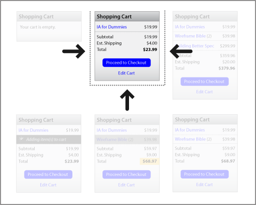
Cropping or masking a grid to show only the variation of interest
Spec and flow
Although boxes and arrows may be sufficient to illustrate a sequential experience path, flows that directly incorporate wireframes result in a far more engaging understanding of an experience. With variations of each view in your path (each built upon module variations), you are better positioned to efficiently construct numerous flows. Such storyboards are more compelling and accessible, relative to your audience’s cognitive struggle to map boxes and arrows to wireframes, relate decision points and business rules, and construct the experience in their mind’s eye.
As the design matures, many reach a point where the design must be annotated or thoroughly documented. The existing abstraction and relationships you’ve built significantly ease the documentation process; in fact, a modular structure should directly suggest a design’s decomposition into specification. You can consolidate your modular artifacts (flows, views, and modules) by placing each into this central document and then detailing each to your heart’s content.
Ideally, a spec’s detailed descriptions are layered onto and beside each type of placed artwork. Examples and variation grids are displayed in tandem with referenceable descriptions of dynamic data and attributes, display conditions, and events (including triggers, transitions, and resulting states).
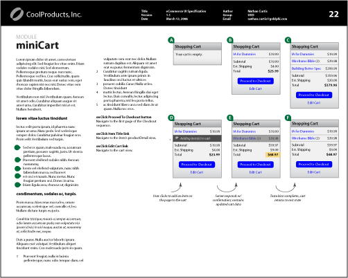
Module placed into a spec document and subsequently annotated
Managing a hierarchy of modularized artifacts
Ultimately, a result of modularization is an interdependent hierarchy of linked files: modules in views and spec, views in flows (to illustrate sequences and storyboards) and spec (to consolidate examples), and flows in spec (for high-level paths and understanding of the experience).
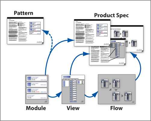
Examples of linked documents: modules in views and spec, views in flows and spec, and flows in spec
An IA can certainly adhere religiously to their own style for managing files and folders. Why not? If it ain’t broke, don’t fix it–especially if it fits your process or model. Up to now, you may not even have worried about this because all of your artwork has been in a single file. However, this modular approach requires that you consider how to store what could end up as many artifacts. One solution is to create directories that mimic your artifact types, such as:
- /projectName/modules/
- /projectName/views/
- /projectName/flows/
- /projectName/spec/
Pros and cons
Of course, such an approach has pros and cons:
Pros:
- Easier updates throughout
- Scales well
- Enables asset sharing for larger projects or multiple projects
- Engenders analysis to consider more peripheral behaviors and scenarios
- Triggers discussions of the team’s shared concept of the experience
- Simplifies design decomposition for documentation
Cons:
- Remains only a static representation of an interactive experience
- Requires discipline and initial effort to abstract modules
- May need to re-crop artwork as variations are added to a file that has already been placed and cropped
- Updates require tinkering to cascade through multiple placement levels across files (in InDesign and Illustrator)
Tighten your use
Some additional ideas to enhance your modular approach:
- Manage your links
Adobe’s products offer a Links palette for viewing, reloading (because of updates), and editing your linked files of placed artwork. Microsoft Visio offers the Drawing Explorer to identify what artwork has been inserted. - Establish size and grids
Once you break out artwork into separate files, it will be very painful to reuse illustrations and maintain consistency unless you establish standard sizes for elements (headers, boxes, form elements) and a grid for placement. Of course, this assumes you’ve conveyed what your wireframes are meant to depict (and not depict) to your visual design and development staff. - Review your artifacts with their audience!
Seek out visual designers, developers, and quality assurance staff early to ensure your technique produces something they want. The better the spec, the better the questions, and ultimately the better the product.
Parting thoughts
I’m all for interactive prototypes. In the near future, I look forward to seeing static wireframe and spec artifacts increasingly combine with interactive prototypes via an approach that simultaneously documents and demonstrates our designs in a single presentation.
However, while such interactive prototypes are valuable, the industry (or at least the type of environment where I most often find myself) is far from denying the need for printable, reviewable, versioned, and auditable documentation that details a design. The waterfall development process, for better or worse, is still a world where many of us live. Therefore, in the short term, modularization is but one way to more efficiently, clearly, and comprehensively illustrate a complex design via wireframes.

Placing artwork
Inserting a module from a separate file is a solution that ca be adopt in Visio, but there is better a solution.
It is to work with the Document Stencil. Compare to the General Stencils where the shapes/objects place in your document have not direct link with their masters, the objects/shapes placed in the Document Stencil share all their properties. A change made on a shape in the Document Stencil will change all the instances of that shapes in your entire document.
Document Stencil Shapes are very useful for navigation. Better than being place in a background, those widgets can be place where ever you want in your document and be change very quickly and easily.
The properties (ex: the fill color) of your shape (dragged from the Document Stencil) can be changed in your document without changing the master. That way you can easily highlight the selected link/button of the navigation in a given page/section. If at some point a new level is added up in your navigation (ex: passing from 5 to 6 links), you simply add that new link in the master (of the Document Stencil) changing the instance of your navigation in all the pages wills still keeping the independent highlighted links/buttons.
Very useful.
You are correct, and I find stencils very useful for a range of techniques for within-document reuse, except that stencils don’t translate for inclusion in other document types, such as Microsoft Word. I’ve found that the majority of IAs using Visio for wireframing will write their spec directly into and create documents from Visio. However, in other cases, such modules and other illustrations need to be reusable for requirements documents, including those composed by resources other than the information architect. In that case, use of stencils can constrain reuse, and the overall modularity suggested by this article breaks down.
In using clipping masks, have you run into any pdf rendering issues or have ridiculously large PDFs? Thanks for the solid info in your article!
In general, I’ve seen no performance degradation or odd rendering in using clipping masks, nor some of the phantom Illustrator instability issues some have experienced with masks in general.
When rendering PDFs from Illustrator (which I rarely do, since my iterative and final documentation is usually via InDesign using the aforementioned linked files), I’ve found that the key to keeping file size down is to uncheck the “Preserve Illustrator Editiing Capabilities”. From there, file size is entirely manageable. Additionally, when creating PDFs from InDesign (via File > Export), the filesize for a specification of ~50-60 pages with 30-50 pieces of linked flows, views, and modules ends up being no more than 1 or 2 MB.
Personally, I use Fireworks for modular designs because it handles symbols very well I find. I create a file called “symbols” in which they are all stored, then import them as needed into the wireframe files I create. I then link the Fireworks PNGs into MS Word, where I annotate them (and get all the table of contents, page numbering and cross-references goodness I need). I can then also create clickable prototypes out of the same files if I want to using Fireworks’s (admittedly primitive) hot spots.
You have to run the “update” command on each of your wireframes to keep their symbols up to date though, which can be a pain, although there is an batch process extension you can get for this.
The tip on having an “archive” directory is nice, although I find I forget to archive versions enough, so now I just use a revision control system like VSS or CS-RCS (single use of which is free) to do it all for me. You can then do roll-backs, tag releases, etc.
You may have surmised from this that I don’t use Macs, and you’d be right, but I think all of the above is possible on that platform as well.
This is very good. This has worked well for me before. I have, however, gotten into self-inflicting versioning wars with this method. It gets confusing, after a while, to keep track of the module version and their relationships to the parent documentation version. Have you had much luck with that? Additionally, my computer’s performance does suffer when I have too many linked files per page. Thank you for documenting and sharing. This is excellent!
Are you referring to my comment, Andres (sorry, not having threads make conversations difficult)?
I don’t understand what you mean when you say you find it hard to “keep track of the module version and their relationships to the parent documentation version.” Why would you want to keep track of that? Doesn’t everything just use the latest version?
I was Nathan’s first guinea pig for this method 🙂 and I continue to use it for most of my projects. I work across a range of programs to create my various UI deliverables so being able to embed all of them into one InDesign document is nice. It allows me to create a cohesive & professional artifact and, sometimes more importantly, maintain consistency across artifacts.
Love this approach in theory, but I’m having some challenges with the practice. First major obstacle is that Illustrator CS2 on the Mac doesn’t seem to want to link another .ai file via the Place dialog. It will happily insert the content of the .ai file into the View.ai, but updates via the Module.ai are not possible (because there’s no link). I suspect that one could get around this by creating PDFs, or image files of all of the modules — but that seems like it would require quite a bit more work overall.
Great idea though; just wish I could make it work for me!
I switched from PC to Mac just a few months after publishing the article. What I found was that instead of saving all the modular files as .ai, instead I saved them as “Adobe Illustrator Editable” .pdf files. With this, you should be able to link files easily while not embedding them as you explain.
In essence, everything about the files remained the same (including file size), but now I can (a) place them and update them with ease within Illustrator and (b) also view them quickly with Preview and Acrobat. The only downside? I had to associate the .pdf extension primarily with Illustrator instead of Preview or Acrobat, so that when within Illustrator I select “Edit Original”, it’ll open that linked file also in Illustrator. Kinda a pain when working generally through Finder or Email (because pdfs now open in AI unless you select “Open With…” via the contextual menu), but worth it in my case.