“To successfully communicate the characteristics of an information space, I needed an approach for creating easily understood diagrams. To be useful to my audience, the diagrams must communicate the “big picture” of the website to stakeholders, while providing enough detail to be useful for the development team.”
Information spaces surround us. When we retrieve a file from our computer, we are browsing through an information space; when we use a search engine we are sifting through an information space; and when we visit a website we are moving through yet another information space. As user experience professionals, it is our job not only to understand how this space works (and how people work within the space), but also how to best access and communicate the information contained therein. Understanding the structure of an information space for a website boils down to the following questions:
- What is the information structure?
- How do I visually represent that structure?
- What relationships exist among the web pages?
- How are those page relationships represented?
I suspected that site diagrams would be quite helpful in answering these questions. How to create the right diagram became a personal challenge.
The evolution of a diagramming approach
My earliest inspiration came in a graduate class on Information Architecture at the University of Michigan’s School of Information. Our textbook was Rosenfeld & Morville’s Information Architecture for the World Wide Web, which provided me with my first examples of site diagrams. Based on the book’s diagrams, I had an idea of how I could visually convey structural and functional information about a website.
Because the text did not provide specific diagramming guidelines, I found myself iterating from the few images it contained. Every project I worked on served as a further iteration as I adopted practices that worked well and discarded those that did not. During this iterative process, Jesse James Garrett released his excellent Visual Vocabulary, which had a decidedly different focus in its diagramming. Whereas my evolving approach focused primarily on mapping out structure and page relationships, with secondary consideration given to functionality and interactivity, I found that the Visual Vocabulary was ideal for displaying detailed functionality and interactivity and was not the right approach for conveying my structural considerations
To successfully communicate the characteristics of an information space I needed an approach for creating easily understood diagrams. To be useful to my audience, the diagrams must communicate the “big picture” of the website to stakeholders, while providing enough detail to be useful for the development team. A final goal was to avoid unnecessary abstraction in the diagrams; the diagram content should map closely to what will later be observed on the website (or what is currently on the website, if the diagram is part of a redesign). In fact, my desire to understand websites led me to develop a diagramming approach called “structural/functional site diagramming.”
Starting with a site outline
A site diagram might initially sound like a site outline. And while not technically a part of the site diagram, a site outline complements the diagram quite well. The site outline presents the website structure in a typical outline format, perfectly mirroring the numbering, levels, and labels in the site diagram. The advantages of site outlines is that they are faster to create and maintain than site diagrams, but their drawbacks include difficulties showing linear page sequences and limits in their ability to mention functionality and other content types, mainly due to the visual clutter the extra text creates. (If that information is provided it is typically in parentheses following the page name.) Site outlines also do not reveal the “big picture” of the website (such as its breadth and depth) as readily as site diagrams.
After creating the initial site outline, the next step is to represent the information in diagram format, which allows us to more easily show complex page relationships as well as functionality. Since we are moving into the diagramming process, the logical starting place is the structural units that serve as the building blocks of the diagram.
Structural units in the diagram
The basic structural unit of the diagram is the web page, represented by a rectangle. If a web page is dynamically generated then the rectangle’s edges are rounded (static pages do not receive rounded edges). Web pages to be developed at a future date are represented by a dotted rectangle; a footnote can indicate the target date for the page to be available or reference a content inventory for those details. By mapping this future development a site diagram can help predict long-term user interface needs and serves to guide interface design towards a more scalable layout (e.g., a layout that will easily accommodate the four new global navigation buttons that will be added over the span of six months).
Multiple pages at the same level of the website can be clustered, providing a useful level of abstraction in situations where displaying each separate page would prove difficult (usually due to the space limitations of the printed page holding the diagram). When deciding to cluster pages some basic criteria are followed:
- The pages being clustered are located no higher than Level 3 of the website; preferably they are at lower levels.
Clustering at too high a level (e.g., from the home page) will often hide pertinent information and page relationships further down in the website structure. More on this later. - There are no sub-pages under the clustered items.
Clustering prevents individual paths through the website from being seen, so any value gained from knowing those paths to lower-level pages is lost. - The pages have similar content.
Executive biographies, press releases, job postings, and discussion board entries all work well for clustering because these are multiple pages with similar content. Given their inherent similarities, showing them separately does not offer enough value to offset the visual clutter they introduce into the diagram. - The quantity of pages is likely to change frequently.
Rather than change the diagram on a daily basis, it is best to show a cluster.

Figure 1: Structural site diagramming units
Specifying levels and numbering pages
Most websites possess a structure that is at least partially hierarchical. In that hierarchical structure, each page is at a certain level, based on parent and child relationships to other pages within the information space. The home page is Level 1, global navigation and other non-global pages off the home page are Level 2, local navigation is Level 3, and so on. Often each link clicked from “Home” (if a hierarchical path is followed) corresponds to a new level of the website.
It is important to note that these levels represent how the website information is structured conceptually–often from general (high-level pages) to specific (low-level pages). User mental models mirror this conceptual structure. The levels do not necessarily correspond to file location and directory structure; a website could have Level 6 pages when all the website files are in the same directory on the server.
Numbering the web pages is a very helpful way to keep everything organized and simplifies communication about the website. The home page is 1.0 and second-level pages are 1.1, 1.2, 1.3, etc. Third-level pages under 1.1 would be 1.1.1, 1.1.2, 1.1.3, etc. A simple website structure, shown in a site outline format, would be:
1.0 Home
1.1 Who We Are
1.1.1 Our History
1.1.2.Our Staff
1.1.2.1–1.1.2.8 Staff Bios
1.2 What We Do
1.2.1 Products
1.2.2 Services
Each web page receives just one number and each number is unique; cross-links to that page reference the number. From the number alone we know at least two things about the page: the level at which the page occurs (for example 1.2.2 is a level 3 page, determined by counting the number of digits) and the path to reach that page (1.2.2 is down the 1.2 path in the global navigation). Clustered pages end in .x (e.g., 1.2.4.1-1.2.4.x) if that cluster is prone to frequent changes; if the number of web pages in the cluster is stable then a fixed final value can be provided.
The importance of numbering the pages cannot be overestimated; there is nothing quite as embarrassing during a client meeting as scrambling to find the relevant diagram and/or documentation for a page based on just its name. This problem compounds as the number of pages increase, and if different pages with the same name (such as “FAQ”) exist in multiple sections of the website. The unique number assigned to each page eliminates those concerns.
Visually mapping the structure
Tree diagrams are used to visually present the structure. The choice of a horizontal tree diagram or a vertical tree diagram (See Figures 2 and 3) usually comes down to a consideration of website breadth and depth as well as the author’s preference for working in portrait or landscape orientation for the printed diagram.
If a horizontal tree diagram is created, the levels of the website progress from left to right, with Level 1 on the left and successively lower levels to the right. Vertical tree diagrams progress from top to bottom, with Level 1 at the top of the printed page and successive levels further down the page.
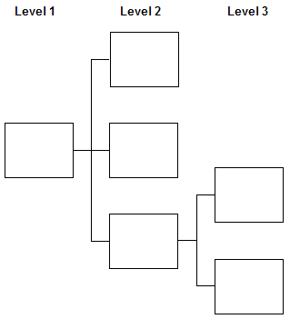
Figure 2: Horizontal tree diagram
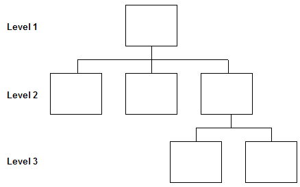
Figure 3: Vertical tree diagram
As a matter of necessity, the site diagram is often divided (chunked) across multiple printed pages (See Figures 4 and 5). The first diagram page contains Level 1 (“Home”), Level 2 (global navigation and other non-global pages off the home page), and the legend. Subsequent diagram pages focus on each Level 2 section that has sub-pages, detailing those areas of the website. Should a given Level 2 section go quite deep (to Level 6 or 7) more than one diagram page may be required. Generally this diagram chunking can only be avoided with small websites (all the content can be shown on one diagram page) or if you have access to a printer capable of spooling output on a continuous sheet of paper.
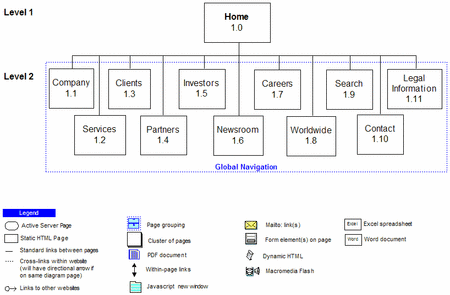
Figure 4: Chunking a site diagram for easier printing: Page 1 (Click to enlarge)
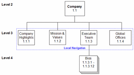
Figure 5: Chunking a site diagram for easier printing: Page 2 (Click to enlarge)
Linking and page relationships
Solid connecting lines between rectangles indicate standard links moving from a parent to a child page. In practice, these standard links usually occur in a navigation bar or from a link in the text of a page. Arrows are not used to indicate directionality for standard links; the visual flow from higher to lower levels in the tree diagram suggests the usual direction of the linking. The ways in which lines connect and diverge reveals valuable information concerning how navigation functions in the website (see Figures 6 and 7).

Figure 6: All Level 2 pages link to each other (Click to enlarge)

Figure 7: Navigation between Level 2 pages requires a return to “Home” (Click to enlarge)
Linear sequences
For linear page sequences, arrows are often used to signify the flow through the process. In cases where the directionality is more rigid (such as a checkout process) the arrow would be pointing in one direction between the pages (See Figure 8). Situations where linearity is an option, but not a requirement (such as a multiple-page article with both “Previous” and “Next” links and links to all article sections on each page), could be represented with a double-sided arrow between the pages as well as a solid line to which all the pages connect. Linear page sequences are also generally displayed from left-to-right, because the pages stay at the same level in the website structure. To resolve numbering issues (which arise because all the pages are at the same level) it is helpful to use a shared page number and add letters (e.g., a, b, c) to the end of that number for successive steps/pages.

Figure 8: Linear page sequences (Click to enlarge)
Cross links
Cross links are a different matter entirely. Those relationships are represented by dotted lines, generally ending in a rectangle containing the numbers of the cross-linked pages (see Figure 9).
The purest definition of a cross link is a link to a page in a different area of the website (e.g., a link from 1.3.2 to 1.5.3), although in practice links within the same section (e.g., a link from 1.3.2 to 1.3.4.3) are often labeled as cross links, especially if the link traverses multiple levels. Quick links on a home page would be labeled as cross links. In cases where cross links are to pages on the same diagram page, an arrow can be added to the dotted line to show directionality.
External links
External links are represented by a labeled icon in close proximity to the page containing the link (See Figure 9). The placement of the icon outside the rectangle is intentionally done to emphasize that the link is external. Incoming links are shown in a similar fashion, using a special icon placed in close proximity to the affected page; showing such links is a relatively rare practice.
Pages that fit into a given grouping (such as global navigation or a local navigation bar) can have that relationship shown with a dashed box that is given a descriptive label (See Figure 9).
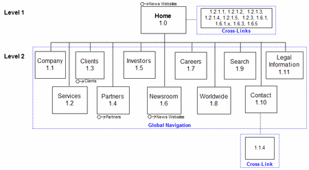
Figure 9: Cross links, external links, and page groupings (Click to enlarge)
Displaying non-web content types
Websites contain a wide variety of content types that do not fit into the “web page” category, including Word documents, PDF files, PowerPoint slides, Excel spreadsheets, executables, archive formats, even images meant for downloading. In this approach the most important difference between web pages and other content types is that the other content types do not receive page numbers. The rationale is that these documents are not part of the website navigation structure, so a number is unnecessary. After all, how often do you load a Word document from the home page in order to navigate deeper into the website? If appropriate, a different identifier (something other than the page numbering approach) could be used to track these content types; such an identifier would likely map to an entry in a content inventory.
What the site diagrams do reveal about other content types is which pages link to them. For example, an icon representing PDF files is added to the legend and that icon is placed inside the rectangles for all pages linking to at least one PDF. The placement inside the rectangle reinforces that this document is available from that web page (See Figure 10). As mentioned earlier, further details about the PDF could be given in a content inventory or perhaps in a footnote. The decision to minimize information about the file (such as the file name, the number of PDFs linked from the page, and any other relevant data) within the diagram is to reduce visual clutter. These tradeoffs between descriptiveness and clutter occur fairly often.
Representing functionality
Broadly defined, the functionality is the scripting and interactive aspects of the website. Forms, email links, within-page links, JavaScript, and server-side languages all constitute website functionality. Visually, this functionality is layered on top of the structural information (See Figure 10). Just like non-web content types, different types of functionality are assigned icons in the legend and those icons are placed inside the rectangles for pages containing the functionality. The one exception is for pages that involve server-side processing; those pages use a rounded rectangle that is also defined in the legend.
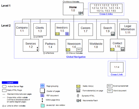
Figure 10: Displaying content types and functionality (Click to enlarge)
Adding the metadata
If one thing is certain about site diagrams, it is that they are continually changing along with the websites they represent. Version numbers are quite useful for tracking these changes (accidentally giving developers an outdated site diagram causes all sorts of havoc), as well as dates for when the document was created and last updated. URL and site name are also included and authorship information is important, should questions arise. Labeling the diagram pages and including the section number (e.g., 1.3) for multi-page diagrams also saves time when trying to track down a specific web page inside the structure.
Diagramming in practice
In using these diagramming techniques, it is important to keep an open mind and to be creative. The ultimate goal is to produce a diagram that accurately describes either what has been created or what is yet to be created, and do so in a manner easily grasped by various stakeholder groups.
Given the diversity of structures and functionality in websites, it is likely that at some point a unique situation will arise, one that goes outside the guidelines noted in this article. This happens most frequently when diagramming large websites at the start of a redesign; large structures invariably have odd pathways arising from multiple authors and/or the addition of content over time. In those challenging situations it is best to iterate and innovate, along the way perhaps creating a novel way of representing that structure or interactivity.
![]()
For More Information:
Examples:
Articles:
Prior to entering the teaching field, he worked in industry as an information architect at a web design firm in Ann Arbor, Michigan. In his spare time he works as a freelance information architect and web designer.

– Jason
“Additionally, rather than trying to develop one massive site diagram it can sometimes work better to focus on multiple smaller diagrams.”
I share your idea here. Nice Article !
Regards,
Nemanja
Regarding Mike’s comment… For large sites, some text labels or clear abbreviations may be appropriate for specifying levels/hierarchies and numbering pages. It can certainly take up a little more space, but offer clarity in a large structure. Especially if there’s tons of tree/flow pages and you’re sharing docs withn non-IA types who might be more likely to be easily lost in a structure. Plus, assuming this is used only at a 2nd tier category level, if you have cause to move the 2nd tier boxes around, you don’t have to re-number everything. Face it, you move stuff when you can’t fit things below, to express the order of menu items, (even if it doesn’t really matter because you’re not really reflecting the design at this point). And you certainly can’t have 1.3 showing up to the left of 1.2.
For example, you might have 1.0 as the home page, then 1.abt for the About Us section, which would subsequently have 1.abt.1.x and so on. (Or whatever works for you.) Personally, I like the numbers better, but I’ve found the text method useful on a few occasions.
The thing is, even with some small abbreviated text, if you have a textual outline or page list with page requirements, (for example, using MS-Word and tagging the page names with a heading), you can still easily outline/sort the page requirements and automatically create index/tables of contents.
Good article. However, one thing I don´t find a mention to is how to handle several global navigation menus. Say for instance you want to seperate the main content pages (About Us, Products, Contact, etc.) from the secondary content pages (Privacy Policy, Careers, Advanced Search, etc). These are both Global in the sense that they are accesible from all pages, but you don’t necessarily want to group them into a single navigation menu.
Fernando > I would typically avoid having more than one ‘real’ global menu (in terms of hierarchy) and instead cross link from the home page to sub-pages (About us > Careers etc.). Otherwise you might end up having an complex website structure that makes website adminstration overly difficult for the webmaster… and in extreme situations the user as well.
On the other hand, assuming you number your home page 1.0 and the subpages 1.1, 1.2 etc, you could label the pages of the second global menu from 2.0, 2.1 etc.
I’d say i depends on the qualifications of the client/webmaster…
I’m interested to know how you model menu items in this diagraming approach. In many cases the name of the menu item is not the same as the page itself as such it is often useful to include them in the site diagram.
Patrick – in cases where the menu item does not match the page name, I put the menu item in parentheses after the page name, such as: Contact Us (Contact) 1.6
I think we can expand the diagram by using colors to add more information.
Level 1 can start at 0 (unless you have a ton of sites to document and you want to assign a unique number to each site).
Perfect post. Here’s a tool that helps create Map Mashup providing a step-by-step wizard that generates ready-to-deploy code on any website or blog http://blog.caspio.com/integration/announcing-the-new-and-improved-map-mashup-version-7/
Danny – good point about having different versions of the diagram, tailored to each stakeholder group. My only concern is having to track multiple versions and the time it could take to create them. I was hoping to serve the needs of both groups at once (in a single diagram), but tailored versions would allow for more specialized information.
The file structure problem has been fixed on the images.
I’m with Danny on this. I work on an enterprise intranet and use more abstract architecture diagrams to explain how people will move through sites. Detailed diagrams seem like overkill when presenting to clients, accidentally causing confusion and fear (weird but true, people are scared of what they don’t know and that includes websites).
But I absolutely see the value of very detailed, structural view of the site to better communicate to a team of web professionals producing the site. I can even see this being useful in tracking progress on project.
Presenting different versions of the diagrams to different stakeholder groups is even more important if you are designing a portal with targeted webparts, as well as links that can be targeted at different audiences. It seems to be common to experience stakeholder meltdown when attempting to explain how different users will see different things.
Is portal architecture a completely different discipline to web site architecture or can we successfully use the same techniques?
The same techniques map quite well to portal architecture. In the past I have developed audience-specific diagrams for projects such as portals, where different user groups see different information and functionality based on their group membership(s). In those cases separate diagrams are extremely useful.
I found this article extremely useful and want to start using this method in practice. Is there any chance you want to post the stencil library you used to create the diagrams?
The stencils are from Visio’s built-in sets (Conceptual Web Site and Web Site Map). I also created some on my own using the tools in Visio. While I do not yet have these assembled into a separate library, some sample diagrams (in Visio format) are available at:
http://courses.wccnet.edu/~jwithrow/main.php?f=290&p=deliverables
An excellent article, but I would like to add one thing. I understand that this maps the information space, but would like to see something of the functional as well. There are on many occasions scripts which serve only to process and are never seen by a viewer. An example would be a script that updates a database. An addtional type should be added to the diagrams for such scripts.
An excellent article, but I would like to add one thing. I understand that this maps the information space, but would like to see something of the functional as well. There are on many occasions scripts which serve only to process and are never seen by a viewer. An example would be a script that updates a database. An addtional type should be added to the diagrams for such scripts.
Excellent suggestion, Peter. Giving a visual indication that there are deeper levels of hierarchy would definitely be beneficial.
A suggestion regarding numbering of sections back to the homepage (as level 1). It might be more productive (for the end-client) to consider the homepage as a ‘wrapper’ to the site proper, similar to the cover or contents page of a book, and as such un-numbered.
Page numbering would then begin at the section level. Rather rather than 1.1, the ‘Company’ section would be numbered 1 (ref. Fig. 5), ‘Mission & Values’ would be 1.2, ‘Executive Team’, 1.3, etc. Where showing cross-links, the numbers would then begin with a unique ‘parent’ section ID rather than the redundant reference to the homepage.
A common issue structure diagrams is the conflation of ‘pages’ with ‘sections/directories’. With reference to Fig. 5, it is not clear if the ‘Company 1.1.1’ page icon represents a page of content, a section label, or both. If navigating to the ‘Company’ section of this site would the first content page be ‘Company 1.1’ or ‘Company Highlights 1.1.2’? Placing section labels across connector lines (instead of using page icons) can be a more immediate means of communicating that this is a label/content-grouping.
Although the reference to the home page as 1 is redundant, having it there keeps the level numbering consistent with the number of digits involved. For example, 1.1.1 is a Level 3 page and 1.2.2.4 is a Level 4 page. If we eliminate the home page digit the reader has to add one to the number of digits to determine the level.
In regard to the second issue, the conflation of ‘pages’ with ‘sections/directories’, the icon used for ‘Company 1.1.1’ identifies this as a page. If a differing section label led to this page I would identify that as ‘Company (Company Overview) 1.1.1’, with ‘Company Overview’ being the section label used to reach the ‘Company’ page. If we had a section label that did not lead to a web page I would represent that by grouping the sub-pages in that section in a dotted box given that section label.
Removing the leading ‘1’ for the homepage, makes it easier to use (read) the code as a short-hand for the content. Guess it’s a trade-off between communicating the general nature of the destination-content vs. the page Level.
Perhaps adding an example to the diagram that shows how to accomodate a section that is not a page would be useful.
Andy – I agree; it’s definitely a trade-off. It just depends on the author’s desired goals and what the audience(s) will find most useful.
There have been a lot of excellent suggestions, so perhaps a second article should be written to explore some of those specific areas and provide more examples. Is there interest in a follow-up article?
How do these techniques differ for large scale websites? The example shown is a fairly small site in scale (as it would have to be for example purposes). What if you were creating something along the lines of a full-service computer parts ecommerce site. The breadth of the level two tier alone would be mind-boggling, with 20-30 categories as well as product features all appearing on the homepage. It’s beyond me how you could site map something to the degree of Amazon, even in its infant stages. Would this be the process they would follow? Would they utilize shortcuts such as grouping the categories?
Mike – This approach can work fine for large websites, although (as you indicated) there would be more grouping/clustering in the diagrams. This grouping/clustering happens to a greater extent because those big sites usually have lots of sub-pages that are essentially the ‘same’ content type (e.g., product pages), so clustering works well.
Additionally, rather than trying to develop one massive site diagram it can sometimes work better to focus on multiple smaller diagrams.