Whether you love it or hate it, if you are an information architect you will probably find yourself using Visio at some point in your career. When that time comes, these three tips on styles, backgrounds and the F4 key will be indispensable.
Styles and Formats
Visio, while offering a lot of flexibility in applying styles to shapes, does not do much to help users understand the distinction between Style and Format. While they are inextricably related, they refer to different things. To help you distinguish, consider this table:
| Text | ||
| Font | ||
| Size | ||
| Style | ||
| Color | ||
| Fill | ||
| Fill Pattern | ||
| Fill Color 1 | ||
| Fill Color 2 | ||
| Line | ||
| Line Pattern | ||
| Line End | ||
| Line Start | ||
| Line Weight | ||
| Corners | ||
| Color | ||
Each of these attributes describes one aspect of the “style” of a Visio shape.
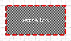
Thus, for the above shape, I could fill in the table like this:
| Text | ||
| Font | Arial | |
| Size | 12pt | |
| Style | Bold | |
| Color | White | |
| Fill | ||
| Fill Pattern | Checkerboard | |
| Fill Color 1 | White | |
| Fill Color 2 | Black | |
| Line | ||
| Line Pattern | Dotted | |
| Line End | None | |
| Line Start | None | |
| Line Weight | 4pt | |
| Corners | Square | |
| Color | Red | |
![]()
All of the information in the table constitutes the shape’s “style.” “Format,” on the other hand, refers to the attributes of the text, fill or line components of the shape (i.e., the right column of the table). Format will always be qualified with one of these components of a shape. You could never talk about a “shape’s format.” You could, however, talk about a shape’s line format, a shape’s fill format or a shape’s text format.
The relationship between Style and Format now becomes straightforward: a shape’s style is the sum of its text, fill and line formatting. This becomes important when you select a shape’s style from the Style menu. In doing so, you affect the format of the text, line and fill of the shape. (Actually, you can define a style with one, two or all three of these formats specified, but the default styles in Visio include all three.)
A confusing aspect of the Style feature is that Visio offers a style menu for each of these shape components. I can select a shape and then select a style from the Text Style menu. When a style selected from the Text Style menu includes formatting for fill and line, you might get this prompt:
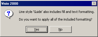
Visio is asking whether you want to style the shape with the fill and line formatting as well as the text formatting. It’s asking, in other words, if you’d like to apply the formatting to all the attributes defined by the selected style, or just to the text.
Backgrounds and Text Fields
By creating a background, you can carry common elements through several pages in a single Visio document. Visio allows you to define many backgrounds, and you can assign any one background to any foreground page.
To create a background, select “Page…” from the Insert menu. You’ll be presented with the page properties dialog box:
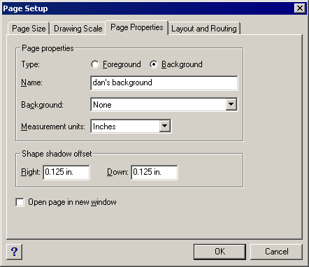
Be sure to select “Background” under Type and give your background a meaningful name. In Visio, backgrounds are pages in the document. They do not get printed, however, like regular pages.
When you click OK, you’ll see a blank Visio page. For the purpose of this tutorial, we’ll use the background to put my name in the lower right-hand corner of every page in the document.
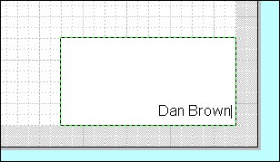
Now, to put the background to use, create another page with Insert > Page… This time, however, the page type should be ”Foreground.” Be sure to give this page a meaningful name as well, since we’ll be using it later. To apply our background to the page, select its name from the Background menu.
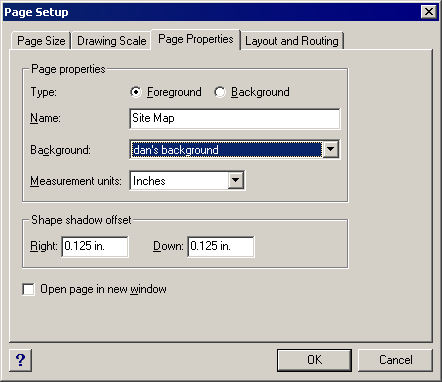
Now, when you click OK, you’ll see a new page with my name at the bottom.
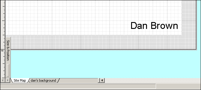
Backgrounds can be particularly powerful in combination with Text Fields. A text field is a variable space in a text area that Visio automatically fills in depending on the type of field you specified. For example, you could use a Date text field to automatically fill in the date.
When a text field appears on a background, it will draw its information from the foreground page assigned to it. This is particularly useful if you’d like the page name or page number to appear on every page.
To do this, create a text area on a background page. In the text area, insert a text field for “page name.” Then, any foreground page with that background assigned to it will show the page name. Here are the particulars:
Visio offers an enormous selection of text fields to choose from. To stick with the example, we’ll use the page name. That field is categorized under “Page Info.”
Note how Visio gives you the opportunity to format the text field. This is particularly relevant to date and time fields.
Now the page name appears. Because we’re still editing the background, you’ll see the name of the background page. Switching to the page we created previously, however, shows that the text field automatically changes depending on the page.
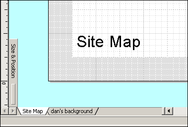
You can see why it is important to give pages relevant and meaningful names. By combining backgrounds and text fields, it is easy to create professional-looking deliverables while minimizing the chance of sloppy mistakes through typos or missing information.
F4
I love F4. I discovered this little trick reading an article on Visio.com before it was merged into Microsoft’s site. The F4 key is Visio’s keyboard shortcut for the “Repeat” command found in the “Edit” menu.
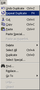
Now, I know what you’re thinking. In many Windows applications, this command is represented by the shortcut Ctrl-Y. In many applications, Ctrl-Y is a shortcut for the “Redo” command, an undo for the “Undo” command. In other words, if you undo something and change your mind, you can hit Ctrl-Y and it will take your work back to the state prior to the Undo command.
Visio’s F4 is different. In fact, if you do an Undo, the menu command changes to Redo and the keyboard shortcut becomes Ctrl-Y.
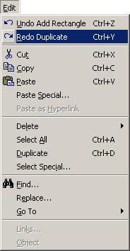
Hitting F4 means, “Repeat the last command I issued.” One use of the Repeat command is to apply formatting to several shapes at once. To do this:
- Select a shape.
- Change the format of the shape (for example, line weight).
- Select other shapes, holding Ctrl to select more than one.
- Press F4.
You’ll see the shapes you selected adopt the same formatting. This feature is limited in that the Repeat command repeats only the most recent command given. Try this experiment:
- Select a shape.
- Change the line weight of the shape.
- Change the color of the line.
- Select other shapes, holding Ctrl to select more than one.
- Press F4.
Instead of adopting both the new weight and color of the line, the other shapes will only adopt the new color.
Visio offers a number of other techniques for applying the same style across many shapes (styles, layers and the Format Painter tool, among others) and F4 is not necessarily the best choice in all situations. The real value in F4 is its ability to repeat a duplication action.
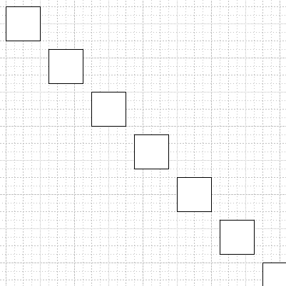
After duplicating a shape, pressing F4 will create another duplication of the shape in the exact same relative position. The best way to describe this is to show it.
I can create a square and duplicate it by holding the Ctrl key and dragging the square to a new position. The top left corner of the duplicate is one-eighth of an inch lower and to the right of the bottom right corner of the original.
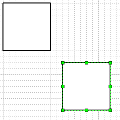
Now, by pressing F4, I can create a second duplicate whose relative position matches that of the first duplicate.
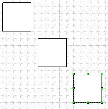
If I press F4 again, a third duplicate appears, also in the same relative position.
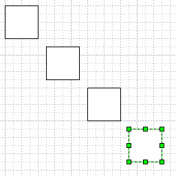
And so on.
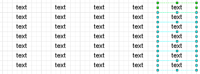
This technique is useful for positioning objects consistently across a drawing, and for creating grids of objects. To create the grid below, I selected a column of text boxes, duplicated them with Ctrl-drag, and then pressed F4 to make each additional column.
Regardless of which party you fall into – Visio naysayer or Visio supporter – these tricks can help make your experience with the application more efficient. Visio is filled with tricks like these, but these three are among my favorites and the ones I use most often to get the job done. I hope you’ll use the discussion area for this article to post your own Visio tricks.
In the next column, we’ll compare the standards available for creating information architecture documentation, and help you decide which standard is right for you. (If you have suggestions for standards I should look at, please drop me a line!)

Hi Dan!
I loved your piece. I was wondering if you could help me out in another way. I have a list of 100 items (text) that I want to put into a visio shape. The list of 100 items fills up the entire page, so I was wondering if there was a way to split the visio shape into three columns of 33 items. Can this be done? Do you know how?
Thanks,
Ben Weagraff
benjamin.weagraff@accenture.com
Love the tips!
Is there anyway to tab between shapes? I can numerous shapes (with text) connected, and I want to be able to move from one to the text while typing without having to use my mouse and click on the next shape.
Hi Dan, and everyone.
Just chiming in here on the pixels in Visio issue. I’ve managed to coerce Visio into displaying pixel-equivalent measurements. For times when Visio is unavoidable, here is a simple fix:
http://complexdiagrams.com/2008/06/01/pixel-rulers-in-visio/
Cheers, Noah
Using Visio to help create “information architecture” diagrams is like using PowerPoint to help create “presentations.”
And I’m with Tufte on this one…
Andrei
Great article. Those tips are really useful.
There’s one thing about using Visio that really troubles me. What’s the point of using a diagramming tool for computer interfaces that does not understand pixels?
Am I the only one that has had a team member ask “Looks great but it will it fit?”
I have been working with visio for a couple of years now but i still appreciate a good tip.
Very nicely done. Now we need Jesse to write the OmniGraffle version…. 🙂
Kevin: I agree with your complaint about Visio and pixels, but you could (and should) save yourself the trouble by not using Visio for UI design in the first place.
Visio is just not meant for UI design, it’s meant for structural design, things like IA, network maps, flowcharts, etc.
You will find work much more pleasurable if you use Illustrator or Photoshop for all UI comps (I prefer Illustrator because everything in a layout remains flexible and changeable, but I still use Photoshop for my fast comps), and just use Visio for designing the underpinnings.
At that point, the pixel issue, well, isn’t 🙂
Cheers,
Dan
I quite agree. Perhaps it’s more an internal politcal battle. Visio is safe for me to use because it is not very faithful. Illustrator and Photoshop are Visual Creative Design tools and the property of visual designers only.
Of course that hasn’t stopped me from screen capturing a browser window and using it as a background in Visio.
😉
I just wish visio would adopt standard keyboard shortcuts.
Great tips Dan! Thanks for publishing them.
USING BACKGROUND PAGES
Another tip that I don’t to see mentioned often is the ability to use background pages to repeat elements of wireframes. For an x-windows application I worked on a while ago, a lot of screens had to be wireframed for a functional spec and I was finding myself duplicating common shapes over and over — e.g. main menus, forms, etc. So what I did in Visio 5 was create a series of background pages and use background pages as background pages to thos background pages. Sounds confusing, but let me explain.
I have these background pages:
1. Screen and main menus
2. Data entry form a
3. Data entry form b
2 uses 1 as a background page so the screen and main menus appear. I can create a foreground screen using 2 as a background and overlay values over the form to mimick some user interaction. I can also create new foreground screens with background 3, which also uses 1 as a background page. If I ever need to make changes to global elements I just change the background page 1. This has helped a lot when iterating through screen changes.
To make things even cooler, I can make each of the menu objects in background page 1 a link to a foreground page, so that if I export the entire thing as html and have a clickable prototype.
Another short cut I use often is to create my own custom palette with the shapes I use most often – pulled from all the other palettes. In addition to the premade shapes, you can create your own – shapes, dialog boxes, other elements and then pull them into a palette that can be saved and then used across any document. This becomes a much more global tool than backgrounds, which are document specific.
hey there folks, did anyone else notice that the “print” version of this doesn’t do the tables of the article correctly?
On a more relevant note … Thanx for sharing the F4. I had always assumed it did the ctrl+Y command.
— dave
Some day someone will create a true information architecture tool – one that works the way we work. Till then why are we still using Visio? I have to use it but having tried several different programs the one that beats all hands down has to be the Flash authoring program. For it’s flexibility and speed using Flash MX (and especially 2004) allows very rapid working with multiple layers, multiple pages and is generaly a quicker program. The customisation options are also huge compared to Visio.
Some day someone will create a true information architecture tool – one that works the way we work. Till then why are we still using Visio? For it’s flexibility and speed using Flash MX (and especially 2004) allows very rapid working with multiple layers, multiple pages and is generaly a quicker program.
Regarding the printing issues: it’s a miracle these pages even render at all. MoveableType is emitting horribly invalid markup (nesting errors, unreferenced character entities, etc.), then putting an XHML 1.0 Strict doctype on it. Just feed one of these URLs to the W3C validator to see what I’m talking about. This markup actually crashes the print formatter in Mozilla-based browsers.
Funny, I thought content management systems were supposed to help alleviate these issues.