“Although subtle, this technique has a noticeable impact on assisting passengers to their destinations and so increases efficiencies in the rail network.”
One task we face on a day-to-day basis is how to effectively communicate ever-increasing amounts of information within increasingly richer and more complex web contexts. While living in Japan, I discovered an approach used as part of the way-finding system of Tokyo’s rail network that has a number of interesting implications for user interface design.
Tokyo’s rail system is famous for being the most complicated and bewildering in the world. With over 1,000 stations, even locals get lost and disoriented. As a designer, I try to be aware of attempts at systems and methods of communication. While traveling the Tokyo rail lines, I quickly realized that apart from the obvious use of real-time electronic signage, colored trains, and audio announcements, there were also other techniques being used to assist travelers in knowing where they were, and where they were going. These techniques were subtler, and bordered on subliminal; this was what really interested me.
When on my regular commute on Japan Railways (JR) East’s Chuo-Sobu line out from the town center to the outer suburbs where I lived, I noticed that short, simple chime melodies sounded on each platform as the train was waiting for passengers to get on and off. I noticed that these melodies were different for each station (indeed, Miyama station, which disembarks to Tokyo Disneyland, plays the theme to “It’s A Small World After All“).
Of course, some of the trips on this network are irregular and spontaneous, and in those situations, the melodies are merely signals for when a train has stopped at the station. However, for the majority of JR East’s 20 million daily users, trips tend to be end-to-end commutes between their home and work, sometimes involving as many as three transfers. Because it is not uncommon for these trips to take over an hour, passengers tend to pass the time by reading small pocket novels, playing with their portable gaming systems, or furiously programming their cellphones. Coupled with these distractions, Tokyo seen from a train, is monotonous and indistinct, so establishing one’s location visually must be an active exercise.
To daily commuters, the station melodies augment the existing ambient landscape (going through tunnels, turning corners, large landmarks, etc.), so despite not necessarily paying attention to the visual cues around them, travelers subconsciously start building up a “landscape” of their journey based on these audible inputs. They quickly learn the melody of their final destination terminal (it is played incessantly as they wait on the platform for their return journey), and soon recognize the melody of the terminal that precedes theirs. After long-term use of the same route, commuters build up a unique chain of melodies that accompany them on their way home. Without necessarily realizing why, they begin to establish a familiarity with these sounds, and can quickly discover when they have overshot their destination by hearing an unfamiliar melody that indicates a strange place.
I call these cues ambient signifiers: design elements that communicate subtly as part of the environment’s ambiance. Although subtle, this technique has a noticeable impact on assisting passengers to their destinations and so increases efficiencies in the rail network. When dealing with such large congestion and complexity, any efficiency improvements will have massive benefits for both the rail infrastructure and Tokyo itself.
The reason for discussing this is not to demonstrate how amazing the Tokyo rail network is (it is!), but to learn from this approach. We can draw parallels between transport networks and their passengers, and websites and their users: both can be complex structures; both have navigable routes and destinations; and both can involve large groups of people using routes with the aid of wayfinding tools. Both also involve users dealing with a sensory overload of sounds, distractions, visual noise, and time constraints. For large-scale websites, the number of users may even be similar to large transport networks, and any efficiency improvement can have a positive impact on both user experience and overheads such as bandwidth and server load. This approach also has business benefits: users will make fewer mistakes; there will be fewer customer support issues; and fewer repair and maintenance.
There are differences between the two concepts that are subtler, however, and arguably more important. When dealing with transport, not all passengers are taking one journey with a common source and destination. Instead, they are constantly getting on and off routes to complete their own unique journeys. With websites, there are usually established paths that tend to have beginning and end points with little need to end the process at certain points along the way. Websites can also provide other important levels of information that transport networks don’t. Websites may need to demonstrate, for example, a change in status, a change in content, or a change in context. They may want to encourage a user to pause on a certain page or to bypass another. They may need to demonstrate progress or to signify an alert. The obvious way to do these things has been to use overt (high-frequency) signifiers, such as iconography and language. What I’ve learned from Tokyo, however, leads me to believe that using ambient (low-frequency) signifiers may be another important—and sometimes more successful—approach.
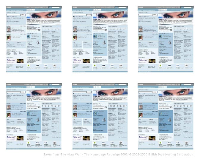
 Web users are already being exposed to emerging rudimentary implementations of ambient signifiers. For example, if you visit a secure site in Mozilla Firefox, you will see the location field in the navigation bar turn yellow. In another case, the BBC’s 2002 redesign of its bbc.co.uk website introduced the wonderfully elegant idea of “digital patina” (sometimes referred to as “digital color footprint”), in which usage patterns create worn paths (e.g., the more you visit the BBC Sports section, the darker the Sports box on the homepage becomes).
Having a user be able to gauge status or context without having to actively seek it out is surely one of the holy grails of human computer interaction. The examples above demonstrate how ambient signifiers fall into Steve Krug’s “Don’t Make Me Think” category of interface cues: they can make a website intrinsically more user-friendly without the user necessarily needing to understand how or why.
Using some common scenarios, we can explore how ambient signifiers can offer a new implicit level of communication—implicit in that they are not designed to be relied upon without prior knowledge (such as breadcrumbs, core navigation, and headings), but rather to indicate context, status, and location through suggestive cues that may be only be received subconsciously and enhanced through experience.
One obvious signifier is the use of change of status. Change in status may be an indication of whether a user is logged in or not, whether he or she is in a mode such as an editing mode or workflow situation, or is interacting with a secure page. For these situations, we would typically employ overt signifiers such as text saying “you are logged in” or perhaps a padlock icon. But these “on” or “off” indicators can also be implied through the use of ambient visual cues: the background color of the page can be changed to a darker hue or become subtly textured. With experience, these subtle cues will allow users to “feel” when they are logged in or when they are using a secure page. Without these cues, they will feel uncertain and will check the standard high-frequency interface elements for verification, such as the text that says “You are currently logged in.” As such, ambient signifiers can promote sensitivity and awareness, which in turn makes the user more responsive and responsible. The user may double-check whether she is in fact logged into a secure page before submitting her details because she senses something is not quite right.
How about content for different user types? Take for example a website that offers different pages for different countries. If a user enters a low-level page through a direct link (from a search engine, for example), the design could communicate to him that he is looking at a page with country-specific content such as prices and specifications, without having him search the page for clues as to what currency the prices are in and that the shipping cost to their country has been taken into account. This could be done using ambient signifiers by introducing minor palette variations for each territory or even country-specific imagery.
Imagine a site that has a complex dashboard widget or a page that presents an overview of the steps and information required for the multi-paged form that follows. How could the design help the user to focus on the page, make it a page that invites contemplation? Perhaps the page could show a contemplative image across the top of the page, encourage users to pause and muse over it. (Is this perhaps the idea behind Window XP’s “Bliss” wallpaper?)
How about implying age or expiration? An online publication could feature this month’s articles in high-contrast colors, while previous months are rendered more subtly. Auction sites could display expired auctions devoid of any color, whereas current auctions are highly saturated. Once an auction has met its reserve, an ambient signifier of color could change from yellow to red.
In cases like those presented above, current web designs tend to communicate using overt signifiers such as icons and text. These small, high-frequency elements—much like the signage at Tokyo stations—require active seeking on the user’s part. Ambient signifiers, on the other hand, are more constant and low-frequency in nature, working on a more passive and subconscious level without any effort from the user. Because of their low frequency, they can communicate effectively irrespective of the competing high frequency “sensory noise” present in today’s rich and complex web interfaces. Users don’t have to look anywhere—ambient signifiers are felt everywhere.
![]()
Just to pick up on a minor point at the risk of coming across like a neo-Marxist nutjob…
The following comment in the article may seem at first innocuous: “An online publication could feature this month’s articles in high-contrast colors, while previous months are rendered more subtly.” However, I have a big problem with news sites, editorial control, and the idea that what goes for offline news should apply to the online variety. The problem I have can be summed up by the question “Why do I need to be told what is important news, by somebody I do not know, who knows nothing about me?”
This isn’t so much a UX issue I know, but I find it immoral that somebody should edit online news, let alone design a system that ingrains this editorial action. Offline news I have to accept is constrained by physical space, so I can tolerate that – but not on line. Sub-editing, yes, authoritative comment, fine, but deciding what I need to see, or what is important – no.
Nice article though, since this is an area that needs more attention in the overall design process. BTW the BBC’s “patina” idea was retired a couple of years back for being far too subtle, and in my opinion, pointless.
can’t remember which book, but in one (or several) of his books, he has some nice samples where he’s redesigned really aggressive pieces and communicated more effectively by removing entire design elements, muting colors, and lessening the presence of of other elements (like type, lines).
I think a cleverly designed subway system has a deep impact on society. In a sense, it teaches the public to think logically. If a subway system is confused or disorienting, it can make the whole world feel disorganized. It would be interesting to examine how people apply the patterns of their subway system throughout their lives.
After reading your article, I’ve tried very hard to find examples in non-web applications that employ these techniques. Off the top of my head, Firefox is a great example – not only the yellow address bar to signify security, but also the red search box in the bottom when your search item is not found on the page. MacOS X, when searching in the preference pane, desaturates and darkens the window, except for the icons relevant to your query; the icons that have partial matches appear colored with penumbral shadows, and the full matches appear with umbras. But perhaps the best example I’ve seen comes with certain Unix shell customizations that change the user prompt to a different colour if you’re logged in locally or remotely, and darken and lighten the prompt according to the laod of the machine.
I mention this because I think there’s great room for improvement in these areas. Perhaps the MacOS X dock should also change its hue slightly to reflect the machine load. Connectivity to the internet could be indicated by making the shadow of every window that has accessed a remote IP slightly red (Imagine what a great security feature this would be!) How about physical mediums? Library overdue notices should be printed on paper ranging from light pink to red (I receive multiple for the same book, but naturally, I ignore the first few) – similarly, package notices (from USPS, UPS, and Fedex) could use a similar system. Subway systems could use the improvements the Tokyo line has, and more: in New York, the signage leading to the north exit should be a different color than the south.
Much can be done with pigment altering chemistry: Thirty-day Metrocards should be printed on special paper than gets increasingly redder as its expiration aproaches. I’ve seen something similar done in some parking spaces, where either by accident or thoughtfulness, the machine dispensed ticket you stick to your window fades out completely in 24 hours, allowing an inspector to immediately spot a violation. Cups could show the temperature of their contents.
It’s great to see this issue come up again, with such a thoughtful approach (and great discussion). In grad school many moons ago I was part of that auditory interface scene (if there was ever a scene) Adam refers to. Some called it “earcons” while others felt that term wasn’t broad enough and on and on it went.
For my thesis I tried and semi-failed to create a tone language for navigating hypertext structure. This was pre-WWW, and was based on some naive assumptions about how people could or could not learn to move around virtual space. The research was really rudimentary but there were some intruiging things that people COULD learn to do. You can see a PDF of a paper I haven’t looked at for a long time at http://www.icad.org/websiteV2.0/Conferences/ICAD94/papers/Portigal.pdf