Most software user experience and product management teams have similar questions: How do users feel about our products? How is our product experience changing over time? How do users feel about a recent change we’ve made in the product?
Our user experience (UX) and product teams are no different, so we set up a system that provides an ongoing stream of data that answers these questions and does much more.
In this case study, we describe our user experience monitoring system at Qualtrics.[1] With data collected through this system, we are able to monitor the overall UX of our software-as-a-service (SaaS) products, share dashboards and reports with stakeholders, and send automated messages to individuals and groups based on key performance indicators. This system complements our existing traditional UX research initiatives (such as interviewing, surveying, usability evaluations, and reviewing telemetry data) with an actionable stream of high quality user experience data collected with very little ongoing effort from our team.
This case study is therefore useful for any researcher, designer, or product manager interested in creating a similar monitoring system for their eCommerce, website, app, or SaaS products (and potentially useful for non-digital contexts as well).
We start our case study by describing our system; from there,
we’ll share our process for creating this system and share some advice.
Who we are
First, here’s some context on our company: Qualtrics is the leader in experience management software and offers the Qualtrics Experience Management Platform.™ The platform is a single system of record for all experience data, also called X-data,™ allowing organizations to manage four core experiences of business—customer, product, employee, and brand experiences—in one place.
To that end, the XM Platform is composed of several complementary applications (e.g., Customer Experience,™ Brand Experience,™ Product Experience,™ Employee Experience,™ and Research Core™) that allow companies to collect, analyze, display, and act on data and insights.
This case study is therefore peculiar in the sense that we will describe using our own products to understand our product experience—a form of product “dogfooding” as it were.
But in this article we emphasize the philosophy, methodology, and content behind our system (and not its technology per se) so the case study is widely applicable. We intend this article to serve as a means for researchers and product managers to think differently about how they monitor and understand the product experiences for which they are responsible. Ultimately, complementing traditional user research methods with this kind of approach enables teams to work more strategically and with more and better data and insights.
What we created
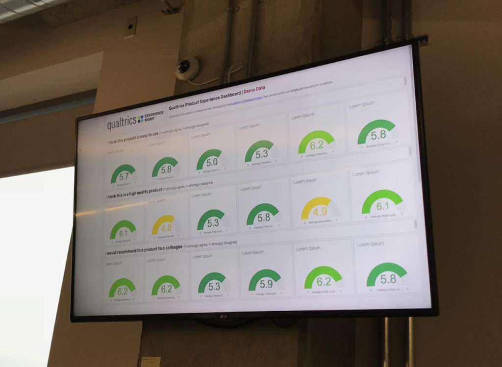
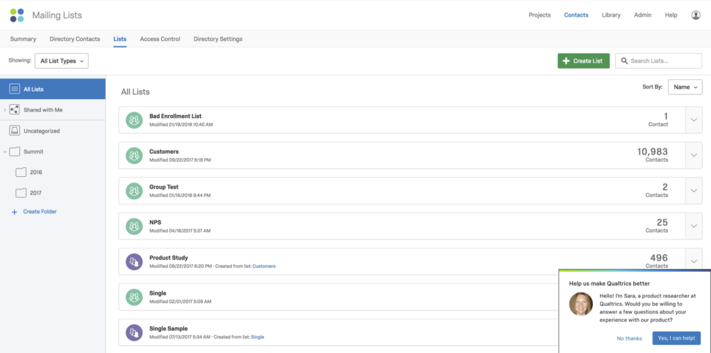
Now, on to how our monitoring system works. In our monitoring system, products in our platform have pop-up surveys that gather feedback from our customers related to their experience with said products. The surveys (which will be described in more detail later) collect a wealth of information from users, including their activity in the product, their ratings of the product across several dimensions, and their product improvement ideas. The data collected is, in turn, presented on real-time dashboards with graphs that visualize the feedback. These dashboards are accessible by stakeholders across our organization and are displayed in our offices as well (see Figure 1 for a dashboard with demo data).
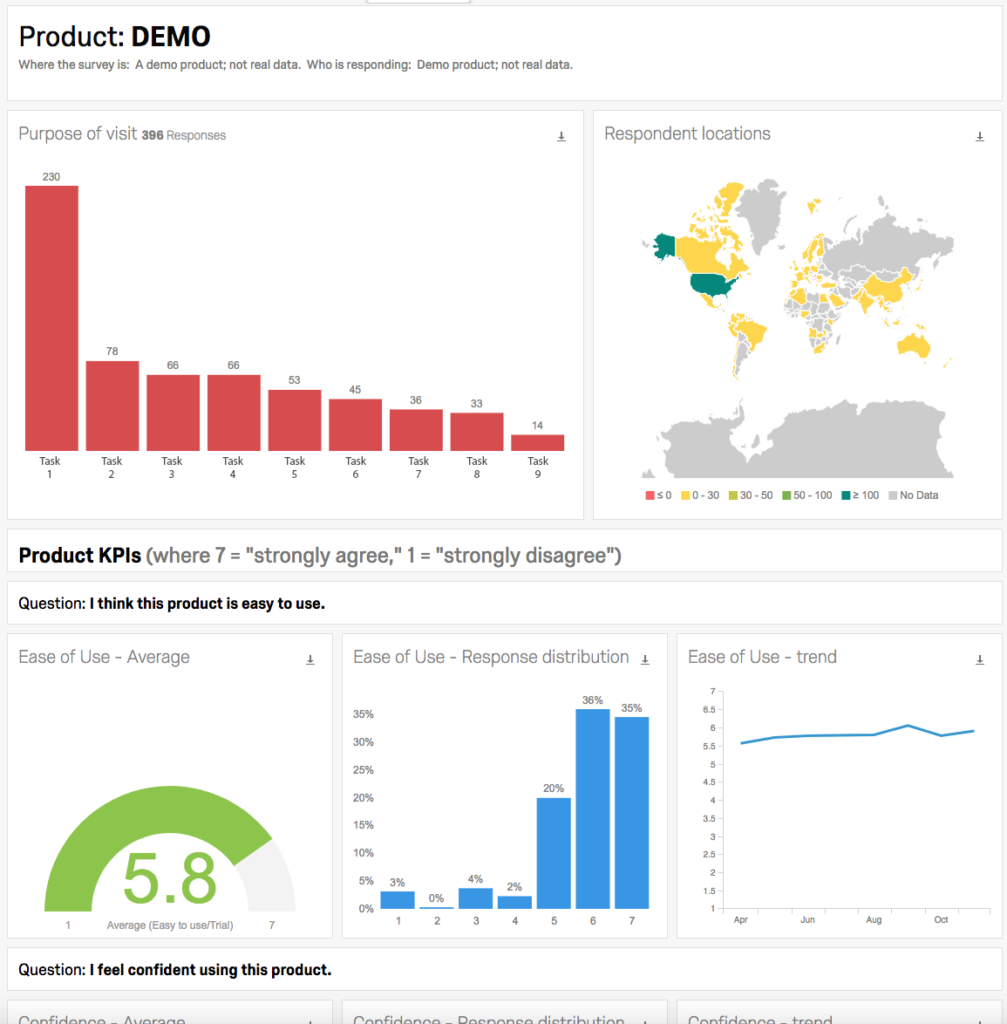
(Of course, in our context these dashboards show feedback related to our products, whereas readers who implement a similar program would have dashboards displaying the health of their own products and/or services.) The dashboards summarize the overall experience across our various products, but they also include pages with detailed feedback on each specific product (Figure 2 for a page with demo data):
Qualtrics stakeholders can review, filter, and analyze data on each product via these pages, allowing them to see trends across several dimensions, identify common topics/themes, determine how people with different needs experience the products, see how people in different parts of the world respond to the products, review the impact a design change may have had on the user experience, and so forth.
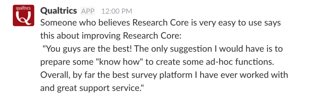
But viewing data on dashboards is only one aspect of our system. Our system also emails feedback and creates tickets to specific departments (such as customer support) if certain conditions are met. For example, in the event a Qualtrics customer has an improvement idea for a product, that respective Qualtrics product team could receive a message in a channel in Slack (a messaging application used at our firm). These messages and this mechanism often spawn constructive discussion about product improvements (Figure 3) and allow teams to remain connected to customers and their needs.
Our system can also email feedback directly to specific departments (such as customer support) if certain conditions are met. And we email a weekly summary of data to key product stakeholders so they can understand what’s transpired over the past week, see any emergent trends, and take action where appropriate.
Our system operates with very little intervention from our team. Data is captured automatically (from our standpoint), dashboards are continually updated, and messages are sent based on rules. And yet despite the automation the data collected by the system are rich enough to allow stakeholders to explore the content themselves to answer ad hoc research questions of their own, and complete enough to provide a robust means of monitoring the user experience. Ultimately the system is both strategic and tactical, active and passive, depending on the stakeholder and use case.
Our journey
With the overview of our system complete, let’s now turn our attention to how we built it and provide more detail about our research approach.
Our approach to building the system was similar to most research projects, with some steps necessary at the end to create an ongoing, automated system.
We:
- set goals for the program,
- solicited stakeholder alignment and buy-in,
- chose a research protocol,
- defined the system architecture,
- created a pilot survey and dashboard to capture and display data,
- fielded the pilot survey and collected sample data,
- evaluated the pilot data,
- updated the pilot survey instrument, and replicated the resultant survey across our products,
- formally launched the surveys and began collecting data,
- formally launched the dashboards,
- set up automatic triggers to share data in email and elsewhere on an ongoing basis,
- updated sampling rates, experimented with the system, and added new dashboard views (ongoing).
In the subsequent sections of this article we describe several of the above steps in more detail.
Goal-setting and stakeholder agreement
As with any UX project, we first set clear goals for what we wanted to accomplish with the program. This helped focus our work, but it also allowed us to solicit support from key stakeholders such as UX designers, product managers, lead engineers, and executive leadership. After some discussion, we established the following goals for the program. We wanted to:
- Track product experience over time and across products in our portfolio.
- Provide a means to compare products on key measures.
- Use an objective, rigorous, and valid method for data collection.
- Remove the bottleneck/expense of in-person usability testing for basic, recurring UX monitoring.
- Enable end users to judge our products against their needs and expectations.
- Automatically flag issues/message stakeholders based on KPIs.
- Allow stakeholders to remain connected to customer feedback
It was critical to collaborate on these goals with stakeholders; not only did we need their support to implement our system, we also needed stakeholder alignment. To that point, although some stakeholders naturally wanted to customize their products’ monitoring approach, we wanted to maintain data collection consistency across each product to allow us to compare products. (We ended-up finding a good balance whereby each survey had a core set of questions but each product team could add its own special question(s) if needed.) Lastly, as a team and as a company, we think providing a great user experience is a shared responsibility: Involving non-researchers in the program was critical for maintaining a shared sense of ownership over the product experience and vital for ensuring data gathered through the system was to be acted on.
The goals helped drive many decisions, including what data to collect and how to visualize it.
System architecture
After setting goals and aligning with stakeholders, we created the initial system architecture. See Figure 4 for an architectural model of the solution.
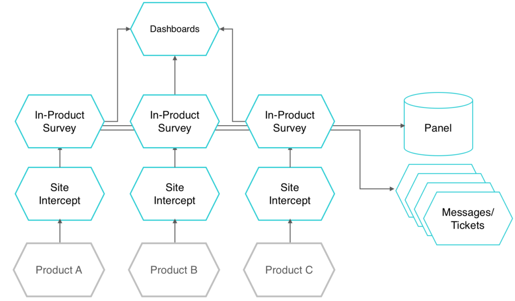
As the diagram illustrates, products in our company’s portfolio feature an in-product survey that is injected into the product experience. The data collected from respondents via the surveys populates a product dashboard, and certain responses also trigger automated messages that are sent to stakeholders. Lastly, the in-product surveys also provide a means for respondents to join our research panel if they are interested.
The survey invitation and the survey instrument
Now let us describe the respondent experience. As users interact with our products, a sample of users receive an invitation to provide feedback on the products. This invitation appears in the lower-right corner of the product user interface.[2],[3]
We generally wait until people are in the product for 10 minutes before displaying the invitation. We wait for two reasons: We want to make sure they have a chance to adequately interact with the product before responding to our survey, and we also want to reduce disruption.
Figure 5 shows the invitation as it appears to the user.
Opting in to the invitation triggers a pop-up survey[4] corresponding to the product the respondent was using. The survey appears in the product so that we do not overly disrupt users, and it also gives respondents context to help them answer the survey questions that are about the product itself.
The survey we use is loosely based on the System Usability Scale (SUS) created by John Brooke in 1986 (and described in 1996 and 2013 and by Sauro 2011; see references below). The standard SUS requires users to rate their level of agreement on 10 statements. In our survey, we reduced the number of statements participants respond to, and we modified the statements to address the questions that were most critical to our team.
Here are the statements we settled on:
- I would recommend this product to a colleague.
- I think this product is easy to use.
- I think this is a high quality product.
- I feel confident using this product.
- I could use this product without training or help.
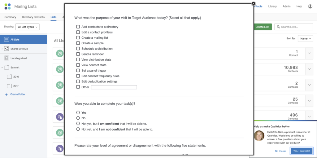
Users are asked to rate those statements on a 7-point scale, where 1 = strongly disagree and 7 = strongly agree.[5] We added two questions at the beginning of the survey to capture the tasks users were trying to accomplish before responding to the survey and whether they perceived they could complete those tasks:
- What was the purpose of your visit today?
[multiple choice, multiple answer: contextual answers based on the product in which the customer was intercepted] - Were you able to complete your task?
[multiple choice, single answer: Yes; No; Not yet, but I am confident that I will be able to; Not yet, and I am not confident that I will be able to.]
We added those questions to better understand the respondents’ context and to isolate issues later on if the respondent reported a negative experience. (Stakeholders viewing the data on the dashboards can filter by these responses to isolate feedback and topics accordingly.)
Finally, we added an open-ended question at the end of the survey to provide teams insight into how respondents would like us to improve the products:
- How can we improve your experience with this product?
Figure 6 is an excerpt from the survey.
In addition to the respondent answers, the survey automatically collects metadata, including the respondent’s browser type/version, screen resolution, language settings, what area of the product the respondent was in when they responded, and so forth. Again, internal stakeholders can use this data for troubleshooting or to better understand the respondent’s context.
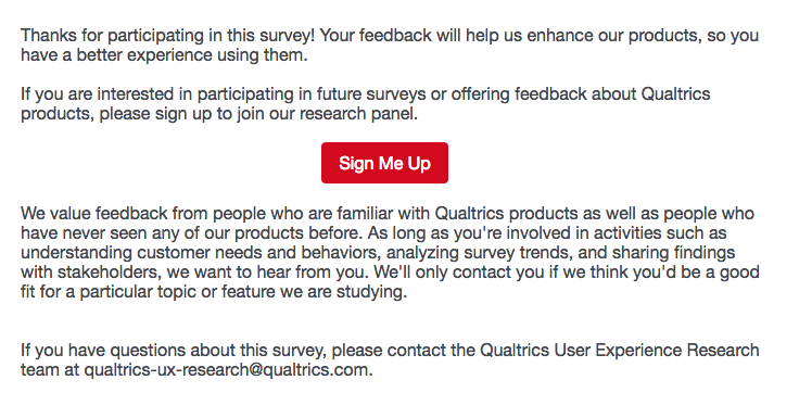
After a respondent completes the survey, we display a “thank you” page which includes an invitation for respondents to join our research panel for subsequent studies (Figure 7)[6]:
Dashboard
Data from all the surveys are visualized on a set of dashboards (Figure 1).[7] The summary page of the dashboard shows average responses across all the products for easy cross-product comparisons. We used a standard graph (a gauge chart) that can be viewed at a distance for making quick comparisons, and we conditionally color-coded the charts so viewers understand at a glance how the products are performing (e.g., green = positive). As mentioned previously, these dashboards hang in our offices, and stakeholders can also access them with their own computers and mobile devices.
Within the dashboard, we provide separate pages that provide greater detail on individual products (Figure 2). On each product-specific dashboard, we display the following data:
- A bar graph describing what respondents were doing in the product prior to taking the survey, sorted by task frequency
- A map showing the countries that respondents are from and the frequency of responses from each country
- Various graphs for each rated statement (e.g., “I think this product is easy to use.”), including:
- The mean score and response count
- The distribution of response scores
- A month-over-month trend
- A “key driver” graph that displays the correlation between response categories and their impact on the likelihood respondents would recommend the product
- Open-text responses to the question “How can we improve your experience with this product?” and when each response was received (e.g., “3 hours ago”)
- A set of filters to allow stakeholders to isolate time periods, tasks participants were undertaking prior to the survey, and so forth
Automated messaging, data sharing and actions
The last aspect of our system we will describe in this article is a messaging component that automatically sends stakeholders messages based on response criteria.[8] For example, if a customer rates a product especially high or especially low, that response triggers a Slack message, email, or ticket containing the related customer feedback to the responsible teams (see Figure 3). The system also automatically sends emails to stakeholders under other conditions and provides a weekly summary of feedback as well. In this way, product teams and individuals receive an ongoing pulse of customer feedback without having to review the dashboard constantly.
We share data from the program in a number of ways above and beyond what we’ve already mentioned. For example, each product team meets on a weekly or biweekly basis. In these product review meetings the team reviews trends uncovered through the system using topic and sentiment analysis on the open-ended feedback. We also use themes and topics drawn from that data in product prioritization discussions, and we build action plans and assign work from that data as well.
Lessons learned
We have several lessons-learned that may help others who are considering a similar system.
Promote consistency if product comparison is important to the organization
Cross-product survey consistency is important in building a program that allows for product comparisons. Still, we found a natural tendency for individual or team stakeholders to want a unique version of the program survey to suit their own individual needs.
Ideally, in a multi-product monitoring solution such as the one we specify, all stakeholders would provide input and agree to the program protocol from the beginning, because diverse survey approaches obviate the ability to compare products. To counter this, we suggest underscoring the need for consistency with stakeholders up front and defending this need throughout the life of the program.
Start small, be ready to iterate, and be flexible where appropriate
It’s easy to get carried away with additional questions, functionality, and visualizations that could theoretically add value to a system before it’s even launched. We recommend starting relatively small with a pilot, getting feedback on that pilot over several weeks or months, and iterating and expanding.
Inevitably, there will be edits and changes to the system (and the organization!) as the data is analyzed and used, so be flexible and expect to expand, modify, and experiment with the system over time. In fact, our system is in a constant state of expansion, with exciting new additions on the horizon.
Establish targets for experience data
Once data is captured through such a system and summarized as scores on dashboards, the first question a leadership team is apt to ask is “What improvement targets should we set against these scores?” After we collected data for several months, we set targets we determined were reasonable. We suggest doing the same if you populate your surveys with your own questions: use the initial data captured by the system to serve as a baseline for understanding the current user experience, evaluating future enhancements, and setting targets. (Of course, if you use an industry-standard survey or question, you can leverage corresponding industry data to serve as your benchmark and/or target.)
Review the data frequently and assign owners
If customers take the time to provide feedback in a system such as this, the organization should be set up to take action. Before an organization commits to such a program, we suggest they establish clear owners for reviewing and taking action on the data.
Conclusion
Moving some product UX monitoring from usability studies to a system such as ours allows staff researchers to focus on more foundational, generative research and more targeted and tactical research. Providing an actionable stream of product experience data in this way allows an organization to actively monitor its product experiences and stay connected to the people who matter most: the end user/customer.
Our system was relatively easy to set up yet provides valuable, actionable feedback on an ongoing basis. We believe many SaaS, eCommerce, mobile application, and website UX and product teams would benefit from a similar approach.
References
Brooke, J. (1996). SUS: A “quick and dirty” usability scale. In P. W. Jordan, B. Thomas, B. A. Weerdmeester, & A. L. McClelland (Eds.), Usability Evaluation in Industry. London: Taylor and Francis.
Brooke, J. (2013). SUS: A Retrospective. Journal of Usability Studies. Vol. 8, Issue 2, February 2013 pp. 29-40
Sauro, J (2011). MEASURING USABILITY WITH THE SYSTEM USABILITY SCALE (SUS). https://measuringu.com/sus/
[1] Note: This article describes the use of Qualtrics’ technologies; Qualtrics is the company where the authors work.
[2] We use Qualtrics’ Site Intercept™ product for this.
[3] Because of the limits we’ve set on the invitation display, most users will not see a survey invitation more than several times year (we vary sampling rates based on the product and we have controls to prevent repeated display of intercepts to individual users for certain time periods).
[4] We use Qualtrics’ Research Core™ product for this.
[5] We are aware of the acquiescence bias associated with agreement scales and are working on an alternative scale; we used a SUS-like scale for our initial system as it is commonly used in UX work.
[6] We use Qualtrics’ Target Audience™ product to collect the names/information of people who sign-up.
[7] We use Qualtrics’ CX product for this.
[8] We use Qualtrics’ Research Core product for this.
very nice and interesting once this article
Thank you
That’s Help Me Dude, Thanks…
Jerrod Larson, thanks so much for the post.Really thank you! Keep writing.
Really interesting approach. I appreciated the details you provided in the case study.
I could see a lot of value found in setting up passive collection and presentation of user feedback. This type of system could significantly enhance a UX Research teams efforts.
Thanks for sharing!