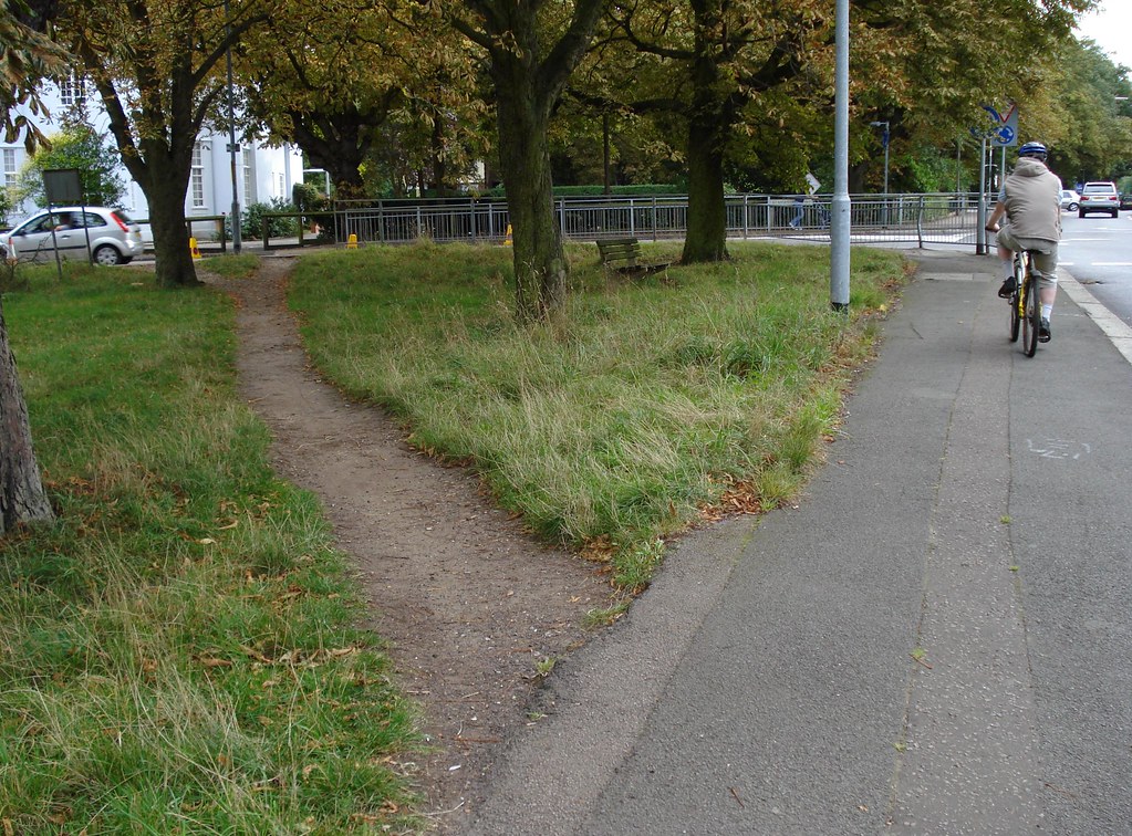
 Imagine you’re on one side of a grass lawn and you want to reach the bus stop on the opposite side. Do you walk on the sidewalk around the edges or cross in the middle? Assuming the grass is dry and it’s not prohibited, you’d probably take the shortest path and walk across the lawn to the bus stop. If others have done so before, you may see a beaten path that you could follow.
Such unplanned paths connect the shortest distance between two points, and we can find them everywhere in our surroundings. In urban planning they are known as “desire paths” or “desire lines.”[1] They are an indication of the gap between natural human behavior and contrived routes.
Architect Christopher Alexander recognizes desire lines in his renowned book, A Pattern Language (1976)[2]. He gives specific instructions for leveraging them in architecture:
To lay out paths, first place goals at natural points of interest. Then connect the goals to one another to form the paths.
Christopher Alexander
In principle, Alexander’s approach is to begin with the goals—the things people ultimately want—and then link them together in the most useful way.
Typically in web design, the opposite approach is the rule: designers begin with the homepage. They then work out a navigation scheme, which pages at the bottom of the site hierarchy automatically inherit whether it’s appropriate or not. The goal—or the primary content people are looking for or tasks they are trying to get done—turns out to be the last thing that gets attention in the design process.
Inspired by “desire lines”, we can reverse this tendency in Web design. Cores and Paths is a technique to guide you through the process of creating straight paths to the core offerings on your site.
The Cores and Paths Model
“Start with the goal.” Information architect, Are Halland, makes this recommendation in his presentation “Cores and Paths: Designing for Findability”[3]. He outlines an alternative approach for web design: instead of beginning with the homepage and overall navigation scheme, start with the core content and work outward from there. It’s that straightforward.
The technique is based on three key elements:
1. The Core
The core is the reason users come to site. From the provider’s perspective, the core is what’s offered on the site. Note that the core isn’t always a page. For YouTube, the core is a video and not a page on www.youtube.com. This makes it possible to have distributable cores, or content that may be found on other websites.
The core may be accompanied by supporting information. Technical details, for instance, can be considered an extension of the core. On sites like flickr a description of a photo as well as the tags user give it are supporting information for the core, which is the photo itself.
2. Inward Paths
How do users get to the core? Sometimes visitors arrive at the core via the main navigation or search of site. But they might also come directly from Google. Other paths are possible as well, such as links from other sites, teasers, entering URLs directly in the browser, and even via rss feeds and newsletters. Thinking about inward paths also considers aspects of SEO, such as what the trigger words do people search with.
3. Outward Paths
Assuming users found what they were looking for, what can they do from there? What are their calls to action? Fundamentally every subsequent interaction should bring some kind of value to the business. This is where conversion takes place. Outward paths can be everything from placing an item in a “shopping cart” to recommending a product to a friend. As with inward paths, there are a variety of options to consider, including links that lead away from the site.
Each of these three elements has a different function. The core is really where value creation for both users and the business takes place. Persuasion plays a big role here: organizations ultimately want users to take some specific action. The inward paths ensure findability. This is how people come to the products and services they are looking for on the web. From a business standpoint, the outward paths are what bring ROI to an organization.
Below is an illustration of the Cores and Paths model, using Amazon as an example (Figure 1). The core is a product, represented here by an image of a book cover and its key details, indicated in the red box. Users find the book in numerous ways, listed on the left. These are the inward paths. Amazon sees a return on investment when users take action on the core, seen on the right as possible outward paths.
 Figure 1: The Cores and Paths model for www.amazon.com
The Cores and Paths Process
Imagine the following scenario:
You work for a small agency and have been contracted by a bicycle shop to improve their website. The shop currently only has a “brochure-like” website with address and opening times. They’d like to get into ecommerce and be able to sell online. The product line consists of high-end racing bikes and mountain bikes, along with the appropriate accessories for each. There are about 1000 products in total they want to sell online. The shop’s main target groups are professional cyclists and highly motivated amateurs. As a result, the bikes sold are primarily from premium brands. The design of the website should highlight the high quality of their products.
Following the Cores and Paths approach, here’s how to design the website from the inside out:
STEP 1: Define the core
What is the core offering? First, make a list of possible candidates: bicycles, accessories, services, etc. It initially starts with brainstorming so there are no right or wrong answers. After compiling a complete list, decide on a core and its supporting information. In large teams this means getting agreement from team members and stakeholders alike.
In the above scenario, the core is the product—a bike. A photo of the product is a central element to represent the core. The bike features, brand, and product line are types of information that belong to core in this case. Supporting information includes the price and additional technical details.
After deciding on and prioritizing these details, sketch the core (Figure 2). Don’t sketch the entire page with navigation and a logo: just focus on the core. Customers may want view details of the product up close, so consider how they will interact with the images even at this stage. Think about the experience visitors will have with the core once they find it.
 Figure 2: Sketch of the core and supporting information
Keep in mind that users will also be visiting the site from smartphones and tablets. And they may also post an image to Facebook or Pinterest. This is an example of a “distributable core.” So sketch how the core might transpose to these different contexts (Figure 3). Again, do this without sketching the page chrome or navigation—just focus on the core.
 Figure 3: Versions of the core in different possible contexts.
From this you’ll see how the core and supporting information behave in different situations. You may have to go back and forth between the versions updating them iteratively.
STEP 2: List all possible inward paths.
What are all the ways that users can reach your core? Obvious things come to mind at first: site search, the main navigation, Google, and links from other websites. But more paths come into play as you brainstorm: links from comparison shopping sites and even references from offline media, such as a printed catalog.
For each inward path in your list, also write down the design requirements that must be met. For instance, SEO and landing page optimization is necessary for visitors coming from Google and other search engines. (See Figure 4)
 Figure 4: A list of possible inward paths and the key requirements for each
STEP 3: List all possible outward paths.
Determine the paths away from the core. As in STEP 2, include design requirements for each outward path. This allows you to rank the outward paths in terms of importance to the business, providing clarity for the design in later on. (See Figure 5). Because outward paths ultimately provide value to the business, rank these according to business goals. A clear call to action button brings the user to the checkout process in this example. And if the customer can’t decide right away, a link to a wish list or to recommend the product to others is a second priority.
 Figure 5: List of prioritized outward paths
Up to this point, we’ve neither looked at the homepage nor have we thought about the navigation. Yet, we’ve addressed important design decisions, such what a mobile version of the core product might look like and how people will interact with the primary content of the site. After making these into higher-fidelity mock-ups, these initial representations could even be tested with users.
STEP 4: Put it all together.
Only after you’ve designed the core and listed the inward and outward paths should you start looking at the homepage and at the navigation. The goal at this point is to bring the user in the simplest, most-direct way possible to the core.
Design the homepage of the site, as well as gallery pages and search results. Sketch several alternatives. While doing this, keep the elements of Cores and Paths in mind: what is the core, how do users get to it, and how will the business see conversion?

 Figure 6: Sketch of the homepage – a first draft
In this scenario, to get users from the homepage to the core the three product lines of the shop appear in the main navigation: “racing bikes,” “mountain bikes” and “accessories.” Since brand is also important to the target groups, a separate point for “brand” is also included. A prominent link to a shopping cart and checkout process is also located in the header.
 Figure 7: Sketch of the gallery page with filters and sorting options
Below is a template we used to capture all of the points and steps described in this article (Figure 8). Download the template at the end of this article to try Cores and Paths out yourself!
 Figure 8: A template for Cores and Paths
Summary
The Cores and Paths process improves design in several ways:
Identifies gaps. Questioning the purpose of the primary content upfront helps uncover gaps in the initial briefing.
Prioritizes design elements. Breaking down key elements helps prioritize how they appear in the overall design.
Focuses Design. Cores and Paths provides a clear direction to follow for the whole project team.
The difference between Cores and Paths and other approaches may seem subtle at first. But the impact is great: now, the core offering stands firmly in the middle of your design. All other elements in the site design serve the purpose of bringing both users and the business to their goal.
Footnotes
[1] “Desire path”, Wikipedia: http://en.wikipedia.org/wiki/Desire_path
[2] Christopher Alexander, A Pattern Language, 1976 (Amazon.com)
[3] Are Halland, “Core and Paths: Designing findability from the inside out”, EuroIA Summit, 2007: http://slidesha.re/dnwrLX
Thanks for the reference James. Maybe a bit dated and in need of a brush-up, but I think the essence of it is still relevant. I’m looking into a follow-up about how we use the model in our ux-consultancy (Netlife Research) today.
I really like the concept of desire lines for a website – the difficulty for me is when a site isn’t product-orientated.
I am the designer for a massive information-based website, and it becomes quite a challenge to identify and prioritise the specific cores, I think in the end it will come down to educating stakeholders that can’t (and shouldn’t try to) be all things to all people.
@Liam The use of products is a simple example, but the methodology conveys across goals/tasks. If you look at the primary goals used—1) Buy XYZ; 2) Get information about XYZ; and 3) Compare XYZ to ZYX—you can see XYZ doesn’t have to be a physical product at all. It could be a service, or even an idea (if “buy” is changed to “accept/believe/vote”). Passing inward and outward paths through a content module doesn’t require that content to do anything other than fulfill a user request, be it for information about something, a game, a feedback method, or any other content item.
The article does a great job of explaining what goes on in my head in terms of mapping entrance and exit actions, against prioritized content. I’ll surely use a diagram like the Amazon screenshot to supplement what I’m already doing with navigation layers. I’d been doing something similar by mapping shortcuts throughout my sitemaps to show module reuse/access, but hadn’t been taking a quantitative inventory of external entrance points aside from usage scenarios and task flows.
My only addition would be to note Cores don’t have to be a compromise between business goals and user needs. I’d almost run this exercise twice—once against strict user wants/needs, then again against business wants/needs, and look for crossover. To refer back to Alexander’s quote, goals can be places IN natural points of interest. I read than as embedding business Cores INSIDE OF user Cores—i.e., driving business priorities via sticky user-demanded content. Knowing all of the possible entrance points for something nobody is interested in browsing to doesn’t accomplish much.
Thanks
Hi, I am currently redesigning the UI for our e-portfolio and found this article very useful. I believe that understanding the core purpose of what the website aims to achieve is important and breaking it down into core elements before starting the design.
This is a great and timely find for me as my team starts to tackle the redesign of some key pages in our buy flow. This approach helps to bring out some information that is often ignored (e.g. paths off the site when you really want to keep your customer on the site).
It is a shame the comments are littered with SPAM but here goes.
This is a great methodology in a way to work but finding the corect path by wireframing out in a lo-fi manor the landing point is a little arbitrary to me without doing some content strategy, informational architecture (hierarchy of data), and then coming up with the flows themselves (ie. user flows and process flows.) Once you know what your product is, have organized it, know how the user is going to find it, then you sketch.
Or at least thats how I work. I try not to design interactions before finding out what is needed.
…and FU to all these SPAM whores. What is up with that? I have been reading articles on this site for a while and it is just getting worse and worse.
What I find so interesting about this approach, especially working on a retail properties myself, is acknowledging all the exit points on certain pages. For example, while we want to provide our customers with relevant information in order to tell them it’s the right product to buy, we need to think critically about the way we provide that information. Too many exit paths may encourage them to do just that – exit, and not come back.
Apologies for spam. We are moving to a new CMS as we can no longer fight it effectively. Hopefully it’ll soon be better and cleaner.
This is a great way to look at design. Is heatmapping found to be useful for defining these user-paths? I’d love to see how to iterate upon a design growing towards improving set user-metrics (example: defined from a startup growth model), focusing on user-paths.
Thanks. I’ll refer frequently.
Thanx a lot. Now I know how to find an approach in web design. But If the core is the most important part in this process so why do all designers (most of them) begin with creating the mainpage?