I can draw.
I went to art school. I studied painting until I fell out with the abstract expressionists and switched to photography. But I can draw.
What I cannot do is diagram. I always wanted to. I have models in my head all the time of how things work. But when it comes time to make a visual model of those ideas, I can’t figure out to to represent them. I find myself resorting to pre-existing models like four-squares or the Sierpinski triangle (I dig fractals.) For example:
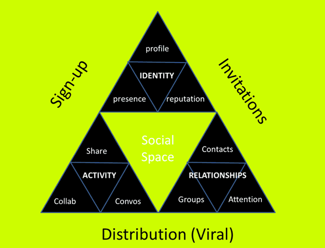
Other than the oh-god-my-eyes color choices, my social architecture diagram has deeper problems. For example, the ideas in it are limited to threes within threes because that’s the form triangles take. The model served to communicate my ideas well enough for the sake of my workshop, but… shouldn’t form FOLLOW meaning? If I had more than four elements for any section, I’d have to either collapse two, or fudge it in some other way. I was sacrificing accuracy for consistency. But I didn’t know how to make to make it better.
A concept model is a visual representation of a set of ideas that clarifies the concept for both the thinker and the audience. It is a useful and powerful tool for user experience designers but also for business, engineering, and marketing… basically anyone who needs to communicate complexity. Which is most of us, these days.
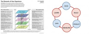
The best known concept model in the user experience profession is probably Jesse James Garrett’s “Elements of User Experience.” The best known in start-up circles is the lean startup process. Both of these models encapsulate the ideas they hold in such a memorable way that they launched movements.
If you wish to clearly present a set of ideas to an audience and represent how they fit together, a diagram is much more powerful than words alone. Dan Roam points this out in his latest book, Blah Blah Blah:
“The more we draw, the more our ideas become visible, and as they become visible they become clear, and as they become clear they become easier to discuss—which in the virtuous cycle of visual thinking prompts us to discuss even more.”
Concept models can serve many purposes. You can use concept models to show your teammates how a complex website is organized before the site is built…
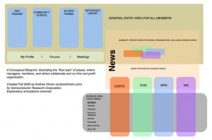
… or to help teammates understand how the site currently works…
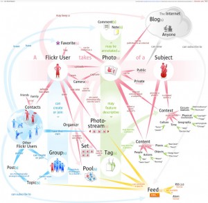
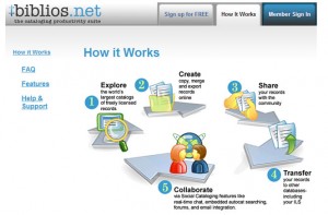
… or to show end users how a service works, to help sell it.
I teach user experience design, and my syllabus always includes concept models. Students of mine who do a concept model before working on the interaction design and information architecture always make better and more coherent products. The act of ordering information forces them to think through how all the disparate elements of a product fit together.
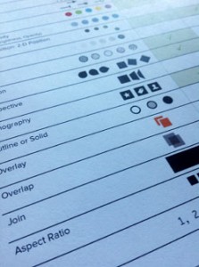
You can imagine how excited I was to take the Design for Understanding workshop at the 2014 IA Summit. Partly because I will go see anything Karl Fast or Stephen P Anderson talk about and having them together is Christmas come early. But mostly in hopes of learning a way to make a good concept model.
The workshop was brain-candy and eye-opening: They covered how the brain processes information and how ways of interacting with information can promote understanding. BUT I still couldn’t make a model to save my life. I didn’t know where to begin!
At lunch, Stephen was manning the room while Karl grabbed food for them. I had been struggling with a model for negotiation I wanted for a talk I was presenting later in the program. Seeing Stephen idle, I pounced and begged for help.
Stephan P. Anderson is author of Seductive Interfaces and the upcoming Design for Understanding. He’s also a patient soul who will put up with ham-handed diagramming and ridiculous requests. He started to sketch my model and tell me what he was thinking as he drew. Then I had my bingo moment: Stephen had forgotten what it was like not to know how to begin! This happens to all experts. After a while some knowledge is so deeply embedded in their psyche they forgot what it was like not to know. They then teach the nuances rather than the fundamentals.
I suggested we do a think aloud protocol while he made a concept diagram; he would draw, and I’d prompt him to talk about what was going through his mind. He was excited to have me reflect his thinking back to him so he could become a better teacher as well. We arranged to have a sketching session after the workshop.

Later in the day, we met in the quiet hotel bar with wine and a sketchbook. I asked him what he wanted to draw. “Do you have something you are working on?” he asked. “That way I can focus on the model, rather than rethinking the ideas.”
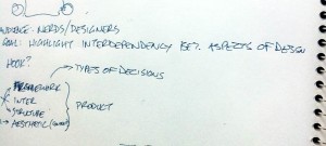
Did I have a model I was struggling with? Always! I shared my new theory of the nature of digital products. I’ll be writing that up in another article when it’s done, but for now, the short version is that one must iterate through the elements of digital design, which include the framework, interactions, information structure, and aesthetics. But a product doesn’t become an experience until a person interacts with it; your design cannot be known until you see what happens when a human shows up.
Stephen’s first step was to ask me about my goal for the model. I said it was for students and young practitioners to understand the interdependencies of the elements, so they have a more iterative approach. And for critics to be able to understand why things are different, both good and bad.
Next, he did what I’d call a idea inventory. He brainstormed more elements that might play into the model. He made sure no ideas were left out. He made notes of those he suspected might be important in the margins. He sketched as he thought, sometimes just making meaningless marks, as if warming up his hands.
He then carefully asked about each element in my theory, making sure he understood each. What was an information structure and what was a framework and were they different? I ended up telling a little story about a product to make sure he got what I was explaining. I began to draw too, encouraged by his easy scribbles.
Finally, Stephen noted the relationships of the items to each other. Were some things subsets of others? Were some overlapping, or resulting?
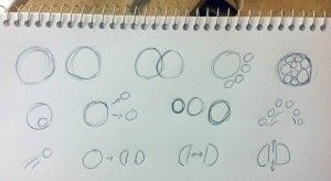
Once he knew what each item was, and how they were related to each other, he began to sketch in earnest. He said, “I always start with circles because edges mean something. They mean you have four items, or five. Circles leave room for play.” His circles quickly became blobs and then shapes.
I don’t know if he’d normally talk to himself out loud when not encouraged to do so, but it was fascinating to to hear him free associate concepts, then draw them out. A string of concepts became a string of beads; moving through an experience became moving through a tunnel; intertwined ideas were a braid. Any important idea got a drawing.
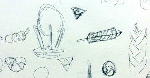
Each time he completed a mini-model, he’d evaluate what was missing and what was working and take that insight to the next drawing. He made dozens of these little thumbnail drawings.
Stephen said, “one shape leads to another…a single word sparks a new representation—we’re always ‘pivoting’ from one thumbnail to the next…”
He pointed out what concepts were left out, or where they could be misinterpreted.
“You want to avoid 3-d, because it’s fraught with problems. You want to be able to sketch it on a napkin.” —Stephen Anderson, on keeping in mind the model’s goal
At one point, he became tapped out, and we spoke of other things. We stared out the window at the harbor, and I drank some of my wine, forgotten in the excitement of drawing and talking.
Then suddenly he started in again and produced a flurry of new drawings. I realized resting and mulling was important too. I was a bit annoyed with myself. An article doesn’t come out perfect in one writing session. Why should I expect a concept model to just materialize?
Finally he came to a stop, several pages filled with a jumble of images. We didn’t have a model, but we had many good directions. As we finished our drinks and headed toward the opening reception, Stephen told me, “You gotta get Dan Brown to do this, too.”
Dan M. Brown is best known in the user experience design community as author of Communicating Design and Designing Together. Both books benefit greatly by clear and succinct conceptual models, and the former even talks about how to use them in the design process:
Purpose—What are concept models for?
There really is only one reason to create a concept model: to understand the different kinds of information that the site needs to display. This structure can drive requirements for the page designs, helping you to determine how to link templates to each other. With the structure ironed out, you might also use the model to help scope your project—determining what parts of the site to build when.
Audience—Who uses them?
Use concept models for yourself. Ultimately, they are the most selfish, introspective, and self-indulgent artifact, a means for facilitating your own creative process.”
–Communicating Design: Developing Web Site Documentation for Design and Planning 2nd Edition, Dan Brown, 2010
Clearly, a guy I should be talking to!
The IA Summit was held in sunny San Diego in a hotel with not one but two swimming pools, so Dan had brought his family with him. When I asked him if I could watch him draw a concept model, he said, “I’m at the coffee shop with the boys around 6:30 every morning.”
You take what you can get.
The next morning Dan settled the boys in a corner with books, pastries, and an emergency iPad, and we got to work. We agreed he’d model the same concept, to control for variations. By now I had created a formula for the idea: (F+In+Is+Ae)+P=E. Framework, interactions, information structure, and aesthetics plus a person makes an experience. I was modeling in words as my friends were modeling in pictures.
I took Dan through the same story of an iterative product design process, since it had helped Stephen. I sketched it out. I felt like my hands were waking up from a long sleep, and they were eager to hold a pen now.
As I spoke, Dan wrote down key ideas and also began to scribble. He used the same process as Stephen: collecting the concepts then inspecting them for hidden complexity.
“A question I ask myself is ‘what needs unpacking?’ I can’t diagram an idea until it’s clear in my own brain.” —Dan Brown
He then took each concept and free associated all the sub-elements of the concept. He drew them out loosely, mind-map style.
Dan also started with the goal and wrote it out across the page.
He also asked explicitly who the model was for. To draw, he needed to visualize the audience. This reminded me of a recent presentation workshop at Duarte where we literally drew pictures of our audience. No work can be good unless you know who it’s for.
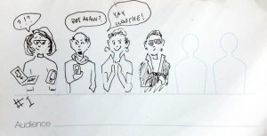
Dan made sure he didn’t carry anything in his head: All ideas were put on paper as a note or a sketch. When he had to turn a page, he ripped it out to lay it next to the other pages. I realized how critical it was to have plenty of room to see everything at once. I saw the same technique of storytelling and drawing of ideas.
Around now, Stephen joined us. He was excited to see what Dan came up with, enough to also climb out of bed at the crack of dawn. I listened as the two diagrammers discussed the poster session and the strengths and weaknesses of the ideas that had been presented.
Dan said, “You can look at people’s posters and see their process. They are so close to their own narrative…In one poster, the key framework was rendered in a very pale text. It was a good story, but there are things you want to jump off the page. For her, my guess is those steps were so self-evident she didn’t see need to highlight them.”
You have to have a beginner’s mind to explain to beginners.
“Speaking of beginner’s mind, so much of my design process is to throw it all out start all over again.” —Dan Brown
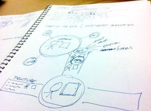
Now Dan began to model the concept. He emphasized the importance of sticking with very simple geometry–circles, squares, triangles, lines–not fussing with trying to find a perfect model at the beginning, just exploring the ideas and their relationships.
He also mentioned he begins with any concept in the model and doesn’t worry about representing order at first. He starts with what catches his interest to get familiar with the ideas.
Dan then deviated from Stephen by seeking the focal point. What concept held all the others together? What was the most important or key idea? He tried out placing one idea, then the other, in the center to see if felt right.
After scrapping one bowtie model, he paused. “I sometimes retreat into common structures and see how these common structures might speak to me. For example, time is one of those fundamental aspects, so I ask myself: How much do I need to show time here?”
He demonstrated by drawing swimlanes and sketched the ideas and their relationships in time.
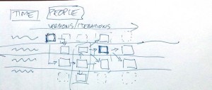
“Are there other elements you often look for, like time?” I asked
“People,” he replied. “People and time are familiar concepts, easy for an audience to relate to. By using them as a foundation for a model, I’ve already made it easier for people to ‘get on board.'”
He stared at the paper, deep in thought.
Stephen then pointed at the page. “What Dan did here,” he said, poking at where Dan wrote out goal and audience, “I did also but didn’t externalize. I was holding it in my memory, but I like having it on the paper better.”
Eventually Dan, too, was tapped out, and his sons began to play Let It Go on the iPad at higher and higher volumes. He separated his sons from the electronics and left to prepare for the swimming pool.
After Dan, I knew I wanted to try to get one more person to model. Since I was lucky enough to be at a conference full of diagrammers, I chased Joe Elmendorf of The Understanding Group. He had just given a talk on Modeling for Clarity that my friends were raving about. And, with my luck still holding, I got to have breakfast with him. Happily, at 8 am this time.
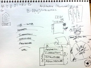
Again, I saw what were becoming familiar concepts (inventory, inspection, relationships, then talk-draw.) I then focused on how he differed from Stephen and Dan. He choose to use the title of the diagram as an element. He did not iterate as widely as Stephen. He was the first person to argue with me about the validity of my theory, which was a great way to understand it (and benefited me by making it better!).
As well, he reinforced something Stephen had mentioned in his workshop and that Dan was obviously doing: Joe had a large mental library of typical models to draw upon, which got him started. Stephen keeps a Pinterest board full of inspiration, if you want to start your own “lego box” of models.

Overall, there were so many familiar patterns I saw in his approach, the differences were more interesting than important. I had my answer. I knew how they did it.
On the last day of the conference in the afternoon, Stephen and I were scribbling further on the model, playing with petals for the elements, when Dan Willis joined us. Dan is also a master of models as well as an inveterate sketcher.
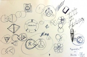
Although Dan declined to diagram for me, claiming brain fatigue (a reasonable claim at this year’s Summit) he pulled up a chair and sat sketching next to us. It was companionable, to sit and talk and draw ideas. We moved back and forth from discussing life to discussing the ideas, teasing, joking, drawing. As we chatted, I realized this was a part of the secret. You need a thinking partner. Sometimes it’s paper, sometimes it’s friends; but it’s best when it’s both. It doesn’t always matter what you draw, just that you draw.
Dan Willis drawing nearby makes me happy.
Our brains work better when our hands are busy.
Later, sitting in the back of a session, I lobbed a model at Stephen, and he shot back with his own.
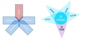
Then I saw another step, one which Dan had alluded to when he mentioned the poster with the key point too pale to read: You have to refine the model to communicate effectively. Type, color, and labels are all a key part of the communication process. While the model did stand alone without the color and type, adding those–and most especially getting labels right–made the model more effective.
 After getting home, I started sketching how concept models were made. I drafted this article and then asked my friend Dave Gray if he’d do a quick edit. Dave was the founder of Xplane, a company that used diagrams–concept and other–to transform companies. Dave has been a proponent of visual thinking and clear modeling for years, and I consider him the master of making ideas visible.
Life then intervened and this article sat. I was busy with several things, including Lou Rosenfeld’s 32 Awesome Practical UX Tips. Dave presented right before me, and watching him sketch, I realized I just had to get one more diagramming session in. It was not enough to have him comment, I needed to see him draw. I was grateful I did; otherwise, I would have missed a crucial piece of the puzzle.
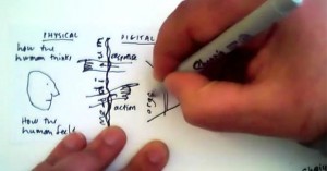
We hopped on a Google Hangout and he also drew out that same darn design model for me. I saw familiar patterns in his approach: inventory, unpack, relationship exploration. But he added a critical step I hadn’t thought of before: Test the model.
He’s currently writing a book on Agile, and it shows. He said, first design the test, then design the thing. For the model, he suggested using his WhoDo Gamestorming tool as a way to design a test of the effectiveness of the model. He lists who the model is for and what they will do if they understand the model.
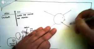
Designing a test of the model’s success radically clarified the goals for the model. Testing it would make sure it did what you wanted it to do.
So then I sat down to make a model of how to make models. And it came easily.
-
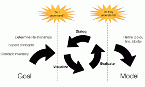
Determine the goal: How will the model be used, by whom? What is the job of the model? To change minds, explain a concept, simplify complexity?
-
Inventory the concepts: Brainstorm many parts of your concept. Keep adding more in the margins as you go.
-
Inspect the concepts: Are there many concepts hiding in one? Do you really understand each idea?
-
Determine the relationships: How do the concepts interact?
-
Decision point: Do I understand the ideas and what I’m trying to communicate?
Test: Ask yourself if the model “feels” right.
If yes, then continue. -
Iterate with words and pictures: Talk to yourself and draw it out!
-
Evaluate with yourself/the client: Keep making sure the drawings match the ideas you wish to communicate. Don’t punk out early! Rest if you need to!
-
Decision point: Does my audience understand the ideas and what I’m trying to communicate?
Test: Can my audience answer key questions with the model?
If yes, then continue. -
Refine: Use color, type, line weight, and labels to make sure you are communicating clearly.
The concept model is invaluable. But like so many useful things, it takes time to make.
When my daughter first started drawing My Little Pony, she expected to start at the ears and draw it perfectly down to the hooves. She was angry when it didn’t work that way, and it took some convincing to get her to block out key shapes then refine the whole, and to use pencil before ink. When I sat down to make a concept model, I made the same mistake! I’d start in Powerpoint or Grafio, and expect perfection to flow from my mind.
No more! Stephen, Dan, Joe, and Dave taught me to play, explore, refine, test, and play some more until the result was right. Thank you all!
Now go make a model!
Postscript
If your hands do not obey your brain, and/or you need more ideas for shapes and relationship models, I recommend Dave Gray’s Visual Thinking School.
See my interview with Dave on how he’d make the experience model


All the words. This is a fantastic article and EXACTLY what I was looking for. If I look back at the process I’ve been going through to make concept models I can clearly see what I have been missing. I particularly like the thought of inventorying, discussing, and testing the concept.
Thank you for the mindblowing read!
This is an awesome analysis and synthesis of the stuff in your head. I like the idea of cards as well since you can move it around. I tried using BoardThing but had some challenges since I didn’t have the physical to toss around. Thank you for sharing and looking forward to more tools to add to my toolkit!
This article has destroyed me. I am now dead.
Awesome article and thanks for taking the time to put in the details…really great read and resources!
great job! christina!
already had a bunch of similies but you went way too deeper in a humble and direct way.
this thing directs rather than distract.
a few more links can be added just to make the real case scenario in my opinion, gathers a lot more readers on the way too!
Concept Models for Concept Models is my new band name! Thanks Christina!
Wonderful article! I really enjoyed not only identifying your struggles, but the process and journey to finding the missing pieces. I know Stephen and Dave and a fan of the others authors you listed. I can only imagine how exhilarating it must have been to have those masters guide you to better model drawing. Well done!
Christina! You article is so magnificent I was into the hotel too, as I was reading a novel. Really, thanks much for sharing. Drawing a perfect diagram is still a mess for me, but for sure I can think to make them better!
Great stuff, and a great example of collaboration in action too. I really like the emphasis on sketching a model to explain, to bring clarity, to simplify.
Another thing that I find is really powerful about concept models is that, if done well, someone else can find it easy to draw as well, so it’s easy to spread to others. That’s when an idea, well-communicated, really spreads. Stephen’s modifications of type, color and labels are great, and still clarify the meaning, but yours still communicates the thrust of the idea.
What an absolutely delightful read. As an information architect, I got more takeaways than many tech event events that I have attended. I am planning a paper on content models and this article gave me some really good food for thought.
Thanks again, for making it such a delight to read.
Fantastic! This article is just what I needed at just the right time. Our UX team is leading the charge to improve how our organization does user-centered design. Concept Models (or Maps) are, in my opinion, one of the most essential parts of an effective design process. But teaching others how to develop them has been a challenge for me, and I also struggle with it myself. Thank you for sharing your learning adventure and the results of your quest!
I’ve written an update on How to Draw Ideas with book recommendations!
http://www.eleganthack.com/resources-for-drawing-ideas/
Really interesting article – thanks!
Christina, this is terrific–and as always, it’s such a treat to read about your process! I’m reminded of the fundamental exercises we did in sophomore year typography to establish and communicate relationships, emphasis, and hierarchy. We had a limited toolkit: just one typeface, and limited variables, just stroke weight and point size. That limited vocabulary was similar to the mental library of typical models you describe. By drawing on just those basic signifiers, we can communicate the most complex theories–and better clarify our own thinking in the process.
This is a great Article 🙂 Love the in depth research you did and effort you went to contacting the different visual artists to get alternative methods and models. Well done! Thank you for sharing.
Thanks, Christina!
In my kid’s school, they’ve implemented “thinking maps” which is a way to teach models to kids in elementary school. http://www.lifestreamcenter.net/DrB/Lessons/thinking_maps.htm. I’ve found my kids coming home with concept models so awesome that I’ve had to post them on my blog! In school, they are finding ways to help kids incorporate visual thinking into the curriculum. Woot!