“Once you’ve completed the data entry, you can immediately review your results.”This article explains how to quickly derive easily-read, quantitative results from a card-sort activity by entering data into a spreadsheet template that is adaptable to any set of cards and categories.
The template provides visually attractive results showing:
- In which categories each card appears
- How often a card appears in any given category
- Where cards appear by percentage
- The number of unique cards in a category
- Color coding to simplify interpretation
- Summaries of category contents
 You can see a preview of the results, using sample data, at right.
Process and time requirements are minimal — all you need to do is paste your lists of cards and categories into the worksheet, enter your data, and tweak a few formatting rules.
The template was developed as an analysis tool for interpreting the results of a card-sort exercise involving more than 100 items and approximately fifteen participants. The best known freely available automated card sorting tools (EZSort and WebCAT, for example) cannot work with item sets of this size. This template will accommodate 180 cards and 30 categories, but is easy to expand further via simple cutting and pasting of the cell references and formulae.
Before you begin
Create and conduct your card sort, using numbered cards with a label and a short description. More information on how to complete a card sort is available in the references section at the end of this article.
To help you get started quickly, I’ve provided a spreadsheet template, with examples, which you can download here.
Preparing your spreadsheet
Your first task is to alter the template to reflect the number of cards in your sort.
Step 1: Open the Excel file and click the tab at the bottom of the window for the worksheet called Initial Card Count.
Step 2: Cut and paste an alphabetical list of the titles of your cards into the column labeled Card Title (column A).
The template includes a column for the card numbers (column B), which you may need for later reference. I recommend including the descriptions that appeared on your cards in the worksheets, as it is much easier for people who did not directly conduct the study to read and interpret the results when they have the original card description readily at hand. I usually place the descriptions in a new column (column C, in this layout) adjacent to the card numbers; you can see this on the last worksheet, “Summary.”
Step 3: Paste this same list of card titles into column A of the other three worksheets: “Low & High Card Count,” “Card Placement Percentage,” and “Summary.”
(I prefer to color code the card names on each worksheet according to different schemes, so I do not link the cells to the list on the first worksheet.)
Don’t worry about customizing the spreadsheet for your particular analysis needs just yet; it’s easier to adjust the formulas and formatting logic for the worksheets after you’ve seen the results and feel comfortable with what they’re telling you. There’s more on this in the “Reading Your Results” section, and a complete list of the various formulas used in the worksheets in the “Formula Reference” sections below.
Note: The “Card Placement Percentage” worksheet includes a hidden row (row 183, labeled “# zero % cards”), used as a shortcut to calculate values in the rows below. Be careful not to delete this row.
Standardizing categories for analysis
If your card sort uses predetermined categories (that is, if it’s a closed sort), cut and paste the names of your categories into row 1 of the “Raw Data” worksheet; the template will automatically transfer these category names into the appropriate cells of the other worksheets.
In an open sort you’ll have to standardize the categories your participants create in order to effectively compare the placement of your cards (unless, of course, all the participants create exactly the same set of categories). This step is very important but tricky, so take care to think about the implications of ostensibly easy decisions.
Here are three quick steps to help you arrive at a list of standardized categories:
Step 1: Sort the category names your participants created into an alphabetical list. Strip any common prefixes (e.g., your company’s name, the word “our”) from the user-created categories to expose the underlying topic or subject of the category.
Step 2: Scan the list for groups of category names that are similar. Common methods of gauging similarity are by root word (noun or verb), by word order, or by meaning. Use the example below for reference. Combine categories with similar names into clusters, and choose a representative label for each cluster.
Step 3: Review the remaining user-created categories, searching for common synonyms of the cluster labels (e.g., “employment” and “careers”). Add these to the initial clusters.
Here’s an example of how a list of raw categories might look when clustered:

Step 4: Add any remaining categories from the original list of raw categories to the labeled clusters you’ve created.
You now have a set of standardized categories to use in comparing card placement and category strength. Additionally, this list now maps user-created categories to the standard categories you’re using for analysis. Make sure to save it, as you’ll need it for reference when entering data into the spreadsheet.
Some categories in the raw list will be unique, or won’t easily fit into an existing cluster. Unless you’re left with a large number (half or more of the total) of unique categories in the raw list, don’t worry. If you do find a large number of unique raw categories, it’s possible that your participants have widely different models of how to organize the content, which means that you’ll need to rethink the starting set of items, or your approach, or both.
Step 5: Cut and paste the final list of standardized categories (Edit > Paste Special, and check the box for “transpose”) across the Row 1 of the Raw Data worksheet.
I like to color the cell backgrounds to make it easier to tell them apart when I’m entering the raw data.
Note: The template will carry your category names forward to the other worksheets automatically.
Entering the raw data
Now for the fun part…
Step One: Take a single group of sorted cards (cards in one raw category) from the collection of groups created by one participant, and match this raw category with the corresponding standardized category you chose earlier. You will likely need to refer to the document that maps the user-created raw categories to your standardized categories to ensure that you’re entering the raw card data correctly.
Step Two: Record the individual card numbers of the cards in the participant’s raw category in the matching column for your standardized category in the “Raw Data” worksheet, entering only one card number into each cell in the column. Complete this process for one raw category at a time, until you’ve recorded the locations of all the cards in all the raw categories for one participant.
Step Three: Moving through the collections of sorted cards from each participant, enter the card numbers from the raw categories they created into the columns for your corresponding standardized categories on the “Raw Data” worksheet.
Note: Don’t sort the columns on the “Raw Data” worksheet to get a preview of how many times cards are repeated in a given standardized category; it is much easier to check for data entry errors when the card numbers appear in the original order of entry.
The template accommodates up to 250 entries in any one standardized category. Should you find that any of your standardized categories end up including more than 250 entries, you will need to alter the formulas in the spreadsheets to count the values from cells with row numbers greater than 250. This is explained further in the Formula Reference Section below.
Here’s a look at the Raw Data worksheet, showing sample categories and card data:
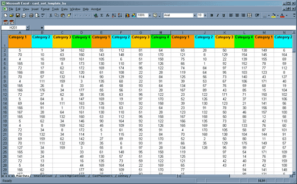
(Click to enlarge.)
When you finish, you’ll see that the other worksheets are populated with values, and some cells are in color.
Reading your results and customizing the worksheets
Once you’ve completed the data entry, you can immediately review your results. The template uses Excel’s Conditional Formatting features to color and highlight cells with specific values, so you will probably need to make some simple changes to the logic that drives the formatting to accurately reflect the number of participants in your card sort, and the way that you wish to see results displayed.
You can change the conditional formatting settings in any worksheet by:
- selecting a block of cells in a worksheet
- choosing the “Conditional Formatting” option from the Format menu
You will then see a dialog box that shows up to three conditions defined by simple Boolean operators and numeric values, each accompanied by a combination of formatting guidelines (font, color, background).

Conditional Formatting dialog.
In this example, taken from a cell in the “Card Placement Percentage” worksheet, you can see three conditions defined in the formatting dialog box. The first condition sets the text color in all cells with a value of zero to white, which is an easy way to make results easier to read by cutting down on the number of cells that have visible results. The second condition sets the background color of cells with values between .01 and .34 to yellow, and the text color to a standard black. Since the values in these cells correspond to percentages, this condition makes it easy to spot cells with values in the bottom third of the results. The third condition sets the background color of cells with values between .66 and 1 to green, and the text color to black; this highlights cells with values in the top third of the results.
Note: Excel applies conditions in the order you specify them, which means that you may need to think through combinations of logic-based conditions carefully to get the results you expect. You can read more about conditional formatting within Excel’s Help libraries.
Now let’s take a look at the other worksheets.
Worksheet 1 – Raw Data
This worksheet contains the source data used to drive the values calculated on each subsequent worksheet in the template. It contains no formulas and no formatting.
Worksheet 2 – Initial Card Count
The Initial Card Count worksheet shows how often each card appears in each category. This is useful, but can be hard to digest, especially with a large set of cards and categories.
Here’s the Initial Card Count worksheet showing sample data:
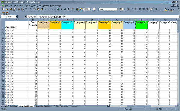
(Click to enlarge.)
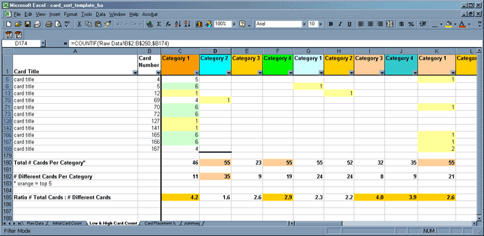
Worksheet 3 – Low & High Card Count
The Low & High Card Count worksheet shows the same numerical data, but employs some basic formatting features to highlight areas of interest and make the results easier to read.
Here’s the Low & High Card Count worksheet showing sample data:
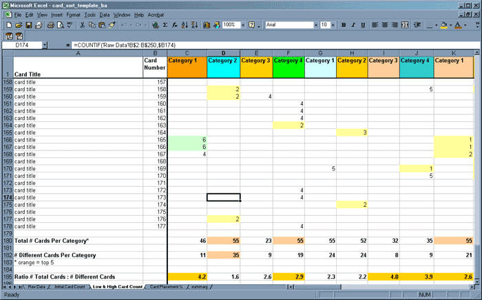
(Click to enlarge.)
Numbers are only visible in cells with card counts of one or higher. Using Conditional Formatting, I’ve specified rules that color the backgrounds of cells with card counts in the lowest third (light yellow) and highest third (light green) of the results to make them easier to pick out. (You might choose different color combinations to suit your needs and circumstances.) The rationale behind this is that a high occurrence count in a single category indicates clear agreement amongst users on where a card belongs, whereas a low count indicates a card that few agree on.
You can change the thresholds for the formatting by opening the Conditional Formatting dialog box for any of the cells and altering the numeric values listed in the conditions to reflect your parameters.
When you decide what rules to employ, remember that the total number of participants determines the thresholds for each segment of the results. The template assumes you have data from nine participants and wish to highlight what are roughly the highest and lowest thirds of the results. Accordingly, the conditional formatting rules come into effect for values of three or less, and six or greater.
At the bottom of the Low & High Card Count worksheet, you’ll find summary rows that show:
- the total number of cards per category
- the number of different cards per category
- the ratio of these two measurements
I manually color-code the top five values in each summary row, again to make them easy to call out. While this isn’t a solid statistical assessment of the data, it does give you an easy way to rapidly identify which categories are broadly and tightly defined, and to make some rough comparisons between them.
Categories with a high ratio of total cards to different cards include many repeated cards. This indicates that your participants agreed often on the placement of those repeated cards within this single category. Compare the ratio to the number of participants in your sort. When these two numbers are close it’s more likely that this category is strongly and consistently defined in the minds of participants.
Categories with a low ratio of total cards to different cards do not include as many repeated placements of cards, which indicates that your participants agreed less often on which cards belong in this category.
The real meaning of these numbers lies entirely in their context, so let’s use a simple example to illustrate some of the conclusions you might derive from reviewing the results on this worksheet:
Say that you ran a sort with 100 different cards; 30 of these cards included the names of songs written by Miles Davis, and the other 70 included a mixture of jazz songs by seven or eight other artists, the names of important jazz ensembles, musical styles related to jazz, famous jazz and blues albums, etc.
If one of the standardized categories created during this sort was “Songs Written by Miles Davis,” you would expect it to contain approximately thirty different cards (one for each of the songs). The total number of cards in this category should be close to 300 — ten repeat placements of each of the thirty different cards for songs by Miles — and the ratio of total cards to different cards would be approximately 10 to 1, matching nicely with the number of participants. Even though this category contains nearly 30 percent of the original unsorted items, it makes sense in this context.
If half of the participants chose to group songs by their opening key, and not by composer, you might see ratios much lower than 10, meaning that fewer participants agreed on how to create their category structures.
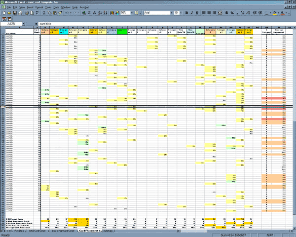
Worksheet 4 – Card Placement Percentage
The Card Placement Percentage worksheet lets you quickly assess the percentile distribution of placements for any card in relation to one another. Reading from left to right along a single row, you’ll see percentages that represent the placement of each card in each standardized category as a percentage of all of the different placements for that card. High percentages indicate that more participants consistently placed that card in that category; naturally, the highest percentage is 100. I refer to these percentages as the level of participant “agreement” on the placement of the cards.
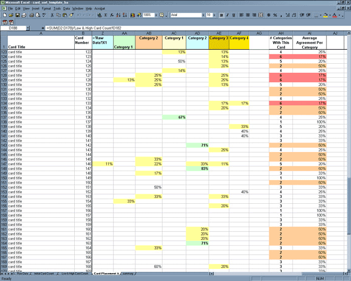
Card Placement Percentage worksheet. (Click to enlarge.)In the screenshot at left, look across the row for card #124. You’ll see that it appeared in Category 1 (column AC) 50% of the time, and in Category 3 (column AE) only 13% of the time. By contrast, looking at the categories where card #147 was placed, you’ll see that it appeared in Category 2 (column AD) 83% of the time. Clearly, a significant majority of participants agreed that this card belongs in Category 2 (column AD).
Note: In this template, the Card Placement Percentage worksheet uses conditional formatting to highlight the lowest and highest thirds of the total set of results. Percentages above 66% appear in bold to make them easy to locate. You can change these thresholds by altering the decimal values in the Conditional Formatting rules.
The far right columns of the Card Placement Percentage worksheet show the number of different categories each card appeared in across all of the results sets, as well as the average of all the percentage values. In these summary columns, conditional formatting highlights cards that appear in a large number of different categories (in this case, six or more, which appear in red), and those that appear in only two categories (in tan). Again, the rationale is to identify items that require immediate attention, or that offer ready opportunities for redefinition.
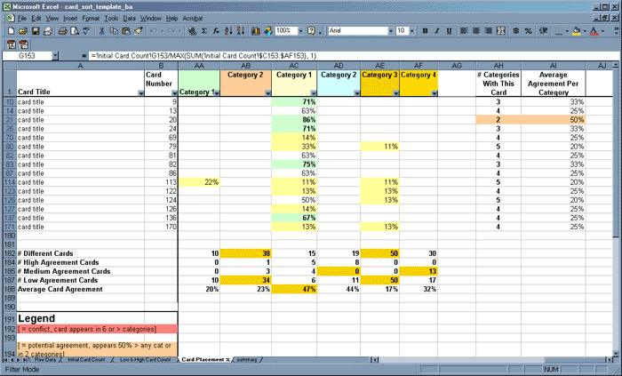
At the bottom of the Card Placement Percentage worksheet, summary rows show:
- how many high-agreement cards appear in each category
- how many medium-agreement cards appear in each category
- how many low-agreement cards appear in each category
- the average-agreement index of all cards in the category
These are additional indicators of the strength of a category, and the way that cards were distributed across the different categories. I often manually color the top five results to allow faster spotting of strong and weak categories.
The Card Placement Percentage worksheet, showing category summaries:

(Click to enlarge.)
Note: Remember: The template includes a hidden row (row 183, labeled “# zero % cards”), used as a shortcut to calculate the values in the three rows below. Be careful not to accidentally delete this row.
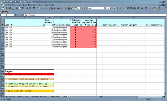
Worksheet 5 – Summary
The Summary worksheet shows the summary columns from the far right of the Card Placement Percentage worksheet directly adjacent to the column containing the description of each card. It also includes suggested columns to use in comparing the current category location of each card with the location you understand the participants to prefer, and tracking recommendations and labeling changes for each card.
I use this display for presentations with clients, developers, and business owners who need abbreviated results, rather than the exhaustive detail of the other worksheets.
Interpreting the Results
Interpreting the results of a card sort depends largely on the context of the exercise: what items you included, who participated, and what questions you hoped to answer or identify will all be important in shaping what you derive from the analysis. The strength of this tool is that it supports pattern analysis at more than one level: you can investigate individual cards, whole categories, and even — if you’ve defined them in advance — groups of cards and groups of categories.
If you’re using a card sort to drive the design of a new information architecture for an existing resource (perhaps navigation for a website), comparing the current location of items that fall into the lowest and highest results groupings with their user-preferred locations could indicate problems that require immediate attention or offer the greatest opportunity for improvement.
Categories that include mostly high-agreement cards and few low-agreement cards are probably well understood in the minds of the participants, and represent structures you’ll probably want to accommodate in your information architecture.
Categories with many low agreement cards may indicate that participants were looking for a place for items they do not value or understand. Or it may mean that the labeling and content of the items is inconsistent, and users couldn’t find a location that suited both the card name and description.
Autofilters
Using Excel’s Autofilters (available under the “Data” menu via Data > Filter > Autofilter), you can display specific combinations of cards and categories to speed interpretation of the numeric results — for example, cards that participants placed in many categories, which indicate conflict about the cards’ labeling and description.
This is the Autofilter Dialog box:

You can zoom in to display all the cards in a single category by percentage:
(Click to enlarge.)
Or by count:
(Click to enlarge.)
Or all the cards that appear in more than X number of categories:
(Click to enlarge.)
While it is possible to use more specialized features in spreadsheet tools like Excel, or even dedicated statistical analysis packages, time and resource constraints make this a practical alternative for quickly deriving insight from the results of this common but usually labor-intensive user research technique.
Formula Reference
For easy reference while you prepare your own spreadsheet, this section collects all the formulas from the worksheets in the template. Each example formula is from the cells corresponding to the last card in the last category in the template. Most of the formulas are composed of simple functions like summing a range of numbers, comparing one value to another, or incrementing a counter to reach a total. Even if you’re not an Excel power user, if you know just a little bit about how to use Excel’s formulas (which is certainly the case for me), you should be able to change these as necessary to suit your specific needs.
Here are a few tips on what to look for and expect when customizing the template:
- Adjust the template to fit the number of cards in your sort and the number of final categories by cutting and pasting whole rows and whole columns; Excel will update formulas and references automatically to reflect your changes.
- The Initial Card Count worksheet counts up to 250 total cards in any one category on the Raw Data worksheet. If you end up with more (!) than 250 cards in any one category, you’ll have to increase the value in the Main cell formula (see below) to make the template count all the cards.
- Several formulas reference other worksheets; if you change the names of any of the worksheets in this template, most versions of Excel will automatically update all of the affected formulas.
Worksheet 1 – “Initial Card Count” Formulas
Main cell formula
=COUNTIF(‘Raw Data’!AD$2:AD$250,$B178)
# Cards Per Category
=SUM(AF2:AF179)
Worksheet 2 – “Low & High Card Count” Formulas
Total # Cards Per Category
=SUM(AF2:AF179)
# Different Cards Per Category
=COUNTIF(AF2:AF178,”>0″)
Ratio # Total Cards: # Different Cards
=(AF180/AF182)
Worksheet 3 – “Card Placement Percentage” Formulas
Main cell formula
=’Initial Card Count’!C2/MAX(SUM(‘Initial Card Count’!$C2:$AF2), 1)
# Categories With This Card
=COUNTIF(C178:AF178,”>0″)
Average Agreement Per Category
=SUM(C178:AF178)/AH178
# Different Cards
=COUNTIF(AF2:AF178,”>0″)
# zero % cards
=COUNTIF(AF2:AF179,”0″)
# High Agreement Cards
=COUNTIF(AF2:AF179,”>.66″)
# Medium Agreement Cards
=AF182-SUM(AF184,AF187)
# Low Agreement Cards
=AF186-AF183
Average Card Agreement
=SUM(AF2:AF178)/’Low & High Card Count’!AF182
Worksheet 4 – “Summary” Formulas
# Categories With This Card
=COUNTIF(‘Card Placement %’!C178:AF178,”>0″)
Average Agreement Per Category
=SUM(‘Card Placement %’!C178:AF178)/D178
![]()
EZSort is available for download at http://www-3.ibm.com/ibm/easy/eou_ext.nsf/Publish/410
Information & Design — a usability consultancy in Australia — provides a brief and useful overview of how to conduct a card sort here: http://www.infodesign.com.au/usabilityresources/design/cardsorting.asp
UsabilityNet.org discusses card sorting by placing it in context of the broader landscape of user research and usability tools here:
http://www.hostserver150.com/usabilit/tools/cardsorting.htm
Since 1996, Joe Lamantia has worked under many titles for very small interactive agencies, very large consulting houses, several medium-sized (and now defunct) internet integrators, and even started his own B2B exchange (which is also—unfortunately—defunct). He is currently the information architect in residence at a major software firm in Boston, and is enjoying the opportunity to practice his User Research chops.
Joe would rather be in Italy, which he will happily discuss with anyone who reaches him at joe (at) joelamantia.com.
I have category, sub-category and sub-sub category, how can I manage them? It would be appreciated if you advice me in this regards.
1 Meat
1.1 White Meat
1.1.1 (10) Chicken
1.1.2 (36) Turkey
1.2 Red Meat
1.2.1 Halal
1.2.1.1 (05) Beef
1.2.1.2 (20) Lamb
1.2.2 Non-Halal
1.2.2.1 (30) Pork
1.2.2.2 (02) Bacon
Waiting for expert advice
Javed,
One way is to conduct several rounds of sorting exercises. In the first round, have participants define the first two sets of categories. In the next round, have participants define additional categories, using the categories from the first round of sorting exercises as a reference.
You could also use one of the other tools available for card sorting (some are mentioned here: http://www.rosenfeldmedia.com/books/cardsorting/, and in other articles in this magazine). Several of these tools support statistical analysis for category structures with more than two levels depth, using clustering and other algorithms.
My spreadsheet is meant to be lightweight and simple, so does not offer such capability yet.
Cheers,
Joe Lamantia
Can you pls let me know what you mean by ‘the number of different cards per category’ in the low & high card count section. i tried to find out what it meant but couldn’t find what it meant. Help pls
Thanks
Linda
Linda – “the number of different cards per category” shows how many unique cards (not counting repeated cards) were placed in each category. This is different than the total number of cards (which counts repeated cards) in the category, because the same card may appear in any one category more than one time.
The ratio of total cards in a category (counting repeated cards) to unique cards (not counting repeated cards) helps make clear whether participants ‘agreed on’ the cards that belong in the category. Categories in which many participants placed the same collections of unique cards, and where there were many instances of repeated cards, are categories that you’ll want to be able to spot and (perhaps) preserve when you’re designing your structure.
Does this help?
Cheers,
Joe Lamantia
Hi Joe–This is such a terrific resource! I’m also glad to see that you’re still responding to questions/comments.
I have spent several hours entering data into this template spreadsheet, but I’m not getting results on the “Card Placement %” or the “summary” worksheets. All the cells have the same thing in it: “#REF!”
The rest of the worksheets are looking good, but those two are not. Any ideas? I’m by no means an Excel wiz, but I was extremely careful not to delete important cells or mess with any formulas. I even attempted to start over in a fresh template and re-enter all the data but with the same results on the last two worksheets.
Any help you can offer would be VERY appreciated!
Thank you. Grace
Joe–Some of my coworkers (who ARE Excel wizzes) figured out my error and fixed it. It’s working perfectly for me now. Thank you again for this excellent resource!
Joe, very helpful – thanks for the template! Couple suggestions for demystifying the “magic” very beginning step with the “super raw” data and also putting the cards in an easier-to-handle-and-tote electronic format.
1. Create a new tab (super_raw) and enter each user’s cards in a column. Use yellow to highlight suggested level 1 topic categories (and blue for level 2 if you go that deep, purple for orphans, etc.). (You can set up macros to automatically make the cell yellow, for faster entry)
2. Optional: Create another tab (super_raw_lookup) that’s a copy of the super_raw tab, and in place of the actual card, use a lookup (=LOOKUP(super_raw!B5,CardNum,CardTitle)) to reference the actual card’s label, for easy reference.
3. Create a copy of the super_raw tab and call it User_Categories. Get rid of all the non-yellow cells (I created a macro for this step – wasn’t coding worthy of an A+, but got the job done), and all you have left are the users’ suggested Level 1 categories.
4. Sort the cells in each column alphabetically and patterns start to emerge a bit.
5. Start moving around related cells and you can see even more trends.
… Once you get your categories set, you can copy/cut & paste the super raw data for each category and stick in the ‘Raw Data’ tab under the appropriate headings.
It may sound like a lot of work, but that initial up-front time to enter the data (especially if you can have someone else do some of that data entry while you jot down your qualitative observations) is well worth it as you sift through the electronic stacks later.
If you’re interested in presenting the different categories where cards appeared, you can do more on that front too and concatenate the category names and have them appear in your summary tab.
Hope the additions help!
Cheers, Kate
I have released a free spreadsheet I use to analyse card sort data. My spreadsheet is great for analysing open sorts – it manages participant results, helps you explore the data and does some basic statistical analysis. It is based on Joe’s spreadsheet described here. Thanks Joe!
Nice work Donna – and thanks for the acknowledgement!
Thanks also to Kate for a great set of suggestions on how to improve the maigc bit of the exercise – refining and normalizing the categories people create. I’ll roll those updates into the master template that’s linked from my site.
Can I have real example of it?
How can i show my work and get advice from you?
Javed – My email address available at my site – http://www.joelamantia.com.
Hello Joe,
Just wanted to let you know that the example of the raw categories and how they would look clustered does not show up.
: ( Is there anyway for you to fix the link so I can see it?
The EZSort is available for download at http://www-3.ibm.com/ibm/easy/eou_ext.nsf/Publish/410 link is dead. Any alternitive link availible or other fine software?
Joe: Great article. I’m about to use the template to analyze a card sort study I did this week. I did a closed card sort, and some participants created sub categories and put cards under those. How would you suggest using the spreadsheet to analyze that? I have some ideas, but I’d rather hear yours. 🙂
Can anyone explain how i enter the raw data from individual users? I was trying to follow Kate’s instructions but i’m a little unclear how to add users results into one column (step 1) when the cards have been sorted as a closed sort – in other words the cards need to appear under categories and sub-category headings. I am new to this so i could be confusing what I need to do. But i’m trying to first record the users card sort (I believe this would be ‘super raw’ data) and then from here i am hoping Joe’s spreadsheet can analyse the results (thanks for the spreadsheet Joe : ) ). Can anyone help?
Hi Joe,
Your excel template has been really great to tabulate the results from the card sort that my colleague and I have done at work. But, we are running into one major problem.
We have done 6 card sort sessions. Therefore, each category we tested is repeated 6 times over. In the Raw Data Sheet in the template that you have provided you have categories 1-4, which repeat several times, presumably to accommodate results from several card sort sessions.
Our dilemma is that when we try to use the Low and High Card Count sheet, the each card only receives 1 count for the category, when in fact, it should show more counts than that.
How do we add the results from the initial card count across the repeated categories? It works in your spreadsheet, but not ours.
If you have any idea of what we might be doing wrong, please let us know!
Thank you…and great job. The spreadsheet has been a great tool.
This a great article explaining the process. Because it is still a very time-consuming task we built a tool that automates some of it. Basically our analytic tools converts raw numbers into percentages and even allows grouping percentages into logical clusters.
Unfortunately, the XLS file doesn’t exist on the server. Oops!
The .xls file is available from my site at this link:
http://www.joelamantia.com/html/card_sort_template_ba.xls
Enjoy!
The .xls file is available from my site at this link:
http://www.joelamantia.com/html/projects/card_sort_template_ba.xls
Enjoy!
We are very new to the concept of IA and user experience/testing in general. I would like to take a group who is incharge of migrating our content into a new cms thru the card sort exercise.
Does anyone have an EASY way to do this? By easy, I’m easy to explain, and where to start. It’s a new concept, so I’ll be doing some selling in conjunction with explaining the exercise.
Thanks!
Mary
Check out this free beta software from IBM. EZSort can help you perform and analyse card sort data. http://www-3.ibm.com/ibm/easy/eou_ext.nsf/Publish/410
Angelina,
The idea of the “Standardized Categories” is that you’ve created a category name for all of the raw categories that are similar. For example, if you have three raw categories, such as “Email Us”, “Contact Info”, and “How to get in touch with us”, you will create a Standardized Category called, for example “Contact Us”. You then place those three Raw Categories into the one Standardized Category. At this point in a cluster analysis, you are not interested in exact labels, but the the topic of the labels.