Large scale websites require groups of specialists to design and develop a product that will be a commercial success. To develop a completely new site requires several teams to collaborate and this can be difficult, particularly as different teams may be working with different methods.
This case study shows how the ComputerWeekly user experience team integrated with an agile development group. It’s important to note the methods we used do not guarantee getting the job done. People make or break any project. Finding and retaining good people is the most important ingredient for success.
The brief
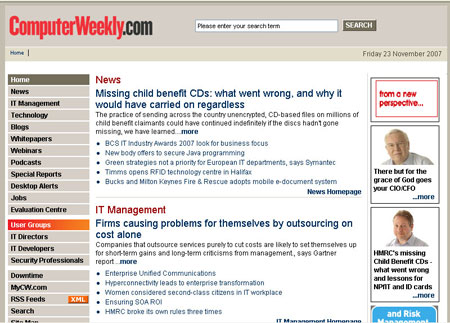
In 2008, we were tasked with resurrecting a tired, old, and ineffective site. It was badly out of date, and the information architecture was decrepit to both users and search engines.
Our goals were:
- Make content visible and easy to find
- Create an enjoyable and valuable user experience so users would return
- Increase page impressions to bring in ad revenue
- Allow site staff to present more rich media content
- Give the site more personality and interactivity
The UX team created personas from ethnographic studies, online surveys, and in-depth interviews with users. The data gave us a clear idea of the user’s needs and wants. We also gleaned data from analytics that told us where users engaged and where the bounce rates were highest.
At this point the development team maintained the site with an agile process. They created features for the new site in parallel to ongoing site maintenance, but this work was outside the normal maintenance sprints. The new site was considered as an entirely new project with a separate budget and scheduled into longer term.
Boundary Spanner
As the User Experience team gathered data key team members were recruited. The diagram below shows the key team members needed to produce this large scale site, their specific concerns, and their methodologies.
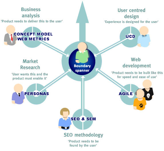
To bring these teams and disparate elements together requires a launch manager or ‘boundary spanner’. Rizal Sebastian wrote about boundary spanners in Design Issues in 20051. The boundary spanner needs to be aware of the individual issues the project faces. He need not know the detail but needs to know the cultural context of the collaborative environment.
Do people get on with each other? Are communication lines clear? Are there any personality clashes on the team. To throw developers, interface designers, business analysts, SEO experts, and usability guys together and expect them all to gel is optimistic but unlikely. It also requires those people devote all their time to just one project and that is unrealistic for a large operation where several projects are underway simultaneously.
They are more than a project manager because the user— and not the project—is at the heart of their concerns. He is responsible for delivering and continually developing a quality product. He is not just monitoring the features on a checklist. The user is at the center of all decisions on the design and development of the site. This is the only way you can ensure the user will be heard throughout product development – to employ somebody who listens to user voices and never forgets what they said. They must also ensure that SEO and business requirements are satisfied, and a well-defined strategy is in place. The boundary spanner owns and clearly communicates the vision until the whole team understands.
The boundary spanner’s strength is that they are core to the product and not a department or team known for their skillset (like a UX team for example). In many cases it is a product manager, but in this case it was the website editor who was responsible for synchronizing the teams.
Defining a process
To assist this user focused approach, the IAs produced set of deliverables that ensured the launch manager’s vision could be realized and developed.
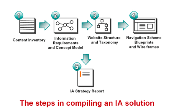
Diagramming the process using a concept model engaged key stakeholders with the project by communicating the vision of what the UX team would achieve with the speed and clarity of an elevator pitch.
Information gathering
A content audit revealed broken links, redundant content, and poor usability plagued the site. It also revealed how much content became lost the second it moved from the home page. The high value research papers were impossible to find.
30 interviews, 20 ethnographic studies, and 950 responses to an online survey. created six personas. With the content audit, personas, and business objectives (what we wanted them to do on our site), we began creating the taxonomy.
Analytics
During this project we were very fortunate to work alongside the web analytics manager who provided insight into user behavior, including high bounce rates from visitors arriving from search engines. He also provided a scorecard that showed where the site failed in terms of traffic and user engagement. We knew what users were searching for, and pretty quickly could tell why they were not finding content we knew we had.

By looking at web metrics we were understood usage patterns and popular and unpopular areas of the site. The depth of information enabled us to quickly formulate a plan.
Persona driven taxonomy
As we knew our user base were industry experts, we also knew their vocabulary was related to specific areas of their markets.
The taxonomy was created by gathering as many industry sources (websites, journals, white papers), breaking these down into unique elements, and clustering these elements together to form categories for our content.
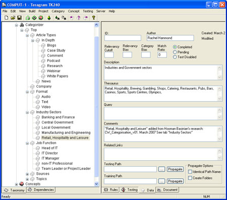
The CW taxonomy formed the basis of the navigation, content categorization, and highlighted areas for future development. It also ensured our search results served up related content in context.
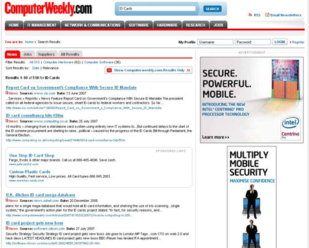
We defined four main areas by looking at the community of users.
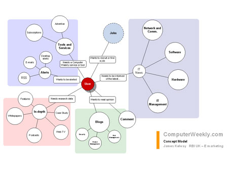
News was an obvious requirement, defined by their particular area of interest within the sector. The need for knowledge was evident, and we created an in-depth research area where case studies and white papers could be easily accessed. Tools and services, RSS, email news alerts, and newsletters reflected user needs to be kept up to date and in tune with their specialization.
Finally, although the CW community was secretive and did not divulge information amongst their peers, they were very interested in expert opinions. This need gave rise to much more integrated blog postings.
Interface development
The navigation scheme defined the elements of the page the users would use to move to other areas in the site. It clarified the naming of those items on the page.
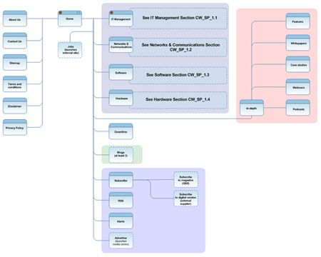
We then considered the prioritization of information and content for each page, and this facilitated the production of wireframes that represented the culmination of all research, showed the interface and interactions for elements on the page, and were a working document that changed as we iterated the design.
Core and Paths
We used Are Halland’s method for ‘designing findability inside out.’2
- Prioritize and design the core – Satisfy user goals using prioritized content and functionality.
- Design inward paths to the core – Consider how users will arrive at the page from search engine results, facets, menus, search, RSS, aggregation, email, etc.
- Offer relevant outward paths from the core – Ensure that the site delivers both user and business goals through clear calls to action and completion of interaction tasks.
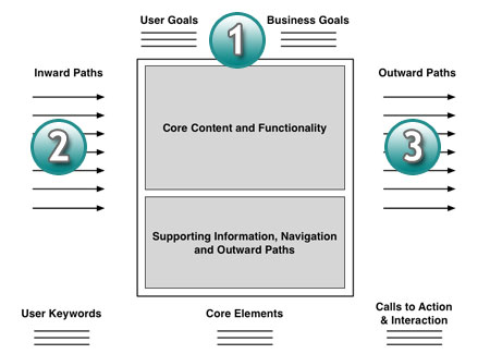
For CW.com, we focused on the cores for the home page, a channel level homepage, and a news article page and looked at key content such as lead news story and the editor’s picks or the best from the web aggregated from external sources. The key functionality and supporting content also had to be included and prioritized on the page.
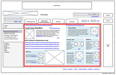
Next we considered the inward paths, which are the channels that our users are likely to utilize to arrive at the page.
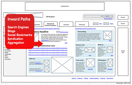
Inward paths included search engines, blogs, bookmarks, syndication, aggregators, RSS, and email subscriptions. Considering inward paths helped us focus on the marketing channels we needed to drive users to the relevant type of page. It also focused on the keywords and themes that users are likely to use and helped us optimize pages for search and online marketing campaigns.
Finally we designed the outward paths that helped users complete online tasks for our business objectives.
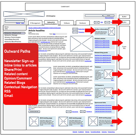
These outward paths include:
- Newsletter sign-up
- Inline links to related articles to drive page consumption
- Sharing, printing or emailing of news articles
- Related content types such as video or audio
- Stimulating community participation in forums or blogs
- Contextual navigation to aggregated content or the editors best bets
- Subscription to an RSS feed
- Prioritizing the content
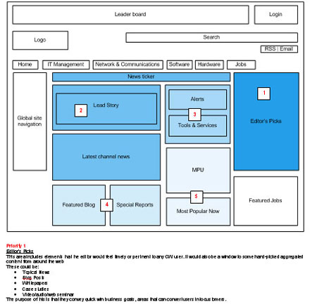 

Once the wireframes had been approved, the content was organized so the most commercially valuable and user focused content was pushed to the top of the page. As the design went through user testing, certain elements changed, as with any iterative process, but through team collaboration, the solution remained true to the initial vision from concept to design delivery.
The development cycle
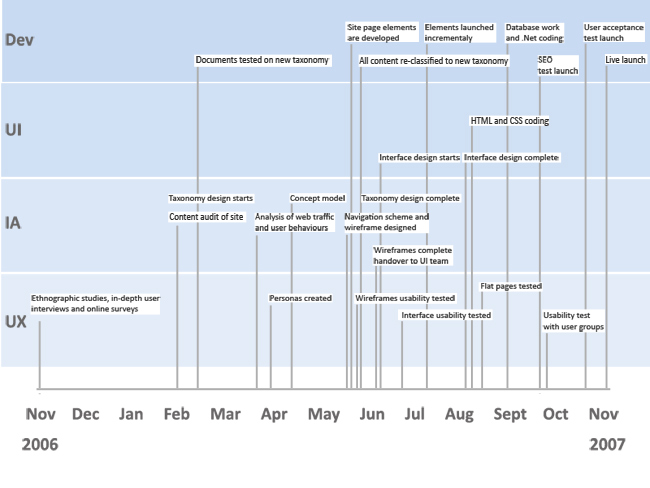
The wireframes were handed over to creative, and they began designing the interface and graphic elements. The development group released some functional elements to the old website before the relaunch.

These agile methods allowed the old site to feel the benefits of the new widgets. However, as the site changed so radically in the new design, we still had to release the site in an old style ‘big-bang’ manner. This is perhaps where agile has its problems as a methodology for new launches. It’s focus on many small releases is a great tool to implement incremental changes but not for a completely new site.
As the html flat pages were passed to the team, the SEO requirements were defined and built into the site. By the time the site launched it, had been through four major pieces of testing.
A holistic solution
Providing user experience deliverables like the concept map and wireframes ensured more comprehensive requirements were delivered to the design and development team. This approach addressed marketing, editorial, sales, and business requirements next to the needs and wants of the user. The vision was aligned with an achievable delivery from the IT team that ensured we delivered the site we wanted to give the user.
The core IA work enabled the new site to be future-focused and versatile. The structure and design of good sites should be able to adapt to change.
User-centered design and agile can work alongside each other but what is more important is having people who can tie all the loose strands of a website design and development cycle together. The concept map, wireframes and the IA strategy document that listed the rationale behind the design decisions helped ensure the product vision was correctly communicated to the development team, so the product that was developed through their agile processes was in line with the overall product vision.
1http://www.mitpressjournals.org/doi/abs/10.1162/0747936053103020? cookieSet=1&journalCode=desi
2http://www.slideshare.net/aregh/core-and-paths-designing-findability-from-the-inside-and-out

Thanks for the article. Unfortunately you don’t go deep into how the interaction between the IA’s and the Agile development was organised and how UCD and Agile fitted together.
It looks like most of the IA work (structure, wireframes etc) were designed upfront and handed over to the next team. Was that part of the project done in a more waterfall like process or was it seen as preparation or ‘sprint 0’?
What happened to the IA during development and were the IA’s part of or interacting with the development team to further iterate the IA?
Hi James – great article thx for sharing, I think you really did a great job of highlighting some of the aspects of Agile. When I think or thought about Agile, I summed it up with the words or it appeared to me as a “squeezed development process”. I’ve been working in waterfall, agile, and fragile processes. (Fragile is like Agile but in the absence of discipline and sometimes I’m under the impression that it’s entire chaotic). I firmly believe the key to success is the willingness to change things based on gained knowledge and wisdom. I love the big bang approach myself but sometimes it’s NOT the only way to find the Holy Grail. The big plus of Agile is – Agile chooses to do things in small increments with minimal planning, rather than long-term planning – but that’s also its big minus. I’m very fascinated by Agile but also frightened and nervous about it again and again. Your article allayed such irritation for a little bit – thx.
@ Marius van Dam – Thx for your questions – I looking for forward to read James’s answers.
I agree with Marius. Nice, detailed work, but this process looks more like waterfall than agile. I see Agile as a way to combine both UX wireframing and UI development work into manageable sprints. It appears you handed all wireframes over to the UI team at once. Not saying that’s bad, just saying that’s not really agile.
I also don’t agree that agile forces a project team to LAUNCH work incrementally. It simply means that a team can CONSTRUCT work incrementally. Thus, agile can still happen in a big bang project. You simply collect all your agile sprints into the test phase, test as a collective whole, then push the button.
Great to have some feedback here with some important questions. I have the benefit of hindsight and much more experience since this project went live. This gives me a perspective similar to the one that Anthony Colfelt writes in his article a couple of months ago (http://boxesandarrows.com/view/bringing-user).
@Marius
I was effectively a UX team of one here so I did the IA and interaction design, working very closely with the visual designer (for UI) and the development team for functionality of the elements. This would occur on a daily basis, very much in a loose, iterative way of designing and developing simultaneously. So although wireframes were handed to both parties, decisions were being made around these documents as they were being worked from and we moved quickly, sometimes without further wireframe revisions.
So yes it was a Sprint 0, for some elements and then I carried on through subsequent sprints to check the new functionalities with the website editor (product manager). It was not optimal as a way of working, one problem we had was that we were located on several floors which meant a lot of protracted meetings. But under the circumstances, it was the best we could do.
@Holger
I too hold a love/hate relationship with Agile. Mainly as I am a big supporter of iterative design, and a development process that seems to be based on the cyclical nature of design is very interesting. However it does have limitations, mainly on the type of culture that it operates in. Some companies or organisations will never be able to build in a truly Agile way as much as they are incapable of utilising social media technologies. Unfortunately it is the nature of the beast.
Agile, like so many new ways of working, seems to require a course in change management before people rush headlong into it. Your fears about Agile are mirrored time and again in the clients that I work with. They like the idea but they feel they are on a train unable to get off. If it is not managed by a very empathetic project manager the client feels lost and out of the loop with a budget being spent on intangible elements they can not see.
Fragile is such a great way to put it, and there is definitely room to improve this area of Agile. It seems to need the UCD thinking more at its core to help bridge that gap between the concept and the delivery of the product. Agile is development and delivery focussed but it needs great communication and collaboration between people to produce quality results.
@Eric
I totally agree about the difference between launching and construction. This being a relaunch I highlighted the project in this context but as you rightly say, construction is the focus of Agile. Launching in a phased way was the initial ambition of the development team but it proved too much of change in technical architecture.
Interesting article & comments. I have found a hybrid development process with an “external” waterfall view (complete with up-front specs, Alpha, Beta, RC, Gold milestones) combined with an “internal” agile process based on user stories, sprints & iteratively releasable code works well for us 🙂
Really enjoyed the case study, James. Thank you.
Regardless of whether your working in an agile context, I think there’s great value in the Boundary Spanner concept. It seems to me to be an excellent way of communicating the strategic importance of UX, from the perspective of project team effectiveness.
I also found your description of the deliverables do a good job of showing their value for a development team. Churn at pre-release becomes especially expensive when we are talking about a relaunch.
Together these help broaden the business value of UX, and shift it away from being some sort of quality assurance method with purely marketing value.
This is a great case study and a lot of good work (and diagrams) but I’m sorry I can’t agree that this represents an agile+UX approach. What you’ve described with the 6 month period to concept is the very definition of ‘big design up-front’ that is typical of Waterfall. Just because you design iteratively doesn’t mean it’s agile.
To replace a whole website in a big-bang approach isn’t anti-agile. In fact, you could achieve the whole outcome by using the same team, working collaboratively in parallel, working on a ‘skinny solution’ to replace the whole website, within 8 weeks. The focus after that would be to identify what users value most (through application of UCD techniques) and then add to the site incrementally in 2 week iterations.
UCD can also lead the assessment of the priority of features to be designed+coded within an iteration through collaborative work and I often see great IAs doing this through what you term here the ‘boundary spanner’. In agile-speak this is the job of the Agile Master who’se been there and done that and knows enough to be able to be the gel that keeps the team together, helps to identify impediments to the project and keeps everyone working to the Agile Way.
@Craig
This sounds really interesting and glad to hear it works for you. It is dependent where you operate, but it is a really important matter to find the solution that is right for the context you operate in.
@Justin
The boundary spanner is actually the core message of this article that I wanted to get across and I am really glad you picked up on it. UX people are the ones who have the ability to bridge those roles in organisations that may be more traditional and subject to organisational structures that confine efficiency. We should strive to go beyond boundaries, reach out and collaborate beyond our remit as a matter of course. If we do this effectively and avoid the jargon (especially amongst the stakeholders) then business value is derived from our behaviour. I firmly believe this is the
differentiator between the usability guy and a person who will transform the product to a desirable or delightful experience.
@Matthew
The case study really highlights what occured within the confines of what we were able to operate in. Agile was the method of the development department. You are right in saying that iterative design is not agile, I completely
agree. Agile is a way of getting work done with a series of steps and methods that are clearly defined, taught to
scrum masters and stuck to rigidly in my experience.
I would say that iterative design happens in a different arena in a different mode in the development of the site. Sorry if this was unclear – but it is an important distinction to make.
I agree with your point of how it could be done, but that was not the reality in this particular company and that moment in time. The organisational make up of the business proved to be an impediment to developing the site optimally. This meant that the ‘Agile Master’ was not actually the boss of the team but the client of internal departments. The scrum was managed by another person, who led the development team. In this situation, there was no way that they would do any IA at all.
I have written about this recently (http://userpathways.com/2010/04/agile-and-the-importance-of-cultural-understanding/) and it would be great to have some feedback.
What you raise here is really valid, but this situation, called for this solution. It couldn’t be done in any other way – at that moment. It was not optimal but it achieved the brief in a manner that satsified both the users and the business.
On design in an agile environment, I read Lynn Miller’s (Alias software – they developed Maya) paper (2005): http://agileproductdesign.com/useful_papers/miller_customer_input_in_agile_projects.pdf .. There I learned (and we adopted) parallel design and development. In short, the IxD is one sprint ahead .. The product owner now does have to look one sprint ahead as well ..
Here’s another document by Desirée Sy (2007, also Alias) that elaborates on the parallel approach: http://upassoc.org/upa_publications/jus/2007may/agile-ucd.pdf
@Matthijs
Thanks for the links and I agree Sprint 0 is the way to go – one sprint ahead. But as you say, the product owner is there also in this IxD stage. Such an important fact, and one that needs to be encouraged and monitored to ensure a successful project in my opinion.
This parallel way to design and develop works really well when communication lines are clear and used frequently, if not it can go badly wrong very quickly. Hence the need for boundary spanners, or product owners who collaborate in all stages of the product’s creation.
Thanks for sharing your experience. I think this is a great case study that really highlights the value that a “boundary spanner”. From previous work experience, I’ve learned that an effective boundary spanner (a.k.a, interactive producer) can truly make or break a project on several fronts. We used to refer to these resources as web/interactive producers (not sure if that’s still as widely used in the industry). Their mandate was not only to keep the project moving forward, but also to continuously speak on behalf of all the viewpoints and be able to effectively translate those viewpoints into actionable, solvable chunks. Whether it’s waterfall, agile, or some combination, I can’t agree with you more when you state at the beginning of your article that “People make or break any project.” You could place really talented people and have them succeed in just about any type of development/project life-cycle.
@ Andy
Thanks for the comment and I have recently posted on my blog this same subject (or at least this is covered in the comments). I agree about people being so important. Getting the right team and the right mix of personalities will define how easy it is to reach success.
I think the biggest problem I see when people talk about how UX and “agile” can work together is the assumption that it is all one process that divides work into small fast chunks where the team figures it all out as they go.
A lot modern buildings that are built on super fast schedules such as the CityCenter collection of buildings in Las Vegas are in fact built in an Agile format where the engineering for a particular floor is being designed as the concrete for the floors below are being poured. The one thing that is required for this to happen is a general design of the entire structure before construction begins.
So likewise, if you say you are going to rebuild a website and use Agile, the overall design of the new website, with colors, elements, components, etc. cannot be done piecemeal, one iteration at a time. The overall vision and design has to be in place (via waterfall or whatever) so that when the agile process of building the site begins, there is a clear end goal in mind. The specifics of the construction of the pages is what gets figured out as the team go and fits the profile of an agile process and environment.
“However, as the site changed so radically in the new design, we still had to release the site in an old style ‘big-bang’ manner. This is perhaps where agile has its problems as a methodology for new launches. It’s focus on many small releases is a great tool to implement incremental changes but not for a completely new site.”
This author does not understand agile.