Skip to content
Boxes and Arrows

Boxes and Arrows

  • Authors
  • About Us
  • Contact Us

Categories

Archives

Popular

  • A Stakeholder Interview Checklist
  • Competitive Analysis: Understanding the Market Context
  • Design Leadership for Introverts
  • UX Design Careers in 2018 and Beyond: The Future of the UX Designer
  • Card Sorting: A Definitive Guide
  • Designing Screens Using Cores and Paths
  • Focus on Usage Maturity: Part I

Category: Search and Metadata

Content Recommendations and the Creation of Emotions

by: Oded Napchi  |  Posted on October 24, 2018September 7, 2020

This article investigates content recommender systems. Because Netflix is probably the best known recommendation system and numerous articles have been published about their system, I will concentrate on their content recommendation mechanism as representative of the type.

I will show that the Netflix mechanism contains characteristics of updated theories of emotion—mainly constructed emotions theory—but it still lacks several essential components.

The lack of these components can explain some inaccuracies in Netflix recommendations and can suggest broader implications.

Continue reading Content Recommendations and the Creation of Emotions

Categories Search and Metadata, Usercentric6 Comments on Content Recommendations and the Creation of Emotions

Keep the Kitchen Cabinets from Overflowing

by: Grace G Lau  |  Posted on September 26, 2017September 26, 2017

Don’t laugh. I’m sure you’ve done this before. At the office, there’s a refrigerator cleanup every two weeks. At least I think it happens every two weeks. The office administrator sends out an email or posts a note on the fridge, warning you that things will be dumped if they’re not labeled. You’ve seen these long-forgotten food containers of who-knows-when science experiments pushed up against the back of the fridge. Same with those things that start growing in your pantry…. Don’t ask. I won’t continue. Please don’t tell my mother I had so many potatoes left.

When it comes to explaining governance, the one in the kitchen is the best example to illustrate exactly what happens when you take a taxonomy for granted. Not only do you see it, you smell it. You’ll feel it if you consume the foods way past its best by or expiration date. You’ll taste the food quality deteriorate if the ingredients used are not as fresh as they could be. What better way to illustrate ROT analysis than the five senses? This kitchen analogy doesn’t stop at organization.

Continue reading Keep the Kitchen Cabinets from Overflowing

Categories Findability, Search and Metadata2 Comments on Keep the Kitchen Cabinets from Overflowing
Could You Hand Me the Dry Rub Please?

Could You Hand Me the Dry Rub Please?

by: Grace G Lau  |  Posted on November 29, 2016February 9, 2020

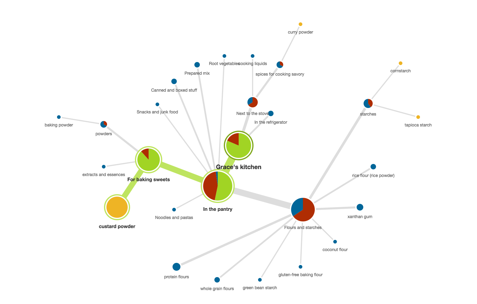
Tree testing is an effective technique for evaluating navigation and taxonomy. In an environment devoid of visual design and cues, tree tests are useful for assessing existing site navigation and proposed site structure changes. Using my kitchen, I devised a plan to test the findability of my kitchen’s spices and pantries.

Continue reading Could You Hand Me the Dry Rub Please?
Categories Findability, Search and Metadata1 Comment on Could You Hand Me the Dry Rub Please?
Card Sorting a Kitchen Taxonomy

Card Sorting a Kitchen Taxonomy

by: Grace G Lau  |  Posted on June 14, 2016February 9, 2020

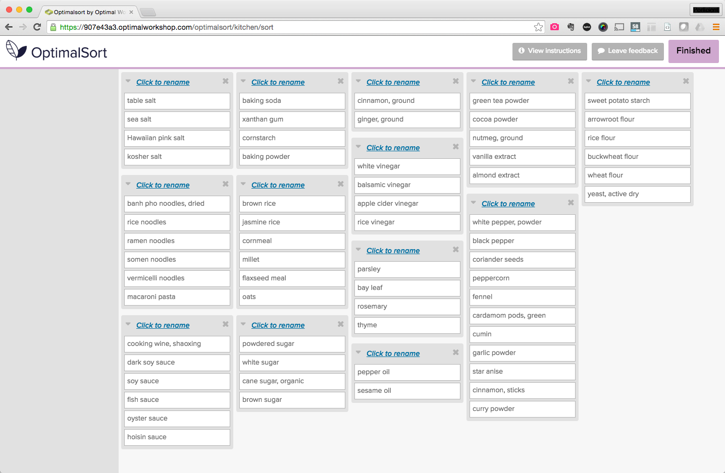
This is the fourth in a series of real-life examples of taxonomies found in my kitchen. Part 4 of “Taxonomy of Spices and Pantries” looks at how card sorting studies can inform a taxonomy.

  1. Building the business case for taxonomy
  2. Planning a taxonomy
  3. The many facets of taxonomy
  4. Card sorting a kitchen taxonomy
  5. Tree testing
  6. Taxonomy governance
  7. Best practices of enterprise taxonomies
The son raiding the refrigerator. Credit: Grace G Lau

Continue reading Card Sorting a Kitchen Taxonomy

Categories Findability, Search and Metadata

What UX Designers Need to Know about Conversion Rate Optimization

by: Guiseppe Getto  |  Posted on February 9, 2016September 26, 2017

Conversion is most often defined through sales, but it can also apply to clicks, sign-ups, repeat visitors, or any other metric that meets your organization’s goals.

The real problem many organizations face regarding conversion, is that content is often still considered “the stuff that goes into the design.” Putting content at center stage means changing some of the fundamental ways we think about content in the design process and how it helps conversion.

The principle of ‘form follows function’ states that the form of an object must be based on its intended purpose, and UX is no different. Since the primary function for any brand’s website is to engage, inform, and convert visitors into consumers, then the design of that website should be created primarily to support its content, or the “stuff” that has the greatest potential to engage, inform, and convert. The folks over at GatherContent, as well as several others, have begun calling this a “content first” approach.

From our viewpoint, content first doesn’t mean sacrificing design, or other elements of UX, but it does mean that content goals, which are often defined through business goals, should drive design. The elements of design—from the architecture and navigation to the look and feel to the code functionality and everything in between—are all components that come together to help the user reach their intended goals in the most efficient and enjoyable way possible.

Both CRO and UX should be about helping people reach their goals. That’s how you convert. You give people what they weren’t even sure they were looking for.

But how do you do that?

Continue reading What UX Designers Need to Know about Conversion Rate Optimization

Categories Content Strategy, Search and Metadata2 Comments on What UX Designers Need to Know about Conversion Rate Optimization
The Many Facets of Taxonomy

The Many Facets of Taxonomy

by: Grace G Lau  |  Posted on February 2, 2016February 9, 2020

This is the third in a series that has become real-life examples of taxonomies found in my kitchen. Part 3 of “Taxonomy of Spices and Pantries” looks at where and how facets can be used as multiple categories for content.

  1. Building the business case for taxonomy
  2. Planning a taxonomy
  3. The many facets of taxonomy
  4. Card sorting a kitchen taxonomy
  5. Tree testing
  6. Taxonomy governance
  7. Best practices of enterprise taxonomies

Using my disorganized kitchen as an analogy, I outlined in part 1 the business reasons why a kitchen redesign needed to focus on taxonomy. I’ve moved often and content migration gets pretty ugly in the pantry. After a while, content creators are quick to stuff things into the nearest crammable crevice (until we move again and the IA is called upon to reorganize).

In part 2, I started planning and outlining the scope of this kitchen taxonomy project. Who are its users and core stakeholders? How do they move around the kitchen? What content in this domain would be covered in this taxonomy and where do we draw the line?

However, a simple list of pantry and spice categories is not enough to demonstrate the potential of taxonomies. A neatly organized spice drawer doesn’t represent a sound taxonomy unless there lies some underlying understanding of how the spices are used and in what context.

Continue reading The Many Facets of Taxonomy

Categories Findability, Search and Metadata2 Comments on The Many Facets of Taxonomy
Planning a Taxonomy Project

Planning a Taxonomy Project

by: Grace G Lau  |  Posted on October 20, 2015September 26, 2017

This is part 2 of “Taxonomy of Spices and Pantries,” in which I will be exploring the what, why, and how of taxonomy planning, design, and implementation:

  1. Building the business case for taxonomy
  2. Planning a taxonomy
  3. The many facets of taxonomy
  4. Card sorting
  5. Tree testing
  6. Taxonomy governance
  7. Best practices of enterprise taxonomies

In part 1, I enumerated the business reasons for a taxonomy focus in a site redesign and gave a fun way to explain taxonomy. The kitchen isn’t going to organize itself, so the analogy continues.

I’ve moved every couple of years and it shows in the kitchen. Half-used containers of ground pepper. Scattered bags of star anise. Multiple bags of ground and whole cumin. After a while, people are quick to stuff things into the nearest crammable crevice (until we move again and the IA is called upon to organize the kitchen).

Planning a taxonomy covers the same questions as planning any UX project. Understanding the users and their tasks and needs is a foundation for all things UX.  This article will go through the questions you should consider when planning a kitchen, er, um…, a taxonomy project.

Continue reading Planning a Taxonomy Project

Categories Findability, Search and Metadata

Building the Business Case for Taxonomy

by: Grace G Lau  |  Posted on September 1, 2015September 26, 2017

XKCD comic strip about not being able to name all seven dwarfs from Snow White.

How often have you found yourself on an ill-defined site redesign project? You know, the ones that you end up redesigning and restructuring every few years as you add new content. Or perhaps you spin up a new microsite because the new product/solution doesn’t fit in with the current structure, not because you want to create a new experience around it. Maybe your site has vaguely labelled navigation buckets like “More Magic”—which is essentially your junk drawer, your “everything else.”

Your top concerns on such projects are:

  • You can’t find anything.
  • Your users can’t find anything.
  • The navigation isn’t consistent.
  • You have too much content.

Your hopeful answer to everything is to rely on an external search engine, not the one that’s on your site. Google will find everything for you.

A typical site redesign project might include refreshing the visual design, considering the best interaction practices, and conducting usability testing. But what’s missing? Creating the taxonomy.

“Taxonomy is just tagging, right? Sharepoint/AEM has it—we’re covered!”

In the coming months, I will be exploring the what, why, and how of taxonomy planning, design, and implementation:

  1. Building the business case for taxonomy
  2. Planning a taxonomy
  3. The many facets of taxonomy
  4. Card sorting
  5. Tree testing
  6. Taxonomy governance
  7. Best practices of enterprise taxonomies

Are you ready?

Continue reading Building the Business Case for Taxonomy

Categories Findability, Search and Metadata9 Comments on Building the Business Case for Taxonomy

Novices Orienteer, Experts Teleport

by: Tyler Tate  |  Posted on April 20, 2011April 10, 2014

Would you rather take a photo using your phone, a point-and-shoot camera, or a digital SLR? How you answer this question is probably a good indicator of your photographic expertise. If you snap casual shots, your phone or a point-and-shoot camera will probably suffice. If you’re a professional photographer, on the other hand, you probably prefer using an SLR that gives you control over the focus, aperture, and exposure.

Expertise significantly impacts how we seek information online. Just as novice and expert photographers prefer different tools, so novices and experts behave differently when searching for information. Understanding these differences will help us design better search interfaces for both groups of users.

There are experts, and then there are experts

User expertise exists on two levels. If you’re an avid photographer, your domain expertise in photography will be quite high: that is, you’ll be familiar with the terms and techniques of the trade. Each of us is likely a domain expert in a few areas, and a complete novice in others. A second aspect is technical expertise. Familiarity with how computers, the internet, and search engines work significantly impacts how users seek information. Consider these personifications of each quadrant of expertise:

Image 1 - Quadrant comparing domain versus technical expertise

* *Angela Baer*, since completing her MFA at Pratt 5 years ago, is quickly building a reputation as one of New York’s up-and-coming fashion photographers. In the office connected to her studio, Angela edits her photographs on two large monitors and top-end computer. She delivers the edited shoots electronically to her clients, and regularly updates her online portfolio and blog. Angela is highly proficient using her computer, and when it comes to photography, she’s a domain expert.

* Though officially retiring over 10 years ago after a successful career in banking, *William Hayes* still sits on the board of a number of financial institutions. From his Elizabethan cottage on the Kent coast, he uses a 5-year old computer to exchange emails and access financial reports, though he prefers doing business on the phone and keeping up with the world though The Financial Times. While William is a domain expert when it comes to finance, his technical expertise is lacking.

* 18-year-old *Fane Tomescu* helps run an internet cafe in Braşov, Romania. Having saved for over a year, Fane recently came across a car that he’s considering purchasing. But when the time came to arrange car insurance, Fane had no clue how things worked. He asked his parents and friends for advice, and then spent several hours comparing providers online. Fane is a technical expert, but when it comes to insurance, he’s a domain novice.

* *Claire Jones* is a 9-year-old from Colorado Springs. Her school is holding a science fair and Claire has decided to build a model of the solar system using styrofoam balls suspended with string. Having left her science textbook in her locker over the weekend she was meant to start building the model, Claire used the internet to lookup information on the order, size, and appearance of each planet. Though she did eventually find what she was looking for (with her parents help), Claire would be considered both a technical and a domain novice.

While either dimension of expertise is valuable, users are most likely to succeed when both are present. There are, however, a number of design guidelines which can help both novices and experts succeed in their pursuit of knowledge.

Novices Orienteer

Image 2: An orienteer at the 2010 World Orienteering Championships in Trondheim, Norway. Photo by Torben Utzon.

Image 2: An orienteer at the 2010 World Orienteering Championships in Trondheim, Norway. Photo by Torben Utzon.

Wayfinding is a challenge as old as humankind, but the discipline of orienteering originated in the Swedish military in the 1800s and is now a sport practiced throughout Scandinavia. Equipped with a map and compass, participants navigate between control points spread across many miles, making tradeoffs between distance and difficult terrain as they strive to complete the course in the shortest amount of time.

The strategies employed by novice users seeking information resemble the sport of orienteering. [1] Users with low levels of domain and technical expertise, typified by Claire Jones, share three main characteristics.

Short queries

Novices tend to enter queries that use about half as many words as experts.[2] Domain novices (like both Claire and Fane Tomescu), feel particularly unsure of which terms to use.

Many queries

Novices perform more queries than experts, but look at fewer documents. Although they frequently reformulate their query, technical novices often suffer from an anchoring bias [3] and make only small, inconsequential changes.

Going back

Novices are much more likely than experts to hit dead ends and seek to get back to a previous state.

These behaviours result in an orienteering-like strategy where novices “test the waters” with a short, general query, quickly skim the top results returned, and immediately reformulate the query based on their improved knowledge of the subject. [4]

Design considerations for Novices

There are a number of design considerations which can help novice users succeed at orienteering. In particular, novices need help formulating their query, refining their query, and backing out of trouble.

Autosuggest

As-you-type suggestions can help users get off on the right foot when they’re uncertain what to search for. Research has shown [3] that users are more capable of choosing a viable option from a list than they are of composing a question out of thin air. Autosuggest provides an opportunity to help users express specific terms (such as airports or stocks), and to suggest queries that other users have performed in the past.

Image 3: Autosuggest on Etsy.com

Related searches

After users have performed an initial search, they may still need help refining the query. A list of related searches can help the user break out of their anchoring bias and help them arrive at the optimal set of results.

Image 4: Foodily.com place related searches on the same line as breadcrumbs.
Image 4: Foodily.com place related searches on the same line as breadcrumbs

Avoid zero results

If the user is presented with no search results, he may be disheartened enough to give up his quest. Avoid zero-result screens if possible. Tools such as automatic spelling corrections and query expansion (using synonyms and lemmatisation,[5] for instance) can help.

Image 5: Amazon.com's handling of zero results
Image 5: Amazon.com’s handling of zero results

Breadcrumbs

Because novices tend to take wrong turns, they often need help navigating back to a previous state. Breadcrumbs are an ideal solution because they communicate both the user’s current location, as well as how to go back.

Image 6: Breadcrumbs on Zappos.com

Experts Teleport

Image 7: In Star Trek, crew members of the USS Enterprise stand on transporter platforms to be beamed down to a nearby planet.

Image 7: In Star Trek, crew members of the USS Enterprise stand on transporter platforms to be beamed down to a nearby planet.

While novices orienteer, experts teleport. Akin to being teleported to a precise but distant location, users with high domain and technical expertise like Angela Baer tend to jump directly to their final destination.

Longer queries

Experts enter longer, more specific queries than novices. Domain experts like William Hayes often rely on their vocabulary of specific terminology, while technical experts such as Fane Tomescu are more likely than novices to use formatting techniques such as quotation marks in their queries (87% of experts compared with 47% of novices according to a 2000 study [1]).

Fewer queries

Experts usually amend their queries less often than novices and move forward with a higher degree of confidence.

More Documents Examined

Experts tend to review more documents and follow a greater number of links within those documents. Domain experts are especially adept at quickly determining whether or not a given document is useful.

In essence, experts often construct queries using numerous highly specific words which act to teleport [6] them directly to a destination, cutting out the query reformulation often practiced by novices. After having arrived at a destination, experts are then likely to explore the surrounding territory.

Design considerations for Experts

Designing for experts involves facilitating their teleporting behaviour, helping them get to their destination as quickly as possible.

Advanced syntax

Technical experts like Fane are often willing to learn special commands in exchange for having greater control. Commonly supported operators include AND, OR, and quotes for searching for exact phrases.

Image 8: Wolfram Alpha is designed to understand domain-specific terminology and return computed answers.

Keyboard shortcuts

Keyboard shortcuts can also increase the speed of interaction. Google, for instance, allows users to press the up/down arrow keys on the keyboard to traverse results, and press return to go to the URL of the selected result.

Image 9: Google places a caret beside the currently-selected result.

Filtering & sorting

Experts are more likely to engage with advanced sort and filtering controls than novices, including operations such as selecting ranges, filtering by format, or excluding certain terms (e.g. everything that includes “apples” but does not mention “oranges”).

Image 10: Getty Image's Moodstream lets users search for stock photos using sliders.
Image 10: Getty Image’s Moodstream lets users search for stock photos using sliders.

As-you-type results

As-you-type completion interfaces most often display query suggestions to users. However, another use case is to present actual results in the autocompletion interface, enabling users to skip the search results screen altogether and go directly to a specific document.

Image 11: Rather than suggesting terms to search for, Nutshell returns search results directly without needing to go to a separate page.

Result table of contents

Providing links to the top destinations within a result can reduce the number of steps required for the expert to reach his destination.

Image 12: Google sometimes provides links to the top-level pages within a given site.

Yin and Yang

While novices and experts practice two very different approaches to information seeking, it’s important not to overemphasis one at the expense of the other. As illustrated by the ancient Chinese symbol, understanding the behaviour of both novices and experts can help us design more informed, balanced search experiences.

The author would like to thank Cennydd Bowles for organising the UK writer’s retreat during which this article was written, as well as for the editorial guidance that he provided.

References

[1] Vicki L. O’Day and Robin Jeffries; “Orienteering in an Information Landscape”:http://www.hpl.hp.com/techreports/92/HPL-92-127.pdf

[2] Christoph Hölscher & Gerhard Strube; “Web Search Behavior of Internet Experts and Newbies”:http://www9.org/w9cdrom/81/81.html

[3] Marti A Hearst; “Search User Interfaces”:http://searchuserinterfaces.com/book/sui_ch3_models_of_information_seeking.html#section_3.5

[4] Morten Hertzum and Erik Frokjaer; “Browsing and Querying in Online Documentation”:http://www.cparity.com/projects/AcmClassification/samples/230570.pdf

[5] Christopher D. Manning, Prabhakar Raghavan and Hinrich Schütze, “Introduction to Information Retrieval”:http://www.cambridge.org/us/knowledge/location/?site_locale=en_US , Cambridge University Press. 2008.

[6] Jaime Teevan, Christine Alvarado, Mark S. Ackerman and David R. Karger; “The Perfect Search Engine is Not Enough”:http://people.csail.mit.edu/teevan/work/publications/papers/chi04.pdf

Categories Design Principles, Interactivity, Search and Metadata, Usercentric4 Comments on Novices Orienteer, Experts Teleport

Faceted Finding with Super-Powered Breadcrumbs

by: Greg Nudelman  |  Posted on April 9, 2010

Most of the today’s finding interfaces do not support integrated finding effectively, often creating disparate search and browse user interfaces that confound people with a jumble of controls competing for their attention.

In this article, I propose the Integrated Faceted Breadcrumb (IFB) design that integrates the power of faceted refinement with the intuitive query expansion afforded by browse. Although other breadcrumb-based finding interfaces currently exist, they fall short of expectations by ignoring design best practices. At best, the breadcrumb is stuck in a role of a side-kick, forced to eke out meager screen real estate along-side more powerful finding controls.

In contrast, breadcrumb is the superhero of the IFB design, dealing a decisive blow to many usability issues that plague today’s finding interfaces. To prove this point, I did what we do best – I tested my hypothesis. Twelve evaluators found IFB to be easy to use, intuitive and resourceful for solving complex finding tasks which would be difficult to accomplish using more conventional faceted search interfaces.

The Challenge of Integrated Finding

In his recent UIE webinar, Peter Morville lauded the advantages of integrated finding: “Browse and Search work best in tandem… the best finding interfaces achieve a balance, letting users move fluidly between browsing and searching.”1

Unfortunately, most sites today do not integrate faceted search and browse effectively. For example, Walmart.com approaches browse and search using two different interfaces creating a jumble of duplicate controls that overwhelm the customer, making the site more difficult to use, as shown in Figure 1.

Walmart

Figure 1. Disjointed finding mechanisms for faceted search and browse on Walmart.com

A veritable cornucopia of filters, links and options on Walmart.com make it unlikely that the customers will be able to duplicate the search successfully or efficiently discover related items and content. Duplicate finding methods also create a problem for natural search, because each finding page exists only within the context of the specific session.

Achieving “flexible navigation, seamless integration of browsing with directed (keyword) search, fluid alternation between refining and expanding, avoidance of empty results sets, and at all times allowing the user to retain a feeling of control and understanding” are “overarching design goals” of faceted finding, says Marti Hearst in Chapter 8 of her Search User Interfaces book.2

Integrated Faceted Breadcrumb (IFB) Design

To meet the search and browse integration challenges, I propose the Integrated Faceted Breadcrumb (IFB) design solution. A wireframe of the recommended Walmart.com UI redesign that uses the Integrated Faceted Breadcrumb is shown in Figure 2.

Wireframe of Walmart.com redesigned using Integrated Faceted Breadcrumb (IFB)

Figure 2. Wireframe of Walmart.com redesigned using Integrated Faceted Breadcrumb (IFB)

Breadcrumbs are simple, intuitive, flexible and resourceful. As Jacob Nielsen, states in his 2007 Alertbox, Breadcrumb Navigation Increasingly Useful: “Breadcrumbs show people their current location relative to higher-level concepts, helping them understand where they are in relation to the rest of the site. Breadcrumbs afford one-click access to higher site levels and thus rescue users who parachute into very specific but inappropriate destinations through search or deep links. Breadcrumbs never cause problems in user testing… people… never misinterpret breadcrumb trails or have trouble operating them.”3

Preliminary Usability Evaluation of the Integrated Faceted Breadcrumb

Findings from the early usability testing of the Integrated Faceted Breadcrumb design using a linked HTML prototype are very promising. Using a simple, 8-page HTML prototype, I tested several variations of this design with 12 current users of popular e-commerce interfaces, people of various genders, ages and backgrounds.

Evaluators were able to quickly grasp the range of possible interactions and use the interface effectively to solve complex finding tasks which would be difficult to accomplish with the existing faceted search interface. Most evaluators found IFB design intuitive because it makes liberal use of the existing mental models for breadcrumbs and faceted search. 

The participants’ confidence and ability to accurately predict system behavior was also observed to be very high after just 1-2 simple tasks; this indicates a fairly short learning curve for IFB design. Although no formal studies comparing the performance of someone using IFB vs. existing faceted finding solutions have yet been conducted, IFB design was strongly preferred by the participants when compared with the existing Walmart.com faceted search design for certain kinds of finding tasks.

Early usability tests show that Integrated Faceted Breadcrumb (IFB) design provides many benefits over most conventional faceted search designs:

  1. Short learning curve: familiar links and drop-downs make this control fairly intuitive. People who previously used a breadcrumb can operate IFB effectively.
  2. Efficiency: combining breadcrumb and facets into one control makes very efficient use of limited screen real estate and greatly reduces clutter caused by duplication of controls.
  3. Unlimited Access: Combined search and browse allow unrestricted access to any page that pertains to the current query.
  4. Integration: fully integrates landing pages, brand catalogs and category pages into the faceted search hierarchy. There is one prominent place on the screen to see where you are and access all the navigation tools right where they are needed.
  5. Flexibility: customers can switch from search to browse and back again as best fits their needs at each stage of the finding process.
  6. Resourcefulness: provides opportunities to widen the search and access complimentary products and services related to the current query.

What makes Integrated Faceted Breadcrumb (IFB) different

In his 2009 UIE webinar, Faceted Search: Designing Your Content, Navigation, and User Interface 4, Daniel Tunkelang stated that most breadcrumb-based finding interfaces are not intuitive, nor easy to use. What makes Integrated Faceted Breadcrumb (IFB) design different? I believe Integrated Finding Breadcrumb design is more intuitive and resourceful than other faceted breadcrumb solutions due to the following key design recommendations made based on several years of designing and researching finding interfaces:

  1. Combine hierarchical Location & Attribute breadcrumbs
  2. Use Change instead of Set-Remove-Set
  3. Automatically retain relevant query information
  4. Label breadcrumb aspects
  5. Make it clear how to start a new search
  6. Allow direct keyword manipulation.

In the following sections, I discuss these design recommendations and explain how Integrated Faceted Breadcrumb compares with some existing faceted breadcrumb solutions. Whether or not the reader decides to adopt all or some part of IFB in their own finding interface designs, I hope the following sections will prove to be a good resource for discussion and further exploration of integrated finding UI designs.

1. Combine Hierarchical Location & Attribute breadcrumbs

In 2002, information architect Keith Instone cataloged the three types of breadcrumbs in his 3rd Annual IA Summit poster with a revealing title: Location, Path & Attribute breadcrumbs.5 In faceted search interfaces, Attribute breadcrumbs commonly convey applied facet values such as price, category, style and brand. Most commonly, Attribute breadcrumbs are Path breadcrumbs, displaying facet values in the order they were applied by the customer to reach the current set of search results. Attribute-Path breadcrumb UI on the Ariba Discovery Network is shown in Figure 3.

Attribute-Path breadcrumb in the Ariba Discovery Network UI

Figure 3. Attribute-Path breadcrumb in the Ariba Discovery Network UI

Unfortunately, Attribute-Path breadcrumb is not resourceful from the standpoint of integrating search and browse and helping people find related content:

  1. Temporal breadcrumb cannot be used to effectively link and anchor categories, landing pages, brand catalogs and other browse pages, precisely because it is carrying all of the attribute history instead.
  2. Temporal breadcrumb cannot be used to effectively show the customer where they can go because instead it is busy showing them where they’ve been.
  3. Pages with Temporal breadcrumbs cannot be effectively linked by natural search, because people creating different URLs each time the content is accessed.
  4. When the query changes, attributes appear to “randomly” jump around on the breadcrumb.

In contrast, Location breadcrumbs are hierarchical: they do not deal with where the person has been, only with where within the site’s organization they are right now. Hierarchies are very helpful in a wide range of finding and navigating tasks and provide an intuitive way to manage complexity and access resources.

How do we determine the hierarchy of Attributes? My research led me to believe that most people find it intuitive when the Attribute-Location breadcrumb simply replicates the order in which un-selected facets are presented (most typically in the left nav bar). Replicating the order in which un-selected facets appear also provides an effective way to integrate search and browse by treating the Category as just another Attribute in the breadcrumb. In vast majority of finding interfaces, Category appears first in the left nav bar, which places any applied “browse” Category Attributes in front of the applied faceted search values.

Un-selected facets in the left nav bar on Amazon.com

Figure 4. Un-selected facets in the left nav bar on Amazon.com

Most of the people found the Integrated Faceted Breadcrumb hierarchy straightforward and intuitive and were able to confidently and accurately predict the expected system behavior for complex filtering tasks that involved applying, removing and changing filter values, after spending only a few minutes working with the system.

2. Use Change instead of Set-Remove-Set

Overstock set-remove-set implemented via checkboxes

Figure 5. Overstock set-remove-set implemented via checkboxes

Applied aspects are removed from the breadcrumb by un-checking the checkbox next to the applied aspect in the breadcrumb. For most people, set-remove-set interaction conflicts with their mental model. As one of my evaluators stated: “This feels like having to turn off the radio every time I want to change the station.”

Instead of removing Canon in order to select Nikon, most people think in terms of simply changing Canon to Nikon, which can be accomplished most readily with a drop-down control. The drop-down is more intuitive than a typical remove mechanism, as it allows the user to discover all of the navigation options available from the parent facet or category. This idea was first introduced by Luke Wroblewski in his excellent book Site Seeing: a Visual Approach to Web Usability.6 One of the sites that implement drop down in the breadcrumb is Edmunds.com, shown in Figure 6.

Edmunds breadcrumb with drop down options

Figure 6. Edmunds breadcrumb with drop down options

In my testing, vast majority of people preferred this design to a more common set-remove-set paradigm and found it very intuitive and effective.

3. Automatically retain relevant query information

In my research, I found that people seldom want to start the query over completely from scratch, unless they specifically indicated this action. Instead, they wanted to retain as much of the query as possible with every change of the facet values, and expect the system to help them construct a query that “makes sense”, gracefully dropping facet selections that no longer apply to their new query.

Unfortunately, few sites today implement this function well. For example, changing the model from Mustang to Fusion does not retain the year selection of 2005, as most people would expect. Instead, as shown in Figure 7, Edmunds.com resets the model year to the current year, 2010, which simply disappears from the breadcrumb.

Changing aspect values drops useful query information on Edmunds.com
Figure 7. Changing aspect values drops useful query information on Edmunds.com

I found that a more resourceful system behavior is to retain any relevant attribute values that apply to the new query, preferably in way that always produces some search results.

Figure 8 shows how Integrated Faceted Breadcrumb design handles the change in the Product Type from Digital Cameras to Lenses, retaining the Brand and Keywords aspect, while dropping the Camera Resolution aspect (as it does not apply to Lenses).

Integrated Faceted Breadcrumb retains relevant query information

Figure 8. Integrated Faceted Breadcrumb retains relevant query information

Retaining aspects that apply to the updated query allows the customer to concentrate on their finding goals, while the system takes care of the details.

What if the person really wanted to browse just the Lenses Product Type? My testing showed that most people found it very intuitive to click the Lenses link in order to navigate to the Lenses Product Type landing page. The result of combining drop-down control functionality with the existing breadcrumb link interaction gives us a powerful, intuitive, flexible finding control.

What if instead of browsing, someone wanted to remove a single applied aspect from a breadcrumb, leaving the rest of the query intact? My research showed that most people found it easy and intuitive to navigate to the drop down and select “See All” option Integrated Faceted Breadcrumb design provides at the #1 position in the drop-down, as shown in Figure 9.

Integrated Faceted Breadcrumb makes aspect removal intuitive

Figure 9. Integrated Faceted Breadcrumb makes aspect removal intuitive

4. Label Breadcrumb Aspects

In Design Cop-out #2: Breadcrumbs7, Jared Spool mentions that the biggest problem with breadcrumbs is “the lack of scent” and that “the wording of the individual trail elements becomes very important.”

While most applications simply display the applied aspects in the breadcrumb, my research shows that labeling each of the applied aspects with the aspects name adds a great deal of information scent. The resulting IFB “breadcrumb tiles” (shown in Figure 9) display relevant aspect labels which help customers make sense of their queries and orient themselves quickly if they find the page through natural search.

5. Make it clear how to start a new search

Ariba interface in Figure 3 has a single search box which retains the original keywords, in a manner similar to Google. Unfortunately, any keyword change drops all of the applied aspects and filters launching a new keyword-only search. This is obviously not very resourceful, as we are trying to retain as much of the query as possible for reasons explained above.

In contrast, Integrated Faceted Breadcrumb (IFB) provides a dedicated “New Search” button on the Home breadcrumb tile. As shown in Figure 10, clicking the “New Search” button removes all aspects and keywords, resetting the breadcrumb to the full-screen text box, reminding many evaluators of the simplicity of the Google search.

“New Search” in the Integrated Faceted Breadcrumb (IFB) interface

Figure 10. “New Search” in the Integrated Faceted Breadcrumb (IFB) interface

Resetting is accomplished via an HTML layer or similar device so that the rest of the content on the page does not change. This way, the search box can reset almost instantaneously, perhaps even with an elegant animated transition.

6. Allow Direct Keyword Manipulation

Many faceted search interfaces like Overstock.com pictured in Figure 11, have two search boxes: one to “search within” the existing query, and one to start over with a new keyword-only search. Having two search boxes takes up precious screen real estate and increases the potential for confusion. Worse yet, the customer can not directly modify their keyword query after the search is executed, because the system converts all the keywords into an aspect which cannot be modified, only removed in its entirety.

 Overstock.com does not allow direct manipulation of the keyword query
Figure 11. Overstock.com does not allow direct manipulation of the keyword query

In his seminal book, Designing the user interface: Strategies for effective human-computer interaction8, Ben Shneiderman describes direct manipulation is one of the key HCI design principles. Integrated Faceted Breadcrumb (IFB) provides direct keyword query manipulation with the dynamic editable Keywords Aspect shown in Figure 12.

Direct query keyword manipulation in IFB

Figure 12. Direct query keyword manipulation in IFB

At the start of a finding session, the search box starts out fully expanded across the entire width of the page. When the customer types in some keywords, they are retained in the search box for easy editing or keyword addition, as shown in Figure 12-A. If the customer selects one or more facets, they are always added according to their respective hierarchy in front of the search box. As more aspects are added, the keyword box gets progressively smaller, until it reaches some reasonable minimum size as shown in Figure 12-B.

If sill more facets are applied at this point, a scroll arrow appears immediately after the Home facet, allowing customers to scroll only the applied aspects in the manner of a carousel control, without ever hiding the Home facet or the search box, as shown in Figure 12-C. IFB dynamic editable Keywords Aspect design proved to be very successful with our evaluators who found it intuitive, resourceful and easy to use.

Conclusion

Bruce Sterling, in his brilliant and entertaining book Shaping Things9, mentions Raymond Lowey and his very useful acronym MAYA. Faceted breadcrumb designs have only recently began to move out of being Most Advanced (the domain of academics and computer geeks) and toward becoming Acceptable to the general internet public.

Faceted breadcrumb holds in my opinion the promise to become the key component in the next generation of intuitive finding interfaces that fully integrate the best of faceted search and browse capabilities. I hope this article will assist anyone designing a faceted finding interface and helps move faceted breadcrumb designs, like the Integrated Faceted Breadcrumb, one step closer to the edge of MAYA, helping make resourceful integrated finding a commonplace reality. I look forward to continuing the discussion of IFB in the article comments thread and on Twitter “@DesignCaffeine”:http://twitter.com/designcaffeine.

References

1 “Search UI Patterns”:http://www.slideshare.net/UIEpreviews/search-discovery-patterns-a-uie-virtual-seminar

2 “Search User Interfaces”:http://searchuserinterfaces.com/book/sui_ch8_navigation_and_search.html book.

3“Alertbox, Breadcrumb Navigation Increasingly Useful”:http://www.useit.com/alertbox/breadcrumbs.html

4 2009 UIE webinar “Faceted Search: Designing Your Content, Navigation, and User Interface”:http://www.uie.com/events/virtual_seminars/facets/

5 “Location, Path & Attribute breadcrumbs”:http://instone.org/files/KEI-Breadcrumbs-IAS.pdf

6“Site Seeing: a Visual Approach to Web Usability”:http://www.lukew.com/resources/site_seeing.asp

7“Design Cop-out #2: Breadcrumbs”:http://www.uie.com/articles/breadcrumbs

8 “Designing the user interface: Strategies for effective human-computer interaction”:http://www.aw-bc.com/dtui/

9 “Shaping Things”:http://mitpress.mit.edu/catalog/item/default.asp?tid=10603&ttype=2

Categories Interactivity, Interfaces, Search and Metadata10 Comments on Faceted Finding with Super-Powered Breadcrumbs

Posts navigation

Page 1 Page 2 Page 3 Next page

Follow & Subscribe

LinkedIn | Facebook | Twitter | RSS


Authors | About Us | Contact Us | Rights & Permissions | Sign-in


Boxes and Arrows 2001-17, Boxes and Arrows LLC 2017-18 - All Rights Reserved