This article is the fourth in a series sharing a design framework for dashboards and portals.
Part 2 of the series, “Building Block Definitions (Containers)” described the Container components of the Building Block system in detail.
Part 4 describes the Connector Components in detail.
Overview of the Connector Blocks
The building block system includes several types of Connectors that make it possible for designers and architects to link the different areas of a Dashboard together via a consistent, easily understandable navigation model. The system also ensures the resulting information architecture can grow in response to changing needs and content. There’s no special stacking hierarchy for the Connectors. However, they do have an official stacking size (most are size 3) in order to keep Dashboards constructed with the building blocks internally consistent.
The defined Connectors are:
- Control Bar
- Section Connector
- Page Connector
- Dashboard Connector
- Crosswalk Connector
- Contextual Crosswalk Connector
- Utility Navigation
- Geography Selector
Control Bars allow access to deeper collections of similar blocks, such as Tile Groups and Tiles offering narrowly focused content. Section, Page, and Dashboard Connectors offer hierarchically driven navigation paths between larger Containers. Crosswalk Connectors and Contextual Crosswalks extend the capabilities of the default Building Blocks navigation model to include links that express context-driven associative relationships between Containers, regardless of their location within the Dashboard or Portal structure. Combinations of Connectors provide the familiar patterns of paths from a user’s current location to higher or broader levels of the Dashboard, links to items at the same level, links to contextually related items at all levels, etc.
Container Definitions
Each Connector definition includes:
- Mandatory components
- Optional components
- Stacking size
- Detailed description
- Example rendering (for illustrative purposes only)
- Rendering description
Control Bar definition
Mandatory components: Controls for manipulating Container content
Optional components: None
Stacking size: special – can be attached to Tiles, Tile Groups, or Views
Control Bar description
A Control Bar increases the amount of content offered by a Tile, Tile Group, or View by giving users the ability to change the content displayed within the block. Designers attach a Control Bar to a block to increase the effective depth (or scope) of the block’s content. Control Bars allow dashboard designers to increase the depth of a new or existing Container block without increasing the on-screen size of the block or creating a large number of very similar blocks.
One common way of using Control Bars is to allow users to perform repeated tasks on one object that is a member of a group of similar objects. For example, a Tile that allows users to approve or reject purchase orders for one operating unit could be augmented with the addition of a Control Bar. The Control Bar will expand the scope of purchase order approval functionality by allowing the user to choose one or more operating units from a list of all available operating units. The approval functionality itself should appear and remain within the Tile, though the scope may expand with successive revisions of the Tile.
Another common use for Control Bars is to provide tools for choosing different combinations of data parameters for display within a block, such as selecting a single item for focus (or rendering of available data) from a list of many other items of the same type, shifting the start or end dates for a time period, changing a measurement unit or referencing an axis for comparison.
The controls – buttons, sliders, actuators, etc. – in a Control Bar are often rendered as standard form elements such as radio buttons or select lists, or hyperlinks. They could just as easily appear as custom scripted elements, applets, or AJAX / RIA delivered sliders. The types and styles of controls presented should be driven by the guidelines of good user experience design. And perhaps your budget!
A primary benefit of Control Bars is to reduce the total number of blocks necessary for a dashboard – though they do increase the complexity of individual blocks – thereby lowering overall development costs and saving valuable screen real estate. For example, consider a single product that is part of a family of fifteen related products: placing a Control Bar on a Tile that shows the inventory for one of those products allows users to change between displaying the same kind of inventory data for any product in the family, instead of simultaneously displaying fifteen separate Tiles with the same inventory data for all the different products in the family. Control Bars also work well when users need to compare metrics, items, or groups of metrics or items, in a side-by side fashion.
Control Bars attached to stacked blocks retain their functionality. Stacking Containers with attached Control Bars can lead to complex possible permutations of scope and depth for block content. Explore the potential combinations and permutations carefully, especially in regards to security and access rights. Control Bars should not replace functionality already located within a block, or serve as a means of combining wildly different sorts of content together into a single block that is incoherent or inconsistent. I recommend limiting the use of Control Bars to one per Container.
Example rendering:
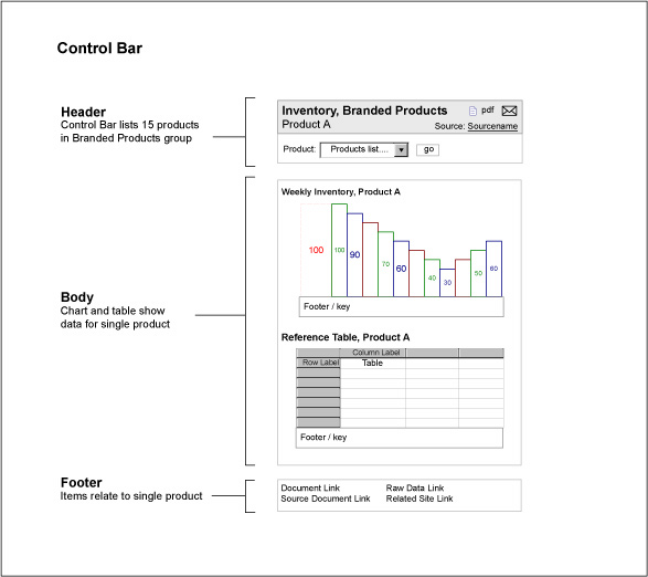
Figure 19: Example Control Bar
Rendering description
This rendering shows a Tile with attached Control Bar that allows users to shift the focus of the Tile to any of a list of fifteen individual products, chosen via the select list shown. When the user chooses a product, the contents of the Tile refresh to show weekly inventory data for the new product, as well as a reference table and associated documents and links for the same new product.
Page Connector definition
Mandatory components: links to all Pages in the parent Section
Optional components: None
Stacking size: 3
Page Connector description
The Page Connector links all the Pages stacked within a single Section of the Dashboard. The Page Connector typically appears on every Page within a Dashboard, though this is not required. As users navigate from Section to Section, the links in the Page Connector change to reflect the different Pages stacked in each Section. Of course, placing a Page Connector on any Page does not preclude creating other groups of links to other Pages located throughout the Dashboard. The Building Blocks are an open system – architects and designers should introduce additional (Free Form, within the view of the blocks) navigation models and mechanisms into the experience as needed.
Example rendering:
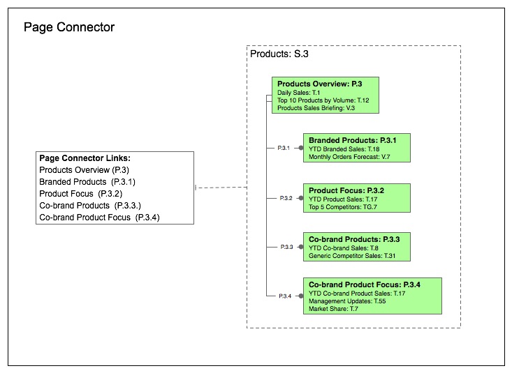
Figure 20: Example Page Connector
Rendering description
This rendering shows the navigation links to Pages appearing in a Page Connector for a Section titled Products, which contains a Section summary page and four other Pages.
Section Connector definition
Mandatory components: links to all Sections in the Dashboard
Optional components: link to Dashboard Home Page
Stacking size: 3
Section Connector description
The Section Connector is a high level Connector that provides a link to each Section making up the Dashboard. The Section Connector typically appears on every Page within the Dashboard, though this is not required. The Section Selector is akin to the ubiquitous global navigation element familiar from many web sites, though its actual content when displayed to a user will vary based on security settings or access rights. The links in the Section Connector should take users either to the Section Summary Page for that Section or to the chosen default Page within the Section. Include a link to any Dashboard Home Page in the Section Connector, especially if it offers unique content not available elsewhere in the dashboard.
Example rendering:
(click on image for larger view)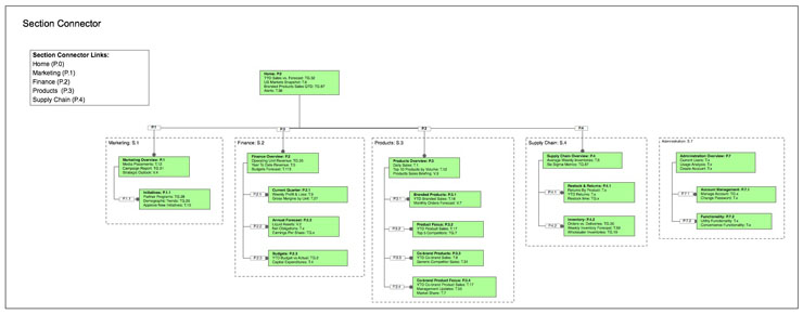
Figure 21: Example Section Connector
Rendering description
This rendering shows the navigation links to Section summary Pages appearing in a Section Connector for a Dashboard that includes a Home Page and five Sections. Four of the Sections are navigable via the Section Connector, the remaining fifth Section – S.5 Administration – is dedicated to administrative uses, and is not navigable or linked via the Section Connector.
Dashboard Connector definition
Mandatory components: links to each Dashboard in a Dashboard Suite
Optional components: None
Stacking size: 3
Dashboard Connector description
The Dashboard Connector allows users with access to two or more Dashboards within a Dashboard Suite to move quickly and directly amongst all the Dashboards they may access, without passing through multiple log-in or authentication interfaces. Dashboard Connectors typically appear on every Page of a Dashboard, though this is not required. The individual links in a Dashboard Connector often point to the Homepage for each listed Dashboard. A less-common linking behavior for Dashboard Connectors is to connect to the last visited Page in each linked Dashboard or to a default Page of the users choosing that is stored as a personalization preference. For administrators and maintenance staff, Dashboard Connectors can offer the same quick and direct access to the separate administrative areas of each Dashboard in a Suite.
Example Rendering:
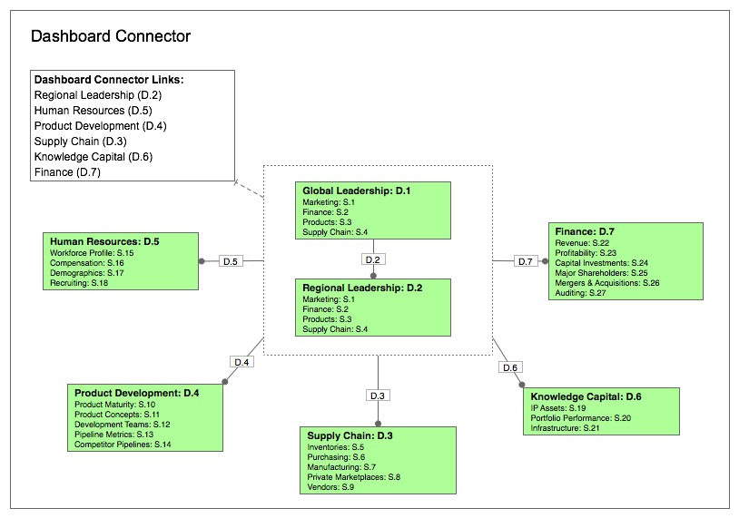
Figure 22: Example Dashboard Connector
Rendering description
This rendering shows the Dashboard links appearing in the Dashboard Connector for the Business Intelligence Suite described above.
Crosswalk Connector definition
Mandatory components: recurring item (link origin), destination building block
Optional components: None
Stacking size: None
Crosswalk Connector description
A Crosswalk Connector is a direct navigation path between individual building blocks, regardless of origin and destination locations in the Dashboard structure. Crosswalk Connectors provide a hub and spoke style path from many locations to a single destination, rather than a uniquely occurring link between two blocks. Crosswalks often take the form of a recurring name, term, or object that consistently links to another single building block offering content related to the linked item.
Common examples of Crosswalk Connectors include:
- product names linked to a summary Page or View of the identified product
- topic terms linked to a news aggregator or RSS aggregator block that shows recent items related to that topic
- competitor names linked to a profile snapshot or market intelligence block
- market or product family names linked to sales performance blocks
- colleague names linked to profile information blocks showing their role, responsibilities, and direct reports
Example rendering:
(click on image for larger view)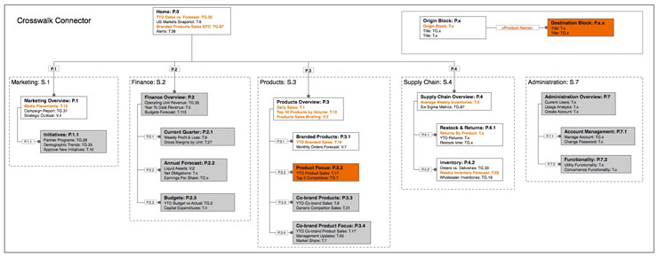
Figure 23: Example Crosswalk Connector
Rendering description
This rendering shows all the appearances of a Crosswalk Connector that links the instances of a product name to a destination Page in the Products Section (S.3) titled “Product Focus” (S.3.2), in this case a Page offering detailed information and tools related to a single product.
Contextual Crosswalk definition
Mandatory components: linked term (recurring item), origin contexts associative relationship, destination building blocks
Optional components: None
Stacking size: None
Contextual Crosswalk description
Contextual Crosswalks allow dashboard architects to create a direct link between blocks that is sensitive to context, instead of simply point to point. Contextual Crosswalks typically link a recurring item, such as a product name, to a destination block that varies based on the location of the originating link within the Dashboard’s information architecture. With a Contextual Crosswalk, the destination block of each occurrence of the product name is determined by the location or context of the link within the Dashboard structure; that is, by relying on the users current location to offer insight into the things they are most interested in seeing.
For example, each occurrence of a product name throughout a Dashboard could link either to a block offering inventory information for that product, or to a block offering sales information for competing products. When the product name is located in the Supply Chain section of the Dashboard, it would connect to the inventory block: when the product name is located in the Sales section, the link would connect to the competitor sales block.
Contextual Crosswalks are useful when Dashboards offer a substantial amount of content that addresses several different facets or aspects of an important and recurring topic, term or item. Contextual Crosswalks often appear in the form of a Page showing Views for an item, both of which are chosen via Control Bar to give users ready access to the other available collections of blocks matching the other origin contexts.
Keeping the broader principles of the Building Blocks in mind, it’s perfectly logical for Contextual Crosswalks to link from one of several Dashboards or Portals within a Dashboard Suite to another destination Dashboard.
While Contextual Crosswalks can express any kind of associative relationship, in practice, it’s best to define a limited set of types of Contextual Crosswalk in advance and apply them consistently across the Dashboard or Portal Suite. We know well that complex navigation models increase the work required for designers, developers, users and administrators. Prescribing the available set of Crosswalk Connectors (Contextual and standard) in advance will make it much easier to maintain consistent and easily understood navigation models.
Example rendering:
(click on image for larger view)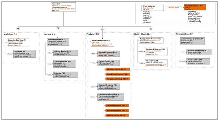
Figure 24: Example Contextual Crosswalk
Rendering description
This rendering shows the navigation paths for a Contextual Crosswalk that links from a number of different origin contexts (or locations) to one of a number of similar destinations within the Products Section of a medium-size Dashboard. The legend on the map identifies the origin contexts and destinations for the Contextual Crosswalk, as well as the linked term: a Product Name. In this case, the Contextual Crosswalk directly links product names in six possible origin contexts (Marketing, Finance, Supply Chain, etc.) with six matching briefings that provide detailed information on the status of a that same product. Those briefings appear as Views available from the Branded Product Focus Page (which contains the Marketing, Supply Chain, and Competitors briefings) or the Co-brand Product Focus Page (which contains the Customers, Regulatory, and Auditing briefings). After clicking the linked product name in the Supply Chain Section, a user navigates to the Branded Product Focus Page (P.3.2), which presents them with the Supply Chain Briefing (V.3.2.2).
Utility Navigation definition
Mandatory components: links to Dashboard Utility Functionality
Optional components: None
Stacking size: 3
Utility Navigation description
This Connector gives users consistent access to the most important utility functions and features for a Dashboard or Portal, gathering ubiquitous links to these necessary tools into a single building block. Utility Navigation should include links to any Utility Function that must be accessible from most or all Dashboard Sections or Pages.
Utility Navigation is typically considered to have a stacking size of 3, meaning it is placed at the Page level of the stacking hierarchy and not within individual Tiles, Tile Groups or Views. This approach is common practice in design settings and enterprise environments where standardized functionality is often supplied by or closely connected to externally defined services supplied via SOA – situations where some sort of dependency links the Dashboard or Portal to another system or environment.
Example rendering:
![]()
Figure 25: Example Utility Navigation
Rendering description
This Utility Navigation component uses icons to provide links to eight distinct Utility Functions, an enterprise directory, a news feed aggregator, managed documents (Resources), a calendar, enterprise search, KPI driven alerts, prioritized staff updates and personalization settings. As you review the illustrations and examples of Utility Navigation and the other Connectors, keep in mind that no rule from the Building Blocks system requires Utility Navigation to appear onscreen collected together in a single location (though good conceptual and practical reasons for doing so often apply). Likewise, the design decision about how to provide access and use – via icons, text, or other features – should be driven by the particulars of your project and user needs.
Recalling the example business intelligence dashboard designed with the Building Blocks system from Part 1, this illustration shows a Dashboard Page which includes several of the Connectors.
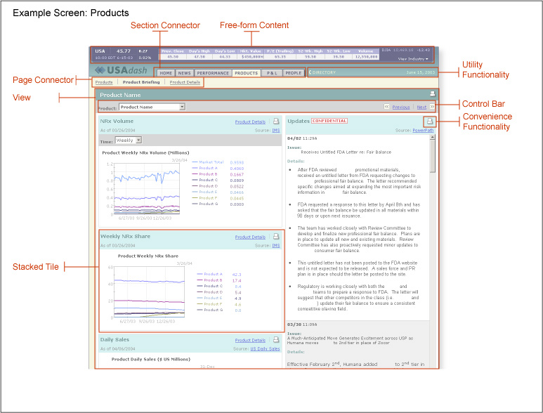
This Page includes a Section Connector, a Page Connector, a View and a Tile with attached Control Bars, Utility Navigation (labeled ‘Utility Functionality’ here) and Convenience Functionality (described in more detail in Part 5).
Geography Selector definition
Mandatory components: controls or links for shifting the geographic context of a Container
Optional components: None
Stacking size: special – can be attached to Tiles, Tile Groups, Views, or Pages.
Geography Selector description
The Geography Selector allows designers and architects to decouple the information architecture of a Dashboard from the shifting organizational structures based on geography that many enterprises rely on to understand the fundamentals of their activities. The Geography Selector presents users with controls or links allowing them to change the geographic reference point of a Container, while maintaining the structure of that Container. In the same way that Control Bars increase the depth of a Tile, Tile Group, or View, a Geography Selector increases the scope or depth of a Container while reducing the number of additional Containers to manage. For example, a Geography Selector might allow users the ability to change the focus of a sales activity chart located in a Tile from one US state to another.
Large enterprises often operate in or with reference to multiple states (or provinces, departments, etc.), regions, countries or even continents. These geographic concepts or schemes frequently differ from unit to unit within an enterprise. They often change dramatically from year to year to suit external environmental changes or internal reorganizations. Just as aligning a site map to an organization chart creates a brittle structure subject to disruption during reorganization, tying a Dashboard’s information architecture to an enterprise’s current geographic scheme is a recipe for frustration.
Some Geography Selectors allows users to choose from a single set of geographic units, such as states or counties, with respect to the parameters determining the data shown for a defined set of KPI’s (fixed Containers, variable scope for their content). Other Geography Selectors allow users to traverse a hierarchy of geographic units, with respect to the parameters determining the data shown for a defined set of KPI’s (fixed Containers, variable scope for their content). It’s possible to attach Geography Selectors to Containers with Control Bars. In these cases, the Geography Selector typically drives the Container contents before the Control Bar.
Example rendering:
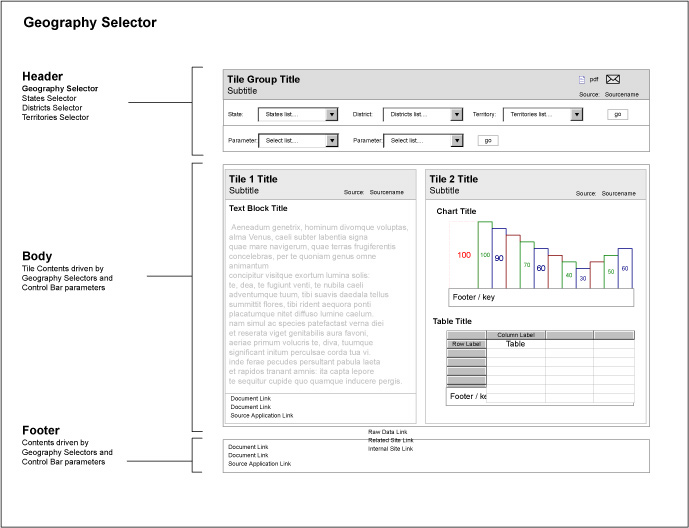
Figure 26: Example Geography Selector
Rendering description
This rendering shows a Tile Group with attached Geography Selector and Control Bar. The geographic scheme represented is hierarchical, spanning three tiers, beginning with State, moving to district and concluding with territory. Of course, many businesses use non-hierarchical geographic schemes, irregular schemes, or a combination of these options; in these cases the structure and quality of the underlying data, functionality and business logic may require creative solutions to the problems spawned by unusual intersections of the various choices.
This set of Connectors provides the minimum tools necessary for the assembly of coherent Dashboards across a wide variety of circumstances. I encourage you to refine this starting set, or create additional types of Connectors to meet new challenges.
Conclusion
When combined in a fashion that meets the specific needs and context of a tile-based design effort, the Containers and Connectors can strike a good balance between cost, flexibility, and customization in terms of the user experience, systems and technology efforts and business perspective.
With proper assembly, using the stacking hierarchy and the small set of required elements, the information architect can create a consistent and scalable structure that supports a high quality user experience, lowers development costs and establishes a basis for sharing of resources across the enterprise.
—
Part Five of this series will describe a common set of utility and convenience functionality often used to extend the reach and relevance of dashboard content to other contexts of use, making practical suggestions for following the principles of Openness, Independence and Portability underlying the Building Block system.

Nice article and series in general. Dashboard/portal design is definitely in need of a pattern language like the one you’re proposing.
The Geography Selector component, in my opinion, is more generically about parameterizing a Container with respect to some attribute, which doesn’t have to be geographical in nature. For example, I am currently working on e-commerce store management application where a similar component provides the ability to switch the language in which product data is displayed in the Container below.
Looking forward to Part 5!
@Dmitry: Geogrpahy selection is indeed a kind of parameter. It’s a very, *very* common parameter for global / international organizations: I’ve seen it used in almost every medium or larger effort I’ve participated in. In the case of Geography, it was the close association with “place” in the minds of users that drove the decision to identify it as a specific type of Connector, rather than just mentioning it as one of many possible parameters.
In early uses of the blocks, we found many people expected to be able to ‘navigate’ to a ‘page’ for each geographic locale, and expected to do so by seeing those possible navigation choices displayed as conventional navigation / browse structures composed of hyperlinks. Using the Control Bar to choose a geographic context took a bit of getting used to, (this was before the broad acceptance of RIA, but still holds true in many cases) and so we bridged the mental gap by creating a specific kind of Connector.
Also, looking ahead, identifying a Connector based on this single parameter seemed a good way to illustrate the potential for adaptation and extension that is inherent in a framework like the blocks. Language is another great suggestion for a standard type of Connector. Currency, unit of measurement, and time span are all also quite common. I’d hope to see people extending / refining / enhancing the building blocks exactly this way.
Thanks for the great feedback!
Nilesh,
As a good consultant, I recommend going with the development / architecture / build model that best suits your needs 🙂 At this point, many of the technology elements of a complete dashboard solution architecture are available from several vendors (and perhaps in Open Source form as well, though I’m not familiar with any OSS dashboard packages).
The building blocks will allow you to define a vendor-neutral design – which should make comparison of any specific combination of build vs. buy components for the overall solution much easier.
I’d check with dashboard vendors directly to see if they implement the building blocks in whole or in part (I’m not aware of any at the moment), or any similar design / architecture framework that the blocks can align with.
-Joe