One of our finest tasks as designers is to filter the abundance of choice into easily digestible bits. Creating great interfaces is as much about motivating, teasing, leading, and guiding users along—so that they experience value, faster—as it is to improve usability by removing friction. This requires an endeavor into product psychology and the art of designing with purpose and intent.
Stakeholders in design
All design has at least two stakeholders. Otherwise it is not design, but art.
- The user. If we fail to acknowledge usability and user needs, no motivation or guidance can help make a product succeed.
- The business (or the purpose and intent of the design). If we fail to acknowledge the business, or the change the design was intended to create, the design itself has no meaning. Design without intent will most likely also suffer lack of future sponsorship in the long run.
To cater to both sides of design, I started the journey of mapping and documenting useful psychological insights used by designers. Starting in 2010, the collection has now grown large and mature. Having already documented user interface (UI) design patterns at my site, UI-Patterns.com, catering to usability and user needs, adding persuasive patterns to the site was the perfect addition to also cater to the business side of design.
Removing friction and introducing fun
Having documented useful psychological design principles, I was still struggling to put them to practice with my development teams. Reading up on scores of articles of somewhat complicated psychological concepts was an incomprehensible task for most team members.
I needed to remove friction and introduce fun.
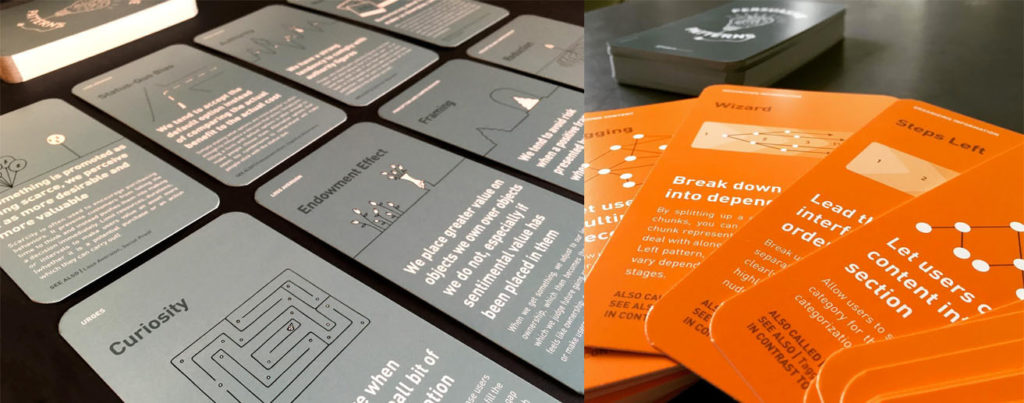
The Persuasive Pattern card deck was created to aid designing with purpose and intent. It is a collection of 54 printed design patterns driven by psychology, presented in a manner easily referenced and used as a brainstorming tool. With a focus on human behavior, each card describes one psychological insight and suggests ways in which you can apply it to your product.
The idea and basic concept is not new. Both Stephen Anderson and Dan Lockton published similar decks back in 2010. Unfortunately, they are now both sold out, nor were they quite the same.
Behind the design
Designing the card decks was a long and winding road that took a little over nine months, ending in a product launch in the spring of 2016.
Although I’m well experienced in web design, I quickly knew my print design skills weren’t going to be enough to create a quality product. I quickly teamed up with a great Copenhagen local print designer, Daniel Prip Pedersen from Voke.
He was intrigued by the idea, but we quickly agreed that we needed to both validate the usefulness of the product and validate the market.
After a few weeks of work, I had transcribed the persuasive patterns documented at UI-Patterns.com that my team and I deemed most useful into bite-size nuggets that would fit on printed playing cards. Daniel had narrowed down the first design style. We printed a small batch that we started using ourselves and sent to friends around Copenhagen, Denmark.
For months, I offered free workshops using the cards to friends, former co-workers, design schools, and universities in Copenhagen. After the first workshop, I wasn’t in doubt that the cards were going to make a useful and even great product. However, the execution of both the product and workshop facilitation needed refinement.
Validating the market
We allowed customers to pre-order the cards via PayPal. Our goal was to validate whether people would actually pay money for the product we had dreamed up.
At that point, we had no clue how much the production costs were going to be, nor a qualified guess of the final price. Once we confirmed demand, we would begin investigating the final production costs. To limit a potential loss, we decided to let the first 100 pre-orders go for $29—a price we later found was lower than our production costs.
To create a controlled test, we sent out a newsletter to 1,000 site subscribers before promoting the card deck elsewhere. With an open rate of 50%, the newsletter created 25 pre-orders. With a conversion rate of 5%, we considered the market validated.
Announcing the project
Earlier in 2015, Christian Perstl had invited me to speak on persuasive design at the 2015 Push Conference. It was the perfect opportunity to officially announce the project to the world. My talk on persuasive design patterns was accompanied with a full day workshop on how to use the cards.
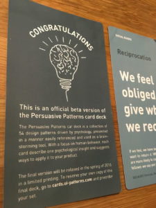
Rigorous testing and continuous improvement of the cards continued throughout the late summer and early fall to make us ready. When time came for the conference, we were confident that we had a useful product as well as a workshop format that showcased the how to use them properly.
To market our cards and gain feedback, I passed around beta decks to conference participants in return for a promise to send back feedback and put the cards to use. Some of the best and most useful feedback came from these people.
Design iterations
While hopeful customers were pre-ordering, we were in full swing perfecting our product. We set up a continuous feedback loop, carrying out a test every 14 days. The test came in many forms: full-day workshops, 2-hour workshops, talks at local meetups, remote testing by universities, and sit downs with good friends.

We learned much about the usefulness of the concept, what cards worked better, what text worked better, and what exercises were deemed most rewarding. Based on feedback from around 80 people, we made several improvements.
- Text was shortened, made more precise, and proofread several times.
- 15 cards from the original persuasive deck were replaced by more suitable alternatives.
- We created a pamphlet to go along with the final deck, outlining basic exercises and how to use the deck.
- Paper quality was significantly increased from the beta deck to the final deck.
- We tried out several coatings and materials, from plastic to paper and from glossy to matte.
- Corners were rounded even more to make shuffling easier.
- We added illustrations.
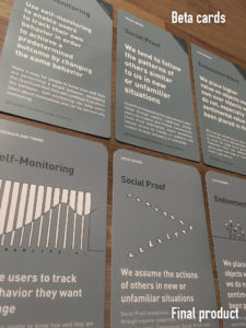
Illustrations
One point of feedback kept popping up again and again: “You should have an illustration for each card.” At first, we were reluctant, but after a few tests, we could see how a good illustration helped understanding and sparked ideas instantly. We kept the cards without illustrations for a few months, but finally caved in. We would add illustrations.
We quickly realized that crafting good looking and meaningful illustrations for psychological concepts is harder than you think. Daniel and I each kept a notepad to scribble down illustration ideas and met for several brainstorms. Some ideas were clearly better than others.
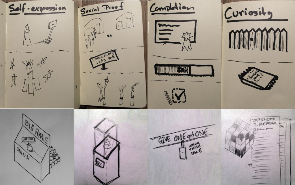
Many bad and some good sketching ideas later, we hired a freelancer to make them come to life. When we got the illustrations back from the first freelancer, it didn’t quite match the style we were looking for. We tried another. And another. We were pouring money down the drain.

We finally decided to change our game plan. Instead of relying on our own illustration ideas, we knew we needed to bring in help of someone more qualified—someone who could challenge our thoughts and whose style could add to our product rather than bring it down. Our answer was a Danish artist, Annesofie Sandal, currently living in New York.
Although more expensive than a freelancer, she put a smile on our faces every time a new illustration ticked in our inboxes. Annesofie’s illustrations lifted the overall expression of the cards dramatically. We couldn’t have been happier with our choice.
UI pattern card deck
Through the testing-workshops, it came clear that applying persuasive patterns often led to the implementation of common UI patterns:
- The Status-Quo Bias would lead to using the Good Defaults UI pattern
- Limited Choice would lead to using Progressive Disclosure
- Completion and Sequencing would lead to use of Wizards or the Steps Left UI pattern
- Reduction would lead to use of the Forgiving Format UI pattern
- Intentional Gaps would lead to use of the Fill in the Blanks UI pattern
- Recognition over Recall would lead to use of Autocomplete and Calendar Pickers.
The list goes on.
To get truly great results readily applicable to web design from using the persuasive patterns card deck, we needed to create yet another deck: the UI pattern card deck. I have been documenting user interface patterns since 2007, so the content was almost ready.
Thankfully, UI patterns are easier to illustrate as they represent concrete functionality rather than complex psychological concepts.
Production of the cards
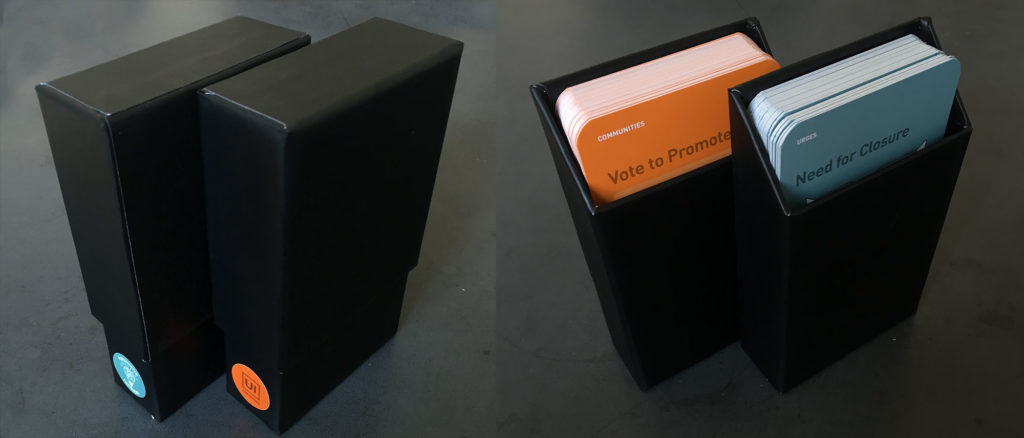
The production of the cards also turned out to be more complex than Daniel and I first realized. Both card decks have five parts: the card, the box, an instructional folder, a set of stickers to decorate your box, and a shipping container that would take all parts safely to our customers.
We had to deal with production in China, shipping to Denmark, customs, and initial batches with stained printing—which all helped to postpone the project a bit more.
Figuring out how to use the cards
Through years of practising UX, I’ve found that both persuasive patterns and UI patterns help establish a shared design vocabulary. By distilling complex concepts of both psychology and user interfaces into digestible bits, alternative solutions are easily communicated, help end feature debates, and spark new ideas.
It’s one thing to build upon a shared understanding of design concepts; it’s another to use them effectively. To help our future users get a head start, I set out to methodically test various workshop exercises. With inspiration from innovation powerhouses like IDEO and Frog Design, from various coaching frameworks, and from workshop participants during testing, these exercise tips produced great results again and again:
- Define the behavioral goals of your desired outcome up front. This will ensure that you truly design with purpose and intent.
- If you’re stuck, reversing the problem will help you redefine your problem space. If your goal is to get people to spam less, then exploring the question “What if we were to make people spam?” It will help discover alternative solutions, probably closer to the root cause of the actual problem.
- Too often, the problem we’re trying to solve isn’t the real problem. Try solving the problem from the opposite perspective. If your problem is to get enough users, then consider what you would do if that wasn’t the case—if you truly did have enough users.
The final product
The final product finally shipped in June 2016, a couple of months late. We are stoked about the final result.
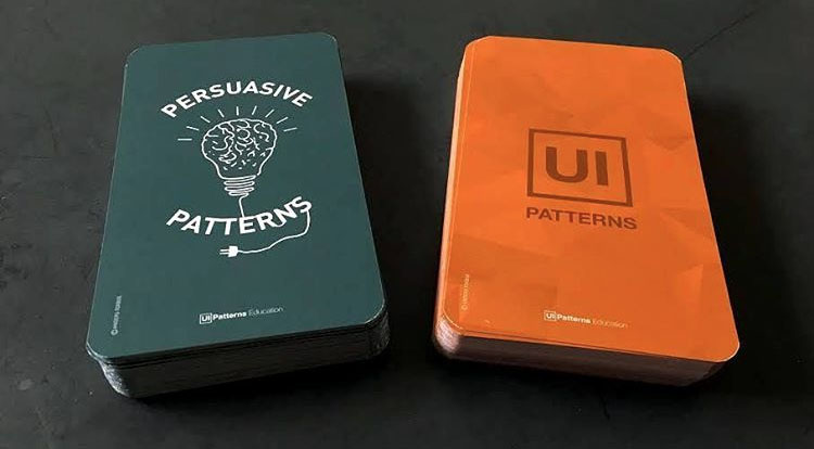
Did you already try them?
If you already got hold of a card deck of your own, we would love to hear how you have used it. We are still discovering new ways to best apply persuasive design and hope to refine our product further in the future. If you have experienced the power of persuasive design, we would love to hear from you to discover new ways to develop our card decks in the future. Drop me a line on twitter.
