By the end of this primer you will have:
- Become familiar with the basic functionality of Dreamweaver
- Made a sample HTML wireframe that you can use as a template for future wireframes
How to use this primer
This primer assumes that you have never used Dreamweaver before. Although there are many HTML editing applications out there, I recommend Dreamweaver for wireframing and prototyping because it is easy to learn, offers palettes with all the necessary interface widgets, and has built-in project management tools like source control, which is useful if you are working with a team. If you are already familiar with Dreamweaver, you can skip the Dreamweaver Basics section and go right to the “Let’s start wireframing” section.
Also, this primer is designed to be used while you are running Dreamweaver. The instructions are accompanied by illustrations and examples so you can try the techniques in Dreamweaver as you read along.
Finally, the techniques suggested in this primer are specifically for creating wireframe prototypes, not for creating launchable sites with working backends. As a matter of fact, many of the techniques here would probably make a web developer’s hair stand on end—they do not produce implementable code. However, since the goal is to communicate design concepts, not to implement a site, it is okay to take shortcuts where possible. Working faster facilitates easy iteration and the creation of many different design ideas.
Dreamweaver basics
When you launch Dreamweaver, it will open a blank web page called “Untitled Document.” This default Dreamweaver document window is divided into 5 horizontal sections. These sections, and the most useful buttons in the window, are labeled in Figure 1. Since we will be doing all of our work in the design view area of the window, you can close the code view area by clicking the design view button in the toolbar.
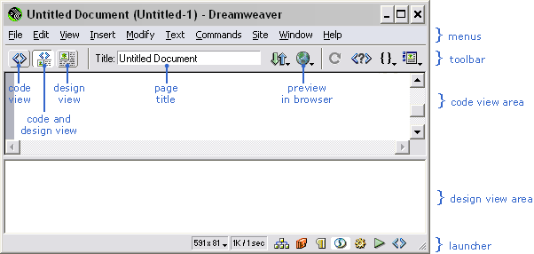
Figure 1: The default Dreamweaver document window and its key functionality.
Click the design view button to hide the code view area.
Now for a tour of the tools that are available for your wireframing work. Dreamweaver provides access to tools via floating palettes, which you can display by choosing them from the Window menu. The palettes that are the most useful for wireframing are Objects, Properties, and Styles.
Objects palette
The Objects palette offers most of the visual elements that we will add to the wireframe. When you click an item in the Objects palette, Dreamweaver places that object where you last clicked in the document.
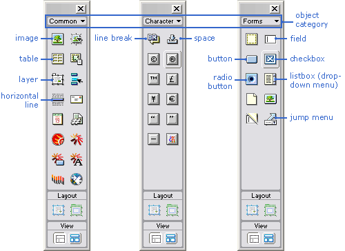
Figure 2: The Objects palette showing Common objects, Character objects, and Forms objects.
At the top of the Objects palette is the Category drop-down menu, which lets you control which object types appear in the palette. For wireframing, we will primarily use the Common, Character, and Forms object categories. Figure 2 shows how the Objects palette looks with each of these three categories selected and labels the most useful items in each set.
| Expanding the Properties palette Often, the bottom portion of the Properties palette is not displayed when you open it. This portion contains useful properties that you don’t want to miss! To expand the palette, click the small white arrow in the bottom right corner of the Properties palette. If the arrow is pointing up, you know that the palette is expanded and you are seeing all of the properties. |
Properties palette
Each object that you insert into your document has a set of properties associated with it, which you can view and modify in the Properties palette. When you select an object, its properties appear in this palette. For example, Figure 3 shows the properties for some text in a table cell. The top portion of the palette governs the properties of the text, while the bottom portion controls the properties of the table cell.
You can use the Properties palette to format text, add links, specify background colors, indentation, and alignment, create lists, and so on. For example, you can create a link by selecting a block of text and entering the URL in the Link field. When a table is selected, the Properties palette is useful for specifying the size of the table or the number of rows and columns in it.

Figure 3: The Properties palette when text in a table cell is selected in the document window.
| Table cell property definitions Cell spacing: This is the number of pixels that Dreamweaver puts outside each table cell and around the table as a whole. For example, specifying a cell spacing value of 2 pixels puts 2 pixels between each cell and a 2-pixel invisible border around the entire table. Cell padding: This is the number of pixels that Dreamweaver uses to pad the inside of a table cell. To remember the difference between padding and spacing, I think of the padding on the walls inside a cell at an asylum. |
CSS Styles palette
The CSS Styles palette is used for setting up the CSS (Cascading Style Sheet) styles that will govern your wireframe. A style is a description of the formatting properties that you apply to text or a table cell, including things like font color and size, background color, etc. Styles are useful for ensuring that all of the wireframes you create look consistent. If you have ever used styles in Microsoft Word, CSS styles work in much the same way.
![]()
Figure 4 shows a CSS Styles palette with the various styles I used for the example wireframe in this primer. The most important command to remember when using the CSS Styles palette is New Style, the button for which is available at the bottom right of the palette.
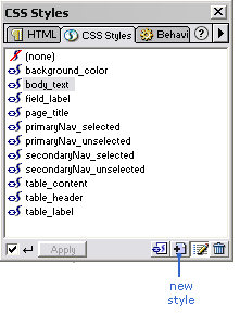
Figure 4: The CSS styles palette.
Other palettes
Other useful (but slightly more advanced) palettes for wireframing are the Behaviors and Layers palettes. While we will not explore their functionality in this article, I encourage you to try these palettes once you are comfortable with Dreamweaver. They offer tools to help you do things like produce pop-up windows and have page elements dynamically appear or disappear.
Now that you know the basics of what is available to you in Dreamweaver, let’s put together a wireframe. For this example, I will walk you through the steps to create a wireframe for an inside page of a website about dogs. When we are done, the Dreamweaver document for the wireframe that you have created will look like this:
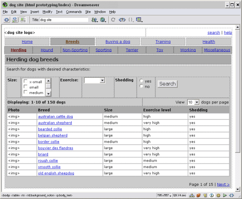
Figure 5: The finished wireframe for a dog website as it will look in Dreamweaver. Click to enlarge.
In a browser window, the finished wireframe will look like this:
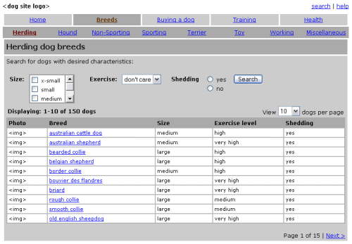
Figure 6: The finished wireframe as it will look in a web browser. Click to enlarge.
You can download this finished wireframe as a basis for your own work here.
Now, let’s get started.
Step 1: Define a site
| NOTE: If you are going to put all of the files or documents related to a project in subfolders that are contained within a main folder, you should select that main folder here, not just the wireframe folder. That way, if you put the HTML files in one folder and the images in another and the site maps in a third, then Dreamweaver site management can help you manage them all. |
The first thing you should do when beginning a new wireframing project in Dreamweaver is “define a site.” When you define a site, Dreamweaver groups all of the wireframes for the site together into a single project, which allows for easy updating of links when you move pages around, and, if you are working with a team, source control.
To define a site:
- Select “New site” in the Site menu, which will open a dialog box.
- Enter the name of the site and select the root folder where you will save the wireframes for the project. If you will be sharing these documents on a server, select the “Remote info” category on the left side of the dialog box and choose how you will access these files in the Access drop-down menu.
- If necessary, enable source control after you select an access type. Source control facilitates file sharing by checking files in and out.
- You can ignore the other options in the dialog. Click OK to close it.
After you close the dialog, you will see the Dreamweaver site window, which works similar to Windows Explorer or the Mac OS Finder for accessing your site files. For now, we’ll ignore this window and move on to Step 2.
Step 2: Set up your document work space
- Go to the Untitled Document that Dreamweaver launched on start-up and save it with an appropriate name.
- If they are not already open, open the Objects, Properties, and CSS Styles palettes by selecting them from the Window menu.
Step 3: Set up your basic wireframe layout
Every HTML wireframe consists of tables that make up the basic layout of the page. Usually, I create separate tables for the top global area (including the logo), primary navigation, secondary navigation (if it is horizontal), and the content area. Also, I always make the tables 760 pixels wide, assuming a minimum 800 x 600 screen resolution. To set up tables in general:
- In the Objects palette (Common category), click the Table button to insert a table. This will open a table dialog box.
- Enter the necessary properties for the table and click OK.
- Click to the right of the new table to deselect it, then press Enter to position your cursor for insertion of the next table.
- Follow steps 1-3 to insert the rest of the tables.
Now, let’s work from the top down to set up these four basic tables. Select a table and, in the Properties palette, enter the following table properties:
- Global area table (for the logo and search and help links): 1 row, 2 columns, width = 760 pixels, border = 0, cell padding = 0, cell spacing = 0
- Primary navigation table: 1 row, 5 columns (for the five primary navigation categories), width = 760 pixels, border = 0, cell padding = 0, cell spacing = 3
- Secondary navigation table: 1 row, 8 columns (for the eight secondary navigation categories), width = 760 pixels, border = 0, cell padding = 0, cell spacing = 0
- Content area table: 2 rows, 1 column, width = 760 pixels, border = 0, cell padding = 4, cell spacing = 3
When you are done, your Dreamweaver document should look like this (without the table names marked in blue):
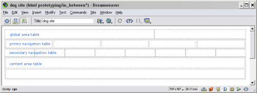
Figure 7: Dreamweaver window with the four basic layout tables. Click to enlarge.
Step 4: Set up the primary navigation
Once you have set up your basic table layout, you can fill in the primary navigation elements. To format the navigation area, let’s create our first style in the CSS Styles palette:
- Click the “New style” button at the bottom of the palette. This will open a dialog box.
- Enter the style name .primaryNav_unselected. Click OK.
- Since this is your first style, Dreamweaver will open another dialog box asking you to name your new style sheet. All of the styles that you create will be associated with this style sheet. Name your style sheet and press Enter.
- This will open the edit style dialog box in which you can specify the format of your new .primaryNav_unselected style.
- Select Verdana font, size 12.
- Click the Background category (on the left side of the dialog), then select light gray (#CCCCCC) as the background color.
- Click OK.
Congratulations! You have created your first style. Creating additional styles should be easy. Now let’s apply this new format to the primary navigation table that you created and fill in the table with the navigation categories:
- Select the entire primary navigation table.
- Click the .primaryNav_unselected style you just created in the CSS Styles palette. This should make the entire table gray.
- With the primary navigation cells selected, apply the rest of the formatting by entering the following options in the Properties palette: text justification = center, horizontal alignment = center, vertical alignment = middle, height = 25 width = 152.
- In each cell of the primary navigation table, type in one of the primary navigation categories: Home, Breeds, Buying a dog, Training, and Health.
- Create fake hyperlinks for each of the primary navigation items by selecting the category name and entering “#” in the Link field of the Properties palette.
- Create the selected state for the primary navigation by making a .primaryNav_selected style in the styles palette with these properties: Verdana size 12, type color = burgundy (#663300), background color = medium gray (#999999).
- Select the cell that contains “Breeds” and apply the primaryNav_selected style to that cell.
- Select the “Breeds” text and apply the primaryNav_selected style to the text.
At this point, your document window should look like this:
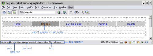
Figure 8: The Dreamweaver document showing the complete primary navigation table. Click to enlarge.
| Special Tip: Tag Selector At the bottom of the document is an area called the Tag Selector (marked in blue in Figure 8). This area shows what HTML tags are applied to the currently selected element of the page. For example, in Figure 8, the selected text is located within a <div> tag, which is within a table cell (<td>), which is within a table row (<tr>), which is within a table (<table>), which is within the body of the document. Click a tag to select it and all of its content and then apply a style to your selection. The Tag Selector also shows what style is currently applied to an item. For example, the <td> cell in Figure 8 is displayed as <td.primaryNav_selected> to indicate that the .primaryNav_selected style has been applied to that cell. |
Format the remainder of the tables, including the secondary navigation table and the background color of the content area table, by repeating the basic process described above. To facilitate the formatting of your wireframe, I have created a style sheet with all the styles you’ll need; you can download it here. To attach this style sheet to your document, save it in the same folder as your wireframes, then from the Text menu in Dreamweaver, select CSS styles >Attach Style Sheet. This will display a dialog box that asks you to select the style sheet to attach. Choose the one in your project folder and you are in business.
Note: The rest of this primer assumes that you have downloaded and attached this style sheet.
Step 7: Add the search tools
For this example, we are creating a wireframe for the inside page of a dog site. Specifically, this wireframe lists all of the breeds of herding dogs and lets you search through them. To add the search tool to the page:
- In the first row of the content area table, type in the page title “Herding dog breeds” and apply the page_title style to it.
- In the second row of the content area table, type in the instructions for the search (“Search for dogs with desired characteristics:”) and apply the body_text style to it.
- Below the instructional text, insert a new table to house the search fields: 1 row, 7 columns, width = 100%, border=0, cell padding=3, cell spacing=0. Each search field and label will go in a separate cell of the table.
- Enter the name of the first label for the search (“Size”) and apply the field_label style to it.
Now, let’s add a multiple-select box for the Size options in the second column of the search tool table. Since Dreamweaver does not automatically create multiple-select boxes, we’ll need to make one from scratch:
- Create a small table: width=100 pixels, 1 row, 2 columns, border=1, cell padding=0, cell spacing=0.
- Use the Properties palette to set the border color of the table to gray.
- In the left cell of the table, insert checkboxes from the Objects palette and add a label for each checkbox.
- For the right side of the multiple-select box, take a screen shot of a scroll bar and edit it to the proper size in Dreamweaver (in this case, 60 pixels tall), or download one here. Place the scroll bar in your table by clicking the Insert Image button in the Properties palette.
Next, add the Exercise drop-down menu:
- In the next column of the search tool table, type “Exercise” and apply the field_label style to it.
- In the Objects palette, select the Forms category and click the Insert List/Menu button.
- With your new drop-down menu selected, click the List value button in the Properties palette. This will open a dialog box.
- Enter a label for each item in the drop-down menu (i.e., ”don’t care,” ”low,” “medium,” “high,” “very high”). You can ignore the Value field.
Add the Shedding radio buttons and the Search button:
- In the next column, type “Shedding” and apply the field_label style to it.
- In the Objects palette, with the Forms category selected, click Insert Radio Button twice to insert two radio buttons.
- Add labels to the radio buttons and apply the body_text style to them.
- Click Insert Button again to place the Search button on your page.
Step 8: Add the table of breed details
Now, let’s create the table of dog information.
- Type in the label for the table: “Displaying: 1-10 of 150 dogs.” Apply the table_label style to it.
- Directly under the label, insert a new table: 11 rows, 6 columns, width = 100 %, border = 1, cell padding = 3, cell spacing = 0
- With the new table selected, choose a light gray border color for the table in the Properties Palette.
- Fill in the contents of the table, using the table_header style for the column headers and the table_content style for the cell content.
Step 9: Apply the finishing touches
- Add the page counter (“Page 1 of 15”) and the “Next >” link for accessing subsequent pages of the site (use “#” for the link again).
- In the global area table, put a logo placeholder in the left column and links to search and help in the right column.
Voila! You are done!
Creating this wireframe should have taken you between 30-60 minutes. In the future this should go even quicker because you can reuse the basic elements you’ve already set up.
Finally, the following is a list of tips and reminders to help you tackle more wireframing situations with ease:
- Reuse and recycle! Once you have made one wireframe, there is no reason to ever start from scratch. You can download the wireframe created in this primer here and use it, or create your own.
- Use “#” for URLs to create placeholder links that won’t cause “file not found” errors when you click them. Once you have created wireframes for other pages on your site, you can replace the #s with links to those pages to make an interactive prototype.
- Use cell padding and spacing to create margins between table columns and cells.
- In general, specify the size of main tables in pixels; specify the size of tables within other tables in percent.
- Dreamweaver does not make it easy to make multiple-select boxes, so I walked you through making one above. It is easy to fake other functionality not provided by Dreamweaver through clever use of screen shots.
- Much of the functionality described above is also accessible by right-clicking (option-clicking on a Mac) on an element to bring up its contextual menu. For example, right-clicking inside a table will display a table edit menu for adding and deleting columns and formatting text.

A revised, valid XHTML/CSS version can be found here: http://www.webgraph.com/css/wireframe/
One of the benefits of this revision is that the page now displays properly (IE5/Mac had some display problems with the pop-up menu, and some of the CSS properties were invalid because an underscore was used in the property name: that can cause problems with some browsers parsing the CSS), plus the main table is now accessible. I will soon revise it further to remove all tables used for layout, leaving only the data table. CSS will be used for positioning, as it should be. This will be much better for designers who plan to code in XHTML/CSS without using tables for layout, as you will be able to judge the basic CSS capabilities of your clients’ browsers at the wireframe stage (or test on non-desktop browsers, or screen-readers, depending on your clientele)
An additional benefit is lighter code which will render just that much more quickly (old: 10k, new: 8k), and I optimized the scroll.gif from 27k to
Xavier Fan and I have been having an offline discussion about his comment which leads me to this post.
I want to point out that the technique that Xavier mentions results in a scrollable multi select box without checkboxes next to each item. To multi select the user must ctrl+click which is hard for some on the web. The reason for integrating the gif of the scrollbar with the table of checkboxes is to show a forms widget that avoids the ctrl+click interacton. Another problem with ctrl+click is that if you come back and click again, then you lose all of your selections. For forms that the users edits over and over, this could be very bad.
When we used it in a complex budgeting application where people needed to multi select from a list of about 100 items and often change their selections, this widget was eventually implemented in DHTML by our talented dev team. However, the fake scrollable protoype in our wireframe was user-tested to make sure that users were happy with it before the engineering team implemented it.
But, the reason that I included it in this Primer is to get your brain cells going about creative ways to integrate gifs with your forms elements and other elements of a wireframe to quickly approximate functionality. It’s not necessary to go out and spend hours buidling a widget you may or may not use and may not know how to build w/o help. Just do some clever hand waving and you’re set.
None of your click to view examples work on a mac with Firefox.
Also Dan’s link is 404 as well.
I was wondering about using div’s instead of tables as I read the whole thing- it might be good to either update this- or – put a note at the top.
Thanks- it was still informative.
Thanks for the revision Dan. Since we are super quick and dirty, we tell our clients that they can only view the wireframes on IE on a PC. Since I live in an all PC world here in enterprise web app design land and never do actual implementation, I am very bad about noting Mac related issues that probably effect many other designers. Thanks!
For the multiple select box, wouldn’t it be easier to just create an actual one, rather than use a table, checkboxes and a scroll.gif image?
As follows in DreamWeaver:
1) from the Forms palette, “Insert List/Menu”
2) Add “List Values”, either from the Properties, or by right clicking on the list
3) In the properties, change Type from “Menu” to “List”. This enables the “Height” and “Allow Multiple” attributes.
4) Change “Height” as desired. If the number of “List Values” is less than Height, than a scrollbar will automatically appear.
5) Check “Allow Multiple”, which does the obvious.
…and that’s it. This has the benefit of being able to easily add as many List Values as you want without doing layout changes (as well as being more “real”).
Dan, thanks for the XHTML version. We do code in XHTML, but we haven’t been able to use CSS for positioning (and ditch tables for layout entirely) for large, public-facing sites yet. Maybe when Netscape 4.x finally dies. =)
Julie, great primer…I wish more IAs would use DreamWeaver!