There’s an old adage among screenwriters that when a writer can sum up a story in a sentence or less, he has discovered what’s important about the story. He’ll know what the story is about and therefore have a strong sense of theme. And in knowing the theme, he’ll have a compass to use in the process of “designing” the damn thing (i.e. what to keep, what to lose, what actually happens at the end). The story will be all the better for it because it all hangs together with a central idea that will give it greater impact and meaning.
Now wouldn’t it be nice if we had something like that for user experience design?
This article is about a method drawn from storytelling that can help us build a better story about our product, unify teams, inspire design concepts and get us closer to evoking the pleasure, emotion and meaning of the experience we intend to deliver to users through the products and services we design.
So, What’s the Problem Anyway?
As designers, we spend a lot of time examining design solutions against an array of information–business goals, user needs, design principles, best practices, the results of usability tests–but less often (if at all) against a definition of the core experience we hope to deliver. If you’re not sure what I mean, think about this:
We had a big problem at our company. The problem was that the websites we were designing and building were coming together like potluck meals made by a loose confederation of team members and stakeholders who were all working out their dishes independently, and on their own terms.
You know the story: User experience brings the structural framework and behaviors of the interface; creative brings the visual design; client marketing brings the copy; business brings content; our engineering folks were sometimes bringing error messages. When each of these more tangible elements are cooked up in separate quarters without a shared vision or intent how can we possibly deliver an optimal experience, let alone agree on what that experience should be? It’s not that the meal is bad–it often makes a lot of people very happy–it just seemed that we were missing out on a chance to serve up something better, something that would distinguish itself as a dining experience people would remember in a marketplace of potluck dinners.
Coming from a filmmaking background where it’s a matter of course to see an army of people with specialized roles focus their efforts around bringing the story of the “project” to life, it often seemed as if our practice as UX designers neglected an important approach. On a film set, bringing a project to life involves having a very clear understanding of the experience the story is supposed to deliver to an audience. Everyone from the prop master to the camera person has a sense of this experience goal. If the story (or a particular scene) is supposed to make the audience fall over with laughter, the cameraperson, to be sure, will frame each shot in a way that maximizes that goal. Every scene, every moment, every tangible element of a film works together for a purpose: to make it easier for audiences to understand and engage with a story and to create an emotional response to walk away with.
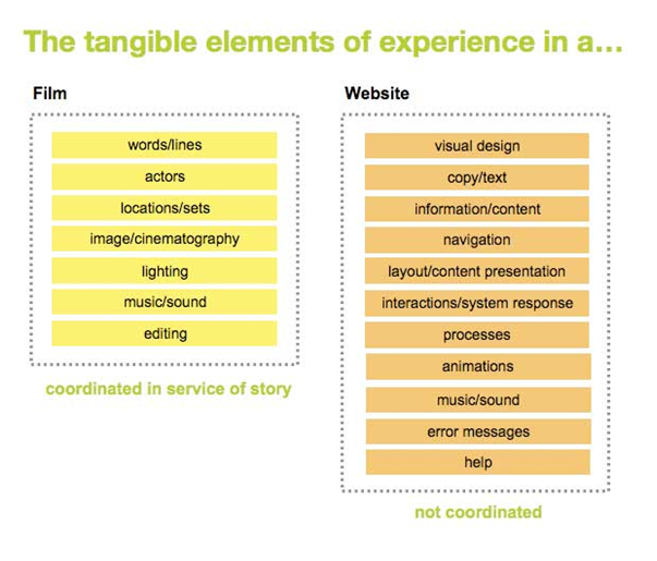
In the case of user-centered design, we do well at coming up with the right technology and features that perform in a way that meets the needs or behaviors we observe in our users. But we often neglect to consider the story that’s told through the interactions people have with the things we make. For this story to be apparent to people, let alone meaningful, those involved with the design of a product should have a shared sense of the kind of experience they are trying to create. In the domain of digital products the story comes from asking the big questions: What’s the product or service about? What will it do for the customer? Where does it fit into their lives? In what ways might we create an emotional response the customer can walk away with?
How does a good story get built? With a theme, of course. Writers and filmmakers have been using themes to build stories for a very long time. They’re also not shy about designing explicitly for emotion and meaning. So why not designers? For us, a definition of the core value of experience can function as the theme that helps teams collectively build a more meaningful product. It’s the thing that can serve as a coordinating force behind the design. When the tangible elements of a product are all working together for the same purpose the product has a stronger story to tell. The theme is merely the thing that helps us deliver that story in the form of an experience.
From Theme to Story
For a writer, a theme is not the thing one starts with, but the thing one “finds” or discovers at some point after the writing has begun. It’s an idea that should emerge organically from the raw material of one’s research, note-taking, plotting, scene-making, and character sketches that are produced during the story planning and early writing process. Typically, a story theme is expressed as a value (greed), an opposition (freedom vs. security), a value plus a cause (justice is restored when the truth is revealed), or simply a very strong gut feeling of what the story is ultimately about. The form can vary widely, and often depends on the bent of the writer or the type of story.
An experience theme also emerges from the raw materials of our design process: the business goals, market considerations, user research and content analysis, among others. Yet while a story theme may express a topic or idea, an experience theme expresses the core value of the user experience. One such theme, for a project commissioned by Agnes Nixon, the renowned writer and creator of the soap _All My Children_, looked like this:
_Reliving All My Children_
Agnes Nixon and her family had asked us to create a site that would leverage their “tremendous library of content in a new, engaging interactive video-centric web property.” That was their only requirement. So where to start?
We started where one might expect. We immersed ourselves in the domain, read about soap operas, watched episodes, and spoke to fans until we got to the point where we felt like we finally understood what this rather obsessive world of fandom was all about.
But when it came time to define functional requirements, it simply wasn’t enough to take the business objectives and our user research and conclude that we should create a flexible video portable that would do x, y and z, include a really cool interactive timeline of Agnes Nixon’s life and a blog authored by Ms. Nixon herself. This wasn’t a concept or an experience. It might be easy to use. It might perform well and look great. But to go that route would do no more than deliver a library of branded video content.
What we needed to know was what this site was all ABOUT. What will it do for these fans? Where does it fit into their lives? In what ways might we create an emotional response the fans can walk away with?
So in an attempt to break away from our customary ways of approaching design we started hunting for themes. We looked at what we had learned about prospective users and soap fans in general and considered our business objectives. With this information we then spent a long time brainstorming ideas that would answer two questions: “What’s the site all about?” and “What kind of experience would be most compelling and meaningful to our users?”
_Reliving All My Children_ was just one of three possible themes. Our plan was to take these themes to the client to see if it would help them further articulate their vision.
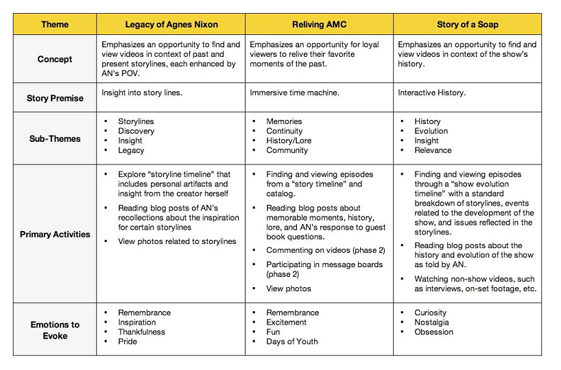
Each of these themes sprang directly from what we knew to be true about soap fans, and each evoked a different kind of experience. For each theme there’s also an associated concept and story premise as well as an altogether different set of primary activities. If the site was to be “about” _Reliving All My Children_, then our design process would focus on creating an engagement that would tap into the memories of loyal soap fans who grew up watching the show. This theme evoked a product story about an immersive time machine where fans could engage with a “story timeline” of episodes, read blog posts about memorable moments, ask Agnes Nixon questions about what happened to certain characters.
The idea was that one of these themes would drive the site’s concept, functional requirements and our design strategy. The amazing thing: when the client saw these themes they were suddenly able to talk at great length about their vision for the fan’s experience of the site. We had, together, begun to form our product story.
Go team, go!
Once your team has an experience theme, they can begin to behave more like film crews. Everyone involved in the project will have a clear sense of what the site is about and their efforts can be focused around achieving that experience. When this happens all of the component parts of the product will begin to work together. If you’re a consultant or designer working alone, you can think of the theme as the thing that will coordinate your inner team.
But how does this happen? In our practice, the experience theme is packaged in a way that can be shared and internalized by all stakeholders. This usually takes the form of an _Experience Brief_ that outlines the purpose of the theme, the attributes upon which it was founded and the strategy it informs. And in a manner of speaking this document becomes another iteration of the product story.
For another project we created a theme that was to capture the value of the experience of an entertainment alerts program:
_Don’t Miss Out. Discover something new. Get it first._
With this long-term client, comprised of stakeholders from separate interactive, business and marketing departments, we introduced the concept of a theme with an experience brief that looked like this:
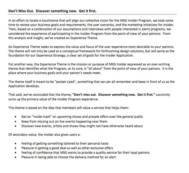
Our goal was to get this client to step away from discussions of pure functionality and to consider the value of using the product. As we were leading the research, we did the work of finding the theme that seemed to best reflect their business goals as well as their user’s expectations. We also appended a strategy, drawn from this theme that would connect it to more tangible, measurable goals.
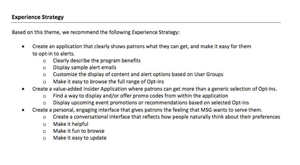
With this brief on the table in front of them, the concept of user experience no longer seemed so abstract. By expressing the value of that experience, it gave them a way to look at their program from the point of view of their users. It gave us, as their vendor, a way into their ideas of what they envisioned as well as a chance to validate our thinking behind what kind of experience the program could deliver. It led to a discussion about how the efforts of marketing could match up with what we were doing in the design of the online piece.
The overall effect of this simple document was to synchronize our collective thinking about the project. In this way our product story was beginning to form. With this shared story, the copywriter from the marketing department and the interaction designer with our agency could now work toward the same experience goal.
Designing with Themes in Mind
What’s really interesting is how themes, once found, function in the creative process. In the words of Robert McKee, the author of “Story” and screenplay workshop guru, the theme (or, as he liked to call it, the “Controlling Idea”) is the thing that “_shapes the writer’s strategic choices. It’s yet another Creative Discipline to guide your aesthetic choices toward what is expressive of your Controlling Idea and may be kept versus what is irrelevant to it and must be cut._” A subplot, for example, may be constructed as a counterpoint to that controlling idea. A character might be designed to embody some aspect of theme. A scene might be cut because it’s simply not relevant to the theme.
The best way to understand how this applies to design is to think of the theme as the geography as well as the compass. When generating concepts, the theme acts as the region within which our ideas circulate: this conceptual lay of the land gives us an area of focus and a space to create. When analyzing and reviewing solutions, a theme functions more like a compass: if a creative solution doesn’t line up with North, it might mean that it doesn’t quite chime with the theme. In this way theme can inspire solutions as well as help us make decisions during the design process.
In another project, our team used the following theme to inspire solutions ranging from functional requirements to content strategy, site architecture and interaction design.
_Where the Fight Never Ends_
This project was for Showtime Sports, a site delivering content and event information for fans of Boxing and Mixed Martial Arts. We felt this theme encapsulated the idea that the site could provide an online experience that seamlessly extended the kinds of real-world engagement found among fans of the sport. Not only could the fight live on in the context of the site, but fans would be able to engage, follow and learn about the full fight story. It was supported by our research, and potent enough to carry around as an idea that could inspire and inform anyone working on the project and at all phases. It was expressive of what differentiated the site as well as what would be compelling to users. It was good for business as well as design.
Here are some examples of how the theme impacted our design:
- Functional Requirements – We used the theme as a compass when looking at our standard spreadsheet of features for determining scope. In addition to frequency of use, importance and level of technical difficulty, we looked at these items against theme. For example, someone had an idea for a really “cool” dynamic ranking tree. Fabulous, but when it’s put up against the core story of the site it really had no place. The site wasn’t about seeing the sport in this way. It was about extending the experience of a fight. With the theme as an additional filter, it was easy to remove this from the list without prolonged discussion about its value. The idea simply wasn’t contributing to the core experience we were hoping to deliver.
- Content Strategy – As a basis for content strategy, we analyzed the available content against the theme and created suggestions for new content ideas. Showtime had a wealth of footage related to each event and some promo clips shot before the fight, but nothing about what happened well-before or after a fight was over. When thinking about content that could support our theme, we suggested creating short, cheaply produced segments of the fighters’ private struggles in preparation for an event. We also suggested in-depth interviews with the fighters after the fight–something that would give them a chance to reflect on what they needed to do in preparation for the next fight. In this way, the theme functioned as a space in which to generate ideas that would support our collective vision about what was most important about this site experience.
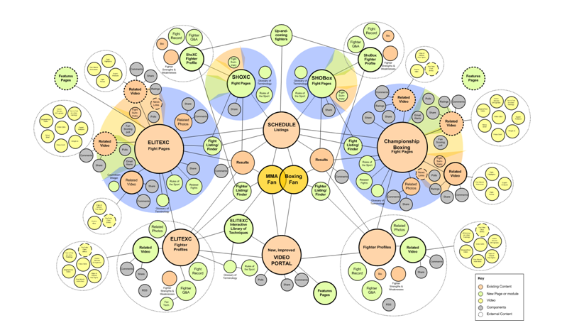
- Site Architecture – The theme inspired ideas for the structure and user pathways. For this, we began thinking about how the users flow through content would reflect our theme. We created a concept model as a way of seeing these paths and their relationship to key content areas. To further explore this idea, we created an animated version of the model which added a dimension of time, where certain content elements appeared during specific “phases” of the fight (illustrated by the colored bands around the content buckets). Our hope was that this evolving structure would also support the theme.
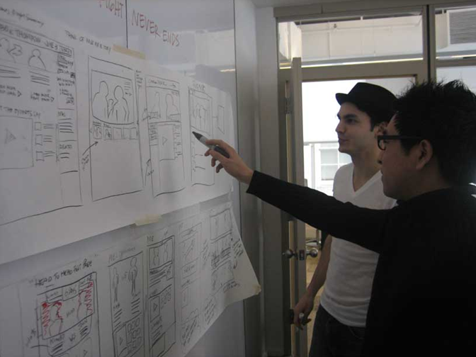
- Interaction Design – When it came time to create solutions for the interface, our interaction designers sketched with the theme in mind as way to ideate concepts. This is the moment when the use of theme feels closest to “writing”. In this context theme is simultaneously our geography of play as well as our compass for analysis. We try not to be over-conscious of theme when generating ideas and sketching, but we do want to have it in the back of our minds.
To this end, we usually have our theme written somewhere on the whiteboard. Then, while iterating on sketches, we’ll pause and discuss the way we usually do, but we’ll also reflect on whether or not the sketches are doing anything to support our theme.
This process eventually led to the design of a flash component that stored all video content related to the fight in a carousel organized by time. The linear progression of videos would together create a “fight story”, from early pre-fight videos to post-fight interviews.
Whether users wanted to catch up on something they’ve missed, follow the fight online in absence of TV or revisit the fight at some future point the interaction design was supporting our experience goal of providing a place where the fight never ends.
The lesson? Experience themes can inspire solutions, help teams make decisions and (perhaps most important) help us remember the quality and value of the experience we intend to deliver.
Final thoughts
As Robert McKee writes: “The more beautifully you shape your work around one clear idea, the more meanings audiences will discover in your film as they take your idea and follow its implication into every aspect of their lives.” Themes, used in the context of experience design, can function in a similar way. By aiming to capture the value and focus of experience, themes have guided us in the design process and, by extension have strengthened the impact and meaning of that experience. Equally important, they’ve given us a path to holistic design.
As user experience professionals we should be looking at all aspects of the product or service design, as well as the aesthetic potential of every element that comprises the experience. Themes can help us do that. They can be a potent tool for harmonizing otherwise distinct, tangible elements of a product or service in a way that will effectively distinguish it from competitors and offer a more pleasurable and meaningful experience on the part of the user. A theme can be applied to all stages of the experience design process, and it helps everyone involved in creating the “whole” of the product or service, no matter what their role. From the critical perspective of leaders and stakeholders, a theme will help unify the efforts of those who play a role in anything from the strategy to the design, development and delivery of the service.
The ultimate beauty of a theme is that, in the product or service context, it can simultaneously inform the practical, tactical and aesthetic considerations of our work. It can be the coordinating force for an entire product, or a smaller component of a larger service. It is the organizing principle behind our product story. It can work for business as well as design. And in the end, it ultimately works for the benefit of customers.
Special thanks to Steve Baty, my editor, as well as Joe Lamantia, Jared Spool and Andrew Hinton for their immensely helpful support and feedback for this article.

Great article, Cindy – I couldn’t agree more: focussing on a key idea, and returning to that key idea throughout the design process is crucial to doing great work. Love the ‘potluck’ analogy, and the screenwriting insight. Loads to enjoy in this article.
Excellent article! When I was last year in in @media 2008 I remember Andy Clarke also talked about the value of story telling when we create websites. The only difference is that instead of making the analogy with movies, he has doing it with the kind you see in comic books to depict the momentum of actions and pace of story graphically.
Thanks so much for this Cindy! I’m in the early stages of a project whose purpose is for users to contribute content to an ongoing story. Using a theme in this case is not only providing us with a guidepost for design decisions but it will also give our users a star to sail by in creating their stories as well as unify the digital experience with the core essence of the project.
Cindy,
You had my interest immediately when I realized that you were both a designer and screenwriter (I got my BFA in film/video at RISD, but now work in web development). I completely get the idea of making the “story” the unifying element that brings together each individual discipline represented in the development process.
We’ve been exploring the concept of personas, who, as characters in the overall “story,” represent the goals of a site as well as the challenges of succeeding at those goals. By creating specific personas for each project, we can anticipate some of the barriers to communication, as well as identify new ways to articulate messages through copy and design that are most appropriate to the end user.
I’m with @Giles- there is much to enjoy in your article. I’m going to have our Project Management team read this as part of our professional enrichment program.
– Chris
Thanks a lot for this article Cindy!
It reminds me that there is so much to learn from others displicines (such as storytelling) to bring UX to the next level. I’d love to read more article like yours.
@giles @ivan @ray @chris @pierre Thanks so much for your comments! Glad you enjoyed. 🙂
@ray: how interesting to think that this might be used to guide user generated content. You have to let me know whether it works.
@chris Yes personas are good for making design decisions as well. But I find them insufficient when thinking about the “whole” experience. For example, it’s difficult to write copy against a set of personas. Ideally, the “story” suits the actors (your personas) who are engaged with the site. In fact, we always consider our personas when coming up with a theme. They’re a necessary element to draw from. If you ever have any questions about process you can always reach me on twitter at @cchastain.
I’m hoping to write a follow-up to the article that goes into greater detail about the process of “finding” and using themes.
As a budding ux designer, I learned a lot from this article, thanks Cindy! I’m eager to read the follow-up article 🙂
Great posting. I am using it to confirm and add to discussions my small team is having on an ongoing basis. Looking forward to the next article about the process of “finding” and using themes.
Cindy,
Your theme scheme screams! Cogent and helpful advice for an area of design that often gets short shrift. Kudos!
I’ve been using Goal-Directed methods for many years, which have helped me design in accord with a user’s fundamental needs as they apply to the site/product/service/etc.; typically this means coming up with several personae that represent the potential population of users. But I’ve often found some small something lacking in this approach: basically, a cohering slogan for the *entire* enterprise, and a way to arrive at it.
Your experience themes nail this. I particularly loved the example: “Don’t Miss Out. Discover something new. Get it first.”
~Thanks
What is it with UX people with film backgrounds? I too studied film (at UCSC) but found my career swept up by the dot.com craze. Follow the money, I guess…
Anyhoo, I thought this article was fantastic and most timely. Yesterday, I had this great “a-ha!” moment with my client (a very large bank) when a theme suddenly emerged out of some rather frustrating discussions around a poorly defined product. I kept asking stakeholders, “So, what is this product actual for and why does it need to exist?” No clear answer came until a BA working on requirements documentation said to me, “This is to make your boss’s boss’s boss happy.”
Everything fell into place. What had been an ad hoc collection of features suddenly became a clear statement of the product’s implicit value to its users. I don’t know yet if I’ll end up explicitly stating this in a strategy brief, but it’s mighty tempting.
Really great read Cindy, thanks. Really useful tips when a project needs some direction or uniformity. I definately agree that an overall project theme is extremely valuable for web design projects, especially when mulitple stakeholders are involved, however I feel like if you follow a traditional UCD approach, your project will already require a (guiding) ‘clear and stated objective’. Whille I admit that a ‘site objective’ isn’t as warm and fuzzy as a ‘ux theme’ I argue they are much the same.
Thank you. Your article helped me get over a designer’s block today.
I enjoyed your presentation at IA Summit 2009 and find this resulting article very useful. I like “experience theme” very much as a way to unify seemingly disparate roles and decisions. For instance, I think it’s one way to bring design / creative strategy and content strategy together. I also admire the way your project team came together to arrive at the theme, rather than a creative director creating the theme alone.
Nice work!
Late to this but Thanks for thinking this through. I’m always interested in how to best synthesize story (usually scenario content) into design and experience theming seems to do that quite nicely. The biggest complement I can pay is that I killed a tree (or at least part of one) to file this one into the design reference library. Kudos!
Nice job, Cindy!
I agree that having a unifying theme to the experience is critical to the process. So often we forget the core of what we’re doing during the development process and it’s key for everyone on the team to be fully immersed in the theme and to always keep it in mind.
Wow, finding this article could not have had better timing! I came on as a user experience designer with my new employer about 4 months ago, tasked with the redesign of one of their websites (a HUGE undertaking). Having grown up as a filmmaker and designer, your article completely speaks volumes. I’m up against a huge number of stakeholders who “want this” and another user experience designer who feels research and all the user input is the key to success, while I come from the “creativity and imagination” school of thought. A few weeks ago I had the revelation that our new website needs to tell a story (it’s a university website with both a 100 year old physical campus as well as a large online campus population), and invite prospective students to make their story with us. How to make the website a living, growing story…
I shared this article with my boss, and hope I can sway the other UX designer to open his eyes to this method and how it can take a website from mediocre to WOW!
This theme is so attractive and Mind Blowing .
http://supercoloncleanse1800.net/