From the moment a user lands on your website until they either leave or convert into a customer, a series of steps lead them from one point to another. Buyer personas represent your typical customer and help address pain points your customers have as well as predicting actions specific audiences might take. About 63 percent of marketers use buyer personas when creating content.
From my experience, here are some steps to help improve your user’s journey once you develop your target audience’s unique buyer persona.
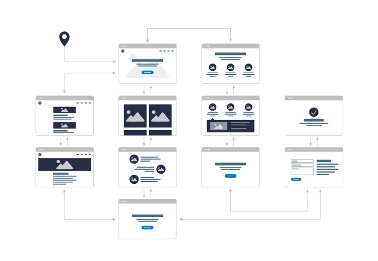
Build a user journey map
The key to any good trip is knowing where you’re starting and where you’ll end up. To write an accurate user journey map, think through the path you want your users to take from the minute they land on your page through conversion and even after for follow-up. Write out each step of the journey so that you don’t miss a single point. The final destination should align with your goal for visitors who land on your page, such as signing up for a newsletter or making a purchase.
The buyer’s journey starts with the awareness stage where the prospect has a problem or sees an opportunity. It then moves to the consideration stage, where the person better understands some possible solutions to the problem. The final step is the decision stage where the consumer decides what their solution is.
The journey may be a bit different for different types of websites. For example, on an e-commerce site, the journey might start with an informational video, move to an FAQ about the product, go to a call to action (CTA), and end with the person buying the product.
One of my clients found customers had some very specific questions when they landed on the homepage of the site. Answering these questions quickly and above the fold allowed me to design a journey map where the client moved quickly from the first stage to the consideration stage. Conversions increased, and the website’s sticky factor improved.
However, an advocacy site may use different steps to qualify volunteers and make sure they align with the organization’s values rather than sell a product. Another thing to consider is when part of the journey occurs non-digitally, such as an initial connection made at a trade show and final sale through the website. The steps will vary depending on the first contact with users and how much information must be provided through your landing page.
Create focus on the landing page
The first step in the user journey is your landing page. You may have more than a single landing page on your site, too.
For example, if your analytics show that most of your search engine traffic comes because of a specific piece of content, use the content as part of your landing page and include a CTA at the end of the article.
Another example: If your analytics show that 90 percent of your traffic arrives on a specific page, treat that page like any other landing page.
Figure out the audience members and create a buyer persona for that specific group of site visitors. You must also decide where these visitors are in the journey—if they are already in the consideration stage, your content will present the solution to the problem rather than just defining the problem.
Only 39 percent of marketers create a custom landing page for a specific marketing offer. However, unique pages for each of your offers allows for specific content which drives the buyer through the journey and ignores content not related to solving the user’s problem.
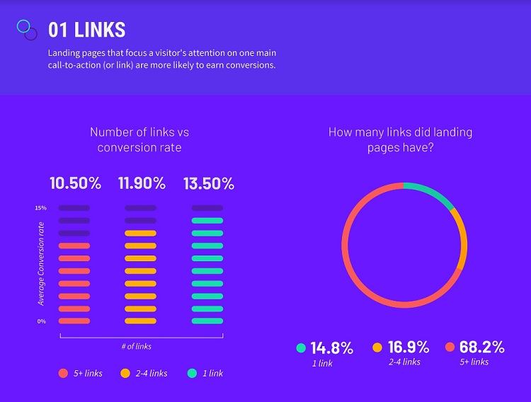
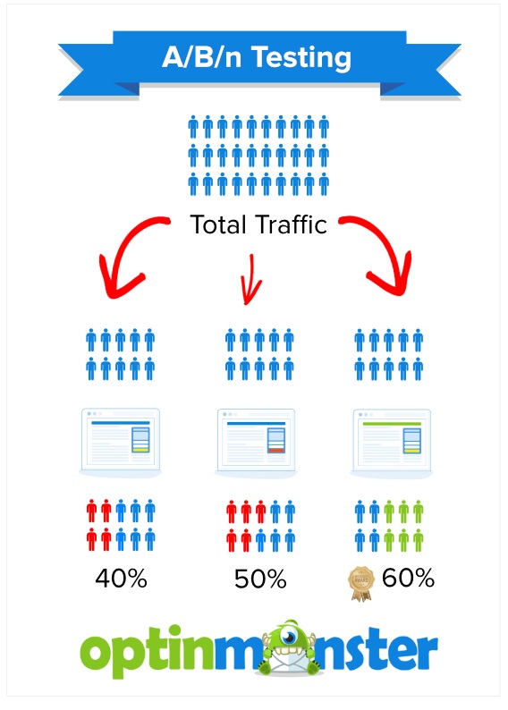
One of the best ways to make your landing page highly attractive from the minute users land on your site is by creating a singular focus that drives the buyer down the path you want them to take. Allow a strong balance of positive and negative space so that attention is drawn where you want it to go. Show users next steps with arrows and clear calls to action. No matter what type of website you manage, you must conduct A/B testing to figure out what changes garner the highest conversion rates from your specific users.
Determine your end goal
Before you add any content, you need to know the final purpose of the buyer’s journey. By the time your users get to the final leg of the journey, you’ve narrowed down their buying experience and know exactly what they’re looking for, but what is your goal for their actions? The micro-interactions on your site might only have a single purpose, but they should all point toward the final goal or larger purpose of your website, even from the first moment the user finds you.
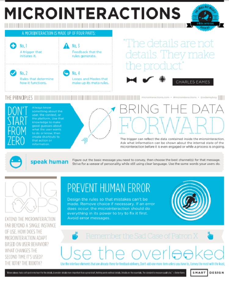
Place your focus on the final call to action and perfect it as much as possible. What’s the one concern you haven’t yet answered through the micro-interactions that might make the user reluctant to take that final step? How can you effectively answer any concerns the buyer might have? Put yourself in the buyer’s shoes and think about what might keep you from buying or signing up. Then, offer a guarantee or additional information that puts the user at ease.
Educate the consumer
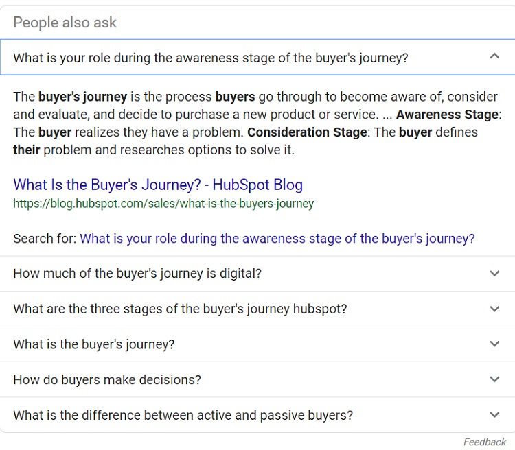
If your site visitor makes it midway through the journey, they’re definitely interested in what you have to offer. You must now convince them that your product, service, organization, or information is exactly what they’re seeking. Clearly answer any questions the user has.
You can figure out typical questions based on what others have asked via telephone, email, or in forums such as Yelp, the Google Play Store, or the Apple App Store. Study Google’s “People also ask” questions for more ideas. Answer the most popular questions upfront and provide additional options if the user has additional questions. Add live chat for any out-of-the-ordinary questions that need an immediate answer. There are many effective ways of educating site visitors, including video, articles, and guides.
Plot touchpoints
List the places where customers engage on your website and match them to where the buyer is in their journey. Someone who connected with you in a local store might arrive right on the shopping page on your site. If you’ve already vetted a volunteer for your organization, they may just need to go directly to the signup form.
This image from optinmonster.com shows potential results for A/B/n testing, illustrating how it’s possible to see what site contents perform best.
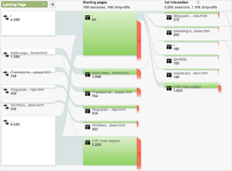
A behavior flow report allows you to address the needs of different types of users and where they came from. Build a map based on the information users expect to see and the typical behavior of each user, but also be aware that 49 percent of users expect instant access to information at all times. As more people buy smartphones and get online with them, people grow more accustomed to searching for an answer and getting immediate results. Devices such as Alexa and Google Home also make it easier than ever to pull up information with little effort. Make the details easy to locate within your navigation and add voice search functions to your site.
Each touchpoint on the journey should have a goal. For example, the goal for the landing page may simply be to get the user to read the information and click on a video link. The goal for the video might be to direct them to a signup form. The signup form has a call to action to fill in and submit the form. Knowing the purpose of each touchpoint allows you to create a singular focus and drive conversions. Remember non-digital experiences as well. If a user sees an advertisement at a bus stop at a time when they need a solution to a problem, do you help them solve that problem as soon as they navigate to your website?
One of my clients placed advertising in local theaters but wasn’t getting the hoped-for results. Simply by adding a specific website address that took moviegoers to a page geared specifically toward that buyer persona, the client saw an increase in site visitors. She also had the advantage of knowing exactly how many moviegoers saw the ad and visited her site because the landing page was specific to that campaign.
Test everything, then retest
A design that’s user-centered drives the buyer smoothly from Point A to Point B to Point C. Test each step along the way and make any tweaks needed to gain the highest conversion rate possible. You may need to change the color or wording of a CTA button, remove or add information, or complete any number of other tasks.
Split testing allows you to make sure each and every point of contact is the best it can be. Track your conversion rates and test frequently to ensure ongoing success.
The path isn’t always straight
You might spend countless hours mapping the buyer’s journey and planning out each point along the way. However, users don’t always enter your website where you think they should, nor do they use a straight path in their journey. Allow some room for users who bounce around in a different pattern than you expected. With a little attention to the journey, the buyer is likely to take alternate routes, you’ll get a better return on your investment than you ever expected.