An atlas is usually a book of maps. They were named for Atlas, one of the groups of gods called Titans in Greek mythology. For participating in a war against the supreme ruler Zeus, Atlas was punished by standing and supporting the sky forever. Many works of art depict Atlas supporting the Earth, not the sky, on his shoulders.1
The Flemish cartographer Gerardus Mercator first used the term “atlas” for a collection of maps in the 16th century. 2 Atlases have become saturated containers. Extensive editorial (documentation and descriptions) and graphics (cartography and photography) fill an atlas’ large pages. Such an eclectic and dense array of material is both intensive and intimidating. Such material was illuminated in the “World Geo-Graphic Atlas.” From its Preface, Bayer designed the information “in an abbreviated, simplified style with extensive use of the pictorial medium.” Bayer’s rendition of the atlas can be described by the following techniques:
- Page presence and harmony
- Multiplicity of views
- Storytelling
Page presence and harmony
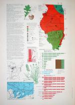
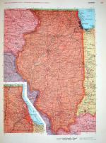
Each spread acts as a poster. The Atlas page size is 10.75″ x 15″. The book’s physicality is monumental. No page acts alone but in concert with another. The Atlas’ pages are complementary: A single seamless surface packed with data. The contrast of content was optimized between facing pages. Each turning of the page unfolded a spectacle. Showcasing a state is a major template. The left side is a microcosm of features, from a display of the state’s bird to a table measuring consumption of natural resources.
The right side is a macrocosm through the map of the state. The unified coverage achieves a “state”ment, two pages functioning as a unit of one. The left page naturally transitions into its adjacent counterpart and vice versa. This toggling between two levels of detail provides a dual survey of the land.
Bayer’s orchestration of “the pictorial medium” is lyrical in the Atlas. The grand symphonic poem of the world is broken down into digestible clusters, rhythmic in their visualization. There is a visual lilt to the layouts. The visual composition of data density naturally lends itself to musical play that amplifies the meaning of the content instead of distorting the truth.
Multiplicity of views
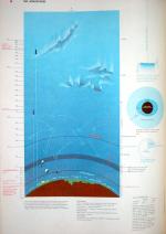
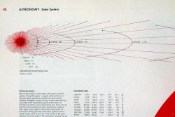
The graphical texture is thick as shown, for example, on describing the earth’s atmosphere and circulation of air. 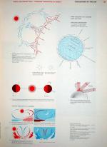
The various views of data are matched by the variety of disciplinary views. That is, Bayer gathered and assembled data that crossed disciplines such as geography, sociology, history, astronomy, and geology.3 From the Atlas’ Preface, Bayer states that “There are close ties and overlappings between geology and water supply, between astronomy and glaciers, between population figures and physiographic features, between sunspots and communications.” This texture of multiple forms stemming from multiple disciplines gives each page a contextual ambiance rooted in the liberal arts and sciences. The cultural and physical properties are revealed in the manner of a tapestry whose choreography incites exploration of the subject matter. It also fosters an appreciation for the scientific fields of inquiry in learning more about our habitat through a local or international lens.
Storytelling
“People and places are the twin pillars on which most nonfiction is built. Every human event happens somewhere, and the reader wants to know what that somewhere was like.”4 The writer William Zissner’s words, from his chapter on “Writing About Places” can be applied to the Atlas. Bayer’s handling of concrete detail builds a strong sense of place. The visual organization and treatment is objective but also evokes a setting – the sight and sounds – that fascinates the senses of the reader turned traveler. “The mere agglomeration of detail is no free pass to the reader’s interest. The detail must be significant.”5 Each page of the Atlas is an eloquent passage, not a superficial heap of data. The reader is presented with a passage through time, space, and culture.
Evangelizing Ecology
The Atlas eloquently presents data of the world – its people and places – in a colorful format that is both enriching and enlightening. Bayer orchestrated a sequence that is strong from beginning to end. The Atlas does not only visually capture the landscape of the mid-twentieth century but rewinds to the beginning of planetary movements and of the planets themselves. The typical strategy is to fast forward to the present day and concentrate on the here and now, but Bayer finds relevance in what was, the origins.
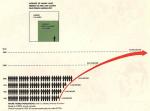
Regarding the future, a graphic is found at the end of the Atlas. It shows a comparison between the growth of the global population to the availability of the earth’s resources. The proportion of land to individual is becoming more disproportionate. Tapping into the power of narrative, the visual coda provides an explicit challenge: Take care of the Earth. This coda matches the preamble that expresses a collective conscience in sustaining the challenge.
From the Atlas’ Foreword, Walter Paepcke states, “It is important that we know more about the geography and the conditions of life of our neighbors in the world so that we may have a better understanding of other peoples and nations.” Global empathy through cooperation and collaboration is a key to our world’s survival. In evangelizing the critical value of understanding in an ever-changing information landscape, information design is nothing short but an environmental discipline.
Photos by Ignatius Aloysius, True Ideas
For more information
|
1 Atlas with Earth on his shoulders.
2 Geradus Mercator coined the term “atlas” for a collection of maps.
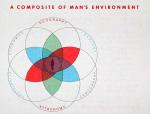
3Bayer, Herbert (edited & designed by), World Geographic Atlas: A Composite of Man’s Environment, Chicago, Container Corporation of America, 1953, First edition.
4From On Writing Well: The Classic Guide to Writing Nonfiction, p. 116.
5From On Writing Well: The Classic Guide to Writing Nonfiction, p. 117.
| Nate Burgos Nate Burgos is a designer who sustains growing design webliography “Design Feast”:http://www.designfeast.com. |

Wonderful article Nate, about one of the most exquisitely designed books of the 20th century. It has known to make graphic designers gasp and…even one that I know…weep [with joy].
Thank you for putting the images back up – we continue to link to your article on all copies offered.
Best,
Polly D
Optos Books
http://www.optosbooks.com
Great summary!
While it is a brilliant text, in my experience the multiple perspectives and story telling is the universal value here.
Page presence and harmony preferences change over time and environment that people find themselves.
For example a mobile interface requires a different sensibility of presence and harmony.
While some may note that mobile interfaces were not considered by the author, let’s go to audio.
Consider a storyteller that has the text and is conveying the knowledge to an audience.
It may be possible to use a different page presence to cue the storyteller.
On the other hand the multiple perspectives and story values are intact.
Cheers,
Nick
A great article but why can’t I resize the pop-up windows. I have a 21 inch monitor, it would be sweet if I could see those entire pages.
I’ve fixed this: make those babies large!
I would like to purchase this nook, Information Ecology: Bayer’s Book of Maps. Does anyone know where I can find it?
thank you.
jeanette smith
nette@cruzio.com