A lot of confusion and misunderstanding surrounds the term "user experience." The multitude of acitivities that can be labeled with these two words span a vast spectrum of people, skills and situations. If you ask for UX design (UXD), what exactly are you asking for? Similary, if someone tells you they are going to provide you with UXD for an application, website or intranet or extranet, what exactly are you going to get?
Is it just one person who is responsible or is it a team of people who are in charge of UXD? In this story I´ll sketch my ideas of UXD based on my experiences and at the end of this story I will give you my answer.
Let us start at the beginning – UXD starts with experience – experience of the users. And so I will talk about the users first.
UXD-P – every person is an individual
Every person is an individual. Every person is in possession of different roles. For each individual there will be many roles and each person adopts a different role depending on the circumstances.
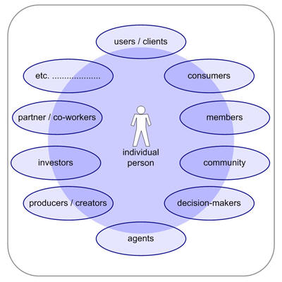
User Roles
Sometimes the individual person holds one role, but mainly he will hold quite a few roles like consumer, customer, user, client, investor, producer, creator, participant, partner, part of a community, member, and so on.
UXD-P – network of expectations, experiences and knowledge
Every user is multi-faceted – and is considerably more complex than they themselves can imagine – so it´s not very helpful just to talk to the user or ask him what he needs. We have to watch what people do; we have to listen to what people say and to recognize what decisions people make – and by observing we have to evaluate and understand why they do this and that. Why and what kind of visual elements will the user like, prefer and or understand? Why and what kind of mental model, navigation or function do they respond to?
Jakob Nielsen said “To design an easy-to-use interface, pay attention to what users do, not only what they say. Self-reported claims are unreliable, as are user speculations about future behaviour.” (Jakob Nielsen – Alertbox) and I agree – I think no statement can be objective. Perhaps the circumstances are not realistic or not reasonable for the person. Or maybe the person himself is not really in the “situation,” or he is being influenced by other factors (trying to please the tester for example). Or maybe he is trying to succeed with the test rather than trying and failing, which tells us so much more.
When all three perspectives (do, say, make) are explored together, we are able to realize the experience spectrum of the “normal” user/customer we are working for.
Jesse James Garrett said: “User experience is not about how a product works on the inside. User experience is about how it works on the outside, where a person comes into contact with it and has to work with it” (J.J.Garrett – The Elements of User Experience) .
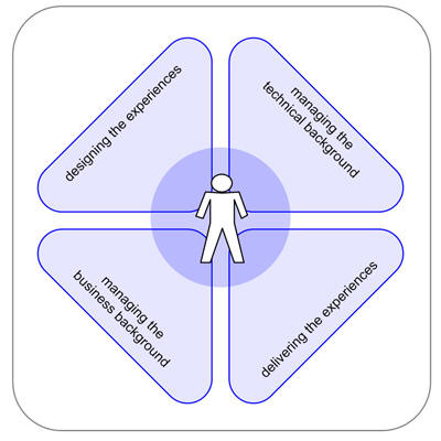
Experiences
Areas of experiences: different areas which effect the quality of communication
UXD-P – personal and individual
When we talk about experiences, we take the individual into consideration, including the subjective occurrences felt by the person who has the “confrontation” with what we want them to use. Experiences are momentary and brief – sometimes they are part of a multi-layered process or they are on their own.
Normally such know-how has been learned as a part of something or by itself and will be remembered in the same way – but that’s not always the case – and the person deals with the situation in a different way. If we look at their exeperience as a continuum, the user brings their experiences of the past to the interaction in the present and adds their hopes for the future. That future could be: to interact with their banking in a safe and secure way.
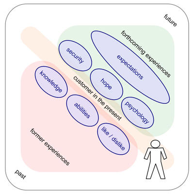
Flow of Experience
Flow of experience: the individual user/customer is always in the present – they act in the present. They are influenced by former experiences and current expectations.
UXD-P is taking the users’ views, behavior, and interactions, to figure out the emotional relationship between them and the thing we have built. For the most part these "people" and their experiences are unknown. It requires an appreciation of the customer: their journey, their personal history and their experiences.
It is the collective set of experiences, in the online-world, the offline-world, or even tiny little things (i.e. My coffee was cold this morning) that affects their experience of the products and the companies that represent them. It is about appreciating the individual user’s unmet needs, wants, capabilities and desires in a contextual way. It´s a box of experiences including the things the user saw, acted and felt. (BBC Two [12th February 2008, 9pm, BBC Two] had a program on rational thought. Highlights of the program include: Loss complex, Post-decision rationalization, Priming, Precognition. Watch highlights from the programme : http://www.bbc.co.uk/sn/tvradio/programmes/horizon/broadband/tx/decisions/highlights/ )
Experiences and expectations meet in the present. Both are inseperably combined, and every action we take takes both parts into consideration. When a person uses an application, he tries to understand what happens. He will always try to reference this to his past experiences. The moment is also tightly coupled to his expectations of his personal outlook.
At this point of “present” I think of the UX honeycomb of Peter Morville [1] …
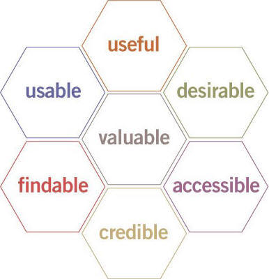
Morville’s "honeycomb"
honeycomb – Peter Morville (P.Morville – Facets of the User Experience)
In the present we have to deliver to the individual user and his specific task the best answers to following questions.
- Is the application useful for the individual user and his specific task?
- Is the application usable for the individual user and his specific task?
- Is the application desirable for the individual user and his specific task?
- Is the application valuable for the individual user and his specific task?
- Is the application accessible? Available to every individual user, regardless of disability?
- Is the target findable for the individual user and his specific task?
- Is the application credible for the individual user and his specific task?
In the UXD-P the whole team has to take the users’ views of the GUI and the interactions to figure out the emotional relationship between the brand and potential customers. It requires a common appreciation of the customer journey and their personal history: not only with the product and similar products, but also with similar experiences.
UXD-P – teamwork and cooperation
The first stage in discovering – to invent or design for the experience – is to take a new viewpoint about the people who buy and use the products and services we are designing. This is a birdseye view and from step to step we have to use the "mouseview," which is to say a detailed view from the user’s perspective, as we develop the application we have to switch between these views. Our main desire is to to respect, value, and understand the continuum of experience and expectations our users have .
UXD-P can sometimes be a slippery term. With all the other often used terms that float around: interaction design, information architecture, human computer interaction, human factors engineering, usefulness, utility, usability and user interface design. People often end up asking, “What is the difference between all these fields and which one do I need?” If the UXD is aimed to describe the user’s satisfaction, joy or success with an application, product or website, however we specify it, there are a few key essentials which need to be tackled and I have to point out the UX honeycomb of Peter Morville [1] a second time. Each of these points, as enlightened above, makes up a considerable component of the user experience. Each is made effective due to the design offerings from each of the following elements:
Usefulness is based upon utility and usability. This means the product is able to give exactly the right kind of service and what the user is expecting from it. And it´s the joy of reaching my aims and the joy of doing so easily. The information architecture is in charge of clarity of the information and features, lack of confusion, a short learning curve and the joy of finding. The designing of the interaction is essential for a successful and overall satisfying experience. So the interaction design has to answer the questions of workflow, logic, clarity, and simplicity of the information. Visual design is responsible for the clarity of the information and elements, simplicity of tools and features, pleasant or interesting appearance of the interface, the visual hierarchy, and the joy of look and feel. Accessibility is a common term used to describe how easy it is for people to use applications or other objects. It is not to be mixed up with usability which is used to describe how easily an application, tool or object can be used by any type of user. One meaning of accessibility specifically focuses on people with disabilities: physical, psychological, learning, among others. Even though accessibility is not an element of its own, it is important to notice that accessibility also plays a role on the whole user experience to increase the likelihood of a wide-ranging user experience. People tend to gravitate to something that is easier to use regardless of who it might have been designed for.
The UXD innovation process is a nonlinear spiral of divergent and convergent activities that may repeat over time. Any design process begins with a vision. This applies particularly to the UX process. A vision, however, is not enough to start design. As I mentioned before, we always have different circumstances, users and roles. Therefore, it is critical to accurately understand the end user’s needs and requirements – his whole experience and expectations. The UX process relies on iterative user research to understand users and their needs. The most common failure point in UX processes is transferring the perspective of users to UI design. The key is to define interaction first, without designing it. First, all the research (the user, product and environment) have to be organized and summarized in a user research composition. These lead to user profiles, work activities, and requirements for the users. The user research composition feeds directly into use cases. The use cases show steps to accomplish task goals and the content needed to perform interactions. Completed use cases are validated with the intended user population. This is a checkpoint to see if the vision is being achieved and the value is clear to users and the project team. The next step is to design the user interface, generating directly from the interaction definition. A primary concern with design is to not get locked into a single solution too early. To keep the project on time, this step should be split into two parts: rough layout and exact and detailed design. The rough layout allows experimentation and rapid evaluation. Detailed design provides exacting design and behavior previews of the final application that specify what is to be coded. Iterative user evaluations at both stages are connected to be fast and effective in improving GUI, design feedback, rapid iterative evaluations, and usability evaluations.
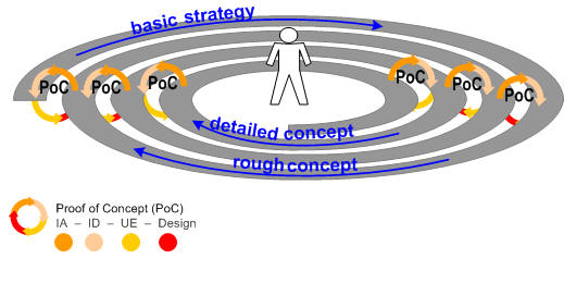
Image_7
design workflow – workcycle – workspiral
UXD-P – Gathering the elements
The diagram below presents the relationship of the elements above:
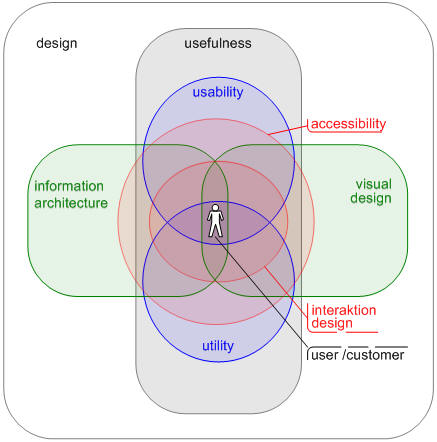
Elements of UXD-P
Lewin’s equation
Lewin’s Equation, B = f (P,E) ( B – Behaviour; f – Function; P – Person; E – Environment ), …
… is a psychological equation of behaviour developed by Kurt Lewin. It states that behaviour is a function of the person and his or her environment [2].
There is a desired behaviour that we need to encourage, but we have no control over the person, so via interaction design, information architecture and interface design we control the environment and therefore generate the desired behavior. (see reference: books.google.com ).
UXD-P – many steps to go but every step is worth it
How do we involve our team, customer and our user/consumer? We can start at different points, but I like to think about the circumstances first. Where do we come from? Where are we? Where will we go? And who is “we”? “We” means each person who is involved in the project. Iin the centre of each effort stands the user. To get the user with his personal experiences and expectations into the project, the design team and the customer needs a combining glue / tool / instrument. I believe these are the personas of the “target users/consumers” in the process of UXD-P. If there are no personas the second or third choice are scenarios or the workflows (based on a certain user/person).
The management point of view for the most cases is also the view of our customer. It includes the user’s/consumer’s age, income, gender and other demographics. The perspective of UXD-P is to look at behaviour, goals and attitude.
To get a realistic persona we have to identify first of all the target users. Out of my experiences this is not only the task of our client to define the users and consumers – we have to support him. During the identification and characterization we have to go beyond demographics and try to understand what drives individual users and consumers to do what they do and these as detailed in quantity and quality as necessary and possible – like I mentioned above. The approach and the complexity of the characterization depend on the tasks, project and functionalities. Parallel to the very personal description we need a “picture” of the environment. For each persona we must define their business and/or their private concerns and aims. Do they want to research a product for purchase later? Are they concerned about not wasting time primarily? Do they just want to purchase something online as easy and quick as possible?
Depending on these personas we can formulate, discuss and prove scenarios – from the very beginning of the project, during the project and as check or analysis at the end of the project.
UXD-P – my blueprint of schedule – "todos" and deliverables
We are always asking and being asked: what are the deliverables. Throughout my career as an IA, UX-planner and designer, as well as during my study of architecture and town planning, I have constantly asked myself following the questions:
- What kind of project is it? What are the key points?
- What should our steps and milestones be in the project?
- What should our/my deliverables be?
- How can we/I explain the main idea?
I have realized that if I do not answer these questions previous to creating a deliverable, I waste more time and deadlines slip.
The deliverables are not for us. The deliverables are a means of communication with several people: manager, decision maker, client, designer, front-end developers, back-end developers, etc. Sometimes I have the feeling we overlook this from time to time. After I think about the project I have to ask myself, where will my deliverables and other efforts fit within the process of design? The following diagram describes different lines of work that will lead us to some questions each line must accomplish. Depending on these questions and topics I will outline the basis, basics and deliverables for which each skill and ability which is necessary.
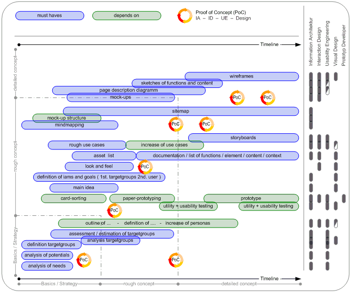
Image_6
schedule of UXD-P ___ better view – schedule 1238px x 1030px
UXD-P – my conclusion
I studied architecture and town planning. And just like town planning and architecture isn’t just for architects and art lovers, the internet isn’t just for computer users and developers. Similarly, just as the towns and the cities are for the inhabitants and architecture is for the users of a building, so products and applications are for the user, the customer, the member and not for the people who build them.
In every kind of process we should act in a team but in the process of UXD-P it is absolutely essential that we have to think parallel, with the same focus . We have to act in a team, although every team member is a kind of lawyer: lawyer of budget, of the client, of utility, of usability, of look and feel, of brand and finally of the user himself. Because at the end of the project, our user/customer is the final judge.
Good design is not only interface, or look and feel, or technology, or hardware, or how it works. It is every detail, like the structure, the labelling, the border of a button or a little icon. Finally, it is the sum of every element. I believe that a shared vision of a group of creators will have more potential than individual creativity. And that is the point where creativity meets expectation. The point of view on IA and design and the process to get to a well-designed product will be changed by UXD-P.
The persons who use the application or other object that we invent are the real “architects” of the “architecture” – the real “inventor” of the design. The more we know about our users, the more likely we are to meet their needs.
As the capabilities of interactive applications and the internet go forward and grow, more and more consumers use the applications and the various possibilities in new and different ways. We must think about all aspects of user experience.
And I will ask you once again: Is it just one who is responsible or is it the team which is in charge of UXD-P?
Personally, I believe it is the process of planning and designing for User Experiences (and so I think it’s the team which is in charge), but the overview has to have an experienced planner as a kind of captain.
The most common cause of an ineffective website (one that doesn’t deliver value to both the business and its intended constituents) is poor design. The products have to follow, to cover the functions and the experiences. The lack of clear organization, navigation and values of brand and mood mean that people will have an unintentional and maybe bad experience, rather than one that will meet the business’s relationship objectives for each individual. User experience design and planning is a fundamental component to the creation of successful digital products, applications and services.
UXD-P is UXdesign and planning- – In my estimation there are distinctions between Design and Planning.
Design is usually considered in the context of arts and other creative efforts. When I think of design in the UX process it focuses on the needs, wants, and limitations of the end user of the designed goods, but mainly on the visual parts and the mood. A designer has to consider the aesthetic-functional parts and many other aspects of an application or a process.
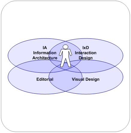
The planning part provides the framework. The term "planning" describes the formal procedures used in such an endeavors, such as the creation of documents, diagrams etc. to discuss the important issues to be addressed, the objectives to be met, and the strategy to be followed. The planning part is responsible for organizing and structuring to support utility, findability and usability.
I strongly believe that both parts – design and planning – have to work closely together. Every team member should have the ability to think cross-functionally and to anticipate consequences of activities in the whole context.
I’ve often seen timelines like this …

and this doesn´t work for UXdesign and planning …
I give a timeline the preference which looks like this:

… to develop a UXdesign and UXplanning.
And in the center of this team and of this process should stand the leading person – the user!
[1] _ UX honeycomb of Peter Morville
semanticstudios.com-publication
[2] _ The Sage Handbook of Methods in Social Psychology _ by Carol Sansone, Carolyn C. Morf, A. T. Panter
google-books (The Sage Handbook of Methods in Social Psychology)
amazon.com (The Sage Handbook of Methods in Social Psychology)

Thanks for this article, Holger. It’s helpful that you’ve reinforced a distinction between the different roles and their responsibilities on a team. And that some of us can be several of these roles at a given design phase.
And I also liked the thread about ‘context’ that runs through your article. Lewin’s equation is a good client-digestible artifact that considers context’s influence on behavior. But I think the extra dimension of multiculturalism is missing from it (This is not negative reflection on you, of course). I would add a C for culture in the formula, making it B = f(PEC).
A person behaves (B) in a certain way in a given environment (E). But people from another culture (C) may act differently given that same environment. They may respond in an unexpected way. They may make an unpredictable decision based on that other culture’s cognitive habits or communication style. Or that person might get confused because the environment is unfamiliar.
I think that if an experience which requires a multicultural design sensibility is called for, all your ideas and charts need two or more layers. For example, the Do/Make/Say evaluations are performed on subjects from all cultural populations that can be identified for a given experience. Each subject approaches the design in context of his/her cultural values (i.e. what has utility for you might not have utility for me); the team may have to consider two or more distinct possible Do/Make/Say perspectives for a given environment and then design accordingly.
And considering differing cultures which might experience the same UX, there may be a disconnect in your Flow Of Experience diagram (one of my favorites in your article). The Former Experiences population may not be able to undertake the Present State because of mismatched knowledge/abilities/likes. Or they may have different Forthcoming Experiences based on their cultural influences, experiences that the Present state cannot prepare them for.
I know it means extra work to plan and design for one or more additional user groups, but I think it’s valuable to do so. It might lead to a higher ROI.
I subscribe to your opinion/view about culture – more and also less – … in any case it´s interesting point. The specifically cultural skills, knowledge and experience in each set of circumstances are often wrongly understood as hindrances to development work. I quite agree with you that we have to look for this point(s). And this might be a “problem” which not to be underestimated. And furthermore for the future and or multicultural projects, it will be of major significance that culture is given adequate consideration. But … Is it not so that one element of culture is a part of individual history / his former experiences? I think Yes! But the longer I think about your comment I see the second element of culture and that´s a part of environment. This element of culture isn´t related to a person himself – it´s related to the area “customer in the present” in my Flow Of Experience diagram. Thanks a lot for your comment – Your comment will provide me ample food for thought. 🙂 thx
This is one of the better design process descriptions I’ve read, and I seem to have read a great deal of them. I hope you will therefore forgive me if I ask what might be a silly question. In describing UXD-P, do you mean that there are other ways of performing UX design that do not involve what you describe? While I agree with much of what you write, but I’m unclear why you’re saying it.
Hello Jonathan
Thanks for your comment. … And I´ll try to answer you – given that I got you right. I strongly believe that there are always several ways to come to a good result. The way and the steps we need will depends on the marginal conditions – but the core element in UXD-P is the spirit that we have to work as one – and not as lone fighters – who fights for IA or usability or visual appearance.
Did I have you right? … Or am I a bit slow on the uptake? – If I got you wrong – please can you specify your question – what you mean?
Hi Holger,
interesting article, and I strongly agree that you do raise some very important points here. Having seen similar articles recently I just wanted to flag one thing that is often overlooked in those discussions:
Business Analysis.
Having worked with clients and agencies on a wide variety of online projects, I came to realize that quite often, the client’s reqiurements, as well as their strategic and technical capabitlities are often overlooked. Instead agencies create something nice with loads of usability, that not necessarily works for the client or satisfies the underlying requirement, or more important doesnt even meet client expecations.
I strongly believe that there is another element reuqired in those models above, that of the business analyst. We have made very good experiences in capturing business requirments, modelling use cases and then having the rest of the team, on that basis continue their work. (Of course the process is iterative and there are feedback loops).
The advantages are:
– better understanding of the client, and not only of the end-customer, but of the business you as an agency are actually working for
– being able to support the client’s business strategy and therefore add true value
– undestanding capabilities, risks, contraints and oportunities around all aspects of a project (how often do online projects not deliver because of a business process change that could not be achieved or due to a third-party integration gone wrong?)
– align the team and ensure common and consisten undestanding of project objectivs and success criteria
– baseline for client sign off, development and testing
and so on
The reasons why this aspect overlooked, I believe, are historical: Online media being considered less technical and more fluffy than software development. The funny thing is that this goes both ways: Application development requres not only business analysis, but also user experience design, and very design led projects als may need business analysis, even banner campaigns. In the end, there are client expectations to be met, so no project without business requirements – even if the agency defines them for / with the client – – and the more complex, technical or process heavy such products become…
I believe you actully have it in your model: It is the extension of the green line for techincal resource to the beginning of the project.
I personally believe that there should be a specific role tasked with the aspects I mentioned, which has, depending on the project, their main effort at the beginning of the project, and will then, depending on the type of project be involved furhter down the line more or less.
Have you had any experience with this?
Hi Marcel
Yes I had – I have been working on solutions for websites, intranets, mobile and terminal application, but also for software applications. You are right when you see the points you mentioned in the “green line”. How exactly the lines ought to flow depend on the subject, efforts and timelime.
My intention to wrote this story had been influenced by several disappointments out of ineffective, strictly and firmly divided design processes. Aside from the basement (here I see for instance the business analysis) of the process I saw always huge problems when we did the overall design process in divided steps.
A clear communication between web developers and our clients and among members of the development team is a or the key to the success of a project. The main focus of the story is how we involve the user and how we put the user in the center of the process. Out of my experiences there are several gaps between UXD-P and business or marketing analysis. In the UXprocess we are looking at users ( HCI, IA, IxD, human factors, … ) – business or marketing analysis has its focus on customers ( sociology, statistics, demographics, … ).
We (planner, designer, developer and none the less the client) have all the same aim, to offer the best possible user experience across all customer touch points. But we have different perspectives on the settings.
That is the reason why I didn´t mention business analysis and technical requirements in detail.
In general and first of all, i have to point-out my profound interest in the subject of concept and information architecture, due to the fact that Holger has become a kind of my mentor at the work at argonauteng2 since a few months, even tough I never heard of IA or UE seriously half year ago.
All in all I guess it’s an awesome article to emblaze the essential premises of successful IA/UE. Especially for me as an job beginner and in terms of correct understanding what this subject is about the article provides me with the most needed information to start the job with a special point of view and with some little background information which always should have been kept in mind to achieve the key success factors in our job.
I’m not a typical designer, concept developer or information architect – strange to say that I would claim being a mixture of all of them. By reason of the development of my further career I started developing and designing websites more on a “looks-good” level than on a “works-and-looks-good” level. This aspect has to be considered due to the fact that media has changed in some way. It has become more complex, more interactive and so the demands of clients has also rapidly grown as well as the users demands. A long time ago I built a lot of websites on the basis of “how I would use the website”. I strongly relied on my intuition, but, nowadays I know: it’s hazardous, because not only demands have become more complex, but information as well. In former times it worked and clients were quite happy, and now my demand on user-centered websites has raised, not least by the sensitization by Holger for the different influences which play a strong role in the work of IAs.
The issue that concept development or information architecture has to do with the most important ports to design department, account management department or technical department, it has become a desirous job outlook for me. I’m interested in a lot of things and I’m definitely convinced that people like Holger are that kind too. And today we have to be flexible, to open our eyes and ears widely, to react on our surrounding and maybe to build our surrounding with regard to other people who will be living in it (for example our childs). So, in addition to this, I guess that Holger’s article reflects this attitudes in a very positive way.
I would appreciate a spoken presentation on your article, Holger – that would make me glad and it would definitely be an enrichment for all upcoming information architectures.
Holger, this is a great article. I especially like the “timeline” diagrams toward the end, because I think the first one, is often the expectation of how user experience and the visual design will work in a given project, but the second diagram, which shows the peaks of certain elements, yet virtually all the components being done for the duration of the project, is significantly more accurate in the real world of software design, especially that is rushed to market. Usually, as the UE person and the visual designer, I am working concurrently with developers and product marketing in iterations of planning, design and development. If people understood the timing to begin with, the pressures and expectations might not be so intense. Thanks for this great article!
KrisC
An interesting article, not sure I am on-board with all of it. But allow me to join in the existentialist banter and note the following:
“When all three perspectives (do, say, make) are explored together, we are able to realize the experience spectrum of the “normal” user/customer we are working for.”
Actually, there is another (and arguably) more important perspective and that is how a user *feels*.
I’d also be careful with the cleaving off of design and planning. Design has always been about experience, visual design is just a part of it. Design vs Planning is another interesting discussion that would be worth exploring.
Hello Kristi
Thank you – It gives me pleasure when you can take advantages of the story.
:-:-:-:-:-:-:-:-:-:-:-:-:-:-:-:-:-:-:-:-:-:-:-:-:-:-:-:-:-:-:-:-:-:-:-:-:-:-:-:-:-:-:-:-:-:-:-:-:-:-:-:-:-:-:-:-:
Hello Ross
Thx for your comment – You are right that we need more knowledge of the user concerning his feelings – his behaviour beyond “do, say, make” – but how to measure / determine? I can just listen to the things the user say and observe what he does and makes. I didn´t forget this perspective – you’ll find these considerations in different paragraphs of the story. We can make up personas to have a feeling for his feelings / to get a “window” or “door” to his view / his vision.
I just found this video on Neuroscience in Retail. http://online.wsj.com/public/page/8_0004.html?bctid=1553185107
I deem it’s interesting what Dr. David Louis said to the potential to make use of these findings in this tape.
Holger,
I enjoyed your article very much, and appreciate the depth with which you have began to deal with the subject. In particular, I appreciated how your “lines of work” diagram indicated several phases of prototyping. This is something that I have found to be critical to a successful project as it takes into account the media by which team members communicate most effectively, as well as that which is most effective for providing a preliminary user experience prior to any real development. While some team members may find a paper prototype the most effective means to communicate initially, a functional, interactive prototype that is accessible in a collaborative environment is much more suitable for beginning to actually experience the decisions that have been made by the team so far. And, in response to your question (“Is it just one who is responsible or is it the team which is in charge of UXD-P?”), clearly a well-rounded team is needed, but also one that has some hierarchy for the sake of accountability. As they say, speed of the leader, speed of the team.
In response to Marcel’s comments about preliminary business analysis, I couldn’t agree more. My firm has added a recommended strategic review to our project anatomy, as we’ve been burned many times by constantly evolving requirements that disrupt the progress of a project and expand its scope to an unsustainable degree. This is especially important for any company that plans to actually do business online (as opposed to having a simple online presence or an application not related to their primary product or service). While we’ve found that those clients with already successful operations tend to reach success online more easily than those without a proven track record, it is never a guarantee that a business will work both on and offline using the same plan and resources. As Marcel notes, evaluating these concerns prior to any other project planning is a critical but often overlooked step.
Chris
Holger!
WOW ! excellent info ! Holger i think i need you for my next meeting with my client ! are you available ? keep it coming !
This serves as a great overview – interesting and helpful for experts but especially for someone who’s very new to the area.
Relevant to the topic at hand: http://www.uie.com/articles/assessing_ux_teams/
Thank you all for your replies and comments.
Yes – I will write another article on Boxes and Arrows – but I have so less time – Currently you can find latest articles and ideas on http://www.ux4dotcom.blogspot.com
And YES – I am available as a freelancer 🙂 but I’ve currently working permission just in Europe – I’m still waiting for my Green-Card for the US 🙂
This is a great article, lot of good work and excellent diagrams – Interesting article & comments.
And by the way I’ve visited your blog – great work! – Are you available for a intranet project?
Holger!,
This is superb article i have found on the UX. i have read so many book related to UI design but from your article I got lots of knowledge from your total articles as well as the graphs which you explained it using the examples.
I am very pleased to hear that. We live and work within a fast moving environment – but we should never forget or overlook or ignore that we have to plan and design for users / for humans – humans before commodity or machine – I wish you and yours joy and success!
Pretty cool article and very nice work .
I really like this article! And I strongly believe user experience design is the X-factor for everything we design.
Keep it up – Thanks for sharing with us
Hi Holger,
thank you for taking the time to write this. This is a great overview and explanation. I completely agree with you at almost every point. I know your blog http://ux4dotcom.blogspot.com/ since a few months. I’m looking forward to reading something new from you.
This is just brilliant. Really good work, very impressed with the attention to detail and your approach …
Whenever I have to explain UX to people and how to deal with UX I will point them to this post from now on.
Janet
Thank you for the excellent article, Holger. I come to this as a SharePoint project manager, not directly responsible for user interface but accountable for ensuring that we have a good and consistent experience across all aspects of our SharePoint implementation.
I would also like to reinforce Marcel’s comments about the significance of business analysis.
If we ask our users “how do you work? how would you like to work?” they are generally limited by their own past experience and technical knowledge. They are sometimes able to answer “how do you work?” well; they are rarely able to give a full answer to “how would you like to work?” because their answer is so commonly a combination of their current method (their history, as you identify) combined with improvements they can imagine based on their limited technical/product knowledge.
So what I hope my BA can do in user design is to help see potential ways of working that the users may never define on their own, but would if they were able… to change do/say/make to would do/would say/would make, and be able to make the jump from giving them what they say they want to what they really need.
Of course, the more sophisticated your users and simpler your service. the less of a gap there will be between the two. But in cases of new/complex technology, a strong BA can help to fill that void.
From a novice in UXD, thanks again for the clear explanation and thought-provoking ideas.
Cheers,
Darryl