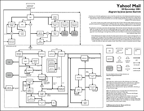
Email was one of the first applications to move to the web, and the first to find widespread popularity among users.
In many respects, email is the ideal web application: it’s an application that people often need access to when they’re away from their “home” environment, and the core user tasks (reading and writing) are easily accommodated with standard HTML interface elements.
As a result, it should come as little surprise that the basic flow of Yahoo! Mail has hardly changed at all since the portal first acquired the RocketMail service in 1997. But rather than offering an outdated solution to the web-based email problem, Yahoo! Mail demonstrates the lasting effectiveness of a simple approach.
The application is extremely conservative with page designs. Almost all user interaction takes place across only three pages: the “message list” folder view, the “message display” page, and the “compose” page.
Another demonstration of this conservative approach is in the site’s error handling. The entire application contains only one standalone error page (the “no account found” page in the login flow), and this seems more likely to be the result of a back-end limitation than a deliberate design choice.
A few awkward spots do appear in the flow. An empty search result set returns a search result page with a “no messages found” message, rather than bringing the user directly back to the query interface to retry the search.
Downloading attachments is a two-step process, which seems like one step too many. The dichotomy between viewing and editing contact information in the address book seems like an artificial distinction whose purpose is unclear. But these are really minor quibbles; overall, Yahoo! Mail is a model of streamlined interaction design.

Poster-sized diagram (![]() PDF, 37K) | Letter-sized diagram (
PDF, 37K) | Letter-sized diagram (![]() PDF, 100K)
PDF, 100K)
Note: The date on the diagram indicates when the snapshot of the system was taken. Yahoo! Mail may be substantially different now.
| Jesse James Garrett has been working in the Internet industry since 1995. In the information architecture community, Jesse is recognized as a leading contributor to the development of this rapidly evolving discipline. |
![]()

Great thanks to the author of this notation (graphic language)!
There is a little mistake in the Poster-sized diagram. Line from the screen “Persistent navpane” to the screen “Adresses” must not be connected with the line from “Message display” to “Compose”. In other words there is connection line from “Message display” to “Adresses” – why?
I was studied to be an engenier of the plasma-electronic devises. So i have an experiense to make lage drawings. No i am an usability engenier. And i want to tell that lage-format drawings are much more understandable then the same but broken in to the letter or A4 format pieses. Let all usability enginiers use usable drawings!
Hi Andrey,
Glad you like the poster. Jesse is an amazing IA, and this poster shows how you can
design a deliverable in ways that people can use effectively.
> In other words there is connection line from “Message display” to “Adresses” – why?
Great question. In Yahoo! Mail, you can read a messge and add a contact to your
address book. You don’t actually visit the page any longer, you get a popup that allows
you to add the contact right there. Pretty useful.
I have some questions about your diagram, specifically about page 3 and page 4 (the letter size version), in my attempt to understand your representation.
You see, we’ve been using your diagramming method in our company and this gives me an opportunity to see if we understood correctly.
Everything seems to connect, from my pov, except for one item–the message display.
From 2d (on page 3) it connects to the message display flow on page 4. Then from there it points to a connection to compose (on page 3). But looking at the compose flow on page three, I failed to locate the connector from the message display.
My questions: Did I miss the connection? Pls point it out. Or if it is indeed missing, shouldn’t the 2d connect to a flow reference (for message display) instead of a continuation point so we could connect it to the compose page?
I hope you will indulge me.
Me again. Forget what I said–I see the connector now. Sorry for the mistake. 🙂
Great little article. I am glad to see that Yahoo! Mail is getting some recognition.
I was an old Rocket Mail customer back in 97′ when Yahoo aquired them. I remember skeptically making the conversion thinking that my new email with Yahoo will likely be discontinued within 9-12 months. Here we are in 2002 and it has been my primary email every since.
I use Yahoo because it never changes. It works superb for what I need to do and I can check it anywhere (Mobile PDA, Cell Phone, basically anything with an internet connection) Any changes that Yahoo make to the service seem to be very well analyzed.