This article is the fifth in a series sharing a design framework for dashboards and portals.
Part 1 of this series, The Challenge of Dashboards and Portals, discussed the difficulties of creating effective information architectures for portals, dashboards and tile-based information environments using only flat portlets, and introduced the idea of a system of standardized building blocks that can effectively support growth in content, functionality, and users over time. In enterprise and other large scale social settings, using such standardized components allows for the creation of a library of tiles that can be shared across communities of users.
Part 2 of the series, Introduction to the Building Blocks, outlined the design principles underlying the building block system and the simple guidelines for combining blocks together to create any type of tile-based environment.
Part 3 of the series, Building Block Definitions (Containers), described the Container components of the Building Block system in detail.
Part 4 of the series, Connectors for Dashboards and Portals, described the Connector components of the Building Block system in detail.
In Part 5, we look at ways to enhance the long-term value and user experience quality of portals created with the building blocks by encouraging portability and natural patterns of dialog and interaction around aggregated content.
For the reader’s convenience, this article is divided into the following sections:
A Portal Design Vision: Two-Way Experiences
Presentation Standards and Recommendations
Manage Functionality By Creating Groups
Enterprise 2.0 and the Social Portal
A Portal Design Vision: Two-Way Experiences
Portals gather and present content from a wide variety of sources, making the assembled items and streams more valuable for users by reducing the costs of content discovery and acquisition. By placing diverse content into close proximity, specialized forms of portals, such as the dashboard, support knowledge workers in creative and interpretive activities including synthesis, strategy formulation, decision making, collaboration, knowledge production, and multi-dimensional analysis.
At heart, however, aggregation is a one-way flow. In the aggregation model common to many portals, content is collected, organized, and perhaps distributed for use elsewhere, but nothing returns via the same channels. Savvy users quickly see that the greatest value of aggregative experiences and tools lies in their potential contributions to two-way flows. They understand that experiences capable of engaging direct and indirect audiences transform portal and dashboard content into a broadly useful resource for communities of much greater scope and impact. Further, business staff and IT users comfortable in the new world of Enterprise 2.0, DIY / mashups and shadow IT now often create their own information technology solutions, assembling services and tools from many sources in new ways that meet their individual needs.
Accordingly, portal designers should create experiences that support increased discussion, conversation, dialog and interaction, and allow for the potential value of remixing content in innovative ways. We might summarize a broad design vision for two-way portals that synthesizes these audiences, environmental factors and imperatives as follows:
- Provide users with rich contextual information about the origin and nature of dashboard or portal content; context is crucial, especially in a fragmented and rapidly moving enterprise environment.
- Improve the quality and consistency of the user experience of aggregated content.
- Improve the portability of content, making it useful outside the boundaries of the dashboard.
- Allow dashboard users to take advantage of other tools available outside the immediate boundaries of the portal.
Operatively, this means providing two-way channels that make it easy to share content with others or even "take it with you" in some fashion. The building block framework is ideal as a robust foundation for the many kinds of tools and functionality – participatory, social, collaborative – that support the design vision of two-way flows within and outside portal boundaries.
Recommendations
Based on this vision and my experience with the long-term evolution and usage of many portals, I recommend five ways to enhance two-way capabilities and the overall quality of user experiences designed with the building blocks framework:
- Define standardized Convenience functionality that could apply to all blocks. This will provide a baseline set of common capabilities for individual blocks such as export of Container content and printing.
- Define Utility functionality offered at the Dashboard or Dashboard Suite level. This captures common productivity capabilities for knowledge workers, linking the dashboard to other enterprise resources such as calendars and document repositories.
- Define common metadata attributes for all Container blocks, to support administration and management needs.
- Define presentation standards that appropriately balance flexibility with consistency, both within Container blocks and across the user experience.
- Define user roles and types of blocks or content to allow quick management of items and functionality in groups.
As with the rest of the building blocks design framework, these recommendations are deliberately neutral in terms of business components and processes, technology platforms, and development frameworks (RUBY, AIR, Silverlight, etc.), and design methods. They describe capabilities and / or functionality that design, business, and technology decision-makers can rely on as a common language when deciding together what a given portal or dashboard must accomplish, and how it should do so. (Besides allowing extension and reuse of designs, neutrality is consistent with the principles of Openness, Independence, Layering, and Portability that run throughout the building blocks system.)
Convenience Functionality
Convenience functions make it easier for users to work with the content of individual Container blocks. Good examples of Convenience functionality include printing the contents of Containers for use outside the Dashboard, or subscribing to an RSS feed that syndicates a snapshot of the contents of a block. Convenience functionality is associated with a single Container, but is not part of the content of the Container.
This collection is a suggested set of Convenience functionality meant to help establish a baseline that you can adapt to the particular needs of your users. Assign Convenience functions to individual blocks as appropriate for circumstances and as endorsed by users, business sponsors, and technologists. Some of these features make sense at all levels of the block hierarchy, and some do not (how would one print an entire Dashboard in a way that is useful or readable?).
The collection is broken into five groups:
- Understanding Content Sources and Context
- Making Dashboard Content Portable
- Controlling the User Experience
- Staying Aware of Changes / Subscriptions
- Social and Collaborative Tools
The illustration below shows Convenience functionality associated with a Tile.
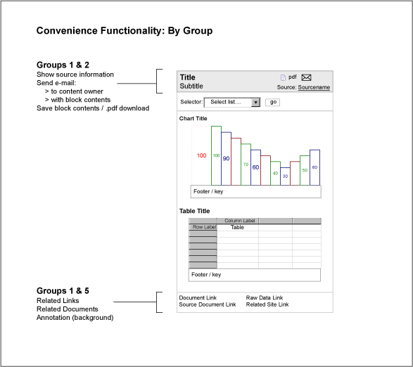
Figure 1: Tile Convenience Functionality (By Group)
Group 1: Understanding Content Sources and Context
Preserving accurate indication for the source of each block’s content is critical for the effective use of heterogeneous offerings. Dashboards that syndicate Tiles from a library of shared assets may contain conflicting information from different sources, so users must have an indication of the origin and context of each block. (Wine connoisseurs use the term "terroir.")
Show detailed source information for a block. For business intelligence and data content, the source information commonly includes the origin of the displayed data in terms of operating unit, internal or external system (from partners or licensed feeds), its status (draft, partial, production, audited, etc.), the time and date stamp of the data displayed, the update or refresh cycle, and the time and date of the next expected refresh.
For widgets, web-based applications, and content that takes the form of transactional functionality such as productivity or self-service applications delivered via an intranet or web-service, source information commonly includes the originating system or application, its operating status (up, down, relevant error messages), and identifying information about the group, operator, or vendor providing the functionality.
Send email to source system owner / data owner. This allows portal users to directly contact the "owners" of a content source. In enterprises with large numbers of internal data and functionality sources that frequently contradict or qualify one another, the ability to ask clarifying questions and obtain additional or alternative content can be critical to making effective use of the content presented within the Dashboard.
Show performance data and metrics. If standard performance data and measurements such as key performance indicators (KPIs) or balanced score cards (which have risen and then fallen out of favor in the past five years) affect or determine the contents of a block, presenting them readily at hand is good practice.
Such performance indicators might take the form of KPIs or other formally endorsed metrics, and require:
- Showing displayed KPIs
- Showing supporting KPIs (rolled up or included in the summary KPI on display)
- Showing related KPIs (parallels by process, geography, industry, customer, etc.)
- Showing dependent KPIs (to illuminate any "downstream" impact)
For performance indicators defined by number and name—perhaps they are recognized and used across the enterprise or operating unit as a comparative baseline, or for several different measurement and assessment goals—provide this important contextual information as well.
Show related documents or assets. Whether automated via sophisticated information management solutions or collected by hand, related documents and assets increase the range and applicability of dashboard content. Bear in mind that less is often more in a world drowning in electronic assets and information.
Show source reports or assets. If the contents of a block are based on an existing report, then providing direct access to that item—bypassing document repositories, collaboration spaces, or file shares, which often have terrible user experiences and searching functions—can be very valuable for dashboard users.
Show related blocks. In large portals or Dashboards that aggregate Tiles from many different sources—perhaps several Tile Libraries—providing navigable links to related Pages or Sections of the Dashboard increases the density and quality of the connections between pieces of content. Whether mapped by hand or automated, these links can further enhance the value of the dashboard by exposing new types of relationships between informational and functional content not commonly placed in proximity in source environments.
Search for related items and assets. If individual Container blocks carry attached metadata, or metadata is available from the contents of the block, search integration could take the form of pre-generated queries using terms from local or enterprise vocabularies, directed against specifically identified data stores.
Group 2: Making Dashboard Content Portable
These capabilities enhance the portability of content, supporting the two-way communication and social flows that make content so useful outside the boundaries of the dashboard. The items below include several of the most useful and commonly requested portability measures:
- Print contents of block
- Email contents of block (HTML / text)
- Email a link to block
- Create a .pdf of block contents
- Create a screenshot / image of block contents
- Download contents of block (choose format)
- Save data used in block (choose format)
- Download source report (choose format)
Group 3: Controlling the User Experience
Individual blocks may offer users the ability to change their on-screen layout, placement, or stacking order, collapse them to smaller sizes, or possibly activate or deactivate them entirely. If designers have defined standard display states for Containers (see Presentation Standards and Recommendations below), blocks may also allow users to customize the display state:
- Change layout or position of block on screen
- Collapse / minimize or expand block to full size
- Change display state of block
- Deactivate / shut off or activate / turn on block for display
Group 4: Staying Aware of Changes / Subscriptions
Aggregation models lower information discovery and acquisition costs, but do not obviate the costs of re-finding items, and do little to help users manage flows and streams of content that change frequently. Many portals and dashboards aim to enhance users’ awareness and make monitoring the status of complex organizations and processes simpler and easier. This group includes functionality allowing users to subscribe to content through delivery channels such as RSS or to receive notices when dashboard content changes:
- Send email on block change (it is optional to include contents)
- Subscribe to RSS feed of block changes (it is optional to include contents)
- Subscribe to SMS message on block change
- Send portal Page on block change
Group 5: Social and Collaborative Tools
This group includes social features and functions that engage colleagues and others using social mechanisms. Introducing explicitly social mechanisms and capabilities into one-way dashboard and portal experiences can dramatically enhance the value and impact of dashboard content.
When designed properly and supported by adoption and usage incentives, social mechanisms can encourage rapid but nuanced and sophisticated interpretation of complex events in large distributed organizations. Social functions help preserve the insight and perspective of a diverse community of users, an intangible appreciated by many global enterprises.
Annotate block. Annotation allows contributors to add an interpretation or story to the contents of a block. Annotation is typically preserved when blocks are syndicated or shared because annotations come from the same source as the block content.
Comment on block. Commentators can provide a locally useful interpretation for a block originating from elsewhere. Comments are not always portable, or packaged with a block, as they do not necessarily originate from the same context, and their relevance will vary.
Tag blocks. Tagging with either open or predetermined tags can be very useful for discovering unrecognized audiences or purposes for block content, and quickly identifying patterns in usage that span organizational boundaries, functional roles, or social hierarchies.
Share / recommend blocks to person. Combined with presence features, sharing can speed decision-making and the growth of consensus.
Publish analysis / interpretation of block content. Analysis is a more thorough version of annotation and commenting, which could include footnoting, citations, and other scholarly mechanisms.
Publish contents of block. Publishing the contents of a block to a team or enterprise wiki, blog, collaboration site, or common destination can serve as a communication vehicle, and lower the opportunity costs of contributing to social or collaborative tools.
Rate block. Rating blocks and the ability to designate favorites is a good way to obtain quick feedback on the design / content of blocks across diverse sets of users. In environments where users can design and contribute blocks directly to a Tile Library, ratings allow collective assessment of these contributions.
Send contents of block to person (with comment). Sending the contents of a block – with or without accompanying commentary – to colleagues can increase the speed with which groups or teams reach common points of view. This can also provide a useful shortcut to formal processes for sharing and understanding content when time is important, or individual action is sufficient.
Send link to block to person (with comment). Sending a link to a block – with or without accompanying commentary – to colleagues can increase the speed with which groups or teams reach common points of view. This can also provide a useful shortcut to formal processes for sharing and understanding content when time is important, or individual action is sufficient.
Commenting and annotation, coupled with sharing the content that inspired the dialog as a complete package, were the most requested social capabilities among users of many of the large enterprise dashboards I have worked on.
Stacking Blocks
Some combinations of Convenience functionality will make more sense than others, depending on the contents of blocks, their purpose within the larger user experience, and the size of the blocks in the stacking hierarchy (outlined in Part 2). Figure 2 illustrates a Page composed of several sizes of Containers, each offering a distinct combination of Convenience functionality.
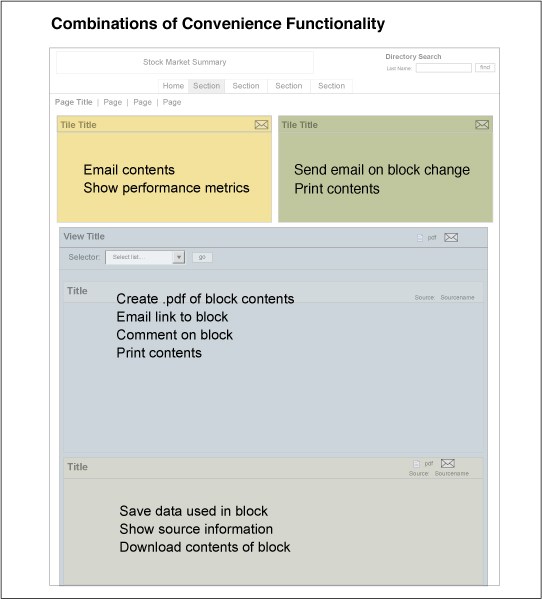
Figure 2: Combinations of Functionality
Convenience…or Connector Component?
Several of the Connector components (described in Part 4 of this series) – especially the Control Bar and the Geography Selector – began life as examples of Convenience functionality. Over the course of many design projects, these pieces were used so frequently that their forms standardized, and they merited independent recognition as defined building blocks. (The change is a bit like receiving a promotion.)
With sustained use of the blocks framework, it’s likely that designers will identify similar forms of Convenience functionality that deserve identification as formal building blocks, which can then be put into the library of reusable design assets. This is wholly consistent with the extensible nature of the blocks system, and I encourage you to share these extensions!
Utility Functionality
Utility functionality enhances the value of content by offering enterprise capabilities such as calendars, intranet or enterprise searching, and colleague directories, within the portal or dashboard setting. In practice, Utility functionality offers direct access to a mixed set of enterprise resources and applications commonly available outside portal boundaries in a stand-alone fashion (e.g. in MS Outlook for calendaring).
Common Utility functions include:
- Team or colleague directories
- Dashboard, intranet or enterprise searching
- Dashboard personalization and customization
- Calendars (individual, group, enterprise)
- Alerting
- Instant messaging
- Corporate blogs and wikis
- Licensed news and information feeds
- RSS aggregators
- Attention streams
- Collaboration spaces and team sites
- Profile management
- Document repositories
- Mapping and geolocation tools
- Business intelligence tools
- Supply Chain Management (SCM), Enterprise Resource Planning (ERP), and Customer Relationship Management (CRM) solutions
My Experience or Yours?
One important question designers must answer is where and how portal users will work with Utility functionality: within the portal experience itself or within the user experience of the originating tool? Or as a hybrid of these approaches?
Enterprise productivity tools and large software packages such as CRM and ERP solutions often provide consumable services via Service-Oriented Architecture (SOA) or Application Programming Interfaces (APIs), as well as their own user experiences (though they may be terrible). The needs and goals of users for your portal may clearly indicate that the best presentation of Utility functionality syndicated from elsewhere is to decompose the original experiences and then integrate these capabilities into your local portal user experience. Enterprise tools often come with design and administration teams dedicated to supporting them, teams which represent significant investments in spending and credibility. Carefully consider the wider political ramifications of local design decisions that affect branding and ownership indicators for syndicated Utility functionality.
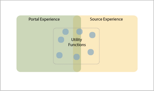
Figure 3: Local vs. Source Experiences
Metadata
In portals and dashboards, aggregation often obscures origins, and content may appear far outside the boundaries of its original context and audiences. The Convenience and Utility functionality suggested above is generally much easier to implement and manage with the assistance of metadata that addresses the dashboard or portal environment.
The attributes suggested here establish a starting set of metadata for Container blocks managed locally, or as part of a Tile Library syndicated across an enterprise. The goal of this initial collection is to meet common administrative and descriptive needs, and establish a baseline for future integration metadata needs. These attributes could be populated with carefully chosen values from a series of managed vocabularies or other metadata structures, or socially applied metadata provided by users as tags, keywords, facets, etc.
Administrative Attributes:
- Security / access level needed for content
- System / context of origin for content
- System / context of origin contact
- Data lifecycle / refresh cycle for content
- Most recent refresh time-date
- Effective date of data
- Block version #
- Block release date
Structural Attributes:
- Container blocks stacked in this block
- Crosswalk Connectors present within block
- Contextual Crosswalk Connectors present within block
Descriptive Attributes:
- Title
- Subtitle
- Subject
- Audience
- Format
- Displayed KPIs (defined by number / name)
- Supporting KPIs (defined by number / name)
- Related KPIs (defined by number / name)
- Related Documents / Assets
- Source Report / Assets
- Related Blocks
- Location
Metadata Standards
The unique needs and organizational context that drive the design of many portals often necessitates the creation of custom metadata for each Tile Library or pool of assets. However, publicly available metadata standards could serve as the basis for dashboard metadata. Dublin Core, with a firm grounding in the management of published assets, offers one useful starting point. Depending on the industry and domain for the users of the dashboard, system-level integration with enterprise vocabularies or public dictionaries may be appropriate. Enterprise taxonomies and ontologies, as well as metadata repositories or registries, could supply many of the metadata attributes and values applied to building blocks.
Presentation Standards and Recommendations
Visual Design and Style Guidelines, Page Layouts, Grid Systems
The neutrality of the building blocks framework allows architects and designers tremendous flexibility in defining the user experience of a dashboard or portal. The system does not specify any rules for laying out Pages, defining grid systems, or applying design styles or guidelines. Responsibility for these design questions should devolve to the local level and context; the architects and designers working on a given user experience must make these critical decisions.
Standards for Containers and Connectors. One of the paramount goals for the building blocks system is to minimize the presence of unneeded user experience elements (no excess chrome for designers to polish!), and maintain the primacy of the content over all secondary parts of the dashboard experience. Even so, aspects of the building blocks themselves will be a direct part of the user experience. Thus setting and maintaining standards for those aspects of Containers and connectors that are part of the user experience is essential.
The many renderings and examples of Tiles and other components seen throughout this series of articles show a common set of standards that covers:
- Location and relationship of Tile components (Tile Body, Tile Header, Tile Footer)
- Placement of Convenience functionality
- Placement of Utility functionality
- Treatment of Connector components
- Boundary indicators for Tiles and Containers
- Boundary indicators for mixed content (block and free-form)
Figure 4 shows one set of standards created for the Container and Connector components of an enterprise dashboard.
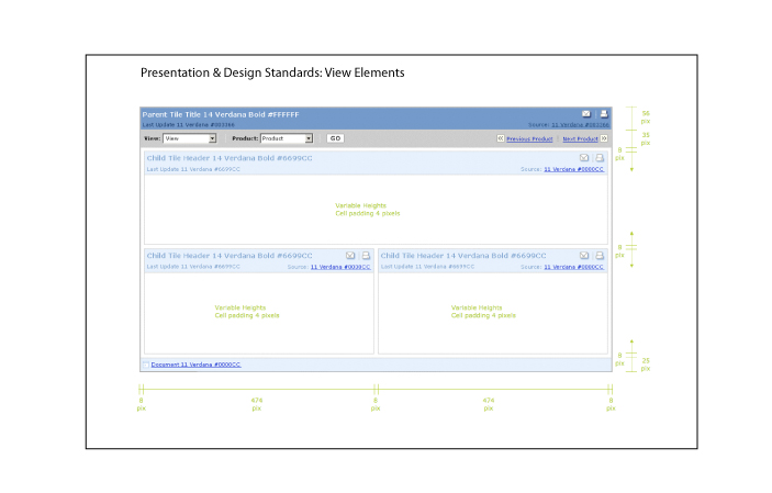
Figure 4: Presentation Standards for Containers and Connectors
This is a starting set of elements that often require design standards. Architects and designers working with the building blocks will need to decide which block elements will be part of the user experience, and create appropriate standards. (If using lightweight and modular user experience development approaches, relying on standards and structured components, it’s possible to effect quick and easy design iteration and updates.)
Standards For Content Within Containers. Setting standards and defining best practices for layout, grid systems, and visual and information design for the contents of Container blocks will increase the perceived value of the dashboard or portal. In the long term, offering users a consistent and easy-to-understand visual language throughout the user experience helps brand and identify Tile-based assets that might be syndicated or shared widely. A strong and recognized brand reflects well on its originators. Figure 5 shows example standards for chart content in Container blocks.
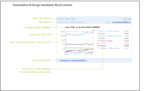
Figure 5: Presentation Standards for Chart Content in Container Blocks
Standards For Mixed Building Block and Freeform Content. Setting standards for layouts, grid systems, and information design for the freeform content that appears mixed with or between Containers makes sense when the context is known. When the eventual context of use is unknown, decisions on presentation standards should devolve to those designers responsible for managing the local user experiences.
Container States
The core principles of openness and portability that run throughout the building blocks framework mean the exact context of use and display setting for any given block is difficult for designers to predict. Defining a few (three or four at the most) different but standardized presentation states for Containers in a Tile Library can help address the expected range of situations and user experiences from the beginning, rather than on an ad-hoc basis. This approach is much cheaper over the long-term, when considered for the entire pool of managed Tiles or assets.
Since the on-screen size of any element of the user experience is often a direct proxy for its anticipated value and the amount of attention designers expect it to receive, each standard display state should offer a different combination of more or less content, tuned to an expected context. Using a combination of business rules, presentation logic, and user preferences, these different display states may be invoked manually (as with Convenience functionality) or automatically (based on the display agent or surrounding Containers), allowing adjustment to a wide range of user experience needs and settings. In practice, states are most commonly offered for Tiles and Tile Groups, but could apply to the larger Containers with greater stacking sizes, such as Views, Pages, and Sections.
One of the most commonly used approaches is to assume that a Container will appear most often in a baseline or normal state in any user experience, and that all other states cover a sliding scale of display choices ranging from the greatest possible amount of content to the least. The four states described below represent gradations along this continuum.
Normal state is the customary presentation / display for a Container, the one users encounter most often.
Comprehensive state is the most inclusive state of a Container, offering a complete set of the contents, as well as all available reference and related information or Containers, and any socially generated content such as comments, annotations, and collective analyses. Figure 6 shows a Tile in comprehensive display state.
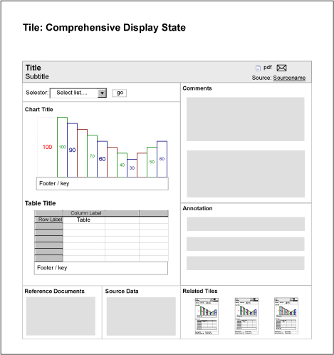
Figure 6: Tile: Comprehensive Display
Summary state condenses the block’s contents to the most essential items, for example showing a single chart or measurement. The summary state hides any reference and related information, and places any socially generated content such as annotation or comments in the background of the information landscape. Figure 7 shows a Tile in summary display state.
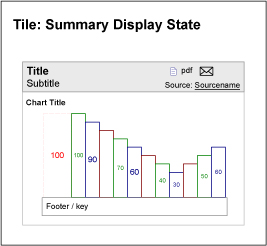
Figure 7: Tile: Summary Display
Snapshot state is the most compact form of a Container block, offering a thumbnail that might include only the block’s title and a single highly compressed metric or sparkline. Snapshot states often represent the Container in discovery and administrative settings, such as in search experiences, in catalogs of assets in a Tile Library, or in dashboard management interfaces. Figure 8 shows a Tile in snapshot display state.
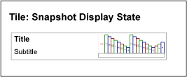
Figure 8: Tile: Snapshot Display
Convenience and Utility Functionality
New platforms such as Adobe Integrated Runtime (AIR) and Microsoft Silverlight, and the freedom afforded by Asynchronous Javascript and XML (AJAX) and Rich Internet Application (RIA) based experiences in general, offer too many possible display and interaction behaviors to discuss in detail here.
Accordingly, I suggest designers keep the following principles in mind when defining the interactions and presentation of Convenience and Utility functionality:
- Convenience functionality is meant to improve the value and experience of working with individual blocks.
- Utility functionality addresses the value and experience of the portal as a whole.
- Convenience functionality is less important than the content it enhances.
- Convenience functionality is always available, but may be in the background.
- Utility functionality is always available, and is generally in the background.
- Convenience functionality does not replace Utility functionality, though some capabilities may overlap.
- Usability and user experience best practices strongly recommend placing Convenience functionality in association with individual blocks.
- Usability and user experience best practices strongly recommend presenting Utility functionality in a way that does not associate it with individual Container blocks.
Manage Functionality By Creating Groups
Most users will not need the full set of Convenience and Utility functionality at all times and across all Tiles and types of Container blocks. Usage contexts, security factors, or content formats often mean smaller subsets of functionality offer the greatest benefits to users. To keep the user experience free from the visual and cognitive clutter of un-needed functionality, and to make management easier, I recommend designers define groups of functionality, users, and content. Create groups during the design process, so these constructs are available for administrative use as soon as the portal is active and available to users.
Other recommendations include:
- Define bundles of Convenience and Utility functionality appropriate for different operating units, business roles and titles, or access levels of users.
- Allow individual users to select from bundles of Convenience and Utility functionality. Customization commonly appears in a profile management area.
- Create roles or personas for dashboard users based on patterns in content usage, and match roles with relevant and appropriate functionality bundles.
- Define types of user accounts based on personas, or usage patterns and manage functionality at the level of account type.
- Define types of Tiles or Containers based on content (informational, functional, transactional, collaborative, etc.). Apply bundles of Convenience functionality to all the Tiles or Containers of a given type.
- Define standard levels of access for social features and functionality based on sliding scales of participation or contribution: read, rate, comment, annotate, write, edit, etc. Manage access to all social functions using these pre-defined standard levels.
Larger portals may warrant the creation of a dedicated administrative interface. The building blocks make it easy to define an administrative console accessible via a Page or Section apparent only to administrators.
Enterprise 2.0 and the Social Portal
Portals and dashboards that augment one-way aggregation of information with Convenience and Utility functionality can offer diverse and valuable content to savyy users – customers who expect Enterprise 2.0, Web 2.0, and social software capabilities from all their experiences and tools. As these recommendations demonstrate, the building blocks can serve as an effective design framework for portals that serve as two-way destinations.
Many of these recommended Convenience and Utility capabilities now come "out of the box" in portal or dashboard platforms, and the interactions that make them available to users follow standard behaviors in the resulting user experiences.When first identified as valuable for users (almost five years ago), these capabilities almost universally required teams to invest considerable amounts of time and money into custom design, development, and integration efforts. Thankfully, that is no longer the case.
Part Six of this series will explore how the Building Blocks framework solved recurring problems of growth and change for a series of business intelligence and enterprise application portals. We will review the evolution of a suite of enterprise portals constructed for users in different countries, operating units, and managerial levels of a major global corporation.

Nice article Joe! Lately I got a change to work on Sharepoint 2007, the client was migrating from Sharepoint 2003 to 2007. As usual, Information Architect was called upon when they had already messed up the system. Most of the times, the client takes help from internal IT staff to set up the portal and realize their mistake when it is already too late. Internal IT teams lack the capability to capture primary user tasks and to create content categories.
Your series was really insightful in terms of designing and standardizing portal. Your articles really helped me in providing me consolidated information about portal design. Keep up the good work Joe.
I had to look up terroir: From Dictionary on my Mac: “The complete natural environment in which a particular wine is produced, including factors such as the soil, topography, and climate.
• (also goût de terroir |goō də|) the characteristic taste and flavor imparted to a wine by the environment in which it is produced.”
Nice term.
@Praveen: Thanks – glad you’re getting benefit from the material. Care to share some more about how you used the ideas / the building blocks?
@Joe Sokohl: Yep – it’s a fancy (make that ‘nuanced’) way to say ‘context’. People in the audience who *aren’t* tired of hearing about ‘context’, please raise your hands. That’s about what I thought.
And If your hand isn’t up, I hope it’s busy holding a glass of good wine!
Sure Joe. Every project comes with its unique set of requirements and nuances. Mostly, designs are context specific because there are so many variables that control it. These variables depend on the project in hand; however, the bottom line is to understand the design thinking and to leverage upon it while building a site or portal.
The important thing about your article is portal vocabulary. I was doing all the design without any language. However, after reading the article I was able to articulate my thoughts in a better way.
I used almost all the concepts you provided in one way or the other. As an IA I was already familiar with all these concepts through experience or exposure. The important thing is that you put them together as a binder which one could refer back to.
In the end, I would say that I like the way you approached portal design. You made it look unified and created sense out of it. Basically, you stitched together the fragments of portal design that were spread all over in my mind and perhaps everybody’s. Thanks for creating this “101 of Portal Design”.
Thanks for a great series Joe. You mention in an earlier article about how this can be applied to other sites, not explicitly dashboards or portals. I think this way of looking at the IA that can be used for various online solutions will be really valuable. In terms of governance for access rights on sites where there are multiple web editors, this way of isolating page elements helps in defining the roles of users who administer sites.
Have you thought about widening the perspective to include all types of website? I am thinking particularly about CMS and how these software solutions affect what can be delivered and the controls content producers have over the visual representation of the pages they maintain. Obviously what they do with a page has a big effect on the user experience but these patterns that you outline here may help to control, or define, the ability to move elements around.
The company I work for are about to purchase a system that will give control over to the website producers, away from the UX team, so they can change the page in an instant. Have you any tips to look out for in terms of user engagement metrics or the monitoring of what they do with the aim to not disturb the user experience?
@James: I’ve seen the building blocks put to work in support of governance several times; in these cases, the governance perspective becomes another layer that the blocks help provide structure and language for. I should add that to the discussion on the ‘layering’ principle – thanks for the tip.
CMS is definitely an arena with good potential for applying the blocks. Social media and rich interactions are others, but we’re not focused on those at the moment. In CMS efforts, the blocks can help bridge the customary mental fault line separating content creation vs. content distribution. It’s an outdated framing that adversely affects the basic model for much CMS work at all levels of size and complexity, not just the enterprise realm. [See Dan Brown’s http://www.greenonions.com/archives/2005/06/24/content-managements-inevitable-conclusions/ for a start on this…]
Would you mind sharing some of the things you’re working on / thinking about related to CMS and building blocks?
If your company is tracking any of the common business metrics (for customer satisfaction, time to market, product sales, revenue vs. expenses, effectiveness of your on-line channels, average rate of new customer acquisition, etc.) then assessing disturbance to the overall UX might be as easy as comparing the before and after numbers of any of these indicators.
Also, if your website producers can move things around at will, you’ll need some new tools to understand the effects those changes have. A/B or multivariate testing of different combinations of blocks may help provide insight into any effects on the user experience.
Mainly I think we have cultural issues to deal with on top of the technical implimentation and also the impact on our users. I have to remind myself that our users are the people who are on both sides of the website – the people managing the content and those who are viewing it. So I guess we do not want to constrict their creativity in producing killer content, but we don’t want to destroy user engagement because of a few minutes of madness with no guidelines or governance.
We are definately going to set up some metrics to easily see where choices on the interface have impacted on user experience. Thanks for the list here as that will provide the bluepint for our sequence of measurements. We have also worked on other engagement metrics such as frequencey of visits, bounce rate, page impressions per user, time on site etc.
We are also working on A/B testing which with the new CMS, should enable the producers to conduct their own testing. As there are so many different sites this seems the only way to ensure a level of test and measurement. Our IA department numbers 1 – and the UX team are too stretched to offer anything other than consultation.
So this leads me to governance. The navigation (and revenue drivers such as subscription sign-ups) I think should be locked down. At present all elements on the page can be moved around, a WYSIWYG approach for the site editors. These elements are so key to user’s interactions that the thought of them moving rings the usability alarm bells.
I’m thinking an adaptation of your model, the layers you mention, needs to be constructed and outlined to all the stakeholders. So often our discipline seems to come across as the killjoy to the party when new technologies are bought and developed. It would be nice to somehow come up with a workable solution where our producers can create without feeling their hands are tied but our user’s needs are not compromised through changes in the interface.
Dan Brown’s take on this is interesting as he rightly states CMS is not linear and in fact the whole process will become more iterative – perhaps that is what we are leaning towards, iterative content management. With the testing and live metrics this will be even more true. I will keep you posted on future developments – but thankyou again for the series, it really has allowed me to start framing the problem.
Joe, thanks for this series. I’m new to the whole area of portals and portlets and the series is helping me crystallize some of the concepts. One question though, you occasionally use the term “portlet”. When i see this word, I think of JSR-168. But I don’t think this is what you mean when you say portlet. Can you elaborate? And also say some more about portlets in the context of JSR-168 and your definition of “Tile” (and “tile group”, etc if appropriate)?
Thanks again!
Rich
@Rich Glad you’re getting some value out of the series. Regarding JSR-168, the building blocks are neutral in regards to all standards like JSR-168, and any of the specific portal platforms and technologies available. They’re supposed to serve as a descriptive and design framework that all portal stakeholders (biz, users, tech, etc.) can use to understand and define what a portal should offer, and then use as a tool to help implement the resulting design in their individual environments and business contexts.
If you compare the components outlined in the Building Blocks with the stock portlet defined by JSR-168 (and the standard panes / tiles / widgets / whathaveyous in most of the vendor specific portal design kits) you’ll see that the blocks framework includes new, larger, and more sophisticated elements. This is largely and upward and outwwrd progression: The Building Blocks begin with Tiles as the smallest standardized element, and then offer larger elements that are based on Tiles, such as the Tile Group and View, that can interconnect in ways not offered by JSR-168, or platforms such as Sharepoint.
Note that because the Building Blocks are not tied to the universe of portals in any way, they serve well as a design framework for any modular environment composed of shared / syndicated / aggregated chunks of content and functionality. This support for fragmented content and services means the blocks are well suited to the public internet in the Web2.0 era, and other contexts besides. You can use the blocks to design everything from personal consoles, to web applications, to ubiquitous mobile devices. Consider the iPhone home screen – composed of lots of little apps that you can collect and group together – and the configurable ‘Spaces’ offered by the Apple OSX desktop. Overall, think of the building blocks as a modular design framework that supports synthesis of small set of standardized elements into larger and more meaningful constructs, not an extension or enhancement for any particular portal standard.
Does that help?
I’m writing a case study now to finish the series here at B+A, which will show several examples of how the building blocks have been applied in the past. I’ve also several presentations that explain the Building Blocks; these are available at http://slideshare.net/moJoe.