I can’t recall how or when I first learned of the Boxes and Arrows redesign contest. On July 5, 2004, I sent an email to a good friend, Matt Titchener, proposing that we enter the contest together. I got to know Matt while working with him at a nonprofit organization developing intranet web applications. We discovered that we shared the same appreciation and views toward usability, accessibility, web standards, and visual design. Matt is also one of those rare talents that possess great design ability as well as a keen technical understanding in web development/design. After confirming Matt’s interest in the contest, we embarked on what would become more than a two-year journey to redesign Boxes and Arrows.
The contest
From the start, Matt and I agreed to take this contest seriously, approaching it as if we were revamping a website for an actual client. We spent much time studying the existing site hierarchy and brainstorming for ways to produce better user experience. We knew that we didn’t have to convince Boxes and Arrows’ audience of all the invaluable and insightful articles and discussions on the site. It was only a matter of how to get readers to the content more effectively. We were looking to accomplish a very intuitive navigation and site structure/flow to allow the readers to reach their desired content with the fewest clicks possible. It took us roughly a month to create our initial design concept (see Figure 1 & 2), which we are still quite pleased with even to this day. Then with about four days remaining to the deadline, I revisited the contest guidelines and comments posted by the Boxes and Arrows staff. I realized that the B&A folks were looking for a fresh and entirely different look, but the design that we created still too closely resembled the existing site (with its color scheme and layout).
I became convinced that in order for us to have a better chance at winning the contest, we would have to rethink our concept. So painfully, we decided to put aside the design that we had worked so hard on, and started from scratch with a different visual approach. After a few sleepless nights, with heavy bags under our eyes, we submitted our new design concept less than two hours before the contest closing time (see Figure 3 & 4).
Then we waited…
Three months later, I received an email with the subject line “Congratulations!! You have the winning Boxes and Arrows Site Redesign Submission.” I habitually ignore and delete all email that has subject lines beginning with “Congratulations!! You have won…”, assuming spam, so I nearly missed this one! Not until I read through my inbox more carefully later that day and recognized it was from Erin Malone, did I realize that we had actually won the contest. I immediately rang up Matt in London to share the good news with him. I stopped everyone that passed my desk that day to tell them all about the contest. The announcement of our win put a fixed grin on my face for days to come.
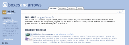
Figure 1: First iteration of the front page design
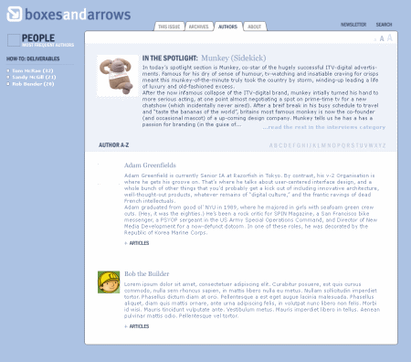
Figure 2: First iteration of the author’s page design
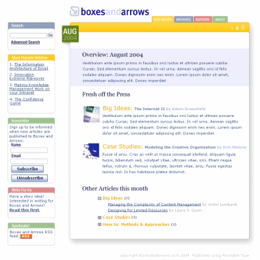
Figure 3: Final front page design submitted to the contest
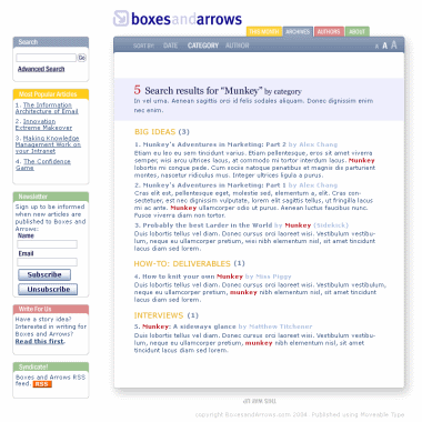
Figure 4: Final category page design submitted to the contest
Redesigning the redesign
In January of 2004, we began working with Christina Wodtke and Erin Malone on the implementation of the design. During one of our initial conference calls, we asked for permission to create another design concept different from the one we submitted. Since we only had a very short timeframe to put together the contest entry after our decision to start from scratch, we felt that we did not have adequate time to create a design that fully represented our capability or design vision. Christina and Erin kindly agreed to our request.
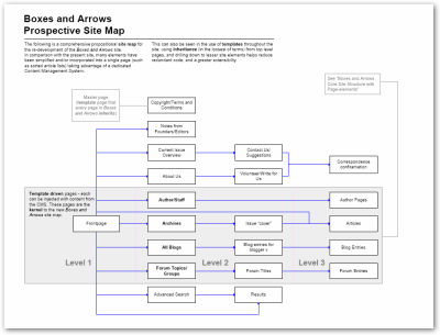
For the next nine months, we went through many rounds of brainstorming sessions, looking at ways to improve the visual presentation, the functionality, and the structural flow of the site (see Figures 5-7).
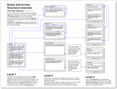
Figure 5: Site structure proposal submitted with the design
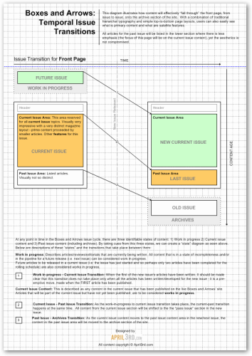
Figure 6: Idea for how articles should flow/transition through the front page from issue to issue
The folks at Boxes and Arrows made it clear from the onset that they would like to see B&A take on more of a magazine look instead of the blog-centric feel that it had previously. We began looking at various print magazines like Time, Wired, Newsweek, and National Geographic, trying to figure out what elements in periodical cover designs make people quickly recognize a magazine when they see one. We identified strong typography, compelling imagery, and the concept of weekly or monthly issues as the elements that we would like to bring into our site design. (“Transcending CSS”:http://www.transcendingcss.com, a book recently written by Andy Clarke, includes chapters entitled “Marking Up the World” and “Looking for Grids Outside the Web” touching upon the approach of bringing visual elements from different media to the web.) A few weeks later, we created a mockup of the front page. This mockup became the foundation of the design that you see today.
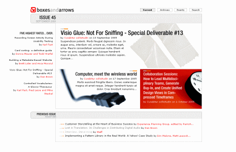
Figure 8: First iteration of second redesign
Design ideas and solutions
Instead of a traditional navigation menu, we incorporated a tag cloud into the site’s left navigation design. Because of the variety of categories listed in the left navigation, we initially took this approach not only to highlight the categories with the higher number of articles, but we felt that different font weight distributions in the navigation menu would also draw the users’ attention to the category list. We invested much time in creating the best algorithm and rendering method to make this work effectively. At the end, B&A decided to leave this piece out after the site launch due to the arrangement of the current taxonomy on the B&A site and the evenly distributed number of articles across the categories (which negates the reason for having a tag cloud to highlight the variance between categories). Nevertheless, we still considered it a clever design approach and hope to see it implemented on the site again one day.
Two other areas that we put much thought into were the layout of the new articles on the front page and the transition/flow of the articles from issue to issue. We wanted to accommodate the different number of articles being published and at the same time create a dynamic layout that provides a fresh look to the front page in every issue, much like a print magazine. We proposed a template system that will allow the editors to easily choose the layout with the best fit each time they publish new articles (see Figure 9 and 10). I believe as the PublicSquare CMS continues to mature, a future plug-in can make this workflow even more automated.
Regarding the transition of articles on the front page, as you can see in Figure 6, we created a flow that will smoothly bring the articles from the new article spots at the top of the front page down to the “Previously” section whenever new articles are published. Eventually, the older articles will be moved out of the front page and will be found in the archived story section of the site. This helps to provide our readers a good sense of continuity each time when they visit the site and enables them to quickly locate the most recent issues.
Anther finer touch was the use of the font-embedding feature in Internet Explorer to apply a more attractive type (Helvetica Neue Medium 67) to the article titles and the issue header, while making sure it degrades gracefully with a similar core web font in other browsers with the help of CSS.
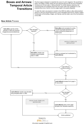
Figure 9: Proposed process for creating different front page layouts for publication
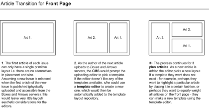
Figure 10: Examples of different front page layouts based on the number of new articles
After several iterations of changes and refinement of this magazine site concept in collaboration with Liz Danzico and Christina Wodtke over a period of two months, we arrived at a polished design concept that was ready to be implemented (see Figure 11 & 12).
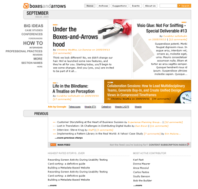
Figure 11: Final front page redesign
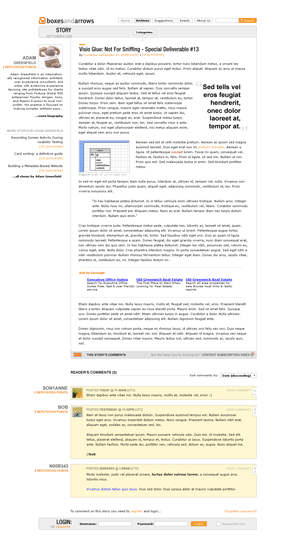
Figure 12: Final article page design
A bump in the road
While we were conceiving Boxes and Arrows’ new site design, “PublicSquare”:http://publicsquarehq.com/, a new content management system (which now drives the B&A site) created by Christina and Lars Pind was in the works. We soon shared the growing pains of PublicSquare as we were met with challenges in implementing our design into this developing CMS. After failing to launch the new design prior to the 2006 IA Summit, we went back to the drawing board and the implementation phase of the design was put on hold as Lars worked hard to integrate a new theme engine/templating language (“Liquid”:http://home.leetsoft.com/liquid) into PublicSquare. You can read more about this in “Christina’s article”:http://www.boxesandarrows.com/view/are_we_there_ye.
Towards the later half of 2006, the maturing PublicSquare was ready for us to begin the implementation phase again. It took another few months for us to port over our design into the Liquid theme language with the PublicSquare API. Because of some intricacies in the design, the amount of effort and time required for this phase far exceeded our expectation. It also happened to be the busiest time of the year for our day jobs so we had a bit of a difficult time juggling the work. Nevertheless, slowly but eventually, on the evening of January 15, 2007, we raised the curtain on the new Boxes and Arrows site. I can’t begin to describe the overwhelming sense of joy and relief that we had seeing our design live on the web.
The tortoise crosses the finish line
It has been a long ride. From the day that we received Erin Malone’s email to the day that our design finally launched was almost exactly two years. On this road of redesign, there were many IM chats and Skype calls made, numerous late nights and working weekends spent, and countless cups of tea and coffee consumed. It took awhile, but we got there. Working with these folks at the forefront of the IA community has been a great learning experience. The positive responses from industry leaders in the field of web design have also been a real reward to us.
We hope to continue to contribute to Boxes and Arrows as well as the community it serves. But for now, I am going to get some much-needed sleep, so good night!
See also: Are We There Yet for more tales of the redesign.

It is so weird to have the left side of my screen cut off and no scrollbar to help me see the content — how did you manage that? Is there a reason for this? How would I get to see this content if my browser window were maximized and there is no scrollbar (say maximized at 1028?)
I see this in both Firefox 1.5 and IE7 on XP Pro PC. The scrollbar doesn’t kick in until my window width is narrowed 852 px. I can’t see the entire page unless my window is set at 1050 px wide — and that width leaves lots of blank space on the right (100 pixels wide).
it’s not showing up on the new version of firefox. We’ll look into it.
The same thing is happening to me in Firefox 2.0.0.3. I’m running OS 10.4.9 and the viewport is currently at 968px.
Same issue with Safari 2.0.4. The left-side of the screen completely disappears when you size down the window. There is a div titled #page which is 682px wide but very little of the layout within it, then all of these extra div’s with no set widths (e.g. #authorList, etc.). If it were me, I’d place every element within a single global container and assign a master minimum width. That way, you’d avoid the vanishing act that’s going on here.
I applaud everyone involved. It shows how difficult a site redesign is. I do wish the type weren’t so godawful small–it’s broken on my Mac running Firefox. From my usability perspective, as a user I shouldn’t have to bump up the type size for the site.
Anyway, though, it really is a herculean effort. Accolades all around!
Just a slight issue I have and I encounter it often on various sites. Please set the background color to white if you want a white background display. Many of us out there have our program background default color to not be white and a page like this is very disjointed when there is no defined background color. It seems to be a very common oversight most people make when building a white background site.
0 reputation points, but if it counts for something, i think you have done an amazing job. I love this site.
it’s the way the “side bar” content is positioned on the page. In the source code the information in the side area as well as some of the content in the header are children of the container #page. The navigation container #categoryList is position:absolute and 700px from the right. This means if you shrink the window it will push past the left edge of the view port. The questionable items in the header are position with a negative value and will do the same.
To fix it you may want to widen the width of the container #page to be the sum of the width of the #categoryList and #content containers. Then position those two containers from the left rather than from the right.
There’s a little more to it than that but it’s a start.
The single most exciting thing is the real-time feedback when entering in your username on the login page. This should become standard everywhere, now. It will save me ten minutes of frustration per day.
Think this has been great. Were the colors chosen for links driven by the CMS? If not, recommend we consider changing for the following reasons:
1. Link colors vary and in some cases (see 1A, 1B, 1C) B&A now uses a color that in some cases is for a link and in others is for static text. Seems like we now violate an important tenet of consistency and affordances:
A. orange used to highlight reputation points (not a link), but orange also used for links (author name at top of some articles, post comment, advertise event, etc.)
B. gray links in some cases
C. Black links for items such as Most Commented Stories (granted, position and context helps clarify that they may be links)
2. Link colors like #663300/brown make links difficult for both users without visual impairments, but even moreso for those with visual impairments, to spot.
3. A run-through with JuicyStudio’s Colour Contrast Analyzer shows some failures with respect to providing sufficient contrast between foreground and background colors –
A. Orange (#ff9f27) on white for links / hover colors has luminosity contrast ratio (LCR) = 2.74 vs. 5.0 recommended by WCAG – http://www.w3.org/TR/2006/WD-WCAG20-20060427/guidelines.html
B. different shades of gray on white for some links –
gray (#999999) on white LCR = 2.85
gray (#7f7f7f) on white LCR = 4
gray (#666666) on white LCR = 5.74 (passes WCAG AA 5.0 ratio but falls short of AAA 10.0 ratio, and fails on difference in color)
I like the design, but am having trouble figuring out where to send a comment like this:
I use Firefox on Windows. When I print articles, I often do not get the illustrations that accompany them. I like the print stylesheet (every site should use these IMO) but I would like to get the pix.
Thanks.