In many organizations, the design team does some research then retreats to their tower to conjure deep magics that turn note filled notebooks into a customer journey map. At least that’s what it looks like to their peers.
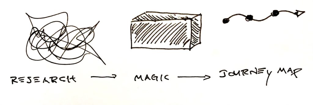
Journey diagrams capture tons of detailed info about users, processes, and systems. The best teams share the same understanding of the user’s journey. Instead of having your team wonder where you got this information or how you came to these conclusions, have them build the journey map with you.
When you map the user journey with your team, everyone understands what it says and why. When you collaborate with your team, the journey map transforms from the designer’s magic to the team’s mission, representing the journey you shepherd for your users.
Focus your Journey Map on the Outcome
Journey maps are pretty easy. Start somewhere and keep going until you run out of stuff to talk about or get tired. Whatever comes first. But, when you finish, does the journey help your team do what they need to do?
- Do you need user stories for a backlog? The completed journey map should give you a bunch of user stories.
- Do you need to improve parts of the experience? The journey map should note the good and bad parts of the experience.
- Do you need to improve adoption or retention? The journey should identify where the user enters and leaves the product’s ecosystem.
The following collaborative approach to build journey maps provides just enough structure and flexibility, so you can customize the journey map, and your team gets what it needs.
Over the last decade, this flexibility has helped all kinds of teams create collaborative journey maps. From feature teams to business execs and furniture stores to chemical companies, anywhere a group of people can talk about how users interact with a system, you can collaborate to create a journey map.
Understand the Journey Map “Canvas”
Have you ever searched for “journey maps” on the web? They all look different and include different information. If they’re all different, how can you know what information your journey map needs? First, imagine experience maps, customer journeys, and service blueprints as different flavors of the same thing: a map of how a user moves into, through, and out of a system.
The type of journey you need will sprout from the collaboration with your team. This means most journey map templates are too strict, too rigid, and too structured to let the right information emerge organically. That doesn’t mean you start with a blank sheet of paper. You start with an invisible grid.
Use the Horizontal Space
A journey follows a timeline from left to right. When you move from left to right, you document “when” something happens. The timeline also creates a horizontal axis where you can add additional information about the journey. You can break the timeline into phases.
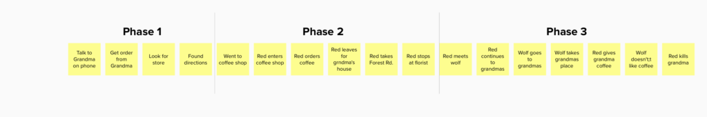
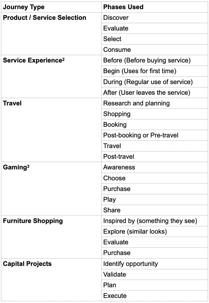
Typically, you segment the timeline into phases or steps where users do a type of thing. Maybe every touchpoint in a phase occurs outside. Maybe every touchpoint in another phase occurs when the user evaluates products. Table 1 (way) below shows some of the ways you might segment a timeline.
Use the Vertical Space
Just like you use horizontal space, you can use vertical space the same way. That’s how swimlanes work. Move items up or down to place them in the right “lane”. On a journey map, you can move the touchpoints up and down to communicate additional information. Maybe each lane indicates the primary user at a touchpoint. Maybe they indicate the channel or the interface.
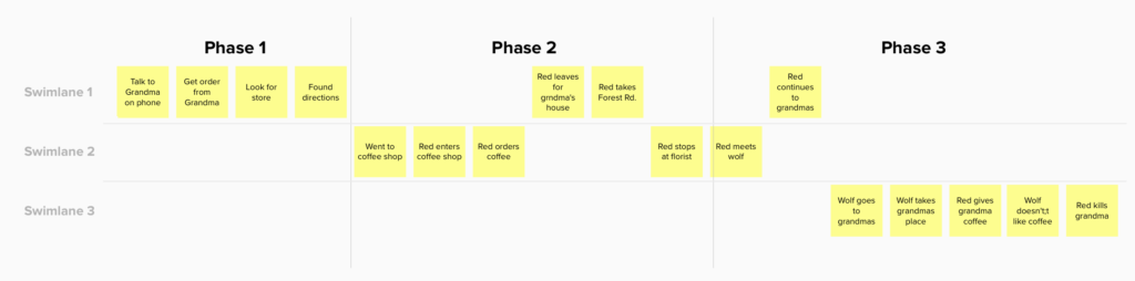
The journey map lives on an invisible grid, and you can move items up and down and side to side to create the structure your team needs to understand their journey. Take advantage of horizontal and vertical space to help your team figure out what’s important and what you need to document.
When you imagine the journey map on an invisible canvas, you have the freedom to let the right kind of journey emerge. You’re almost ready to start.
Before You Start, Ask Two Questions
First, do you want to dive into a single touchpoint? Or do you want to look at a range of touchpoints? A range of touchpoints could be something like searching a website, buying coffee, or loading a train car. If you want to map a single touchpoint, restrict discussion to everything within a specific interaction. On the other hand, if you want to look at a range of touchpoints, resist diving into each interaction.
Second, determine whether you want to map today’s journey or a future journey. Map the current state journey if you have an existing product or service you want to improve. Map the future state if you want a north star for where you need to go. Honestly, most journey maps include both current and future state because you can affect some parts of the journey and not others. You can only map the current state of areas outside your control.
Materials and supplies
To create a collaborative journey map, you need three things:
- A way to collect observations and insights
- A place you can collect those insights and move them around
- Some people
In person, you can use sticky notes on a wall or whiteboard or big piece of paper. Remote, you can use a virtual collaboration tool like Mural or Miro1. You don’t need special tools or templates or recipes or canvases.
Once you have a wall, some sticky notes, and some people, you’re ready to create your journey map.
Begin your Journey Map at the Start
What happens first? Capture the first step on a sticky note and place it on the wall at the center.
When you capture this first touchpoint, phrase it as: “a user does a thing”.
- “Austin writes an article.”
Bonus points if you capture the channel.
- “Austin writes an article on Google Docs.”
You also get bonus points if you capture why.
- “Austin writes an article, so he can submit to Boxes and Arrows.”
Or, go deeper:
- “Austin writes an article, so he can demonstrate expertise.”
Travel Back in Time
In the world of journey maps, time moves in two directions. Return to the first touchpoint and ask what happened before that?
We often focus journey maps on the ecosystems we control. When we focus on the user’s journey inside our ecosystem, we miss contexts that affect how users find, enter, and leave our system. When you map the system around your product, you reveal opportunities where you can influence user awareness, boost conversion, and improve adoption and retention.
Keep going backward and forward along the timeline. When you have a good set of touchpoints stretched across the wall, it’s time to add some analysis.
Add Horizontal Meaning
The journey moves from left to right. Take a look at the touchpoints. Where does the type of touchpoint change? Keep a lookout for places where…
- The user moves from one type of activity to another like moving from looking for products to buying a product.
- The user moves from one channel to another like moving from browsing online to shopping in a store.
- The primary user changes roles like the change from the barista manning the register to the barista manning the espresso machine.
- The user interacts with different people like when patients go from meeting with their primary care physician to meeting with a specialist.
Every journey is different. Hidden somewhere in your sticky notes are places where things change. Look for these changes and mark them. These changes identify different contexts that may change user needs or design constraints. Table 1 shows example phases from a range of journey maps.
Table 1: Example of horizontal segments found in journey maps
When you find one type of change, keep looking for more.
First, you may find a more useful way to segment the journey. For example, maybe the user does change channels from online to in person, but maybe the more significant change happens when the user goes from talking to friends and family to talking to the salesperson.
Second, you can add different kinds of horizontal segments. Maybe note when the channel changes and also when they interact with different people.
Add Vertical Meaning
Once you’ve added horizontal meaning with phases, move sticky notes up and down to add vertical meaning. This adds swim lanes like we discussed earlier. Like horizontal groupings, swim lanes can signify different information:
- Channels
- Users
- Mindset
- Device
- Type of activity
There’s no rule around how you use swim lanes. In my experience, the most useful way to add vertical meaning will differ based on your product and organization. As a consultant who works with many types of organizations, teams, and projects with different internal or external users, swim lanes regularly indicate different types of information, but they always make sense given the context.
Dive Deep into Each Column
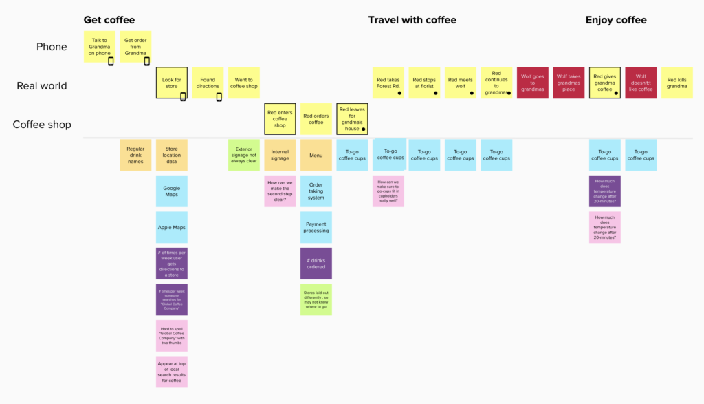
As the journey stretches from left to right, each touchpoint creates its own column where you can analyze each touchpoint in more detail. I recommend the service blueprint approach by Erik Flowers and Megan Erin Miller at Practical Service Design.
In Erik and Megan’s service blueprint approach, they document different types of information for each touchpoint:
- Actors: the primary user and any other users involved with the touchpoint (like you and your doctor and nurse when you’re in the exam room)
- System: any technology, hardware, or applications required at this touchpoint
- Processes/Policies: any business processes or policies at play with this touchpoint
- Data: what data is needed for this touchpoint
- Content: what content is needed
- Metrics: what metrics do we need to capture at this touchpoint
- Open questions: things you don’t know and would like to know (so you can build a list of research questions)
- Pain points and barriers: things that make this touchpoint difficult
- Observations and info: any additional info about the touchpoint that could be useful
Not every touchpoint will have every point of information, so consider each point optional, and capture things that seem useful. Erik and Megan recommend using a different color sticky note for each attribute.

The anatomy of a service blueprint by Erik Flowers and Megan Erin Miller at Practical Service Design
At this point, after categorisation, you have a pretty good journey map. If you mapped the journey with your team, then everyone shares the same understanding about what’s going on and (most importantly) how you got there. You can stop here, or you can keep going.
Add Additional Annotations
As you comb over the map and learn more about the journey, you can annotate additional information.
Add icons or marks to individual touchpoints to highlight information you can’t capture with horizontal segments, vertical swimlanes, or in the touchpoint column. I use these to mark touchpoints that need lots of love. You can literally use these marks to indicate anything.
Next, note the critical moments, what marketers call, “moments of truth”4, moments that indicate a place in the user’s journey where they make a critical decision to continue forward. You may have seen Google’s “Zero moment of truth” when a customer decides to buy, but it’s more useful to think more broadly and identify any touchpoint where users make a critical decision to move forward.
These moments of truth identify key inflection points where design can improve conversion, adoption, and retention.
Nurture, Grow, and Share
As a consultant, I deliver lots of pretty journey maps as PDFs. These journeys are dead almost as soon as they’re delivered.
A journey map represents your team’s current understanding of the user and their journey. Every day, your understanding of the user and their journey improves. You adjust misperceptions and add nuance where you didn’t see it before.
Just as your user understanding evolves, the journey map needs to evolve and grow. When you capture journeys in an online tool like Mural or Miro: anyone can make changes to reflect new understanding. Imagine a developer makes changes after seeing how users interact with your product. Imagine how amazing the user experience can be when everyone on the team understands the journey and is so invested, they update the journey map to continually reflect what they learn.
Collaborative journey maps transform an esoteric, magical user experience deliverable into a visual mission statement created and maintained by the entire team. And all you need is some sticky notes and a blank space.
——————————
Download a free facilitation guide with templates and framing material for creating collaborative journey maps. Learn more about collaborative journey maps and other ways to collaborate around design in my book, Collaborative Product Design from O’Reilly.
Endnotes
1. Find a list of virtual whiteboards for collaboration on my blog at https://www.agux.co/workshops/tools-for-remote-workshops
2. Miller, Megan Erin. “Understanding the Lifecycle of Service Experiences.” Practical Service Design, Practical Service Design, 22 Sept. 2016.
3. From a user journey created by nForm (https://www.nform.com) for a Comcast gaming site.
4. See Wikipedia for more information: https://en.wikipedia.org/wiki/Moment_of_truth_(marketing)
Photo by Clemens van Lay on Unsplash
This is a genuinely clear and concise article about how to refine and improve on user journey while also adding value. I am definitely sharing this with the UX designers in my team, it was really informative for me.